
The “Blank Canvas” Anxiety is Finally Cured
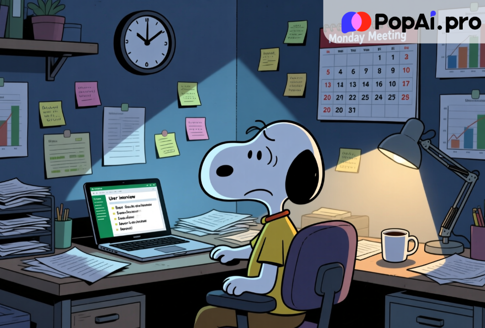
We need to talk about the “Sunday Night Scaries.” You know the feeling. You have a massive stakeholder meeting on Monday morning. You have spent the last two weeks conducting user interviews, analyzing heatmaps, and compiling survey data. You have all the insights in your head or scattered across fifty different Notion pages and Excel sheets. But you have exactly zero slides.
For years, the bottleneck in the creative industry—especially for User Experience professionals—hasn’t been the research; it’s been the packaging. We spend 20% of our time finding the truth and 80% of our time wrestling with text boxes, alignment tools, and finding the perfect stock image to represent “synergy.”
This week, the tech world has been buzzing about the shift from “Chatbot AI” to “Agentic AI”—tools that don’t just talk back to you, but actually do the work. While headlines focus on massive corporate layoffs or stock market shifts, the real revolution is happening on our laptops, quietly, late at night.
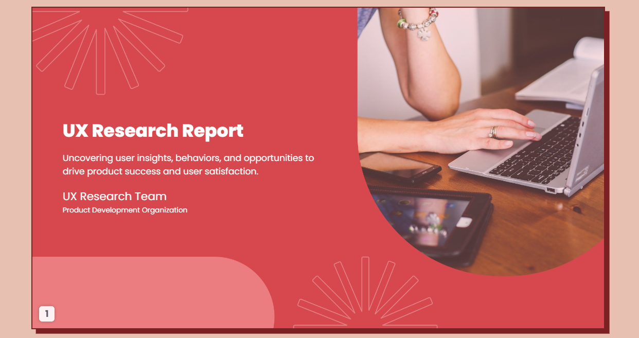
I decided to test this. My mission? To create a comprehensive UX Research Report PPT based on a dense, 40-page PDF of user interview transcripts. The goal? To do it in under 10 minutes using PopAi.
What happened next didn’t just save me time; it fundamentally changed how I view the value of my labor.
The Death of the “Copy-Paste” Era
Let’s be honest: nobody went to design school to resize fonts. Yet, if you look at the daily life of a Product Manager or a UX Researcher, that’s the reality. The recent news cycle regarding Generative AI has shifted from “Look at this funny poem” to “How do we maximize enterprise efficiency?”
We are seeing a massive pivot in user behavior. According to recent productivity reports from Q4 2025, professionals are abandoning general-purpose chatbots in favor of specialized “output-focused” AI. We don’t want a chat; we want a deliverable.
This is where the UX Research Report PPT becomes the perfect testing ground. It is a notoriously difficult document to create. It requires:
1. High-level synthesis: Summarizing hours of talk into bullet points.
2. Visual storytelling: Mapping data to charts.
3. Structure: A logical flow from Hypothesis to Methodology to Conclusion.
I opened PopAi with a heavy dose of skepticism. I’ve used AI slide generators before—usually, they give you five slides of nonsense text and irrelevant photos of people shaking hands. But PopAi’s promise of “Chat with Document” integration combined with presentation generation piqued my interest.
The PopAi Experiment: From PDF to Podium
Here is the workflow I used. It felt less like working and more like directing a very fast, very talented intern.
Step 1: The Knowledge Dump
I dragged my raw PDF—a messy transcript of user interviews regarding a fintech app redesign—directly into PopAi.
Usually, this is where the friction starts. Most tools choke on large files or lose context. PopAi read the document instantly.
Step 2: The “Analyst” Phase
Before asking for slides, I needed to know if the AI understood the data. I typed:
“Extract the top 3 pain points regarding the checkout flow and suggest 3 actionable UX improvements based on this data.”
PopAi didn’t hallucinate. It cited the specific pages in the PDF where users complained about the “hidden fees” and “slow loading times.” This is a crucial feature: Source traceability. In a professional setting, you cannot present data you can’t verify. PopAi allows you to click the citation and jump exactly to that part of the document.
Step 3: The Magic Trick
Then came the prompt that typically results in disaster. I typed:
“Create a presentation outline for a UX Research Report PPT based on these findings, then generate the slides.”
This is the “content-first” approach. PopAi didn’t just throw random slides at me. It first structured the narrative:
· Slide 1: Executive Summary.
· Slide 2: Methodology (Qualitative Interviews, N=15).
· Slide 3: Core Problem: The Checkout Friction.
· Slide 4: User Verbatims (Direct quotes).
· Slide 5: Proposed Solutions.
Once I approved the outline, it generated the deck.
Analyzing the Output: Why This Time It’s Different
When the presentation loaded, I paused. It wasn’t perfect—AI rarely is on the first shot—but it was 90% there.
The layout was clean. The headers were action-oriented (e.g., “Checkout Latency Drives 15% Drop-off” rather than just “Checkout Data”). It had automatically pulled the most biting, emotional quotes from the users and placed them in pull-quote boxes.
For a UX Research Report PPT, visual hierarchy is everything. Stakeholders don’t read paragraphs; they scan headlines. PopAi seems to understand the “skim-ability” required for executive presentations.
But here is the deeper insight, the “news behind the news”: PopAi didn’t just design the slides; it acted as a thinking partner.
By analyzing the document first, the content on the slides was substantive. It wasn’t generic fluff. It referenced the specific “Button Color A/B Test” mentioned on page 12 of my upload. This integration of Document Understanding + Generative Design is the “Killer App” we have been waiting for.
The “Professional Gap”: Why Free Tools Won’t Cut It

This brings us to a critical juncture in the AI adoption curve. There is a growing divide between “Casual Users” and “Power Users.”
Casual users stick to free versions of basic models. They copy-paste text into a blank PowerPoint slide, struggle with formatting, and spend 4 hours fixing alignment. They save a little time on writing, but lose it all on design.
Power users, however, understand the ROI (Return on Investment) of premium tools.
Let’s talk about the elephant in the room: Why pay for PopAi when free tools exist?
The answer lies in Workflow Velocity and Token Context.
Creating a robust UX Research Report PPT requires processing a massive amount of context. Free models often have “memory loss”—they forget the beginning of the document by the time you get to the recommendations. They limit the number of slides. They watermark your images.
Upgrading to a paid plan on platforms like PopAi isn’t about unlocking a “cool feature”; it’s about unlocking reliability.
1. Extended Context Window: You can upload 100+ page reports, academic papers, or entire books. The AI remembers every detail.
2. Advanced Models: You get access to the smartest engines (like GPT-4o logic) that can handle complex reasoning, not just text prediction.
3. Visual Capabilities: The ability to generate relevant imagery or charts that don’t look like clip-art from 1998.
If your hourly rate is even $50/hour, and this tool saves you 5 hours of formatting per week, the subscription pays for itself before lunchtime on Monday. This is the calculation savvy professionals are making in late 2025. The cost of the tool is negligible compared to the cost of your time.
The Future of “Work” is “Edit,” Not “Draft”
We are witnessing a fundamental shift in the definition of “white-collar work.”
Previously, value was defined by creation. “I wrote this.” “I drew this.”
Now, value is defined by curation and insight. “I directed the AI to find this pattern, and I verified its accuracy.”
When you use PopAi to generate a UX Research Report PPT, you are not “cheating.” You are elevating yourself from a “Slide Designer” to a “Strategic Consultant.” You are outsourcing the low-leverage activity (formatting, summarizing) to focus on the high-leverage activity (interpreting user needs, persuading stakeholders).
This connects to the broader trend of “AI Literacy.” Employers are no longer impressed that you can use AI; they expect you to use it to deliver faster. If your colleague can produce a deep-dive report in 30 minutes using PopAi, and you take 3 days doing it manually, you aren’t “hardworking”—you are inefficient.
How to Structure Your AI-Generated Report for Maximum Impact
To get the most out of PopAi, you need to treat it like a junior analyst. Here is the secret sauce prompt strategy for UX Reports:
1. Context Loading: Always upload your raw data first. Don’t just prompt blindly.
o Prompt: “Read this file. You are a Senior UX Researcher. Adopt a tone that is objective, data-driven, and empathetic to the user.”
2. The Outline Check: Never jump straight to slides.
o Prompt: “Outline a 10-slide deck. The narrative arc should go: Context -> Data -> The ‘Aha’ Moment -> Recommendations.”
3. The Visual Request: Be specific about layouts.
o Prompt: “For the quantitative slide, use a layout that highlights the ‘30% increase’ metric. Use bullet points, not paragraphs.”
By guiding the AI with these constraints, the output you get from PopAi is often better than what a tired human could produce at 11 PM.
Conclusion: The Choice is Yours
The tech news cycle moves fast. Yesterday it was about chatbots; today it is about multimodal agents like PopAi that bridge the gap between “text” and “visuals.”
You have two choices.
You can continue to view these tools as novelties, sticking to the “safe” manual workflows that have governed office life for twenty years. You can continue to dread the blank PowerPoint screen.
Or, you can embrace the shift. You can accept that your value lies in your brain, not your mouse clicks.
Creating a UX Research Report PPT used to be a multi-day headache. With PopAi, it is a morning coffee task. The data is accurate, the sources are linked, and the design is clean.
The tools are here. The barrier to entry is low. But the competitive advantage for those who master them is massive. Don’t let the future leave you stuck in “Format -> Align Center.”
Give PopAi a try today. Upload that PDF you’ve been dreading reading, and ask it to build you a deck. You might just find you have your weekend back.