

Why Does Your DMAIC Report Keep Getting Rejected by Your Boss?
Many people learning Six Sigma get stuck at the first step: it’s not that they don’t understand the concepts, but that they can’t communicate them clearly. You know exactly where the problem lies in your mind, but when it comes to creating a PPT for team training or leadership reporting, it ends up dry, disjointed, and unfocused. In the end, even a well–executed project gets sidelined or abandoned early because the presentation fails to secure buy–in and support.
This is exactly why a Lean Six Sigma DMAIC slides presentation is so critical. It is not a “decorative accessory” for your project—it is a battle map to drive the project forward and a communication weapon. A great presentation aligns you, your team, and leadership on the same page, speaking the same language.
But creating such a PPT the traditional way is agonizing: hunting for templates, drawing flowcharts, tweaking data charts, aligning layouts… it devours massive amounts of time. Today, with AI tools, this process has been completely transformed. Below, we’ll explain exactly what to do at each DMAIC step in the simplest terms, and show you how to use PopAI—the ultimate “game–changer”—to build a professional report that wows everyone, like putting together building blocks.
Step 1: Define – Stay on Target, Aim for the Bullseye from the Start
What You Need to Do:
l State the problem in one sentence: For example, “Customer return rate for Product A reached 5% last quarter, far exceeding the 2% target, resulting in losses of XX million yuan.”
l Define the scope: Will you only revise the last three stages of the production line? Or cover the entire process from procurement to delivery? This must be crystal clear.
l Identify key customers: Paying consumers are external customers, and the next process that receives your semi–finished products is also an “internal customer.”
l Clarify customer needs: Customers don’t want just a “screw”—they want a “secure connection.” Dig into these core, underlying needs.
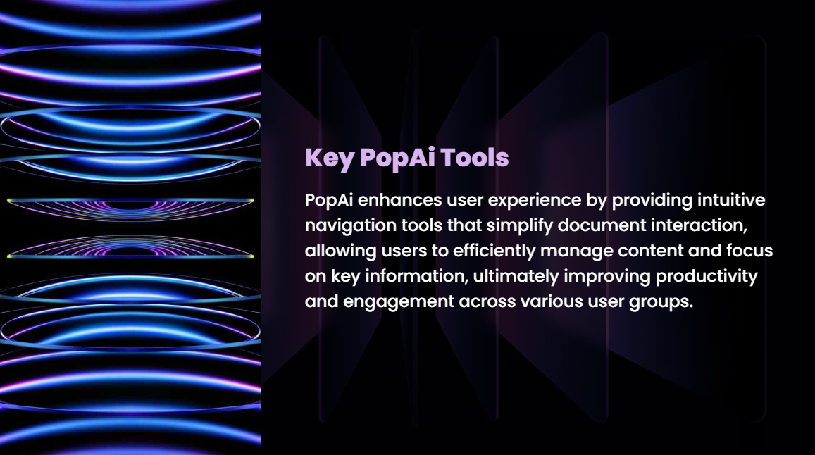
How to Build “Define Phase” Slides with PopAI:
Open PopAI and use the Instant PPT Generation feature. In the theme library, simply search for keywords like “Project Charter,” “Problem Statement,” or “Six Sigma,” and you’ll instantly get a professionally color–matched template with a clear structure.
l Title Slide: Enter your project name, e.g., “Project to Reduce Return Rate of Product A.”
l Project Charter Slide: Leverage AI–Enhanced Content—it will prompt you to fill in modules: business case (why we’re doing this), problem statement, goals, scope, team members, and timeline. The logical framework is already built for you; all you need to do is fill in the blanks.
l Customer Needs Slide: Use the Flexible Upload Option to drag and drop your Word document of customer needs compiled from meeting minutes or survey questionnaires directly into PopAI. It will automatically convert the content into bullet points or tables in the presentation, eliminating manual copy–pasting.
Step 2: Measure – Take a “Snapshot of the Current State” with Data
What You Need to Do:
l Identify metrics: Return rate, production cycle time, error count, etc.
l Ensure reliable measurement tools: Using an inaccurate ruler to measure something yields useless data. First, verify that your testing equipment or data recording methods are consistent and reliable.
l Collect current data: Gather actual data over a period to calculate the current performance level. For example, the average return rate over the past three months is indeed 5%.
How to Build “Measure Phase” Slides with PopAI:
Move on to creating slides for the Measure phase.
l Flowchart & Data Slides: Tell PopAI, “I need one slide showing the current process and one slide displaying current defect rate data.” Its AI–Enhanced Content engine will recommend layouts using “flowchart shapes” and “data charts.” Simply paste or input your data, and it will intelligently suggest the most suitable chart type (e.g., Pareto chart, trend chart) and generate a draft—you only need minor adjustments.
l Visual Presentation: PopAI automatically searches for high–quality, copyright–free images related to “quality inspection” and “data measurement” to use as slide backgrounds or illustrations. This makes your data pages engaging instead of dry, rich in information and visually appealing.
Step 3: Analyze – Act as a Detective, Uncover the Real “Root Cause”
What You Need to Do:
l List all potential causes: Gather your team and brainstorm using a fishbone diagram, covering factors like manpower, machinery, materials, methods, and environment.
l Validate hypotheses with data: Don’t rely on intuition! Are night–shift employees more prone to errors? Or is there an issue with a specific batch of raw materials? Use collected data for comparative analysis (hypothesis testing) to narrow down to a few critical root causes.
How to Build “Analyze Phase” Slides with PopAI:
This is the core section to showcase your logical depth.
l Causal Analysis Slide: In PopAI, simply say, “Generate a fishbone diagram (cause–and–effect diagram) framework.” It will instantly create a standard–formatted fishbone diagram; you only need to fill in the causes identified by your team on the “bones.”
l Data Analysis Slide: Upload your filtered key data comparison table, and PopAI will quickly convert it into comparative bar charts or scatter plots. You can seamlessly edit text annotations to emphasize data–driven conclusions, e.g., “Data shows the night–shift return rate is 2.3 times that of the day shift.”
l Maintain Consistency: When rearranging the order of analysis slides, PopAI preserves the overall structure and visual coherence, so you won’t face messy layouts from moving pages.
Step 4: Improve – Test and Validate, Find What Actually Works
What You Need to Do:
l Develop solutions for root causes: For example, to address “insufficient night–shift skills,” solutions could be “creating standardized operation videos” or “adjusting mentor–mentee arrangements.”
l Evaluate and pilot–test: Select the most feasible solution and run a pilot in a small scope (e.g., one production line, one team) for a period.
l Collect pilot data to measure effectiveness: After the pilot, did the return rate drop to 3%? Let the data speak for itself.
How to Build “Improve Phase” Slides with PopAI:
l Solutions & Plan Slides: Use the Audience–Centric Design feature. If your audience is senior leadership, PopAI will recommend layouts focusing on “return on investment (ROI)” and “expected benefits.” If presenting to the execution team, it will suggest pages emphasizing “action steps,” “responsible persons,” and “timeline Gantt charts.” Easily create different versions of the PPT for different stakeholders.
l Pilot Results Slide: Input pre– and post–pilot comparison data, and PopAI’s AI will recommend a striking “before–and–after” chart design. This makes improvement results obvious at a glance, greatly enhancing visual impact and persuasiveness during presentations.
Step 5: Control – “Lock In” Effective Methods, Prevent Backsliding
What You Need to Do:
l Document effective methods as standards: Update work instructions to formalize the new process.
l Establish monitoring mechanisms: For example, review control charts of key metrics daily to flag anomalies early.
l Hand over the project to process owners: The project team can’t monitor forever—train daily managers to sustain the results.
How to Build “Control Phase” Slides with PopAI:
l Standard Documents & Control Plan Slide: Upload the PDF of your new work standard, and PopAI will automatically extract key clauses and convert them into PPT bullet points. Using its extensive chart library, quickly generate a template for a monitoring control chart (e.g., Xbar–R chart).
l Project Summary & Handover Slide: Generate a summary of project benefits, a list of lessons learned, and a clear “responsibility handover matrix” slide to ensure project closure.
Conclusion: Let Tools Work for You, Focus on Solving Core Problems
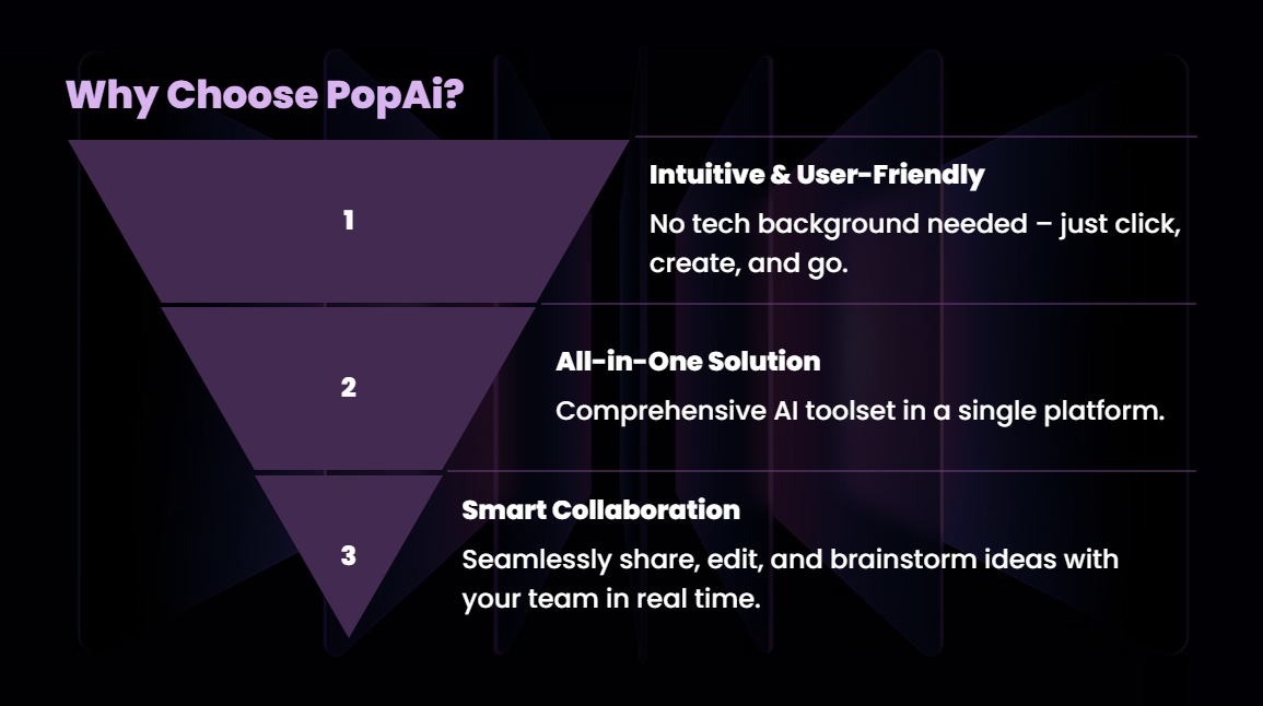
The essence of a Lean Six Sigma DMAIC slides presentation is that it forces you to tell a compelling “problem–solving story” with clear logic. The value of tools like PopAI is that they take on all the “manual labor” of storytelling—layout design, image sourcing, formatting, and consistent styling.
It’s like having an assistant who is an expert in both Six Sigma and graphic design:
l When starting a new project, it instantly generates a structurally rigorous PPT draft.
l When you need to present data and ideas, its AI–Enhanced Content finds the most suitable charts and illustrations.
l When you revise your approach repeatedly, its Seamless Editing lets you adjust smoothly and efficiently.
l When presenting to different stakeholders, its Audience–Centric Design optimizes content focus with one click.
l When you have piles of existing documents, its Flexible Upload & Auto–Conversion lets you “launch a project review meeting in seconds.”
A true Six Sigma master isn’t judged by how fancy their PPT is, but by their ability to precisely define, analyze, and drive solutions to problems. Now, let PopAI professionally, efficiently, and beautifully present your brilliant problem–solving process. Use the time you save for deeper on–site investigations and data analysis—that’s the ultimate closed loop of cost reduction and efficiency improvement.