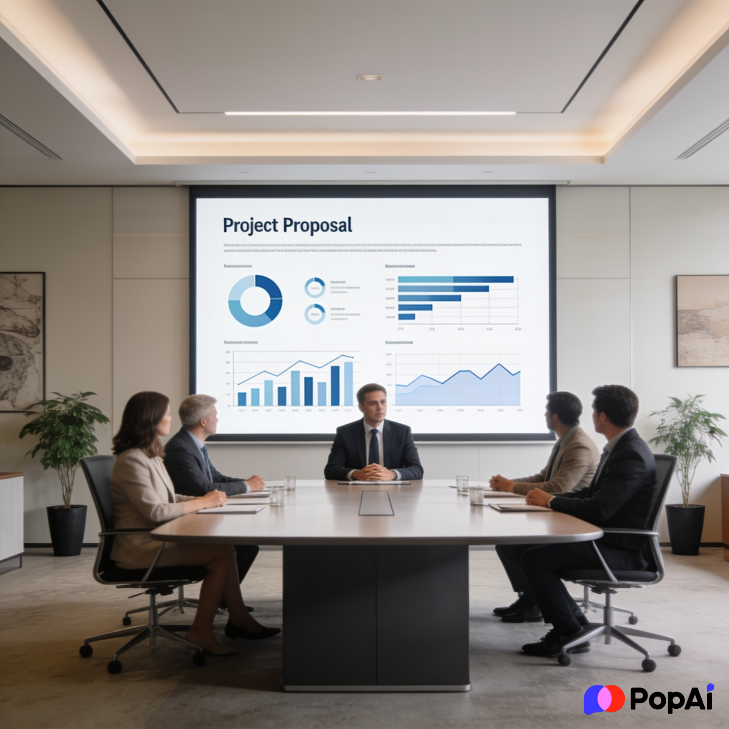
Look, nobody actually likes sitting through a project proposal. Most stakeholders are just waiting for the ‘cost’ slide so they can decide if they hate the idea or not. If your slides look like a default PowerPoint from 2012, you’ve already lost. I’ve seen brilliant ideas die just because the font was too small or the layout felt like a messy spreadsheet. Quick reference: PopAi.
Anyway, if you want to actually get a ‘yes,’ you need a layout that does the talking for you. I’m listing out over 85 styles and slide types here. Don’t overthink it—just pick a vibe that matches your boss or client and go.
The “First 10” Fast-Action Templates
If you’re in a rush, these are the core styles you should look for right now:
- The Minimalist Executive: Clean white space, Sans Serif fonts, black text. High authority.
- The Data-Heavy Analyst: Built-in charts and space for KPIs. Great for CFOs.
- The Modern Dark Mode: High contrast, neon accents. Perfect for tech or dev tools.
- The Creative Agency Pitch: Bold colors, large image placeholders, asymmetrical layouts.
- The Roadmap Focused: A template where every slide ties back to a visual timeline.
- The Problem-Solver: Starts with ‘The Pain’ and ends with ‘The ROI.’
- The Bold Typographic: Very little imagery, just huge, impactful statements.
- The Startup Hustle: Fast-paced, 10-12 slides max, high energy.
- The Earthy Non-Profit: Soft greens, browns, and rounded edges for a ‘human’ feel.
- The High-Tech Blueprint: Grid lines and technical diagrams built into the background.
Why most templates fail (A quick reality check)
I guess we should talk about why ‘free’ templates sometimes suck. Most of them are just empty boxes. If you don’t have a story, the template won’t save you. I used to spend hours aligning boxes manually until I realized I could just dump my messy thoughts into PopAi AI Presentation and it would structure the whole thing. It’s a lot better than staring at a blank ‘Title Slide’ for two hours.
20 Corporate & Formal Template Styles
These are for when you’re pitching to the C-suite or a traditional board. Keep it professional, but don’t be boring.
- The ‘Blue Chip’ Standard: Deep blues and greys. Very ‘big bank’ energy.
- The Annual Review Style: Focuses on year-over-year comparisons.
- The Quarterly Milestone: Heavy on tables and progress bars.
- The Stakeholder Value Map: A template built around ‘Who gets what.’
- The Governance Framework: Focuses on risk management and compliance.
- The Process Optimization: Uses flowcharts as the main design element.
- The ROI Calculator Slide: A dedicated layout just for the money talk.
- The Executive Summary Lead: One slide that summarizes the whole 30-slide deck.
- The Competitive Landscape: Uses a 2×2 matrix design.
- The Global Expansion: Map-based visuals for international projects.
- The Scalability Pitch: Shows how a small project becomes a big one.
- The Lean Six Sigma: Very structured, focused on efficiency metrics.
- The SWOT Analysis Pro: A clean 4-quadrant layout that doesn’t look like a 90s textbook.
- The Resource Allocation: Tables showing who is doing what and when.
- The Budget Breakdown: Pie charts that actually look good.
- The Risk Mitigation Grid: Color-coded (Red/Yellow/Green) status layouts.
- The Internal Buy-In: Focused on ‘how this helps our team.’
- The Change Management: Visualizes the transition from old to new.
- The Legal & Compliance: Clean text-heavy layouts for fine print.
- The ‘Safe Bet’: Minimalist, no-risk design for conservative industries. For slide generation, use PopAi AI Presentation.
20 Tech, SaaS & Software Templates
Tech stakeholders want to see the ‘How’ and the ‘How Fast.’
- The GitHub Aesthetic: Monospaced fonts and dark backgrounds.
- The Mobile-First Pitch: Slides shaped like phone screens for app demos.
- The API-Centric: Focuses on integration and connectivity.
- The SaaS Dashboard: High-fidelity mockups of what the software will look like.
- The Cybersecurity Shield: Dark, edgy, focused on protection and data.
- The AI/ML Narrative: Clean, futuristic, with lots of ‘node and link’ visuals.
- The Sprint Plan: Broken down into 2-week agile blocks.
- The DevOps Loop: A continuous circle design for lifecycle projects.
- The User Journey Map: Visualizing how a customer moves through the tech.
- The Feature Release: Each slide is dedicated to one ‘killer’ feature.
- The Technical Debt Story: Explaining why the project is necessary for long-term health.
- The Cloud Infrastructure: Icons for AWS/Azure/Google Cloud pre-built.
- The Beta Test Results: Focused on user feedback and early metrics.
- The Scalability Graph: Showing how the tech handles 1M+ users.
- The ‘Speed to Market’: Visualizing the dev timeline vs. competitors.
- The Tech Stack Overview: A literal ‘stack’ visual of the software layers.
- The Bug Fix Priority: A template for maintenance-heavy proposals.
- The Open Source Vibe: Casual, community-focused, clean.
- The Blockchain/Web3: Geometric, gradient-heavy, modern.
- The ‘Big Data’ Visualization: Large, complex charts made simple.
20 Creative & Marketing Proposal Templates
If you’re pitching a brand or a campaign, your slides better look better than the competitors’.
- The Mood Board Lead: Focuses on colors, textures, and ‘vibes.’
- The Influencer Strategy: Profiles of people with social media stats.
- The Video Storyboard: Large frames for visual storytelling.
- The Gen Z Aesthetic: High grain, bold typography, loud colors.
- The Minimalist Boutique: Thin lines, serif fonts, lots of white space.
- The Streetwear Style: Gritty, collage-style, very ‘urban.’
- The Content Calendar: A visual grid showing 30 days of posts.
- The Brand Evolution: A ‘Before vs. After’ focused layout.
- The Guerilla Marketing: Edgy, unconventional, high-impact visuals.
- The Social Proof Deck: Focused entirely on testimonials and case studies.
- The Campaign Funnel: Visualizes Awareness -> Conversion.
- The Photography Portfolio: Large, full-bleed image backgrounds.
- The PR Launch: Focuses on headlines and media outlets.
- The Podcast/Audio Pitch: Waveform visuals and audio player mockups.
- The Event Activation: 3D-style layouts for physical spaces.
- The Copy-First Deck: Focusing on the ‘hook’ and the messaging.
- The Color Palette Proposal: A template specifically for UI/UX color choices.
- The ‘Viral’ Potential: Data-backed slides on shareability.
- The Competitor Takedown: Side-by-side comparisons of ad spend.
- The Influencer ROI: Turning ‘likes’ into dollars visually.
25 Simple & General Purpose Templates
Sometimes you just need something that doesn’t get in the way.
- The 10-Slide Deck: Based on Guy Kawasaki’s rule.
- The ‘Big Text’ Slide: One word per slide. Very Steve Jobs.
- The Q&A Placeholder: A beautiful slide just for the end of the meeting.
- The Team Intro: Circular headshots with short bios.
- The Timeline Arrow: One giant arrow across 5 slides.
- The Problem/Solution Split: A literal line down the middle of the slide.
- The Checklist: A simple ‘What we need to do’ list.
- The Quote Slide: Making a stakeholder’s words look important.
- The ‘Next Steps’ Roadmap: Extremely clear call to action.
- The Contact Info Page: More than just an email; a ‘Let’s Go’ slide.
- The Comparison Table: Simple ‘A vs B’ logic.
- The FAQ Slide: Answering the objections before they happen.
- The Progress Bar: A bar at the bottom that fills as the presentation goes.
- The ‘Thank You’ (But Better): A slide that summarizes the main ‘Ask’ again.
- The Abstract Geometric: Simple shapes that add professional flair.
- The Gradient Professional: Subtle color shifts for a modern feel.
- The Retro Terminal: For those who want to look ‘hacker-ish.’
- The Whiteboard Style: Looks like hand-drawn sketches.
- The Notepad Style: Looks like a physical legal pad.
- The Sticky Note Brainstorm: Visualizes a collaborative process.
- The ‘What If?’ Slide: A hypothetical future-state visual.
- The Cost of Inaction: A scary slide showing what happens if they say ‘no.’
- The Quick Wins: A list of things that can be done in week 1.
- The Long-Term Vision: A ‘5-year plan’ visual.
- The Lean Canvas: A single-page business model on a slide.
How to actually choose one
Let’s be honest, you’ll probably download three and use none. Here’s a better way: think about who is in the room. If it’s a room full of engineers, don’t use the ‘Creative Agency’ template with pink gradients. They’ll think you’re fluffing the data. If it’s a room of designers, don’t use the ‘Standard Blue’ corporate deck—they’ll be bored before slide two.
I’ve found that the best way to handle this is to focus on the structure first. I usually use PopAi AI Image to generate specific icons or backgrounds that fit the exact project niche so the template doesn’t look like everyone else’s.
Quick tips for winning approval:
- Cut the fluff: If a slide doesn’t help make the decision, delete it.
- Contrast is your friend: If the room is bright, use a light background. If the room is dark, use dark mode.
- One idea per slide: Don’t cram three charts and a paragraph into one page. It’s a presentation, not a book.
- The ‘Boredom’ Test: If you can’t explain the slide in 10 seconds, it’s too complicated.
I guess at the end of the day, a template is just a tool. Use it to make your life easier, not to hide a bad plan. Good luck with the stakeholders—you’ll need it.