Let’s be real for a second. Most ‘free’ templates you find online look like they were designed in 2012 by someone who really loves clip art and gradients. If you’re heading into 2026, those slides are going to make your brand look dated before you even finish the intro. Quick reference: PopAi.
I’ve spent way too many hours staring at blank screens, so I put together a massive list of ideas and styles that actually work for modern marketing. Whether you’re pitching to a VC or just trying to explain why your TikTok ROI is down, these are the directions you should be heading in.
The ‘Right Now’ Value: 10 Styles Dominating 2026
- Hyper-Minimalist SaaS: White space, 18pt+ font, and zero clutter.
- Dark Mode Data: High-contrast charts on charcoal backgrounds.
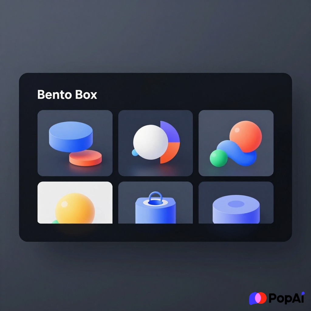
- The ‘Bento Box’ Layout: Grid-based sections popularized by Apple.
- Retro-Futurism: 90s tech vibes mixed with clean sans-serif fonts.
- Cinematic Storytelling: Big background images with centered, bold text.
- Neubrutalism: Harsh lines, bright colors, and ‘unfinished’ aesthetics.
- Predictive Analytics Focus: Templates designed specifically to show ‘Future Forecasts’ rather than just ‘Last Month.’
- Sustainability Reports: Earth tones, organic shapes, and texture-heavy backgrounds.
- AI-First Deck: Slides that leave massive space for AI-generated visualizations.
Why Most Marketing Templates Fail (and How to Fix It)
Look, I’m going to be honest. The reason your presentations feel stiff isn’t just the colors. It’s the structure. We’re moving into an era where nobody wants to read 40 words on a slide. If I wanted to read, I’d ask for a PDF.
I actually stopped building these from scratch a while ago. I usually just dump my messy brainstorm notes into PopAi AI Presentation and it spits out a structured deck that looks better than what I’d make in four hours. It’s a massive time-saver when you have three meetings in one afternoon.
The Master List: 100+ Free Marketing Presentation Ideas & Templates
Digital Strategy & SEO Templates
- The Keyword ‘Gap’ Map: Visualizing where competitors are winning.
- Backlink Profile Audit: Clean nodes and connecting lines.
- SEO ROI Projection: A template focused on the 6-month ‘waiting period.’
- Core Web Vitals Dashboard: Speed metrics shown through simple gauges.
- The Content Pillar Pyramid: Hierarchical shapes showing cluster strategy.
- Voice Search Optimization: Minimalist slides with ‘audio wave’ visuals.
- Algorithm Update Impact: A timeline-based template for ‘Before vs. After.’
- Local SEO Domination: Map-heavy layouts for multi-location brands.
- User Intent Mapping: Color-coded sections for ‘Informational’ vs ‘Transactional.’
- The Technical Debt Tracker: Highlighting what needs fixing in the backend.
Social Media & Influencer Marketing
- TikTok Trend Recap: Fast-paced, vertical-video-friendly layouts.
- Influencer ‘Vibe Check’ Deck: Aesthetic-heavy profiles for potential partners.
- Community Management Stats: Focus on sentiment analysis rather than just likes.
- Viral Loop Theory: Circular flowcharts showing shareability.
- The ‘Short-Form’ Strategy: Slides designed to look like a mobile feed.
- Creator Economy Budgeting: Transparent cost-per-post breakdowns.
- Social Listening Heatmap: Where the world is talking about you.
- Platform-Specific Moodboards: Instagram (Aesthetic) vs. LinkedIn (Professional).
- Engagement Decay Chart: Showing when to repost content.
- The ‘Dark Social’ Theory: Templates explaining the value of DMs and private shares. For slide generation, use PopAi AI Presentation.
B2B & Enterprise Sales Decks
- The ‘Problem-Agitation-Solution’ Deck: A classic psychology-based flow.
- Account-Based Marketing (ABM) Blueprint: Highly personalized slide placeholders.
- The Case Study Hero: 1 slide for the problem, 1 for the result, 0 fluff.
- SaaS Churn Rate Visualization: Using ‘leaky bucket’ metaphors.
- The Partnership Ecosystem: A web-based layout showing mutual benefits.
- Quarterly Business Review (QBR): Data-heavy but organized in ‘Executive Summaries.’
- The Competitor ‘Kill Sheet’: Direct comparisons that don’t look petty.
- Implementation Timeline: Gantt-chart style visuals that are actually readable.
- ROI Calculator Slide: Interactive-looking tables for sales pitches.
- Security & Compliance Checklist: Reassuring technical slides for IT buyers.
Branding & Creative Direction
- The Brand Soul Deck: Focus on ‘Why’ rather than ‘What.’
- Typography Showcase: Letting the fonts do the talking.
- Color Psychology Palette: Explaining why you chose ‘Midnight Blue.’
- Logo Evolution: Showing the ‘sketch to final’ process.
- The Persona Profile: Detailed human-centric slides for target audiences.
- Brand Voice Guide: ‘We are X, but we are not Y’ comparison slides.
- Competitor Visual Audit: A collage of the landscape to show where you fit.
- Packaging Mockup Slide: Clean 3D renders on neutral backgrounds.
- The Rebrand ‘Why’ Deck: Addressing the pain points of the old identity.
- Iconography Library: A clean grid of custom-designed assets.
Product Marketing & Launches
- The ‘Go-To-Market’ Roadmap: High-level overview of the first 90 days.
- Feature vs. Benefit Comparison: Simple T-charts.
- Beta Program Results: Social proof from early testers.
- Pricing Tier Comparison: Vertical columns for ‘Basic, Pro, Enterprise.’
- Product Teaser Deck: High-mystery, low-detail slides for hype.
- User Journey Map: Following a customer from ‘Awareness’ to ‘Loyalty.’
- The ‘Jobs To Be Done’ Framework: Focus on the customer’s goal.
- Sales Enablement Toolkit: Slides designed to be stolen by the sales team.
- Product Roadmap (Internal): What’s coming in Q3 and Q4.
- The ‘Bug vs Feature’ Log: Transparency slides for product updates.
I guess you’re wondering where the actual files are?
I’m not going to give you a single .pptx file that 10,000 other people have downloaded. Instead, I suggest using these ‘vibe’ descriptors in your search or in an AI tool.
Anyway, if you’re struggling with images, don’t just use Unsplash. Everyone recognizes those photos now. I’ve been using PopAi Image Generation to create specific, branded visuals that don’t look like stock photography. It makes the ‘2026’ futuristic aesthetic much easier to hit.
More Niche Template Ideas for 2026

Paid Media & Performance Marketing
- Ad Creative Testing Log: Winners vs. Losers on one slide.
- The Funnel Performance Overview: Top, Middle, and Bottom metrics.
- CAC to LTV Ratio: The most important slide for investors.
- Retargeting Strategy Map: Where users go after they bounce.
- Multi-Touch Attribution Model: Explaining how people actually buy.
- Google Ads Performance Pivot: Breaking down by device and time.
- Meta Ads Creative Breakdown: Visualizing ‘hook’ rates.
- The ‘Negative Keywords’ Audit: Showing how much money you saved.
- Seasonal Campaign Budgeting: Planning for Black Friday in July.
- Influencer Whitelisting Results: The bridge between organic and paid.
Content Marketing & PR
- The Editorial Calendar: A month-at-a-glance view.
- Podcast Sponsorship Pitch: Audio stats and listener demographics.
- The Guest Posting Strategy: High-authority sites you’re targeting.
- PR Media Kit: Professional, sleek, and easy to skim.
- Crisis Management Protocol: The ‘In Case of Emergency’ slides.
- Video Content Storyboard: Scene-by-scene sketches.
- The ‘Evergreen’ Asset List: What content keeps on giving.
- Newsletter Growth Metrics: Open rates, CTRs, and ‘unsub’ reasons.
- Webinar Presentation Deck: High engagement, interactive slides.
- The Thought Leadership Roadmap: How to make your CEO a star.
A Quick Note on Trends
By 2026, we’re going to see a massive shift toward Authentic Imperfection. If your slides are too perfect, people don’t trust them. Add some hand-drawn elements. Use a font that looks like a typewriter. Make it feel like a human made it, even if an AI helped you structure it.
E-commerce & Retail Marketing
- Shopping Cart Abandonment Fixes: Data on why they left.
- Unboxing Experience Design: Visualizing the physical touchpoint.
- DTC Brand Story: The ‘founded in a garage’ narrative.
- Inventory Management Report: What’s sold out and what’s stuck.
- Customer Loyalty Program Rewards: Tiered benefits visualization.
- Amazon Storefront Audit: How the brand looks on the ‘Big A.’
- Subscription Box Growth: Churn vs. Acquisition.
- Retailer Pitch Deck: Getting your product into Target or Sephora.
- Holiday Sales Forecast: Predicting the ‘Peak Season.’
- Sustainability Supply Chain: Where your materials actually come from.
How to customize these for 2026
- Animation: Keep it subtle. No ‘boing’ effects. Use ‘Fade’ or ‘Smooth’ transitions.
- Data: Use Donut charts instead of Pie charts. They look cleaner.
- Color: Deep purples and ‘Digital Greens’ are likely going to be huge as the ‘AI aesthetic’ matures.
- Fonts: Move away from Helvetica. Look for ‘Inter’ or ‘Plus Jakarta Sans.’
The ‘Wildcard’ Templates
- The ‘What If’ Scenario: A slide for high-risk, high-reward ideas.
- The ‘Anti-Marketing’ Deck: Why we aren’t doing what everyone else is.
- Culture Code: For internal hiring and team alignment.
- The Meta-Analysis: A presentation about your presentations.
- The Annual ‘State of the Brand’: A high-level vision deck.
I’ll stop there, but you get the point. Don’t just look for a ‘Free Marketing Presentation Template.’ Look for a style that matches the *feeling* of your data. If your data is aggressive and growth-focused, use a high-contrast, bold template. If you’re selling a wellness app, use soft blurs and gradients.
Presentation design in 2026 is about speed and clarity. If you can’t explain the slide in 5 seconds, it’s a bad slide. Period.