Let’s be honest. Most business plans are boring. They’re long, they’re dry, and usually, they end up in a digital trash bin because they don’t get to the point. If you’re hunting for Free Business Plan Presentation Templates: 12-Section Layouts, you probably know you need structure, but you don’t want to spend three days messing with margins. Quick reference: PopAi.
I’ve been there. You have a great idea, but your slides look like a middle school science project. Here is the deal: a 12-section layout is the industry standard for a reason. It hits every note an investor or partner wants to hear without overstaying its welcome.
The “Golden 12” Section Layout (Copy This First)
Before you even download a template, you need to know what goes on the slides. Don’t overthink it. Just follow this flow:
- The Hook (Title Slide): Your name, your logo, and one sentence that makes people lean in.
- The Problem: What’s broken in the world right now?
- The Solution: How are you fixing it? (Keep it simple).
- Market Opportunity: How many people are actually going to buy this? (TAM/SAM/SOM).
- The Product/Service: Show, don’t just tell. Screenshots or photos work best.
- Business Model: How do you make money? Subscription? Direct sales? Ads?
- Traction: What have you done so far? (Sales, sign-ups, or even just a finished prototype).
- Marketing Strategy: How will people find out you exist?
- Competitor Analysis: Who else is doing this and why are they worse than you?
- The Team: Why are you the right people to win?
- Financial Projections: The “hockey stick” graph (be realistic, though).
- The Ask: How much money do you need and what will you do with it?
Anyway, let’s get into the actual templates and styles that actually work.
—
1. The “Clean Tech” Minimalist Layout
Best for: Software startups, SaaS, or anything high-tech.
This layout focuses on whitespace. You don’t want your slides looking like a CVS receipt. Use high-contrast fonts (think Montserrat or Inter) and lots of dark blues or slate greys.
- Slide 2 (Problem): Use one big, scary statistic in the middle of the slide.
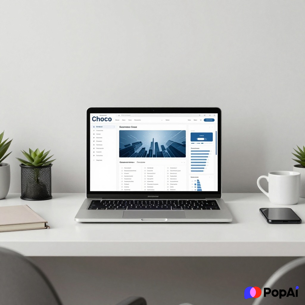
- Slide 5 (Product): Use a clean mockup of your app.
2. The “Creative Hustle” Bold Layout
Best for: Marketing agencies, fashion brands, or consumer goods.
Forget the boring corporate blue. Use yellows, oranges, or deep greens. This template should feel energetic. If your business is about being “different,” your slides shouldn’t look like they came from 1998. For slide generation, use PopAi AI Presentation.
3. The “Corporate Professional” Layout
Best for: Logistics, manufacturing, or B2B services.
Look, sometimes you have to play it safe. If you’re pitching to a bank or a traditional board, use a grid-based layout. It shows you’re organized and reliable. Use serif fonts for a more “established” feel.
4. The “One-Image” Narrative Layout
Best for: Non-profits or social impact businesses.
Each of the 12 sections features one high-quality image with a short text overlay. It’s more of a storytelling deck. It keeps the audience’s eyes on you, not reading the slides like a book.
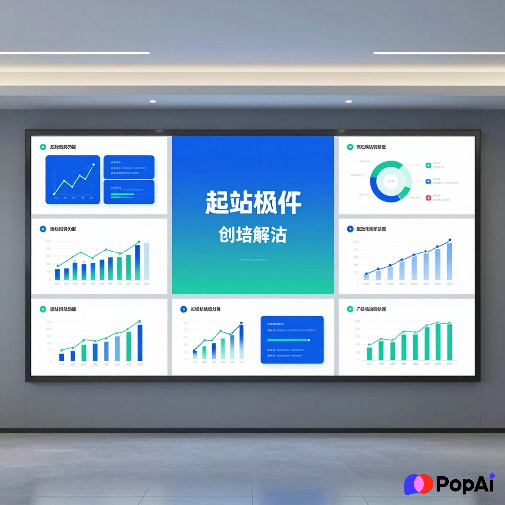
5. The Data-Driven Heavyweight
Best for: Biotech or Deep Tech.
If your business relies on hard science, your 12 sections need to prioritize charts. Use a template that has pre-built infographics. Don’t just paste Excel screenshots; it looks terrible.
I actually didn’t build my last data deck from scratch—I dumped my raw notes into PopAi AI Presentation and it handled the layout for me. It saved me about four hours of crying over alignment tools.
—
Why Most Free Templates Fail (And How to Fix It)
I’ve seen a lot of “free” templates that are just… bad. They’re cluttered or the fonts are weirdly small. Here is how you make any template look like it cost $500:
- Rule of Three: Never put more than three bullet points on a slide. Seriously. If you have more, move them to the next slide.
- Consistency is King: If your first slide uses a round font, don’t use a sharp, edgy font on slide 4. It looks messy.
- The 30-Point Rule: If your text is smaller than 30 points, nobody in the back of the room can read it. You’re pitching, not writing a legal contract.
Breaking Down the 12-Section Content (Deep Dive)
The Problem & Solution (Slides 2 & 3)
Don’t spend twenty minutes here. People know the world is messy. State the pain point, show the relief. If you can’t explain your solution in ten seconds, you don’t have a solution; you have a hobby.
The Business Model (Slide 6)
I’ve seen so many people try to be clever here. “We’ll figure out monetization later.” No. Don’t do that. Even if it’s just a guess, show that you’ve thought about how the dollars flow back into your pocket.
Competition (Slide 9)
Never say “we have no competitors.” It makes you look like you haven’t Googled your own industry. Even if no one does *exactly* what you do, people are spending their money *somewhere* else right now. That’s your competition.
Where to Find the Best Free Layouts Today
You don’t need to pay for a subscription to get high-quality stuff. Here’s where I usually look:
- Canva: Great for the “Creative Hustle” vibe. Just don’t use the most popular ones or you’ll look like everyone else.
- Google Slides Gallery: Surprisingly decent for the “Corporate Professional” look.
- Slidesgo: They have specialized layouts for almost every niche (medical, education, etc.).
- PopAi: If you’re feeling lazy (or just efficient), you can use PopAi to generate a custom 12-section draft based on your specific business idea. It’s a solid way to get a head start.
Final Thoughts
At the end of the day, a template is just a container. You can have the prettiest Free Business Plan Presentation Templates: 12-Section Layouts in the world, but if your numbers are fake and your team is uninspired, it won’t matter.
Pick a layout that matches your brand’s personality. If you’re a rugged outdoor brand, don’t use a pink and neon layout. If you’re a high-end law firm, maybe skip the cartoons. Keep it simple, keep it fast, and for the love of everything, don’t read from the slides.
Anyway, go grab a template, fill in those 12 sections, and go get that win. Let’s be honest, the hardest part is just starting. Once you have the first three slides done, the rest usually just flows.