AI-Generated Images for Presentations: Tools and Techniques
Check licensing and visual consistency for AI-created slide visuals.
In AI-generated decks, icon problems usually appear in predictable places: a sales deck uses the same rocket for revenue growth, launch timing, and team energy; a compliance deck decorates every risk with a warning triangle; a training deck mixes thin outline icons with glossy 3D illustrations and suddenly looks less credible than the content actually is.
Effective AI presentation icon usage starts before generation and continues through review. Treat icons as controlled visual labels for ideas, steps, categories, risks, metrics, and actions—not as empty slide decoration. This guide gives you practical prompt patterns, slide-type rules, audit workflows, and accessibility checks you can apply in PopAi AI Presentation or any modern presentation workflow.
Icons shape the first scan of a slide. Before viewers read every word, they notice repeated shapes, color groupings, and familiar symbols. A target icon can frame a goal, a shield can suggest risk control, and a clock can signal timing. But icons also carry assumptions: a sparkle can mean AI, automation, magic, quality, novelty, or “premium,” depending on the audience and industry.
The AI-specific issue is not simply that tools can generate icons quickly. The issue is that AI often chooses plausible symbols without understanding the slide’s decision context. It may add a handshake to every partnership point, a lightbulb to every idea, or a chart icon beside a chart that already explains the data. Speed helps only if the icon reduces interpretation time rather than adding another thing to decode.
Use an icon only when it helps the viewer classify, compare, remember, or act. If the slide is already clear without it, the icon is probably noise.
Case note: In a 14-slide executive update audit, reducing icons from 47 to 18 made the deck easier to scan without changing the written content. The biggest improvement came from keeping icons only for recurring sections—market, product, customer, financials, and next steps—instead of adding a different icon to every bullet.
A useful test is to compare two versions of the same slide. Three consistent category icons beside three strategic priorities help viewers group the information. Eight unrelated icons beside eight dashboard metrics compete with the numbers. Icons work best when they create structure; they fail when they become a second, ungoverned layer of meaning.
Good icon use is not about adding more decoration. It is about making repeated slide meanings easier to scan.
One filled 3D icon, one outline icon, one emoji-like symbol, and no label. The audience has to guess whether the icons are decorative or meaningful.
📊 ◯ 🧩
Use one outline style, one stroke weight, one color rule, and a short label under each icon.
MetricProcessRisk
A shield icon could mean security, warranty, compliance, privacy, insurance, or risk. Without a label, it is unclear.
Pair the icon with a label such as “Data privacy review” or “Compliance evidence” so the meaning is explicit.
Every bullet gets an icon, even when the icon adds no meaning. The slide becomes visually noisy.
Keep icons for steps, categories, warnings, metrics, or actions. Remove decorative icons from ordinary bullet lists.
Before publishing, verify the current terms for the icon library, AI image generator, or design asset source. Keep a note of the icon source, license, and any attribution requirement when the deck is used commercially.
Give the AI icon rules before it starts designing, not after it has already scattered mismatched symbols across the deck.
If your team is still choosing a tool, compare AI presentation makers by how well they support post-generation editing, PPTX export, brand control, and replacement of visual assets—not just by whether they can insert icons automatically.
The prompt stage should define two kinds of rules: semantic rules and visual rules. Semantic rules tell the AI what icons are allowed to mean. Visual rules tell it how those icons should look. This matters because generating icons one by one often produces a deck that looks assembled from multiple libraries.
Vague icon prompts usually create decorative results. A stronger prompt assigns roles, limits density, and gives the AI a reusable system.
Create a modern business presentation with nice icons and a professional style.
Improved prompt:Create a 12-slide presentation for [audience] about [topic]. Use icons only for section markers, process steps, risks, and final actions. Use one consistent outline icon family with rounded corners, simple geometry, no 3D, no shadows, and no mixed perspective. Use brand colors [hex codes] plus neutral gray. Every meaningful icon must have a nearby text label. Avoid generic rockets, random sparkles, cultural stereotypes, and symbols that resemble protected logos.
Some instructions are easier for AI tools to follow than others. “Use icons only for process steps and risks” is usually reliable. “Use exactly 2px stroke on every icon” may require manual review after export because slide tools scale objects differently. Treat detailed measurements as a design target, not a guarantee.
If you need a consistent set, define the full set in one request instead of generating icons one at a time.
Create six presentation icons for a SaaS onboarding deck: account setup, data import, user permissions, workflow automation, reporting dashboard, and support handoff. Use a minimal outline style, rounded terminals, equal visual weight, no fill except one small accent shape, transparent background, and blue #2563EB plus slate #475569. Keep each icon recognizable at 0.35–0.6 inches high on a 16:9 slide. Name the icons using this convention: onboarding_account_setup, onboarding_data_import, onboarding_permissions, onboarding_automation, onboarding_reporting, onboarding_support. Do not include logos, screenshots, tiny UI text, gradients, or photorealistic objects.
After generation, use a revision prompt if the first pass drifts: “Replace all filled and 3D icons with simple outline icons. Keep the same meaning, use blue #2563EB only for icon strokes, and remove decorative icons that are not tied to a heading, step, risk, metric, or action.”
Icon strategy should change with the job of the slide.
A cover slide may need one restrained symbol. A process slide may need repeated step icons. A dashboard may need almost none. The most common AI mistake is applying the same icon density everywhere, which makes an agenda, data chart, and conclusion slide feel visually equal even when they serve different purposes.
| Slide type | Best icon use | Avoid |
|---|---|---|
| Cover | One simple industry or topic symbol only if it reinforces the title. | Generic rockets, lightbulbs, or multiple tiny icons floating around the title. |
| Agenda | Small section icons that return later as navigation markers. | Icons that introduce meanings not used anywhere else in the deck. |
| Process | One icon per action step, equal size, aligned with numbers or arrows. | Icons for abstract nouns when the step is really an action such as review, approve, test, or launch. |
| Comparison | Neutral criteria icons for cost, speed, risk, coverage, support, or adoption. | Thumbs-up/thumbs-down symbols when the decision is nuanced or political. |
| Data chart | One icon in the title or section marker to frame the metric category. | Decorating axes, bars, legends, and labels with unrelated symbols. |
| Conclusion | Action icons for owner, deadline, approval, pilot, rollout, or follow-up. | Generic trophy icons that celebrate without specifying what happens next. |
For a sales deck, icons often work best as recurring markers for customer pain, solution, proof, and next step. For a training module, they are more useful as wayfinding cues: concept, example, exercise, warning, and recap. For an executive update, icons should be sparse because numbers, decisions, and trade-offs usually deserve the attention.
If an icon needs a long explanation, it is not doing its job. Replace it with a clearer label, a diagram, a chart, or no icon at all.
Consistency is where many AI-generated presentations lose credibility.
A deck can have accurate content but still feel unfinished if one slide uses filled blue icons, the next uses thin black line icons, and another uses glossy 3D illustrations. For business, education, and technical decks, consistent visual grammar usually matters more than novelty.
Build an icon style system with five decisions:
Generate icon systems, not isolated icons. A deck should feel like one designed family, not a folder of unrelated downloads.
Review note: In AI-generated technology decks, the most frequent inconsistency is not color; it is visual weight. A filled blue shield beside a gray outline chart looks more important even if both ideas are equal. Gradient or 3D icons create the same accidental hierarchy because they attract more attention than flat icons.
Use these diagnostic questions during review:
For AI and technology topics, be especially careful with sparkle icons. A sparkle can be useful when it consistently means “AI-assisted,” but it should not appear randomly on analytics, security, customer service, and finance slides unless the deck explicitly defines that symbol. When a concept is technical or new, pair the icon with a label such as “AI-assisted scoring,” “automated review,” or “model monitoring.”
Good icon selection can still fail if the icon is too small, too loud, or too far from the idea it explains.
On a standard 16:9 PowerPoint slide, list and card icons often work well as a practical starting range at roughly 0.3–0.6 inches high, which corresponds roughly to the 28–56 px range designers use when thinking in screen units. This is not a fixed standard. Hero icons can be larger, but only when they are simple and not competing with charts, diagrams, or headlines.
Labels are not only a readability issue; they are also an accessibility and cross-cultural issue. A lock icon may mean security, privacy, access control, compliance, or “locked feature.” A short label removes the guesswork.
For data slides, use icons sparingly. A revenue chart may need a single currency or growth icon in the title area, but the insight should come from the chart itself. If you are revising an AI-generated chart slide, improve chart type, scale, labels, legend, units, and annotations before adding decorative symbols.
AI generation should be treated as the first draft, not the final design pass.
After a deck is created from a prompt, document, report, old PPT, or notes, review the icon system slide by slide. In PopAi, you can use natural-language revision and manual editing to replace irrelevant icons, simplify crowded slides, adjust layouts, and export a PPTX or PDF for final review. The same audit logic also applies if you finish the deck in PowerPoint, Google Slides, Canva, or Figma.
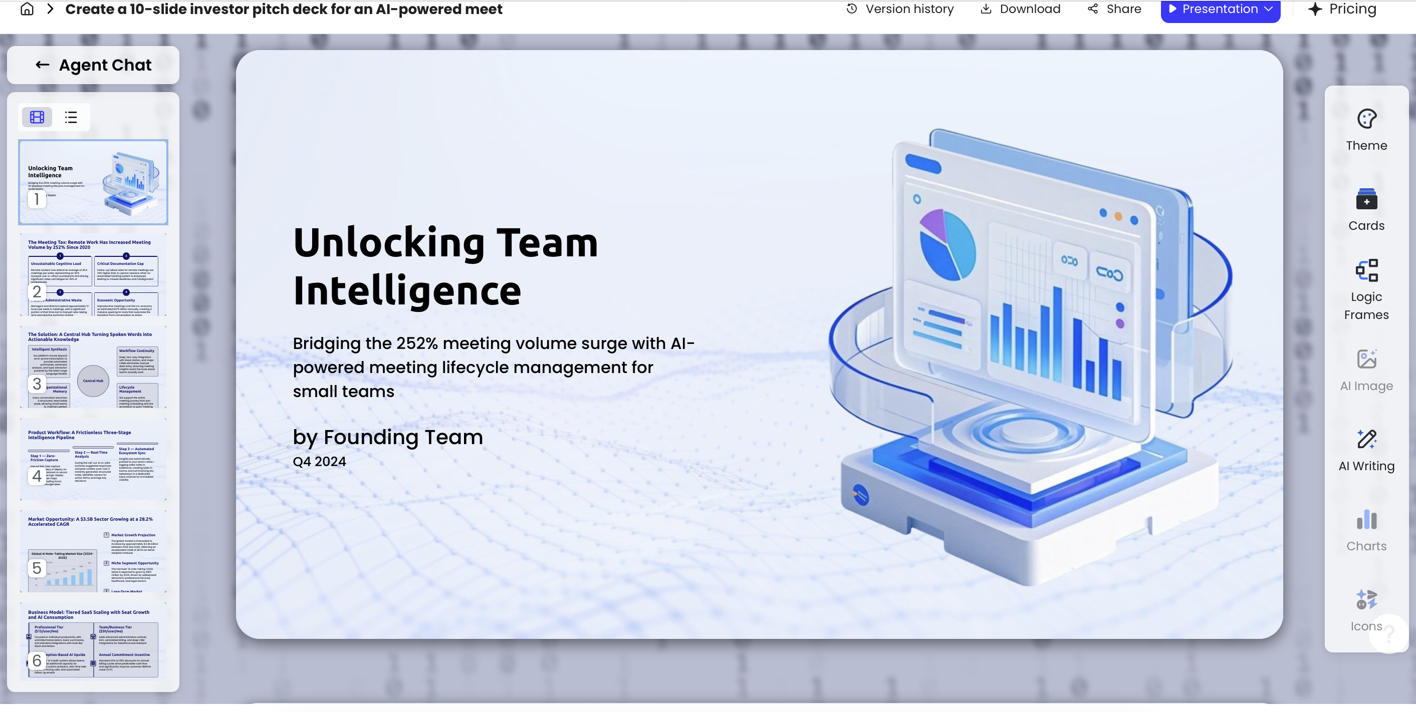
A useful revision command is: “Audit the deck for icon consistency. Remove decorative icons that do not support a heading, section, step, risk, metric, or action. Replace mismatched icons with one minimal outline style, keep labels beside all meaningful icons, and preserve the slide layout unless spacing is too tight.”
Before presenting to executives, clients, students, or stakeholders, run a final quality check. This is where many AI-generated decks move from “acceptable draft” to “safe to share.”
Commercial use deserves special attention because icons from libraries, AI generators, design tools, and internal brand systems can carry different rights. For high-stakes decks, keep a simple asset note: icon source, license type, attribution requirement, and date used. That small record can save time when a client, legal team, or procurement reviewer asks where visuals came from.
Finally, know when not to use icons. Use icons for quick category recognition, recurring navigation, process steps, and simple action cues. Avoid them when the slide depends on nuance, evidence, emotion, quotation, or detailed comparison. A quote slide may be stronger with typography alone. A customer story may need a real photo. A market sizing slide needs a chart. Good presentation design is not about adding visuals everywhere; it is about choosing the visual form that makes the message easiest to understand.
Use one icon for a headline idea, three to five icons for a balanced list, and avoid more than six unless the slide is designed as an icon grid. If every point has an icon, keep them equal in size, spacing, and style.
For most business, education, and technical decks, yes. Labels prevent ambiguity, improve accessibility, and help audiences interpret concepts consistently across cultures and experience levels.
SVG is usually better for crisp scaling and easy recoloring. PNG is fine for quick insertion or detailed rendered icons, but use transparent backgrounds and enough resolution for large screens.
It depends on the generator and source materials. Check the license, avoid protected brand marks, and document sources for client, enterprise, or public-facing presentations.
Turn your topic, document, report, or old slides into a structured deck, then refine icons, layouts, charts, and wording before export.
Create with PopAi