How to Design Readable Tables in AI-Generated Presentations
Published on August 19, 2026
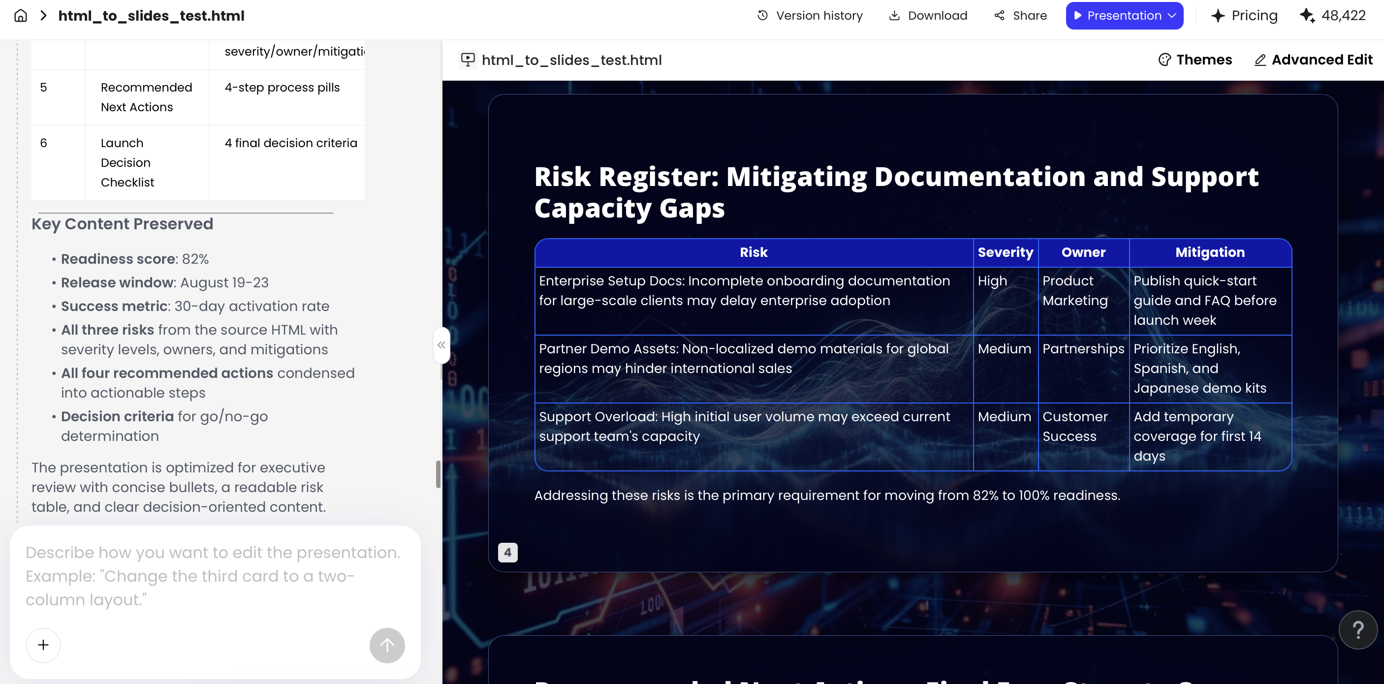
AI-generated presentation tables usually fail in a predictable way: the AI preserves the source table instead of redesigning it for a slide. In a recent risk-register test, a 12-column HTML table looked acceptable in edit mode but became unreadable in a 16:9 presentation. The fix was not “make the font smaller.” We reduced it to four fields: Risk, Severity, Owner, and Next Action, then moved mitigation detail and scoring assumptions to speaker notes.
That is the core skill when you design tables in AI presentations: turn stored data into a decision view. AI can structure messy notes, PDFs, reports, HTML, images, and existing PPTX files into slides, but it can also choose too many columns, blur units, invent summaries, or preserve spreadsheet clutter. This guide shows how to prompt, edit, validate, and test AI-generated tables so they work in business reports, board updates, research summaries, pricing decks, and project reviews.
Why AI Presentation Table Design Often Fails
Most unreadable AI-generated tables fail because they are optimized for completeness, not communication. A spreadsheet is allowed to be exhaustive; a slide has to be selective. If you do not tell the AI what decision the table supports, it will often keep every field that looks important.
Spreadsheet logic vs. slide logic
Spreadsheet logic asks, “Is all the data here?” Slide logic asks, “Can the audience see the comparison fast enough to act?” Those are different design jobs. A table for a finance analyst may include account code, region, owner, period, currency, adjustment type, and comment history. A table for an executive review may need only Metric, Actual, Plan, Variance, and Driver.
Design rule: a presentation table is not a miniature spreadsheet. It is a visual argument with rows and columns.
AI extraction and transformation errors
AI adds a second layer of risk because the output can look polished while the data has been changed. Common failures include merged labels, hidden unit changes, invented totals, and grouped categories that should remain separate.
| Source Field | Risky AI Output | Safer Slide Fix |
|---|---|---|
| Q1 Revenue ($M) | Revenue | Revenue, Q1 ($M) |
| FY Forecast Revenue ($M) | Revenue | Forecast Revenue, FY ($M) |
| Mitigation owner | Owner | Action Owner |
| Likelihood: 1–5 | Risk Score | Likelihood (1–5), unless impact is also included |
Workflow observation: In recurring business reviews, the Excel-to-PPT or report-to-slide table is one of the most common places where clarity breaks down. The problem is rarely that the AI cannot create a table. The problem is that the AI has no meeting context: who is reading it, what decision is pending, which rows are material, and which details belong in an appendix.
Visual polish can hide weak data trust
A generated table with clean colors and rounded cells may still contain a mislabeled period, a rounded figure that changes the interpretation, or a “Total” row that never existed in the source. Treat every AI table as a draft layout plus a draft interpretation, not as an approved analytical artifact.
Before you generate or edit the table, define its job in one sentence. Examples: “Show which three risks need executive attention,” “Compare pricing tiers for buyer selection,” or “Summarize study findings by participant group.” That sentence becomes the filter for every column, row, highlight, and footnote.
Practical filter: If a column does not change the decision, explain the takeaway, or support trust in the data, it probably belongs in notes, an appendix, or the source file—not on the main slide.
Readable Table Before/After: What to Fix First
A table can contain the right data and still fail as a slide. The fix is usually fewer columns, stronger grouping, clearer labels, and a message title.
Too much table for one slide
| Segment | Q1 | Q2 | Q3 | Q4 | YoY |
| Enterprise | 1.2 | 1.3 | 1.4 | 1.5 | ? |
| SMB | .9 | .8 | .9 | 1.0 | ? |
| Channel | .5 | .6 | .6 | .7 | ? |
Problem: no takeaway, tiny text, unclear units, weak comparison.
Enterprise drives most growth
- Show three rows only: Enterprise, SMB, Channel.
- Add units and time period in the heading.
- Highlight the largest movement, not every cell.
- Move raw quarterly data to appendix.
Suggested visual: summary table plus one callout arrow on Enterprise growth.
How to Prompt AI to Design Tables in AI Presentations
Prompting will not eliminate all table problems, but it reduces the most predictable ones: overcrowded columns, sentence-length cells, missing units, unclear sorting, and unsupported summaries.
Prompt constraints that matter
A useful table prompt should specify the audience, decision, maximum size, sorting rule, highlight rule, source note, and what the AI must not infer. “Make this into a table” is too open-ended for presentation design.
Reusable prompt framework
Bad prompt vs. better prompt
| Weak Prompt | Why It Fails | Better Prompt |
|---|---|---|
| “Create a table from this report.” | No audience, no limit, no decision, no validation rule. | “Create one executive slide showing the five highest operational risks. Use Risk, Severity, Owner, Next Action. Move mitigation detail to notes. Do not invent scores.” |
| “Summarize this pricing page.” | May flatten limits, add-ons, and included features into vague labels. | “Compare plans for a buyer choosing a tier. Use tiers as columns and group rows by Core, Security, Support, and Limits. Mark unavailable features as ‘Not included,’ not blank.” |
| “Make the finance data look nice.” | Design request without analytical rules. | “Show metrics with variance above ±10%. Use Actual ($M), Plan ($M), Var %, Driver. Round to one decimal. Label favorable/unfavorable variance.” |
Prompting by source type
- Spreadsheet or CSV: Ask the AI to inventory fields first, then classify each as keep, combine, move to appendix, or remove.
- PDF or report: Ask the AI to preserve source wording for labels and flag uncertain extracted values instead of guessing.
- Image or scanned table: Ask for a two-step output: extracted data first, slide table second. Verify the extraction before accepting the design.
- Long notes or meeting transcript: Ask the AI to separate facts, interpretations, and proposed actions so the table does not mix evidence with recommendations.
Revision prompts for dense AI output
- “Reduce this table to the five rows most relevant to the executive decision.”
- “Convert long mitigation text into three-word action labels and move full text to notes.”
- “Keep only rows where variance exceeds ±10% or the owner has requested escalation.”
- “Use units in column headers, not repeated in every cell.”
- “Group low-priority items into ‘Other’ and place the full list in the appendix.”
- “Do not create a Total row unless the source contains one.”
In tools such as PopAi AI Presentation, review the generated outline before producing the final deck whenever possible. If the outline assigns one slide to a 20-row operating table, fix the slide plan first; layout cleanup is much easier before the AI has compressed the table into tiny cells.
When comparing AI presentation makers, look beyond whether the tool can create a table. Evaluate whether it lets you refine the layout after generation, edit chart data, apply a controlled template, work from multiple input formats, and export to PPTX or PDF for final QA.
Readable Table Specs for 16:9 Presentation Slides
Good table design needs measurable constraints. If you do not give AI boundaries, it may squeeze ten columns into a slide because the data technically fits. The audience experiences the slide from a projector, a video call window, a board pre-read PDF, or a laptop screen—not from your design canvas.
Practitioner benchmark: Use three quick tests during review: the 5-second takeaway test, the 15-second verification test, and the 50% zoom test. At 50% zoom on a laptop, the slide approximates the loss of clarity that happens in screen sharing, projectors, and back-of-room viewing. If the title, row labels, and key numbers disappear at that size, the table is too dense for a live presentation.
Recommended table limits
- Columns: 3 to 5 for most live slides; 6 only when labels are short and values are compact.
- Rows: 5 to 7 visible rows; use “Top 5,” “Priority risks,” or “Key segments” instead of full data extracts.
- Font size: 18–24 pt for body cells, 22–28 pt for headers, 11–14 pt for source notes. For webinar screenshots or mobile-heavy audiences, move toward the larger end.
- Cell padding: leave enough vertical space that wrapped text does not touch row dividers.
- Table footprint: roughly 55–75% of slide height, leaving room for a takeaway title, one annotation, and a source note.
- Alignment: text left-aligned; numbers right-aligned or decimal-aligned; status labels centered only when short.
- Number formatting: round consistently, align decimals, and avoid mixing $K, $M, and percentages in the same column.
Adjust specs by presentation environment
| Use Context | Table Density | Design Priority |
|---|---|---|
| Live executive meeting | Lowest: 3–5 columns, 3–6 rows | Fast takeaway, one highlighted exception, large type |
| Board pre-read PDF | Moderate: more rows acceptable | Clear hierarchy, source notes, definitions, appendix links |
| Webinar or Zoom screen share | Low: avoid wide tables | Large labels, high contrast, minimal gridlines |
| Appendix slide | Higher, if not narrated live | Completeness, traceability, consistent units |
| Mobile viewing | Very low | Cards, stacked comparisons, or split slides instead of wide tables |
If everything is highlighted, nothing is highlighted. Use emphasis to direct the eye to the decision, not to decorate the table.
Use borders sparingly. Heavy grids add visual noise, especially on projectors. Light horizontal dividers, subtle zebra striping, grouped sections, or muted background fills usually make rows easier to scan. For color, keep the base neutral and reserve one accent color for the most important value, exception, or recommendation.

A Before-and-After Checklist for AI-Generated Tables
Once AI creates a table slide, review it like an editor, analyst, and presenter at the same time. The goal is not to make the table prettier; it is to remove anything that slows interpretation or weakens trust.
Example: dense AI risk table before cleanup
| Risk ID | Risk Description | Business Area | Likelihood | Impact | Mitigation Plan | Owner |
|---|---|---|---|---|---|---|
| R-014 | Supplier delay may affect Q3 launch timeline for enterprise rollout | Operations | High | High | Identify backup vendor, review contract terms, and create escalation path | Ops Lead |
| R-022 | Customer onboarding capacity may be insufficient if pipeline conversion increases | Customer Success | Medium | High | Hire temporary onboarding specialists and update training schedule | CS Director |
This version is common in AI drafts because it preserves the source register. It is technically complete, but the long description and mitigation cells force smaller type, the risk ID adds little for executives, and the audience must infer which action matters now.
After: presentation-ready risk table
| Priority Risk | Severity | Owner | Next Action |
|---|---|---|---|
| Supplier delay threatens Q3 launch | High | Ops Lead | Approve backup vendor |
| Onboarding capacity may lag pipeline | High | CS Director | Fund temporary specialists |
The redesigned table keeps the decision-driving information: what needs attention, how severe it is, who owns it, and what happens next. Risk ID, business area, likelihood, impact scoring detail, and full mitigation text can move to an appendix or speaker notes.
Checklist for fixing the AI draft
| Problem in AI Table | Why It Hurts | Presentation-Ready Fix |
|---|---|---|
| Too many columns | Forces tiny text and slow scanning | Keep only decision-driving fields; move details to appendix |
| Mixed units | Creates false comparisons | Standardize units in headers, such as “Revenue ($M)” |
| Long cell text | Turns the table into paragraphs | Use keywords or short phrases under six words |
| No row order | Makes the audience search randomly | Sort by severity, value, date, priority, or rank |
| Decorative color | Competes with the message | Use one accent for the key takeaway or exception |
| Missing source note | Makes the table hard to defend | Add source, date, scope, rounding, and AI-summary assumptions |
Case-study workflow: In a test using an HTML report with an executive summary, KPI section, and 14-row risk register, the generated deck organized the material into six slides and converted the register into a table slide. The first table used seven columns and carried full mitigation sentences, which failed the 50% zoom test. After reducing the table to four columns, shortening actions to verb-led phrases, and adding a source note, the slide became usable for a live review. The AI saved the initial structuring work, but the final quality still depended on manual data checks and table editing.
Use natural-language edit requests that sound like a design director, not a data clerk. Try: “Shorten this table to the five highest risks, keep severity and owner, remove mitigation detail, and add the mitigation summary as a speaker-friendly note under the table.” Or: “Split this table into two slides: one for current KPIs and one for next actions.”
When Not to Use a Table in an AI Presentation
The best table design decision is sometimes to avoid a table entirely. Tables are strong for exact lookup and side-by-side comparison, but weak for trend recognition, emotional emphasis, and quick ranking when the data has a clear visual pattern.
Choose the format by audience task
- Use a table when people need exact values, names, owners, dates, pricing tiers, or feature-by-feature comparison.
- Use a bar chart when the message is ranking, magnitude, growth, or variance.
- Use a line chart when time and direction matter more than precise individual cells.
- Use cards when you have three to five key metrics and each needs a label, value, and short interpretation.
- Use a heat map when the pattern across categories matters more than the exact number.
- Use a matrix when you are comparing options by two dimensions, such as impact and effort.
AI-specific conversion prompts
- “Analyze this data and recommend table, chart, card, matrix, or appendix. Explain the choice in one sentence.”
- “If exact values are not required, convert this table into a bar chart and keep the source data available for verification.”
- “Create one summary card slide and move the full table to an appendix slide.”
- “Convert revenue by quarter into a line chart; do not average or interpolate missing quarters.”
- “Convert risk likelihood and impact into a 2x2 or 3x3 matrix, but preserve the original scoring labels.”
When an AI tool creates a table but the message is really a pattern, switch formats before polishing. Revenue by quarter usually belongs in a line chart. Regional performance ranking usually belongs in a bar chart. A KPI snapshot often works better as cards. A feature comparison, risk owner list, or pricing tier selection still often belongs in a table.
Decision shortcut: If your spoken explanation begins with “notice the trend,” use a chart. If it begins with “compare these options,” a table may be right. If it begins with “remember these three numbers,” use cards.
Accessibility and Trust Checks for AI Presentation Table Design
A readable table is not only visually clean; it is accessible and credible. AI-generated tables need special review because the slide can look finished while hiding weak contrast, missing context, or questionable data transformations.
Visual accessibility checks
Use contrast that survives low-resolution projectors and compressed video calls. As a practical baseline, review W3C/WAI contrast guidance: normal text commonly targets at least 4.5:1, while large text and meaningful graphical indicators often use 3:1 as a minimum benchmark. These are digital accessibility baselines, not a guarantee that every projected slide will be readable. Do not rely on red and green alone for status; pair color with labels such as “High,” “Medium,” and “Low,” or icons plus text.
- Keep headers visually distinct with weight, fill, or spacing—not just color.
- Avoid pale gray text on colored cells, especially in source notes and footnotes.
- Use color-blind-safe status palettes, such as blue/orange or neutral plus one accent.
- Check the slide in grayscale; the table should still make sense.
- If exporting to PDF, ensure the reading order is logical and the table has a text-readable structure where required.
Source and data integrity checks
Trust depends on source transparency. Add a small note with source name, update date, data scope, and whether AI summarized, grouped, or translated the source. For research decks, include sample size, geography, period, and definitions. For financial slides, show units and rounding rules. For project status tables, make owners and dates explicit.
AI-specific validation checks
Before presenting, compare the generated table against the source. Pay special attention to extracted PDF tables, scanned images, and reports where AI may confuse headers, footnotes, and grouped rows.
- Check all totals, percentages, ranks, and deltas against the source.
- Confirm that AI did not merge categories with different meanings.
- Verify that quarterly, annual, forecast, and actual values are not mixed.
- Look for invented summary labels such as “Overall,” “Total,” or “Average.”
- Remove rows that are merely complete but not relevant to the slide decision.
- Verify that brand colors do not reduce contrast.
- Test the slide at 50% zoom and in the environment where it will be presented.
Examples: Finance, SaaS Pricing, Risks, and Research Tables
Different table types need different design rules. Start with the decision, then define the columns, sorting rule, highlight rule, and source note before accepting the AI output.
Finance variance table
Use this when the audience needs to understand what changed and why. Recommended columns: Metric, Actual, Plan, Var %, and Driver. Sort by absolute variance or materiality, not by spreadsheet order.
- Sample row: Gross Margin | 62.4% | 65.0% | -2.6 pts | Higher support cost.
- Highlight rule: accent only variances above a defined threshold, such as ±5% or any board-level exception.
- Rounding rule: use one decimal place for percentages; use $M or $K consistently.
- Common AI mistake: mixing percentage-point variance with percent-change variance.
- Source note: include period, currency, whether values are preliminary, and rounding basis.
SaaS pricing comparison
Use tiers as columns and buyer criteria as rows. Keep rows grouped by buyer concern—Core, Security, Support, Limits, and Add-ons—so the reader does not scan a random list of features.
- Sample row: SSO | Not included | Included | Included + SCIM.
- Highlight rule: if recommending a plan, use a subtle column badge or border rather than coloring every cell.
- Remove: marketing adjectives such as “advanced,” “powerful,” or “premium” unless they are defined.
- Common AI mistake: treating add-ons as included features or leaving unavailable features blank.
- Source note: include pricing date, billing period, usage limits, and whether prices exclude taxes or discounts.
Project risk register
Use Risk, Severity, Owner, and Next Action for the main slide. If the scoring model matters, explain it in a note or appendix instead of adding multiple scoring columns to the live slide.
- Sample row: Vendor delay threatens launch | High | Ops Lead | Approve backup vendor.
- Sorting rule: severity first, then due date or escalation status.
- Highlight rule: mark overdue or executive-decision items, not every high-risk row.
- Common AI mistake: confusing likelihood, impact, severity, and urgency.
- Source note: include last update date, scoring scale, and owner of the register.
Research findings summary
Use Segment, Sample, Key Finding, and Implication when the audience needs to act on findings rather than inspect every statistical detail. Keep analyst interpretation separate from source evidence.
- Sample row: Enterprise admins | n=84 | 68% cited audit logs as blocker | Prioritize compliance workflow.
- Highlight rule: emphasize findings that are statistically reliable or strategically material.
- Remove: overprecise decimals, uncited claims, and AI-written implications that go beyond the evidence.
- Common AI mistake: overstating qualitative themes as quantitative facts.
- Source note: include sample size, field dates, geography, method, confidence notes, and limitations.
For template-driven organizations, table governance matters as much as slide style. Finance teams should lock variance colors, rounding rules, and footnote placement. Research teams should standardize sample-size formatting and methodology notes. Risk teams should define severity labels, owner fields, and overdue-action styling so AI-generated drafts inherit the right rules instead of improvising them.
A Repeatable Workflow to Design Tables in AI Presentations
The strongest workflow combines AI speed with human judgment. Let AI structure, summarize, and propose layouts; then apply table-specific design and validation standards before the deck reaches an audience.
- Start with the decision. Write the takeaway before asking for a table: “Which risks need action?” is better than “Show the risk register.”
- Create a field inventory. List source fields and mark each as keep, combine, move to notes, move to appendix, or remove.
- Define units and rounding. Decide whether numbers use $, $K, $M, percentages, percentage points, or whole numbers before generation.
- Prompt with constraints. Specify maximum rows, columns, sorting, highlights, source notes, and what the AI must not infer.
- Review the outline. If one slide carries too much data, split it before generation into main slide, appendix, and notes.
- Edit for scanning behavior. Shorten labels, align numbers, reduce borders, add whitespace, and keep one visual emphasis.
- Validate the data. Check totals, units, categories, dates, labels, and any AI-generated summaries against the source.
- Run the 5/15/50 test. Five seconds for the takeaway, fifteen seconds to verify key data, and 50% zoom for readability.
- Export and inspect. Open the PPTX or PDF in the final environment because text wrapping, font substitution, and chart/table spacing can shift after export.
When stakeholders ask for “all the data on one slide,” separate the presentation layer from the evidence layer. Put the decision table on the main slide, include the full table in an appendix or shared workbook, and use the source note to make that traceability explicit.
Final quality test: can someone understand the slide’s main point in five seconds and verify the key data in fifteen?
If the answer is no, the table is still too dense, too ambiguous, or better suited to another format. A readable AI-generated table is not the one with the most information; it is the one that makes the right comparison trustworthy at presentation speed.
FAQ: Readable Tables in AI-Generated Presentations
How many rows and columns should a presentation table have?
For one slide, aim for three to five columns and five to seven visible rows. If the audience needs more detail, split the table across slides, summarize the totals, or provide the full source separately.
Can AI generate a readable table from a document or notes?
Yes. AI tools can structure notes, reports, PDFs, Word files, HTML, text, and images into slide tables, but you still need to verify facts, labels, units, sorting, and visual hierarchy before presenting.
Should I use a table or a chart in an AI-generated presentation?
Use a table when exact values, categories, or comparisons matter. Use a chart when the audience needs to see trends, proportions, ranking, or change over time quickly.
Do presentation tables need borders?
Not always. Light horizontal dividers, whitespace, zebra striping, or selective emphasis are usually more readable than heavy full grid lines.
What should I check after AI creates a table slide?
Check data accuracy, source notes, units, row order, column meaning, contrast, font size, slide fit, brand consistency, and whether the table supports the spoken point.
Create your presentation with one click now
Turn prompts, documents, reports, images, HTML, and existing slides into editable presentation drafts, then refine tables, layouts, charts, and themes before exporting.
Create with PopAi