How to Use Icons Effectively in AI-Generated Presentations
Use icon systems with clear labels, consistent style, and rights checks.
If you build pitch decks, training slides, executive reports, or classroom presentations, the image problem is rarely “find something beautiful.” It is usually more specific: create a 16:9 visual that leaves room for a title, matches the deck’s tone, avoids fake text, and supports one spoken point without distracting from it.
AI-generated images can solve that gap when stock photography is too generic or when the subject is abstract, future-facing, confidential, or hard to photograph. They do not remove the need for design judgment, licensing review, or manual cleanup. This guide compares practical tools, shows prompt workflows, and gives slide-specific techniques for turning AI visuals into presentation-ready assets rather than random artwork.
Lead with the job of the image, not the novelty of the technology. In presentation design, images usually do one of four jobs: clarify a concept, create emotional relevance, guide attention, or make an abstract idea visible. AI image generation is useful because it can create visuals for specific situations that stock libraries rarely cover: a cybersecurity analyst explaining risk to a hospital board, a teacher showing a future classroom, or a founder visualizing a product workflow that does not exist yet.
Stock search often forces compromise. You adjust the story to match the image, crop around irrelevant objects, or settle for the same laptop, handshake, and glass-office photos your audience has already seen. AI reverses the order: the message defines the visual. For slide design, that matters because a strong image should support one idea at a time.
AI images should reduce explanation load. If the presenter still needs a paragraph to explain why the image is on the slide, the image is decorative—not strategic.
Production example: For a B2B onboarding slide, a stock search for “customer onboarding frustration” typically returns generic call-center photos or people staring at laptops. A better AI prompt can show a simplified user journey with three clear bottlenecks, negative space for the headline, and a consistent SaaS-style palette. The image becomes a visual metaphor for friction instead of a vague mood photo.
Where AI is weaker: Use verified photography or official assets when authenticity is the point: customer proof, product screenshots, team photos, medical procedures, compliance examples, testimonials, or any slide where the image is evidence rather than illustration. AI-generated visuals are excellent for metaphors and scenarios; they are risky when they imply real events, real people, or factual proof.
Tip: Use AI-generated visuals when your idea is specific, future-facing, abstract, confidential, or hard to photograph. Use real photography when credibility depends on showing something that actually happened.
For a broader view of available tools, compare the latest AI presentation makers before choosing the workflow that best fits your team.
The right workflow depends on whether you need only images or an entire presentation system. Some creators want to keep an existing PowerPoint template and generate only custom hero images. Others start with a topic, PDF, Word document, HTML report, old PPTX, or training outline and need the tool to organize content, create slides, suggest visuals, and export the final deck. If you are comparing full deck-generation options, review current AI presentation makers alongside dedicated image tools.
| Workflow | Best for | Watch out for |
|---|---|---|
| Standalone image generator | High-control concept art, custom metaphors, illustrated scenarios, campaign visuals | Manual resizing, licensing checks, background cleanup, and deck-to-deck consistency |
| Presentation AI platform | Turning prompts or source files into slides with layouts, themes, icons, charts, and visuals | Requires human review for facts, visual nuance, image accuracy, and final brand polish |
| Design suite with AI tools | Marketing teams that need templates, brand kits, collaboration, and social-content reuse | May be less optimized for editable PowerPoint objects, chart-heavy decks, or report workflows |
For presentations, compare tools by slide mechanics—not only by how impressive the image looks in isolation. Check 16:9 composition, title-safe negative space, text rendering, reference-image support, commercial-use terms, brand kit controls, export options, and how quickly you can iterate.
| Tool | Presentation strengths | Common limitations | Best fit |
|---|---|---|---|
| Midjourney | Strong aesthetics, cinematic lighting, polished editorial and conceptual imagery | Less native slide integration; exact brand/product consistency can require reference images and repeated prompting | Pitch-deck hero images, campaign concepts, atmospheric section dividers |
| DALL·E / ChatGPT image generation | Good natural-language iteration, useful for business scenes and quick revisions | Still verify hands, faces, logos, and small details; generated text should not be trusted for final slide copy | General business decks, rapid concept exploration, presenter-friendly prompt iteration |
| Adobe Firefly | Brand-conscious workflow, useful generative fill, strong fit with Adobe editing tools | May need extra prompting for distinctive visual concepts; check plan and enterprise terms | Corporate and marketing teams with stricter commercial-safety requirements |
| Ideogram | Often stronger than many tools at decorative text and poster-like layouts | Do not rely on it for legal, financial, or mission-critical text; recreate final text in PowerPoint or Google Slides | Event posters, section openers, stylized title concepts |
| Canva / Microsoft Designer | Easy templates, quick edits, background removal, brand-kit-style workflows | Exports may be less editable for complex PowerPoint production; image originality varies by template use | Marketing, classroom, internal communications, social-to-slide reuse |
| Stable Diffusion / Leonardo | High control through models, seeds, reference images, and advanced settings | More setup, governance, and quality control; licensing depends on model, platform, and assets used | Teams with design or technical expertise needing repeatable visual systems |
| Presentation-native platforms | Connect outline, slide layout, image placement, theme, charts, and export | May not match the raw visual artistry of specialist generators; final review is still required | Fast first drafts, file-to-slides workflows, business reports, training decks |
A practical hybrid workflow is often best: use a dedicated image generator for the most important hero visuals, then use a presentation-native workflow for structure, layout, charting, and export. For example, PopAi AI Presentation supports topic-to-slides and file-to-slides workflows, including PDF, DOCX, TXT, MD, XML, HTML, PPTX, common image formats, audio, video, and YouTube URLs. That is useful when the starting point is a report or training document, but high-stakes images should still be reviewed, cropped, and sometimes replaced with a specialist-generator output.
A presentation image prompt should describe the slide job, not just the scene. Most poor AI visuals fail because the prompt omits the audience, message hierarchy, aspect ratio, empty space, or visual style. A prompt for a slide is different from a prompt for wall art: it must leave room for titles, support a spoken point, and work at projection size.
Build your prompt in this order:
Never ask an image model to create mission-critical slide text. Generate the scene without words, then add editable typography in your slide tool.
| Prompt version | Likely result | Why it matters |
|---|---|---|
| “Make an image about supply chain risk.” | Generic warehouse, trucks, warning signs, random text | No audience, message, aspect ratio, or slide layout guidance |
| “Create a 16:9 business illustration about supply chain risk for executives.” | More relevant tone, but still may be cluttered or lack title space | Adds audience and format, but not enough composition control |
| “16:9 landscape editorial business illustration for an executive risk slide: a simplified global supply chain map with three highlighted disruption points, calm analytical tone, navy and warm amber palette, focal point on right, clear empty space on left for headline, no words, no logos, no realistic brand marks.” | More usable slide background with clear hierarchy and fewer cleanup issues | Defines slide purpose, visual hierarchy, palette, composition, and exclusions |
Small prompt test: In a 12-slide sales-enablement deck workflow, vague prompts such as “sales team using AI” produced attractive but unusable scenes: crowded rooms, floating screens, and unreadable interface text. Adding “three people maximum,” “no visible words,” “negative space in upper left,” and “flat editorial style” made the outputs easier to place behind a headline and reduced manual cropping. The improvement was not because the model became smarter; the slide constraints became clearer.
| Slide type | Prompt starter | Avoid |
|---|---|---|
| Title slide | “16:9 atmospheric business visual with strong negative space for a title, showing…” | Busy full-frame scenes that compete with the headline |
| Problem slide | “Editorial illustration showing friction, delay, or overload in…” | Overly dramatic disaster imagery unless the topic truly warrants it |
| Solution slide | “Clean optimistic visual showing connection, simplification, and flow…” | Magic-wand metaphors and vague glowing technology |
| Process slide | “Semi-abstract process visual with three stages, no words, simple icons, consistent spacing…” | AI-generated labels; add text manually in the slide |
| Training scenario | “Consistent character-based workplace scenario showing…” | Too many faces, complex hands, or changing character identity |
| Data slide | “Subtle background texture or small conceptual accent related to…” | Images that compete with charts or imply unsupported evidence |
Presentation prompt example: “16:9 landscape editorial illustration for a B2B sales deck, showing a manufacturing operations manager comparing fragmented spreadsheets with a unified dashboard, confident professional tone, deep blue and white palette, soft lighting, clean background, open space in upper left for headline, no words, no logos.”
Consistency is the difference between a professional deck and a collection of unrelated AI experiments. When AI-generated images appear across multiple slides, create a mini art direction system before generating the visuals. This is especially important for training scenarios, product walkthroughs, investor narratives, and educational stories where the same person, product, or environment appears repeatedly.
Before generating slide images, write a compact “continuity card” and paste it into every related prompt:
Prompt discipline helps, but it does not guarantee consistency. Many image models still change faces, product proportions, clothing details, interface layouts, or room geometry between generations. For recurring characters or products, use tools that support reference images, style references, seed locking, or batch generation. Keep the same aspect ratio and model version throughout the deck.
Case workflow: For a four-slide training scenario about handling an angry customer, the most reliable approach is to simplify the art direction: two characters, waist-up framing, flat vector style, same café counter background, no detailed fingers, no readable signs. Generate all four scenes in one session, select the closest matching set, then crop consistently in PowerPoint or Google Slides. If one character’s face changes too much, switch to back-facing figures, silhouettes, or icon-style people rather than forcing photorealistic continuity.
If a slide must show an exact product interface, do not ask the image model to invent it. Use approved screenshots, product mockups, or official UI components, then place AI-generated backgrounds or environment scenes around them. For brand colors, specify approximate palettes in prompts, but finish color alignment inside the slide editor where you can apply exact hex values and contrast checks.
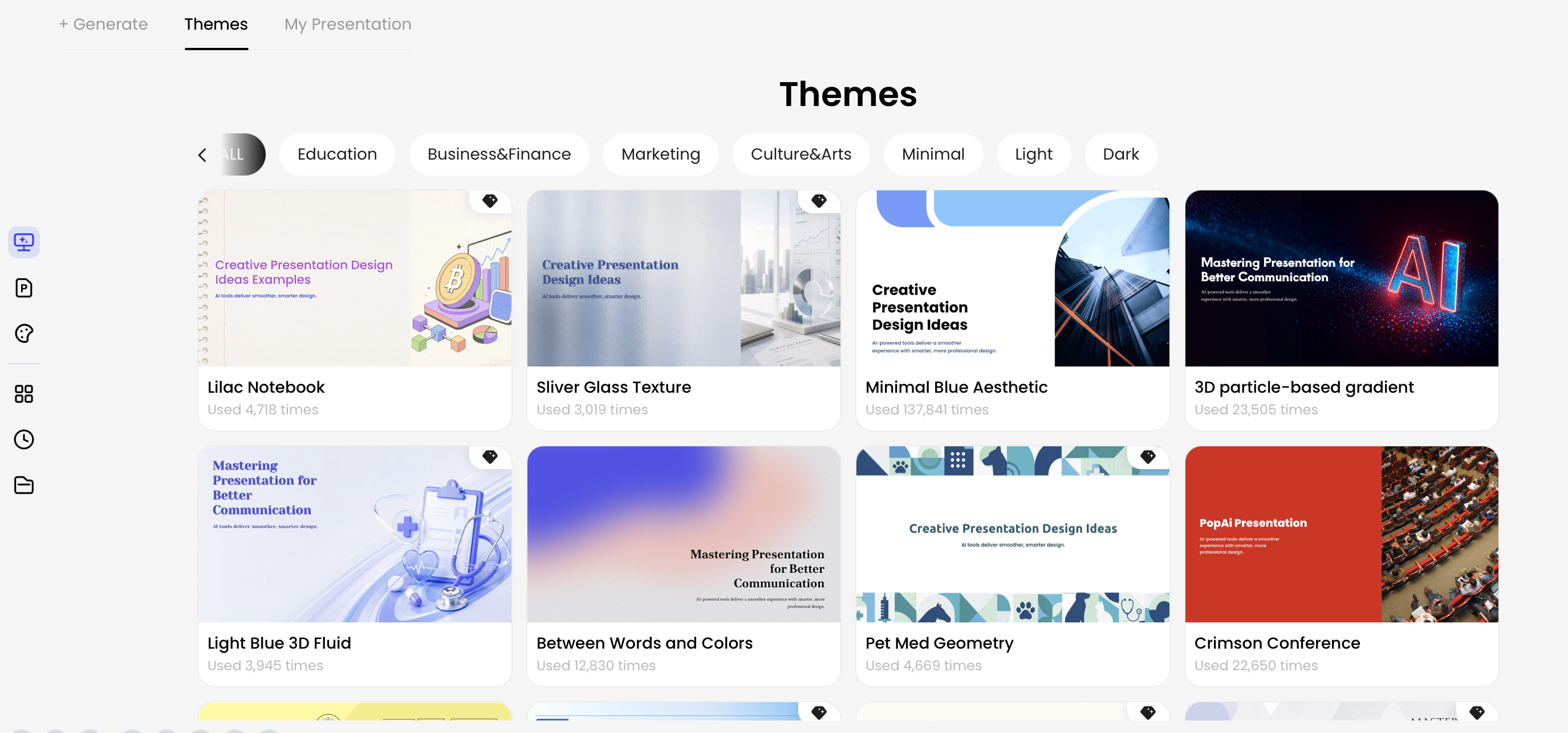
In PopAi, theme categories can help establish an initial visual direction before you refine individual pages. A practical workflow is to choose a theme direction, generate the deck, inspect which visuals support the message, then refine layouts, images, charts, icons, and text in Advanced Edit. Treat the generated deck as a structured first draft, not as final art approval.
File-to-slides example: In an HTML-to-slides workflow for an executive report, a six-page deck can be organized around summary, key metrics, risks, and recommendations. Metrics such as Beta users, Activation, and Support load belong on number-driven slides; the risk register belongs in a structured table; AI-generated images should be limited to section dividers or conceptual risk visuals. This division prevents decorative images from competing with evidence.
Different slide types need different image strategies. A title slide can use a bold atmospheric image; a financial slide usually needs restraint; a process slide benefits from icons or simplified diagrams; a training slide may need scenario-based illustration. Treat image generation as a design decision tied to the slide’s communication role.
| Slide type | Image goal | Recommended style | Finishing step |
|---|---|---|---|
| Title or section divider | Create tone and attention | Full-bleed atmospheric image with generous negative space | Add a dark or light overlay behind the headline |
| Problem slide | Show tension, delay, overload, or contrast | Simple scene with one clear focal point | Crop to remove secondary details that dilute the message |
| Solution slide | Show clarity, connection, flow, or improvement | Clean illustration, connected nodes, simplified before/after metaphor | Use brand colors for key shapes or accents |
| Process slide | Make steps easier to follow | Icons, semi-abstract diagrams, or simplified system visuals | Add editable labels and arrows manually |
| Data slide | Support the chart without becoming the evidence | Subtle background, small accent illustration, or no image | Keep chart contrast high and remove visual noise |
| Case study slide | Build credibility | Use real customer assets where approved; AI only for anonymized context | Label simulated visuals clearly if needed |
| Training scenario | Show behavior and context | Consistent character illustration or storyboard panels | Keep characters, setting, and camera angle consistent |
For data-heavy business reports, let charts carry the evidence. AI visuals can frame the section, introduce the theme, or humanize the business problem, but they should not compete with axes, labels, or key numbers. If a generated image makes a metric slide feel more impressive but harder to read, remove the image.
Inside PowerPoint or Google Slides, apply practical finishing moves: set the image as a background, crop to 16:9, add a translucent overlay behind text, use master placeholders for repeatable placement, compress images before sharing, and write alt text for accessibility. If the visual includes unnecessary details, crop aggressively. If faces or hands look distorted, regenerate with fewer people or use a more abstract illustration style.
When a workflow includes chart editing, keep the hierarchy clear: images create context; charts provide proof; annotations explain the takeaway. In tools with editable chart controls, refine chart type, colors, axes, legends, labels, units, prefixes, suffixes, reference lines, and highlighted data points before spending time polishing decorative imagery.
Credibility is often lost in small defects. AI images can look polished at first glance and still fail on projection: garbled text, strange hands, inconsistent characters, unclear metaphors, incorrect UI, accidental logos, or compositions that leave no room for headlines. Build a quality-control pass into your deck workflow.
| Problem | Likely cause | Prompt fix | Editing fix |
|---|---|---|---|
| Misspelled words in the image | Model tried to render text | Add “no text, no letters, no signage” | Regenerate, then add editable labels in the slide |
| No space for title | Prompt described scene but not layout | Specify “clear negative space in upper left” or another exact zone | Crop, blur, or overlay a text-safe panel |
| Style drift across pages | Different prompts, settings, or model versions | Reuse continuity card, palette, aspect ratio, reference image, and seed if available | Apply consistent cropping, overlays, and color treatment |
| Awkward hands or faces | Too many people or photorealistic detail | Use “abstract figures,” “back-facing people,” or “simple vector characters” | Crop tighter, mask defects, or switch to icons/silhouettes |
| Bad transparent background | Complex edges, hair, shadows, or low contrast | Generate on a plain solid background with clean object edges | Use background removal, then inspect edges on both light and dark slides |
| Overly detailed scene | Prompt encouraged realism and too many objects | Ask for “minimal composition, three major objects maximum” | Crop aggressively or replace with a diagram |
For upscale and cleanup tasks, external tools can enlarge images or remove backgrounds, but do not rely on automated fixes for every slide. Sometimes the more professional answer is to simplify: use a clean illustration, add an icon, or turn the concept into a diagram. A deck should feel intentional, not artificially decorated.
Review checklist: View every AI image at slide-show size. Check readability from six feet away, confirm no accidental logos or text, verify people and products look plausible, add alt text, compress the deck, and keep a record of the generator and license terms for commercial work.
Do not describe AI images as automatically copyright-free or risk-free. Treat every generated visual as something that still needs licensing, model-output, brand, privacy, and rights review before commercial use. For U.S. copyright policy context, review the U.S. Copyright Office AI resources, then check the current terms of the specific AI image tool and any stock/icon library used in the slide.
AI-generated images can reduce stock-photo friction, but they do not remove the need for licensing judgment. Commercial rights vary by tool, plan, prompt inputs, uploaded reference assets, and jurisdiction. A free plan may have different usage rights than a paid or enterprise plan. An image that resembles a real celebrity, protected character, branded product, or copyrighted artwork may create risk even if the file was generated by AI.
For client, investor, healthcare, finance, government, education, and enterprise decks, set a simple governance rule: document the tool used, subscription tier, prompt, generation date, model or version if available, reference assets, and final file location. Store this with the deck so the team can answer basic rights and provenance questions later.
A practical team policy should also define approved tools, prohibited prompts, whether confidential client information can be entered into prompts, who reviews final visuals, and when legal or brand review is required. Always check the current official terms of the tool you use; licensing language changes, and enterprise accounts may have different protections from consumer plans.
AI can generate plausible but inaccurate content. If a deck includes market size, compliance advice, academic claims, financial projections, technical diagrams, or citations, review the facts manually and use verified sources. AI-generated images can make a slide more understandable, but they should not be used to imply proof that does not exist.
Use AI visuals for custom metaphors, conceptual scenes, and draft exploration; use verified sources for evidence. That balance gives you originality without weakening trust.
Before presenting, ask one final governance question: “Would I be comfortable explaining where this image came from, what it represents, and why it is safe to use?” If the answer is no, replace it with approved photography, a simpler diagram, or a properly licensed stock asset.
Yes. Many tools can generate an outline, slide text, layouts, and visuals from a prompt or uploaded material. For professional work, review facts, citations, brand compliance, and image licensing before presenting.
Use a repeatable style system: fixed color palette, aspect ratio, camera angle, illustration style, lighting, and character or product description. Save the prompt, reuse reference images when available, and refine inside the presentation editor.
Commercial use depends on the generator's terms, your subscription, source material, and whether the image resembles protected brands, people, or copyrighted works. Confirm the license and keep records for client or enterprise decks.
Avoid asking image models to render important text. Generate the visual without words, then add editable text in PowerPoint, Google Slides, or your presentation editor so it stays sharp and correct.
Turn prompts, documents, reports, and existing slide material into a structured presentation, then refine visuals, charts, icons, themes, and layouts before export.
Start creating with PopAi