Dark Mode Presentations: Design Tips and Best Practices
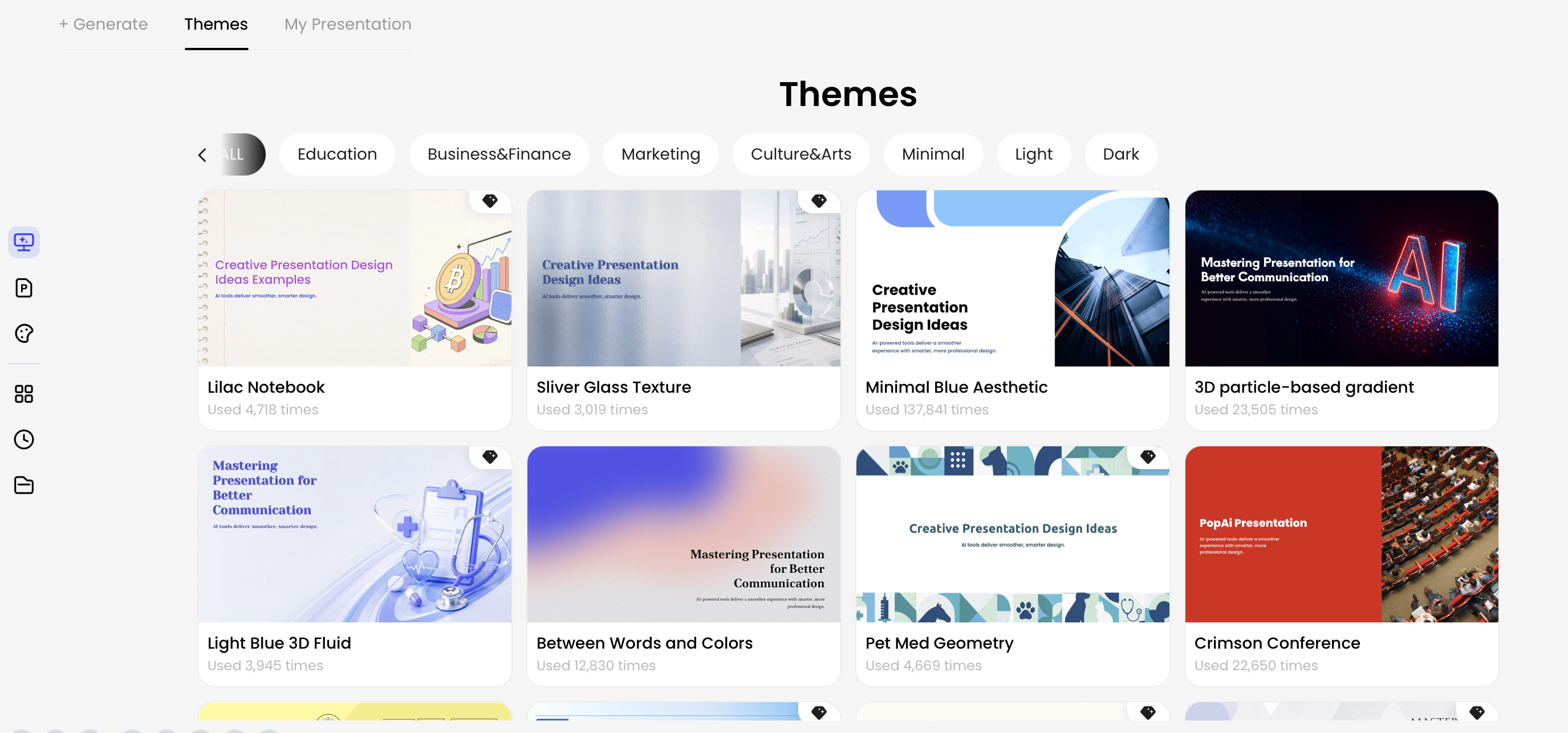
A dark mode presentation is not just a deck with a black background. It is a slide system that uses dark canvases, lighter type, controlled accent colors, and layered surfaces so the audience can read, scan, and remember the content in the room or on the call.
Dark mode can look sharp and premium in the right environment, but it can also fail quickly. The common failure pattern is familiar: white text on pure black, low-contrast gray labels, neon chart colors, invisible logos, and slides that look excellent on a laptop but flatten on a projector.
This guide focuses on practical slide production: color tokens, typography sizes, chart rules, AI-assisted drafting, brand asset fixes, export QA, and delivery testing. The goal is a deck that still works after it leaves the design file.
Why Dark Mode Presentations Work—and When They Do Not
Dark mode works best when it supports focus, not when it is used as decoration.
Best-fit use cases for dark presentations
Dark slides are often effective for product launches, cybersecurity briefings, SaaS demos, entertainment brands, creative portfolios, investor narratives, and keynote moments where a few visuals or metrics need to dominate the screen. In a dim room, a dark canvas reduces glare and lets the speaker, product screenshot, hero image, or single number carry more weight.
- Investor pitch: use charcoal backgrounds, restrained accent color, large traction metrics, and clean competitive positioning.
- Product launch: use dark panels, large screenshots, gradients, and motion sparingly to create anticipation.
- Security or data briefing: use dark navy/charcoal with precise labels, status colors, and direct annotations.
- Portfolio or creative deck: use dark space to make photography, video stills, and case-study visuals feel curated.
When dark mode hurts readability
Dark decks are risky for dense training content, regulatory reviews, spreadsheet-heavy reporting, printed handouts, classrooms with old projectors, and boardrooms with bright overhead lighting. They also underperform when the deck has many footnotes, long tables, or screenshots from light-mode software that turn into bright rectangles.
Nielsen Norman Group research on dark mode notes that user preference is mixed rather than universal. That matters for presenters: some audiences like the look, but readability depends more on display conditions, content density, and visual hierarchy than on theme preference.
Design dark slides for the environment where they will be consumed, not only for the screen where they are created.
Delivery context matters more than theme
Dark decks behave differently on different outputs. A laptop OLED display may make black look deep and accents look crisp. A projector in a lit room may lift the background to gray and erase subtle labels. A video call may compress thin chart lines and soften small type. A printed PDF may use too much ink and become hard to annotate.
Use dark mode confidently for: keynote launches, SaaS product demos, investor decks, entertainment concepts, design portfolios, and data stories with a few strong metrics.
Use caution for: long-form training, dense financial appendices, legal/regulatory content, handout-first materials, and rooms with strong ambient light.
OLED power savings are sometimes mentioned in dark mode discussions, but they are rarely the main design reason for presentations. Most decks are consumed through projectors, LED walls, laptop screens, PDFs, or compressed meeting streams. In those contexts, contrast, font size, chart legibility, and export fidelity matter more than battery life.
Dark Mode Presentations Need a Better Color System Than Black and White
Use W3C/WAI contrast guidance as a baseline, not as the only test. Dark mode may reduce glare in dim rooms for some viewers, but readability still depends on room lighting, screen brightness, font size, projection quality, compression, and the viewer’s needs. Test the exported deck in the actual presentation environment.
A good dark deck starts with a reusable color system, not a black slide and white text.
Avoid pure black and pure white as defaults
Pure black backgrounds such as #000000 can make white text shimmer or appear too harsh on high-brightness displays. Pure white body copy can also feel tiring across many slides. Start with charcoal, graphite, or very dark navy—such as #101114, #121212, #16181D, or #0F172A—then create slightly lighter surfaces for cards, charts, callouts, and screenshots.
Build dark slide color tokens
Treat your deck like a small design system. Define tokens once, then reuse them across titles, charts, icons, tables, and section dividers.
- Canvas/background: #101114 or #121212 for the main slide.
- Raised panel: #1B1D24 or #20232B for cards, tables, and chart areas.
- Border/keyline: #2A2F3A at 60–100% opacity for quiet separation.
- Headline text: #F5F7FA for short, large text only.
- Body text: #D8DEE9 or #CBD5E1 for reading comfort.
- Caption/axis text: #94A3B8, but increase size if projected.
- Primary accent: one brand color adjusted for dark backgrounds.
- Status colors: success, warning, and error colors that do not rely on red/green alone.
Use contrast ratios as a baseline, then test the output
For accessibility, use WCAG contrast guidance as a minimum: normal text should reach at least 4.5:1 contrast, while large text should reach at least 3:1. WebAIM’s contrast checker is a quick way to test text/background pairs before you build the full deck.
Practical contrast examples: #CBD5E1 body text on #121212 is usually strong enough for body copy; #94A3B8 on #121212 can work for captions but may be too weak for axis labels in a room; #64748B on #1B1D24 often looks elegant in the editor and disappears when projected. If a label explains the data, treat it as content—not decoration.
Projection usually reduces perceived contrast. If a label is only “barely visible” in the design file, assume it will fail in the room.
In production reviews, the most common dark palette mistake is overusing saturated blue, red, or purple. These colors can vibrate against charcoal and become hard to distinguish at distance. If your brand blue is #0057FF, test a slightly softened version for fills and charts, then reserve the original color for small emphasis moments such as section markers, buttons, or one highlighted metric.
Typography Rules for Readable Dark Slides
On dark slides, typography has to carry more of the accessibility work.
Use fewer words per slide
Dark backgrounds reward visual focus. A useful working rule is one message per slide, one dominant headline, and no more than three supporting points unless the slide is deliberately a reference page. If the audience must listen to you and read a paragraph at the same time, the slide is doing too much.
Choose heavier weights and larger sizes
Thin fonts and tiny captions are the first things to fail. For 16:9 live presentation slides, use these as starting points, then adjust for room size and density:
- Title slide headline: 56–72 px.
- Standard slide title: 44–60 px.
- Body text: 28–36 px for live delivery; larger for conference rooms.
- Captions and chart labels: 18–24 px only if nonessential; 24–30 px if the label carries meaning.
- Font weight: regular or medium for body, semibold or bold for headings; avoid ultra-light weights.
In dark slide design, hierarchy should be visible before the audience reads a single word.
Watch for halation, caps, and condensed type
Bright text on dark backgrounds can appear to glow, especially on large displays. Avoid long passages in all caps, overly tight tracking, and condensed typefaces for body copy. All caps can work for small labels or section markers, but not for paragraphs or chart explanations.
Test typography at presentation distance
Do not judge type only at 100% zoom on your laptop. View slides at 25% and 50%, share them in the actual meeting platform, and stand 8–12 feet from a monitor. If you cannot identify the headline, supporting point, and key number in three seconds, simplify the slide.
AI editing tip: ask your drafting tool to shorten dense pages before you design them. A useful prompt is: “Rewrite this slide for executives, keep only three points, turn the headline into a conclusion, and remove any sentence the presenter can say aloud instead.” Always review the result manually; AI often keeps text that feels important but does not belong on the slide.
Dark Mode Presentations with AI: A Practical Workflow
AI can draft a dark deck quickly, but it cannot reliably judge whether the slide will survive a projector, a boardroom, or a compressed screen share.
Define constraints before generating
Before using any AI deck tool, write down the constraints a designer would ask for: audience, room, output format, brand rules, slide count, data sources, required sections, chart needs, and whether the deck also needs a light handout version. Tools such as PopAi AI Presentation can help move from source material to a first draft, but the quality of the result still depends on how clearly you define the problem.
- Set the context: audience, decision to be made, delivery channel, and time limit.
- Generate the outline: ask for slide titles that state conclusions, not generic topics.
- Select the dark direction: charcoal, dark navy, graphite, or brand-led dark theme.
- Create the first draft: import notes, reports, transcripts, or existing slides where useful.
- Apply tokens: standardize background, panel, text, accent, chart, and border colors.
- Audit slide by slide: check text density, hierarchy, chart labels, logos, and screenshots.
- Export and test: open the file in the software and device environment used for delivery.
- Create a light variant if needed: especially for handouts, appendix material, or post-meeting PDFs.
Prompt examples for dark decks
A strong AI prompt might read: “Create a 10-slide dark mode investor pitch for a B2B cybersecurity startup. Audience: seed investors. Tone: confident, technical but concise. Use a charcoal background, muted blue and violet accents, large typography, simple charts, and minimal text. Include problem, solution, market, product, traction, business model, competition, go-to-market, team, and ask.”
- Product launch: “Create a 12-slide dark launch deck for a new analytics feature. Use one message per slide, large screenshots in framed panels, and a reveal from customer pain to product demo to proof.”
- Training deck: “Convert this training material into a dark facilitator deck. Keep live slides sparse, move details into speaker notes, and flag any slide that needs a light handout.”
- Data report: “Summarize this quarterly report into an executive dark deck. Use bar charts for rankings, direct labels, and one highlighted insight per chart.”
- Existing light deck conversion: “Convert this light presentation to a dark theme. Preserve brand recognition, replace white screenshot rectangles with framed panels, and check every chart label for contrast.”
Review AI output manually
In PopAi, a practical workflow can move from input to delivery: enter a topic or upload files, review the AI-organized outline, select a theme, generate the deck, then refine text, visuals, layout, icons, charts, and export options. Inputs such as PDF, DOCX, TXT, MD, HTML, PPTX, images, audio, video, and YouTube URLs are useful when the dark deck starts from a report, old presentation, research notes, or meeting recording. Treat the output as a draft, not a finished design system.
If you are comparing broader workflows, review how different AI presentation makers handle templates, editable charts, document import, and PowerPoint export. For dark mode specifically, prioritize tools that let you revise colors, chart labels, layouts, and typography after generation rather than locking you into a static visual.
Common AI-generated dark deck problems
- Inconsistent background colors across sections.
- Decorative gradients that reduce text contrast.
- Charts with tiny legends and no direct labels.
- Brand colors copied from light mode without dark-mode adjustment.
- Too much body text preserved from the source document.
- Attractive title slides followed by dense, low-contrast content slides.
Charts and Data Visualization on Dark Backgrounds
Dark chart design is less about making colors brighter and more about reducing visual competition.
Simplify the chart type first
Charts are where many dark decks fail. Bright lines can vibrate, gridlines can overpower the data, and legends can become a low-contrast afterthought. Choose the simplest chart that answers the question: bar chart for rankings, line chart for trends, stacked bar for limited composition comparisons, and scatter or bubble only when the audience truly needs multiple variables.
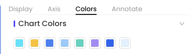
Charts are where many dark decks fail because the chart may look “designed” before it is actually readable.
Use muted, distinct colors—not neon
A reliable dark chart palette might use softened cyan, violet, amber, mint, and coral. Keep saturation controlled and reserve the brightest accent for the one series or number you want remembered. For charts with many categories, use one highlighted color plus neutral grays instead of five equally loud colors.
- Gridlines: blue-gray or neutral gray at roughly 10–20% opacity.
- Axis labels: light gray, larger than you think; avoid dark gray labels on dark panels.
- Primary series: one accent color with strong contrast.
- Secondary series: lower saturation or neutral tint.
- Negative values: use color plus a label, icon, or directional marker.
- Financial charts: do not rely only on red/green; add plus/minus signs and direct labels.
Label directly and reduce legend dependence
A common before/after fix: replace a five-color donut chart plus legend with a ranked horizontal bar chart. Put labels at the bar ends, highlight the top category, and move the takeaway into the slide title. The audience should not have to look back and forth between legend, color, category, and number while listening to the presenter.
Another frequent fix: for a line chart, use a muted cyan primary line, a lower-contrast secondary line, gridlines at low opacity, and endpoint labels placed directly beside each line. This usually reads better than a neon line chart with a legend in the corner and small gray axis text.
QA charts for projection and accessibility
Analysis teams should treat chart contrast as a separate QA step. On dark backgrounds, the perceived difference between two saturated colors can shrink when viewed from the back of a room or through video compression. If your chart relies only on color, add direct labels, icons, patterns, or short annotations. This is especially important for color-blind viewers and for financial, healthcare, and operational presentations where misreading a category can change the decision.
Chart editing tools are useful when they let you adjust chart type, data tables, colors, axes, legends, units, prefixes, suffixes, reference lines, min/max values, and individual data labels after generation. AI can produce a starting chart, but the presenter or analyst should still tune it so the insight is readable at distance.
Brand Assets, Images, and Visual Depth in Dark Mode Design
Dark mode often breaks brand assets that were designed for white backgrounds.
Build depth without heavy shadows
Dark presentations can look premium because they create depth, but traditional drop shadows are less visible on dark surfaces. Use layered grays, soft gradients, thin borders, subtle glows, and brighter surface panels to separate foreground from background. A card that is only two or three shades lighter than the canvas can feel elevated without looking like a floating sticker.
Prepare logos and icons
Brand assets need extra attention. A dark logo may vanish; a transparent PNG may have hidden light edges; a white icon may be too bright; and brand colors that work on white can look oversaturated on charcoal. Use official reversed logos where available. If no dark-mode logo exists, place the original logo on a small light or neutral brand-approved container rather than recoloring it without approval.
Treat screenshots and product images
Product screenshots from light-mode software are one of the hardest elements to place on dark slides. Do not drop a large white screenshot directly onto a charcoal canvas unless the contrast is intentional. Use a raised panel, device frame, or cropped close-up so the screenshot feels integrated.
- Add 12–24 px padding around screenshots inside a dark raised panel.
- Use a 1 px keyline around transparent assets to reveal their edges.
- Crop screenshots to the decision-relevant area instead of showing the entire interface.
- Place white-background screenshots inside a browser frame, device mockup, or neutral card.
- Use a gradient overlay on photos when text must sit on top of the image.

Convert a brand palette for dark slides
- Keep brand recognition: preserve the core brand color for logos, dividers, or primary emphasis.
- Create dark tokens: define canvas, raised panel, border, headline, body, caption, and disabled states.
- Adjust saturation carefully: desaturate secondary colors by 10–25% as a starting point, then test on actual dark gray.
- Document approved usage: specify which colors are for charts, icons, backgrounds, and emphasis.
- Check logos and charts together: a brand accent that works in a logo may overpower a chart.
Mini example: if the original brand blue is #0057FF, the dark deck might use #0F172A for the canvas, #1E293B for panels, #E2E8F0 for body text, #94A3B8 for captions, and a softened blue accent for chart fills while reserving #0057FF for small emphasis marks. This keeps the brand recognizable without letting one saturated color dominate every slide.
Creative decks can lean into mood, but formal decks should use restraint. A financial board update may use dark navy with conservative blue accents, while a product launch may use violet gradients, glows, and oversized screenshots. The practical test is simple: if the styling makes the content look less credible or harder to read, reduce it.
Delivery Testing Checklist for Dark Mode Presentations
The final test is not whether the deck looks good in your editor. It is whether the audience can understand it in the actual delivery context.
The final test is the room, the call, and the exported file—not the design canvas.
Dark decks are sensitive to room light, projector contrast, screen-sharing compression, embedded fonts, transparency rendering, and PDF export settings. Build testing into the production schedule rather than treating it as a last-minute check.
Use a real delivery QA workflow
- Zoom out: review the deck at 25%, 50%, and full-screen size.
- Back-of-room test: stand 8–12 feet from a monitor or test from the rear of the room.
- Platform test: share the deck in Zoom, Teams, Google Meet, or the actual event platform.
- Export test: create PDF and PPTX versions, then open them on another device.
- Projection test: if possible, take a phone photo of the projected slide; contrast failures often become obvious in the photo.
- Accessibility test: check contrast, avoid color-only meaning, and test critical charts in grayscale if decisions depend on them.
- Handout test: print one representative slide in low-quality or grayscale mode if printed materials matter.
Before presenting, verify:
- Projector or LED wall: dark backgrounds still have enough separation between canvas, cards, and charts.
- Video meeting preview: text remains readable when the shared screen is reduced in size.
- PDF export: gradients, icons, transparent images, and chart labels render correctly.
- PPTX export: text remains editable and key layouts stay intact when opened in PowerPoint.
- Fonts: embedded or substituted fonts do not shift line breaks, chart labels, or button text.
- QR codes: codes have enough light background padding to scan reliably on actual phones.
- Videos/GIFs: dark edges, captions, and controls remain visible when played full screen.
- Laser pointer or cursor: the pointer is visible against both dark panels and bright images.
- Handouts: consider a light-mode print version to avoid heavy ink usage and improve annotation.
Editable PPTX and PDF exports are helpful, but export is also where layout problems appear. Font substitution, chart rendering, transparency, gradients, and image compression can shift between tools and operating systems. After generating or exporting a dark deck, open the file in the exact software environment you will use—PowerPoint on Windows, Keynote on Mac, Google Slides, or the event laptop—and inspect the most complex slides first.
For high-stakes presentations, create two theme variants: the polished dark version for live delivery and a simplified light version for printed handouts or follow-up documents. This small step prevents a common dark mode failure: a beautiful live deck that becomes inconvenient after the meeting.
FAQ: Dark Mode Presentations
Should dark mode presentations use a pure black background?
Usually no. Deep charcoal colors such as #121212 or #1E1E1E are often easier on the eyes and create smoother depth than pure black, especially on projectors and shared screens.
Is pure white text best on dark slides?
Pure white can work for large headlines, but long body text is often more comfortable in off-white or light gray. Test contrast while avoiding a harsh glowing effect.
Do dark mode slides reduce eye strain?
They can reduce glare in dim rooms, but they are not automatically better for every viewer. Room lighting, screen brightness, text size, and contrast matter more than the theme alone.
Are dark mode presentations good for data-heavy reports?
They can be effective if charts use muted but distinct colors, subtle gridlines, readable labels, and simplified views. Dense financial or scientific dashboards may need extra testing.
How can AI help design dark mode presentations?
AI can structure the deck, generate a visual direction, create charts, rewrite dense slides, and help iterate layouts. Designers should still verify contrast, accessibility, brand fit, and projection quality.
Create your presentation with one click now
Turn your topic, files, or notes into a polished presentation draft, then refine the design, charts, and layout for your audience.
Start creating with PopAi