How to Turn CSV Data into a Presentation with AI
Published on August 03, 2026

If you need to turn CSV data into a presentation with AI, the safest workflow is not to throw raw rows into a slide generator and trust the result. Start by creating a small, verified input packet: the raw CSV, a cleaned summary table, a data dictionary, and a short note explaining the business question.
This version uses a simple marketing performance dataset so the full path is visible: raw data, cleaned KPIs, chart plan, slide outline, and final validation. The point is not to claim a fixed time saving. The point is to reduce blank-slide work while keeping every number traceable.
Download the sample CSV used in this guideComplete Example: Raw CSV to Clean Slides
A small source file is enough to show how the process should work before you use larger business exports.
| Stage | What you prepare | What AI should do | What a human must verify |
|---|---|---|---|
| 1. Raw CSV | Rows such as month, channel, spend_usd, leads, customers, revenue_usd. | Read fields and detect likely dimensions and measures. | Column names, date format, currency, blanks, duplicated rows, and sensitive fields. |
| 2. Clean summary | A pivot-style table by month and channel, plus totals and calculated KPIs. | Convert the summary into a narrative, not recompute hidden formulas. | ROAS, conversion rate, CAC, growth rates, and any rounding. |
| 3. Chart plan | One chart question per slide: trend, ranking, mix, variance, or exception. | Suggest line charts, ranked bars, KPI cards, or exception tables. | Whether the visual supports the actual decision. |
| 4. Slide draft | Audience, goal, slide count, source table, and data dictionary. | Create titles, bullets, visual suggestions, and speaker notes. | Accuracy, context, causal language, and unsupported recommendations. |
Cleaning Table, Formulas, and Traceable Metrics
Before generating slides, convert the raw CSV into a compact table that a reviewer can audit. Keep one source of truth for formulas. For example, use ROAS = revenue_usd / spend_usd, customer_conversion = customers / leads, and CAC = spend_usd / customers. If a metric uses a different business definition, write it down before the AI sees the data.
| Metric | Formula | Slide use | Review warning |
|---|---|---|---|
| Total spend | SUM(spend_usd) | Budget context and variance slide. | Confirm refunds, taxes, agency fees, and excluded channels. |
| Revenue | SUM(revenue_usd) | Outcome trend and channel comparison. | Confirm attribution window and whether revenue is booked or projected. |
| ROAS | revenue_usd / spend_usd | Channel efficiency slide. | Do not compare channels if attribution rules differ. |
| Customer conversion | customers / leads | Funnel quality slide. | Do not treat low volume segments as conclusive. |
Technical references to include in production workflows: CSV files are commonly documented using RFC 4180 (rfc-editor.org/rfc/rfc4180). Formula definitions should come from your analytics, CRM, finance, or spreadsheet owner rather than from AI.
From Clean Summary to Slide Plan
After the calculations are verified, ask AI for a slide plan rather than a final claim. A good prompt says: Use the table below to create a 7-slide marketing performance deck. Do not invent missing data. Label assumptions. Show the calculation behind every metric used in a title.
| Slide | Purpose | Suggested visual | Evidence to check |
|---|---|---|---|
| Executive summary | What changed and why it matters. | Three KPI cards. | Each KPI ties to the summary table. |
| Spend and revenue trend | Show whether revenue moved faster than spend. | Dual-line chart or two simple lines. | Same period, same currency, no missing months. |
| Channel efficiency | Compare ROAS by channel. | Ranked bar chart. | ROAS formula and attribution window. |
| Lead quality | Separate volume from conversion quality. | Scatter or funnel table. | Low sample sizes and duplicated leads. |
| Actions | Turn insights into next steps. | Decision table. | Owner, timeline, and confidence level. |
Avoid Unverifiable Time Claims
Do not promise that AI always turns CSV data into slides in a fixed number of minutes. Dataset size, cleanliness, chart complexity, export format, and review requirements change the result. A more accurate claim is that AI can reduce the first-draft writing and slide-structuring work after the data is cleaned.
Safe wording: In a small, prepared example, AI can help move from verified KPI summary to a presentation draft faster than starting from blank slides. The final deck still requires data validation and editorial review.

If you need to turn CSV data into a presentation with AI, start with one practical question: do you want the AI to analyze raw rows, or do you want it to turn a verified summary into slides? For most business decks, the safer workflow is to clean the CSV, summarize the key numbers in Excel, Google Sheets, Python, or a BI tool, then use AI to structure the story, draft slides, and refine the visuals.
In this guide, we will use a sample marketing CSV with columns such as month, channel, spend_usd, leads, customers, and revenue_usd. The output is a 7-slide marketing performance deck: executive summary, KPI cards, channel comparison, monthly trend, efficiency analysis, budget recommendation, and appendix. A small, already-clean file can often move to a reviewable first draft faster than a manual blank-slide workflow, but high-stakes executive decks still need validation, source checks, and stakeholder review.
This workflow is especially useful when you are using an AI presentation tool such as PopAi AI Presentation to convert structured source material into an outline and editable slide draft, while keeping the spreadsheet as the source of truth.
Important file-support note: PopAi currently provides file-to-slides entry points such as PDF, Word, Image, HTML, Text, and PPTX, plus local upload, existing file selection, and Google Drive import options. If your source is a
.csv, use one of these practical paths: convert the CSV summary to a supported document, paste a structured table summary into the prompt, export charts/images from Excel or Sheets, or create a short analysis brief first. Treat the CSV as the data source, not necessarily the direct upload format.
Here is the type of compact sample data we will refer to throughout the article:
| month | channel | spend_usd | leads | customers | revenue_usd |
|---|---|---|---|---|---|
| 2026-01 | Search | 18000 | 620 | 54 | 81000 |
| 2026-01 | Social | 12000 | 710 | 31 | 37200 |
| 2026-02 | Search | 19500 | 655 | 59 | 90200 |
| 2026-02 | 4200 | 360 | 44 | 52800 |
Why CSV Data to Presentation AI Works Better Than Manual Slides
The main benefit is not prettier charts; it is faster movement from verified numbers to a usable narrative.
A manual CSV-to-PowerPoint workflow usually looks like this: open the export, clean column names, build pivot tables, calculate KPIs, create charts, paste them into slides, rewrite slide titles, adjust formatting, and repeat every time someone asks for a different cut. That is fine for one chart. It becomes slow when the deck needs segmentation, recommendations, caveats, and a clean executive sequence.
Where AI saves time
- Outline creation: AI can turn a KPI summary into a slide sequence faster than starting from a blank deck.
- First-draft wording: It can convert spreadsheet language into slide titles, speaker notes, and executive summaries.
- Chart planning: It can suggest which questions deserve a line chart, ranked bar chart, KPI card, or exception table.
- Audience tailoring: The same CSV summary can become a board update, sales review, classroom exercise, or client report.
- Revisions: You can ask for a shorter executive version, a more operational version, or a slide-by-slide action plan.
Where AI still needs human review
AI can misclassify columns, especially when a CSV contains numeric-looking IDs, mixed date formats, or unclear metric names. For example, campaign_id should not be averaged, 0 may mean “no sales” or “missing value,” and a partial June export should not be described as a full-month decline. Use AI for structure and explanation; use your spreadsheet or BI tool to verify the calculations.
A strong AI-generated data deck is one where every slide answers a specific business question and every number can be traced back to the CSV or summary table.
Workflow comparison: For a six-month marketing CSV, a manual deck typically involves several separate steps: cleaning, pivoting, charting, writing titles, and formatting. An AI-assisted workflow can reduce first-draft slide structuring when you provide a clean KPI table and chart instructions, but the effort shifts toward data preparation and validation rather than disappearing.
Before comparing workflow options, understand what different tools emphasize. Some products focus on polished investor-style decks, some support multiple file formats and automated exports, while others are closer to design platforms. If you are evaluating vendors more broadly, this overview of AI presentation makers can help you compare presentation generation features beyond CSV handling.
Prepare CSV Data for an AI Presentation Before Uploading
For a broader view of available tools, compare the latest AI presentation makers before choosing the workflow that best fits your team.
Most CSV-to-slide problems start before the AI sees the data.
The quality of the generated presentation depends heavily on the source file or summary you provide. Ambiguous headers, duplicated rows, mixed currencies, and unclear denominators often produce confident but wrong slide headlines. A short cleanup pass is usually faster than fixing a misleading deck later.
Clean the structure first
- Rename columns clearly: Change
val1,date2, andamtto names such asclose_date,monthly_revenue_usd, andcustomer_segment. - Standardize dates: Use one format such as
YYYY-MM-DDorYYYY-MM. Do not mix03/04/26,April 3, and2026-04-03in the same column. - Separate identifiers from measures: Mark account IDs, order IDs, SKUs, or employee IDs as identifiers so they are not treated as values to average or sum.
- Resolve missing values: Decide whether blanks mean zero, unknown, not applicable, or not collected. Use a note such as “blank revenue means not yet closed, not zero revenue.”
- Normalize units: Make currency, percentages, and counts explicit. Use
revenue_usdinstead ofrevenue, and use either0.24or24%consistently. - Calculate formulas before export: If the CSV comes from Excel or Sheets, convert formulas to values before creating the summary.
- Remove unnecessary personal data: Delete names, emails, phone numbers, addresses, and sensitive IDs unless they are essential and approved for the workflow.
Use aggregated summaries for large CSVs
Raw row-level data is rarely the best input for a presentation. If the CSV has thousands or millions of rows, create an aggregated table first: monthly totals, channel-level KPIs, regional breakdowns, top exceptions, and definitions. This reduces privacy exposure and gives the AI clearer material for slide creation.
| CSV problem | Risk in AI deck | Better preparation |
|---|---|---|
amt |
AI may not know if it is spend, revenue, or deal size. | Rename to spend_usd or revenue_usd. |
03/04/26 |
Ambiguous date: March 4 or April 3. | Use 2026-03-04. |
customer_id stored as a number |
AI may calculate meaningless averages. | Label as identifier; exclude from KPI calculations. |
| Blank values in revenue | AI may treat blanks as zero or ignore them silently. | Add rule: blank means “not yet reported.” |
Add a short data dictionary
For AI, context is as important as the file. Add a short data dictionary that explains key fields, formulas, and columns to ignore. It does not need to be long; five to twelve rows are often enough for a management deck.
| Field name | Meaning | Type | Example | Notes for AI |
|---|---|---|---|---|
revenue_usd |
Revenue attributed to campaign | Numeric | 90200 | USD; excludes refunds |
roas |
Revenue divided by spend | Decimal | 4.63 | Higher is better; validate against spend and revenue |
channel |
Marketing acquisition channel | Text | Search | Group by channel for comparisons |
campaign_id |
Internal campaign identifier | Identifier | CMP-1042 | Do not average, rank, or display unless needed |
Preparation template: “This dataset contains monthly campaign performance from January to June 2026. Key fields are campaign_name, channel, spend_usd, impressions, leads, customers, revenue_usd, CAC, and ROAS. Build a 7-slide presentation for marketing leadership. Focus on budget efficiency, channel winners, underperforming campaigns, and recommended reallocations. Do not invent missing numbers; flag incomplete periods.”
Upload Your Source File and Generate an AI Presentation Outline
The safest path is CSV → verified summary → AI outline → generated deck → validation pass.
Once the data is clean, move from spreadsheet thinking to presentation thinking. Because CSV support varies by tool and workflow, prepare the CSV in a format the AI presentation builder can reliably use.
Step 1: Convert or summarize the CSV
- For small datasets: Paste a cleaned table or KPI summary directly into the prompt or a text document.
- For larger datasets: Use Excel, Google Sheets, Python, or a BI tool to create summary tables before using AI.
- For visual-heavy decks: Create charts in Excel or Sheets, export them as images or place them in a PPTX/PDF, then upload the supported file.
- For executive decks: Create a one-page analysis brief with source, date range, filters, definitions, key findings, caveats, and requested slide structure.
A practical summary for the sample marketing CSV might look like this:
| Metric | Jan–Mar | Apr–Jun | Change | Comment |
|---|---|---|---|---|
| Total spend | $102,400 | $118,900 | +16.1% | Higher spend concentrated in Social and Search |
| Total revenue | $386,200 | $492,800 | +27.6% | Revenue outpaced spend |
| ROAS | 3.77 | 4.14 | +0.37 | Email and Search drove most efficiency gain |
| Customer conversion rate | 7.4% | 6.9% | -0.5 pts | Lead quality declined in Social |
Step 2: Upload or paste the structured input
Use the local upload, existing file, or Google Drive import option shown below when your source has been converted into a supported format such as PDF, Word, Text, HTML, or PPTX. If you are using a pasted summary, include the KPI table, data dictionary, and presentation instructions in the prompt. If your organization requires a specific template, create the draft first and then adapt styling during editing.
Step 3: Review the AI-generated outline
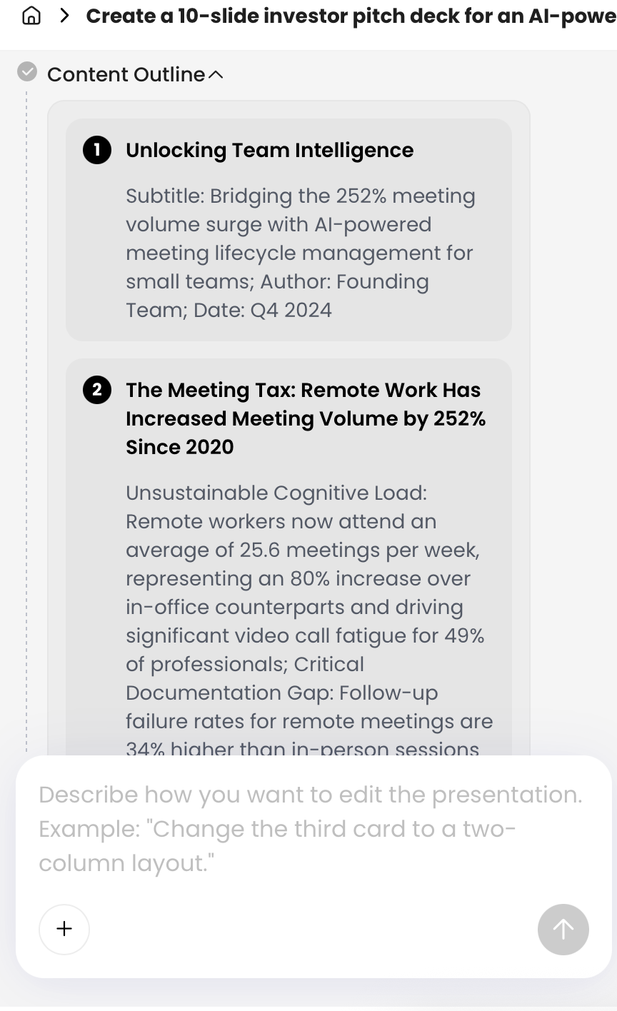
The outline review step is where many people save the most time. Instead of generating 12 slides and then discovering that the narrative is wrong, check whether the AI has understood the audience, decision, metrics, and sequence. For data presentations, the outline should usually move from “what changed” to “why it changed” to “what action should follow.”
For the sample marketing CSV, a useful 7-slide outline would be:
- Executive summary: Revenue grew faster than spend, but Social efficiency weakened.
- KPI snapshot: Spend, revenue, ROAS, leads, customers, and conversion rate.
- Monthly trend: Revenue and spend by month with April–June acceleration highlighted.
- Channel comparison: Search and Email outperform Social on ROAS and customer conversion.
- Efficiency risk: Social generated many leads but fewer customers per dollar.
- Budget recommendation: Shift 10–15% of low-efficiency Social spend toward Search and Email tests.
- Appendix: Data definitions, formulas, date range, and caveats.
A reliable prompt for CSV-based decks
Use a prompt that gives the AI boundaries. Avoid asking for “a presentation about this CSV.” Ask for a specific decision-support deck and tell the AI not to invent values outside the supplied summary.
Create a 7-slide executive presentation from the data summary below. Audience: VP of Marketing and channel owners. Goal: explain January–June 2026 campaign performance and recommend Q3 budget actions. Use only the numbers supplied. If a metric is missing, flag it as unavailable instead of estimating. Include slide titles that state insights, not labels. Required slides: executive summary, KPI snapshot, monthly trend, channel comparison, efficiency risk, budget recommendation, and appendix with formulas and caveats.
When using PopAi for this step, the most useful pattern is to provide verified source material first, review the generated outline, and then ask for revisions before producing the final slides. Natural-language revisions work well for narrative changes such as “make this more board-level” or “turn the recommendation into three options.” Use more detailed editing controls for layout, visual hierarchy, icons, chart styling, theme consistency, and slide density. After any AI rewrite, recheck the numbers against the source summary.
Choose the Right Charts for CSV Data to Presentation AI
Choose charts by question, not by whatever the AI happens to generate first.
AI may suggest attractive visuals, but chart choice is an analytical decision. Give the tool explicit chart instructions when the data contains time series, rankings, rates, or exceptions.
| Question | Best chart or slide type | Example use case |
|---|---|---|
| How did a metric change over time? | Line chart or area chart | Monthly revenue, churn rate, active users |
| Which category performed best? | Ranked bar chart | Top sales regions, best campaigns, highest-rated products |
| How does composition vary? | Stacked bar chart | Revenue by segment within each quarter |
| Are two variables related? | Scatter plot | Ad spend vs. revenue, discount vs. win rate |
| What are the headline numbers? | KPI cards | Total revenue, average deal size, conversion rate |
| Where are anomalies concentrated? | Heatmap or exception table | Support tickets by product and severity |
Common AI chart mistakes to prevent
- Pie charts with too many categories: Use a ranked bar chart when there are more than five categories or small differences.
- Line charts with irregular intervals: Use lines only when time periods are consistent. If weeks or months are missing, call that out.
- Stacked bars for exact comparison: Avoid stacked bars when the audience needs to compare segment values precisely.
- Raw counts across unequal groups: Use rates when group sizes differ, such as conversion rate instead of total conversions.
- Unexplained outliers: Label one-time events, data errors, or seasonality instead of letting AI overinterpret them.
- Misleading axes: Keep zero baselines for bars unless there is a clear reason and label units visibly.
Visualization analysis: In the sample marketing deck, use a line chart for monthly revenue and spend, a ranked bar chart for channel ROAS, KPI cards for total spend/revenue/customers, and an exception table for underperforming campaigns. Avoid asking for “impressive visuals.” Ask for “the simplest visual that supports the slide headline.”
For a CSV-to-slides deck, write slide titles as conclusions: “Revenue grew 27.6% while Social conversion weakened” is stronger than “Campaign Performance by Channel.” This helps the AI create a narrative rather than a gallery of disconnected graphics.
Prompt Templates for Common CSV Presentation Scenarios
Good prompts include required columns, KPI definitions, chart expectations, and validation rules.
Different audiences need different stories from the same data. A CFO may want margin and variance. A sales leader may want pipeline risk. A teacher may want patterns students can interpret. Use these prompt patterns as starting points and replace the bracketed items with your actual fields.
Sales pipeline review
Required columns: stage, amount, close_date, owner, region, probability, and last_activity_date. Useful KPIs: total pipeline, weighted pipeline, stage conversion, average deal size, stale opportunities, and forecast by close quarter. Weighted pipeline usually equals amount × probability.
Prompt: “Turn this sales CSV summary into an 8-slide pipeline review for regional sales managers. Highlight total pipeline, weighted pipeline, stage conversion, average deal size, stalled opportunities, regional differences, and next-step priorities. Do not treat open opportunities as closed revenue. Do not average opportunity IDs. Include a caveat slide for data freshness and probability assumptions.”
Marketing campaign performance
Required columns: channel, campaign_name, spend_usd, impressions, clicks, leads, customers, and revenue_usd. Useful KPIs: CAC = spend ÷ customers, ROAS = revenue ÷ spend, lead conversion = leads ÷ clicks, and customer conversion = customers ÷ leads.
Prompt: “Create a marketing leadership deck from this campaign data. Compare spend, leads, customer conversion rate, revenue, CAC, and ROAS by channel. Recommend budget reallocations only when the data supports them. Warn about small sample sizes and attribution lag. Use a line chart for monthly trend, ranked bar charts for channel comparison, and KPI cards for headline numbers.”
Finance or P&L summary
Required columns: period, account_category, actual, budget, forecast, currency, and business_unit. Useful KPIs: variance to budget, variance to forecast, gross margin = (revenue - cost_of_goods_sold) ÷ revenue, and expense mix.
Prompt: “Build a board-ready financial performance presentation using the provided monthly P&L summary. Show revenue, gross margin, operating expense categories, variance to plan, cash risks, and management actions. Keep tone factual and conservative. Do not present the deck as audited financial reporting. Include source period, currency, accounting basis, and unresolved data issues.”
Survey or classroom data
Required columns: respondent_id, question_id, response, group, and submitted_at. Useful checks: sample size, response rate, missing responses, demographic balance, and whether open-text comments have been anonymized.
Prompt: “Create a teaching presentation from this survey CSV summary. Explain the sample size, top findings, differences between groups, limitations, and discussion questions. Use accessible language for undergraduate students. Do not overstate representativeness. Separate quantitative results from open-text themes, and include a slide on bias and missing responses.”
PopAi editing tip: Use natural-language revision for slide purpose and narrative, such as “make slide 2 a KPI dashboard” or “turn slide 6 into three decision options.” Use Advanced Edit for layout, icons, chart styling, theme adjustments, and visual hierarchy. Avoid commands like “improve the numbers” unless the verified source data is attached and the calculation rule is explicit.
Validate AI-Generated Data Insights Before Presenting
Do not present an AI-generated data slide until the headline, chart, and source calculation agree.
AI can misread data. It may treat text IDs as numbers, infer a trend from incomplete periods, use the wrong denominator, or create a conclusion that sounds plausible but is not supported by the file. Validation is not optional, especially for finance, sales forecasts, regulated reporting, or executive decision meetings.
Check the numbers
Use this review checklist before sharing the deck:
- Recalculate headline KPIs: Verify totals, averages, rates, and percentages in the source spreadsheet.
- Check denominators: Confirm conversion rate, churn, ROAS, margin, and satisfaction scores use the right base.
- Inspect date ranges: Make sure partial months or missing weeks are not presented as complete periods.
- Review outliers: Decide whether extreme values are real, errors, or one-time events.
- Match chart labels to data: Check axes, units, currencies, and category names.
- Separate correlation from causation: Do not let AI imply that one metric caused another without evidence.
- Add caveats: Include limitations where the data is sampled, incomplete, self-reported, or operationally messy.
Validation walkthrough: revenue growth
Suppose the AI writes, “Revenue grew 27.6% from Q1 to Q2.” Verify it in the spreadsheet before keeping the headline. If Q1 revenue is $386,200 and Q2 revenue is $492,800, the formula is (492800 - 386200) ÷ 386200 = 27.6%. Then check whether Q2 contains three complete months. If June is a partial export, revise the title to “Reported Q2 revenue is up 27.6%, but June is incomplete” or remove the comparison.
For the sample marketing deck, also verify ROAS with revenue_usd ÷ spend_usd, CAC with spend_usd ÷ customers, and customer conversion rate with customers ÷ leads. If the AI claims Social is underperforming, confirm whether it is based on ROAS, CAC, conversion rate, or all three. A vague “underperforming” label is not enough for a budget recommendation.
Use AI as a drafting analyst, but require a human owner for calculations, caveats, and final sign-off.
Know when AI use is low, medium, or high risk
- Low risk: Public datasets, classroom exercises, anonymized sample data, or internal practice decks.
- Medium risk: Internal sales, marketing, operations, or support reports where numbers influence decisions but are not regulated disclosures.
- High risk: Board decks, financial reporting, medical data, legal records, HR data, client-confidential information, or datasets containing personal identifiers.
- Restricted use: Audited statements, legal disclosures, regulated personal data, and confidential client files unless your organization has approved controls, contracts, and review processes.
In high-risk contexts, AI may still be useful for formatting approved numbers, rewriting slide titles, or creating a template. It should not independently calculate, interpret, or recommend actions without expert review and documented assumptions.
Export, Edit, and Share Your AI-Generated Data Presentation
Test export behavior before you depend on an AI-generated deck in a live meeting.
After the slides are drafted and validated, the final mile is editability. Many tools can produce a good-looking deck, but users often discover too late that charts are flattened images, text is difficult to edit, or the layout does not match their PowerPoint template. Before committing to a workflow, test the export format you actually need.
Test PPTX editability before high-stakes use
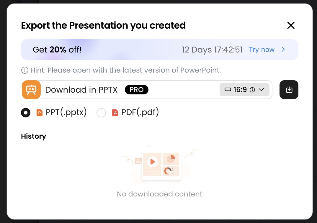
PopAi supports export options including PPTX and PDF. In a basic PPTX export check, the file opened in Microsoft PowerPoint and sample text boxes remained editable. Treat that as a starting point, not a guarantee for every object. Before using the workflow for leadership or client delivery, test whether your exported deck preserves text boxes, shapes, images, tables, speaker notes, fonts, layout spacing, and chart objects in your own PowerPoint environment.
Pay special attention to charts. Depending on how the deck is generated, charts may export as editable PowerPoint elements, grouped shapes, or static visuals. If the numbers are likely to change before the meeting, keep the verified chart source in Excel, Sheets, or your BI tool so you can update the slide quickly.
Use PDF for stable viewing
Use PDF when you need the layout to stay fixed for review, archiving, or external sharing. Use PPTX when stakeholders need to edit wording, apply a company template, add speaker notes, or combine slides with another deck. For sensitive decks, avoid public share links unless permissions are clear and approved.
What a strong final deck should include
- An executive summary that states the main finding in plain language.
- KPI slides that show the few metrics that matter most.
- Charts that match the question, not just the available columns.
- Slide-level source labels, including data range and refresh date.
- Definitions for derived metrics such as ROAS, CAC, churn, gross margin, or weighted pipeline.
- Record counts, filters applied, and aggregation method where they affect interpretation.
- Clear recommendations tied to verified evidence.
- A caveats slide or appendix for assumptions, limitations, data quality issues, and source summary.
Security and Automation Considerations for CSV-to-Slides Workflows
CSV files often contain more sensitive information than the final chart reveals.
Even if a file looks like “just numbers,” it may include customer names, employee IDs, transaction IDs, pricing, pipeline forecasts, health information, or confidential supplier details. Before uploading data to any AI tool, check your organization’s policy and remove fields that are not required for the presentation.
Sanitize the CSV before upload
- Remove names, emails, phone numbers, addresses, and account-level identifiers unless approved.
- Replace customer or employee names with anonymous segment labels.
- Aggregate raw transactions into monthly, regional, or category-level summaries.
- Exclude columns that are irrelevant to the presentation objective.
- Keep a local verified source file so the uploaded summary is not the only record.
Check vendor and workspace controls
For enterprise workflows, evaluate whether the tool supports your requirements for retention, access controls, audit logs, SSO, private workspaces, and model-training restrictions. Ask practical questions before uploading sensitive CSV-derived material:
- Is uploaded data used for model training?
- How long are uploaded files and generated decks retained?
- Can admins delete uploaded files and revoke shared links?
- Is data encrypted in transit and at rest?
- Are SSO, role-based permissions, and workspace restrictions available?
- Are access logs or audit logs available for enterprise users?
- Are subprocessors disclosed?
- Is a data processing agreement available if your organization requires one?
Automate only after validation
Automation can be useful when the risk is managed. Teams can build monthly workflows that pull data from a spreadsheet or BI export, generate a KPI summary, create a slide draft, and send it for review. However, automation should not remove human approval. A reliable production pattern is: automated draft, verified calculations, reviewed caveats, approved recommendations, then shared deck.
If nobody owns the source data, nobody should approve the AI-generated conclusion.
Practical governance rule: If you would not paste a CSV into an external email thread, do not upload it to an AI workflow without anonymization, approval, and a clear data-handling policy.
The safest CSV-to-presentation workflow is simple: prepare the data, summarize only what the audience needs, give the AI explicit instructions, validate every headline number, and export in the format your stakeholders can actually use. AI can shorten the path from spreadsheet to deck, but the credibility of the presentation still depends on your source data, definitions, and review process.
Frequently Asked Questions
Can AI turn CSV data into a PowerPoint presentation directly?
Yes. AI presentation tools can use uploaded files or structured data summaries to generate slide outlines, charts, narrative insights, and exportable decks. Always verify calculations and chart labels before presenting.
How should I prepare CSV data before uploading it to an AI presentation tool?
Clean column names, standardize dates and currency, remove duplicate rows, label ID fields, document missing values, and add a short data dictionary. This helps the AI choose better KPIs and visualizations.
Will the generated charts be editable after export?
It depends on the tool and export format. PopAi has been tested to export PPTX files that open in Microsoft PowerPoint with editable text objects, but users should not assume every chart, animation, or data object will remain fully editable.
Is it safe to upload business CSV files to AI tools?
Treat CSV files as sensitive. Remove personal data, confidential identifiers, and unneeded raw rows where possible. For regulated or enterprise use, review the vendor’s data retention, access control, SSO, audit, and model-training policies.
When should I avoid using AI for CSV-based presentations?
Avoid relying on AI alone for audited financial statements, legal filings, board minutes, regulated disclosures, or causal analysis that requires statistical modeling. Use AI for drafting, then require expert review.
Create your presentation with one click now
Turn structured data, reports, and ideas into a polished presentation workflow with AI-assisted outlines, layouts, editing, export, and sharing.
Start with PopAi AI Presentation