How to Design Section Divider Slides with AI: Examples & Prompts

If you are turning a 35-slide quarterly business review, training module, pitch deck, or data-heavy report into a live presentation, section divider slides do more than separate topics. They help the audience reset before the next decision, dataset, or learning objective.
This guide shows how to use AI to find section breaks, write stronger divider titles, generate layout directions, enforce brand rules, and QA the final deck. The practical goal is simple: your divider slides should make the presentation easier to follow without adding decoration for its own sake.
A quick preview: a weak divider says “Market Analysis” in the center of a generic background. A stronger one says “02 / Demand is rising, but trust is the adoption barrier,” uses a large section number, leaves generous whitespace, and visually connects to the evidence slides that follow.
Section Divider Sequence Example
Section dividers should help the audience understand the story structure, not just decorate a pause between topics.
Ask AI to create dividers as a connected sequence. The wording, color, icon style, and visual rhythm should make the deck feel intentional from beginning to end.
| Deck section | Divider title | Visual job | Risk to avoid |
|---|---|---|---|
| Context | Where We Are Starting | Set the baseline and orient the audience. | Using a decorative divider with no meaning. |
| Evidence | What the Data Shows | Signal a shift from background to proof. | Making the divider look like a chart slide. |
| Options | Three Paths Forward | Prepare the audience for a decision frame. | Using vague labels such as “Part 3.” |
| Decision | Recommended Next Step | Focus attention on action and ownership. | Ending with a divider instead of a clear recommendation. |
Ask AI to “create four section divider slide concepts that share one visual system but use distinct titles, icons, and colors to show narrative progression.”
What Section Divider Slides with AI Actually Do
A section divider slide, sometimes called a chapter divider, is a full slide placed between major parts of a presentation. It is different from a PowerPoint Section, which is an editing feature used to group slides inside the file. The divider slide is visible to the audience; it signals, “We have finished one idea, and here is the next one.”
AI is useful only when it supports two separate jobs: structural sectioning and visual divider design. Keep those jobs separate when you review the output.
How AI finds section breaks
AI can scan a deck or source document and group slides by argument flow, audience question, decision stage, module, product journey, or evidence type. For example, in a 28-slide recommendation deck, an AI tool might suggest four sections: Problem, Evidence, Recommendation, and Rollout. A designer might then merge Evidence and Recommendation if the executive audience needs a faster path to decision.
Case note: In a typical board update, section breaks often belong at changes in executive question: “What happened?” “Why did it happen?” “What are we doing about it?” and “What decision is needed?” If AI groups slides by department instead—Marketing, Sales, Product, Finance—the deck may look organized but still feel hard to follow because the audience’s decision flow is missing.
Good section breaks usually meet at least two of these criteria:
- The audience question changes.
- The presenter moves from context to evidence, evidence to implication, or implication to action.
- The visual density of the deck needs a pause after several charts or tables.
- The next slides require a different mental frame, such as risk, customer voice, product workflow, or implementation.
- The agenda item is important enough to help people relocate themselves if they tune out for a moment.
How AI turns section breaks into divider slides
Once the structure is right, AI can propose concise titles, one-line takeaways, section numbering, progress indicators, icon styles, image treatments, and layout variations. The human review is still essential: check whether each divider title accurately represents the slides that follow and whether the visual system feels like part of the same deck.
A strong divider is not decoration. It is a navigation device that protects audience attention at the exact moment the story changes direction.
In practice, a good divider usually includes a short chapter title, optional section number, visual whitespace, and a restrained brand cue. Advanced dividers may include a one-line takeaway such as “Retention improved after onboarding friction was reduced” rather than a generic label like “Results.” AI is especially useful for making that shift from folder-style labels to audience-facing narrative statements.
When to Use Section Divider Slides with AI—and When Not To
For a broader view of available tools, compare the latest AI presentation makers before choosing the workflow that best fits your team.
Use full section divider slides when the deck has real narrative turns; use lighter cues when the deck simply needs pacing.
Section divider slides are particularly valuable in executive briefings, consulting-style recommendations, annual reviews, academic lectures, onboarding courses, marketing proposals, product catalogs, and e-learning modules. They are less useful when a short deck needs speed, such as a six-slide sales introduction or a founder pitch where every transition should feel immediate.
The common “three to five sections” guideline is a practical presentation-design heuristic, not a rule. In many business decks, three to five dividers create enough structure without interrupting momentum. In workshops and training, five to seven module dividers may be appropriate because the audience needs to track time, learning objectives, and exercises.
Workflow estimate: In a messy 30-slide deck, manually identifying section breaks, rewriting divider titles, and checking agenda consistency can easily take 30 minutes or more. AI can shorten the first draft of that work, but the time savings depend on how clean the source material is and whether your brand template is already defined.
| Deck situation | Recommended divider approach | Why |
|---|---|---|
| 8-slide sales deck | Use small transition headers or agenda progress, not full dividers | Full divider slides can slow the pitch and inflate slide count. |
| 25-slide board update | Use 3–4 clean dividers with decision-oriented titles | Executives need fast orientation around performance, risks, priorities, and asks. |
| 40-slide analytics report | Use data-led dividers after dense chart sections | Dividers give the audience a reset before interpreting the next evidence set. |
| 60-minute training deck | Use 5–7 module dividers with time and learning objective | Learners benefit from clear module boundaries and progress cues. |
- Use dividers when the audience must remember a sequence: context, insight, decision, action.
- Use dividers when charts, tables, and dense evidence need breathing room.
- Use subtle transition cues when the topic shift is small but the audience still needs orientation.
- Avoid heavy dividers in short sales decks where speed and momentum matter more than chaptering.
- Avoid ornate dividers when they compete with the main message or make every transition feel equally important.
A Practical AI Workflow for Section Divider Slides
A reliable workflow moves from structure to wording to layout to QA; do not ask AI to design final dividers before it understands the deck logic.
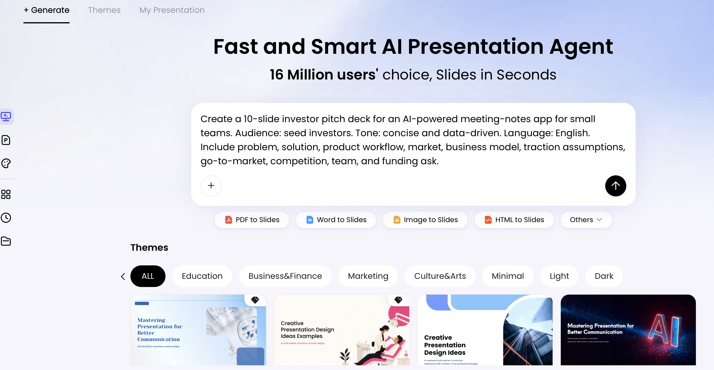
Start with the best source you have: an existing PPTX, a PDF report, a meeting agenda, a transcript, or a rough outline. In PopAi AI Presentation, for example, you can begin from a prompt or upload source files, then use the generated outline as the place to review proposed section breaks before committing to slide design.
Step 1: Upload or describe the deck
Give AI the same brief you would give a presentation designer: audience, meeting type, decision needed, desired tone, slide count, brand constraints, and file format. If the deck already exists, ask the AI to analyze the argument rather than simply count slides.
Prompt: “Review this 32-slide deck for a CFO and operations leadership audience. Identify the natural section breaks based on the decision flow, not department names. For each proposed section, list the slide range, audience question, and why the break belongs there.”
Step 2: Review the proposed sectioning
Do not accept the first outline automatically. AI often over-sections decks because it treats every topic change as a chapter. Check whether each section contains enough content to justify a divider and whether adjacent sections could be merged for a smoother story.
Expected output to inspect: slide ranges, proposed section names, rationale, and any slides that do not clearly belong. If the AI invents a section that is not supported by the slides, ask it to regroup using only the uploaded material.
Step 3: Rewrite section names as audience-facing takeaways
Once the section breaks are right, improve the divider titles. A divider title should usually be shorter than a slide headline and easier to read aloud. For live presentations, aim for under nine words where possible.
Prompt: “Rewrite these section names as divider slide titles. Provide three tones for each: neutral, executive, and persuasive. Keep each title under 9 words. Do not use vague labels such as Overview, Results, Insights, or Next Steps unless they are paired with a specific point.”
Step 4: Generate layout directions before final slides
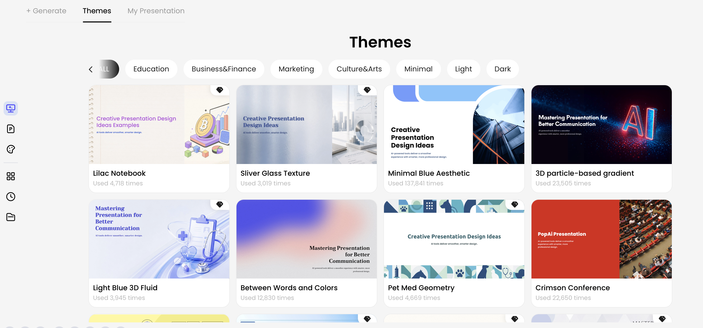
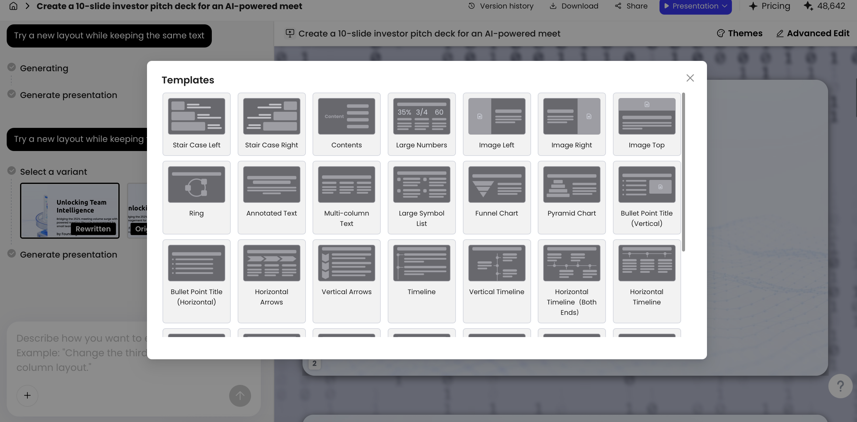
Ask for layout concepts first, then choose the system. This prevents AI from making every divider visually different. For most professional decks, the dividers should feel like variations of one pattern, not a theme gallery.
Prompt: “Create three divider layout directions for this deck: 1) minimal numbered, 2) agenda-progress, and 3) data-led. For each, describe title placement, section number size, visual anchor, color use, and what should remain editable in PPTX.”
Step 5: Apply brand and accessibility constraints
After selecting the direction, give explicit rules: font family, title size range, accent colors, logo safe area, icon style, contrast requirement, and whether images are allowed. If you use a company template, ask AI to follow the existing slide master or uploaded PPTX template rather than inventing a new style.
Prompt: “Apply the uploaded company template. Use the same typography scale as the title and content slides. Keep logo placement unchanged. Use only navy, white, and the approved accent green. Ensure high contrast and avoid placing text on busy image areas.”
Step 6: QA in slide sorter before export
Review all dividers together in slide sorter view. This is where inconsistencies become obvious: one divider has an icon, another has a photo, a third uses a different title size, and the progress indicator skips a number. Fix the system before polishing individual slides.
Practical workflow tip: Generate the outline first, approve the section breaks, choose one divider pattern, then ask for natural-language refinements such as “make all divider slides use the same left-aligned number/title structure and update the progress numbering.”
If your team is still selecting software, compare whether different AI presentation makers can analyze existing decks, preserve brand templates, revise individual slides through prompts, and export editable PPTX files. Divider quality depends less on a pretty template and more on whether the tool respects the deck’s structure.
Prompt Library for AI Section Divider Slides
Good prompts are specific about audience, purpose, section count, title style, visual constraints, and output format. Use the following prompts as starting points and edit the bracketed details for your presentation.
Prompt anatomy: what to include
- Audience: board, sales prospect, learners, investors, internal team.
- Purpose: decision, update, training, persuasion, reporting, onboarding.
- Section logic: decision flow, customer journey, product workflow, learning modules, timeline.
- Title style: neutral, conclusion-style, provocative, instructional, executive.
- Visual constraints: brand colors, type hierarchy, icon style, image use, progress markers.
- Negative instructions: no bullet lists, no stock-photo clichés, no decorative fonts, no clutter, no invented data.
- Output format: table, slide-by-slide plan, editable PPTX, three variations per divider.
Structure prompt for a messy existing deck
“Analyze this deck and propose 4–5 section breaks. Use only the uploaded slides. For each section, provide slide range, audience question, proposed divider title, and one sentence explaining the transition. Flag any slides that feel out of sequence.”
Consulting or strategy report
“Create 4 section divider slides for a consulting deck about [topic]. Use numbered chapters, concise conclusion-style titles, one data-backed takeaway per section, and a minimal executive design with strong whitespace. Do not use bullet lists or decorative icons.”
SaaS sales pitch
“Turn this product pitch into 5 sections: customer pain, workflow gap, product solution, proof, rollout plan. Write energetic divider titles under 8 words and design each as a clean transition slide using brand blue, geometric blocks, and one consistent line-icon style.”
Training or course module
“Generate chapter divider slides for a 60-minute training session. Each divider should show the module number, learning objective, estimated time, and a calm educational visual style. Keep the layout consistent and make all text readable from the back of a classroom.”
Annual business review
“Create section breaks for an annual review deck. Use sections for performance snapshot, growth drivers, risks, priorities, and next actions. Each divider should include one executive takeaway and a subtle progress indicator. Use no more than one metric per divider.”
Revision prompt when AI makes dividers too decorative
“Simplify all divider slides. Remove decorative illustrations, reduce each divider to section number, title, optional one-line takeaway, and one consistent visual anchor. Match the typography and spacing of the uploaded template.”
QA prompt for consistency
“Audit the deck for divider consistency. List any mismatch between agenda labels, divider titles, section numbers, progress indicators, and slide order. Suggest exact corrections without changing the content slides.”
Ask AI to name the chapter as the point you want remembered, not the folder where slides happen to belong.
A strong prompt does not need to be long, but it must remove ambiguity. The most common failure is asking for “professional section dividers” and receiving attractive slides that do not match the deck’s argument, brand, or pacing.
Design Patterns That Work for Section Divider Slides
The best divider pattern depends on how much orientation the audience needs at that moment: a board may need restraint, a workshop may need progress, and a report may need one anchoring metric.
Minimal numbered divider
Best for: executive decks, board updates, investor presentations, consulting reports. Use a large section number, a short left-aligned title, and a small accent line or color block. Keep the logo in the same position as the master template.
Design notes: Put the number at 20–35% of slide height, title at 36–48 pt for live projection, and keep the title under one line when possible. Avoid centered title-only layouts if the rest of the deck uses strong grid alignment.
Prompt instruction: “Use a minimal numbered divider with a large ‘02’ on the left, title aligned to the same grid as body slides, no bullets, no icons, and generous whitespace.”
Agenda-progress divider
Best for: workshops, training, long webinars, product walkthroughs. Show all sections in a small progress rail and highlight the current one.
Avoid when: the deck has only two or three sections, or when the progress rail becomes tiny and unreadable. For color-blind accessibility, do not rely on color alone; use weight, shape, or underline to identify the current section.
Prompt instruction: “Create an agenda-progress divider with five section names across the bottom. Highlight the active section with both color and bold weight. Keep inactive section labels readable but secondary.”
Data-led divider
Best for: business reviews, analytics decks, financial updates. Use one metric to frame the next section, not a full chart. For example: “03 / Margin pressure is concentrated in two operating areas” supported by “-4.2 pts margin impact.”
Avoid when: the metric requires explanation, caveats, or source notes that would crowd the divider. In those cases, place the chart on the first content slide after the divider.
Prompt instruction: “Design a data-led divider using one large metric and one takeaway title. Do not include axes, legends, or multi-series charts. Leave room for a source note only if required.”
Image-led divider
Best for: brand storytelling, education, customer journeys, nonprofit narratives. Use one strong image with a restrained overlay, but only if the image clarifies the section’s emotional or practical context.
Avoid when: the image is generic, too busy, or makes text contrast unreliable. Stock photos of handshakes, laptops, and abstract teamwork often make dividers feel less credible.
Prompt instruction: “Use a full-bleed image only if it supports the section theme. Add a dark overlay if needed for contrast. Keep title and number in editable text, not flattened into the image.”
Quote-led divider
Best for: customer research, employee engagement, stakeholder voice, leadership messages. A quote can give the next section a human reason to matter.
Avoid when: the quote is too long, anonymous, or not directly connected to the slides that follow. One sentence is usually enough; the divider should not become a testimonial slide.
Prompt instruction: “Create a quote-led divider using one verified customer quote under 18 words, section number, and chapter title. Keep the quote secondary to the title.”
Analysis: Divider slides should usually have lower information density than standard content slides. A useful design target is two to four main elements: number, title, optional takeaway, and visual anchor. That reduction creates the reset. When every divider is packed with charts, bullets, icons, and imagery, the transition effect disappears.
Keep AI Section Dividers On Brand and Readable
AI-generated dividers often fail not because they look bad, but because they look imported from another deck. Brand and accessibility checks should be part of the prompt and part of the final review.
Tell AI to reuse the same title hierarchy, brand colors, logo safe area, icon stroke weight, image treatment, and spacing rhythm already present in your slides. If you use a template-led workflow, upload the official PPTX template or brand sample and ask the tool to preserve the master layout rules instead of inventing new ones.
Practical accessibility benchmark: For live presentations, divider titles are usually safest at 34 pt or larger, with strong contrast against the background. WCAG contrast guidance of 4.5:1 for normal text and 3:1 for large text is a useful reference point, even for slide decks. If the room is bright, the projector is weak, or the deck will be viewed on mobile, increase contrast rather than relying on subtle gradients.
Case note: In a sales enablement deck review, a set of AI-generated dividers looked polished on a laptop but failed in conference-room projection because light gray titles sat over pale gradients. The fix was not a redesign; it was a stricter rule: dark text on light backgrounds or white text on a solid brand-color block, with no text over gradient transitions.
Use this brand consistency prompt before finalizing dividers: “Audit all section divider slides against the uploaded template. Match font family, title size, logo position, safe margins, accent colors, icon style, and progress indicator placement. Flag any divider that uses off-brand imagery or low-contrast text.”
Quality checklist for every divider
- Does the title explain the point of the next section, not just its topic?
- Does the divider match the agenda wording and numbering exactly?
- Is the main title readable in three seconds from the back of the room?
- Is text contrast strong enough after PDF export and projection?
- Are the same fonts, logo position, icon style, and accent colors used across all dividers?
- Is the section number or progress marker consistent and correctly ordered?
- Is there enough whitespace for a real pause?
- Does it add orientation rather than visual noise?
Before and After: Turning Bland Dividers into Narrative Slides
The fastest improvement is usually copy first, layout second. A bland divider labels the next folder of slides; a narrative divider frames how the audience should interpret them.
Complete before/after example:
- Before title: “Section 2: Market Analysis”
- Problems: vague topic label, no point of view, centered text with weak hierarchy, generic background image, no connection to the charts that follow.
- After title: “02 / Demand is rising, but trust is the adoption barrier.”
- Layout: large “02” on the left, title in the upper-left grid, muted chart texture or simple line pattern on the right, small progress marker at the bottom, no bullet list.
- Why it works: the audience now knows the next section will not simply describe the market; it will explain a tension that affects adoption.
AI prompt used: “Rewrite ‘Market Analysis’ as three divider titles for an executive product strategy deck. Each title should state the market implication, stay under 10 words, and prepare the audience for charts about demand growth, buyer skepticism, and adoption barriers.”
Refinement prompt: “Use the second title. Design a minimal numbered divider: large 02, left-aligned title, subtle chart texture, no stock photo, no bullets, high contrast, and editable text.”
Here are three more practical transformations:
- Before: “Part 1: Background”
After: “01 / The current workflow costs teams time they cannot recover.” - Before: “Financials”
After: “03 / Margin pressure is concentrated in two operating areas.” - Before: “Implementation”
After: “04 / A phased rollout reduces risk while proving value quickly.”
Analysis: The “after” examples create a narrative contract: they tell the audience what lens to use when interpreting the next few slides. This is especially useful in data-heavy presentations, where people may see charts before they understand the argument. The divider primes attention and lowers cognitive load.
Conclusion-style titles are not always the right choice. In compliance training, scientific reporting, legal updates, or academic presentations, a neutral title such as “Module 3: Reporting Requirements” may be more appropriate than a persuasive claim. Ask AI for three tones per section—neutral, executive, and persuasive—then choose the one that matches the stakes and culture of the room.
Export, Maintenance, and Common Mistakes
AI-generated divider slides still need human QA, especially when you move from a web editor to PPTX, PDF, Google Slides, or a conference-room machine.
After AI creates the divider slides, test the deck in the format you will actually present. If you export to PPTX, confirm that titles, section numbers, and progress markers remain editable text objects rather than flattened images. If you export to PDF, inspect gradients, contrast, image crops, and line breaks at full-screen size.
Maintenance is another overlooked issue. If you add or remove a chapter, update the agenda, divider numbers, progress indicators, section titles, and presenter notes together. AI can help by renumbering dividers and rewriting the agenda to match, but you should still do a final scan in slide sorter view.
Final QA workflow before presenting
- Review slide sorter: confirm divider placement, pacing, section order, and visual consistency.
- Compare agenda and dividers: check that names, numbers, and progress indicators match exactly.
- Test presentation mode: verify readability, contrast, animation behavior, and transition timing.
- Export to PDF: inspect text clarity, gradients, image crops, and any transparency effects.
- Open PPTX on another machine: check font substitution, object shifts, and missing images.
- Check editability: make sure section titles and numbers can still be edited by collaborators.
- Version control: keep one owner for final divider numbering if multiple people are editing the deck.
Common AI-specific mistakes and fixes
| Mistake | What it looks like | How to fix it |
|---|---|---|
| Over-designed dividers | Each section uses different icons, images, gradients, or compositions. | Ask AI to apply one divider system with controlled variations only. |
| Generic labels | Titles such as “Overview,” “Data,” “Findings,” or “Next Steps.” | Request titles that state the point of the next section in under 9 words. |
| Wrong section breaks | A divider appears between slides that are part of the same argument. | Ask AI to regroup by audience question or decision flow, not topic keywords. |
| Agenda mismatch | The agenda says “Risks” while the divider says “Barriers,” or numbering skips. | Use a QA prompt to list all agenda-divider inconsistencies. |
| Low-contrast export | Text looks readable in the editor but weak in PDF or projection. | Use solid backgrounds, stronger contrast, and avoid text over busy images. |
| Non-editable text | Divider titles export as images and cannot be revised in PowerPoint. | Request editable PPTX objects and test before sharing with collaborators. |
Maintenance prompt: “Renumber all section divider slides, update agenda labels to match, and list any mismatch between divider titles, progress indicators, and slide order. Do not change body-slide content.”
The goal is not to make every transition dramatic. The goal is to make the audience feel oriented. When section divider slides are designed with AI thoughtfully, they become a rhythm system for the deck: context, pause, next idea, evidence, decision.
FAQ: Section Divider Slides with AI
What is a section divider slide?
A section divider slide is a full slide placed between major parts of a presentation. It signals a topic shift, resets audience attention, and introduces the next chapter with a number, title, visual cue, or short takeaway.
Is a section divider the same as a PowerPoint section?
No. PowerPoint Sections are an editing and organization feature used inside the file. A section divider slide is visible to the audience and works as a narrative transition page.
How many section divider slides should a presentation have?
Most business presentations work best with three to five section divider slides. More than six often means the deck is over-fragmented, while short decks under ten slides may not need dividers at all.
Can AI generate section dividers from an existing deck?
Yes. AI can analyze an existing deck or source document, group slides into chapters, suggest stronger section names, generate takeaway lines, and apply a consistent visual layout.
What should go on a section divider slide?
Use a short section title, optional section number, a concise takeaway, and restrained brand visuals. Avoid dense bullet lists because the purpose is transition and orientation, not detailed explanation.
Create your presentation with one click now
Turn your outline, report, or existing deck into a structured presentation with clear section breaks, consistent layouts, and editable export options.
Start with PopAi AI Presentation