How to Create Diagrams and Flowcharts with AI Presentation Tools
Published on August 19, 2026

A common presentation problem looks like this: a project manager has 45 minutes of meeting notes describing a 12-step approval process, but the executive deck needs one clear slide showing where the delay happens. The hard part is not drawing boxes and arrows; it is extracting the real sequence, removing side conversations, choosing the right diagram type, and making the result readable in a 16:9 slide.
This guide shows a practical workflow for creating diagrams and flowcharts with AI presentation tools: prepare messy source material, prompt for the right structure, generate a first diagram slide, edit it for presentation use, validate the logic, and export or share it without losing clarity. It is most useful for trainers, product managers, consultants, technical leads, and operations teams who need PPTX-ready visuals rather than unlimited whiteboard canvases.
Fast path: Start with your notes or source file, ask the AI to extract steps and decisions, generate a slide-constrained diagram, then edit labels, branches, and emphasis before exporting. Treat the first result as a structured draft, not a finished process document.
Why AI Presentation Diagram Creation Works Best with a Slide-First Mindset
Start by deciding what the audience must understand in 10 seconds.
Many AI diagram generators focus on producing a canvas: a flowchart, UML sequence, ERD, or architecture map. That is useful for exploration, especially in engineering or collaborative whiteboarding. Presentations need one more layer: sequencing. Your diagram should support a message such as “customers abandon onboarding at identity verification,” “the new approval workflow removes two handoffs,” or “the revised architecture separates customer data from analytics workloads.”
In hands-on presentation production, three tool routes show up repeatedly. Specialized diagram generators convert requirements or nested lists into diagrams. Large language models create Mermaid or PlantUML syntax for technical rendering. Whiteboard tools support collaborative editing and comments. AI presentation tools solve a different problem: adapting the diagram into a slide story, deciding what belongs on one slide, what needs a build animation, and what should move to an appendix.
Before asking AI to draw, ask what the audience must conclude after seeing the diagram. That conclusion should shape the level of detail, labels, colors, and slide order.
For slide-first work, use AI as a structure partner. It can extract actors, decisions, handoffs, inputs, outputs, and exceptions. Then you decide the layer of detail. A leadership audience may need a five-step business process with one risk marker. A technical audience may need a system context diagram followed by a data-flow view. A classroom audience may need a four-step procedure with icons, common mistakes, and a practice prompt.
Case example: In an operations review deck, a 20-node procurement process is usually too dense for one slide. A better AI-assisted version is a three-slide sequence: an executive summary with five phases, a swimlane showing the two slow handoffs, and an appendix slide with the full exception path. The diagram becomes easier to present because each slide has one job.
AI Diagram Tool Fit: Choose the Workflow Before You Generate
SERP intent for AI diagram searches is practical: people want to know which tool can make which diagram, whether it remains editable, and how it fits a presentation workflow.
Use the comparison below as a workflow map, then verify current product features, export formats, and collaboration limits on the official product pages before standardizing a team process.
| Workflow | Best fit | Editable output to verify | Use when |
|---|---|---|---|
| Presentation AI such as PopAi | Slide-first process maps and simple business diagrams | Editable slide objects / exported deck, depending on workflow | The diagram belongs inside a presentation and must support a narrative. |
| Whiteboard tools such as Miro | Collaborative journey maps, workshops, brainstorming | Board objects, export formats, and permissions | The team needs to co-create before converting into slides. |
| Diagramming tools such as Lucidchart | Formal flowcharts, org charts, systems, and architecture | Native diagram files plus presentation exports | Accuracy, governance, and reusable diagrams matter more than speed. |
| Diagram-as-code such as Mermaid or PlantUML | Technical flows that need version control | Text source plus rendered diagrams | Engineers or analysts need maintainable source logic. |
| Design tools such as Canva | Polished simple visuals for non-technical decks | Visual editor and export options | The message is simple and visual polish is the main task. |
When a diagram represents a real workflow, system, or customer journey, keep a source note that says where the steps came from and who approved the final version. AI can make a diagram clearer; it should not invent process steps or ownership.
Before/After Example: From Messy Notes to a Slide-Ready Flowchart
Messy source notes
- Client submits intake form.
- Ops checks fields, but sometimes finance needs to approve.
- If missing info, send back to customer success.
- Approved requests go to implementation.
- Status is updated in CRM later.
Slide-ready flow
- Intake received
- Completeness check
- Finance approval if budget impact exists
- Implementation handoff
- CRM status update
Visual treatment: five-step horizontal flow with one decision diamond at finance approval and one owner label under each step.
Prepare Messy Notes Before You Create Diagrams with AI Presentation Tools
Clean the logic before you ask AI to design the visual.
Do not paste a long transcript and expect a perfect slide. First ask AI to normalize the material. This is especially important when your source is a meeting recording, product requirement document, customer support process, training policy, or architecture notes collected from several stakeholders.
Step 1: Extract roles, actions, decisions, and exceptions
Use a cleanup prompt before the diagram prompt:
From the notes below, extract a structured process table with columns for Step, Owner, Action, Input, Output, Decision, Exception, and Open Question. Do not invent missing steps. If the notes conflict, flag the conflict instead of resolving it silently.
Messy input example: “Customer submits request. Sales sometimes reviews it, unless it is under $5K. Finance checks payment terms. Legal only gets involved for custom terms. Someone sends approval, not sure if Ops or Sales. If rejected, customer needs updated quote.”
Cleaned extraction example: Start: customer submits request. Decision: deal value under or over $5K. Owner: Sales reviews standard requests. Finance reviews payment terms. Legal reviews custom terms. Open question: who sends final approval. Exception: rejected request returns to quote revision. This cleaned version is now suitable for a flowchart or swimlane.
Step 2: Resolve missing or conflicting logic
- Ask for open questions: “Which steps need stakeholder confirmation before diagramming?”
- Separate happy path from exceptions: Put the normal process on the main slide and exceptions in a callout or backup slide.
- Confirm ownership: Swimlanes are only useful when lane assignments are correct.
- Block hallucinations: Tell the AI to label uncertain steps as “TBD” instead of filling gaps.
Step 3: Choose a diagram type before generating slides
Choose the format from the logic, not from the template gallery. Use a flowchart for decisions, a swimlane for handoffs, a user flow for screens, a process map for phases, and an architecture diagram for systems or data movement.
Step 4: Generate a slide-constrained version
Once the logic is clean, add slide constraints: “no more than eight visible nodes,” “short verb-led labels,” “16:9 layout,” “one takeaway title,” and “move exceptions to a second slide.” These constraints prevent the AI from creating a diagram that is technically complete but impossible to read in a presentation.
PopAi AI Presentation is useful for this source-to-slide workflow because you can begin from a prompt or bring in materials such as a PDF policy, Word procedure, PPTX audit, image of a whiteboard, audio recording, video, YouTube URL, Markdown brief, or plain text notes. In practice: a policy PDF can become a compliance process map, a meeting transcript can become a decision flow, a whiteboard photo can become a cleaned flowchart, and a training video can become an instructional workflow slide.
Workflow observation: The biggest time savings usually come before the diagram is drawn. In a typical 45-minute process meeting, the transcript may contain side comments, repeated steps, and unresolved ownership. AI can extract a first structure in minutes, but the human reviewer still needs to confirm the business rule, owner, and exception path. That review prevents the most expensive mistake: a polished diagram with wrong logic.
Choose the Right Diagram Type for the Story You Need to Tell
Match the diagram type to the question your slide answers.
A workflow diagram is not interchangeable with a data-flow diagram. A swimlane is not just a wider flowchart. Choosing the wrong format forces the audience to decode structure while you are speaking. Choosing the right one makes the visual feel obvious.
| Diagram type | Best for | Avoid when | Prompt keywords | Common AI failure |
|---|---|---|---|---|
| Flowchart | Sequential steps, decisions, yes/no branches, approval paths | The main issue is ownership across teams | start node, end node, decision branches, exception path | Unlabeled branches such as “yes/no” without clear conditions |
| Swimlane | Role handoffs across teams, departments, or systems | There are more than five lanes or unclear ownership | lanes, handoffs, approvals, waiting points, rework loop | Putting steps in the wrong lane or hiding shared responsibility |
| User flow | Product onboarding, checkout, feature adoption, support journeys | You need backend architecture rather than user decisions | screens, user action, system response, drop-off, activation | Showing every screen instead of the critical conversion path |
| Architecture diagram | System components, integrations, cloud services, data movement | The audience only needs a business process | system boundary, data flow, API, service, datastore, security zone | Mixing logical architecture, deployment architecture, and vendor icons |
| Process map | Operations, policy, training, service delivery, compliance workflows | The process depends on many conditional branches | phase, owner, input, output, policy checkpoint, exception | Crowding exceptions into the main path |
| Decision tree | Triage, eligibility, routing rules, support scripts | The process is mostly linear | criteria, branch label, outcome, mutually exclusive conditions | Creating overlapping conditions that lead to ambiguous outcomes |
| Timeline or roadmap | Milestones, phased rollouts, implementation plans | You need to show decision logic or handoffs | phase, milestone, dependency, date, owner | Turning a timeline into a vague list without dependencies |
| Data-flow diagram | How information moves between users, services, databases, and vendors | You need to show UI screens or task ownership | source, destination, data object, direction, storage, trust boundary | Reversing arrows or confusing data movement with control flow |
If you are comparing ecosystems, evaluate not only diagram quality but also export, editing, collaboration, privacy controls, and PowerPoint readiness. Some AI presentation makers prioritize full-deck generation, while whiteboard tools prioritize collaboration and diagram-as-code tools prioritize technical precision.
| Tool category | Use when | Strength | Watch out for |
|---|---|---|---|
| AI presentation tools | You need diagram slides inside a deck | Fast outline-to-slide workflow, theme consistency, PPTX/PDF handoff | Generated diagrams may need manual logic review and shape cleanup |
| Whiteboard tools | Teams need to brainstorm, comment, and move nodes collaboratively | Flexible canvas and stakeholder review | Outputs may be too large or informal for executive slides |
| Diagram-as-code tools | Engineering teams need versioned, precise diagrams | Mermaid, PlantUML, and similar syntax can be reviewed like code | Not always presentation-friendly without redesign |
| Dedicated diagram generators | You need a precise standalone flowchart, ERD, UML, or org chart | More diagram controls and symbol libraries | May require extra work to fit a slide narrative |
| PowerPoint-native editing | The final deck must be adjusted by stakeholders in Microsoft Office | Familiar editing, comments, and corporate templates | Complex connectors and imported images may not remain fully editable |
Prompt Templates to Create Diagrams with AI Presentation Tools
Write prompts that define the logic, the audience, and the slide constraints.
The best diagram prompts are not poetic; they are operational. They define boundaries, force the AI to expose uncertainty, and specify how much detail can fit on the slide. Use these templates as starting points and replace the bracketed details with your own material.
Business process flowchart prompt
Create a presentation-ready flowchart for [process name]. Audience: [executives/new hires/client]. Start node: [start]. End node: [end]. Include these steps: [steps]. Include decision points for [conditions]. Show exception paths for [exceptions]. Use short verb-led labels, no more than eight main nodes, and suggest a slide title with one key takeaway. If any step is uncertain, mark it “Confirm” instead of inventing details.
Follow-up prompt: “Reduce the flowchart to six main nodes, move exception paths to a second slide, and highlight the decision point that causes the most delay.”
Swimlane prompt for handoffs
Create a swimlane diagram for [process]. Lanes: [Customer], [Sales], [Finance], [Legal], [System]. Show only the main path plus the most important rework loop. Identify handoffs, waiting points, approvals, and ownership gaps. Use a left-to-right layout, no more than five lanes, and mark the highest-risk handoff in a contrasting color. Add a one-sentence takeaway title.
Sample use: For a contract approval workflow, ask the AI to flag where Sales hands work to Finance and where Legal review begins. Then confirm those lane assignments with the actual process owner before presenting; swimlanes are persuasive only when responsibility is correct.
User flow prompt for product teams
Turn these onboarding notes into a user flow slide. Audience: product leadership. Include user actions, system responses, decision points, and likely drop-off risks. Group screens into stages rather than showing every screen. Highlight the step most likely to affect activation rate or time-to-value. Use no more than seven visible nodes on the main slide.
Follow-up prompt: “Create a second slide that zooms into the friction point and lists three product experiments to reduce drop-off.”
Technical architecture prompt
Technical diagrams need stricter boundaries than business flowcharts. Ask the AI to separate user interface, application services, data stores, third-party integrations, security boundaries, observability, and data direction. Do not let it blend logical architecture with deployment architecture unless you specifically need both.
Extract components from the notes below and create two outputs: first, Mermaid syntax for a system context diagram that engineers can review; second, a simplified presentation slide outline for non-technical stakeholders. Show system boundaries, external services, data stores, and data direction. Do not invent cloud services, databases, or security controls not mentioned in the notes. Mark unknown integrations as “Confirm.”
Technical workflow: generate the component list, review Mermaid or PlantUML with engineering, confirm data direction and trust boundaries, then convert the approved structure into a simplified slide. Keep the detailed version in the appendix for Q&A.
Training workflow prompt
For instructional design, specify the learning objective, learner level, procedure steps, common mistakes, practice activity, and assessment check. Training diagrams should show what learners must do, not every policy detail behind the procedure.
Turn this procedure into a four-step training workflow for [novice/intermediate/advanced] learners. Learning objective: [objective]. For each step, include one action verb, one short instruction, one common mistake, and one icon suggestion. Keep the main slide simple enough for a five-minute explanation. Add a final knowledge-check question and speaker notes for the trainer.
Before/after example: A policy paragraph that says “Employees must identify hazards, notify a supervisor, isolate the area when safe, and complete the incident report within 24 hours” becomes four teachable steps: Identify hazard, Notify supervisor, Isolate area, File report. The exceptions and deadlines can sit in speaker notes or a second slide instead of overcrowding the workflow graphic.
Revision prompts that save time: “Convert this flowchart into a swimlane,” “remove duplicate nodes,” “split this into overview and exception slides,” “make labels executive-friendly,” “add alt text for the diagram,” and “create a 30-second speaker explanation.”
Turn AI Diagrams into Presentation-Ready Slides
Edit the first draft for readability, emphasis, and PowerPoint handoff.
After AI generates the first visual, reduce cognitive load. A slide diagram should have a clear entry point, visible reading direction, consistent shapes, and a single emphasis. If every node is bright, nothing is important. If every exception path is included, the main story disappears.
Edit labels and structure first
- One message: Write the slide title as the conclusion, not the topic. Use “Two approval handoffs create the delay,” not “Approval process.”
- Readable labels: Use verb-led phrases such as “Validate request,” “Route to approver,” or “Send revised quote.”
- Node limit: Keep the main slide to roughly 5–9 nodes. Move dense logic into backup slides.
- Decision clarity: Label branches with real conditions such as “Custom terms?” or “Over $5K?” instead of generic yes/no labels.
Improve visual hierarchy and accessibility
- Directional flow: Keep arrows left-to-right or top-to-bottom; avoid crossing lines.
- Visual hierarchy: Use color for the current focus, risk point, or changed step—not for decoration.
- Accessibility: Use high contrast, avoid red/green-only meaning, keep body labels large enough to read in presentation mode, and add alt text that describes the process in order.
- Progressive explanation: Split complex diagrams into overview, detailed flow, and exception slide.
- Speaker support: Add notes that explain what changed, failed, or improved.
Check export and editability
Before sending the deck to a client or executive team, export a test file and open it in PowerPoint or your target presentation software. Check whether diagram objects remain editable as text, shapes, and connectors, or whether they export as a flattened image. If they are flattened, make final text corrections before export and keep an editable source version for later updates.
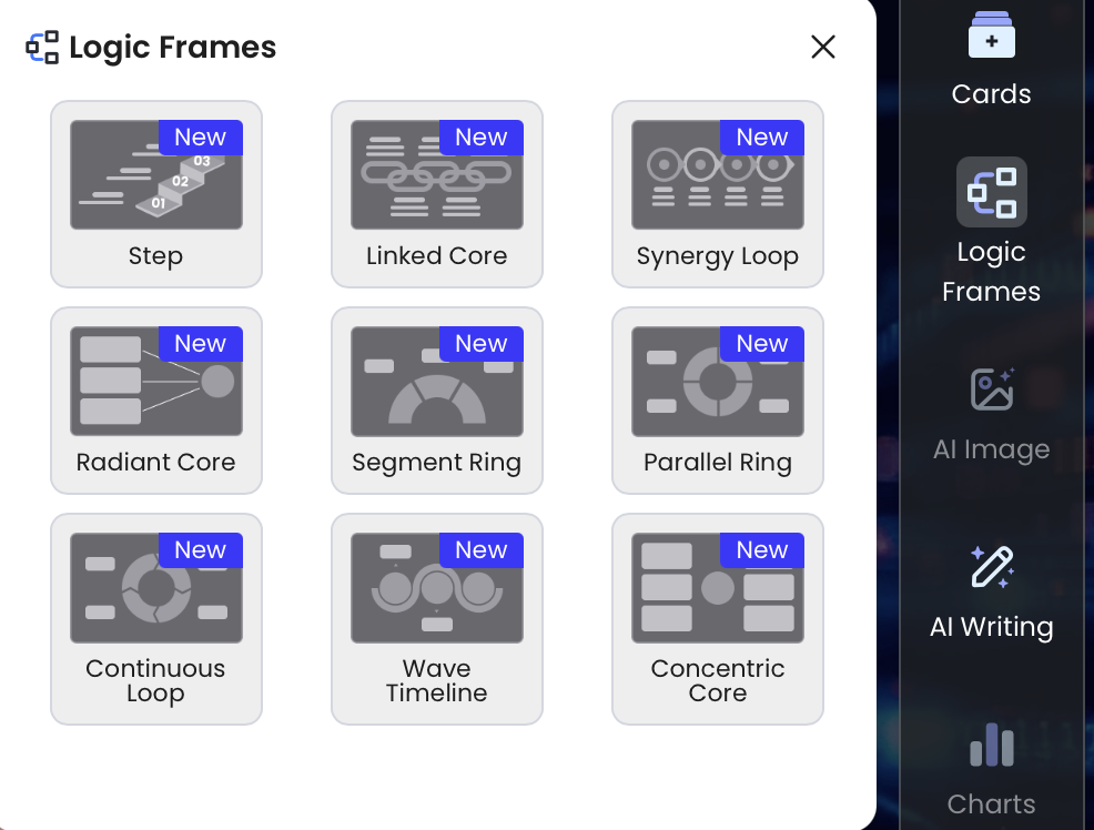
In PopAi, the practical editing sequence is: generate the deck, inspect the diagram slide, shorten labels with natural-language edits, adjust the layout or Logic Frame if the flow is crowded, use icons only where they improve scanning, then export and test the file. For data-heavy diagram slides, avoid mixing too many chart details with process logic; if the audience needs metrics, place the chart on a companion slide.

Validate Accuracy, Privacy, and Complexity Before You Present
A professional-looking AI diagram can still be logically wrong.
Accuracy problems usually appear in four places: decision branches, exception paths, role boundaries, and system dependencies. AI may create a reasonable-looking diagram that omits a compliance approval, reverses a data flow, merges two different systems, or assumes that every user follows the happy path. Validation should be a formal step, not a quick glance.
Logic validation checklist
- Are all start and end states clearly labeled?
- Can a subject-matter expert walk through the happy path without correcting the sequence?
- Do decision nodes include mutually exclusive branch labels?
- Are handoffs assigned to the right role, department, or system?
- Are exception paths shown or intentionally moved to a separate slide?
- Are repeated nodes consolidated without hiding important differences?
- Does data flow in the correct direction?
- Does the diagram still make sense when viewed from the back of a room?
Common AI diagram mistakes to catch
- Invented steps: The AI fills gaps with plausible but unapproved actions.
- Wrong owner: A task is assigned to Sales when Finance or Operations actually owns it.
- Branch ambiguity: Decision lines say “yes/no” without defining the question.
- Crossed arrows: The diagram is technically connected but visually hard to follow.
- Mixed diagram types: A single slide tries to be a swimlane, timeline, data-flow diagram, and org chart.
- Overcrowding: Every exception is included on the main slide, burying the core story.
Privacy and security review
Do not upload confidential customer data, credentials, unreleased financials, protected health information, proprietary source code, or sensitive architecture details unless your organization has approved the tool and workflow. For sensitive technical diagrams, redact names, use generic system labels, or generate diagram syntax from sanitized summaries. Enterprise teams should also check data retention, model-training policies, access controls, and export rules.
The biggest risk is not that AI produces an ugly diagram. The bigger risk is that it produces a beautiful diagram that quietly changes the logic.
Case example: In a technical briefing, an AI-generated architecture slide may place the analytics warehouse before the event queue because the notes mention analytics first. That reverses the actual data path. A quick SME review of arrow direction, storage locations, and trust boundaries catches the error before the slide reaches leadership.
The best teams treat AI-generated diagrams as version-one artifacts. AI compresses discovery time; domain review raises confidence. A complex system map can become a useful first draft much faster than manual whiteboarding, but the final review—edge cases, risk, ownership, and privacy—is where expert judgment protects the presentation from being misleading.
Three Practical Workflows for AI Presentation Diagram Creation
Use the workflow that fits your source material, not a generic prompt.
1. Meeting notes to executive process map
Input: meeting transcript, action items, owner list, and known blockers. Cleanup prompt: “Extract the current approval process as steps, owners, decisions, blockers, and open questions. Flag contradictions.” Diagram prompt: “Create a five-step executive process map with one risk callout and a takeaway title.”
Final slide sequence: context, current process, bottleneck, proposed process, next actions. A strong executive title might be “Two manual reviews add three days to standard approvals.” Put detailed exceptions in backup slides so the main slide supports a decision.
2. SaaS onboarding to user flow slide
Input: signup steps, product screens, activation event, drop-off data, and support tickets. Extraction step: ask AI to separate user actions from system responses. Diagram type: user flow with grouped stages: Create account, Verify identity, Configure workspace, Invite team, Reach activation.
Useful metrics: activation rate, drop-off rate, time-to-value, and completion time by step. Instead of showing every screen, create an overview flow and a second slide zooming into the highest-friction step. This supports a product decision, not just a walkthrough.
3. Code or architecture notes to technical briefing
Input: architecture notes, component list, API inventory, data stores, queues, external vendors, and security boundaries. Intermediate output: Mermaid or PlantUML syntax for engineering review. Human review: confirm data direction, trust boundaries, and service names before converting the diagram into a slide.
Final deck structure: system context for executives, component view for technical stakeholders, data-flow slide for risk discussion, and detailed diagram in the appendix. The main presentation should explain the architecture; the appendix should prove it.
The most important habit is to design at two levels: a high-level diagram for comprehension and a detailed diagram for validation. AI can help draft both, but the presenter decides which version belongs in the main story and which belongs in backup material.
FAQ: AI Diagrams and Flowcharts for Presentations
Can AI create flowcharts directly for PowerPoint presentations?
Yes. AI presentation tools can turn prompts, documents, transcripts, or existing slide files into presentation-ready workflow slides. Review the logic, simplify crowded diagrams, and export to PPTX or PDF when you need to finalize the deck.
What should I include in a prompt for an AI-generated diagram?
Include the goal, audience, start and end points, roles, steps, decision points, branch conditions, inputs, outputs, and exception paths. For complex processes, ask AI to extract actors and actions before generating the visual.
Are Mermaid or PlantUML diagrams better than AI presentation diagrams?
Mermaid and PlantUML are useful for technical teams that want diagram-as-code precision and version control. AI presentation diagrams are better when you need a readable slide with hierarchy, styling, captions, and speaker-friendly flow.
How accurate are AI-generated process maps?
They are strong first drafts, but they can miss edge cases, handoffs, dependencies, or compliance constraints. Validate the map with a subject-matter expert and use a checklist for branches, labels, data direction, and exceptions.
Create your presentation with one click now
Turn prompts, documents, notes, and source files into structured slides with diagrams, process frames, charts, and editable layouts.
Create with PopAi