How to Design KPI Dashboard Slides with AI: Examples & Prompts

KPI dashboard slides should help people make decisions, not admire data density. If you are a manager, analyst, founder, RevOps lead, marketer, or client services team, the hard part is usually not drawing the chart; it is deciding which numbers deserve executive attention, what changed, what caused it, and what action the slide should trigger.
This guide walks through a practical workflow for designing KPI dashboard slides with AI: prepare the metric logic, prompt for the right audience, choose chart layouts, validate the first draft, and turn a raw report into a meeting-ready deck. We will use a monthly marketing example with sessions, MQLs, SQLs, CAC, ROI, and pipeline sourced so the process stays concrete.
Raw KPI Table to Executive Dashboard Example
A KPI dashboard slide should show what changed, why it matters, and what action is needed.
Do not paste every metric into one dense slide. Use AI to group metrics by business question, then ask for a dashboard that separates headline status, trend movement, risk, and next action.
| Raw metric | AI grouping | Executive slide treatment | Human review |
|---|---|---|---|
| Traffic, conversion, leads, CAC, pipeline value. | Acquisition performance. | Scorecard plus one trend chart and a short interpretation. | Confirm definitions and attribution window. |
| Tickets, response time, resolution time, CSAT. | Support health. | Status tiles plus exception callout for the worst movement. | Check period, sample size, and operational cause. |
| Revenue, gross margin, churn, renewal risk. | Business health. | Executive summary with variance from target. | Separate actuals from forecast and verify source system. |
If the audience cannot identify the top risk and next action in ten seconds, the dashboard is still too dense.
Why Design KPI Dashboard Slides with AI for Executive Decisions
A KPI dashboard slide is not a data warehouse screenshot. It is a decision interface: a curated view of performance that helps an audience understand what changed, why it matters, and what should happen next.
Traditional BI dashboards are excellent for monitoring. Meeting slides need a tighter narrative. A CEO does not need fifteen filters in a quarterly review; they need to know whether growth is on track, which KPI is putting the plan at risk, and what trade-off requires approval. When you design KPI dashboard slides with AI, your job is to guide the system from “all available metrics” toward a sequence such as summary, trend, anomaly, cause, decision, and owner.
Practical heuristic: For executive slides, 5–10 KPIs across the whole deck is usually enough for one discussion. On a text-heavy slide, keep the visual load to one main chart or two simple charts. On a pure visual dashboard slide, four small visuals is often the upper limit before labels, legends, and comparisons become hard to read in a meeting room. Treat these as design constraints, not universal laws; appendix slides and operational war rooms can be denser.
Good KPI slides do not show everything the team measured. They show the few signals that change the conversation.
AI is most useful in the middle of the process: summarizing long reports, grouping metrics by business question, drafting insight-led slide titles, spotting candidate anomalies, and proposing layouts. A tool such as PopAi AI Presentation can help turn a prompt or uploaded report into a first deck structure, but you still need to validate the numbers, definitions, and recommendations before presenting.
Where AI adds the most leverage
- Monthly business reviews: compare actuals versus target, surface exceptions, and create a short “what changed / why / next action” storyline.
- Marketing and sales updates: summarize funnel health, CAC, conversion quality, pipeline coverage, forecast risk, and underperforming channels.
- Operations reviews: highlight volume, cycle time, SLA attainment, backlog aging, quality defects, and capacity constraints.
- Client reporting: translate activity metrics into business outcomes, then separate internal diagnostic detail from client-facing recommendations.
- Recurring reporting: reuse a validated slide structure each month and ask AI to update commentary only after the latest data is checked.
Case example: In a sales review deck with 18 dashboard metrics, the useful executive story was only five slides: revenue versus target, pipeline coverage, stage conversion, enterprise deal slippage, and the recovery plan. The metrics removed from the main deck were not unimportant; they belonged in the appendix because they explained execution, not the leadership decision.
Choose the Right KPI Dashboard Slide Structure
For a broader view of available tools, compare the latest AI presentation makers before choosing the workflow that best fits your team.
Deck structure should follow the decision flow: current status, trend, diagnosis, risk, and action.
1. Executive snapshot
Show 3–5 KPI cards with value, target, delta, status, business implication, and decision required.
2. Trend and variance
Use line, area, or bullet-style visuals to show movement over time versus target, forecast, or prior period.
3. Segment diagnosis
Compare region, channel, product, team, or cohort to identify where the overall result is coming from.
4. Action and ownership
List recommended actions, owner, timing, expected KPI impact, dependency, and next review date.
Different meetings need different dashboard architecture. A board update may need 6–8 slides on growth, margin, retention, cash, runway, and major risk. A marketing performance review may need 5–7 slides on demand trend, channel efficiency, conversion quality, pipeline sourced, CAC, and next bets. A customer support operations review may need 4–6 slides on ticket volume, first response time, SLA attainment, CSAT, backlog aging, and staffing actions.
Use AI to create audience variants from the same dataset. Ask for a CEO version with fewer operational details, a team version with diagnostic drill-downs, and a client version that avoids internal jargon. The metric values can stay the same while slide emphasis changes.
Audience fit is the difference between a dashboard people admire and a dashboard people use.
Outline review tip: Generate the outline before the slides. Check whether each proposed slide has a decision purpose, whether low-value activity metrics have been pushed to the appendix, whether leading and lagging indicators are separated, and whether the final slide names owners rather than ending with vague recommendations.
Prompt Workflow to Design KPI Dashboard Slides with AI
Prompts for KPI slides should define the audience, KPI logic, business context, data limits, and expected output—not just the topic.
Copy-ready prompt template
Use this structure and replace the bracketed details:
- Role: “Act as a senior business analyst and presentation designer.”
- Audience: “The audience is [CEO / sales VP / client sponsor / marketing leadership team].”
- Goal: “Create a [5-slide] KPI dashboard deck to support [budget decision / performance review / campaign optimization / client QBR].”
- Data context: “The reporting period is [March 2026], compared with [February 2026] and [monthly target]. Source data comes from [CRM, GA4, finance export, support platform].”
- KPI definitions: “Use these formulas: CAC = sales and marketing cost / new customers acquired; MQL-to-SQL conversion = SQLs / MQLs; campaign ROI = pipeline sourced / campaign spend; churn rate = customers lost / customers at start of period; SLA attainment = tickets resolved within SLA / total applicable tickets.”
- Structure: “Include executive snapshot, trend, segment diagnosis, anomaly/root cause, and next actions.”
- Design: “Use 16:9 slides, large KPI cards, concise labels, consistent colors, visible source notes, and no more than two charts per text-heavy slide.”
- Accuracy rule: “Do not invent benchmarks, targets, or causes. Flag missing data and separate facts from recommendations.”
Bad prompt versus better prompt
Weak prompt: “Make a KPI dashboard presentation for marketing.” This usually produces generic slide titles, decorative charts, and unsupported commentary.
Better prompt: “Create a five-slide executive marketing KPI dashboard for March 2026. Use the table below. Compare March with February and target. Calculate deltas for sessions, MQLs, SQLs, MQL-to-SQL conversion, CAC, spend, pipeline sourced, and ROI. Identify one underperforming channel, propose likely causes only if supported by the data, and write slide titles as conclusions.”
Prompt variations for KPI accuracy
- Outline only: “Do not generate slides yet. Propose the slide sequence and explain why each slide is needed.”
- KPI audit: “Check these KPI definitions for ambiguity, missing denominators, inconsistent time periods, or overlapping metrics.”
- Chart recommendation: “For each KPI, recommend the best chart type and explain the business question it answers.”
- Insight titles: “Rewrite neutral slide titles into conclusion titles, but avoid claims not proven by the data.”
- Executive version: “Reduce this operational deck to five leadership slides and move diagnostic detail to an appendix.”
- QA review: “List possible errors, unsupported assumptions, and data points a finance or RevOps reviewer should verify.”
If you are comparing broader tool categories—BI dashboards, template libraries, and presentation-first systems—this guide to AI presentation makers can help you decide which workflow fits your team.
Turn Metrics into Clear Charts and Slide Layouts
Choose the chart based on the business question the slide must answer.
Match chart type to the question
- “Are we on target?” Use KPI cards, bullet-style progress visuals, or a bar with target reference line.
- “Are we improving?” Use a line chart with prior period, target, or forecast shown clearly.
- “Where is the problem?” Use a ranked bar chart by region, channel, product, team, or cohort.
- “Where are users dropping off?” Use a funnel chart with conversion percentages between stages.
- “Which segments need attention?” Use a heat map only when the audience can read the labels and the color scale is explained.
- “Who owns the fix?” Use a table for action items, owners, due dates, risks, and expected KPI movement.
Dashboard slide layout patterns
- 4 KPI cards + one trend: best for an executive snapshot. Put the headline status across the top and the trend below.
- Left insight panel + right chart: best when the audience needs a short interpretation beside a single important chart.
- Top KPI cards + bottom variance table: useful for finance, sales, or operations reviews where exact target variance matters.
- Exception dashboard: show only red/yellow/green exceptions, grouped by severity, with owner and next action.
- Segment comparison slide: use one ranked bar chart and one short annotation explaining the highest and lowest performers.
- Appendix detail slide: include dense tables, campaign-level metrics, and data definitions for stakeholders who need to audit the numbers.
Chart mistakes to avoid
- Avoid pie or donut charts for more than 3–4 categories; ranked bars are usually easier to compare.
- Avoid dual-axis charts unless the relationship is essential and both axes are clearly labeled.
- Avoid radar charts for executive KPI reporting; they look sophisticated but are difficult to interpret quickly.
- Avoid 3D effects, decorative gradients, and too many colors because they compete with the data.
- Avoid mixing actuals, forecasts, targets, and benchmarks without labels; each comparison needs a visible definition.
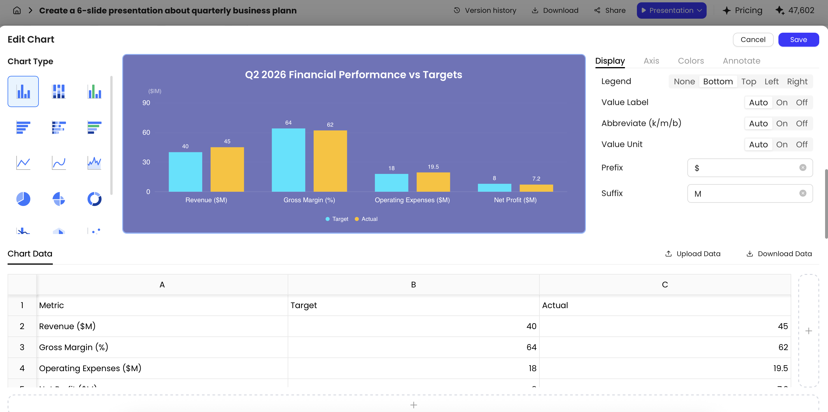
PopAi’s chart editing can help with practical refinements such as switching chart types, editing the underlying data table, adjusting colors, setting reference lines, changing units, and labeling specific data points. Use those controls to make the message clearer, not to decorate the slide. AI-generated visuals should still be reconciled against the spreadsheet, CRM export, or BI source.
Reporting discipline: Fast-moving functions such as sales, marketing, and operations may need daily or weekly KPI snapshots, while strategic review decks are often monthly or quarterly. Every KPI slide should show the reporting date, comparison period, data source, and metric definition when the number could be challenged.
KPI card anatomy
- Label: use the business term people recognize, such as “Pipeline sourced,” not an internal field name.
- Current value: show the primary number in the largest type on the card.
- Target or benchmark: include the goal so the audience can judge performance without asking.
- Delta: state the comparison basis, for example “+8% vs Feb” or “-$42K vs target.”
- Status: use color or an icon, but do not rely on color alone for accessibility.
- Implication: add a short phrase such as “forecast risk,” “budget efficient,” or “needs owner review.”
Design details that improve readability
- Use 24–32 pt for headline KPI values, 14–18 pt for labels, and avoid anything below 10–11 pt on projected slides.
- Round deliberately: use 3.2% instead of 3.2371%, and $1.2M instead of $1,203,492 unless exact values are required for audit.
- Label deltas with the baseline: “vs target,” “vs prior month,” “YoY,” or “forecast variance.”
- Use absolute change for money and counts when scale matters; use percentage change when comparing rates or differently sized segments.
- Reserve red for negative exceptions, green for positive movement, and gray for neutral context. Pair color with text labels for colorblind readers.
- Place source notes in the same position on every slide, usually bottom left or bottom right.
- Use “N/A,” “data pending,” or “definition changed” rather than hiding missing values.
- Use slide titles as conclusions, such as “Pipeline coverage improved, but enterprise deals slowed.”
- Align cards and charts to a grid; inconsistent spacing makes data feel less credible.
Example: Five-Slide Marketing KPI Dashboard with AI
This example shows how a raw monthly marketing report can become a five-slide leadership dashboard.
Sample input data
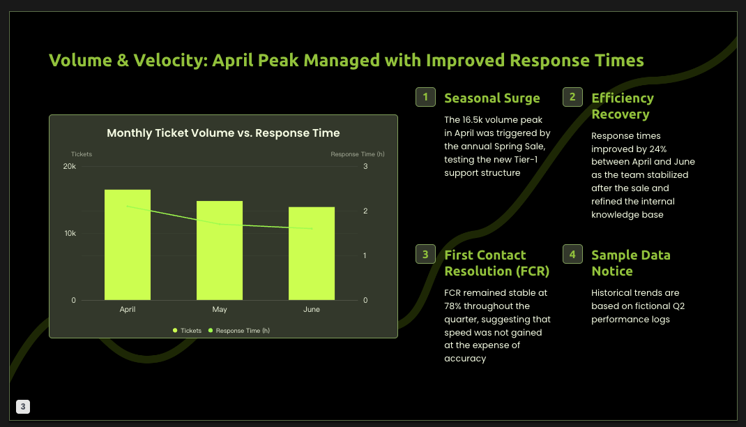
Assume the March leadership review uses the following simplified dataset. The goal is not to show every campaign metric; it is to explain whether marketing is producing enough qualified pipeline at an acceptable cost.
| KPI | February | March | March target | Definition |
|---|---|---|---|---|
| Website sessions | 118,000 | 132,000 | 125,000 | Total web sessions from GA4 |
| MQLs | 2,360 | 2,508 | 2,600 | Marketing-qualified leads meeting scoring threshold |
| SQLs | 590 | 552 | 650 | Sales-qualified leads accepted by sales |
| MQL-to-SQL conversion | 25.0% | 22.0% | 25.0% | SQLs / MQLs |
| Paid spend | $84K | $96K | $90K | Media spend only |
| CAC | $1,420 | $1,760 | $1,500 | Sales and marketing cost / new customers acquired |
| Pipeline sourced | $1.8M | $2.1M | $2.0M | Opportunity value with marketing source attribution |
| Campaign ROI | 21.4x | 21.9x | 22.2x | Pipeline sourced / paid spend |
Data observation: Sessions and pipeline beat target, but SQLs missed target and CAC rose above plan. That is the leadership story: demand volume increased, yet conversion quality weakened. A generic AI draft may celebrate traffic growth; a useful dashboard should focus attention on the quality gap.
Prompt used for the example
A stronger prompt would say: “Create a five-slide executive marketing KPI dashboard for the March 2026 leadership review. Use the metric table provided. Compare March against February and March target. Calculate deltas and flag underperformance. Do not invent benchmarks or causes. Emphasize pipeline sourced, MQL-to-SQL conversion, CAC, and campaign ROI. Use KPI cards, one trend slide, one channel-efficiency slide, one anomaly/root-cause slide, and one action plan slide. Write slide titles as conclusions. Include source notes and move campaign-level detail to the appendix.”
What the first AI draft often gets wrong
- It overweights vanity metrics: traffic growth becomes the headline even though conversion quality is the issue.
- It treats all green deltas as good: higher paid spend is not positive unless efficiency improves.
- It invents causes: the AI may blame landing pages or audience quality without channel data.
- It hides definitions: CAC, ROI, and qualified pipeline need formulas or source notes.
- It uses neutral titles: “Marketing Performance Overview” should become “Pipeline beat target, but SQL conversion and CAC need correction.”
Final five-slide structure
- Executive snapshot: KPI cards for pipeline sourced, MQL-to-SQL conversion, CAC, and ROI. Title: “Pipeline beat target, but conversion quality weakened.”
- Demand trend: line chart for sessions, MQLs, and SQLs over six months with target reference lines. Annotation: “Lead volume rose faster than sales acceptance.”
- Channel efficiency: ranked bar chart comparing paid search, organic, social, events, and partners by CAC and pipeline. Use this only if channel-level data is available.
- Anomaly and cause: highlight the SQL shortfall and CAC increase. Separate verified causes from hypotheses, for example “verified: paid spend +14%; hypothesis: lower-intent audience mix.”
- Next actions: three moves with owners: tighten MQL scoring, shift 15% paid budget from low-converting campaigns, and review landing-page-to-SQL path. Add expected impact and follow-up date.
Case-study note: In this sample deck, the biggest edit after AI generation was removing a “traffic growth” celebration slide. It looked positive, but it did not answer the leadership question. Reframing the deck around SQL conversion and CAC made the action plan more commercially useful.
For the appendix, keep channel-level tables, campaign names, audience segments, and exact source exports. Executives can inspect them if needed, but the main deck should stay focused on the trade-off: spend increased, pipeline improved, and conversion quality fell.
Review Checklist: Accuracy, Consistency, and AI Risks
AI can speed up KPI dashboard slide production, but it can also introduce confident errors. Treat the first draft as a structured prototype, not the final source of truth.
QA workflow before presenting
- Validate the source: confirm the export date, source system, filters, and owner of the dataset.
- Check formulas: recalculate high-stakes KPIs such as CAC, churn, margin, ROI, pipeline coverage, and SLA attainment.
- Verify time periods: make sure month-to-date, full-month, rolling 30-day, and quarterly numbers are not mixed.
- Inspect chart mapping: confirm that chart labels, axes, series names, colors, and reference lines match the data table.
- Review claims: remove any cause, benchmark, or forecast that is not supported by the data.
- Get owner approval: ask finance, RevOps, sales ops, marketing ops, support ops, or the client data owner to approve the final numbers.
- Document assumptions: add a short source note or appendix page for definitions, exclusions, and known data limitations.
Human review checklist
- Metric definition: Confirm every KPI has the correct formula and business meaning.
- Time period: Verify whether the slide shows month-to-date, quarter-to-date, rolling 30 days, or full month.
- Comparison baseline: Check whether deltas compare to target, prior month, prior year, or forecast.
- Data source: Add source notes when numbers come from CRM, analytics, finance, support, or manually compiled reports.
- Chart integrity: Inspect axes, units, scale breaks, labels, and colors for misleading presentation.
- AI wording: Remove confident claims that are not supported by the data.
- Action ownership: Make sure recommendations include owners and next review dates.
- Confidentiality: Redact customer PII, employee data, confidential board numbers, and client-sensitive details unless your company has approved the tool and workflow.
Treat the first AI draft as a structured prototype. The source of truth remains the governed report, spreadsheet, CRM export, or finance-approved dataset.
One common risk is metric drift: the same KPI name appears in two systems but uses different filters or formulas. For example, “qualified pipeline” may mean sales-accepted pipeline in one report and marketing-sourced opportunity value in another. Those are not interchangeable. Maintain a lightweight KPI dictionary with fields for KPI name, formula, source system, owner, refresh cadence, exclusions, and approved display format.
Another risk is false precision. A deck that shows too many decimals or tiny percentage changes can imply confidence the data does not deserve. Use 3.2% instead of 3.2371%, show $1.2M instead of $1,203,492 unless exactness matters, and avoid overinterpreting a 0.1 percentage-point conversion change unless sample size and significance support it.
Tool Fit: Where PopAi Sits in Your KPI Workflow
Use the right tool for the right layer of KPI reporting: governed data, analysis, narrative, design, and handoff are not the same job.
| Tool type | Best for | Watch out for |
|---|---|---|
| BI tools | Live dashboards, governed metrics, permissions, recurring analysis | Dashboards can be too dense for executive meetings |
| Spreadsheets | Ad hoc modeling, cleanup, variance calculations, formula checks | Manual errors and version control issues |
| AI presentation tools | Turning reports and notes into a slide narrative and first visual draft | May misread definitions, invent causes, or choose weak chart types |
| PowerPoint or design tools | Final polish, brand compliance, precise layout, stakeholder edits | Design polish does not fix inaccurate data |
PopAi fits the “input materials to presentation draft” stage. You can start from a prompt or upload materials such as PDF, DOCX, TXT, MD, XML, HTML, PPTX, images, audio, video, or a YouTube URL. For KPI work, a safer workflow is to upload an already reviewed report or anonymized summary, ask for an outline first, review the sequence, then generate and edit the deck.
Mini case study: In an HTML-to-slides test, the input report contained a title, executive summary, five key metrics, a risk table, and recommended actions. The AI organized it into a six-page presentation and converted the risk table into fields for risk, severity, owner, and mitigation. The useful part was structure and speed; the required human edits were tightening slide titles, checking whether severity labels matched the source, and shortening the action slide for executive review.
Do not use AI-generated KPI slides as a replacement for a governed BI system, finance-approved reporting process, or client data policy. Use them to create a first narrative draft faster, then reconcile numbers, formulas, permissions, and wording before exporting to PPTX or PDF for final review.
FAQ: Designing KPI Dashboard Slides with AI
How many KPIs should I include in a dashboard slide deck?
For most executive KPI dashboard slides, track 5 to 10 core KPIs across the full deck. Avoid placing all of them on one slide; use summary, trend, diagnostic, and action slides to control cognitive load.
Can AI generate KPI dashboard slides from existing reports?
Yes. AI tools such as PopAi can generate slides from prompts or uploaded materials including PDF, Word, HTML, text, images, and PPTX. Always review metric definitions, values, and claims before presenting.
What chart type is best for KPI dashboard slides?
Use KPI cards for headline values, line charts for trends, bar charts for comparisons, funnel charts for conversion stages, and tables for exact values or action ownership. Match the chart to the question the audience needs answered.
Do I need design experience to design KPI dashboard slides with AI?
No. AI can draft the structure, layout, and visual hierarchy. You will get better results by providing the audience, decision goal, KPI list, definitions, tone, and brand constraints.
Create your presentation with one click now
Turn KPI reports, prompts, and business data summaries into polished slides faster—then refine charts, wording, layout, and export format for your next review.
Start creating with PopAi