How to Design Comparison Slides with AI: Examples & Layouts

If you build sales decks, executive updates, product proposals, training materials, or procurement presentations, comparison slides with AI can save hours—but only when the slide still helps people decide. A typical weak AI draft looks polished at first: three vendor columns, lots of checkmarks, attractive colors. Then you notice the problem: one vendor is judged on price, another on integrations, another on support, and the recommendation is buried in a paragraph no one will read.
This guide shows a practical design process for using AI to create before/after, pros/cons, vendor, product, pricing, and strategy comparison slides. You will learn how to choose the right layout, prepare fair inputs, prompt for stronger structure, verify claims, and refine the final slide so your audience sees the trade-off immediately.
Quick principle: a comparison slide is not a storage place for facts. It is a decision aid. If the audience cannot tell what is being compared, which dimensions matter, and what action follows, the slide is not finished.
Comparison Slide Layout Examples
A comparison slide should make a decision easier. It should not simply place two columns of text next to each other.
Before asking AI to design the slide, decide what kind of comparison the audience needs: feature selection, before/after improvement, pros and cons, vendor evaluation, or strategy trade-off. Each type needs a different layout and a different review checklist.
| Comparison type | Best layout | AI prompt focus | Human review |
|---|---|---|---|
| Feature comparison | Matrix with criteria rows and product columns. | Ask AI to group features by buyer need, not by random feature order. | Verify every feature claim and avoid unfair criteria. |
| Before and after | Two-panel transformation with one key metric or visual proof. | Ask AI to highlight the exact change and what caused it. | Make sure the “after” result is supported by real evidence. |
| Pros and cons | Balanced two-column slide plus final recommendation. | Ask AI to separate advantages, risks, and open questions. | Remove biased wording and add missing trade-offs. |
Do not let AI decide the winner from incomplete inputs. Provide the criteria, source material, and decision context, then review the comparison for accuracy and balance.
Why Comparison Slides with AI Still Need Design Judgment
AI can draft the slide quickly; your job is to make the comparison fair, defensible, and useful.
Comparison design is an information architecture task before it is a visual design task. You are asking the audience to evaluate options side by side, which means every row, column, score, icon, and label must be purposeful. A beautiful slide with mismatched criteria can mislead decision-makers faster than a plain table.
In practice, AI often fails in predictable ways:
- It compares unlike things: Vendor A gets “low cost,” Vendor B gets “deep integrations,” and Vendor C gets “strong support,” which are all valid facts but not parallel criteria.
- It fills missing data too confidently: If SOC 2 status, pricing, or implementation time is absent, some drafts imply an answer instead of marking it as unknown.
- It over-rewards visible evidence: A vendor with a longer PDF can look stronger simply because the AI has more material to summarize.
- It flattens trade-offs: A matrix may give every option similar scores, hiding the real decision: lower cost versus lower risk.
Most AI presentation workflows follow a similar path: enter a prompt or upload material, review an outline, generate slides, edit the content and layout, then export to PPTX or PDF. When using PopAi AI Presentation, the useful step for comparison slides is not just generation; it is the chance to inspect the AI-organized outline, revise the comparison dimensions, and then refine the slide structure before exporting.
Do not ask AI to “make a comparison slide” first. Ask it to identify the decision, options, dimensions, evidence, and recommended layout first.
In a practical vendor-shortlist rebuild, a raw AI draft with 11 criteria and 64 words per vendor column was reduced to four weighted criteria, one recommendation badge, and a source note. The final slide took longer than a one-click draft, but it cut review discussion from “What are we looking at?” to “Do we agree security should count for 30%?” That is the difference between a decorative comparison and a decision-support slide.
Choose the Best Layout for Comparison Slides with AI
For a broader view of available tools, compare the latest AI presentation makers before choosing the workflow that best fits your team.
Choose the slide structure before you prompt, because layout determines what the audience pays attention to.
AI tools often default to two columns or a wide table because those are easy to generate, but those are not always the clearest formats. The right layout depends on how many options you compare, whether overlap matters, and whether the audience needs a quick recommendation or a detailed audit trail.
| Decision need | Best layout | Use when |
|---|---|---|
| Choose between two options | Parallel two-column comparison | You need a fast “A vs. B” contrast using identical row labels. |
| Evaluate three to five options | Weighted decision matrix | Criteria have different importance or executives need visible trade-offs. |
| Show overlap and difference | Venn diagram or overlap cards | Concepts, audiences, or product capabilities genuinely intersect. |
| Compare many features | Summary feature table | Buyers need proof, but low-priority rows belong in the appendix. |
| Show improvement | Before/current/future comparison | You compare current state, target state, and measurable change. |
| Compare capability balance | Radar chart with caution | You need a visual profile across five to seven criteria on the same scale. |
Use matrices for executive decisions
For executive audiences, a weighted matrix usually beats a full feature table because it compresses complexity into ranked criteria. Keep it to three to five criteria, show the weighting, and include a confidence label such as “high confidence,” “partial data,” or “requires legal review.” If every option receives the same score, the matrix is not finished; ask the AI to explain the trade-off instead of averaging it away.
Use tables when the audience must audit details
For technical buyers, procurement teams, or implementation teams, a feature comparison table may be necessary. Design it as a summary table, not a data dump:
- Group rows into buyer needs, such as “Security,” “Integrations,” “Adoption,” and “Cost.”
- Limit the main slide to five to seven rows; move the rest to an appendix.
- Use checkmarks only for binary facts. Use short labels such as “Native,” “Via API,” or “Not confirmed” when details matter.
- Avoid red/green-only coding; pair color with text labels or icons for accessibility.
Avoid diagrams when the logic is not visual
Venn diagrams work only when categories truly overlap. Radar charts work only when every axis uses the same scale and higher always means better. If the slide compares pricing, contract risk, integration effort, and customer impact, a matrix is usually more honest than a decorative chart.
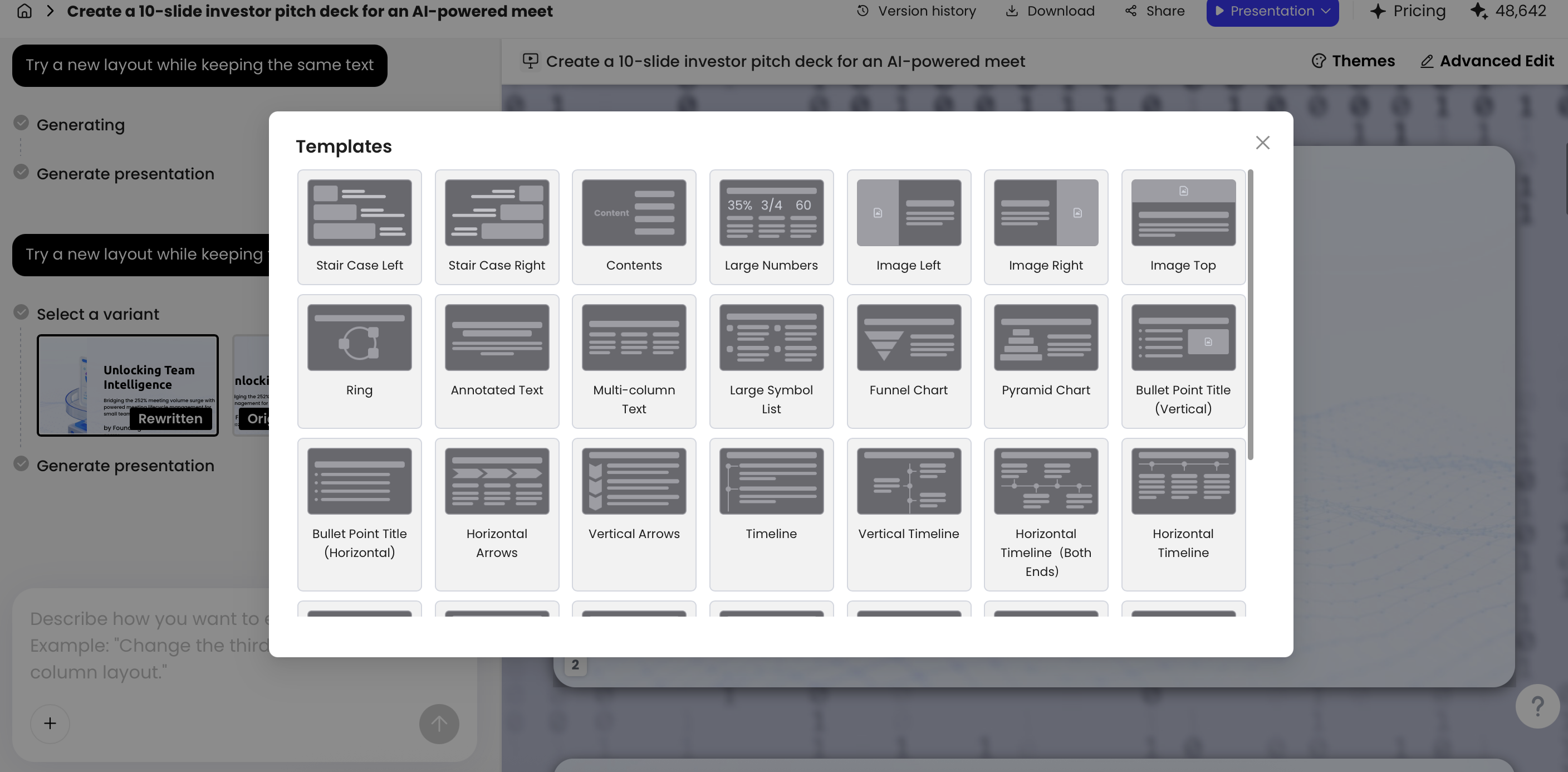
Layout refinement is most useful after the first draft. If the AI produces a dense vendor table, try converting the top criteria into cards or a weighted scorecard. If the slide compares a current process with a future process, a before/current/future layout will usually outperform a generic two-column design. The goal is not novelty; it is reducing the audience’s cognitive load.
Prepare Inputs So AI Can Compare Fairly
Better inputs produce better comparison logic, not just better-looking slides.
Before you generate slides, organize your input around a simple schema: decision, options, criteria, weights, evidence, source dates, assumptions, and desired recommendation. This prevents the AI from inventing criteria or treating incomplete information as fact.
Build a comparison schema
- Decision: What must the audience approve, buy, choose, or understand?
- Options: Name each product, vendor, strategy, concept, plan, or time period.
- Criteria: Use the same criteria for every option to avoid unfair comparison.
- Weights: Mark criteria as high, medium, or low importance, or provide percentages.
- Evidence: Add metrics, quotes, source links, dates, or assumptions.
- Constraints: Mention budget, timeline, region, audience knowledge level, or brand tone.
Example input: CRM vendor shortlist
A useful input is specific enough for the AI to reason with: “Decision: choose CRM for a 45-person mid-market sales team. Options: HubSpot, Salesforce, Pipedrive. Criteria and weights: implementation time 25%, integration with existing tools 25%, reporting depth 20%, total first-year cost 20%, adoption risk 10%. Evidence: pricing from vendor pages as of March 2026, integration notes from internal IT review, adoption feedback from sales managers. Recommendation hypothesis: prefer the option with fastest adoption unless reporting gap is material.”
A weak input is: “Compare these CRMs and make the slide look professional.” It gives no audience, no criteria, no weighting, and no source boundaries. Another risky input is: “Show why Vendor A is best.” That may be appropriate for a sales argument, but it biases the AI before the evaluation is complete.
Add evidence, source dates, and missing-data labels
For comparison slides based on vendor briefs, old PowerPoints, research notes, PDFs, or HTML reports, ask the AI to extract comparable dimensions first. Then verify the extracted facts manually. If security certification, pricing, or implementation timing is missing, write “not provided,” “not verified,” or “requires follow-up” instead of allowing the slide to imply certainty.
Data needs extra care. If your comparison uses scores, pricing, conversion rates, retention, risk levels, or regional forecasts, keep the calculations transparent. Clean the table before charting: one row per criterion, one column per option, consistent units, no merged cells, and no hidden assumptions. For the main slide, use ranges or qualitative labels when precision is not defensible—for example, “$40k–$55k estimated first-year cost” is often more honest than “$47,382.”
Also consider confidentiality. Do not upload sensitive customer data, unreleased pricing, legal documents, or private RFP responses to any AI workflow unless your organization has approved that use. For external sales or competitor slides, route claims through the same legal, brand, or compliance review process you would use for manually created decks.
Fair comparison means every option is judged by the same question. If one column lists benefits, another lists specifications, and another lists risks, the slide is comparing writing styles—not options.
Prompt Templates for AI Comparison Slides
Strong prompts control the comparison logic, the visual hierarchy, and the review process.
Use these templates as starting points and replace bracketed text with your own context. After the first output, do not just ask for “better design.” Ask for a specific correction: fewer rows, clearer scoring, missing-data labels, a different layout, or a stronger conclusion headline.
Product comparison prompt
Prompt: “Create a one-slide product comparison for [audience]. Compare [Product A], [Product B], and [Product C] across [criteria]. Use a decision matrix layout with a conclusion headline. Weight [criterion] most heavily. Keep each cell under eight words, include one evidence note per option, and recommend the best choice for [use case].”
- Best used when: buyers need to choose between similar products.
- Check for: inconsistent criteria, vague labels such as “great support,” or unsupported winner claims.
- Follow-up prompt: “Revise the matrix so every product is judged on the same criteria. Mark missing evidence as ‘not verified’ and reduce the slide to five rows.”
Before/after prompt
Prompt: “Design a before/after comparison slide showing the change from [current state] to [future state]. Use three rows: process, cost, and customer impact. Add a clear headline that states the improvement. Use icons only if they clarify meaning, and include one metric per row.”
- Best used when: you need to show transformation, migration, process improvement, or training impact.
- Check for: activity descriptions without measurable change.
- Follow-up prompt: “Replace generic benefits with measurable deltas. Use before/current/future columns if the transition has an interim phase.”
Vendor shortlist prompt
Prompt: “Turn this vendor research into an executive vendor shortlist slide. Compare [vendors] using weighted criteria: security 30%, integration 25%, cost 20%, support 15%, implementation speed 10%. Show a scorecard, highlight the top recommendation, and add a footnote with source date and assumptions.”
- Best used when: procurement, IT, finance, or leadership needs a defensible shortlist.
- Check for: invented compliance claims, outdated pricing, and false precision in scoring.
- Follow-up prompt: “Add a confidence column and identify which vendor facts require human verification before the recommendation is final.”
Pros and cons prompt
Prompt: “Create a balanced pros/cons slide for [proposal]. Separate benefits, risks, and mitigation actions. Avoid exaggerated language. End with a recommendation line that explains whether to proceed, pause, or test.”
- Best used when: the decision is not simply “which option wins,” but whether to proceed under known risks.
- Check for: symmetrical lists that make minor risks look equal to major risks.
- Follow-up prompt: “Rank risks by likelihood and impact, then move low-impact risks to speaker notes.”
Workflow tip: If you want a complete deck rather than one slide, ask for the comparison slide to appear after the problem framing but before the recommendation. This placement makes the decision logic easier to follow.
If your comparison slide depends on chart editing, source-document extraction, editable PPTX export, or brand templates, compare how different AI presentation makers handle those tasks before committing to a workflow. The best tool for comparison slides is not the one with the most templates; it is the one that lets you inspect and revise the reasoning behind the comparison.
Refine AI Comparison Slides After Generation
The first AI draft is usually too wordy; refinement turns it into a slide people can act on.
Start with the headline. Replace neutral titles such as “Vendor Comparison” with conclusion titles such as “Vendor B offers the strongest security-to-cost balance.” Then make the body prove that conclusion: show the weighted criteria, use consistent labels, and separate verified facts from assumptions.
Use a five-step editing pass
- Check fairness: Make sure every option is evaluated against the same criteria.
- Cut text: Reduce each cell to a short phrase, not a sentence. Aim for fewer than eight words per cell.
- Rank visually: Use badges, subtle emphasis, or ordered placement to identify the leading option after the evidence is visible.
- Separate evidence: Keep one proof point on the slide and move detailed support to notes or appendix pages.
- Export-test: Open the PPTX in PowerPoint and confirm that text remains editable, spacing still works, and chart labels are readable.
Before/after editing example
An overstuffed AI-generated vendor slide might include eight rows: pricing, onboarding, support, integrations, analytics, security, scalability, and user experience. In review, three rows overlap or belong in the appendix. “User experience” and “adoption risk” can be merged. “Scalability” may not matter for a 50-person rollout. “Analytics” belongs under reporting. The improved slide becomes four weighted criteria: security, integration fit, first-year cost, and adoption speed.
The final structure is more useful: headline recommendation at the top, three vendor columns, four criteria rows, one overall score band, and a source note reading “RFP responses and vendor pages reviewed as of Apr. 2026; pricing requires final quote.” That source note is small, but it prevents the slide from overstating certainty.
Natural-language rewriting can help with this step. For example, ask: “Shorten this slide for an executive audience and keep only the top three criteria,” or “Turn this feature table into a recommendation scorecard with one source note.” Review the rewritten version against the original instead of accepting it automatically; the AI may improve readability while accidentally dropping an important caveat.
Choose charts only when they clarify the trade-off
Charts are not always better than tables. A bar chart helps when one metric dominates, a radar chart helps when capability balance matters, and a table helps when the buyer must audit specific features. If you use chart editing, label units, axis ranges, legends, and reference lines clearly. Avoid decorative charts that make small differences look dramatic, and never truncate an axis to exaggerate a minor advantage unless the scale is explicitly explained.
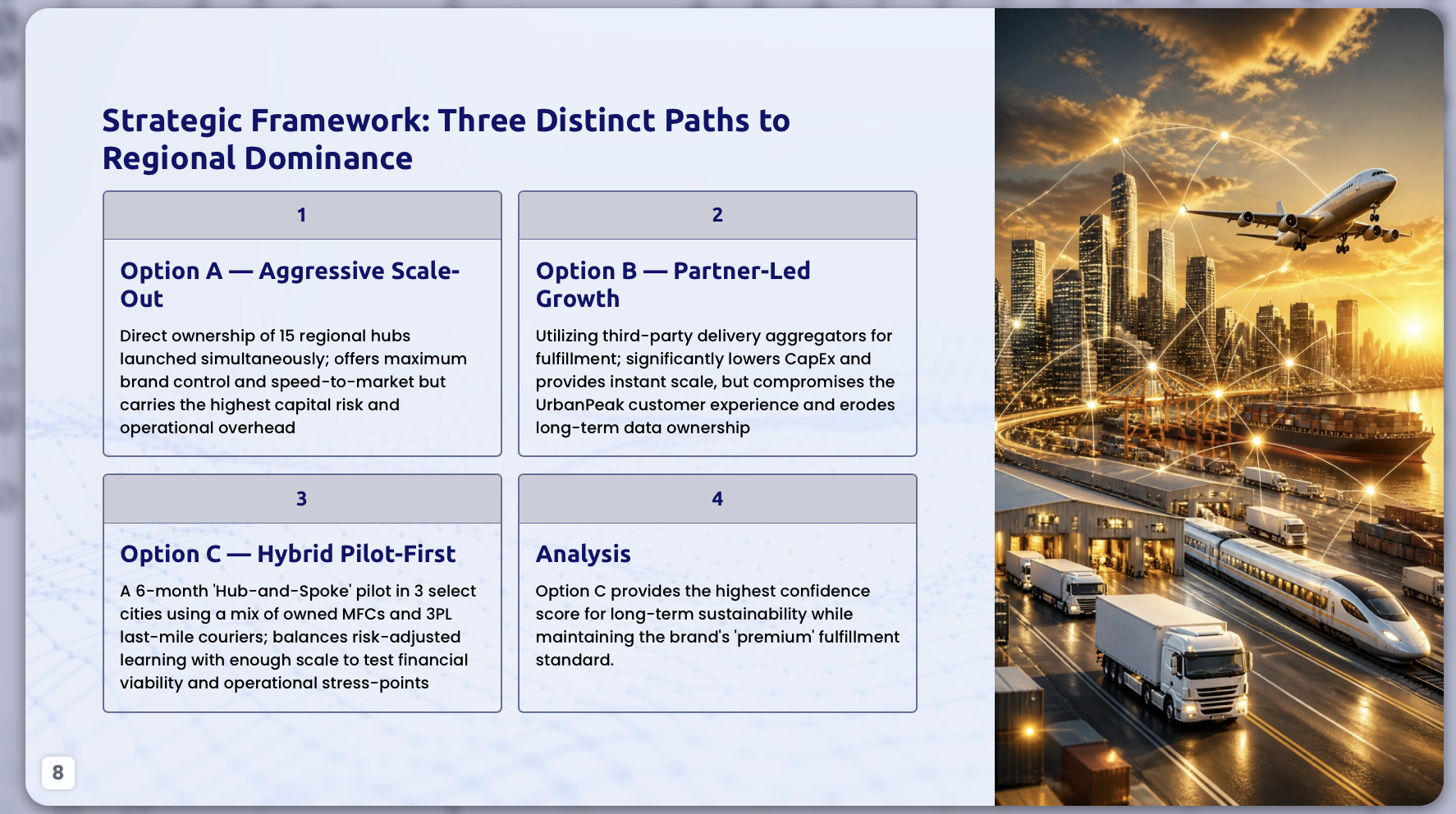
Examples: Sales, Strategy, Procurement, and Teaching
Use the same comparison discipline, but change the slide pattern for the audience.
The following blueprints show how a comparison slide should differ in sales, strategy, procurement, and teaching contexts. Each example includes a practical headline, layout choice, criteria, and mistake to avoid.
Sales battlecard: compare against the buyer’s real alternative
Sample headline: “Switching from the status quo cuts onboarding time by 35% while reducing manual handoffs.”
- Layout: two-column or three-card comparison: Status Quo, Competitor, Your Solution.
- Criteria: implementation effort, time to value, integration fit, risk reduction, measurable business impact.
- Visual emphasis: highlight the buyer pain, not every product feature.
- Evidence note: customer case study, pilot metric, or CRM benchmark with date.
- Common mistake: using generic rows such as “features” or “support” without tying them to buyer outcomes.
Executive strategy comparison: make the trade-off explicit
Sample headline: “Region B offers the best risk-adjusted expansion path, but requires partner hiring before launch.”
- Layout: weighted matrix with three to five criteria and a recommendation badge.
- Criteria: market size, regulatory friction, launch cost, time to revenue, execution confidence.
- Visual emphasis: show confidence and next step, not every supporting data point.
- Evidence note: market model version, forecast date, and major assumptions.
- Common mistake: hiding uncertainty because the AI-generated matrix looks more authoritative without it.
Procurement vendor comparison: show proof and gaps
Sample headline: “Vendor B ranks highest after security and integration weighting; pricing requires final quote.”
- Layout: vendor scorecard with weights, scores, confidence labels, and source notes.
- Criteria: security certification, integration requirements, total cost, support model, implementation timeline.
- Visual emphasis: make missing or unverified data visible.
- Evidence note: RFP response date, vendor documentation date, internal reviewer initials if appropriate.
- Common mistake: allowing AI to summarize compliance claims without checking original documentation.
Teaching and training: compare concepts, not just terms
Sample headline: “Formative assessment guides learning; summative assessment evaluates learning.”
- Layout: Venn diagram, comparison cards, or before/after structure.
- Criteria: purpose, timing, evidence collected, learner action, instructor response.
- Visual emphasis: use examples and non-examples to prevent memorization-only learning.
- Evidence note: course standard, rubric, or training objective.
- Common mistake: building a dense feature grid when learners need conceptual contrast.
In one HTML-to-slides test, the source file was a 2,400-word internal project report with a title, executive summary, key metrics, risk register, and recommended actions. The instruction was: “Create a six-slide executive update. Turn the risk register into a comparison slide showing risk, severity, owner, mitigation, and decision needed.” The AI correctly separated risks from recommendations and converted the table into a slide-ready structure.
The manual fixes mattered: two risks had overlapping descriptions, one owner field was missing, and severity labels needed to be normalized from “high/urgent/critical” into a consistent low-medium-high scale. After correction, the slide worked because it compared risks by the same dimensions and made the required decision visible. This is the right expectation for file-to-slides workflows: useful extraction first, human verification before presentation.
Common Mistakes When Designing Comparison Slides with AI
Most weak AI comparison slides fail because the design looks balanced before the logic is ready.
Watch for these failure patterns before you present, and apply the correction immediately.
- Inconsistent dimensions: One option is judged by price, another by usability, another by roadmap. Fix: create a criteria row first, then score every option against the same question.
- Too many rows: More than five criteria often turns a main slide into an appendix table. Fix: keep only decision-driving criteria on the slide and move proof detail to backup pages.
- Fake precision: Scores such as 8.7 versus 8.8 imply accuracy that may not exist. Fix: use 1–5 scoring, ranges, high/medium/low labels, or confidence bands.
- Meaningless icons: Decorative icons can distract from the actual trade-off. Fix: use icons only when they replace repeated text or clarify categories.
- Visual bias: Color, size, or placement may unintentionally favor one option before evidence is shown. Fix: keep neutral formatting until the recommendation is supported by criteria.
- Unverified claims: AI may summarize outdated prices, features, or competitor statements unless you provide sources. Fix: add source dates and label unverifiable claims as “not confirmed.”
- Broken export assumptions: Do not assume every exported deck is perfect. Fix: open the PPTX and check editability, alignment, font substitution, chart labels, and speaker-note integrity.
- Confidentiality blind spots: AI workflows can expose sensitive vendor, customer, or financial information if used casually. Fix: follow your company’s approved AI and data-handling policy before uploading files.
For business decks, add a small source note when claims involve competitor features, pricing, compliance, benchmarks, or market data. Include “as of” dates where relevant. This is especially important for vendor shortlists and product comparisons because features and pricing can change quickly.
Fake precision implies accuracy that may not exist. If you cannot defend the decimal, do not put it on the slide.
Final quality checklist:
- Can the audience name the recommended option in five seconds?
- Are all options judged by the same criteria?
- Are weights, assumptions, and missing data visible?
- Is the conclusion readable from the back of the room?
- Does the slide support what you will say out loud?
- Can the data be defended if challenged?
- Does the exported PPTX remain editable and aligned?
If the answer is yes, AI has helped you build more than a polished comparison slide. It has helped you create a clearer decision.
FAQ
How do I use AI to design a comparison slide?
Define the decision, options, criteria, evidence, and audience first. Then ask AI to recommend a layout, generate the slide, and refine it with a conclusion headline, fewer rows, consistent criteria, and editable visuals.
What is the best layout for comparing two products?
Use a two-column layout for simple A/B contrast, a scorecard for weighted decisions, a Venn diagram for overlap, or a feature table when buyers need detailed evidence.
Can AI turn a table or spreadsheet into a comparison slide?
Yes. AI can summarize structured data into a matrix, chart, or table. For best results, provide clean criteria, scores, weights, labels, and source notes, then verify the generated slide before presenting.
How do I avoid clutter in AI-generated comparison slides?
Limit the slide to one decision and three to five criteria. Move detailed proof to speaker notes or appendix slides, and make the title state the key takeaway.
Create your presentation with one click now
Turn prompts, documents, reports, and existing slides into decision-ready presentation drafts you can refine, export, and share.
Start creating with PopAi