How to Design Quote Slides with AI: Layouts, Attribution & Prompts
If you design decks for executive updates, pitch meetings, training sessions, or sales conversations, quote slides can be surprisingly hard to get right. The weak version is familiar: a 50-word quote pasted over a stock photo, tiny attribution in the corner, and oversized quotation marks competing with the message.
Here is a more useful way to approach it. In a sales deck, a customer interview may contain this raw line: “Before the rollout, our managers were spending half their weekly planning meeting arguing about numbers instead of deciding what to do next.” AI can help shorten the visible quote, test three layouts, and place attribution cleanly; the designer’s job is to decide whether the slide should feel like proof, urgency, or emotional relief.
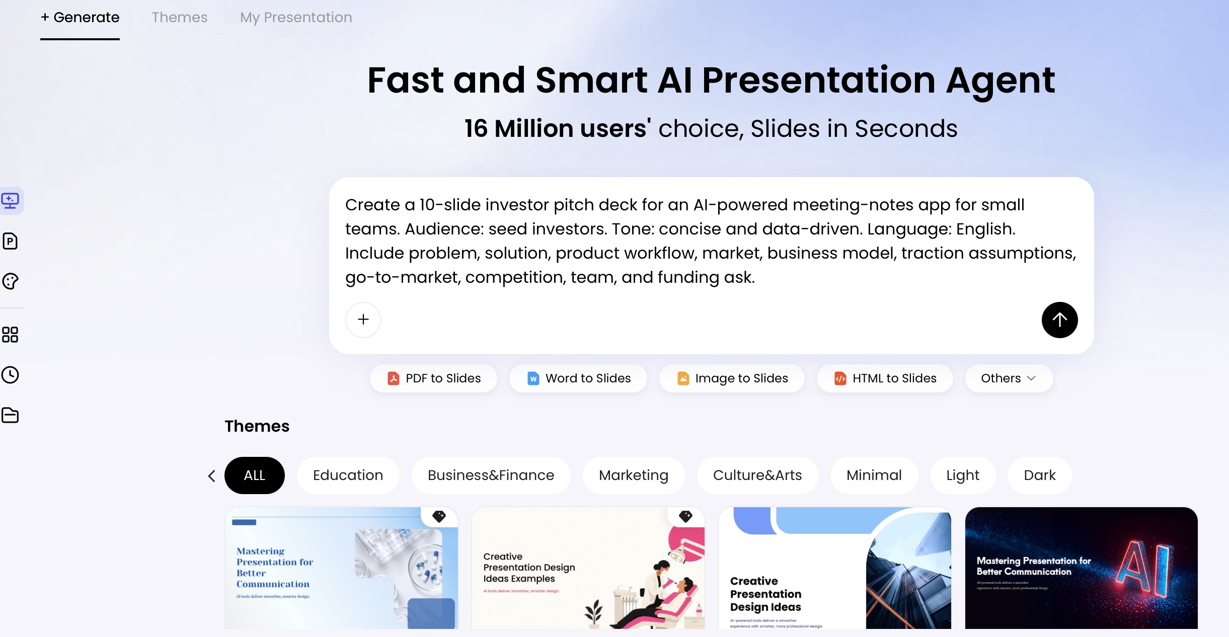
This guide shows how to design quote slides with AI from selection to export: choosing the right line, writing a useful prompt, testing layouts, checking readability, and avoiding attribution or copyright mistakes. Tools such as PopAi AI Presentation can help you move from a raw quote or source document to editable slides, but the final impact still comes from design judgment.
Design principle: A strong quote slide is not a pause for decoration; it is a persuasive beat that makes the audience feel, remember, or reframe the message.
Quote Slide Layout and Attribution Examples
A quote slide works only when the quote is accurate, relevant, and visually easy to read.
Use AI to explore layout and wording choices, but verify the quote before publishing. A polished quote slide with the wrong attribution is worse than a plain slide with correct sourcing.
| Quote slide type | Best use | Layout direction | Review before use |
|---|---|---|---|
| Full-screen quote | Opening a section or emphasizing a central idea. | Short quote, large type, quiet background, clear attribution. | Verify exact wording and source. |
| Quote + image | Human story, customer voice, event recap, or teaching example. | Quote block plus image that directly supports the context. | Confirm image rights and avoid emotional mismatch. |
| Statistic + quote | Combining data with a voice from the audience or customer. | One key number, one short quote, one takeaway title. | Verify the statistic and do not imply the quote proves the number. |
Ask AI: “Design a quote slide using this verified quote and source. Do not alter the quote. Suggest typography, layout, background, and attribution placement. Flag any missing source information.”
Why Quote Slides with AI Work Best When They Have a Job
Before asking AI to make a quote slide beautiful, decide what the quote is supposed to accomplish.
In strong presentations, a quote slide usually serves one of five jobs. Each job should change the source you choose, the layout you request, and the amount of visual drama you allow.
- Open a topic: Use a short, recognizable industry quote or a provocative internal observation. Best layout: centered big type or chapter transition.
- Validate a claim: Use an analyst, research, expert, or publication quote. Best layout: restrained editorial slide with clear source context.
- Create emotional momentum: Use a customer, employee, patient, learner, or community voice. Best layout: image overlay or key phrase emphasis.
- Provide customer proof: Use a permissioned testimonial tied to a business result. Best layout: testimonial card with name, title, company, and logo only if approved.
- Close with a memorable idea: Use a short action-oriented line, not a long inspirational paragraph. Best layout: centered type with strong contrast and minimal decoration.
A common mistake is choosing a famous line because it sounds impressive. If the audience cannot connect the quote to your argument within three seconds, it becomes visual filler. AI can generate layouts, rewrite attribution labels, summarize source material, and suggest visual treatments, but it cannot know your strategic intent unless you state it clearly.
Run a pass/fail fit test before designing
- Relevance: Pass: the quote supports the exact point on the previous or next slide. Fail: it only matches the broad theme.
- Audience trust: Pass: the audience recognizes, respects, or has reason to believe the source. Fail: the source is famous but irrelevant to the room.
- Emotional role: Pass: the quote has a clear tone such as urgent, reassuring, visionary, reflective, or practical. Fail: the tone fights the surrounding slides.
- Length: Pass: the visible quote can be read in under eight seconds. Fail: the presenter has to read the whole slide aloud.
- Proof: Pass: the wording, source, permission, and image rights are verifiable. Fail: the quote came from a social post with no original source.
Workflow benchmark: In a practical design review, compare tasks rather than headline speed claims. A manual quote slide may require source selection, quote shortening, layout search, photo treatment, typography, attribution, and export testing. AI can compress the option-generation stage, but it still needs human checks for quote accuracy, brand fit, permission, and readability.
A Practical Workflow to Design Quote Slides with AI
Choose a workflow that can handle both content judgment and slide editing; if you are still evaluating platforms, compare current AI presentation makers against the steps below rather than template galleries alone.
The best AI workflow is not “generate once and accept.” Treat AI as a fast design partner that creates options, flags candidates, and accelerates revision, while you keep control over message, rights, and audience fit.
Case example: Suppose you have a 22-page customer interview transcript for a sales deck. The raw quote is 42 words. Ask AI to extract five proof-oriented lines, keep the exact wording, and rank them by credibility. Then shorten the visible on-slide quote to a 14–18 word excerpt while preserving the full quote in speaker notes. The final slide might use a testimonial card because the job is trust-building before pricing, not inspiration.
- Collect the source: Paste the quote, upload the document, or provide meeting notes. Ask for page, timestamp, or paragraph references so you can verify the wording later.
- Define the context: State the audience, deck type, slide position, emotional role, brand tone, and whether the quote is public, internal-only, or permissioned.
- Extract and rank candidates: Ask AI to identify quotes by job: opener, proof point, emotional customer voice, transition, or closing idea. Reject lines that are clever but not useful.
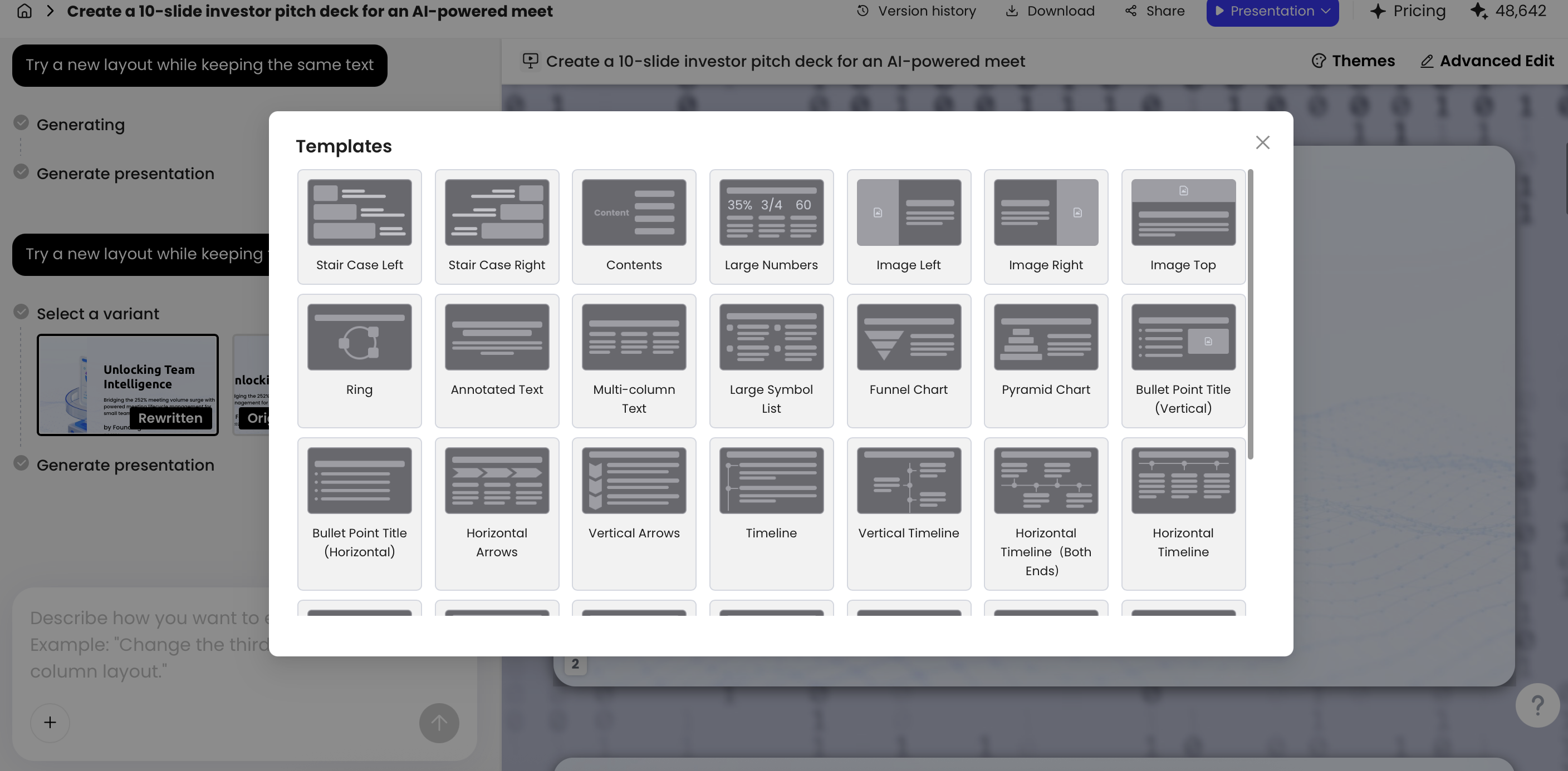
- Generate structurally different layouts: Request at least three approaches such as centered big type, image overlay, and testimonial card. Do not accept three color variants of the same composition.
- Refine the hierarchy: Ask for one emphasized phrase, intentional line breaks, safe margins, reduced background noise, and a readable attribution block.
- Check readability and rights: Preview at small size, projected size, and grayscale. Confirm wording, source, permission, image licensing, and font usage before export.
- Export and reuse: Export to PPTX or PDF, then adapt the same quote for a webinar, LinkedIn post, handout, or internal recap without breaking hierarchy.
Weak prompt: “Make a professional quote slide.”
Better prompt: “Create three 16:9 quote slide concepts for a leadership presentation. Quote: [paste exact quote]. Keep the wording unchanged. Audience: senior managers. Slide job: validate the need for faster decision-making. Tone: confident and practical, not inspirational cliché. Brand: [font/color notes]. Requirements: 6–10 words per line, one emphasized phrase, high contrast, attribution visible at projected size, editable text objects, and speaker notes with source/permission checks.”
When the AI output looks generic, revise the brief instead of only changing colors. Add constraints such as “no stock-photo handshake,” “no giant quotation marks,” “use a plain background,” “make the quote feel like evidence,” or “adapt to our existing executive deck template.”
Six Layout Formulas for AI Quote Slides
AI works better when you give it a composition, not a vague style request.
Instead of saying “make this quote slide look professional,” ask for a known layout formula and define when it should fail. The formulas below work across keynote slides, pitch decks, internal culture decks, sales proposals, and learning materials.
1. Centered big type for a short decisive line
Use when: the quote is under 18 words and needs to open, reset, or close a section. Avoid when: the quote needs proof details, a customer identity, or supporting context. Prompt phrase: “Use centered editorial typography, 60–72 pt quote text, generous whitespace, attribution below, no decorative quotation marks.”
2. Left quote, right portrait for human authority
Use when: the speaker’s identity matters: founder, expert, customer, executive, or instructor. Avoid when: the portrait is low quality or unapproved. Design note: keep the face looking into the slide, place attribution near the quote, and leave at least 8–10% safe margin.
3. Image overlay with mask for emotional context
Use when: the quote needs atmosphere: event recap, nonprofit story, customer moment, field research, or employee culture. Avoid when: the image has busy detail behind the text. Prompt phrase: “Apply a dark overlay of roughly 55–70%, keep text on the quietest image area, and test contrast in grayscale.”
4. Key phrase emphasis for memory
Use when: one phrase must stick, such as “decisions, not dashboards” or “trust before automation.” Avoid when: the slide starts looking like a word cloud. Design note: emphasize three to five words in the brand accent color and keep the rest of the quote calm.
5. Testimonial card for commercial proof
Use when: the quote supports a buying decision, renewal story, case study, or proposal. Avoid when: permission is unclear. Design note: include name, title, company, and “used with permission” in notes; keep logos small so they support credibility without becoming the hero.
6. Chapter transition quote for structure
Use when: moving between sections in training, workshops, or conference talks. Avoid when: the quote interrupts momentum without introducing a new idea. Prompt phrase: “Pair a short quote with a section label, such as ‘Part 2: The Shift,’ and make the label secondary to the quote.”
In an AI editing flow, focus your revisions on the parts that most affect comprehension: line breaks, scale, contrast, margin, attribution placement, and whether the background supports or competes with the message. Theme switching is useful for testing tone, but detailed text placement often still needs a designer’s eye.
Ask AI for variations that differ in structure, not just color. A centered quote, testimonial card, and image-overlay slide solve different communication problems.
Typography and Readability Rules That Make Quote Slides Memorable
Quote slides need theatrical scale, but they still have to pass ordinary reading tests.
Set type size for the room, not the canvas
For a 16:9 slide shown in a room, start around 44–72 pt for the quote and 18–28 pt for the attribution. Online webinars can tolerate slightly smaller type, but remember that viewers may be watching in a small window or on a second monitor. A reliable test: view the slide at 25% zoom, step back 6–10 feet from your laptop, and confirm that the quote still reads before the attribution.
Control line breaks and visible quote length
Line length is just as important as size. Aim for 6–10 words per line, and avoid stacking a long quote into a narrow column unless the typography is intentionally editorial. If the quote is more than 30–35 words, highlight one sentence on the slide and move the full source into speaker notes, appendix, or handout.
Before: “Before the rollout, our managers were spending half their weekly planning meeting arguing about numbers instead of deciding what to do next, and nobody trusted which version was current.” On-slide version: “We stopped arguing about numbers and started deciding what to do next.” The full quote can remain in notes for accuracy.
Check contrast before you fall in love with the background
For accessibility-minded slide design, use strong foreground/background contrast and test the slide in grayscale. WCAG contrast ratios are designed for digital accessibility, but the same principle helps projection: light gray type over a photo almost always fails in a room. If the photo matters, mask it; if the quote matters more, simplify or remove the photo.
AI refinement commands that improve readability
- “Break the quote into natural reading lines with 6–10 words per line and no orphan word at the end.”
- “Keep the visible quote under 25 words; move the full wording to speaker notes.”
- “Increase quote size to approximately 56–64 pt and reduce decorative elements.”
- “Make the attribution 20–24 pt and readable from the back of a room.”
- “Add 12% more whitespace around the text block and keep all text inside safe margins.”
- “Use a high-contrast background; if using a photo, add a dark overlay and verify readability in grayscale.”
Hierarchy test: The audience should see the quote first, the emphasized phrase second, and the attribution third. If viewers notice the background, icon, logo, or quotation marks before the message, the slide is over-designed.
Attribution, Credibility, and Legal Care for AI Quote Slides
Attribution is not a tiny afterthought; it is part of the slide’s credibility system.
Always include the speaker or author name, relevant role, organization when appropriate, and source context if the quote is not widely known. For research or media quotes, add the publication and year in small text or speaker notes. For public, commercial, or recorded presentations, be stricter than you would be for an internal working session.
Exact quotes vs. paraphrased insights
Be careful with AI-generated or AI-rewritten quotes. If AI summarizes a person’s idea, do not put quotation marks around it unless it is exact wording from a verified source. Use “based on,” “adapted from,” or “summary of” when the wording has changed. This is especially important in executive decks, sales materials, analyst references, and training content that may circulate after the meeting.
Customer testimonials and public use
For customer testimonials, secure permission before displaying the person’s full name, company logo, photo, or identifiable details. If the customer asks for anonymity, use a format such as “Operations Director, global logistics company” and keep the full approval record outside the slide. Do not let AI invent titles, company names, quantified results, or logos to make the slide feel more complete.
Research, media, books, speeches, images, and fonts
Famous quotes are often misattributed online, so verify them against a reliable original source where possible: the book, speech transcript, publisher page, official interview, research report, or reputable archive. Also check image licensing and font licensing, especially for public events, paid courses, ads, and social posts. This section is practical guidance, not legal advice; consult counsel for high-risk commercial use.
Safer attribution formats
- Famous source: “Quote text.” — Name, role, work title, or original context
- Customer testimonial: “Quote text.” — Name, title, company; permission recorded in notes or project files
- Research quote: “Quote text.” — Report or publication name, organization, year
- Media/interview quote: “Quote text.” — Speaker, outlet or event, date or year
- Paraphrased insight: No quotation marks; use “Based on...” or “Adapted from...”
Ask AI to create a separate verification checklist for every quote slide: “List what must be verified before presenting this quote publicly: exact wording, original source, author identity, publication date, customer permission, image license, logo permission, and font usage. Flag anything uncertain instead of guessing.” Keep that checklist in speaker notes or your project record.
Prompt Templates for Common Quote Slide Use Cases
Reusable prompts are most useful when they cover the full quote-slide lifecycle: extract, shorten, design, verify, and adapt.
Quote extraction from source material
From the pasted transcript/report, extract 5 candidate quotes for a [presentation type]. Keep exact wording. For each quote, provide: source location, speaker/source, slide job, emotional tone, recommended layout, and any verification concerns. Do not rewrite the quote.
Quote shortening without changing meaning
Shorten this quote for on-slide use while preserving exact wording where possible. Provide: 1) full original quote, 2) visible excerpt under 22 words, 3) omitted context for speaker notes, 4) warning if shortening changes meaning. Quote: “[quote]”.
Famous quote opening slide
Create a minimalist opening quote slide for [topic]. Quote: “[quote]”. Speaker/source: [name and context]. Audience: [audience]. Use large editorial typography, generous whitespace, serious tone, clean lower-third attribution, and no stock-photo cliché. Include a note reminding me to verify the original source.
Customer testimonial slide
Design a B2B customer testimonial quote slide for a sales deck. Quote: “[quote]”. Customer: [name, title, company]. Goal: build trust before pricing. Use a testimonial card layout, subtle brand color, readable attribution, and a permission note placeholder. Do not add metrics, logos, or claims not provided.
Founder vision slide
Create a founder vision quote slide for an investor pitch deck. Quote: “[quote]”. Tone: bold, future-facing, credible. Use a left quote/right portrait layout, emphasize the phrase “[key phrase]”, keep text editable, and leave safe space for a high-quality portrait.
Closing quote slide
Design a closing quote slide that leaves the audience with one memorable action. Quote: “[quote]”. Add a small final line: “[call to action]”. Use high contrast, restrained typography, no oversized quotation marks, and an elegant ending style suitable for [live room/webinar/recorded deck].
Brand adaptation and accessibility check
Revise this quote slide to match our brand guidelines: [paste fonts, colors, logo rules, tone]. Keep the quote dominant, use only one accent color, check contrast, keep attribution readable, and list any brand or accessibility risks.
Case example: When a quote is buried in a long report, ask AI to return candidates with source locations and context, not just “best quotes.” A useful output might rank one line as a proof quote for slide 12, another as a chapter transition, and another as a closing idea. That prevents the common problem of lifting a sentence that sounds powerful but loses meaning outside its original paragraph.
Good vs. Bad: How to Improve an AI-Generated Quote Slide
AI-generated quote slides can look polished but still fail the message.
Use a layered critique: message, hierarchy, typography, background, attribution, and rights. Below is a practical before/after pattern you can apply to any generated slide.
Weak first draft: polished but hard to use
- Quote: 48 words long, split into uneven lines, and impossible to read quickly.
- Background: detailed office photo sitting directly behind the text.
- Decoration: oversized quotation marks draw more attention than the message.
- Attribution: author name and title are too small to read when projected.
- Brand: multiple brand colors are used at once, so nothing stands out.
- Risk: AI has shortened the quote without noting what changed.
Revision prompt: make the slide purposeful
Revise this slide for a projected executive presentation. Keep the quote wording exact unless I approve shortening. Use only the strongest sentence on the slide and move the full quote to notes. Remove decorative clutter, simplify the background or add a dark overlay, make the quote the dominant element, emphasize one key phrase, and make attribution readable at 20–24 pt.
Better revised version: clearer hierarchy and lower risk
- Visible quote: reduced to the strongest sentence, ideally under 25 words.
- Hierarchy: quote first, emphasized phrase second, attribution third.
- Background: plain dark field or image with sufficient overlay for contrast.
- Typography: 6–10 words per line with deliberate line breaks.
- Attribution: placed in a readable lower third with role and source context.
- Notes: full original quote, source link or page number, and permission status retained for review.
The useful habit is to ask AI for a critique before asking for a redesign: “What makes this quote slide hard to read, less credible, or visually generic?” The critique usually reveals whether the problem is too much text, weak hierarchy, a noisy background, or missing source context.
Export, Reuse, and Keep Quote Slides Brand-Consistent
Once the quote slide works, protect its hierarchy across every format where it will appear.
Export QA before the meeting
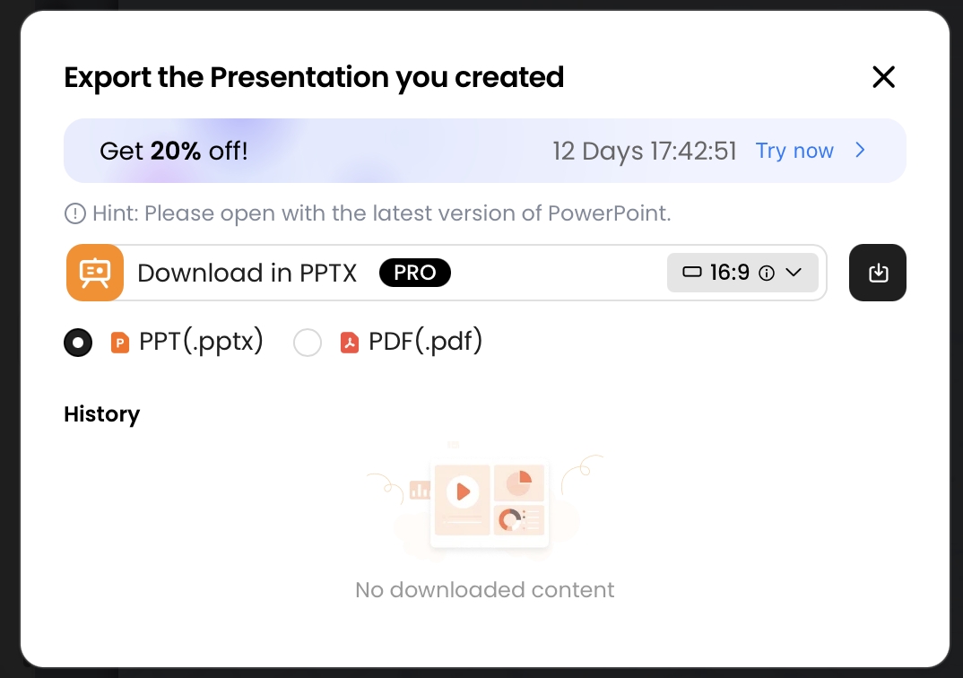
For presentation delivery, export both PPTX and PDF when possible. Open the PPTX in PowerPoint or your target presentation software and check that text remains editable, fonts render correctly, images do not shift, and attribution is still readable. Then test the PDF for locked formatting, especially if the deck will be shared externally or presented from another device.
- Open the exported file on the actual presentation machine.
- Check the slide in slideshow mode, not only edit mode.
- Confirm that custom fonts are embedded, substituted acceptably, or converted according to your team’s policy.
- Verify that image overlays, transparency, and cropping survived export.
- Keep the original editable file in case legal, customer, or executive review changes the quote wording.
Reuse across formats without breaking the message
A strong quote can become a 16:9 presentation slide, 1:1 social image, 4:5 LinkedIn post, internal announcement, training recap, or conference handout. Preserve the same hierarchy while changing dimensions and density. For social crops, increase margins and reduce attribution length; for handouts, add source details; for webinars, make the quote larger because viewers may see it in a compressed window.
Build a small quote-slide system
Brand consistency does not mean forcing every quote slide into the same template. Define a small set of rules: two approved typefaces, one accent color for emphasis, consistent attribution style, safe margins, and a preferred treatment for portraits or backgrounds. For formal corporate decks, use restrained contrast and precise alignment. For education or training, use warmer colors and more context. For luxury or premium brands, rely on whitespace, elegant type, and minimal decoration.
- Is the visible quote under 30–35 words, or is only the strongest sentence shown?
- Can the quote be read in eight seconds at projected or webinar size?
- Does the audience see the quote first, key phrase second, and attribution third?
- Is the exact wording verified against the original source?
- Is permission documented for customer names, logos, portraits, and testimonials?
- Does the slide meet basic contrast and accessibility expectations?
- Does it match the emotional tone of the surrounding slides?
- Has the exported PPTX or PDF been checked on the actual presentation screen?
FAQ: Designing Quote Slides with AI
How do I use AI to design quote slides quickly?
Start with the quote, audience, tone, slide purpose, and brand style. Ask AI for three layout options, then refine typography, attribution, contrast, and export format.
What font size should a quote slide use?
For a 16:9 presentation, use roughly 44 to 72 points for the quote in a room setting, with attribution around 18 to 28 points. Test from the back of the room or on a small laptop preview.
Do quote slides need attribution?
Yes. Attribute the speaker, author, customer, or source whenever the line is not your own. For customer testimonials, confirm permission before displaying names, logos, or identifying details.
Can AI-generated quote slides be exported to PowerPoint?
Yes, many AI presentation tools support export. PopAi supports PPTX and PDF export, and the PPTX can be opened in Microsoft PowerPoint with editable text objects.
Create your presentation with one click now
Turn quotes, reports, notes, or outlines into editable presentation slides, then refine the story, layout, and export format for your next meeting.
Start creating with PopAi