How to Design a Cover Slide with AI: Examples & Prompts
Published September 10, 2026
If you need to design cover slides with AI, you are probably working against a deadline: a founder polishing a pitch at midnight, a consultant turning a strategy memo into a board deck, or a trainer trying to make a compliance course look less forgettable.
The common failure is not “bad design taste.” It is a weak brief. A prompt like “make this look modern” often produces a glossy background, tiny subtitle, oversized logo, and a title that disappears in thumbnail view. This guide shows how to turn that vague request into a usable design workflow: define the cover’s job, prompt for hierarchy, review AI visuals, iterate the first draft, and check export quality before the deck leaves your hands.
Cover Slide Examples and Review Checklist
A strong AI cover slide should make the topic, audience, tone, and promise clear before anyone reads the second slide.
Use the cover slide as a signal, not decoration. Before sending the prompt to an AI presentation tool, define the deck type, the desired mood, the required title, and any visual boundaries. Then review whether the generated cover makes the audience understand what kind of presentation they are about to see.
| Deck type | Weak AI cover | Better human-edited cover direction | Review before publishing |
|---|---|---|---|
| Investor pitch | Generic startup background with a vague title. | Company name, category, one-line promise, restrained visual cue, and date. | Confirm the company name, tagline, logo use, and confidentiality label. |
| Class presentation | Decorative stock image with no learning context. | Topic, course or class context, presenter name, and a simple visual metaphor. | Check assignment requirements and avoid uncredited images. |
| Product launch | Overcrowded cover with product features listed on slide one. | Product name, launch theme, one clear benefit, and a clean hero visual. | Verify product claims, release timing, and approved brand language. |
Prompt upgrade
Instead of “make a cover slide,” use: “Create a presentation title slide for [audience] about [topic]. Use a [tone] visual style. Include [title], [subtitle], [presenter/company], and no more than one supporting visual idea. Keep the slide clean and leave space for branding.”
Why an AI Presentation Cover Slide Matters
A cover slide is the audience’s first orientation point: topic, owner, meeting context, tone, and level of seriousness. Before anyone sees your agenda or data, they have already judged whether the deck feels relevant and controlled.
When teams use AI for full presentations, they often spend time on outlines, charts, and speaker notes but accept the first title slide the system generates. That is risky because the cover uses a different design logic from body slides: fewer words, stronger hierarchy, larger type, more controlled whitespace, and one clear visual idea.
A cover slide does not need to explain the whole deck. It needs to make the right person think, “This is for me, and it is worth my attention.”
Workflow note: In a practical 10-slide deck workflow, AI may create a usable first draft in a few minutes, but the cover usually needs a separate 10–15 minute review cycle. The time is well spent because cover decisions—color palette, typography mood, image style, and title language—often set the pattern for the rest of the deck.
Use a strict five-second test. Show the cover at full screen or as a small thumbnail and ask:
- Can the viewer identify the topic without reading twice?
- Can they tell who the deck is for: investors, executives, students, customers, or internal teams?
- Is the title readable from the back of a room or in a screen-share thumbnail?
- Does the mood match the occasion: board review, sales proposal, course, webinar, or launch?
- Are the presenter, company, logo, and date visible without overpowering the title?
Case example: A weak cover title such as “Q3 Update” gives the audience almost no reason to care. A stronger version—“Q3 Growth Review: Retention Gains, Pipeline Risks, and Next Bets”—sets a sharper expectation. The design can stay minimal, but the message becomes more useful immediately.
The Anatomy of a Powerful Cover Slide
A strong AI cover slide is built from a small set of elements arranged in a clear hierarchy, not from decoration added after the fact.
Before asking any AI tool to design, define what must appear and what should stay out. Most weak AI-generated covers fail because the prompt says “make a professional title slide” without specifying the title length, audience, brand constraints, safe text area, or image role.
Start with hierarchy, not decoration
- Title: A clear, audience-facing promise or topic. Aim for 5–10 words; 12 is usually the upper limit before the cover starts feeling like an agenda slide.
- Subtitle or tagline: One short line that adds context, timeframe, outcome, or point of view. Omit it if the title already does the work.
- Presenter, team, or company: Important for credibility in client, investor, academic, and leadership settings.
- Date or event: Useful for webinars, quarterly reviews, conferences, formal reports, and version-controlled internal decks.
- Logo: Keep it visible but secondary. In most 16:9 covers, a logo works best in a corner or aligned with metadata—not floating near the title.
- Visual anchor: One image, shape system, product detail, pattern, or metaphor that reinforces the topic. If it could fit any presentation, it is probably too generic.
Use practical cover slide proportions
- Canvas: Design in 16:9 unless the event or organization specifies otherwise.
- Safe margins: Keep important text at least 5–7% away from slide edges to avoid projector cropping and cramped exports.
- Title size: For standard business decks, start around 44–64 pt in PowerPoint, then adjust based on font, room size, and title length.
- Subtitle size: Usually 45–65% of the title size. If it competes with the title, it is too large or too close.
- Logo size: Large enough to recognize, small enough that it does not become the main object. When in doubt, reduce it by 15–25%.
- Negative space: Reserve a clean area for the title before generating or choosing a background image.
Common cover layouts include a left-aligned hero title with image space on the right, a centered keynote-style title, a split image/text cover, a full-bleed photo with a dark overlay, or a product mockup cover. For broader tool selection, compare AI presentation makers based on whether they let you adjust these layout decisions after generation.
If you want to create and revise a cover from source material rather than starting from a blank slide, PopAi AI Presentation can generate a deck from a prompt or uploaded content, then let you refine the cover direction with natural language.
Good hierarchy feels almost boring while you are designing it: one dominant title, one supporting line, one controlled visual, and metadata that stays in its lane.
Design Cover Slides with AI: A Prompt Framework
The best AI cover prompts behave like short creative briefs. They tell the system what the slide must communicate, who will judge it, what visual territory to explore, and what mistakes to avoid.
Use a prompt formula that controls design decisions
Topic + audience + occasion + title/subtitle + visual mood + brand constraints + composition + negative prompt + output requirement.
- Audience: Controls formality. “Seed investors” and “new employees” should not produce the same cover.
- Occasion: Controls stakes. A board review needs restraint; a launch event can carry more drama.
- Title and subtitle: Prevents the AI from inventing vague or inaccurate language.
- Visual mood: Defines the emotional range without relying on empty words like “cool” or “modern.”
- Brand constraints: Keeps colors, logo placement, and tone from drifting into a generic template.
- Composition: Tells the AI where text should live and how much whitespace to preserve.
- Negative prompt: Reduces common AI clutter such as fake UI text, random icons, and stock-photo business people.
- Output requirement: Ask for editable slide text, 16:9 format, and multiple variations when the tool supports it.
Weak prompt: “Make a modern cover slide.” Better prompt: “Create a 16:9 SaaS investor pitch cover for seed investors. Title: ‘SignalFlow: Real-Time Revenue Intelligence.’ Subtitle: ‘Helping B2B teams identify pipeline risk before quarter-end.’ Use a dark navy background, electric blue accent, left-aligned editable typography, small logo in the bottom-right, and 40% clean space on the right for an abstract data-flow visual. Avoid stock photos, tiny text, fake dashboard labels, and decorative icons unrelated to revenue.”
Here is a reusable prompt you can adapt:
Copy-ready AI cover slide prompt
Create a 16:9 presentation cover slide for [topic]. The audience is [audience], and the presentation will be used for [meeting/event/context]. Use the title “[title]” and subtitle “[subtitle].” The tone should feel [specific tone: board-level, founder-led, academic, hands-on, launch-ready]. Use [brand colors], include [speaker/company/date/logo], and create one visual idea based on [metaphor or image idea]. Place the title in [left third/center/right third], keep text editable, preserve generous negative space, and avoid [stock photos/tiny text/fake UI/random icons/busy backgrounds].
Iterate the prompt instead of accepting the first draft
- Draft: Generate 2–3 cover variations with different layouts.
- Diagnose: Identify the weakest issue: title length, contrast, image relevance, logo scale, or tone mismatch.
- Revise: Give one precise command at a time, such as “move the title to the left third and darken the background behind it.”
- Stress test: View the cover as a thumbnail, full-screen slide, and exported PPTX/PDF.
Case example: For a healthcare operations deck, the first AI output used a glowing robot doctor image. It looked polished but felt risky for a hospital leadership audience. A better follow-up prompt was: “Replace the futuristic robot image with a calm abstract hospital workflow map, use muted blue and white, keep the title area plain, and avoid faces, medical devices, or speculative technology.” The revised direction felt more credible because it matched the decision-makers’ context.
Use AI Visuals Without Losing Clarity or Brand
AI visuals can help a cover feel distinctive, but the image must serve the title. If the background is the most interesting part of the slide, the design is probably working against the presenter.
Prompt AI images for composition, not decoration
Use image prompts that describe function and placement. Instead of “futuristic city,” try “a minimal, dark, high-contrast abstract city grid viewed from above, with soft blue data lines, leaving empty space on the left for a large title.” The second prompt tells the AI where the text will live and what the image is allowed to do.
Visual directions that work well for cover slides
- Abstract metaphor: Networks, pathways, waves, grids, layers, bridges, or landscapes that represent the topic without becoming literal.
- Contextual photography: A real setting tied to the audience, such as a classroom, factory floor, retail shelf, hospital corridor, or city skyline.
- Brand pattern: Repeated shapes, gradients, lines, or icons built from the brand palette.
- Product detail: A cropped interface, device mockup, package close-up, or feature moment with no unreadable UI text.
Check readability before style
Design check: Cover slide readability depends on contrast, not only font size. A 54-point title can still fail over a busy image. If the title sits on photography or AI art, use a dark tint, gradient overlay, soft blur, solid color panel, or crop that moves detail away from the text-safe zone. For accessibility, aim for strong light/dark separation and avoid placing thin type over high-frequency texture.
- View the slide at 25% zoom. If the title vanishes, the background is too active.
- Convert the slide mentally to grayscale. If the title and image merge, adjust contrast.
- Test on a projector or screen-share view when possible; saturated gradients often behave differently across displays.
- Keep generated text out of images. Titles, subtitles, names, and dates should remain editable slide text.
Protect brand consistency and commercial use
Brand consistency means more than using the right hex colors. Check type personality, icon style, photography realism, logo clearance, and whether the cover looks like it belongs with the rest of the deck. AI tools may introduce random accent colors, inconsistent illustration styles, or glossy effects that conflict with a conservative brand system.
Also review AI-generated visuals for artifacts and usage risk: distorted hands, fake interface details, unreadable signage, duplicated logos, recognizable people, or imagery that resembles protected brand assets. For client-facing or paid work, confirm the tool’s commercial-use terms and replace questionable images with licensed photography or approved brand assets when needed.
Iterate an AI Presentation Cover Slide in PopAi
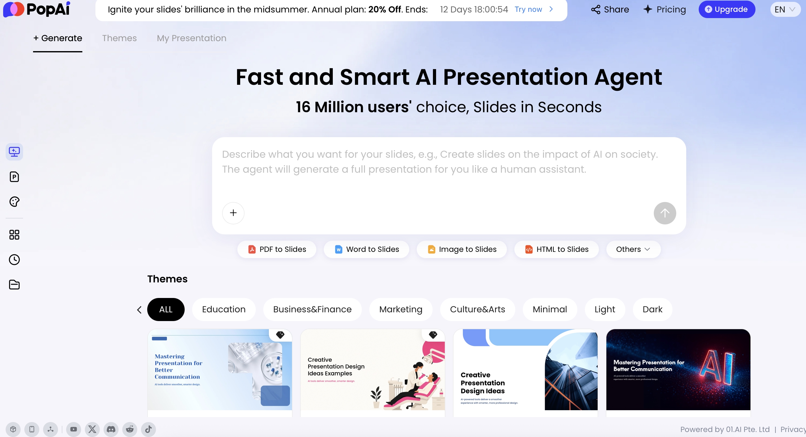
PopAi is most useful for cover slide work when you treat it as a drafting and revision environment, not a one-click design oracle. Start with source material, inspect the story it extracts, choose a theme direction, then revise the title slide against concrete criteria.
For source-based decks, you can start from a topic, report, old deck, notes, proposal, or uploaded file. The key advantage is not the length of the supported file list; it is that a stronger cover title often comes from the actual material. A vague topic line like “AI customer service report” may become “From Ticket Volume to Resolution Quality” after the underlying analysis is summarized.
Start from source material
- Upload or prompt: Use a report, old PPTX, client brief, meeting notes, or a concise written prompt.
- Review the content plan: Check the visible Thought Process, Draft, Outline, or content plan before judging the cover. If the story is wrong, the cover will be wrong too.
- Extract title options: Ask for five title/subtitle pairs before generating or revising the design.
Choose the right theme direction
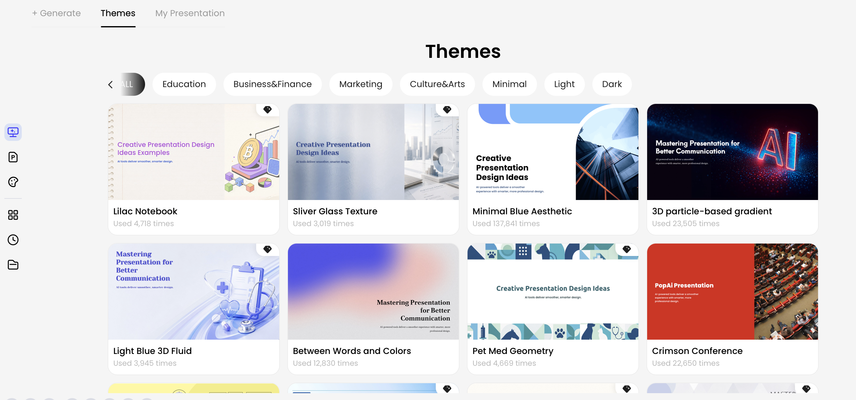
Theme selection should follow the audience. For an investor deck, you may want dark contrast, sparse metadata, and a confident product or market metaphor. For internal training, a lighter palette and friendlier illustration may work better. Avoid choosing a theme only because it looks impressive in the gallery.
Revise the cover with natural language
Good iteration commands are specific. Try: “Make the title 20% larger, move it to the left third, reduce the subtitle to one line, use a darker executive-report mood, and keep the logo small in the bottom-right corner.” Natural language revision works best when you describe the design problem, not just the desired adjective.
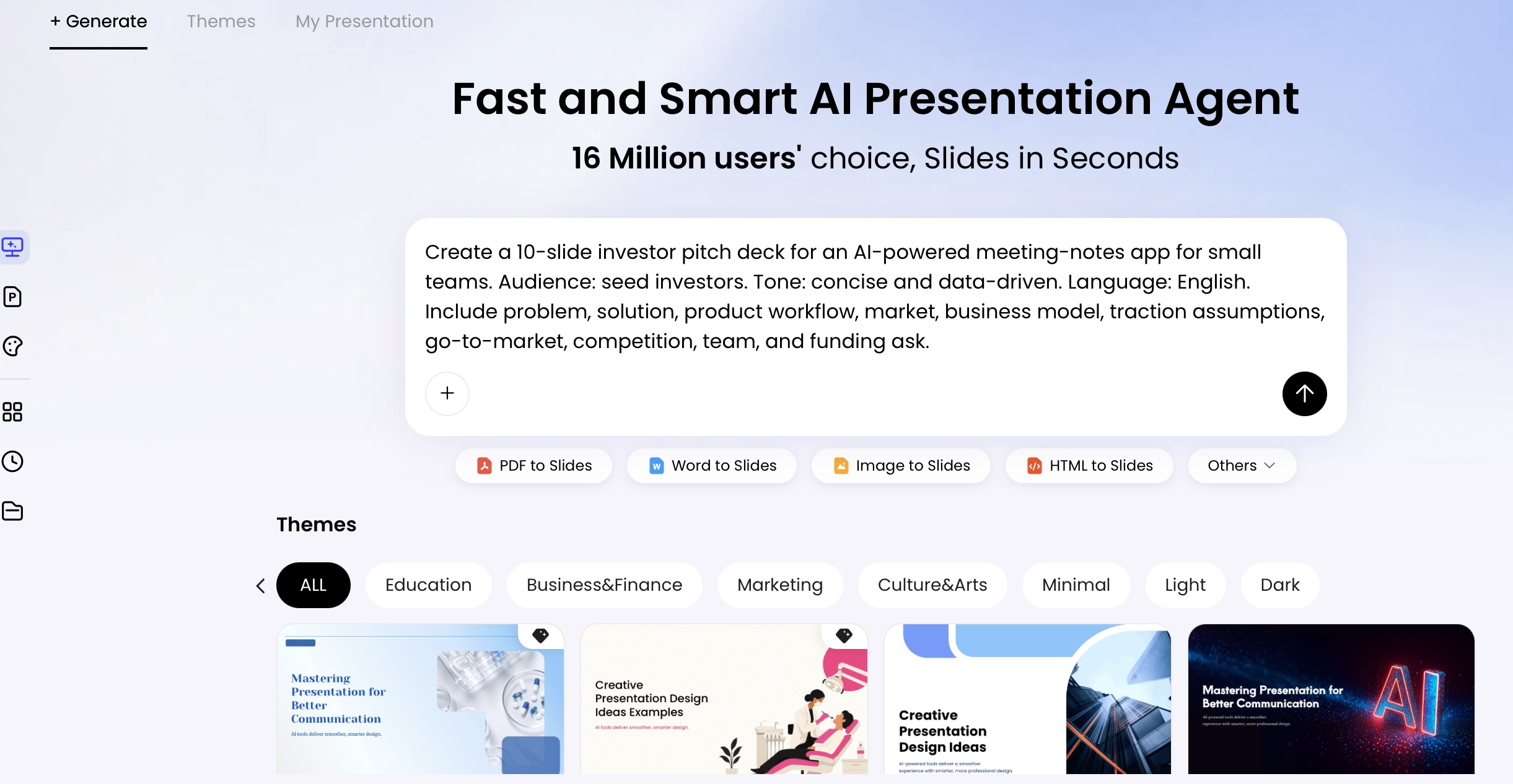
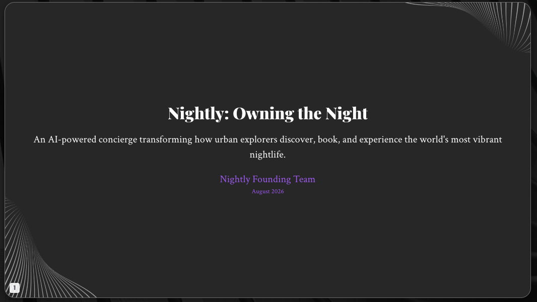
Tested workflow example: For a fictional nightlife concierge pitch, a useful first prompt is: “Create a seed investor pitch deck for Nightly, an AI nightlife concierge that helps travelers discover, reserve, and coordinate premium evening experiences. Cover mood: dark luxury, neon nightlife, founder-led, investable. Avoid crowded club photos and unreadable neon text.” A typical first draft may capture the mood but overuse glow effects. The refinement prompt should be concrete: “Reduce neon intensity, make the title cleaner, keep all text editable, add more negative space around the team line, and make the subtitle sound less promotional.”
Export and check the file
After export, open the PPTX or PDF yourself. In PowerPoint, verify that the title, subtitle, date, and presenter names are editable text objects rather than flattened into the background. Also check font substitution, logo sharpness, image cropping, and spacing shifts. AI can get you to a strong first version quickly, but final delivery still needs a human production pass.
Cover Slide Prompt Templates for Common Decks
Different decks need different first impressions. Use the templates below as structured starting points, then add your own title, audience, constraints, and “avoid” instructions.
Investor pitch deck: make the category promise obvious
Best for: fundraising, demo day, accelerator, or strategic investor meetings. Emphasize: market category, ambition, traction, and founder credibility. Avoid: generic rocket imagery, fake charts, cluttered slogans, and unreadable dark gradients.
Template
Create a bold 16:9 investor pitch cover for a startup called [company]. Audience: [seed/Series A/strategic] investors. Title: “[company]: [category promise].” Subtitle: “[traction, mission, or customer outcome].” Use [brand colors], a confident but uncluttered layout, founder names, date, and one subtle market-related visual metaphor. Keep text editable and avoid stock business photos.
Filled example: “SignalFlow: Revenue Risk Detection for B2B Sales Teams” with the subtitle “Helping teams identify stalled pipeline before quarter-end.” Refinement prompt: “Make the title more legible at thumbnail size, remove extra icons, and use one abstract pipeline-flow visual instead of a dashboard screenshot.”
Executive business review: prioritize evidence and control
Best for: quarterly business reviews, board updates, strategy readouts, and operating reviews. Emphasize: decision context, timeframe, business unit, and calm authority. Avoid: playful gradients, exaggerated motion graphics, and vague strategy buzzwords.
Template
Create an executive cover slide for a quarterly business review about [business unit/topic]. Audience: C-suite leaders. Title: “[specific review title].” Subtitle: “[timeframe + decision focus].” Use a restrained palette, strong left-aligned title hierarchy, small logo, and an abstract pattern based on trend lines or operating metrics. Keep the slide calm, precise, and readable.
Filled example: “Q4 Customer Operations Review” with the subtitle “Retention gains, service capacity risks, and 2026 priorities.” Refinement prompt: “Reduce decorative elements, make the date and business unit smaller, and use a subtle grid rather than a dramatic growth arrow.”
Training or course deck: make the outcome feel approachable
Best for: onboarding, workshops, internal enablement, university lectures, and continuing education. Emphasize: learner benefit, clarity, instructor credibility, and a welcoming tone. Avoid: childish illustrations for professional learners and dense academic titles for beginners.
Template
Create a friendly training presentation cover for [course topic]. Audience: [learner group]. Title: “[course title].” Subtitle: “[practical learning outcome].” Include instructor name and date. Use an approachable illustration or simple progress metaphor, high readability, and a clean layout suitable for screen sharing.
Filled example: “Data Storytelling for Sales Managers” with the subtitle “Turn pipeline metrics into clear weekly decisions.” Refinement prompt: “Make the design more professional and less playful, replace the cartoon character with a simple chart-to-story visual, and increase title contrast.”
Product launch: put the benefit before the spectacle
Best for: customer launches, partner briefings, press previews, and sales kickoffs. Emphasize: product name, main benefit, visual recognition, and energy. Avoid: product screenshots that are too small to read, excessive lens flare, and taglines that could apply to any product.
Template
Create a launch event cover for [product name]. Audience: customers, partners, and press. Title: “[product name].” Subtitle: “[specific customer benefit].” Use product-focused composition, dramatic but readable typography, approved brand colors, and one hero product image or abstract feature visual. Keep metadata minimal and avoid fake UI text.
Filled example: “Atlas Mobile” with the subtitle “Field service scheduling that adapts in real time.” Refinement prompt: “Crop the product mockup larger, remove decorative icons, darken the right side behind the title, and make the tagline more concrete.”
Mistakes That Make AI Cover Slides Look Generic
AI can create a polished-looking cover that still fails strategically. Diagnose the problem before redesigning the slide; otherwise you may keep generating prettier versions of the same weak idea.
| Problem | How to spot it | Fix | AI revision command |
|---|---|---|---|
| Title is too long | It wraps into three or four lines or sounds like a report paragraph. | Rewrite to a short promise, decision, or topic. | “Rewrite the title in under 9 words and make it more audience-facing.” |
| Background fights the text | The title disappears over faces, texture, bright areas, or visual detail. | Crop, blur, darken, add a gradient overlay, or use a solid text panel. | “Darken the image behind the title and move detailed elements away from the left third.” |
| No visual focal point | The cover has multiple icons, patterns, photos, and effects competing at once. | Choose one metaphor or product moment. | “Remove decorative icons and use one abstract pathway visual as the only graphic element.” |
| Logo is oversized | The brand mark pulls more attention than the title. | Move it to a corner, align it with metadata, and reduce size. | “Reduce the logo by 25% and place it in the bottom-right with clear padding.” |
| Template mood mismatches the audience | The slide feels playful for a risk review or too severe for a workshop. | Adjust palette, typography, imagery, and density for the room. | “Make the mood more board-level: restrained colors, less glow, cleaner typography.” |
| AI image is unrelated | The visual could fit any deck in any industry. | Use a specific audience context, product detail, or topic metaphor. | “Replace the generic abstract background with a subtle supply-chain route map motif.” |
| Export was not reviewed | Fonts shift, text becomes flattened, spacing changes, or logos blur after export. | Open the final PPTX/PDF, click text objects, and inspect at presentation size. | “Keep all title, subtitle, and metadata as editable text and preserve spacing for PPTX export.” |
Finally, fact-check any text the AI generated. The cover may contain fewer claims than the body slides, but names, dates, event titles, company spellings, and taglines still matter. A typo on slide one damages trust immediately.
Final cover slide review checklist: confirm the title is under control, the subtitle adds context, the logo is secondary, the image supports the message, the contrast works in thumbnail view, the mood fits the meeting, brand elements are consistent, and exported files open cleanly in the software your audience will use.
FAQ: Designing Cover Slides with AI
What should I include in an AI prompt for a cover slide?
Include the topic, audience, use case, title, subtitle, speaker or company name, date, brand colors, visual mood, format, and source material. Add layout constraints such as left-aligned title, dark background, or 40% negative space.
Can AI create a cover slide from a PDF, document, or old PPT?
Yes. PopAi supports multiple file-to-slides inputs, including PDF, DOCX, TXT, HTML, images, and PPTX. For best results, review the generated outline first, then refine the title, tagline, and visual direction.
How do I stop an AI cover slide from looking generic?
Give the AI a specific audience, industry, tone, brand palette, and image direction. Avoid vague prompts and ask for fewer elements, stronger hierarchy, and one relevant visual metaphor.
Is an AI-generated cover slide good enough for investors or clients?
It can be a strong first draft, but investor and client decks still need human review for accuracy, contrast, typography, brand fit, and message sharpness.
Create your presentation with one click now
Turn prompts, documents, reports, or old slides into a polished presentation draft, then refine the cover, theme, layout, and export format for your audience.
Start creating with PopAi