How to Convert JSON Data into Presentation Slides with AI


JSON data is useful for presentations when it already has structure, but it is not automatically presentation-ready. A slide deck needs labels, hierarchy, comparisons, and a clear audience goal. The human task is to decide what each field means; the AI task is to turn that mapped structure into slide titles, bullets, charts, and speaker notes.
Raw JSON vs Presentation-Ready JSON
The best improvement is to show the input and output shape before asking AI to generate slides.
| Raw API-style JSON | Presentation-ready JSON |
|---|---|
{
  "q1": {"rev": 90200, "spd": 19500},
  "q2": {"rev": 116000, "spd": 24000},
  "seg": ["Search", "Email"]
} | {
"deck_goal": "Explain channel efficiency to marketing leadership",
"periods": ["Q1", "Q2"],
"metrics": [
{"name": "Revenue", "unit": "USD", "q1": 90200, "q2": 116000},
{"name": "Spend", "unit": "USD", "q1": 19500, "q2": 24000}
],
"recommended_slides": ["Executive summary", "Revenue trend", "Channel action plan"]
} |
The second version gives AI the goal, labels, units, and intended slide structure. That makes the output easier to review than a raw object with abbreviations.
Field Mapping Before Slide Generation
| JSON field | Meaning | Slide use | Do not let AI assume |
|---|---|---|---|
period | Reporting period such as month, week, or quarter. | X-axis, section divider, or trend slide. | Whether fiscal and calendar periods are the same. |
segment | Channel, product, region, persona, or cohort. | Comparison table or ranked chart. | That segments are mutually exclusive. |
value | Numeric measure. | KPI card, chart, or variance explanation. | Unit, currency, or denominator. |
status | Qualitative state such as green, at risk, blocked. | Status summary slide. | Severity rules or owner accountability. |
Invalid JSON Example and Repair
Many failed JSON-to-slide workflows come from invalid syntax or ambiguous nesting. Check validity before using the content.
// Invalid: trailing comma and comment inside JSON
{
  "metric": "revenue",
  "value": 116000,
}
{
  "metric": "revenue",
  "value": 116000,
  "unit": "USD",
  "source": "approved dashboard export"
}
For structured production inputs, reference JSON Schema (json-schema.org) and your internal API documentation. Schema validation helps catch missing required fields before the deck is generated.
Use Safer Testing Language
Instead of claiming that a JSON deck was generated in an exact time, describe the example conditions. For instance: In a prepared sample with mapped fields and fewer than 50 records, AI could create a reviewable slide outline from the JSON summary. Larger nested files need cleanup and validation first.
If you are a developer, data analyst, RevOps manager, or product operator, the hard part is rarely exporting JSON. The hard part is turning that export into a deck a VP can read in five minutes without asking, “Where did this number come from?” In this guide, we will use a product analytics JSON example and convert it into a 5-slide adoption review deck: executive summary, KPI snapshot, activation trend, segment table, and recommended actions.
The workflow is not “paste data and hope for slides.” A reliable JSON-to-slides process has eight steps: clean the source fields, add metric definitions, write a constrained prompt, review the AI-generated outline, map JSON fields to slide objects, validate the numbers, edit the narrative, and export an editable deck. Tools such as PopAi AI Presentation are useful in this workflow because they let you start from a detailed prompt, review a content plan, choose a visual style, revise slides with natural-language instructions, and export to PPTX or PDF.
AI is most useful when it turns structured data into a traceable presentation—not when it hides the source, assumptions, or calculations behind polished slide design.
Why Convert JSON Data into Presentation Slides with AI?
JSON is built for systems; presentations are built for decisions.
JSON works well for APIs, dashboards, product analytics tools, CRM exports, support platforms, and automation pipelines. But executives and customers usually do not want nested objects, arrays, or cryptic keys. They want a short narrative: what changed, why it matters, where the risk is, and what action is recommended.
In a recurring reporting workflow, the time loss is not only formatting. A typical performance slide may require a metric definition, a trend chart, a target comparison, an outlier explanation, a caveat about missing data, and a recommendation. In recurring reporting, each JSON readout can require metric definitions, trend charts, target comparisons, outlier explanations, caveats, and recommendations before stakeholder revisions.
Case-study note: For a sample product analytics review, a cleaned JSON file with 14 metrics, 4 weekly trend points, and 6 customer segments was enough to draft a 5-slide deck. The AI-assisted pass was fastest at first-draft structure: grouping metrics, suggesting chart placement, and writing slide titles. Manual review was still required for metric formatting, target interpretation, and recommendation wording.
AI helps most when the work involves repeatable judgment:
- Summarization: turning raw metric fields such as
activationRate,retentionD30, andsupportTicketsinto an executive summary. - Visual selection: recognizing that weekly values should become a line chart, segment comparisons should become a table or bar chart, and single current-period values should become KPI cards.
- Narrative framing: explaining whether a metric is above target, below target, improving, declining, or missing context.
- Slide drafting: creating a usable deck structure before a human analyst refines it.
AI helps least when the JSON lacks context. If the export contains only {"val": 0.37}, the model cannot know whether that means 37% activation, $0.37 ARPU, 0.37 seconds of latency, or a normalized score. Good JSON-to-slide workflows add business labels before generation.
Best-fit use cases with example fields
- Monthly performance reports: Convert KPI JSON such as
revenue,pipeline,churnRate, andforecastVarianceinto an executive summary, department charts, and action slides. - QBR and customer success decks: Generate account-specific slides from
usageByFeature,supportTicketTrend,renewalDate,healthScore, andexpansionOpportunities. - Sales proposals: Personalize proof points, ROI estimates, pain points, and implementation priorities from CRM or enrichment JSON.
- Product analytics readouts: Turn feature usage arrays, cohorts, funnels, activation drops, and retention changes into stakeholder-friendly narratives.
- Education and research: Convert experiment outputs, survey summaries, or literature extraction data into teaching slides with tables and evidence notes.
Prepare JSON Data Before Feeding It to AI
Presentation-ready JSON is smaller, clearer, and more opinionated than raw system JSON.
Before choosing a tool, compare the latest AI presentation makers by input type, template control, export quality, and editing workflow. For JSON-heavy work, the tool matters—but the quality of your cleaned data matters more.
AI slide generation improves dramatically when the JSON is predictable and labeled. The model should not have to infer that act_rate means activation rate, that 0.37 should display as 37%, or that null means “not collected” rather than zero.
Raw JSON vs. presentation-ready JSON
A raw API export often contains too much hierarchy and too little business meaning. Here is a simplified example of the kind of JSON that causes weak slides:
{
  "prd": "2026-07",
  "acct": "all",
  "m": {
    "au": 84200,
    "act": 0.37,
    "d30": 0.61,
    "tgt": 0.40
  },
  "wk": [
    {"w": 1, "v": 0.32},
    {"w": 2, "v": 0.35},
    {"w": 3, "v": 0.36},
    {"w": 4, "v": 0.37}
  ],
  "seg": [
    {"n": "Enterprise", "u": 21100, "a": 0.44},
    {"n": "SMB", "u": 28400, "a": 0.31}
  ]
}
The data is valid, but it is not presentation-ready. Field names are abbreviated, units are missing, the target is not tied to a specific metric, and the audience has no context. A better version separates metadata, rules, metrics, chart data, table data, and validation guidance:
{
  "deckMeta": {
    "title": "July Product Adoption Review",
    "audience": "VP Product and Growth leadership",
    "tone": "concise, analytical, recommendation-oriented",
    "period": "2026-07",
    "source": "product_analytics_api_v3",
    "timezone": "UTC",
    "currency": "USD"
  },
  "rules": {
    "useOnlyProvidedData": true,
    "doNotInventNumbers": true,
    "showMissingValuesAs": "Not available",
    "citeSourceFieldsInSpeakerNotes": true,
    "percentageFormat": "convert decimals to whole percentages without rounding unless stated"
  },
  "metricDefinitions": {
    "activeUsers": "Unique users active during the reporting month",
    "activationRate": "Share of new users completing the activation event",
    "retentionD30": "Share of activated users returning within 30 days"
  },
  "slides": [
    {
      "slideType": "executive_summary",
      "goal": "Summarize the three most important adoption changes",
      "sourceFields": ["metrics.activeUsers", "metrics.activationRate", "metrics.retentionD30"],
      "metrics": {
        "activeUsers": 84200,
        "activationRate": 0.37,
        "activationRateTarget": 0.40,
        "retentionD30": 0.61
      }
    },
    {
      "slideType": "trend_chart",
      "goal": "Show weekly activation rate trend against target",
      "sourceFields": ["chartData.categories", "chartData.series"],
      "chartData": {
        "chartTitle": "Weekly Activation Rate",
        "unit": "percentage",
        "categories": ["Week 1", "Week 2", "Week 3", "Week 4"],
        "series": [
          { "name": "Activation Rate", "values": [0.32, 0.35, 0.36, 0.37] },
          { "name": "Target", "values": [0.40, 0.40, 0.40, 0.40] }
        ]
      }
    },
    {
      "slideType": "segment_table",
      "goal": "Compare activation by customer segment",
      "tableData": {
        "columns": ["Segment", "Active Users", "Activation Rate", "Main Note"],
        "rows": [
          ["Enterprise", 21100, 0.44, "Above target"],
          ["Mid-market", 34700, 0.38, "Near target"],
          ["SMB", 28400, 0.31, "Needs onboarding review"]
        ]
      }
    }
  ],
  "validationRules": [
    "Do not describe activationRate as above target unless activationRate is greater than activationRateTarget.",
    "Display 0.37 as 37%, not 0.37% and not approximately 40%.",
    "If previous-period data is absent, do not claim increase or decline."
  ]
}
What changed and why it matters
- Abbreviations became business terms:
aubecameactiveUsers, andd30becameretentionD30. - Metric definitions were added: the AI can explain a KPI without inventing a definition.
- Targets were made explicit:
activationRateTargettells the model what benchmark to compare against. - Chart and table structures were separated: this reduces confusion between narrative metrics and visual data.
- Validation rules were embedded: the prompt can instruct the AI how to avoid common misreadings.
A practical JSON cleanup checklist
- Flatten deeply nested objects when the slide does not need the full hierarchy. For example, export one row per account or segment instead of sending a full event tree.
- Rename unclear fields such as
val_1,mtd, orarr_deltainto business-readable names. - Add metadata for reporting period, source system, export date, currency, timezone, and intended audience.
- Standardize values for dates, percentages, money, missing values, and calculated fields.
- Separate raw data from slide instructions so the AI knows what is evidence and what is presentation logic.
- Mask sensitive fields such as customer names, email addresses, employee IDs, contract values, or free-text notes unless they are necessary for the deck.
- Validate syntax with your editor, a JSON linter, or a schema check before pasting or uploading data into any AI workflow.
Handling large or deeply nested JSON
If the JSON is too large for a prompt or contains thousands of records, do not send the entire export. Aggregate first. For a QBR deck, the AI usually needs account-level totals, top features, risk indicators, and 3–5 notable changes—not every raw usage event.
- Use SQL: export summarized tables such as monthly active users by segment, support tickets by severity, or renewal risk by account.
- Use Python or jq: flatten nested arrays, rename keys, drop unused fields, and calculate derived metrics before slide generation.
- Use a spreadsheet: if the dataset is small, clean the columns manually, then convert the table back into JSON.
- Chunk by deck section: send executive metrics, trend data, and segment tables separately if one prompt becomes too long.
Tip: Create a small transformation layer that outputs “presentation-ready JSON.” It should format values, remove unnecessary fields, label metrics, define KPIs, mask sensitive data, and preserve calculated fields so the AI does not recompute them differently.
Prompt Pattern: Turn JSON Data into Presentation Slides with AI
The prompt should act like a slide brief, data dictionary, and validation rulebook in one place.
A weak prompt says, “Make slides from this JSON.” A useful prompt tells the AI who the deck is for, what decision it supports, which fields may be used, how numbers should be formatted, what chart types are allowed, and what must appear in speaker notes or audit notes.
Copy-ready prompt template
You are creating a data-driven presentation from the JSON below.

Audience: [describe decision makers]
Goal: [decision, update, recommendation, sales pitch, QBR]
Deck length: [number] slides
Tone: [executive, technical, persuasive, neutral]
Required sections:
1. Executive summary
2. Key metrics
3. Trend analysis
4. Segment, risk, or anomaly view
5. Recommended actions

Rules:
- Use only the JSON values provided.
- Do not invent metrics, dates, customer names, percentages, benchmarks, or prior-period trends.
- If a value is null or missing, write "Not available."
- For every insight, reference the source field name in speaker notes or an audit note.
- Convert decimal percentages into readable percentages.
- Do not round unless explicitly requested.
- Recommend chart types only when chartData, tableData, or time-series fields exist.
- Keep each slide title action-oriented.
- If the JSON does not support a claim, say that the claim cannot be made from the provided data.

JSON:
[paste cleaned JSON here]
Example prompt for the product analytics deck
Create a 5-slide executive presentation from the JSON below.

Audience: VP Product and Growth leadership
Goal: Decide whether to prioritize onboarding improvements for underperforming customer segments
Tone: concise, analytical, recommendation-oriented

Required slides:
1. Executive summary with 3 takeaways
2. KPI snapshot using activeUsers, activationRate, activationRateTarget, and retentionD30
3. Weekly activation rate trend vs target
4. Segment comparison table
5. Recommended actions based only on the provided data

Rules:
- Use only the JSON values.
- Display activationRate 0.37 as 37%.
- Display activationRateTarget 0.40 as 40%.
- Do not say activation increased or declined unless prior-period data is present.
- If a segment is below target, call it out as a risk.
- Put source field names in speaker notes.

JSON:
[paste the cleaned product adoption JSON]
When using PopAi, start with the AI Presentation workflow for a general JSON-to-deck draft. If your priority is brand consistency, use AI PowerPoint with an official, personal, or uploaded .pptx template. If you need a more visual, storytelling-led version after the data story is correct, Creative Slides can be useful for redesigning the deck. For sensitive or very large datasets, paste only the cleaned, aggregated JSON required for the presentation instead of raw records.

Review the AI-generated outline before creating slides
Before generating the full deck, inspect the proposed outline. A good outline from the sample JSON would look like this:
- July adoption is improving but still below target: active users, activation rate, retention, and target gap.
- Activation KPI snapshot: 84,200 active users, 37% activation rate, 40% target, 61% D30 retention.
- Weekly activation trend: line chart showing 32%, 35%, 36%, and 37% against a 40% target.
- Segment comparison: Enterprise above target, Mid-market near target, SMB below target.
- Recommended actions: investigate SMB onboarding friction and test targeted activation improvements.
A poor outline would add unsupported claims such as “activation increased from June,” “retention is best in class,” or “SMB churn is high” when those fields do not exist in the JSON. If that happens, stop and correct the outline before generating slides.
Follow-up correction prompts
- If the AI invents a trend: “Remove all increase/decline language unless the JSON includes previous-period values. Reword slide titles to describe the current-period status only.”
- If decimals are displayed incorrectly: “Correct all percentage formatting: 0.37 means 37%, not 0.37%. Do not round to 40%.”
- If the deck is too dense: “Limit each slide to one main insight, one visual, and no more than three supporting bullets.”
- If source traceability is missing: “Add source field names to speaker notes for every metric and recommendation.”
For data decks, the best prompt is part analyst brief, part design brief, and part validation checklist.
Map JSON Fields to Slide Templates, Charts, and Tables
Every important JSON field should have a slide destination: title, KPI card, chart, table, callout, recommendation, or speaker note.
A JSON-to-slide workflow has three layers. Content is the metric or insight. The visual object is a title, chart, table, KPI card, or callout. The template controls where those objects appear and how they look. If you do not define this mapping, the AI may put important values into body text, overload a chart, or omit the field entirely.
Field-to-slide mapping matrix
| JSON field | Slide object | Example output |
|---|---|---|
deckMeta.title |
Title slide headline | July Product Adoption Review |
deckMeta.audience |
Subtitle or speaker note | Prepared for VP Product and Growth leadership |
metrics.activeUsers |
KPI card | 84,200 active users |
metrics.activationRate + metrics.activationRateTarget |
KPI card with target comparison | 37% activation vs 40% target |
chartData.categories |
Chart x-axis | Week 1, Week 2, Week 3, Week 4 |
chartData.series |
Line or bar chart series | Activation Rate and Target |
tableData.rows |
Comparison table | Enterprise, Mid-market, SMB segment rows |
validationRules |
Speaker notes or audit note | “Do not claim increase without prior-period data.” |
recommendations[] |
Action slide bullets | Prioritize SMB onboarding diagnostics |
Template-driven automation tools often use named placeholders. For example, a title shape might be named slide_title, a chart might be named activation_trend_chart, and a table might be named top_segments_table. The JSON then provides values for matching names. This is strong for recurring reports with fixed layouts, but it requires more setup than a prompt-first AI workflow.
KPI cards: one value, one context clue
KPI cards work best for current-period values, target comparisons, and simple status labels. Avoid putting five metrics into one card. For the sample deck, the activation KPI card should include:
- Main value:
activationRate→ 37% - Comparison:
activationRateTarget→ target 40% - Status: below target by 3 percentage points
- Speaker note: source fields
metrics.activationRateandmetrics.activationRateTarget
Chart data structure that AI can understand
For charts, avoid sending unlabeled arrays such as [12, 17, 21]. Use categories, series names, units, and definitions. This helps AI choose between a line chart, bar chart, stacked chart, or table.
{
  "chartData": {
    "chartTitle": "Weekly Activation Rate",
    "unit": "percentage",
    "xAxis": "Week",
    "yAxis": "Activation Rate",
    "categories": ["Week 1", "Week 2", "Week 3", "Week 4"],
    "series": [
      {
        "name": "Activation Rate",
        "values": [0.32, 0.35, 0.36, 0.37]
      },
      {
        "name": "Target",
        "values": [0.40, 0.40, 0.40, 0.40]
      }
    ]
  }
}
Table data for executive comparison slides
Tables need column labels, row labels, and display formatting. If you use a two-dimensional array, make the first row headers. If you use objects, keep keys consistent. For executive slides, show the five most important rows instead of a complete export of 200 records.
{
  "tableData": {
    "tableTitle": "Activation by Customer Segment",
    "columns": [
      {"key": "segment", "label": "Segment"},
      {"key": "activeUsers", "label": "Active Users", "format": "integer"},
      {"key": "activationRate", "label": "Activation Rate", "format": "percentage"},
      {"key": "status", "label": "Status"}
    ],
    "rows": [
      {"segment": "Enterprise", "activeUsers": 21100, "activationRate": 0.44, "status": "Above target"},
      {"segment": "Mid-market", "activeUsers": 34700, "activationRate": 0.38, "status": "Near target"},
      {"segment": "SMB", "activeUsers": 28400, "activationRate": 0.31, "status": "Below target"}
    ]
  }
}
Slide density should be lower than dashboard density. A dashboard supports exploration; a presentation should guide interpretation.
In PopAi’s Advanced Edit workspace, the practical JSON-specific use case is refinement: turn an overloaded metric slide into KPI cards, convert a long bullet list into a comparison table, or change a recommendation slide into a risk/action matrix. The important rule is to keep edits tied to source fields rather than asking for unsupported embellishment.
Validate AI-Generated Slide Data and Prevent Hallucinations
The highest-risk slide is the one that looks polished while quietly misrepresenting the JSON.
The biggest risk in converting JSON data into presentation slides with AI is silent data drift. Common errors include decimal percentages displayed as tiny percentages, rounded values presented as exact values, invented benchmarks, and unsupported trend language. Validation should happen before design polish, stakeholder review, or export.
Common JSON-to-slide errors to catch
| Source JSON | Bad slide output | Correct output |
|---|---|---|
"activationRate": 0.37 |
Activation rate is 0.37% | Activation rate is 37% |
"activationRateTarget": 0.40 |
Activation is on target | Activation is 3 percentage points below the 40% target |
| No prior-period field | Activation increased this month | Current activation is 37%; prior-period change is not available |
"retentionD30": 0.61 |
Retention is industry-leading | D30 retention is 61%; no external benchmark was provided |
Review note: In the sample product adoption JSON above, a draft could easily round 37% to “about 40%” in a title. Add the rule “Do not round unless explicitly requested” before generation so the slide draft stays closer to the source data.
Use a “no invention” rule
Your prompt should explicitly say that the AI must use only the provided JSON. Ask it to mark missing values as “Not available,” avoid external assumptions, and preserve numeric values unless a formatting rule is specified. For example, 0.37 may become 37%, but it should not become approximately 40% unless you allow rounding.
Create a numeric validation pass
- Compare row counts: Check that the number of categories, segments, accounts, or time periods matches the JSON.
- Verify totals: Recalculate sums, averages, and percentages outside the deck in a spreadsheet, SQL query, or script.
- Check units: Confirm that dollars, users, sessions, percentages, dates, and time zones are displayed correctly.
- Inspect outliers: Make sure surprising claims are supported by actual values, not by AI interpretation.
- Review narrative claims: Every “increase,” “decline,” “best,” “worst,” “risk,” or “above target” statement should map to a field.
- Audit derived metrics: If the AI calculated a gap, variance, or rate, verify the formula manually before sharing.
Correction prompt for validation failures
Review the deck against the JSON rules below.

Fix these issues:
1. Do not round percentages unless requested.
2. Replace unsupported trend language with current-period language.
3. Remove any benchmark that is not in the JSON.
4. Add source field names to speaker notes for each metric.
5. Keep calculated gaps explicit, for example: 40% target - 37% actual = 3 percentage points below target.

Return an updated slide outline before changing the full deck.
Practical safeguard: Add a final appendix slide, hidden working slide, or speaker-note audit trail that lists the source system, export date, JSON version, key field names, calculated metrics, and validation checks performed. This makes the deck easier to defend when numbers are challenged in a meeting.
For sensitive company data, remove or mask anything the deck does not need: personally identifiable information, employee-level records, customer emails, contract IDs, internal notes, or raw event logs. Use aggregated metrics whenever possible. If the deck contains regulated financial, health, employee, or customer data, involve security and legal teams before building an automated data-to-deck pipeline.
Choose the Right JSON Data to Slides AI Workflow
Choose the workflow based on frequency, sensitivity, template precision, automation needs, and who must edit the final deck.
A one-off board update, a weekly automated report, and a factory for hundreds of customer QBR decks have different requirements. Prompt-first tools are faster for exploratory narratives. Template automation is stronger for strict recurring layouts. Code libraries are best when you need full control, APIs, and batch generation.
| Workflow | Best for | Trade-off | Use when |
|---|---|---|---|
| Prompt + cleaned JSON in PopAi | Fast analysis decks, QBR drafts, product readouts, stakeholder summaries | Requires careful validation and prompt discipline | The story changes each cycle and business users need to guide the narrative |
| Uploaded PPTX template + AI PowerPoint workflow | Business presentations that need familiar structure and brand-aligned layouts | Template quality affects output quality | You need a human-editable first draft that resembles internal presentation formats |
| Named-placeholder automation | Recurring reports with fixed charts and strict field mapping | Setup is more technical and less flexible for new storylines | The same slide layout repeats and only the numbers change |
| Python, PptxGenJS, VBA, or custom API pipeline | High-volume generation, internal systems integration, and strict governance | Requires development, testing, documentation, and template maintenance | You need hundreds or thousands of decks, scheduled generation, or internal approval flows |
| Dashboard screenshot export | Quick evidence capture from BI tools | Often produces less editable, less narrative-driven slides | You need a quick visual reference and do not need editable chart data |
Decision rules for real teams
- One-off strategic deck: use cleaned JSON plus an AI-first prompt, then manually validate and refine.
- Monthly recurring deck: use a saved schema, saved prompt, and brand template; keep a validation checklist beside the deck.
- Hundreds of customer-specific decks: build a transformation pipeline that outputs one cleaned JSON file per account, then add template or API automation.
- Highly sensitive data: prefer internal tooling, masked data, or approved enterprise AI workflows.
- Strict editable chart requirements: test export behavior early. Some AI-generated visuals may export as editable objects, grouped shapes, or images depending on the slide type and tool.
A practical rule is simple: if the story changes each time, use an AI-first workflow; if the story is fixed and only the numbers change, use a template-first workflow; if volume and governance matter more than speed, add code or API automation. PopAi is strongest in the middle ground: teams need a high-quality first draft, editable slide text, template options, and a workflow that nontechnical users can still direct.
Export, Edit, and Share the AI-Generated Presentation
Export is not the finish line; it is the point where data accuracy, editability, and presentation quality must be checked together.
After generation, review the deck like both an analyst and a presenter. Does the first slide make the decision clear? Do chart titles state the insight instead of just naming the metric? Are tables trimmed to the rows that matter? Are recommendations tied to JSON evidence? If a stakeholder asks for proof, can you point to the exact source field?
In PopAi, use natural-language revision requests for broad changes and Advanced Edit for precise slide cleanup. Practical requests include: “make the executive summary more concise,” “turn slide 4 into a risk matrix using only the segment table,” “add source field names to speaker notes,” or “replace unsupported trend language with current-period status.” Then use the editor to adjust themes, layouts, cards, charts, icons, and writing elements.
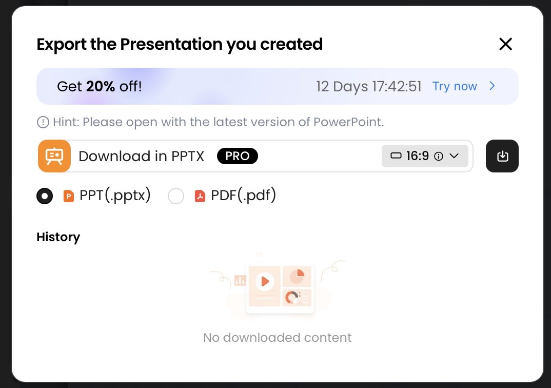
Choose the export format based on what happens next. PPTX is best when colleagues need to edit text, adjust layouts, localize slides, or merge pages into another deck. PDF is better for a locked review copy, customer distribution, or compliance archive. Always open the exported file before sending it; AI-generated slides can look different after export if fonts, charts, or grouped objects are handled differently by PowerPoint, Google Slides, or Keynote.
Export review note: Test PPTX or PDF output on your own deck before relying on it. Text, charts, spacing, fonts, and object editability can behave differently depending on chart type, template, and export path.
Final review checklist
- Data accuracy: every metric appears in the source JSON or is clearly calculated from it.
- Source traceability: key claims include source field names in speaker notes, audit notes, or an appendix.
- Narrative clarity: slide titles communicate insights, not just topics.
- Chart readability: labels, units, date ranges, and legends are clear at presentation size.
- Missing values: nulls and unavailable data are marked consistently.
- Decision focus: the deck ends with a clear action, decision, recommendation, or risk owner.
- Export fidelity: the PPTX or PDF has been opened and checked before distribution.
- Accessibility: color contrast, font size, alt text, and table readability are acceptable for the audience.
- Version control: the exported deck is archived with the source JSON version, prompt, export date, and reviewer notes.
For teams that create recurring reports, save the cleaned JSON schema, prompt template, validation checklist, and final deck together. Over time, this becomes a lightweight presentation system: export data, transform it, generate a narrative draft, validate the numbers, edit the slides, export, and archive. That repeatable loop is where JSON-to-slides AI becomes commercially useful—not just faster for one deck, but safer and more scalable for every reporting cycle after it.
FAQ: JSON Data into Presentation Slides with AI
Can I convert raw JSON directly into presentation slides with AI?
Yes, but the best results come from clean, labeled JSON plus a prompt that tells the AI what story to build, which metrics to visualize, and which fields must not be changed. For recurring decks, use a repeatable schema rather than pasting unstructured output.
What JSON structure works best for data-to-slide generation?
Use a top-level object with metadata, audience, slide goals, and a slides array. Inside each slide, include title, narrative, metrics, chartData, tableData, sourceFields, and validationRules. This makes it easier for AI to map data into layouts.
How do I stop AI from inventing numbers that are not in my JSON?
Explicitly instruct the AI to use only provided fields, preserve all numeric values, mark missing values as unknown, and list source fields for every claim. Then verify totals, percentages, row counts, and outliers before exporting the deck.
Will the exported presentation be editable in PowerPoint?
With PopAi, the export menu includes PPTX and PDF. In current testing, exported PPTX files open in Microsoft PowerPoint and sample text objects remain editable, though no tool should be assumed to preserve every object, animation, or chart perfectly.
Create your presentation with one click now
Turn structured data, documents, and prompts into a polished AI-generated deck, then refine the slides and export when ready.
Start with PopAi