Image selection is often where an AI-assisted deck slows down. A product manager may have ten polished office scenes for a KPI slide, yet none answers the executive’s real question: What changed, by how much, and can we trust the number? The right visual is not simply attractive; it is relevant, credible, legible, and appropriate for the claim beside it.
This guide is for business, training, sales, and internal presentation teams using generated or sourced visuals. It focuses on the slide-by-slide choices that matter most: whether to use an AI image, original photo, screenshot, diagram, chart, icon, or no image at all.
Start With the Job of Each Slide Image
Write one takeaway before searching or prompting, then choose the visual that helps an audience grasp that takeaway quickly at normal viewing distance.
Use a slide-visual decision framework
Match the asset to the slide’s job rather than forcing an AI illustration onto every page:
- Explain: Use a simplified diagram, annotated screenshot, process illustration, or conceptual AI image when the audience needs to understand an unfamiliar mechanism.
- Prove: Use a sourced chart, original photo, current product screenshot, customer-approved quote, or primary document when a claim needs evidence.
- Compare: Use a chart, matrix, table, or paired visual when the audience must see meaningful differences.
- Motivate: Use a human-centered photo or restrained conceptual scene when the purpose is to establish urgency, aspiration, or empathy.
- Navigate: Use icons, color, typography, and whitespace for agenda, transition, and section-divider slides.
Decision test: If removing the visual does not make the message harder to understand, believe, compare, or remember, it is probably decoration.
Resolve slides with more than one visual job
Many slides do both. A product screenshot can explain a workflow and demonstrate that a feature exists; a chart can prove a result while comparing performance. In those cases, prioritize the audience’s next question. If they will ask “Is this real?” lead with proof. If they will ask “How does this work?” lead with explanation.
Example: In a sales deck, a slide claiming “Teams close monthly books 30% faster” should not rely on a smiling AI-generated finance team. Use a labeled chart or approved customer metric as the primary visual, then add a small conceptual image only if it supports the story without competing for attention.
Practical case: In a training deck about incident reporting, an operations team replaced a generic “busy warehouse” image with a three-step annotated process diagram. The slide became less visually dramatic but produced fewer clarifying questions because participants could see exactly where the handoff failed.
Choose AI Presentation Images by Risk and Reality
For a broader view of available tools, compare the latest AI presentation makers before choosing the workflow that best fits your team.
Use AI imagery for concepts and atmosphere; use verifiable assets when an image could be read as evidence, documentation, or a representation of a real person, place, product, or event.
AI-generated visuals work well when stock search cannot express the idea: secure digital networks, a future-state workflow, a learning journey, or an opening-slide metaphor. They are most useful when the audience understands the image is illustrative rather than documentary.
Use authentic assets for factual claims
Choose original, licensed, or sourced materials for identifiable people, real workplaces, product details, clinical subjects, financial evidence, maps, technical interfaces, compliance scenarios, and customer outcomes. A real asset is not automatically proof, however: a stock photo does not validate a customer result, and an outdated screenshot does not validate the current product experience.
Separate factual, legal, and trust risks
- Factual risk: Do not use synthetic dashboards, maps, machinery, safety equipment, or medical details as if they document reality.
- Rights and privacy risk: Check provider terms, source licenses, recognizable likenesses, trademarks, and whether uploaded material is permitted by your organization.
- Audience-trust risk: Do not place a synthetic “customer,” workplace, or event image beside a testimonial or performance claim in a way that implies it is real.
Illustrative case: A strategy team can use an AI-generated cityscape on a “2030 vision” opener if it is clearly conceptual. The same image becomes risky on a slide claiming expansion into named cities, where a real map with labeled markets and a source date is the better choice.
AI generation also has a hidden production cost: review and replacement. Distorted hands, fabricated logos, implausible devices, unreadable interface text, and culturally inaccurate settings can take longer to repair than sourcing a suitable alternative. For a broader view of available tools, compare the latest AI presentation makers before choosing a workflow that fits your team’s review requirements.
Where a client, institution, or regulated environment requires disclosure, label the asset plainly—for example, “Concept illustration generated with AI” in speaker notes or a source appendix. Requirements vary by organization, provider terms, and jurisdiction; this is practical guidance, not legal advice.
Make Images Work With Slide Text and Layout
Choose the composition after placing the headline, key number, and supporting copy; an image that fights the reading path is the wrong image, even if it is beautiful.
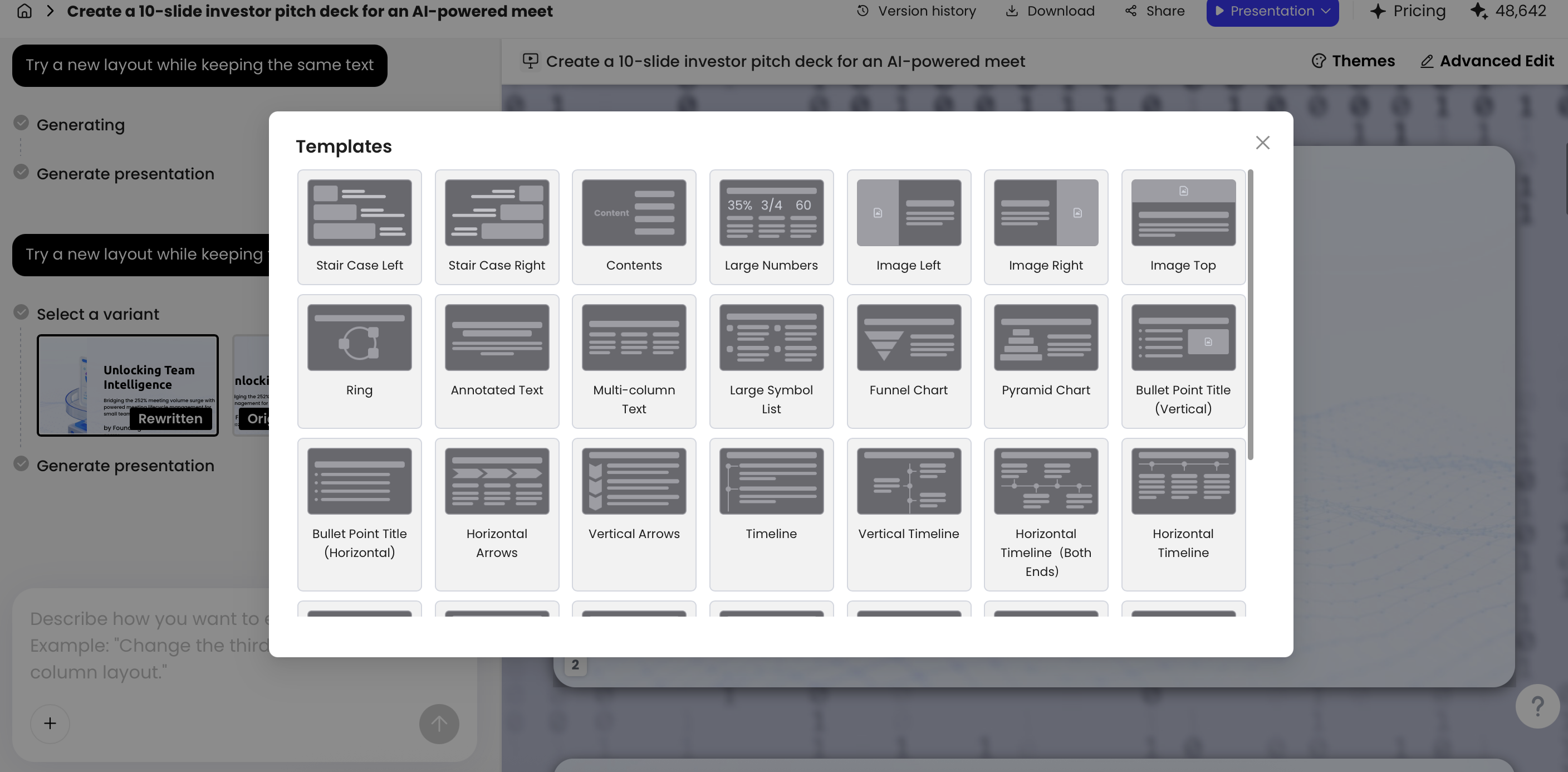
Reserve text-safe space before generating
- Choose the slide ratio—usually 16:9 for modern business presentations.
- Place the headline first and mark the quiet area it needs around it.
- Decide where the focal subject belongs: left, right, center, or full bleed.
- Use body copy only where it adds information the image cannot carry.
- Test the slide at presentation size, on the intended display or a realistic PDF preview.
For a left-aligned headline, prompt for “subject on the right, uncluttered negative space on the left.” For a centered title, choose a calm background with no face, horizon, or high-contrast object behind the text. A dark overlay can improve readability, but use it sparingly: if the overlay must be so heavy that the image disappears, replace the image or change the layout.
Match crop and contrast to the viewing condition
A dense image that works on a laptop can fail in a conference room, on a video call, or after PDF export. Avoid placing small text over busy detail, and do not depend on color alone to distinguish categories or actions. Keep important faces, objects, and labels away from the crop edge; presentation templates and exports can trim more aggressively than an editor preview suggests.
Example: A slide titled “Manual reporting delays decisions” could place the title and one supporting statistic on the left, with a wide image of a professional reviewing a blurred workflow wall on the right. The image should suggest friction without inventing a fake dashboard or placing unreadable UI text near the headline. For an executive review, an annotated process bottleneck or cycle-time chart may be stronger than the scene.
Layout principle: Whitespace is working space. It gives the audience a predictable route from headline to evidence to conclusion.
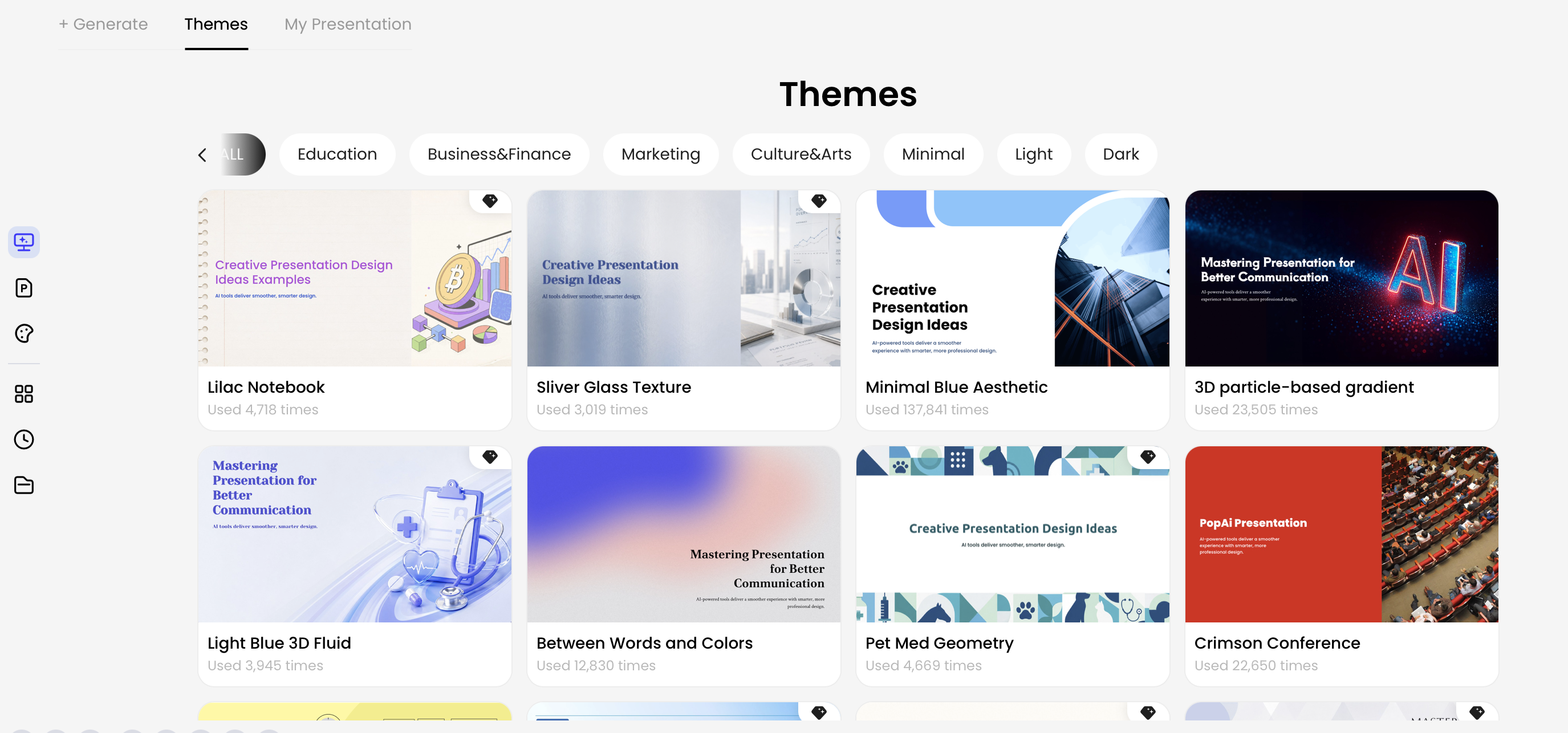
In PopAi AI Presentation, teams can review a content plan before choosing themes and layouts. That sequence matters because a dense research slide, a product demo slide, and a visual story slide need different image treatment rather than one repeated template.
Prompt for AI Presentation Images With Intent
Prompt from a visual brief, not from a vague topic: define the slide’s purpose, composition, and exclusions before generating candidates.
Build prompts around the slide layout
Subject + action + setting + audience emotion + visual style + lighting + composition + slide ratio + text-safe area + exclusions.
For example: “A confident operations manager reviewing a simplified workflow wall in a bright modern office, optimistic and focused, editorial photography style, soft natural side lighting, wide 16:9 composition, subject on the right with clean blue-toned negative space on the left for a slide title, no logos, no readable text, no watermark.”
Use exclusions as requests, not guarantees. Generators vary: some support negative prompts, aspect-ratio controls, seed values, style references, or reference images; others interpret them inconsistently. Review the output rather than assuming that “no text” or “no extra fingers” has been followed.
Generate a controlled set, then test at slide size
- Generate four to eight variants from one approved visual brief.
- Reject weak composition first: no text-safe area, wrong focal point, crowded background, or a crop that cannot survive placement.
- Place the best two candidates in the actual slide before judging aesthetics.
- Check headline contrast, audience interpretation, and consistency with adjacent slides.
- Retouch only small defects. Replace an image that is structurally wrong rather than spending time on repeated prompts.
Keep a deck-wide brief with palette, realism level, lens perspective, lighting, background complexity, and treatment of people. For example, a 12-slide investor deck might use restrained editorial photography for people, flat diagrams for product flows, and one accent color for charts. That is more reliable than trying to make unrelated generations look coherent at the end.
Stop generating when the asset type is wrong for the task. Use an annotated screenshot for a feature walkthrough, a diagram for a process, a chart for a KPI, and no image when the slide needs a single clear statement.
Use Charts When Images Cannot Prove the Point
When the audience must inspect numbers, change over time, ranking, or uncertainty, make the data visualization—not an atmospheric image—the primary visual.
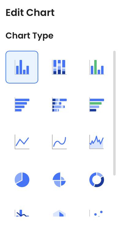
Choose a chart that answers one question
- “Which option is larger?” Use ranked horizontal bars.
- “What changed over time?” Use a line chart with a clear time scale.
- “How are two measures related?” Use a scatter plot, and avoid implying causation from correlation alone.
- “What is the makeup of a whole?” Use a simple proportion chart only when there are few categories; use bars when precise comparison matters.
Make the chart credible and accessible
- State the source, date range, units, and whether values are actuals, estimates, or forecasts.
- Use a zero baseline for most bar charts; if you intentionally truncate an axis, make that choice obvious.
- Avoid 3D effects, dual axes, unranked bars, and legends that force viewers to hunt for labels.
- Highlight one series or data point, but leave the comparison context visible.
- Use direct labels and color-independent cues so the point survives grayscale printing and color-vision differences.
Data-slide example: “Customer data” is not a conclusion. “Renewals rose 12 percentage points after onboarding changes, compared with the prior quarter” tells viewers what to look for. It still needs a visible source, time period, and baseline so the title does not overstate the evidence.
A decorative AI image asks the audience to infer a metaphor; a well-labeled chart lets them inspect the claim. If a chart cannot answer the question because the data is incomplete, say so. Do not use a polished image to conceal missing evidence.
Review AI Presentation Image Quality Before You Present
Use a fast visual check for every slide and a deeper factual, rights, and accessibility review for high-stakes material.
Fast visual and message preflight
- Message: Can a colleague explain the image’s connection to the headline in one sentence?
- Readability: Is the headline legible at a distance, with adequate contrast and calm space around it?
- Composition: Does the crop preserve the focal point and avoid clutter, awkward edges, or competing details?
- Accuracy: Are faces, hands, objects, uniforms, interfaces, labels, and physical details plausible for the context?
- Consistency: Does the image match the deck’s palette, realism, crop style, and tone?
Escalate high-risk slides to the right reviewer
- Presenter or owner: validates the message and audience fit.
- Subject-matter expert: checks technical, clinical, operational, geographic, or cultural accuracy.
- Brand, legal, privacy, or compliance reviewer: checks applicable logos, likenesses, confidential material, licensing, disclosure, and organizational policy.
Red flags deserve replacement, not cosmetic repair: a fabricated product dashboard near a feature claim, a synthetic “customer” beside a testimonial, an AI-generated medical device, or a visual containing brand-like marks. If a visual fails review, edit it only when the correction is minor; otherwise replace it, relabel it as conceptual, cite the source, or remove it.
For formal proposals, academic work, or regulated industries, keep a simple source record: slide number, asset type, origin, license or tool terms, creation or capture date, reviewer, and disclosure status. Alt text should describe the image’s informational purpose—for example, “Line chart showing renewal rate rising from 68% to 80% after onboarding changes”—rather than merely its appearance. Decorative visuals may be marked decorative where the presentation or export format supports that option.
Build a Repeatable Image Workflow for Every Deck
A repeatable workflow gives every slide an asset decision, a source record, and an approval path before the deck reaches an audience.
A practical workflow from outline to export
- Draft the narrative and assign one takeaway to each slide.
- Label the visual job: explain, prove, compare, motivate, or navigate.
- Select the asset type: AI art, licensed stock, real photography, screenshot, icon, diagram, chart, or no image.
- Create a one-line visual brief, including layout position, text-safe area, style, source requirement, and risk level.
- Time-box generation or sourcing, then place only the strongest candidate into the actual slide.
- Run visual preflight and route factual or rights-sensitive slides to the appropriate reviewer.
- Export to the final format and inspect it on the intended screen, video-call view, or PDF.
- Archive approved source links, licenses, prompts, and final assets for future updates.
Scale the process to the deck
For a 10-slide pitch, spend most image effort on the opening, problem, product, proof, and closing slides; simple dividers can rely on typography and color. For a 40-slide training deck, establish two or three repeatable visual patterns—such as annotated screenshots, process diagrams, and scenario images—so learners recognize the slide type immediately. For a monthly executive review, prioritize current charts, source dates, and consistent KPI definitions over generated imagery.
If you start from reports, meeting notes, PDFs, or existing slides, organize the narrative before generating visuals. The practical outcome is less rework: images support the argument and layout instead of becoming the reason the story changes.
Choose image types by evidence and usage rights
A picture can look plausible without proving the claim beside it. It can also be factually accurate without being licensed for your use. Review those two questions separately. The following matrix is an editorial selection aid, not legal clearance.
Comparison table: scroll horizontally to see all columns.
| Visual type | Evidence value | Rights or AI risk | Suitable use | Before publication |
|---|---|---|---|---|
| Original product screenshot | Shows a particular interface state, not every plan or an average outcome. | Customer data, trademarks, confidential panels, outdated UI. | A reproducible tutorial step or an actual product example. | Record date and account context; redact private data; confirm permission and avoid implying an unrun test. |
| Original photo of an event or place | Can document a real moment when provenance is known. | Photographer rights, releases, location restrictions, misleading crops. | An event recap or authentic operational context. | Confirm creator and permitted use; preserve context and any required credit. |
| Licensed stock photograph | Usually illustration rather than evidence about your company. | Editorial-only licenses, reuse limits, model/property rights. | A mood, setting, or clearly illustrative example. | Read the exact license for this asset and distribution; never caption it as your customer or employee. |
| Creative Commons image | Evidence depends on the source and image, not the license label. | The specific license may impose attribution, adaptation, or commercial-use conditions. | A sourced explanatory illustration. | Check the exact license version; retain the source, credit, license link, and change notice as applicable. |
| AI-generated image | Illustrates an idea; does not establish that an event or object exists. | Fabricated people, misleading realism, third-party rights, tool terms. | A labelled concept or a non-evidentiary visual metaphor. | Check terms and subject matter; disclose synthetic content where relevant; never use it as proof of real results. |
| Chart from verified data | Can support a quantitative claim within the dataset's scope. | Incorrect values, unclear reuse rights, hidden denominator or scale. | Comparison, trend, distribution, or a measured outcome. | Verify the data, calculation, license/permission, period, labels, and source note. |
For example, the CC BY 4.0 deed permits reuse subject to its attribution requirements, including identifying changes; it does not clear every privacy, publicity, or other right. Do not treat all Creative Commons licenses as identical. In the United States, the Copyright Office's AI copyrightability analysis distinguishes human-authored expression from purely generated material. Copyrightability is not the same question as whether a particular image infringes another right.
For sensitive commercial campaigns, obtain review appropriate to your jurisdiction and the actual asset. Keep the license record with the presentation so a later editor does not mistake an illustrative picture for an approved evidentiary asset.