If you build presentations for clients, leadership, or a classroom, finding visuals that feel polished and belong together can take longer than writing the slides. The best images for AI slides make a message easier to understand, give slide content room, and feel like parts of one visual system.
This guide shows how to choose a visual for different slide jobs, gives prompts you can adapt, and walks through practical checks for composition and accuracy. It uses fictional examples to explain the decisions; results vary by image model, settings, and editing. Whether you generate visuals separately or use a slide workflow such as PopAi AI Presentation, decide what the audience should notice before deciding what the image should show.
Six Image Roles, Plus Composition and Crop Comparisons
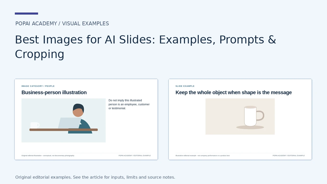
Five original illustrations and one supplied product screenshot show distinct image roles. The illustrations are not documentary photos, customer likenesses or product evidence. Composition and crop examples use the same source artwork and brief; they are not a same-prompt AI-generator experiment.
Open full-size examples and editable HTML layoutsImage roles
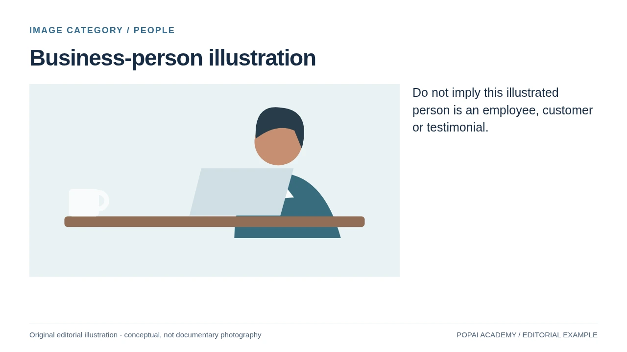
Do not imply this illustrated person is an employee, customer or testimonial. Original editorial SVG illustration; not an AI-generator test.
Read or copy the slide content
Do not imply this illustrated person is an employee, customer or testimonial.
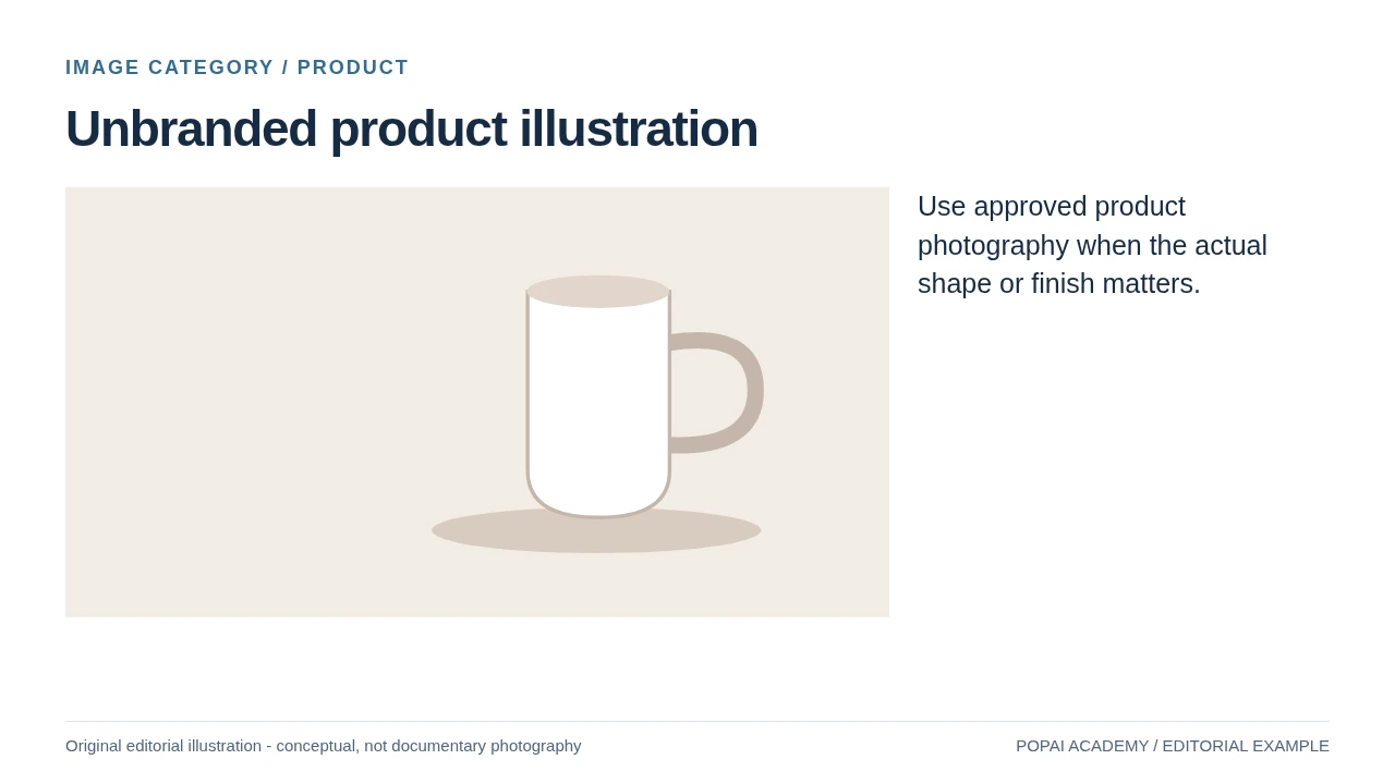
Use approved product photography when the actual shape or finish matters. Original editorial SVG illustration; not an AI-generator test.
Read or copy the slide content
Use approved product photography when the actual shape or finish matters.
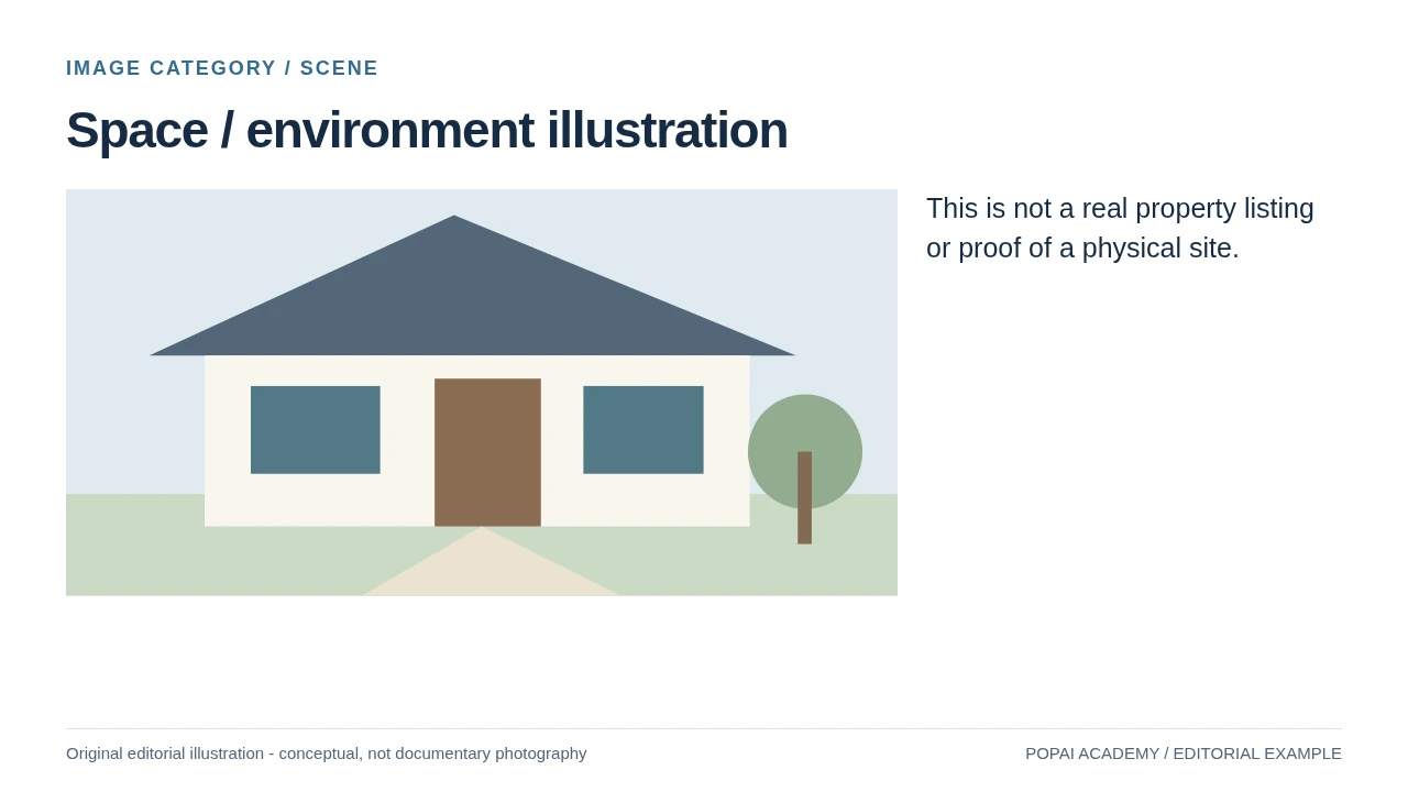
This is not a real property listing or proof of a physical site. Original editorial SVG illustration; not an AI-generator test.
Read or copy the slide content
This is not a real property listing or proof of a physical site.
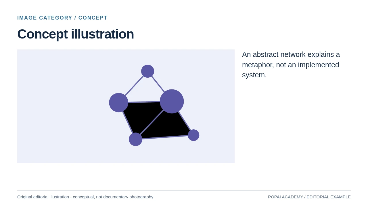
An abstract network explains a metaphor, not an implemented system. Original editorial SVG illustration; not an AI-generator test.
Read or copy the slide content
An abstract network explains a metaphor, not an implemented system.
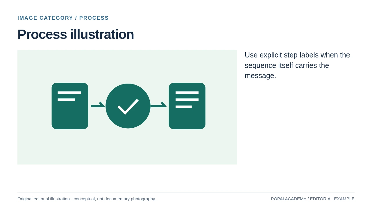
Use explicit step labels when the sequence itself carries the message. Original editorial SVG illustration; not an AI-generator test.
Read or copy the slide content
Use explicit step labels when the sequence itself carries the message.
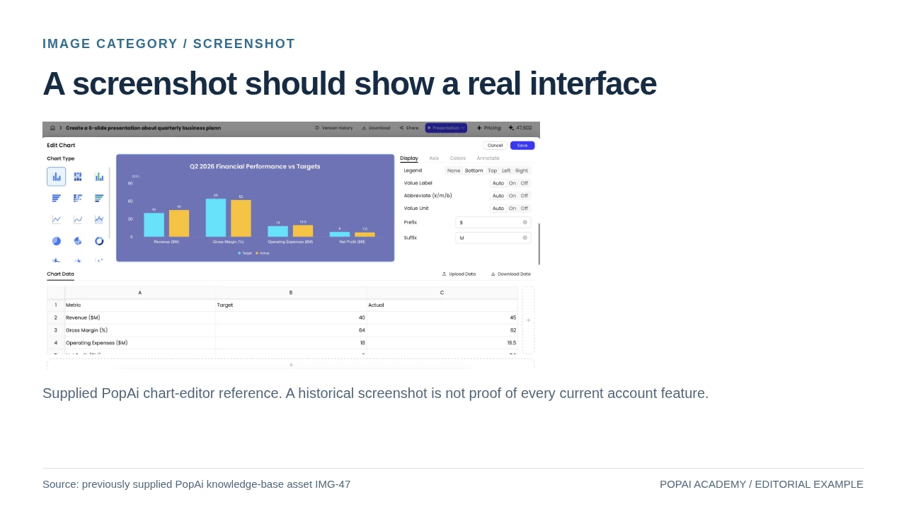
Existing user-supplied PopAi knowledge-base screenshot, reused as an example of documentary UI imagery.
Read or copy the slide content
Supplied PopAi chart-editor reference. A historical screenshot is not proof of every current account feature.
Prompt for Image roles
Create a slide with the purpose "A screenshot should show a real interface". Use these approved source fields or replace the illustrative inputs before use: Supplied PopAi chart-editor reference. A historical screenshot is not proof of every current account feature.. Preserve labels, units, source notes and any uncertainty. Do not add results, claims, customers or capabilities. Suggest a readable layout and keep the output editable in the chosen tool.
Same brief: composition
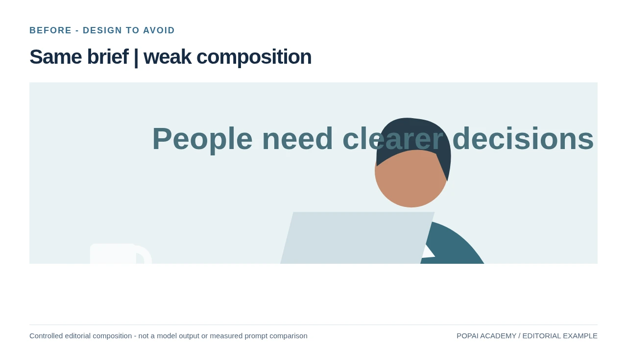
Deliberately poor overlap. The person and headline compete; contrast varies.
Read or copy the slide content
People need clearer decisions
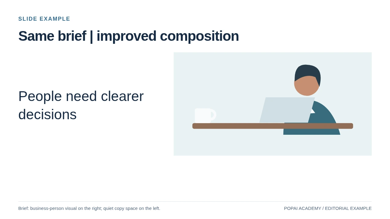
Same illustration and brief, separate text zone. This is an editorial composition comparison, not an AI-generation A/B test.
Read or copy the slide content
People need clearer decisions
Prompt for Same brief: composition
Create a slide with the purpose "Same brief | improved composition". Use these approved source fields or replace the illustrative inputs before use: People need clearer decisions. Preserve labels, units, source notes and any uncertainty. Do not add results, claims, customers or capabilities. Suggest a readable layout and keep the output editable in the chosen tool.
Same source: crop
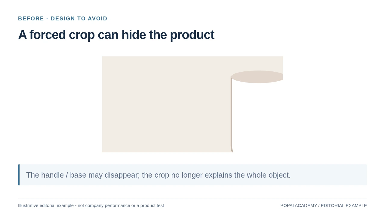
Crop demonstration using an original drawing, not edited documentary product photography.
Read or copy the slide content
The handle / base may disappear; the crop no longer explains the whole object.
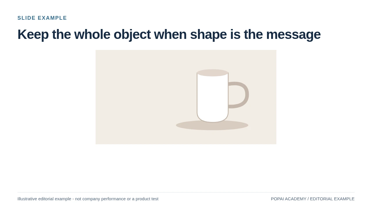
Same drawing fitted without stretching; silhouette and handle remain visible.
Read or copy the slide content
Prompt for Same source: crop
Create a slide with the purpose "Keep the whole object when shape is the message". Use these approved source fields or replace the illustrative inputs before use: . Preserve labels, units, source notes and any uncertainty. Do not add results, claims, customers or capabilities. Suggest a readable layout and keep the output editable in the chosen tool.
Best Images for AI Slides: Match the Image to the Slide
Choose the visual format that helps this audience understand this slide’s main point—sometimes that means using no image.
A request for “a professional image” is too vague to guide a useful choice. First identify the page’s job: set context, explain a process, compare evidence, or ask for a decision. Then choose a format:
- Title or pitch cover — photo or illustration: For a fictional nightlife concierge aimed at investors, a cinematic city-at-night hero scene can establish mood. Keep the subject on the right and the title area quiet; a busy collage of nightlife photos would compete with the company name.
- Data and KPI page — chart, not decoration: On a leadership slide comparing monthly retention, use a chart built from verified figures. A generic smiling-customer photo adds no evidence and may distract from the trend. If the chart is already clear, use no additional image.
- Concept explanation — diagram or simple illustration: For a customer onboarding flow, use three connected steps or a restrained illustration. A lifestyle photo of someone holding a phone may set a scene, but it will not explain the sequence.
- Case study — contextual image, clearly framed: For a fictional example about reducing restaurant wait times, an illustrative restaurant scene can help the audience picture the setting. Label it as illustrative; do not make it look like a photograph documenting a real customer or result.
- Sensitive or dense subject — minimal visual: For a slide about a health risk, employee incident, or complex financial result, a decorative image can trivialize the subject or imply causation. Prefer a carefully sourced chart, a neutral diagram, or no image.
- Closing or next steps — directional image or simple icon: A calm horizon or a clear next-step graphic can support a forward-looking ask. Avoid a generic team-high-fiving image if the actual ask is a specific budget decision.
Consider the Nightly example slide by slide: the cover’s city scene establishes atmosphere; the product slide should switch to a booking-flow diagram; and a market-size slide should use sourced numbers and a chart. The visual changes because the audience’s question changes—not because every slide needs a new decorative image.
Decision check: If removing the visual makes the slide clearer, or if the visual could be mistaken for proof, leave it out or replace it with a labeled illustration. For factual claims, use verified data and clearly identify illustrative imagery as such.
Choose the image that helps the audience understand the slide’s one main point—not the image that merely fills empty space.
Before generating, write a short job label for each page, such as “set context,” “compare two options,” or “ask for approval.” If you cannot explain how the visual supports that job in one sentence, it is probably adding decoration rather than meaning.
Copy-Ready Prompts for AI Slide Images
For a broader view of available tools, compare the latest AI presentation makers before choosing the workflow that best fits your team.
A useful prompt names the slide job, subject, visual treatment, composition, and what must remain clear.
Describe the image as a visual brief rather than a topic. State where the image will sit, reserve space for editable slide text, and ask for no generated lettering when labels need to be accurate. These prompts describe intended compositions, not guaranteed outputs; inspect and edit the result before placing it in a deck.
Cover: set a visual tone
Review for: a clear focal point on the right and enough low-detail space on the left for the actual title. If the generated scene fills the whole frame, try asking for a wider camera view and a darker, simpler left third.
Concept: explain a process
Review for: three distinct stages that read in order. Add the exact labels in the slide editor rather than relying on generated text; if the image merges steps, request three separate panels with equal spacing.
Data slide: keep the evidence in charge
Review for: whether the background remains unobtrusive behind the real chart. If it reduces contrast or makes the figures harder to scan, use a plain background instead; never ask an image generator to invent chart values or present its output as data.
Iterate one problem at a time
Suppose the first cover result puts a bright sign behind the title area. Keep the subject, palette, and style instructions unchanged, and revise only the composition: “Move all bright signage and the main subject to the right half; keep the left third dark and low-detail.” Compare the next result at slide size. This controlled change makes it easier to see whether the instruction fixed the problem.
For a standard wide presentation, a 16:9 source matches the canvas; 1920 × 1080 pixels is a practical starting point for a full-slide image on a 1080p display. A larger source may be useful for a 4K display or if you need to crop, but it is not automatically better if the detail is artificial or the file slows the deck. Place the image in the actual slide, check the crop and title area, then review the exported deck on the target screen.
Keep the Best Images for AI Slides Visually Consistent
Build a short style recipe, then review the images together to catch drift that is easy to miss one slide at a time.
Keep a few decisions stable across the deck: palette, medium, lighting, camera distance, and background treatment. Change the subject or scene to fit each slide, rather than repeating the same image. For example, a Nightly deck could use navy, teal, and coral throughout; a cinematic city cover, a flat-vector booking flow, and a restrained data background can still belong together if color and visual restraint carry across them.
Reusable recipe and deck-level review
- Palette: name two or three core colors and one accent, such as navy, teal, and coral.
- Medium: select a consistent treatment—editorial photography, soft 3D, or flat vector—unless a deliberate change supports the story.
- Composition: specify where the subject belongs and where slide text or data must remain unobstructed.
- Lighting and detail: repeat a simple direction, such as soft light and uncluttered backgrounds.
- Continuity: if a character or product recurs, repeat its defining features, then check outputs side by side rather than assuming the generator will preserve them.
A common drift problem is a sequence that starts with muted navy and teal, then gains bright purple or a different illustration style on later slides. Put the images in slide order and compare palette, contrast, detail, and subject scale. If the drift distracts, regenerate the outlier with the same recipe or correct it in an editor. Many generators do not reliably reproduce an exact product or character; for important brand details, use an approved product image or a manually composed asset instead.
Variation can help when the narrative changes—for instance, moving from a human story to a technical explanation. Keep one or two visual anchors, such as the palette and typography, so that the shift feels intentional rather than like a change of deck.
A style guide is useful only if it can be repeated: keep the recipe short enough to reuse, but specific enough to constrain the result.
When selecting a workflow, assess whether it lets you inspect and edit images alongside the slide narrative, not just whether it produces an attractive single result. A presentation workflow is most useful when you can review the text, crop, and visual together before sharing.
Fit Images to Slide Ratio, Resolution, and Layout
Place, crop, inspect, export, and test the image in the presentation context where people will actually see it.
For a 16:9 slide, ask for a wide composition and keep important faces, products, or details away from the edges. A practical safe area is the central region inside the slide margins, clear of titles, footers, and controls; the exact margins depend on your template. If your slide size differs, match the source and crop to that canvas rather than stretching the image.
Five checks from placement to export
- Place: add the image to the target slide and choose fill or fit deliberately; these options crop or letterbox differently.
- Crop: keep the focal point clear of text and slide edges. Never stretch an image to force a match.
- Inspect: view the slide at presentation size and at thumbnail size. The main subject and message should still read at both scales.
- Check contrast: make sure text remains legible over the image. Use a solid text panel or a subtle overlay if needed; do not rely on color alone to distinguish categories in a chart.
- Export and test: open the exported file on the target device or screen. Look for soft detail, unexpected crop changes, or colors that shift after export.
For example, if the title occupies the left third, position the focal subject on the right and reserve a low-detail area behind the title. If a full-bleed image must support a 4K presentation, start with a sufficiently large source or test an appropriate upscaled version; if the image is a small accent beside text, a smaller asset may be entirely adequate. Test the actual export rather than treating any pixel dimension as a universal guarantee.
Large images can increase file size and slow sharing, while aggressive compression can soften fine detail. Compress simple backgrounds more readily than detailed photography, then inspect the exported slide at the size it will be presented. For accessibility, maintain readable contrast and provide meaningful alternative text when the deck will be shared digitally; decorative images can use empty alt text where the format supports it.
Check Image Quality, Accuracy, and Usage Rights
Review generated visuals as carefully as charts, claims, and other material the audience may interpret as fact.
Visual accuracy and audience impact
Generated images can contain malformed lettering, implausible objects, inconsistent faces, or details that imply something untrue. For example, a fictional product image showing a feature the product does not have could mislead investors or customers even if the slide never states the claim in words. Mark concept art as illustrative, and use a real product image or verified evidence for claims about actual capabilities.
- Text and details: remove garbled lettering; inspect faces, hands, product parts, shadows, and background objects.
- Truthfulness: do not present a generated scene as documentation of a real person, place, customer, or event.
- Representation: check for stereotypes, biased depictions, or exclusions that could distract or cause harm.
- Deck-level fit: review crop, contrast, tone, and repetition across the complete deck.
Licensing, privacy, and a practical source log
Commercial-use and privacy terms vary by provider, plan, jurisdiction, and the terms in effect when an image is created. Check the provider’s current official terms and any plan-specific license before using an asset commercially; a general checklist cannot settle legal questions. For client, regulated, or confidential work, follow your organization’s review process and do not enter sensitive information unless the service’s data handling terms have been approved for that use.
Keep a simple asset log with the image source or tool, creation date, prompt or reference assets, edits made, and any license or attribution requirements. This makes later review easier when a deck is reused or shared outside the original team. If an image depicts a real person, protected brand, or recognizable copyrighted work, check whether permission or additional review is needed.
Decision rule: if a generated visual could mislead the audience about evidence, identity, or product capability, replace it with a clearly labeled illustration, a properly licensed source, or an accurate chart.
Practical workflow: label each slide’s job, choose the visual format, prompt for composition and text-safe space, review and iterate one issue at a time, then check the complete deck and exported file. Record the source and usage terms before sharing—especially when the presentation is client-facing or contains sensitive information.
Use the Gallery as a Design Example, Not Documentary Evidence
The five drawn examples were assembled as original editorial vector illustrations; the screenshot was supplied in the earlier PopAi knowledge-base materials. Their labels distinguish an illustrative person, generic object and conceptual place from a real customer, product or listing. The same-brief before/after comparison is a controlled layout exercise, not two reported outputs from an image generator.
For a real campaign, replace illustrative product or property art with an approved source when appearance is part of the claim. Record creator, source, license, required credit, editing history and consent where applicable. A picture of a person does not establish endorsement. The available gallery demonstrates composition and crop choices; it does not clear rights for an unrelated third-party photograph.