For presentations about AI—or decks using AI-generated artwork—the best background is the one that gives each slide’s content a clear place to land.
A cover can carry a dramatic image; a model-evaluation chart usually cannot. This guide compares background treatments for covers, data slides, and training material, then gives prompts and a review workflow. The examples are compositional recipes rather than claims about a particular image generator’s output: tools interpret prompts differently, so judge the finished slide at its actual presentation size.
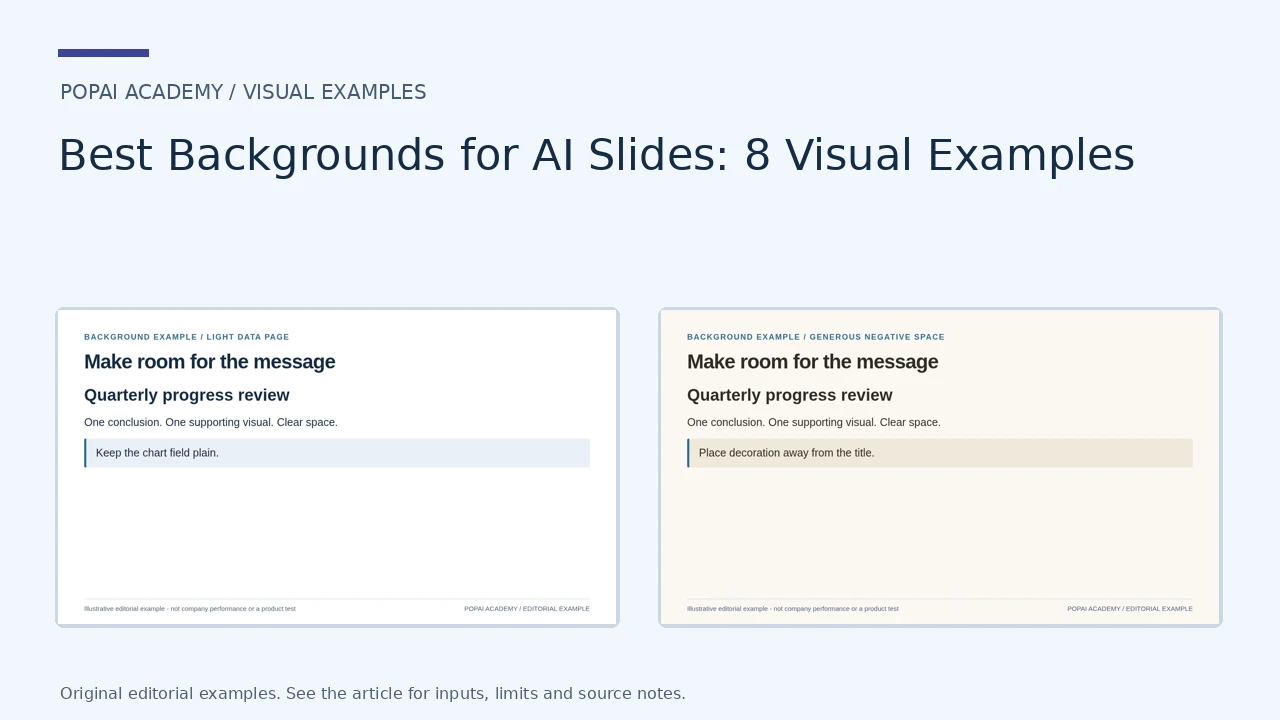
Eight Background Treatments, Shown on a Slide
These are real rendered background treatments, not screenshots of a theme selector. They use the same slide message so the effect of the background and negative space is visible. The image-backed option uses an original illustration, not a stock photograph.
Open full-size examples and editable HTML layouts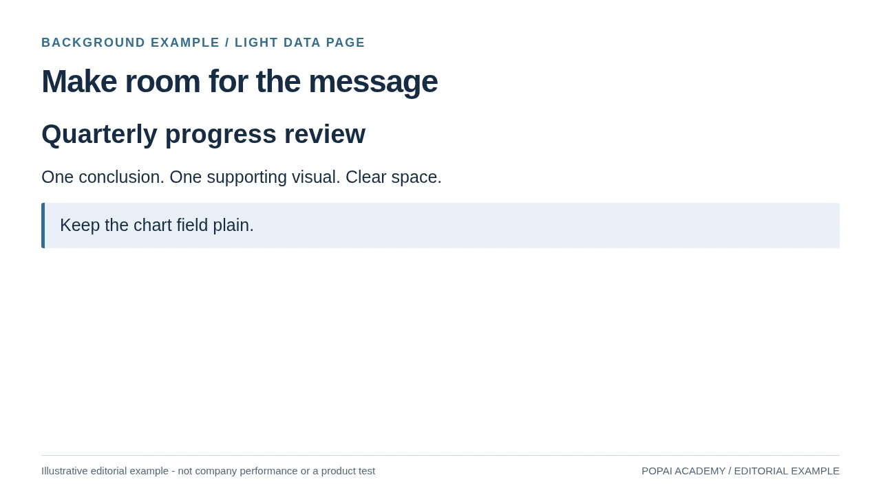
Light data page: background #FFFFFF; foreground #172B43. Keep the chart field plain.
Read or copy the slide content
Quarterly progress review
One conclusion. One supporting visual. Clear space.
Keep the chart field plain.
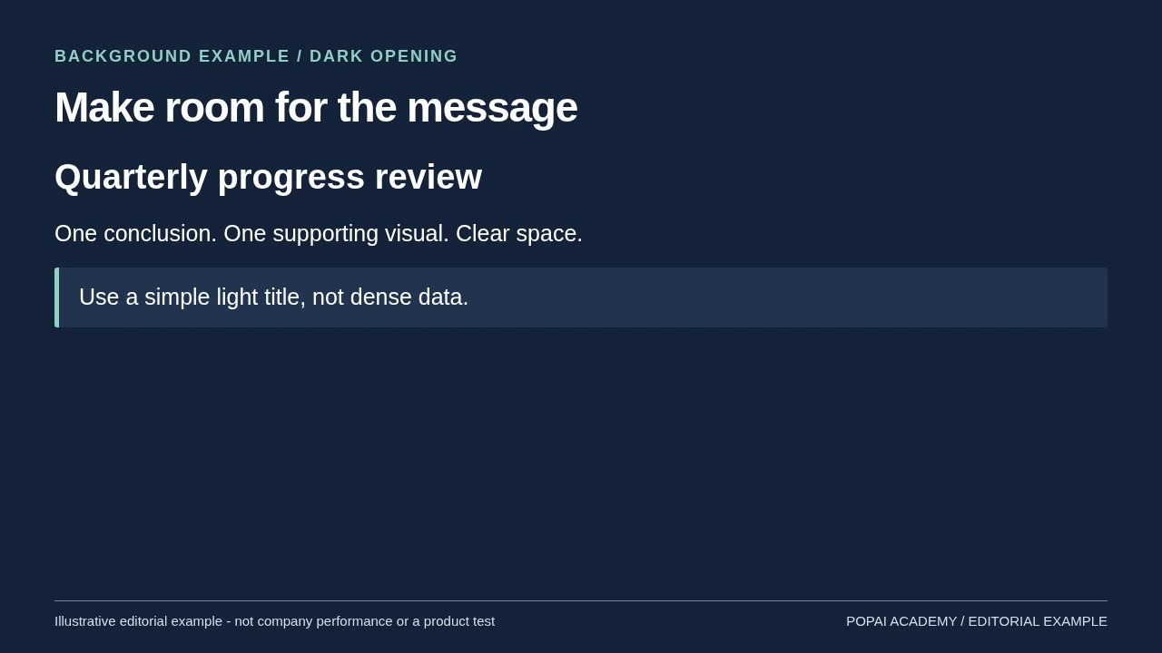
Dark opening: background #142238; foreground #FFFFFF. Use a simple light title, not dense data.
Read or copy the slide content
Quarterly progress review
One conclusion. One supporting visual. Clear space.
Use a simple light title, not dense data.
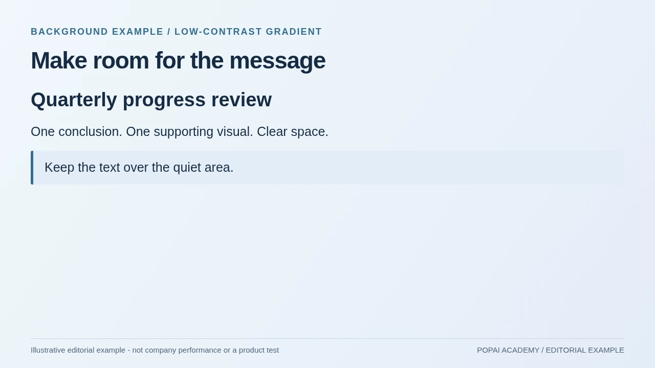
Low-contrast gradient: background #F0F7FA; foreground #172B43. Keep the text over the quiet area.
Read or copy the slide content
Quarterly progress review
One conclusion. One supporting visual. Clear space.
Keep the text over the quiet area.
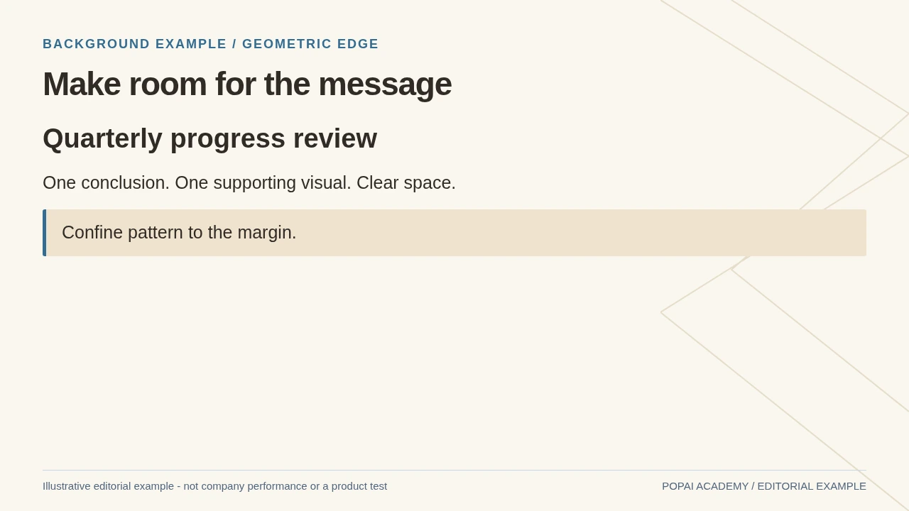
Geometric edge: background #FAF7F0; foreground #302B25. Confine pattern to the margin.
Read or copy the slide content
Quarterly progress review
One conclusion. One supporting visual. Clear space.
Confine pattern to the margin.
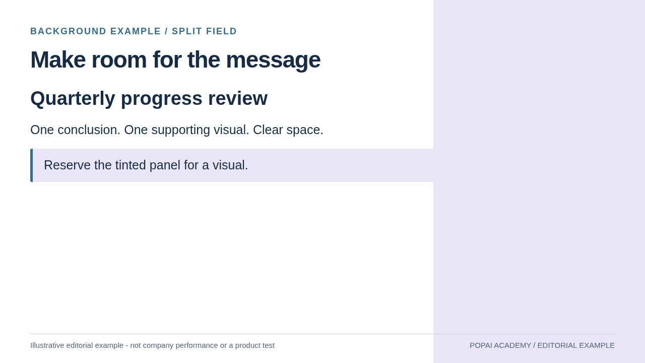
Split field: background #FFFFFF; foreground #172B43. Reserve the tinted panel for a visual.
Read or copy the slide content
Quarterly progress review
One conclusion. One supporting visual. Clear space.
Reserve the tinted panel for a visual.
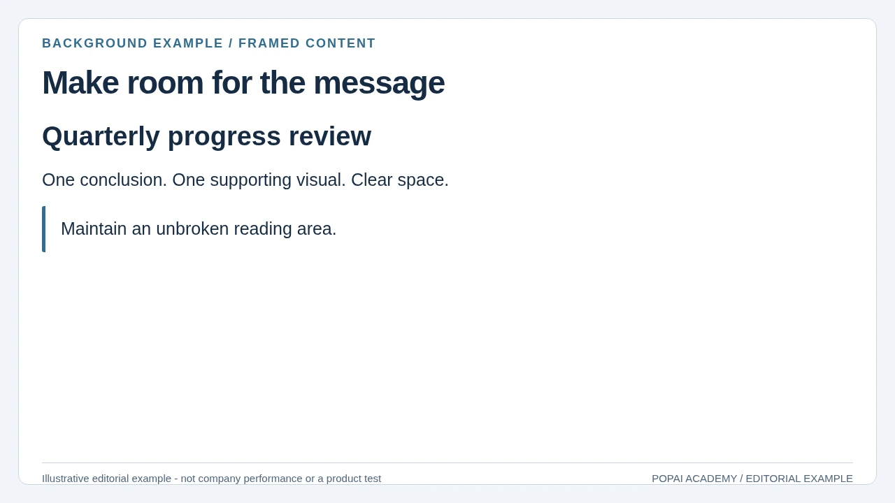
Framed content: background #F2F5F8; foreground #172B43. Maintain an unbroken reading area.
Read or copy the slide content
Quarterly progress review
One conclusion. One supporting visual. Clear space.
Maintain an unbroken reading area.
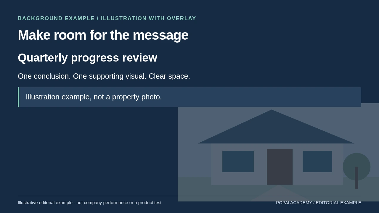
Illustration with overlay: background #172B43; foreground #FFFFFF. Illustration example, not a property photo.
Read or copy the slide content
Quarterly progress review
One conclusion. One supporting visual. Clear space.
Illustration example, not a property photo.
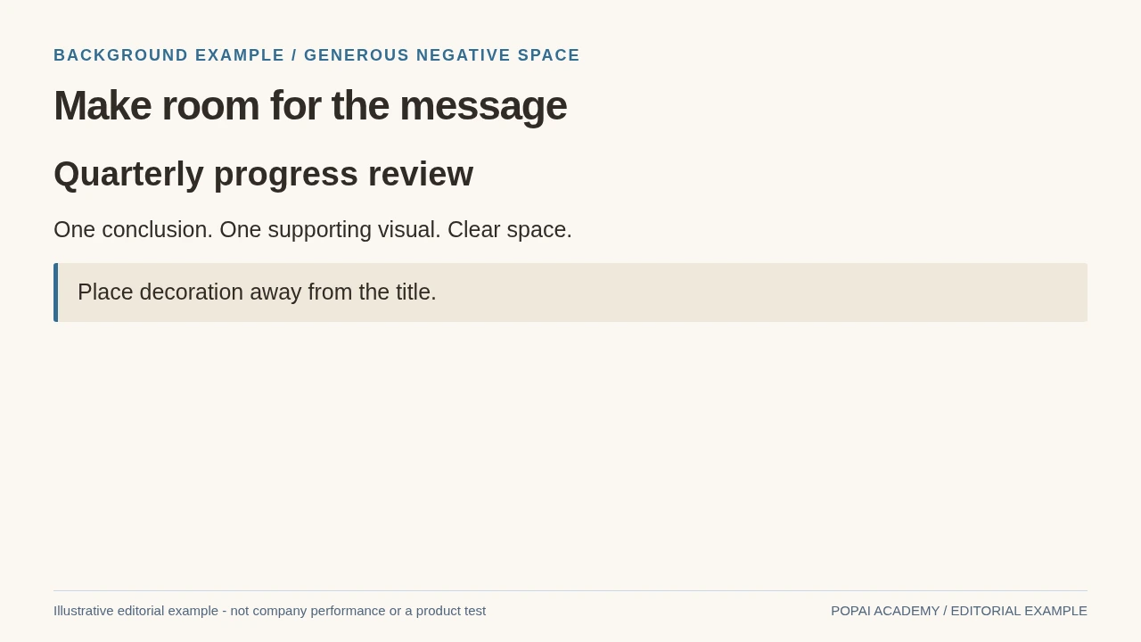
Generous negative space: background #FBF8F3; foreground #302B25. Place decoration away from the title.
Read or copy the slide content
Quarterly progress review
One conclusion. One supporting visual. Clear space.
Place decoration away from the title.
Prompt for this example set
Design a 16:9 light data page with background #FFFFFF, text #172B43. Reserve the title area and keep evidence labels readable. No invented interface or data.
How to choose the best backgrounds for AI slides
Choose by slide purpose first, then tune color and detail to the audience and amount of information.
Start by deciding what the audience should notice first. A technical buyer may need a credible product story; a class needs room for definitions and exercises; an executive update may prioritize a few decision-making metrics. The same deck can use different background treatments for each page type.
| Slide type | Background and text pairing | Common failure |
|---|---|---|
| Cover or section divider | Dark indigo (#14213D) with white text; keep the image or motif to one side. | Bright detail sits behind the title and breaks its outline. |
| Chart or model comparison | Off-white (#F7F8FA) with near-black text (#20242B); use a small accent such as teal (#147D83). | Texture competes with gridlines, labels, or multiple data series. |
| Training or workshop | Warm white with muted teal and lavender accents; keep the same treatment across lesson slides. | Decorative shapes make instructions feel like separate posters. |
| Product or client story | Use the brand palette as accents on a neutral field; use a real product screenshot when the interface matters. | Generic AI imagery suggests features or results the product does not have. |
Worked example: In a model-evaluation deck, use the dark indigo treatment for the opening and section dividers, but switch to an off-white fill for the slide comparing precision and recall. The cover establishes the technology theme; the pale chart page makes axes and small labels easier to distinguish. A full-bleed network image on both pages would look consistent, but its detail could compete with the chart.
Think of complexity as a limited budget. If a page already contains a chart, labels, and a takeaway, spend that budget on the information—not a detailed photograph or pattern. For a short deck, one expressive cover and quiet content pages usually create a stronger rhythm than a different image on every slide.
Design test: if the audience notices the background before it understands the headline, reduce the background’s contrast, detail, or scale.
Best backgrounds for AI slides by style and use
Use a fill for precision, a pattern for atmosphere, and a photograph only when its subject adds meaning.
Solid fills and soft gradients for data
A solid fill is the safest option for charts, process diagrams, and dense teaching material because it gives text a predictable surface. A low-contrast gradient adds some depth without introducing objects or texture. For example, pair a pale blue-gray gradient with charcoal text for an analytics report, or use a deep navy gradient with white text for a short pitch. If the brand color is too bright or saturated behind body copy, keep it for a title band or accent shape instead of using it as the full-slide background.
Abstract patterns for covers and dividers
Network nodes, soft grids, and data lines can signal a technical subject without depicting a specific product. Keep the pattern at the edges or in one corner, with a clear text area on the opposite side. A glowing brain can suit a lighthearted introductory talk about popular AI imagery, but it is a poor stand-in for a specific model, workflow, or capability. For those topics, a simple network pattern or accurate diagram is less likely to imply that AI is magic.
Photography and illustrations when the subject matters
Use a photograph when it establishes a real setting—such as a team reviewing an AI-assisted workflow—or an illustration when a concept needs simplifying. Add a solid panel or gradient behind text if the photo has variable light and dark areas. For a product slide, use a real, current interface capture rather than a generated mockup that could be mistaken for an available feature.
Worked example: For a 12-slide investor pitch, keep the cover image-led, use a simple gradient on three section dividers, and use solid light fills behind financial charts and product metrics. This gives the deck visual variety without making every page compete for attention. If the audience must inspect a screenshot or small labels, choose the solid fill even if the photograph feels more memorable.
Copy-ready prompts for AI slide backgrounds
Specify composition, palette, and protected text space—and set the canvas dimensions in the generator when it allows.
A prompt that says “16:9” does not guarantee a 16:9 output. Choose the desired aspect ratio or pixel dimensions in the tool’s settings first; then prompt for where the visual detail should sit. The prompts below describe background treatments, not finished slides. Add your actual title and chart in presentation software rather than asking the image generator to render text.
Prompt: clean data presentation
Prompt: title slide with AI atmosphere
Prompt: approachable learning deck
Prompt: dark chart slide
Use this iteration loop rather than accepting the first attractive result:
- Generate a small set of options at the intended canvas size; keep the prompt and settings with the chosen file.
- Place the real headline, chart, or screenshot on top. Check whether the promised empty area still exists after cropping.
- If detail lands behind content, revise its location—“pattern only in the lower-right corner”—or switch to a solid fill or text panel. Do not keep regenerating the same broad prompt.
- Remove pseudo-text and artifacts in an image editor, or regenerate with simpler elements. If the tool ignores negative-space instructions, crop, extend the canvas, or add a native shape behind the text.
- Reuse the same palette and motif across the deck; vary placement or scale rather than asking for an unrelated visual style on every slide.
Inspect the result as a full slide, not just a thumbnail. A visually appealing background can fail when a bright highlight crosses the headline or a crop removes the intended blank area. For brand work, compare the final image to the brand guide; a color name in a prompt is not a guarantee of an exact color.
Make AI backgrounds readable on real screens
Check contrast where every text element actually sits, then test the complete slide in its intended format.
WCAG 2.2 sets a 4.5:1 contrast ratio for normal text and 3:1 for large text under its contrast criterion; these are useful digital-accessibility benchmarks, not a guarantee that text will remain readable on every projector. See the W3C explanation of contrast minimum for the scope and exceptions. Over a photograph, contrast changes from one spot to another, so sample or inspect each text area—not just the average color. A text panel or opaque shape is often more dependable than trying to rescue a busy image with a thin shadow.
Worked example: A white chart label may pass over the dark upper-left of a photo but disappear where the image fades to pale sky. Moving the chart onto a uniform navy panel fixes the local contrast across every label; the photo can remain visible around the panel. For small footnotes, test separately or remove them from the projected slide and provide them in a handout.
- Match the deck to the client template, venue, or export requirement; use 16:9 only when that is the required format. Set the ratio before designing to avoid last-minute crops.
- Keep important text, logos, and chart labels inside a consistent safe area—about 5% in from each edge is a useful starting point, not a universal standard.
- Inspect the full-size image for blur, odd objects, false lettering, and unintended marks.
- Overlay the actual text and chart. Check contrast at the lightest and darkest points behind every text block.
- Review the exported PPTX or PDF, then preview on the presentation display when possible. Projectors can wash out dark midtones and subtle gradients.
- Ask someone seated near the back of the room to read the smallest essential label; simplify it if they cannot.
Room check: if a dark background looks elegant on your monitor but loses its midtones on the projector, lighten it or move important content onto a solid panel.
Build a consistent deck with your background choices
A small set of repeatable rules keeps a deck coherent even when backgrounds are made or edited separately.
Set a palette, one light and one dark treatment, a single optional motif, and a rule for where titles sit. Assign them by page type: an expressive cover, quiet content slides, and a repeatable divider. Save the rules in the template and name the background files by use, such as “cover-dark” or “chart-light,” so collaborators do not have to guess which one belongs where.
Before handoff, check for inconsistent crops, transparency changes, substituted fonts, and image compression in the exported file. If slides are edited individually, compare them side by side in slide-sorter view; a background that looks consistent alone may have a noticeably different hue or detail level in the full deck.
For a product-specific example, you can use AI presentation makers to compare theme and editing workflows. With PopAi AI Presentation, review the generated slides as a draft: apply the palette and background rules above, then adjust pages where charts, instructions, or screenshots need a quieter surface. The same review steps apply in any presentation tool.
Keep the handoff clean: document the palette, background files, safe margins, and title placement. Open the exported deck in the software and on the display you will actually use before sharing it.
Avoid common background and AI-image pitfalls
Review visual quality and usage rights as separate checks before a deck goes to a client or public audience.
- Too much detail: replace a busy image with a solid fill or a panel on slides with charts and long explanations.
- Wrong aspect ratio: set the canvas to the required format, then crop and reposition; never stretch an image to fill the slide.
- Fake text or branding: inspect for pseudo-letters, watermarks, accidental logos, and interface details that could imply a real product feature.
- Misleading representation: check whether people or imagery reinforce a narrow view of who builds or uses AI. Use an accurate screenshot or clearly illustrative artwork when the distinction matters.
For a commercial asset review, record the image source and generation date, check the provider’s current terms for commercial use and attribution, and confirm that any uploaded or reference material can be used in that way. Also consider recognizable people, brands, artwork, and product designs. A generator’s terms do not necessarily resolve rights in source material or third-party elements; requirements vary by asset, jurisdiction, and use. This is general guidance, not legal advice—seek qualified advice for high-risk campaigns.
Label an image as illustrative when viewers could reasonably mistake it for a real product, person, interface, or result. For example, a generated dashboard on a sales slide should not be presented as a screenshot of a shipped feature; use the actual interface or add a clear “illustrative mockup” label. Keep a simple asset log with the source, terms checked, edits, and any required disclosure.
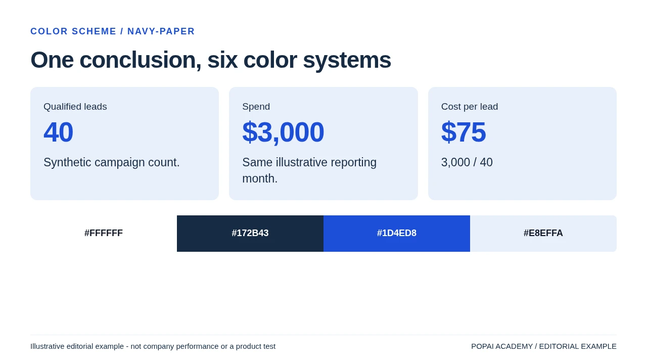
Background Treatment Is Different from a Color Palette
Choose the surface according to the content: plain light fields for dense tables, dark fields for a concise opener, and restrained edge decoration when the center must remain readable. The background examples show text-safe placement; for foreground/background combinations and calculated ratios, use the color-scheme comparison. The illustrated scene is not a substitute for approved photography when a real place must be represented.