The best icons for AI slides identify a specific action or concept at a glance; they do not try to make a deck look “more AI.” This guide maps common concepts to clearer symbols, compares styles, and gives worked layouts and a repeatable selection test.
Use icons as visual labels, not substitutes for important words. A connected-nodes symbol might mean a model, a network, or data relationships; a short label resolves that ambiguity. The examples below are design heuristics for presentation slides, not a universal icon standard. Test them in the context of your audience and claim.
Four Icon Styles for the Same Three Concepts
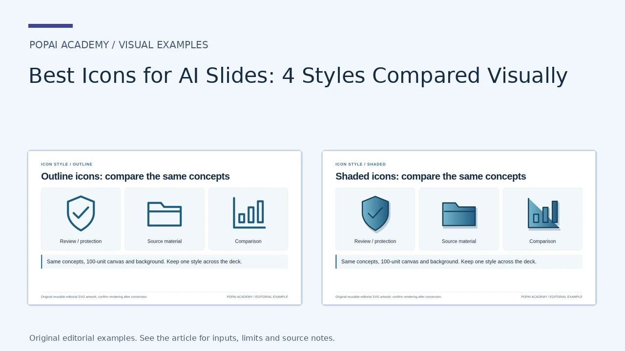
These are original editorial SVG icons, not reproductions of Lucide or Material Symbols. The concepts, canvas and background stay constant so you can compare style. The shaded sample is a two-dimensional vector treatment, not a 3D asset.
Open full-size examples and editable HTML layouts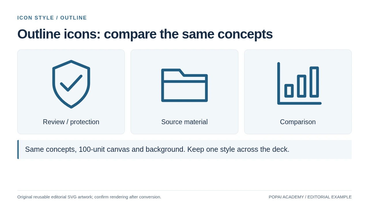
Original editorial outline SVG examples, not copied Lucide or Material icons.
Read or copy the slide content
Review / protection
Source material
Comparison
Same concepts, 100-unit canvas and background. Keep one style across the deck.
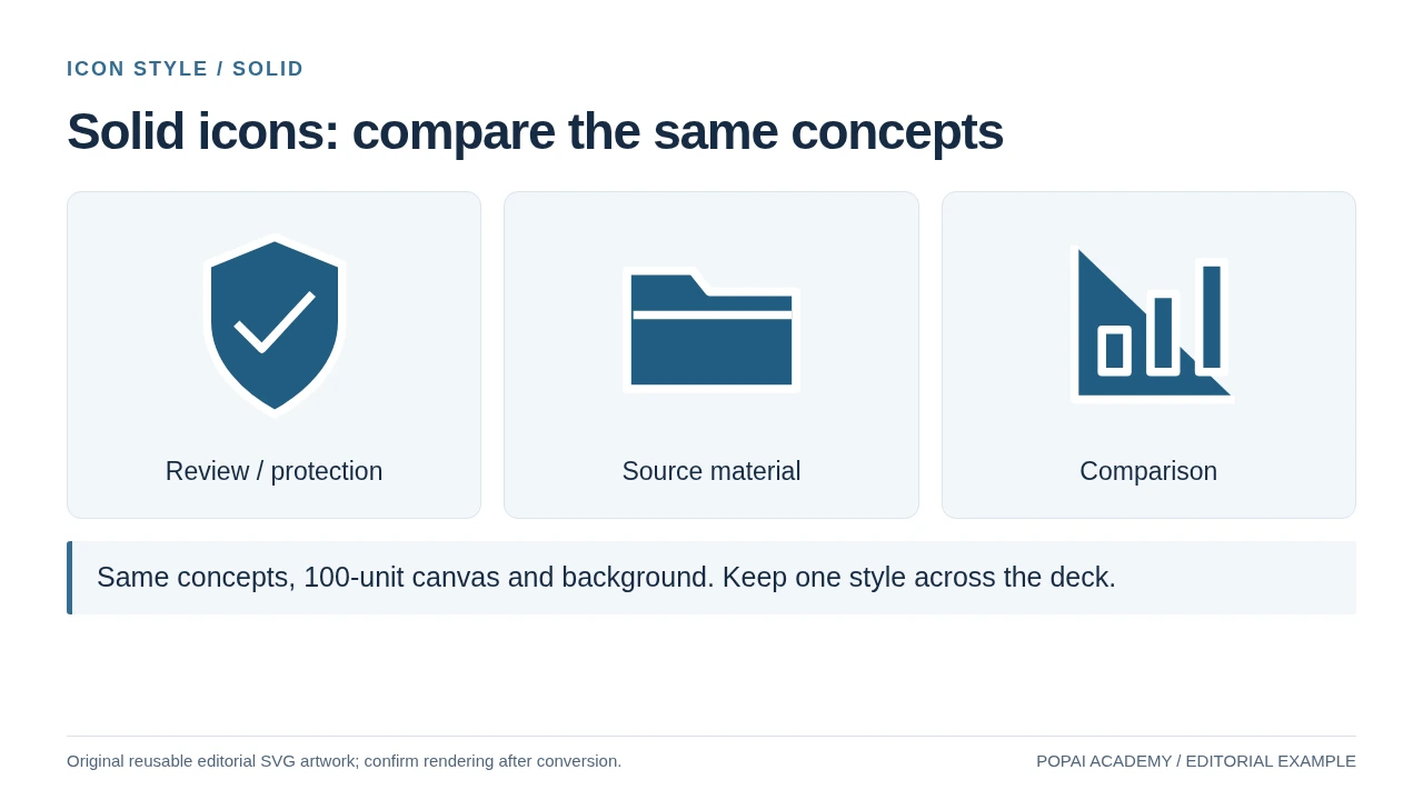
Original editorial solid SVG examples, not copied Lucide or Material icons.
Read or copy the slide content
Review / protection
Source material
Comparison
Same concepts, 100-unit canvas and background. Keep one style across the deck.
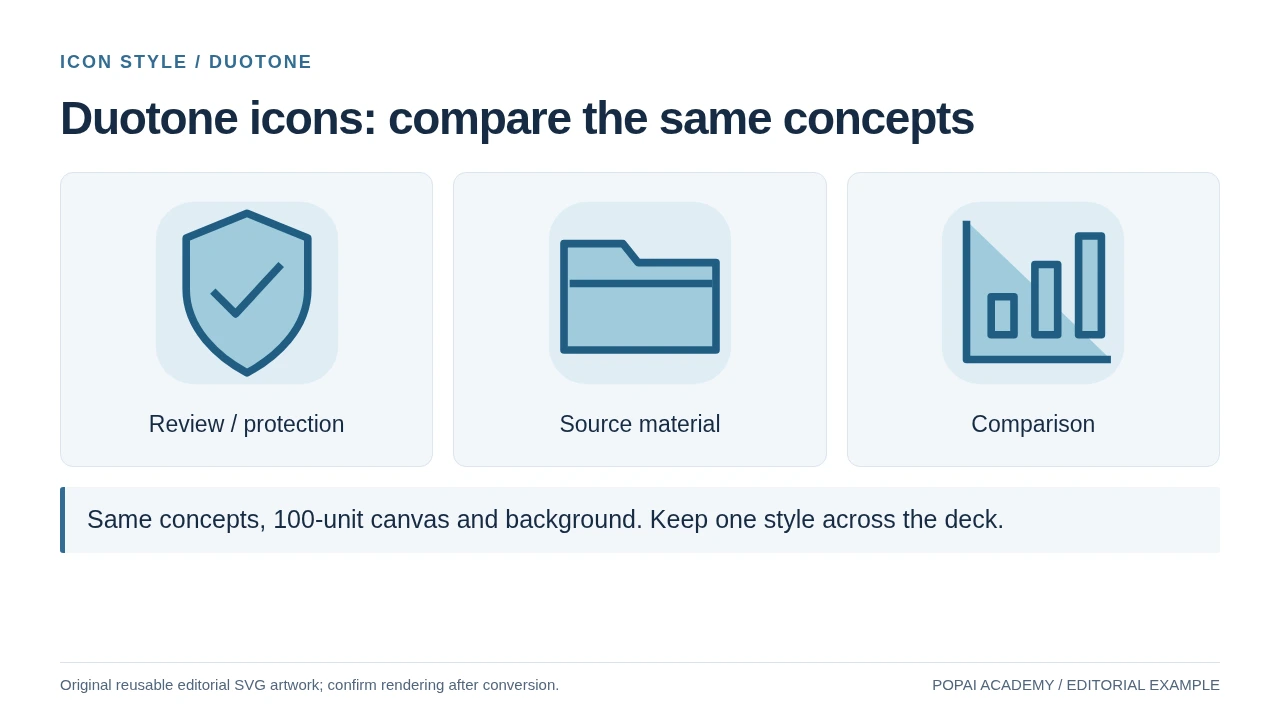
Original editorial duotone SVG examples, not copied Lucide or Material icons.
Read or copy the slide content
Review / protection
Source material
Comparison
Same concepts, 100-unit canvas and background. Keep one style across the deck.
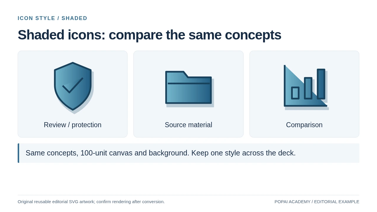
Original editorial shaded SVG examples, not copied Lucide or Material icons.
Read or copy the slide content
Review / protection
Source material
Comparison
Same concepts, 100-unit canvas and background. Keep one style across the deck.
Prompt for this example set
Create a slide with the purpose "Shaded icons: compare the same concepts". Use these approved source fields or replace the illustrative inputs before use: Review / protection Source material Comparison Same concepts, 100-unit canvas and background. Keep one style across the deck.. Preserve labels, units, source notes and any uncertainty. Do not add results, claims, customers or capabilities. Suggest a readable layout and keep the output editable in the chosen tool.
How to Choose Icons for AI Slides
Write down what the audience should understand before searching for a symbol.
A robot can suggest automation, but it does not tell viewers whether the slide is about a chatbot, model training, or data privacy. Pair a simple metaphor with a concise label, and choose the symbol for the actual function—not just the broad topic of AI.
Map the concept to a specific visual cue
- AI system: a labeled model or network can work when the slide is about the system as a whole. A brain or circuit alone is broad and may suggest “technology” rather than a particular capability.
- Machine learning: show data entering a model and an output leaving it. Branching nodes alone can be mistaken for a network diagram.
- Large language model: use a text prompt entering a model and a response leaving it; label the prompt and output if the process matters.
- Generative AI: pair a prompt with the type of output—such as text, image, or audio—rather than using a generic sparkle by itself.
- Privacy: a person, data record, or eye-with-slash can indicate control over personal information. A lock alone usually reads as security.
- Security: a lock or shield can represent access controls or protection from threats; state which one in the label.
- Fairness: show an evaluation or comparison across groups, with context in the slide. A balance scale can imply legal judgment rather than model evaluation.
- Human review: use a person checking, approving, or editing an output. Do not use a shield if the point is specifically human oversight.
A practical decision rule: use an icon when it reinforces a short label or helps distinguish repeated steps. Use a labeled diagram when the relationship between parts matters; use no icon when the symbol needs more explanation than the point itself.
For a quick interpretation test, show the symbol and label to someone who has not seen the slide. Ask, “What do you think this step does?” If they name a different function, or cannot answer without guessing, change the metaphor or make the label more specific.
On a workflow slide, an icon can help viewers tell “review” from “approve.” On a slide already crowded with a detailed model diagram, another decorative brain icon competes with the information instead of clarifying it.
If you are comparing tools for building the deck as well as editing it, this guide to AI presentation makers can help frame that separate decision. The icon itself still needs a meaning check in the finished slide.
Best Icon Styles for AI Presentation Design
Choose a style based on the slide’s viewing conditions and brand, then use the same treatment across comparable icons.
There is no universally best style. For dense business or training slides, outline and solid icons are usually easier to read than highly detailed illustrations. Flat and 3D treatments can suit a product overview or cover, but they take more space and can compete with labels.
Compare the same concept before committing
- Outline: an outline lock is light and unobtrusive beside a label. It works well on uncluttered backgrounds, but thin strokes can disappear when reduced or projected.
- Solid: a filled lock has a stronger silhouette at small sizes. It can feel heavy beside delicate line icons, so match its visual weight to the set.
- Flat: a lock built from a few filled shapes can use brand colors and suit feature cards. Avoid shadows or extra parts that make its meaning less immediate.
- 3D: a rendered lock can be a strong focal visual on a product or opening slide. It is harder to align with simple symbols in a process row and often needs more space.
These are practical comparisons, not results of a controlled visual study. Before selecting a set, place the same concept in two or three treatments beside the slide’s actual text and background. Choose the version that remains recognizable at the intended size and does not pull attention away from the headline.
Starting size, not a rule: on a standard 16:9 slide, try 0.45–0.7 inches for an icon beside body copy and 0.8–1.2 inches for a feature card. These ranges are working layout heuristics for editable slides; font size, stroke thickness, screen size, and projection distance can change what works. Check the exported slide at presentation size before settling on a value.
For a deck that already mixes assets, do not redraw everything automatically. First standardize icon-box size, alignment, and color; replace only the assets whose stroke, detail, or perspective visibly clashes. If the deck uses a detailed 3D hero image, keep small process icons simple so they do not compete.
AI Slide Icon Examples by Use Case
A useful example ties each icon to a slide job, label, and reason for choosing that metaphor.
In the first image above, the four-step structure gives each stage a defined place. Apply the same logic to a training workflow: use the stage label as the primary information and the icon as a quick visual cue. If viewers need to learn what each symbol means before they can follow the process, the labels or diagram need more work.
Worked example: From data to decision
Slide job: explain a four-stage business process, not report measured performance.
Layout: four equal cards connected left to right: Collect → Analyze → Recommend → Measure. Put one short output under each label.
Icon and label: database / “Collect”; input-to-model flow / “Analyze”; branching choice / “Recommend”; simple gauge / “Measure.” A lightbulb is less specific than a decision branch, while a chart icon alone could be mistaken for real results.
Prompt for a generator: “Create four separate, matching outline icons for a business presentation: collect data (database), analyze input with a model (input-to-output model), recommend an option (decision branch), and measure an outcome (gauge). Use one deep-blue stroke, consistent line weight and corner style, simple geometry, no words, no gradients, transparent background. Export each icon separately.”
Illustrative product overview: for a slide about an AI assistant, use a conversation bubble for chat, a prompt-to-image frame for image generation, and a person reviewing a document for human approval. These cues distinguish features better than repeating a robot on every card. If the product does not actually support human approval, do not use that symbol as a promise.
Illustrative responsible-AI review: separate privacy, security, fairness, and human review into four labeled checks. For example: personal-data record for privacy; lock for access security; group comparison for fairness evaluation; person checking an output for human review. A single shield labeled “Responsible AI” hides these important differences.
Symbolic versus real data: a small gauge can mark a “measurement” step in a process diagram, but it should not stand in for a result such as “accuracy increased by 12%.” For that claim, show the actual values, scale, and comparison in a chart, and use the icon only as a secondary cue.
If a visual makes a factual claim—such as performance, risk reduction, or adoption—use data that supports the claim. An icon can name the topic; it cannot serve as evidence.
Where to Find or Generate a Matching Icon Set
Compare sources with a small test set before you build a deck around them.
Presentation software’s built-in icon collections are convenient for quick recoloring and editing. Libraries such as Lucide or Material Symbols make it easier to find related concepts within a recognizable family; check the current terms and available formats for the specific assets you select. A custom generator can fill a gap, but it may produce inconsistent geometry or symbols that look plausible without being accurate.
- Test three concepts: choose one simple object, one abstract idea such as fairness, and one process such as model review. A source that handles only obvious objects may not suit the whole deck.
- Compare editability: confirm whether you can change color, stroke, and size in your target slide software, rather than assuming the download format guarantees it.
- Check terms asset by asset: confirm commercial use, attribution, modification, and template-redistribution rules from the current license or source page.
- Generate separately: request one concept per file and reuse the same style description or reference. Reject outputs with lettering, extra decorative elements, or different perspective unless you can correct them.
For generation, keep a fixed prompt template and change only the concept: “Single [concept] icon, [outline/solid] style, [stroke or fill color], front-facing, simple geometry, no text, no shadow, transparent background, centered in a square canvas.” Generate a small batch, compare them together, and regenerate the outlier rather than adjusting the entire prompt unpredictably.
SVG can scale cleanly, but editing behavior varies by presentation software and by how the SVG was authored. Import a sample into the actual app, try recoloring and resizing it, then export to PDF or presentation mode to check rendering. PNG is a dependable fallback when SVG support is unreliable; use a transparent image with enough resolution for its final on-slide size.
When starting from source material, PopAi AI Presentation can help organize content into a slide outline; treat any generated icons or layouts as draft assets. A practical handoff is to replace unclear symbols, check whether the labels match the source material, and test the exported deck in the software and format you will present.
Check Icon Quality, Accessibility, and Licensing
Check meaning, legibility, accessibility, and permission as separate questions.
For a quick legibility check, view the slide at its intended presentation size and step back from the screen. If the key silhouette disappears, simplify the icon or use a larger version. For contrast, compare the icon with its adjacent background; WCAG’s non-text contrast criterion uses a 3:1 contrast ratio for graphical objects needed to understand content. A contrast checker can help with a borderline case, but it does not replace checking the icon in context.
Run a final asset check
- Meaning: does the symbol support the label, or suggest a different function?
- Readability: can someone identify its main silhouette at the size it will appear?
- Consistency: do comparable icons have similar stroke weight, detail, alignment, and visual scale?
- Accessibility: is meaning conveyed by text or shape as well as color? For an icon that carries information, add an explanatory label. In PowerPoint or another tool with accessibility settings, provide appropriate alternative text where the icon is meaningful to screen-reader users; mark purely decorative icons as decorative when supported.
- Technical fit: does the icon remain sharp and correctly colored in the exported PDF or presentation mode?
- Permission: do the current terms cover your intended use, edits, and distribution?
Keep a simple asset record with the icon name, source URL, download date, license or terms link, attribution text if required, and any modifications. This is more useful than a general note that the deck uses “free icons,” especially when a presentation later becomes a public template or commercial deliverable.
If an icon needs a paragraph to explain, switch to a labeled diagram or remove it. For high-stakes content, check both the visual claim and the source permission; visual novelty is less important than accurate meaning and legibility.
A Repeatable Workflow for Better AI Slide Icons
Turn the icon decision into a short worksheet, then test the result in the slide where it will appear.
Here is an illustrative example for a slide explaining AI-assisted document review. The goal is to show a process—not to claim that the model makes the final decision.
- Write the intended meaning: “The model flags a passage for a person to check.” This prevents a symbol from implying automatic approval.
- Choose the metaphor and label: use a document with a marked passage, labeled “Flag for review.” Avoid a checkmark alone, which can imply the document has already passed review.
- Set the visual treatment: match the deck’s existing outline or solid style, palette, and icon-box size. If no style is established, test one outline and one solid option beside the slide text.
- Ask a focused review question: show the slide briefly to a colleague and ask, “Who makes the final decision?” If they answer “the model,” revise the icon or explanatory line.
- Check the deliverable: inspect the exported file, verify any meaningful alt text, and record the asset’s source and license.
This process makes each step produce a concrete output: a plain-language meaning, a labeled metaphor, a style choice, an interpretation check, and a source record. Keep an icon only if it improves that slide’s explanation or navigation. The simplest test is whether a viewer can understand the point without having to decode the artwork.
Official Icon Sources and Reuse Checks
| Source | Official entry point | License / export check |
|---|---|---|
| Lucide | Browse icons | Check the ISC / derived-icon license notices; preserve required notices. |
| Material Symbols | Browse symbols | See the official Apache 2.0 guide and asset-specific requirements. |
| This gallery | Original editorial SVG examples | The separate SVGs and PNGs included with this article are original illustrations, not copied library assets. |
An SVG is vector artwork, but importing it does not guarantee that every path will remain individually editable. The outcome depends on the editor and conversion route. PNG is rasterized; a PPTX or PDF export can also flatten SVG artwork. Check one actual exported icon in the target application before promising vector editability.
Original SVG and PNG Examples
These original illustrations are included with the article; they are separate files, not a subscription or a promise of native PowerPoint editability.