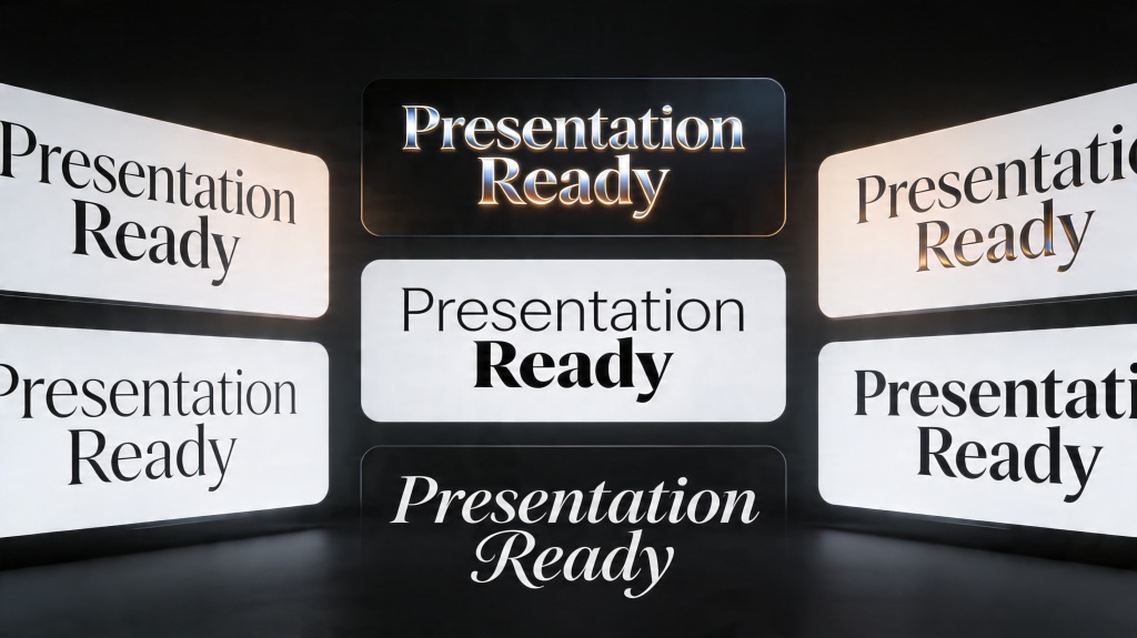
The best fonts for presentations are not the most decorative fonts. They are the ones your audience can read quickly on a laptop, projector, meeting-room screen, or shared PDF. A strong font choice gives your slide titles authority, keeps body text legible, and creates a consistent visual rhythm across the deck.
This guide focuses on presentation typography as a design skill: principles, common mistakes, before-and-after fixes, a reusable checklist, realistic font examples, and where AI can help with styling prompts. For the broader slide creation workflow, connect this long-tail guide to the AI for presentations core page, then move to the main product workflow when you are ready to create.
Best Fonts for Presentations: Design Principles First
Font choice starts with context. A classroom lecture, investor pitch, product update, and conference keynote do not need the same voice. But they all need readable letterforms, clear hierarchy, enough contrast, and consistent sizing.
- Readability beats personality: choose fonts that stay clear at distance and smaller sizes.
- Use hierarchy: titles, subtitles, body text, captions, and labels should each have a distinct role.
- Limit the system: one family is safest; two families can work when the contrast is intentional.
- Match the setting: screen decks need simpler fonts than printed handouts or editorial-style PDFs.
- Check contrast: font choice fails if the text color and background are too close.
1. Reliable Font Choices by Presentation Type
Use this table as a starting point. The best choice depends on tone, audience, and screen conditions.
| Presentation Type | Safe Font Choices | Why They Work |
|---|---|---|
| Business update | Aptos, Calibri, Arial, Inter | Neutral, readable, familiar, and easy to share across systems. |
| Startup pitch | Montserrat, Inter, Helvetica, Avenir | Clean, modern, and strong enough for bold title slides. |
| Classroom or training | Open Sans, Roboto, Lato, Source Sans | Friendly and readable for dense teaching content. |
| Luxury or editorial deck | Playfair Display for headings + Inter or Open Sans for body | Creates contrast without making body text hard to read. |
| Data-heavy report | Inter, Roboto, IBM Plex Sans, Arial | Strong number readability and clean labels for charts. |
2. Font Mistakes That Make Slides Hard to Read
Most typography problems come from trying to make slides look more designed by adding more styles. Good slide typography usually removes decisions.
Error: using a decorative font for body text
Decorative fonts can work for one title slide, but they become tiring in bullet lists, captions, and chart labels. Keep expressive fonts limited to large headings.
Error: too many weights and sizes
If every phrase is bold, colored, or differently sized, nothing feels important. Use a small scale: title, section heading, body, label, and caption.
Error: low contrast text
Light gray text on a white background may look elegant on your laptop but disappear on a projector. Test contrast in the actual presentation format.
3. Before and After: Fixing Weak Slide Typography
Before: all text uses the same size
The audience cannot tell what to read first. The title, subtitle, bullets, chart labels, and notes all compete for attention.
After: title-led hierarchy
Rewrite the title as the main takeaway, increase its size, keep body text shorter, and use captions only for support details.
Before: a pitch deck with mixed fonts
The cover uses a serif font, the problem slide uses Arial, the chart uses Roboto, and the CTA slide uses a decorative typeface. The deck feels patched together.
After: one type system
Use Montserrat or Inter for titles and Open Sans or Roboto for body text. Apply the same size scale across every slide.
For decks where typography needs to support a persuasive narrative, pair this type system with a storytelling presentation framework so problem, solution, proof, and call-to-action slides feel connected.
Scenario: investor pitch
Use a bold sans-serif title style for problem, solution, traction, and ask slides. Keep body text sparse and make key metrics large enough to read from the back of a room.
Scenario: teacher training deck
Use Open Sans or Lato, avoid tiny captions, and keep examples in readable bullet groups. Clarity matters more than a trendy font.
4. Reusable Font Checklist Before You Present
- Are titles at least 36-44pt for room or projector presentations?
- Is body text usually 24pt or larger?
- Does the deck use one or two font families, not several?
- Are numbers and chart labels easy to read?
- Is there enough contrast between text and background?
- Are all slide titles written in a consistent style?
- Can a viewer understand each slide by scanning title, visual, and one key point?
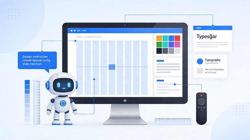
5. Where AI Helps With Font and Styling Decisions
AI is useful for applying a consistent type system across a deck, but it still needs direction. Ask for a font style that matches the audience and setting rather than asking for a generic "professional" look.
- Font pairing: ask AI to pair a bold heading font with a readable body font.
- Hierarchy cleanup: ask AI to reduce text levels and standardize title/body/caption sizing.
- Brand consistency: provide brand colors and ask AI to keep typography restrained.
- Accessibility review: ask AI to flag low contrast, tiny labels, or dense text blocks.
Reusable AI styling prompt
Apply a clean presentation typography system. Use a readable sans-serif for body text, a bold heading style for slide titles, strong contrast, body text no smaller than 24pt, and no more than two font families. Keep the deck consistent and easy to read on a projector.
Font pairing prompt
Suggest a font pairing for a [business/classroom/pitch/report] presentation. Explain which font should be used for titles, body text, captions, and chart labels, and keep readability as the top priority.
Frequently Asked Questions
What are the best fonts for presentations?
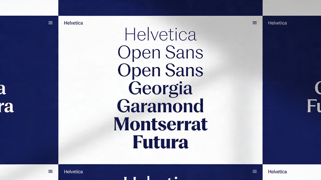
The safest choices are clean sans-serif fonts such as Aptos, Calibri, Inter, Helvetica, Arial, Roboto, Open Sans, Lato, and Montserrat. Serif fonts can work for large headings, but body text should usually stay simple and screen-readable.
What font size should I use for presentation slides?
Use at least 36-44pt for titles and avoid body text below 24pt for projected or meeting-room slides. Smaller text can work for handouts, but not for live presentation viewing.
How many fonts should a slide deck use?
Most decks should use one font family or two complementary families: one for headings and one for body text. More than two usually makes slides look inconsistent.
Can AI help choose presentation fonts?
AI can suggest font pairings, simplify hierarchy, apply brand styles, and generate styling prompts, but you should still check readability, contrast, and consistency before presenting.
Create your presentation with one click now
Use PopAi to turn your topic into a structured deck, then apply readable typography, clean layouts, and consistent visual hierarchy.
Start Designing for Free