Presentation Design Tips for Non-designers (with AI)
Published on April 16, 2026
In today’s fast-paced corporate and academic worlds, the ability to present ideas effectively is a superpower. However, not everyone is born with the artistic eye of a graphic designer. For many professionals, the mere thought of opening a blank slide deck triggers "template anxiety." The good news? You don't need a design degree to create slides that wow your audience. With a few fundamental principles and the right Artificial Intelligence tools, you can transform dull data into a compelling visual narrative.
This guide breaks down the essential presentation design tips for non-designers, focusing on how AI can bridge the gap between your ideas and professional-grade execution.
1. Embracing Simplicity: The Golden Rule
The biggest mistake non-designers make is trying to fit everything onto a single slide. This results in "Death by PowerPoint," where the audience is too busy reading to listen to the speaker. Design simplicity isn't just about aesthetics; it's about cognitive load.
- One Idea Per Slide: If you have three points to make, use three slides. This keeps the audience focused on your current narrative.
- The 6x6 Rule: Try to limit your text to no more than six bullet points per slide and six words per bullet point.
- Whitespace is Your Friend: Don't feel the need to fill every corner. Empty space (whitespace) guides the eye to the most important content.
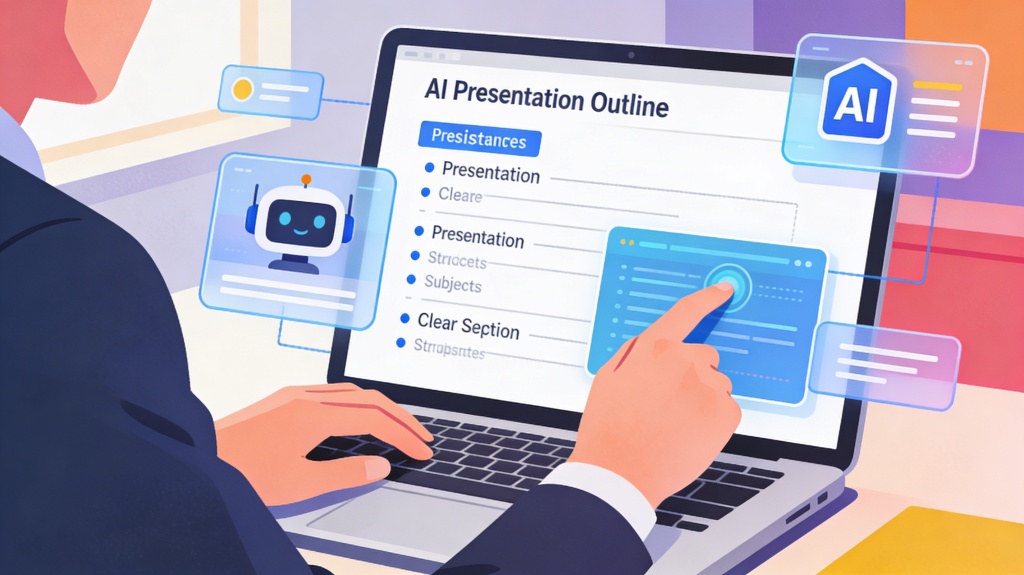
Pro Tip: Use an AI Presentation Maker to automatically distribute your text across multiple slides, ensuring each one remains clean and focused.
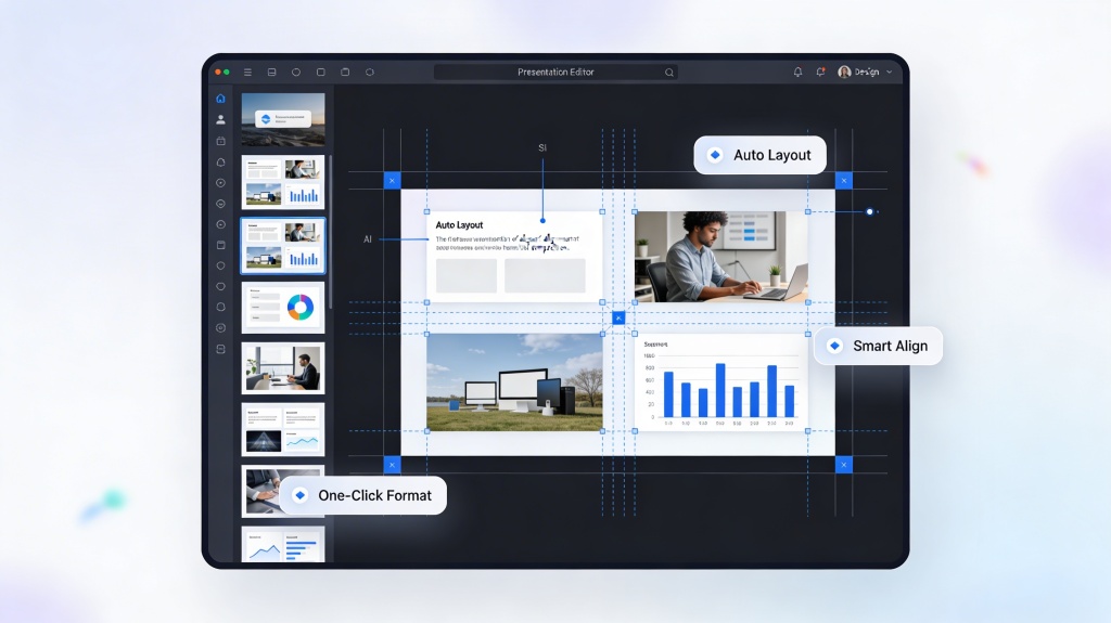
2. Leveraging AI for Layout and Composition
Composition is the arrangement of elements on a slide. For a non-designer, deciding where to put the image versus the text can be paralyzing. This is where AI truly shines. Modern AI tools analyze your content and suggest layouts that follow the "Rule of Thirds" or "Z-pattern" reading flow.
Instead of manually dragging boxes, you can input your outline into an AI tool and watch it generate structured layouts that look balanced and professional. This saves hours of micro-adjustments and ensures your deck looks cohesive from start to finish.
3. Visual Storytelling: Beyond Bullet Points
Humans process visuals 60,000 times faster than text. To be a successful non-designer, you must shift your mindset from "writing slides" to "visualizing ideas."
When selecting imagery, avoid generic stock photos of "people shaking hands." Use high-quality, relevant visuals that evoke emotion or clarify complex data. AI image generators integrated into presentation tools allow you to create custom, unique visuals just by typing a description, ensuring your slides don't look like a carbon copy of everyone else's.
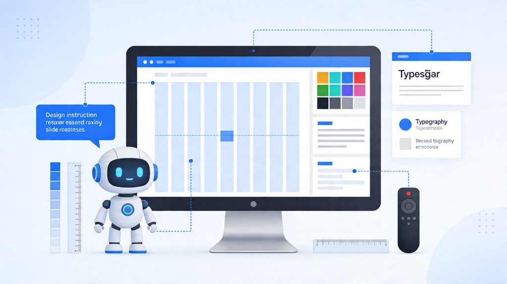
4. Mastering Typography and Color
Color and fonts are the "voice" of your presentation. Poor choices can make your content hard to read or appear unprofessional.
Color Harmony
Stick to a palette of 3-4 colors. Use one primary color for headings, a neutral color for body text, and an accent color (like orange or bright blue) for call-to-actions or key data points. If you're unsure, AI tools can generate palettes based on your brand logo or the "mood" of your topic.
Typography Hierarchy
Use sans-serif fonts (like Arial, Helvetica, or Open Sans) for digital presentations as they are easier to read on screens. Ensure a clear size difference between your title (e.g., 36pt+) and your body text (e.g., 18pt+). This creates a visual hierarchy that tells the audience what to look at first.
5. The Power of Consistency
Consistency is what separates amateur decks from professional ones. This means using the same font styles, the same icon sets, and the same alignment throughout. If your titles jump around from slide to slide, it creates a "jittery" experience for the viewer.
AI-driven templates handle this by applying a global "Style Sheet" to your entire deck. When you change a font on slide one, the AI can update the entire presentation to match, maintaining a polished, unified look without manual effort.
Frequently Asked Questions
Can I create a professional presentation if I have zero design skills?
Absolutely. By following core principles like whitespace and visual hierarchy, and using AI tools like PopAi, anyone can generate polished, high-quality slides without formal training.
How does AI help in presentation design?
AI assists by automating layout creation, suggesting color palettes, generating relevant images from text prompts, and ensuring consistent formatting throughout the entire deck.
What is the most common mistake non-designers make?
The most common mistake is overcrowding slides with too much text. To fix this, stick to one main idea per slide and use visuals to support your message.
Is it better to use a template or start from scratch?
For non-designers, starting with a template or an AI-generated base is always better. It provides a proven structural framework, allowing you to focus on the content while the design remains professional.
Create your presentation with one click now
Stop struggling with layouts and fonts. Let our AI handle the design while you focus on your message.
Start Creating for Free