The best font for AI slides is the one that stays readable at the intended viewing distance, covers the deck’s languages, and behaves predictably when the file is shared.
By the end of this guide, you can choose a font system for a projected briefing, an editable deck, or a PDF handout—and compare eight common families using the same title, body line, and chart label. The recommendations weigh legibility, useful weight options, text width, numeral clarity, and practical availability. They are selection guidance, not a claim that every AI slide tool renders every font identically.
If you are comparing AI presentation makers, check whether the editor lets you change actual font settings after generation; a prompt alone may only influence the visual style of the draft.
Six Real Font Specimens and a Fallback Simulation
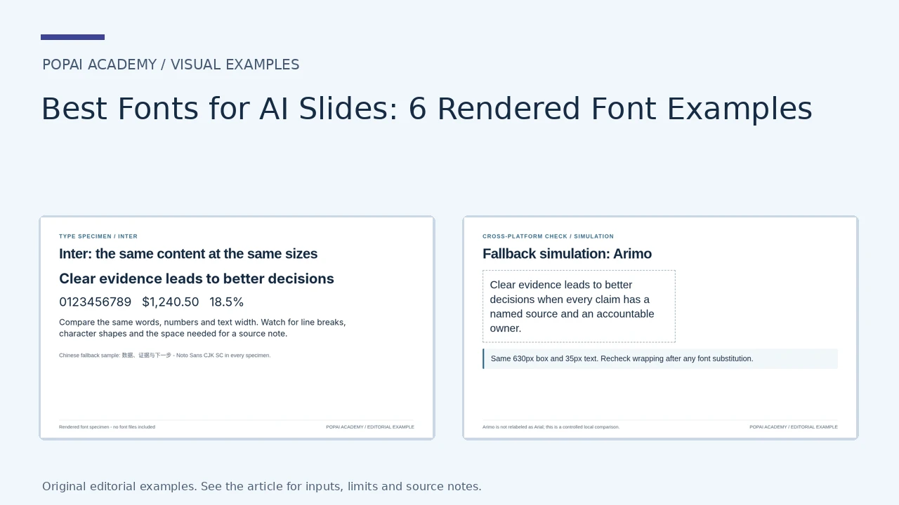
The same English headline, digits and paragraph were actually rendered using Inter, Roboto, Arimo, Lato, Noto Sans and Noto Serif. Chinese uses Noto Sans CJK SC in each specimen. The substitution example is a local rendering simulation, not a PowerPoint or Google Slides compatibility test.
Open full-size examples and editable HTML layoutsSix actual font specimens
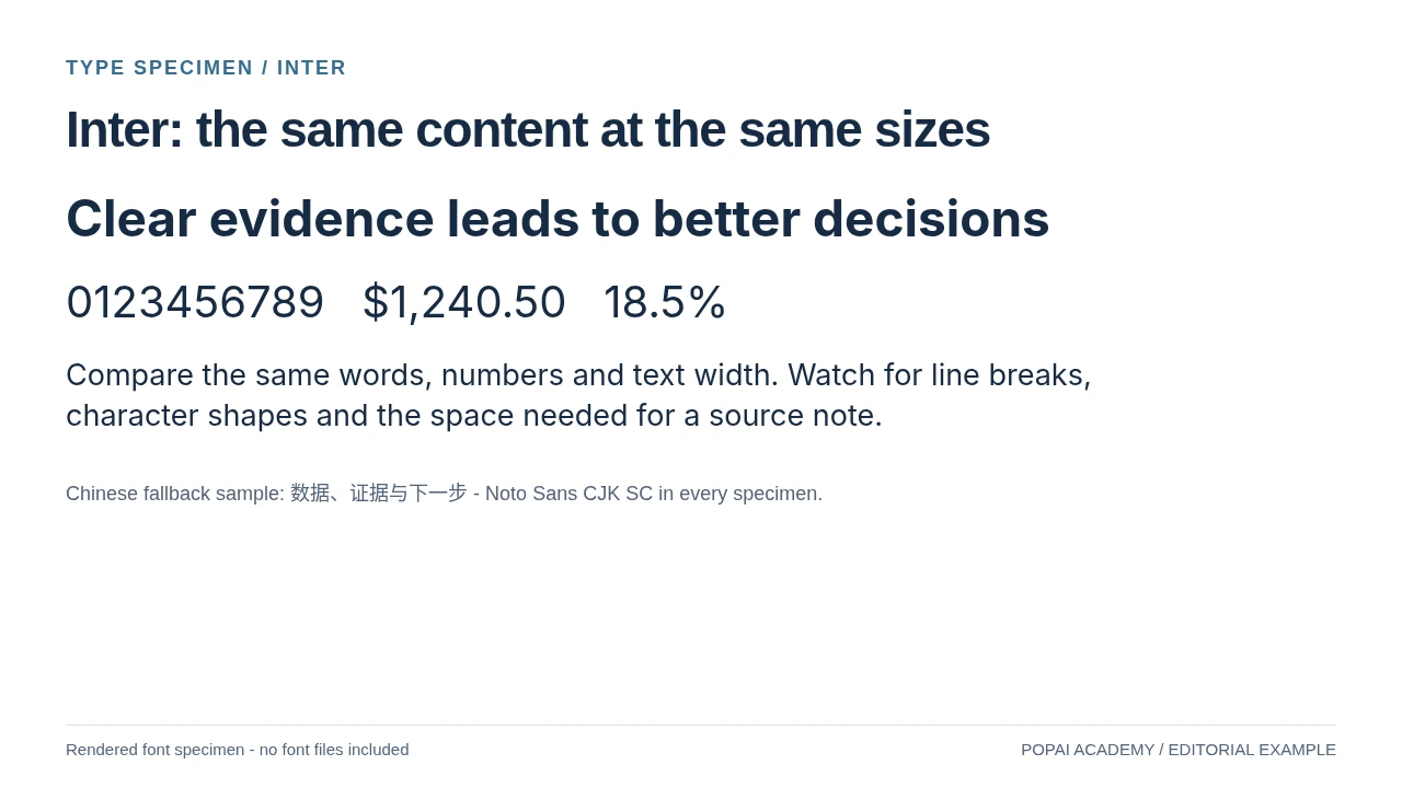
Actually rendered with Inter. Headline 46px, paragraph 27px; Chinese uses the separately identified fallback.
Read or copy the slide content
Clear evidence leads to better decisions
0123456789   $1,240.50   18.5%
Compare the same words, numbers and text width. Watch for line breaks, character shapes and the space needed for a source note.
Chinese fallback sample:
数据、证据与下一步
- Noto Sans CJK SC in every specimen.
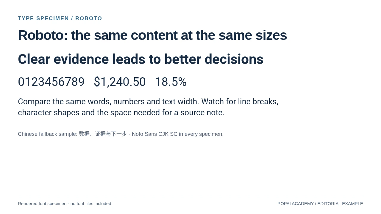
Actually rendered with Roboto. Headline 46px, paragraph 27px; Chinese uses the separately identified fallback.
Read or copy the slide content
Clear evidence leads to better decisions
0123456789   $1,240.50   18.5%
Compare the same words, numbers and text width. Watch for line breaks, character shapes and the space needed for a source note.
Chinese fallback sample:
数据、证据与下一步
- Noto Sans CJK SC in every specimen.
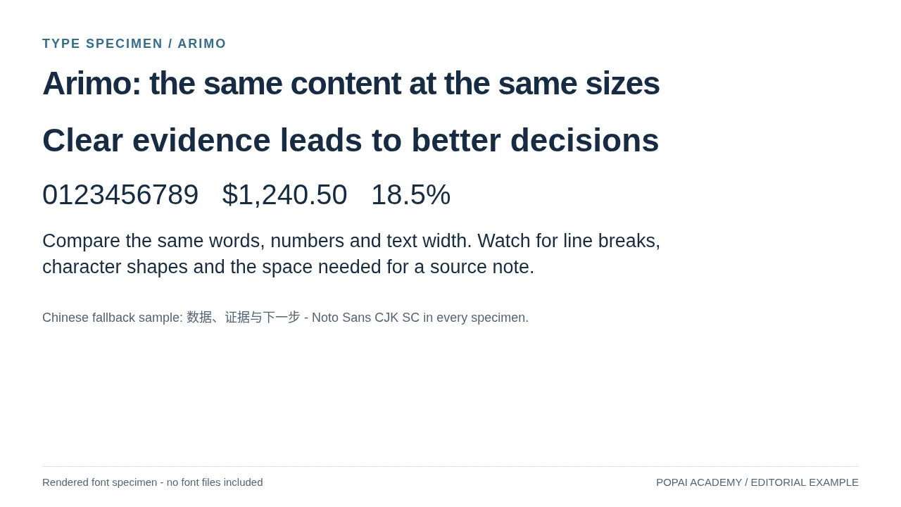
Actually rendered with Arimo. Headline 46px, paragraph 27px; Chinese uses the separately identified fallback.
Read or copy the slide content
Clear evidence leads to better decisions
0123456789   $1,240.50   18.5%
Compare the same words, numbers and text width. Watch for line breaks, character shapes and the space needed for a source note.
Chinese fallback sample:
数据、证据与下一步
- Noto Sans CJK SC in every specimen.
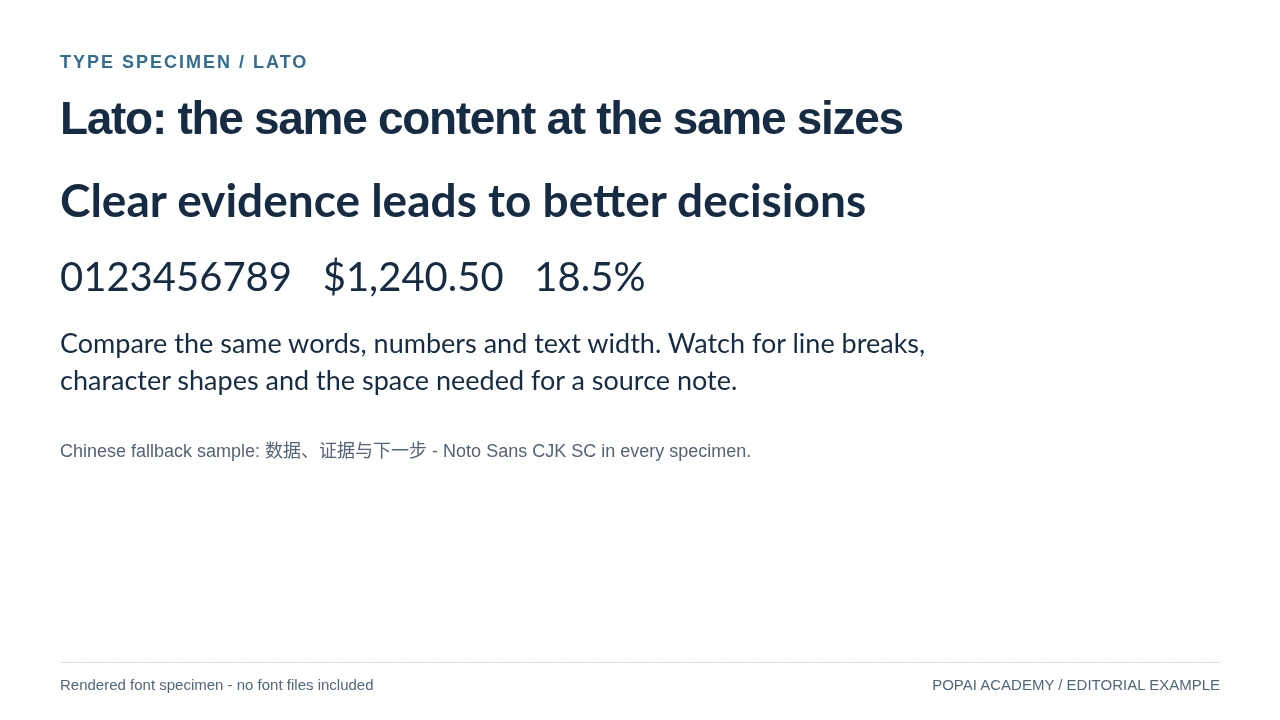
Actually rendered with Lato. Headline 46px, paragraph 27px; Chinese uses the separately identified fallback.
Read or copy the slide content
Clear evidence leads to better decisions
0123456789   $1,240.50   18.5%
Compare the same words, numbers and text width. Watch for line breaks, character shapes and the space needed for a source note.
Chinese fallback sample:
数据、证据与下一步
- Noto Sans CJK SC in every specimen.
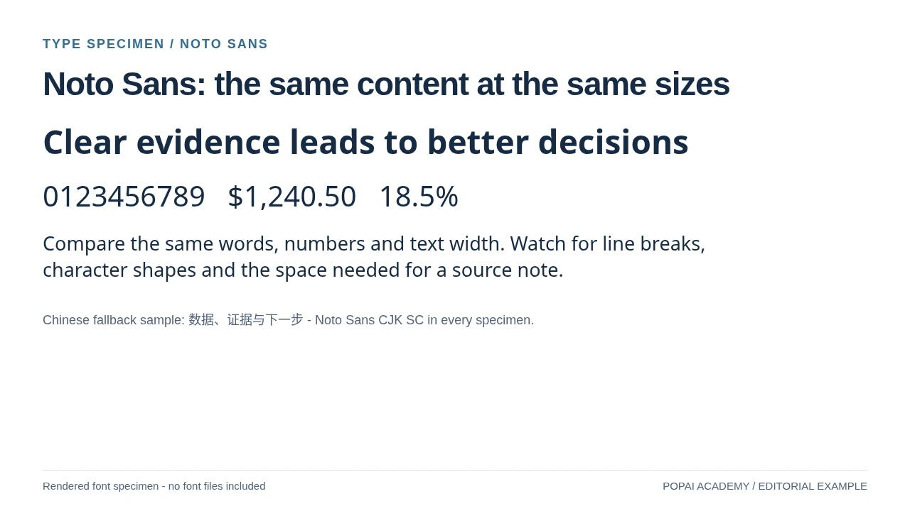
Actually rendered with Noto Sans. Headline 46px, paragraph 27px; Chinese uses the separately identified fallback.
Read or copy the slide content
Clear evidence leads to better decisions
0123456789   $1,240.50   18.5%
Compare the same words, numbers and text width. Watch for line breaks, character shapes and the space needed for a source note.
Chinese fallback sample:
数据、证据与下一步
- Noto Sans CJK SC in every specimen.
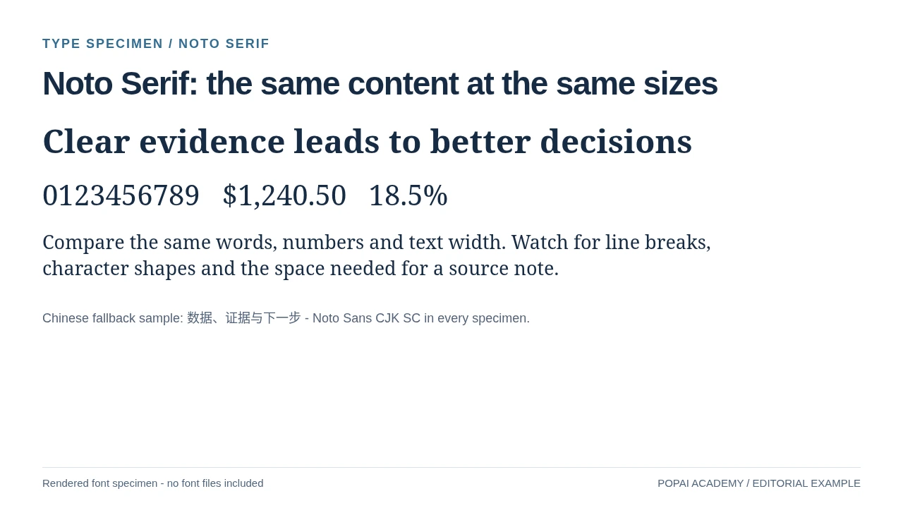
Actually rendered with Noto Serif. Headline 46px, paragraph 27px; Chinese uses the separately identified fallback.
Read or copy the slide content
Clear evidence leads to better decisions
0123456789   $1,240.50   18.5%
Compare the same words, numbers and text width. Watch for line breaks, character shapes and the space needed for a source note.
Chinese fallback sample:
数据、证据与下一步
- Noto Sans CJK SC in every specimen.
Prompt for Six actual font specimens
Create a slide with the purpose "Noto Serif: the same content at the same sizes". Use these approved source fields or replace the illustrative inputs before use: Clear evidence leads to better decisions 0123456789 $1,240.50 18.5% Compare the same words, numbers and text width. Watch for line breaks, character shapes and the space needed for a source note. Chinese fallback sample: 数据、证据与下一步 - Noto Sans CJK SC in every specimen.. Preserve labels, units, source notes and any uncertainty. Do not add results, claims, customers or capabilities. Suggest a readable layout and keep the output editable in the chosen tool.
Controlled fallback simulation
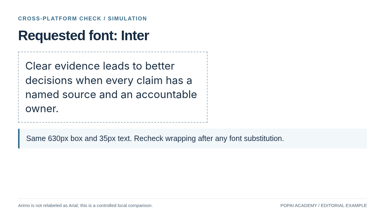
Local rendering simulation, not a PowerPoint or Google Slides import test.
Read or copy the slide content
Clear evidence leads to better decisions when every claim has a named source and an accountable owner.
Same 630px box and 35px text. Recheck wrapping after any font substitution.
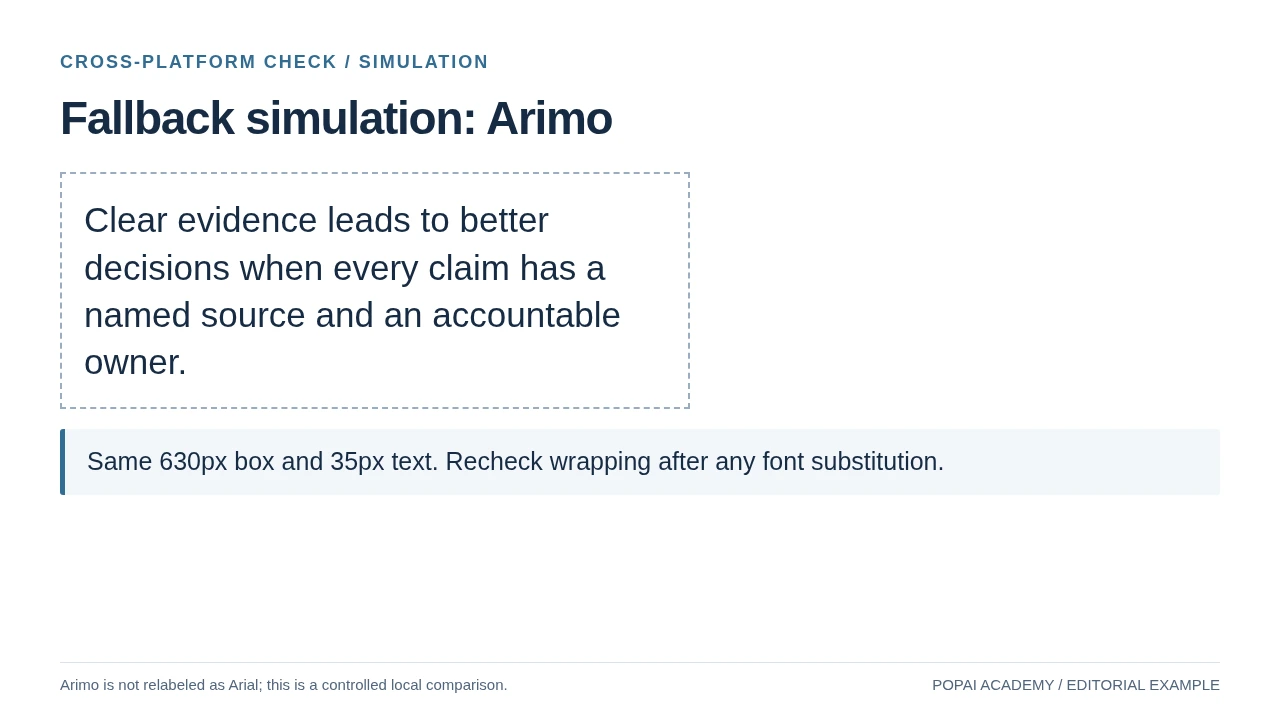
Local rendering simulation, not a PowerPoint or Google Slides import test.
Read or copy the slide content
Clear evidence leads to better decisions when every claim has a named source and an accountable owner.
Same 630px box and 35px text. Recheck wrapping after any font substitution.
Prompt for Controlled fallback simulation
Create a slide with the purpose "Fallback simulation: Arimo". Use these approved source fields or replace the illustrative inputs before use: Clear evidence leads to better decisions when every claim has a named source and an accountable owner. Same 630px box and 35px text. Recheck wrapping after any font substitution.. Preserve labels, units, source notes and any uncertainty. Do not add results, claims, customers or capabilities. Suggest a readable layout and keep the output editable in the chosen tool.
Best fonts for AI slides by role
Choose a family for the job it needs to do: carry a headline, support sustained reading, or make values easy to compare.
The specimens below use identical copy so you can compare the shape and approximate width of each family. They render in your browser only if the font is available there; otherwise, your device will show a fallback. Treat that difference as a reminder to check specimens in the destination app, too.
| Rendered font | Editorial use case | Handoff check |
|---|---|---|
| Inter | Neutral digital headings and body copy | Check the selected weight and line length. |
| Roboto | Product and interface-led content | Recheck numerals and source-note size. |
| Arimo | A named sans-serif alternative for office handoffs | Arimo is not Arial; test actual font availability. |
| Lato | Training and client-facing narrative | Check available weights and compact tables. |
| Noto Sans | A coordinated multi-language font system | Choose the correct language font; this gallery uses a separate CJK fallback. |
| Noto Serif | Editorial or research emphasis | Use readable sizes; do not force dense labels into a serif display treatment. |
Body and chart specimen: “The team reviewed 24 locations; revenue reached $8.4M.” In a slide, compare this line at the size you intend to use—not just at browser zoom. Then check whether the decimal point, dollar sign, and repeated digits remain distinct in the chart or table where they will appear.
Fonts can differ in x-height, character width, numeral design, and weight availability. Those differences affect how much copy fits and how quickly values can be scanned. A font that looks attractive in a title may be too wide for a long headline; a thin display face may also lose detail on a washed-out projector.
Three font systems, with slide-ready settings
- Inter throughout: Use Inter SemiBold for a 32–40 pt title and Regular for 24–28 pt body copy in a projected business deck. Use Medium for chart labels only if it creates a visible distinction. Best when the editing environment supports Inter; otherwise, select a fallback before building the deck.
- Montserrat + Open Sans: Use Montserrat SemiBold for short section titles and Open Sans Regular for body text and labels. This suits a pitch or product overview with a few bold chapter moments. Avoid it when titles are long or the recipient cannot access both fonts.
- Georgia + Arial: Use Georgia Bold for occasional editorial headings and Arial for body copy, tables, and charts. This can suit a research or culture presentation that needs a serif accent. If Arial is substituted, recheck title widths and line breaks rather than assuming the layout will stay fixed.
For a fast-reading slide, let the typeface establish the tone and let size, weight, and spacing establish the hierarchy. A second font should have a clear job—not simply add variety.
Best fonts for AI slides: build a readable hierarchy
A font system works only when viewers can tell what to read first and what can wait.
For a typical 16:9 projected deck, 32–44 pt titles and 24–30 pt primary body text are useful starting ranges, not universal minimums. The right size depends on slide dimensions, viewing distance, contrast, and how much content is on the slide. Point sizes also do not look identical across typefaces: compare the rendered text in the actual slide app.
For example, an Inter projected deck might use a 36 pt SemiBold takeaway, 24 pt Regular explanation, and 18 pt Medium chart labels. For a self-paced PDF, body copy can be smaller if readers can zoom, but dense text still benefits from shorter lines and clear headings. Do not shrink a key conclusion to preserve every sentence—edit or split the slide instead.
Weight and whitespace often do more than another font family. Avoid making every label bold; if every element competes for attention, the audience has no obvious starting point. Check contrast as well as size: the WCAG contrast guidance is a useful reference for text contrast, though it does not replace checking the deck in its real viewing conditions.
Quick hierarchy recipe
- Write the slide’s takeaway as the headline; keep a generic section label secondary.
- Use one or two supporting text sizes and a noticeable difference in weight or scale.
- Keep alignment, line spacing, and capitalization consistent across the deck.
- Use more than color to convey meaning—for example, add labels or markers to distinguish chart series.
Choose fonts by audience, platform, and content
Set the reading conditions first; then choose a font system that can survive the file’s route to its audience.
Match the type to the reading task
- Executive briefing: Use a familiar sans serif and headline-style takeaways. Keep the font choice quiet so a recommendation and its evidence are easy to locate.
- Pitch deck: A distinctive title face can help the opening and section dividers feel branded. Keep traction, market, and financial slides plainer so the numbers remain the focus.
- Teaching or research: Favor a body face that holds up across longer explanations. Make references and source notes readable, or move them to a handout rather than shrinking them.
- Data report: Prioritize consistent numeral shapes, units, and chart labels. Use a display face only where it does not compete with the data.
Choose for the delivery format
- Live presentation: Favor larger text, strong contrast, and uncomplicated letterforms; check from a realistic viewing distance.
- Editable file: Use fonts available in the recipient’s app, or agree on a fallback and inspect the file after opening it there.
- PDF handout: Reopen the exported PDF on a second device. Check line breaks, punctuation, symbols, and any text that sits near an edge.
Import and export can change more than appearance. If the destination app substitutes a wider font, a two-line title may become three lines and crowd a graphic. A PDF usually preserves the appearance of the exported page, but it is not a substitute for checking the source deck if someone needs to edit it. In Google Slides, choose from fonts offered in its font menu; locally installed fonts are not automatically available to every collaborator. In PowerPoint, embedding may help in some sharing workflows, but it depends on font permissions and whether the receiving application supports the embedded font.
Plan for languages and scripts
Tell the generator which languages and scripts the deck needs—for example, English and Japanese—not just “multilingual.” A Latin font may not include Japanese characters, so the app may use a fallback with different widths, line height, or visual weight. Check accents, punctuation, currency symbols, and long translated headings; the translated version may need a wider text box or a shorter title.
Open the final file in the environment where it will be presented. The editing-screen preview is not proof that a font, weight, or line break will survive the handoff.
Prompts to control AI slide typography
Use prompts to set design intent, then use the editor to confirm the actual font family, size, and layout.
What prompts can—and cannot—control
A prompt can request a family, assign roles, limit the number of fonts, and ask for concise titles. Whether the tool applies the exact font and point size depends on its typography controls. Some generators create editable text with font settings; others approximate the request in a visual draft. Inspect the result in the editor rather than treating a prompt as a guarantee.
Reusable prompt for a projected deck
“Create a business presentation for [audience] about [topic]. Use Inter throughout if it is available: SemiBold for slide titles and Regular for body text. Keep titles concise and use no more than two typefaces. For projected viewing, aim for 32–40 pt titles and 24–28 pt body text, adjusting the layout rather than shrinking important text. Keep chart labels readable, maintain strong text contrast, and avoid decorative fonts, all-caps paragraphs, and text overflow. If Inter is unavailable, flag the substitution or use [approved fallback].”
After generation, check whether the editor applied Inter as a font setting or merely followed the requested style. If a title wraps unexpectedly, first shorten it or give the text more room; do not immediately reduce all the type on the slide. For brand use, specify a tested fallback: “Use Montserrat for short titles and Open Sans for body copy; if either is unavailable, use Arial and recheck line breaks.” For charts, ask for aligned values and consistent units, then verify the actual labels in the editor.
In PopAi AI Presentation, you can organize content before generation and continue editing text and layouts afterward. That is a product example, not a guarantee that a prompt will set a particular font in every generated element; check the rendered deck and its editable text settings.
Make chart labels and numbers easy to scan
On a data slide, type should make comparisons easier without becoming another thing to decode.
Use a legible sans serif for axes, legends, data labels, and units. Keep number formatting consistent: for example, show every value in $M or write out the full currency consistently. Lining numerals are digits designed to share a baseline and consistent height; that makes columns of values such as 8.4, 10.1, and 12.6 easier to compare. Check the font in a table or chart to see whether the digits align as intended.
Worked chart example: If a slide compares quarterly revenue of $8.4M, $10.1M, and $12.6M, keep the unit in the chart title or axis label rather than repeating it inconsistently. Align the values, make the latest quarter easy to find, and label series directly where possible. If the axis labels are too small, remove minor gridlines or split the comparison across slides instead of shrinking every label.
Do not rely on color alone to distinguish lines or bars: add direct labels, distinct markers, or a clear legend, and check contrast against the background. Review the title, axes, legend, values, and source note separately. A layout can contain every label and still be hard to read from the room.
Avoid font mismatch, overflow, and fallback surprises
Check the exported file in its destination app before a changed font turns into a layout problem.
A substitute font can be wider or taller than the original. For example, a title that fits in two lines in Inter may wrap to three lines after a recipient opens the deck with a different font. That can push a chart down or clip text at the bottom of a box. A missing weight may also appear heavier or lighter than intended.
Delivery checks for PPTX and PDF
- Keep the system to one or two families and assign each a consistent role.
- Open the PPTX in the target presentation app and look for substitution, changed line breaks, clipped text, and missing characters.
- If you use font embedding in PowerPoint, check the font’s licensing terms and confirm the recipient’s app can use the embedded font.
- For a PDF, inspect the exported pages on a second device, especially small labels, symbols, and text near the page edges.
- Check the deck full-screen at realistic size, including charts and source notes.
Fix overflow in this order: shorten the copy, make more room in the layout, choose the fallback you planned for, then adjust size only if needed. Recheck slides with long headlines, tables, and multilingual text after any font change.
A repeatable font-selection workflow
Work from audience and delivery requirements to a tested font system, rather than styling the deck after it is built.
Worked example: a projected, English-and-Japanese data briefing. The audience needs to compare quarterly results in a live room, and colleagues must be able to edit the PPTX. Start with a sans serif available in the destination app and verify that it covers both scripts; use a short title and a separate, readable chart-label treatment. Ask the AI to use one family with consistent weights and to avoid shrinking text to force a fit. After generation, check a title slide, a Japanese text slide, and the chart. If the title wraps after opening the file on the presentation laptop, shorten it or widen its box before changing the font. Export a PDF too if recipients need a fixed-layout handout, then inspect both files in their intended use.
- Define the situation: Record audience, viewing distance, languages, file format, and whether recipients need to edit.
- Select the font system: Choose one family with multiple weights or a title/body pair; name an approved fallback.
- Set the hierarchy: Choose starting sizes for the actual slide format, then check that critical text remains readable at realistic size.
- Generate and revise: Inspect a title, a text-heavy slide, and a chart. Request targeted changes such as “shorten this title” or “increase chart-label size.”
- Validate delivery: Reopen the PPTX in the target app and check the PDF on another device if one will be shared.
For many decks, the dependable choice is a legible sans serif, a small number of consistent weights, and a fallback that has been checked—not assumed. Use a more expressive face when it helps tell the story, and keep it out of dense data and body copy.
Licensing and Export: What These Specimens Do and Do Not Prove
The specimen images preserve their typography without requiring a reader to install fonts. No font software is bundled. Arimo is labeled as Arimo, not as Arial. Montserrat and Arial may still be useful choices mentioned in the original guide, but are not claimed as rendered specimens here.
Google Fonts' FAQ explains commercial use and family-specific license conditions. Follow each family's official page for Inter, Roboto, Arimo, Lato, Noto Sans or Noto Serif before installing or distributing it. Microsoft's embedding guidance explains why font availability and embedding permissions matter when sharing editable files. An image comparison is not a cross-platform application test.
Before a PowerPoint or Google Slides handoff, open the actual file on the target device and check line endings, table height, symbols, numbers, language fallback and source-note size. A compatible replacement should be named explicitly; do not silently substitute a lookalike and call the result the original font.