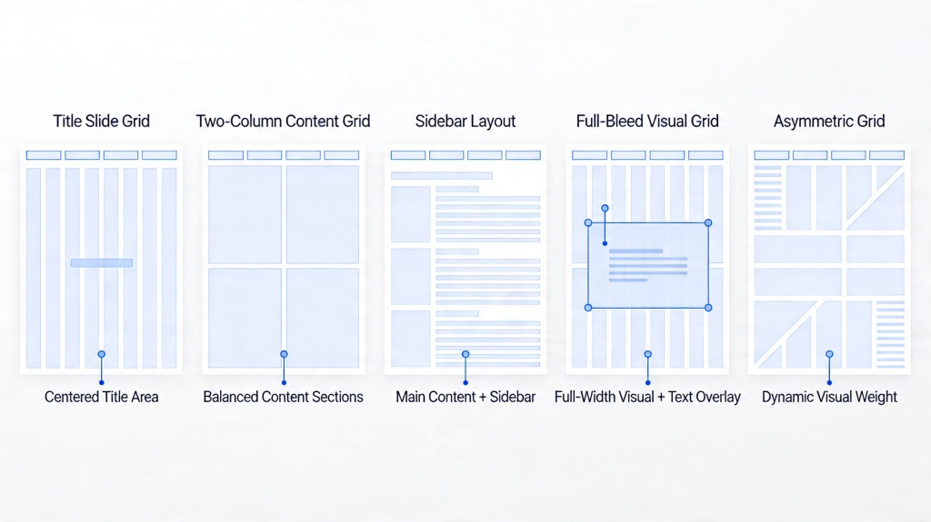
Before and After: Transforming Ugly Slides with AI
If you have inherited a 60-slide deck with mismatched fonts, 12 bullets per page, pasted Excel tables, and a cover slide that looks like it came from 2009, an AI presentation makeover can feel like a rescue mission. The hard part is not only writing better copy; it is turning a cluttered page into a slide with a clear takeaway, readable hierarchy, and enough visual restraint that the audience knows where to look first.
For this guide, I tested an anonymized 18-slide business update deck made from common “ugly slide” sources: report paragraphs, Excel-style KPI tables, feature bullet lists, and an outdated 4:3 training template. The AI-assisted pass produced useful draft layouts in minutes, but none were client-ready without human review. The biggest improvements came from reducing word count, replacing raw tables with summaries, and enforcing a consistent grid—not from decorative icons or background images.
This article shows practical before-and-after patterns, the prompts used to get better outputs, where AI made mistakes, and how to score redesigned slides before you present them. It uses PopAi workflow examples, but the same review logic applies to most AI slide redesign tools.
What Makes Slides Ugly Before an AI Presentation Makeover?
Ugly slides usually fail because the page is trying to be a document, a spreadsheet, and a speech script at the same time.
The most common “before” slide is not ugly because one color is wrong; it is ugly because it has no editorial decision. A single page may contain 200+ words, a full Excel dump, six colors, three typefaces, and no obvious takeaway. When every line has the same size and weight, the audience cannot tell what matters.
Before you ask AI to “make this beautiful,” diagnose the slide like a designer: What is the one idea the audience must remember, and what can be moved to notes, appendix, or another slide?
Fast diagnosis: the six ugly-slide triggers
- Text walls: paragraphs copied from a report, policy document, syllabus, or speaker notes.
- Bullet stacks: 10–15 bullets with no grouping, prioritization, or visual hierarchy.
- Raw data dumps: 30–50 spreadsheet rows pasted directly into a slide.
- Template drift: a deck assembled by five people, each using different fonts, colors, margins, and chart styles.
- Old visual language: clip art, heavy shadows, bevels, 4:3 slides, low-resolution images, and default backgrounds.
- Accessibility issues: small type, weak contrast, decorative charts, color-only meaning, and unclear reading order.
Practical thresholds before you redesign
- Live presentation slide: aim for 40–80 words, 3–5 main points, and body text no smaller than roughly 24 pt when projected.
- Executive update slide: one takeaway title, one primary visual or evidence block, and no more than two supporting annotations.
- Leave-behind slide: can carry more detail, but use sections, labels, and a clear reading path instead of dense paragraphs.
- Appendix/reference slide: tables and detail are acceptable if the slide is not meant to be presented from a stage.
Triage: fix with AI, restructure first, or leave alone
- Good AI candidate: the slide has valid content but poor layout, weak titles, inconsistent styling, or too many bullets.
- Needs human restructuring first: the slide contains three unrelated messages, conflicting numbers, unclear ownership, or missing conclusions.
- Do not redesign yet: legal language, board material, unreleased financials, M&A content, or regulated data that has not been approved for upload.
Field audit note: In the 18-slide test deck, the average “before” slide contained 138 words; the worst slide had 246 words and a 42-row table. After the AI-assisted restructuring pass and manual edit, the average main-deck slide dropped to 58 words. Readability improved most when dense material was split into a takeaway slide plus appendix detail, not when the same content was squeezed into a prettier template.
AI Presentation Makeover Workflow: From Old Deck to Clean Draft
A reliable AI presentation makeover follows a production sequence: prepare the file, diagnose the story, prompt with constraints, generate alternatives, edit manually, and verify every claim.
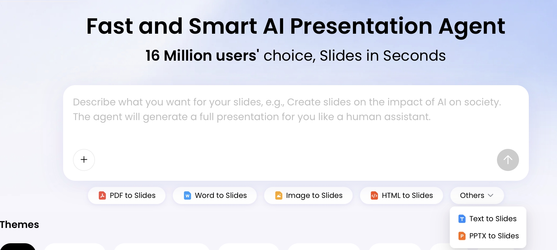
In PopAi AI Presentation, you can start from a topic or bring in existing materials through file-to-slides inputs such as PDF, Word, image, HTML, text, and PPTX. In testing, PPTX and text sources were easiest to control because slide structure and wording were already visible. Screenshot-heavy PDFs required more manual checking because charts, footnotes, and labels could be interpreted inconsistently.
If your team is still choosing software, compare the latest AI presentation makers on source preservation, editable export, layout control, privacy settings, and whether they support partial slide repair—not only on how quickly they generate a deck.
A practical six-step workflow with quality gates
- Prepare the source material. Remove duplicate slides, outdated versions, hidden comments, and confidential details that should not be uploaded. If charts are mission-critical, keep the original spreadsheet nearby for verification.
- State the audience and decision. For example: “10-minute leadership update; the audience needs to approve expansion of the pilot.” This prevents the AI from designing a generic educational deck.
- Ask for a slide-by-slide diagnosis first. Before redesigning, request a list of crowded slides, unclear titles, duplicate messages, weak charts, and content that should move to appendix.
- Tell AI what not to change. Preserve names, dates, financial figures, legal wording, product claims, source citations, and approved terminology.
- Generate two or three layout directions. Try executive summary, KPI dashboard, process cards, comparison frame, timeline, or logic-frame layouts depending on the content.
- Human-check the final 20%. Verify numbers, brand rules, reading order, accessibility, speaker notes, and PPTX/PDF export quality before sharing.
Prompt starter: “Redesign this presentation for a senior business audience. Preserve all facts, numbers, names, and dates. Reduce main-slide text density by about 50%. Use one message per slide, modern 16:9 layouts, strong hierarchy, generous whitespace, and concise takeaway titles. Move secondary detail to speaker notes or appendix instead of deleting it.”
What to do when the first AI draft is weak
- If the output is too generic: add audience, decision, industry context, brand tone, and examples of preferred layouts.
- If it is still text-heavy: ask AI to split the slide, create a summary-plus-detail pair, or move explanation into notes.
- If numbers are wrong: stop styling and run a source check; do not keep iterating on design until the data is corrected.
- If icons feel decorative: remove them or ask for labels, diagrams, or charts that carry meaning.
- If the brand feels off: provide a mini brand kit: colors, fonts, logo safe area, chart style, image style, and forbidden treatments.
Workflow observation: The fastest useful pass was not “upload old deck → export final deck.” It was “upload selected problem slides → request diagnosis → redesign only the worst slides → paste approved copy back into the final master.” That avoided wasting time restyling appendix pages and reduced the risk of AI changing approved wording across the whole deck.
Before and After Examples: What AI Can Fix Fast
The most useful AI transformations are not magic redesigns; they are specific repairs to density, structure, hierarchy, and format.
1. Text wall to executive summary
Source slide symptoms: A training slide contained 184 words in four paragraphs: a process explanation, two exceptions, a compliance warning, and one example. The title was “New Intake Process,” which described the topic but not the point.
Prompt used: “Turn this text-heavy training slide into two slides. Slide 1 should explain the three-step process using short cards. Slide 2 should show exceptions and the compliance warning. Preserve all required wording in the warning. Use takeaway titles and keep each slide under 70 words.”
After: The AI draft split the content into a “Submit → Review → Confirm” process slide and a second “Exceptions require manager approval before submission” slide. Word count dropped from 184 to 68 on the first slide and 51 on the second.
- AI improved: grouping, title clarity, scanability, and spacing.
- AI got wrong: it softened the compliance warning by changing “must” to “should” in one version.
- Human edit required: restored approved wording, removed one generic clipboard icon, and added speaker notes for the longer explanation.
- Score: 2.1/5 before; 4.2/5 after human edit.
2. Excel table to KPI narrative
Source slide symptoms: A product update slide showed a 50-row table with beta users, activation, support tickets, churn risk, and owner names. The table was technically accurate but unreadable in a meeting.
Prompt used: “Convert this table into an executive KPI slide. Show the top three metrics as large tiles, summarize the biggest change in the title, and create a small risk table with severity, owner, and next action. Do not invent numbers. Keep original units and labels.”
After: The AI draft created three KPI tiles, a short trend statement, and a 4-row risk table. This was directionally useful, but the first version rounded one percentage too aggressively and removed the sample size from the activation metric.
- AI improved: it turned a data dump into a meeting-ready management slide.
- AI got wrong: it treated “support load” as negative without the context that volume rose because the beta user base grew.
- Human edit required: restored exact percentages, added “n=842 beta users,” and changed the title from “Support Load Increasing” to “Activation improved while support load stayed manageable.”
- Score: 1.8/5 before; 4.0/5 after human edit.
Mini case study: Redesigning this KPI slide manually from scratch took about 35–45 minutes in a previous deck cleanup because the designer had to decide which numbers mattered, redraw the table, and create visual hierarchy. The AI-assisted version produced a usable structure in under five minutes, but data verification and title rewriting still took another 10–15 minutes. The time saving was real, but only because the source data was already organized and the reviewer knew which metrics were non-negotiable.
3. Bullet list to visual grouping
Source slide symptoms: A sales deck had 12 feature bullets: automation, approvals, templates, comments, version history, analytics, exports, permissions, integrations, onboarding, reporting, and admin controls. The slide listed everything but sold nothing.
Prompt used: “Group these 12 feature bullets into three buyer outcomes. Use outcome-led headings, one sentence of support for each group, and avoid feature dumping. Keep the slide suitable for a sales conversation with a VP-level buyer.”
After: The AI grouped the features into “Automate routine work,” “Collaborate with control,” and “Measure performance.” The structure was stronger than the original list, but the first draft used vague phrases like “unlock productivity.”
- AI improved: grouping and buyer-oriented structure.
- AI got wrong: it added marketing language that did not appear in the approved messaging.
- Human edit required: replaced vague claims with specific outcomes, removed two unnecessary icons, and added one proof point under each group.
- Score: 2.4/5 before; 4.1/5 after human edit.
4. Old 4:3 template to modern 16:9 system
Source slide symptoms: A classroom deck used a narrow 4:3 canvas, inconsistent title placement, clip art, heavy shadows, and small 18 pt body text. The content was still useful, but the design signaled “outdated” before the instructor started speaking.
Prompt used: “Rebuild this training content as a 16:9 deck with consistent title placement, clean section dividers, readable type, and minimal decoration. Preserve the instructional sequence. Replace clip art with simple diagrams or neutral visuals only when they clarify the concept.”
After: The AI produced a cleaner widescreen structure with consistent margins and section headers. The best output kept diagrams simple; the weakest output added unrelated stock-style images that distracted from the lesson.
- AI improved: canvas format, consistency, whitespace, and perceived professionalism.
- AI got wrong: it occasionally selected decorative visuals that looked modern but did not teach anything.
- Human edit required: removed decorative images, checked font sizes, and rebuilt two diagrams as editable shapes.
- Score: 2.0/5 before; 4.3/5 after human edit.
AI is strongest when the content already exists but the visual organization is broken. It is weakest when the source material is vague, inaccurate, confidential, or politically sensitive.
Concrete Before/After Makeover Modules
Because a before-and-after article is more convincing when the transformation is visible, use the modules below as editorial examples for reviewing an AI slide makeover. Each example separates the source problem from the AI draft and the human final correction.
| Original problem | AI restructuring pass | Human final correction |
|---|---|---|
| Text-heavy process slide: four paragraphs explain intake steps, exceptions, compliance notes, and an example. The title says only “New Intake Process.” | AI groups the content into three cards: submit request, review requirements, confirm next step. Long explanations move into speaker notes. | The editor rewrites the title as “New intake rules reduce rework before approval,” verifies the compliance wording, and removes one exception that belongs in the appendix. |
| Raw KPI table: a 50-row spreadsheet screenshot shows beta users, support tickets, churn risk, owners, and dates. Nothing tells the audience which number matters. | AI turns the raw table into a KPI scoreboard with one headline metric, three supporting indicators, and a risk note. | The reviewer checks every value against the source spreadsheet, restores the reporting period, and adds a footnote explaining that churn risk is a qualitative owner assessment. |
| Feature dump slide: twelve product features are listed with equal weight, so the slide reads like documentation instead of a sales argument. | AI clusters the features into three user benefits: faster setup, safer approvals, and easier reporting. | The final slide keeps only the three benefits, adds one customer-facing proof point for each, and moves the full feature list to the appendix. |
Use these modules as a check against superficial redesign. A real makeover should improve the message, preserve the facts, reduce visual noise, and make the slide easier to present—not merely add a new template.
Use a Before-and-After Scoring Framework
A scoring framework prevents you from accepting a slide that looks better but says the wrong thing.
Rate each slide before and after the makeover. Use 1 for “confusing or risky,” 3 for “usable but needs editing,” and 5 for “ready for the intended audience.” For high-stakes decks, treat data accuracy as pass/fail: a beautiful slide with one wrong number is still a failed slide.
| Dimension | Before warning sign | After target |
|---|---|---|
| Message clarity | Title says “Overview” or “Results” with no conclusion. | Title states the takeaway: “Activation rose while support load remained stable.” |
| Information density | 200+ words, 12 bullets, or raw tables. | One idea, three to five supporting points, or a clean summary visual. |
| Hierarchy | Everything looks equally important. | Clear title, subtitle, evidence, annotation, and visual emphasis. |
| Alignment and spacing | Objects float randomly or crowd the edges. | Grid-based layout, consistent margins, and breathing room. |
| Brand consistency | Mixed colors, font sizes, logos, and slide masters. | Defined type scale, color tokens, logo safe area, and repeated patterns. |
| Data accuracy | AI may summarize, omit, or reinterpret figures. | Every number, label, date, and claim matches the source. |
How to score without overcomplicating it
- 1: the slide is confusing, unreadable, inaccurate, or off-brand enough to create risk.
- 2: the intent is visible, but the slide still has major density, hierarchy, or accuracy problems.
- 3: the slide is understandable but needs editing before a real meeting.
- 4: the slide is strong with minor polish needed.
- 5: the slide is clear, accurate, brand-aligned, accessible, and ready for the audience.
Sample scored result: The KPI table example moved from an average 1.8 to 4.0 after AI restructuring plus human review. Message clarity improved from 2 to 4 after the title was rewritten as a conclusion. Information density improved from 1 to 4 after the 50-row table became KPI tiles plus a small risk table. Data accuracy stayed at 3 until the reviewer restored exact percentages and sample size; only then did the slide become usable.
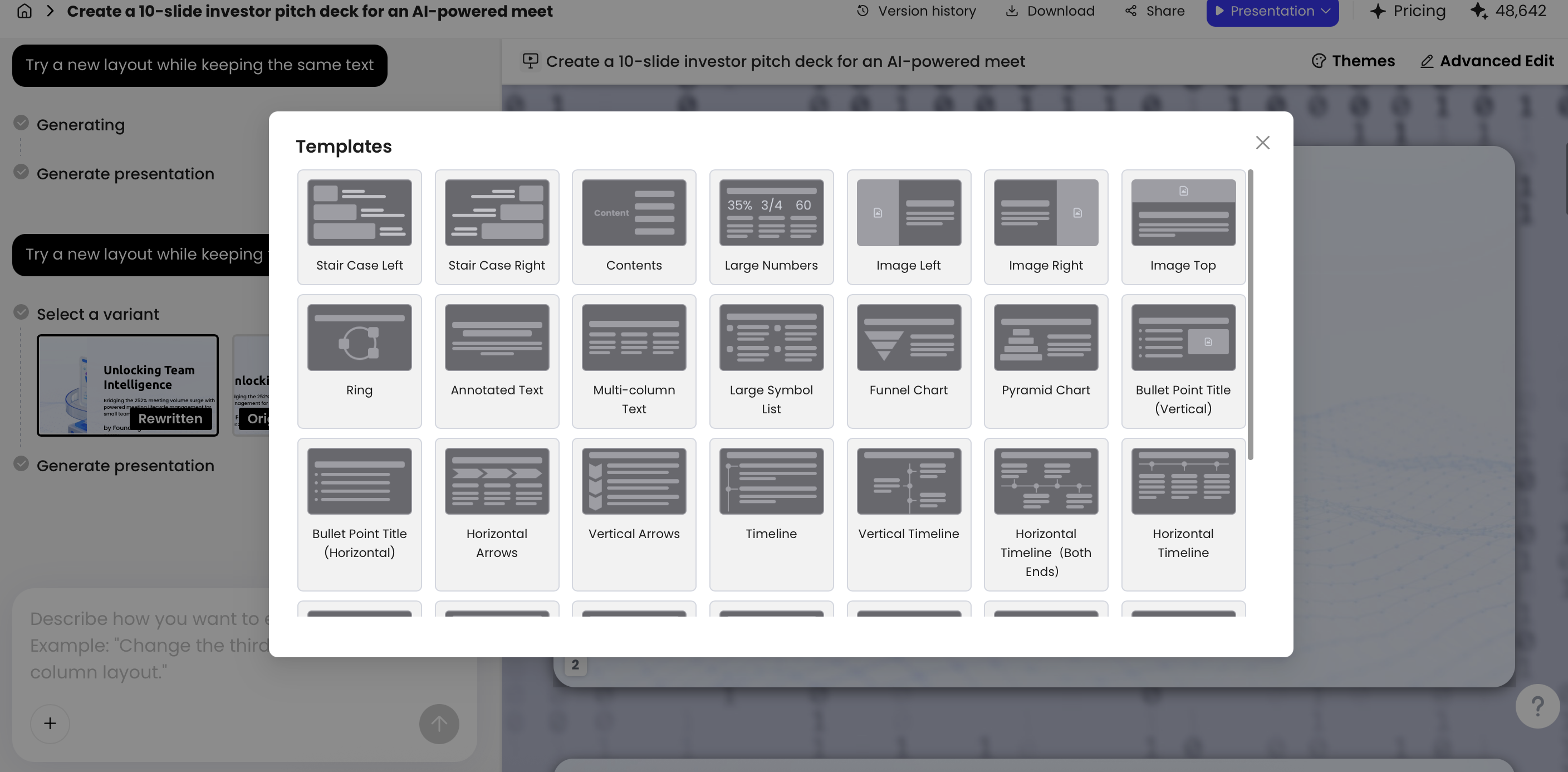
PopAi’s Advanced Edit environment includes options such as Theme, Cards, Logic Frames, AI Image, AI Writing, Charts, and Icons. In practice, each feature is useful for a different repair: Cards work well for training steps and feature groups; Logic Frames help strategy slides show cause and effect; Charts are useful only after labels, units, and source numbers have been checked; Icons should be used sparingly because generic symbols can make a business slide feel templated. The safest approach is to choose the simplest layout that makes the argument easier to understand.
Copy-and-Adapt Prompts for an AI Presentation Makeover
Good prompts turn vague redesign requests into concrete production instructions.
Use these prompts with the source slide, the intended audience, and any brand or compliance constraints. If the first output is weak, do not simply ask for “better”; ask for a different structure, a stricter word limit, or a change log.
For diagnosing before redesign
“Review this deck before redesigning it. For each slide, identify the main message, density problems, unclear titles, duplicated content, weak charts, and material that should move to speaker notes or appendix. Do not redesign yet. Return a slide-by-slide repair plan.”
For a text-heavy slide
“Convert this text-heavy slide into 2–3 clean slides. Preserve the original meaning and all factual claims. Use concise takeaway titles, group related ideas, and move secondary explanation into shorter supporting text or speaker notes. Do not remove required warnings.”
For a raw data table
“Turn this table into an executive summary slide. Highlight the top three metrics, the biggest change, and one risk. Do not invent or round numbers unless instructed. If a chart is used, keep labels readable, include original units, and show the source period.”
For a brand consistency pass
“Apply a consistent visual system across the deck: two brand colors, one heading font, one body font, consistent logo position, 16:9 canvas, repeated title placement, and consistent chart styling. Do not change approved legal, compliance, or product wording.”
For fixing only one ugly slide
“Redesign only this slide. Keep the same topic and key points, but improve hierarchy, spacing, alignment, and readability. Provide two layout alternatives: one card-based and one diagram-based. Explain which option is better for a live presentation and why.”
For critiquing an AI-generated slide
“Act as a presentation design reviewer. Compare this redesigned slide with the source. List any changed claims, missing numbers, vague language, accessibility issues, brand inconsistencies, and layout problems. Recommend only necessary edits.”
For speaker notes without crowding the slide
“Keep the slide copy concise for projection. Move detailed explanation into speaker notes. The slide should be understandable in five seconds; the notes should preserve the full context for the presenter.”
Security checklist: Do not upload M&A decks, board materials, fundraising data, unreleased financials, client-confidential strategy, healthcare/legal records, student records, or regulated personal data to an AI tool unless your organization has approved that workflow. Check data retention, whether uploads train models, workspace permissions, deletion controls, encryption, region/data residency, enterprise admin controls, and NDA restrictions before testing real material.
What AI Cannot Fix Without Human Review
AI can speed up slide repair, but it cannot take responsibility for accuracy, brand judgment, or audience fit.
Content accuracy risks
AI may rewrite or generalize content beyond the source. In the 18-slide test deck, rewrite variants were useful for shortening paragraphs, but three slides needed correction because the AI softened wording, removed a qualifying phrase, or turned a neutral observation into a stronger claim. The most reliable mitigation was to prompt for a change log and then compare every number, date, label, and claim against the source document.
- Red flag: “increased significantly” appears where the source only says “increased.”
- Red flag: a chart title implies causation when the data only shows correlation.
- Red flag: a compliance phrase such as “must,” “required,” or “approved” has been softened.
- Red flag: the AI removes sample size, source period, footnote, or unit of measure.
Brand governance risks
A deck can look polished and still be wrong if it ignores brand color ratios, logo safe areas, typography rules, chart conventions, or approved image style. Prepare a simple brand kit before redesign: primary color, secondary color, font choices, logo usage, chart style, image guidance, and forbidden treatments. If your company uses a PowerPoint master, compare the exported file against that master before distribution.
Accessibility risks
Accessibility needs explicit checking. Ask for sufficient color contrast, readable type size, non-color-only labels, descriptive chart titles, and logical reading order. As a practical target, use WCAG-style contrast expectations for text, avoid relying on red/green alone, keep projected body type around 24 pt or larger when possible, and test charts in grayscale. AI may create attractive pastel combinations that fail contrast checks.
Final human review
Do not confuse speed with readiness. Many tools can generate a redesigned deck in minutes, but professional presentation design still requires intent: Does the slide support a decision? Is the story in the right order? Can the audience read it from the back of the room? Are the numbers correct? Those questions are still human responsibilities.
Final Checklist Before You Present the Redesigned Deck
Use this checklist in order: verify content first, inspect design second, test export last.
- Source accuracy: Compare names, dates, figures, percentages, quotes, definitions, chart labels, units, and footnotes against the original material.
- One-slide-one-message: Each slide should have a takeaway title and a single dominant idea; if two arguments compete, split the slide.
- Visual hierarchy: Run the three-second test: cover the body content, reveal the slide, and ask whether the main point is obvious immediately.
- Density control: Keep live-presentation slides lean; move detail-heavy tables, methodology, and backup evidence to appendix or notes.
- Brand system: Confirm consistent fonts, colors, margins, logo placement, chart styling, image treatment, and title position.
- Accessibility: Check contrast, projected type size, chart labels, non-color-only meaning, reading order, and grayscale legibility.
- Speaker support: Make sure speaker notes contain the explanation that was removed from crowded slides, especially for training or sales decks.
- Export editability: If your team needs PowerPoint editing, export PPTX and test text boxes, charts, icons, grouped objects, and image crops before the meeting.
- Human polish: Remove generic images, awkward icons, repeated layouts, unnecessary decoration, and any AI-written sentence that sounds broader than the approved message.
- Rehearsal pass: Present the deck aloud once. Slides that look clean on screen often reveal pacing, sequence, or explanation gaps during rehearsal.
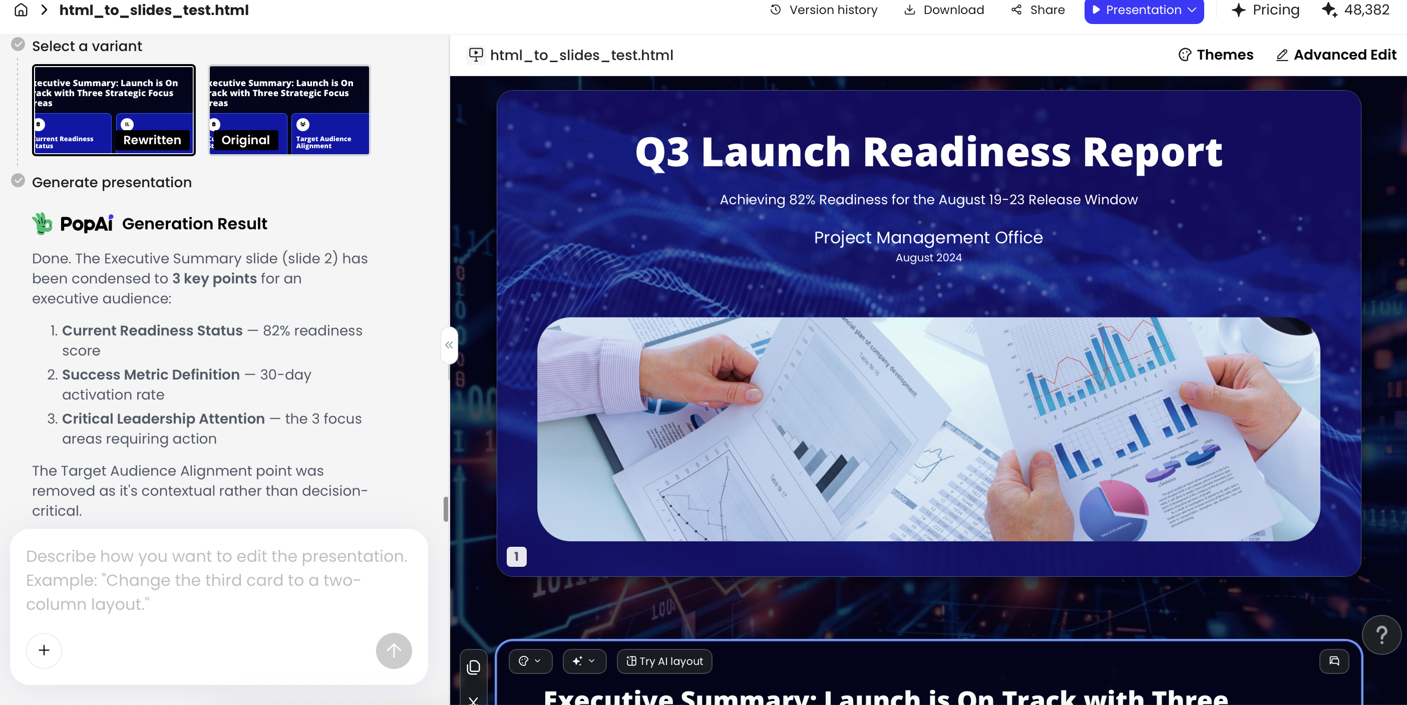
In PopAi, generated presentations can be revised with natural language or edited further in Advanced Edit. Exports to PPTX and PDF are available, and in current testing, PPTX files opened in Microsoft PowerPoint with editable text objects in the simple business slides tested. Treat that as a practical workflow benefit, not as a guarantee that every chart, animation, slide master, embedded object, or source-file layout will preserve perfectly after export.
FAQ: AI Slide Makeover Questions
Will AI change my original slide content?
It can if you allow rewriting. To reduce that risk, prompt the tool to preserve facts, names, numbers, and claims, then compare the output against the source deck before presenting.
Can I redesign only a few ugly slides instead of the whole deck?
Yes. A practical workflow is to isolate the problem slides, upload or paste only that content, generate redesigned alternatives, and then insert the improved pages back into the original presentation.
Can AI turn an Excel table into executive slides?
AI can help summarize a table into KPI cards, trends, charts, and risks, but the numbers must be checked manually. If using PopAi, prepare CSV data as text, Markdown, HTML, DOCX, or a summarized table rather than assuming direct CSV upload.
Are AI-redesigned slides editable in PowerPoint?
Many AI presentation workflows export PPTX. In PopAi testing, exported PPTX files opened in Microsoft PowerPoint and text objects remained editable, though no AI tool should be treated as a guaranteed lossless converter.
When should I not use AI for a presentation makeover?
Avoid relying on AI alone for legal, compliance, board, fundraising, or highly confidential decks. Use AI for structure and draft visuals, then apply expert review, brand governance, data validation, and security checks.
Create your presentation with one click now
Turn existing documents, reports, and rough slide content into a cleaner presentation draft, then refine the structure, design, and wording for your audience.
Start building with PopAi