AI Presentation Maker with Charts: Excel to Editable Slides
Editorially revised October 14, 2026
PopAi's chart editor can work with chart data, not just a picture of a chart. The supplied interface evidence shows Edit Chart, a data table, chart-type choices, and Upload Data / Download Data controls. The documented upload flow here is Excel inside the chart editor. It should not be described as universal CSV upload or a guarantee that every exported chart remains a native PowerPoint chart.
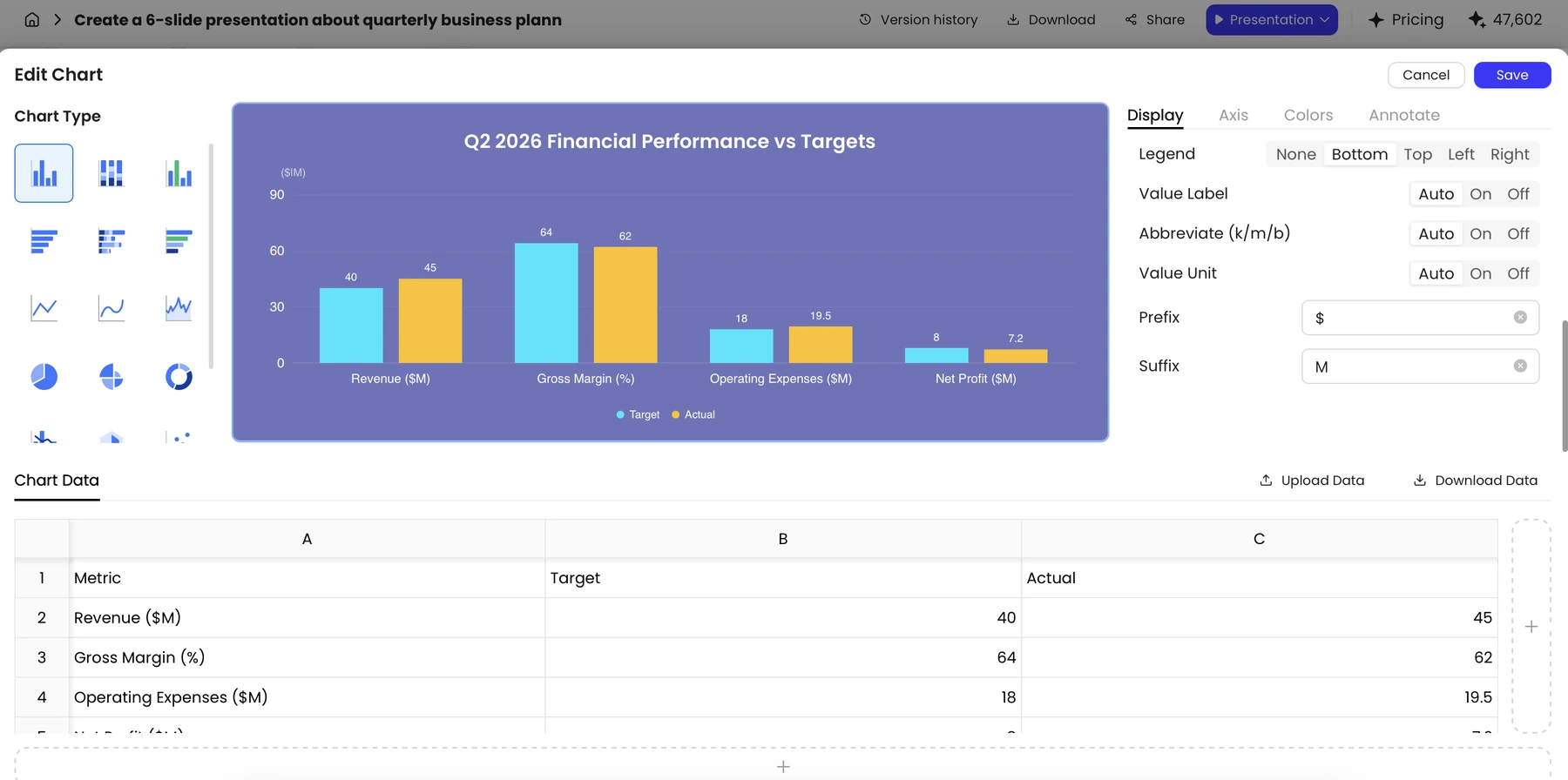
What is editable, and where?
| Stage | Supported by the supplied evidence | Boundary |
|---|---|---|
| Chart editor | Edit cells, add or remove rows and columns, select chart types | Settings vary by chart type; some columns are limited |
| Data upload/download | Excel .xlsx and .xls in the chart-data area | This does not establish direct .csv upload at the presentation input |
| Chart appearance | Display, Axis, Colors, and Annotate controls | Not every option appears for every chart |
| Save | Save writes the edit to the slide; Cancel discards it | Previewing a change is not the same as saving |
| PPTX export | A PPTX can be exported and opened in PowerPoint | Native chart-data editability after export has not been demonstrated for every chart |
Example: turn an Excel support report into a clear comparison
Use the practice table below to follow the data preparation. The same values are provided as copyable, tab-separated text, so you do not need to download a sample workbook. These are fictional practice values, not PopAi results or a customer report. The question is narrow: which support channel missed its response-time target?
| Channel | Target response time (hours) | Actual response time (hours) | Variance (actual - target) |
|---|---|---|---|
| 8 | 10 | +2 | |
| Chat | 1 | 0.8 | -0.2 |
| Phone | 2 | 1.5 | -0.5 |
The original worksheet can contain notes, totals, merged cells, and mixed units. The cleaned chart range should contain only channel labels and comparable numeric series. Here all values are hours and a lower actual value is better. The calculated variance is a check, not an additional series that must be plotted.
Copy the practice data into Excel
Copy the tab-separated block below and paste it into cell A1 of a blank Excel worksheet. It contains the three chart-input columns only; the variance column above is for checking the result. If everything lands in one column, split the pasted text using a tab delimiter. Save the workbook as .xlsx before using Upload Data in the chart editor.
No sample download is required. You can also select the text above and copy it manually with Ctrl+C or Command+C. Keep these values separate from the unrelated figures in the product screenshots.
Step 1. Prepare a narrow Excel table
Use one header row, consistent units, and no merged cells in the chart range. Keep the explanatory notes on a separate sheet. The supplied chart-data documentation notes a small column limit, around five columns in the captured interface, so split a wide report into focused tables instead of assuming every workbook can be imported unchanged.
If your source is CSV, open and clean it in a spreadsheet application first, then save an Excel copy for this chart-editor workflow. Another supported approach is to supply a reviewed summary in a document when building the overall presentation. Do not tell users to upload a raw CSV directly to PopAi as if that route were confirmed.
Step 2. Open Edit Chart and upload the data
- In the generated presentation, select the chart object and open Edit Chart.
- Use Upload Data in the chart-data area and select the prepared Excel file.
- Inspect every imported header and row in the visible table. Correct a value in the table if the imported range or label is wrong.
- Compare totals and units with the source before interpreting the preview. Keep a copy of the original input for later review.

The supplied chart documentation warns that uploading a new table clears existing annotations. Recreate and check those annotations after the new data is loaded.
Step 3. Choose a chart and write an accurate title
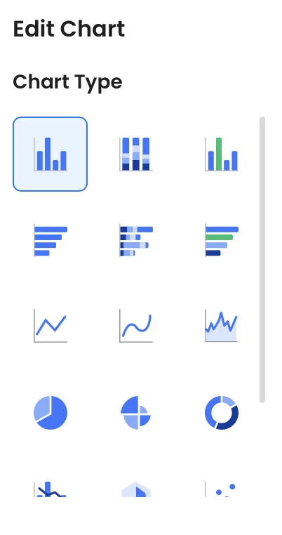
For this example, use grouped horizontal bars for Target and Actual. Channels are the categories, and hours are the common unit. A pie chart would be misleading because these response times are not parts of a single whole. For broader chart-selection principles, see the data-visualization guide; the important task here is checking what the editor does with this specific table.
| Before | After | Why the change matters |
|---|---|---|
| Title: Support performance | Title: Email response time exceeded the 8-hour target by 2 hours | The title states the supported finding rather than making a broad performance judgment |
| Units mixed between minutes and hours | All values converted to hours before upload | The lengths of bars are now comparable |
| Three unrelated chart styles on one slide | One grouped bar comparison with direct labels | The viewer can compare target and actual without decoding multiple systems |
| A guessed explanation for the delay | Cause marked for owner review | The table identifies a gap, not the reason it happened |
Step 4. Revise, annotate, and save
Inspect the preview while changing settings. Use consistent colors for Target and Actual, label the unit on the axis, and add a short annotation only after the numbers are correct. Then select Save. If the slide becomes crowded, reduce the number of categories or split the comparison, rather than shrinking every label until it is illegible.
Download Data when you need a review copy of the chart's current table. Compare that copy with your approved source if anyone has changed cells in the editor. A chart that looks polished can still contain a transposed series, stale date range, or missing category.
Step 5. Export to PPTX and inspect the chart object
Export the deck, open the PPTX in PowerPoint, and select the chart. If the destination application exposes a chart-data editing command, inspect its data; if it selects only an image or another object, treat it accordingly. The product screenshots supplied for this batch do not establish a successful native-chart round trip, so this guide does not promise one.
Check the exported title, axis, legend, annotation, number format, and visual proportions against the saved editor state. Retain the source workbook even when the chart is editable. For final distribution, a reviewed PDF can be useful, but it is not an editable chart-data format.
Sources and evidence
Product documentation checked October 13, 2026. Features, plans, and interfaces may change. Product evidence: supplied knowledge-base screenshots IMG-47, IMG-48, and IMG-49, with the associated chart-control descriptions. The on-page table and copyable data are fictional editorial practice values, not a new product test.
Frequently asked questions
Can I upload Excel data to a chart?
The supplied Edit Chart evidence documents .xlsx and .xls upload and download in the chart-data area. Confirm the available controls and limits in your current account.
Does PopAi support direct CSV upload?
The supplied product knowledge does not support that claim. For the demonstrated chart workflow, clean the CSV in a spreadsheet application and save an Excel file first.
Are exported PPTX charts always native editable charts?
That has not been established. Open your export in PowerPoint, select the chart, and check whether its underlying data can be edited.
Why did my chart annotations disappear?
Uploading a new table can clear existing annotations in the documented workflow. Add them again after the upload and check the saved result.