An AI tool can turn a spreadsheet into a polished slide in minutes—and still make a consequential mistake. Common examples include sorting months alphabetically, treating blank values as zeros, comparing a partial quarter with full quarters, or describing a five-percentage-point retention gain as “5% growth.” The chart may look finished while the analysis is not.
This guide is for business leaders, analysts, educators, and presentation creators who need decision-ready visuals rather than decorative charts. You will learn a practical workflow: define the question, prepare the source, brief the tool, choose the right encoding, validate calculations, and rehearse the final slide. The method works in any tool; PopAi AI Presentation is one environment where you can generate, inspect, and revise chart-based slides.
Start with a presentation question, not a dashboard request
A dashboard supports exploration; a presentation slide supports a decision. Before uploading data, define the audience question the slide must answer.
Working rule: if the title can be replaced with “Metric by category,” the slide probably names data rather than stating an insight.
“Show quarterly revenue” asks for output. “Show whether revenue remains on plan, and identify the region creating the Q4 risk” gives the tool a decision context, a comparison, and a reason to emphasize a variance rather than every available number.
Write a one-sentence visual brief
Use this planning format before asking AI to generate anything:
- Audience: Who will interpret this—CEO, finance team, client, students, or investors?
- Decision: What should they approve, prioritize, investigate, or remember?
- Evidence: Which metric, segment, benchmark, and date range support that decision?
- Takeaway: What complete, defensible sentence should the title communicate?
- Caveat: Is there a partial period, methodology change, forecast assumption, or exception the audience must see?
See how the brief changes the chart
Weak request: “Make a chart of Q1–Q4 revenue.” An AI tool may return four colored bars with a generic title, no plan comparison, and no indication that Q4 is a forecast.
Better brief: “For the operating review, show that total revenue is on plan through Q3, but North America is 8% below renewal forecast. Compare actual revenue with plan by region; label Q4 as forecast; annotate the renewal shortfall; use a title that identifies the decision needed.” The resulting slide can legitimately combine a primary actual-versus-plan view with one driver, because both answer the same question: where should leadership intervene?
Illustrative case example: A customer-success team reviewing retention found enterprise retention rising from 88% to 93% over four quarters while SMB retention stayed near 76%. A company-wide average masked the difference. Segmenting the chart changed the discussion from “retention improved” to “should we scale the enterprise onboarding model before investing in a broad rollout?”
Prompt AI presentation data visualization with useful constraints
For a broader view of available tools, compare the latest AI presentation makers before choosing the workflow that best fits your team.
A reliable prompt does more than request a style. It tells the tool what the data means, what it must not assume, and what evidence the reviewer needs to inspect.
Specify data rules as well as design rules
- State the source context: name the source file, version or report date, reporting period, and data owner.
- Define the metric: clarify whether revenue is booked, recognized, gross, or net; define the numerator and denominator for rates.
- Declare comparability: identify partial periods, revised definitions, currency conversions, excluded segments, and fiscal-calendar exceptions.
- Set AI boundaries: instruct the tool not to infer missing values, create unsupported calculations, or treat correlation as causation.
- Name the audience and takeaway: specify what the audience should know or decide after viewing the slide.
- Set visual requirements: request a chart type or relationship, category limits, direct labels, source notes, and accessibility requirements.
- Request review output: ask for the proposed title, transformations, calculations, assumptions, and unresolved data questions.
A visible assumption is reviewable. An invisible assumption is a presentation risk.
Use a prompt such as: “Create one executive slide from the attached Q1–Q4 retention table. Use only values in the table. Compare enterprise and SMB retention over time with a two-series line chart. Retention means active accounts at quarter end divided by accounts at quarter start. Do not treat blanks as zero; flag any column you cannot interpret. Highlight the five-percentage-point enterprise increase, use direct labels in addition to color, label the source period, and list all calculations and assumptions in speaker notes.”
Handle flawed or ambiguous source data first
If a file contains mixed units—such as revenue in dollars for one region and thousands of dollars for another—do not ask AI to “clean it up” without a rule. Standardize the table yourself or instruct the tool exactly how to convert values, then verify the result. Likewise, upload a spreadsheet when values and calculations matter; use a PDF or report for narrative context, not as the sole source of precise chart data.
For source-heavy work, review the proposed outline before generating the deck. That checkpoint catches a weak story early: if the outline says “Revenue by Region” rather than “North America renewal slippage puts Q4 plan at risk,” revise the brief before visual polish makes the generic message feel final. For a broader comparison of available workflows, see AI presentation makers.
Match the relationship in your data to the chart type
Chart choice is an analytical decision. Select the encoding that lets the audience perceive the relationship accurately within a few seconds.
Choose the chart for the question—not the available menu
Know the AI-generated defaults to challenge
- Pie or donut for six similar categories: replace it with sorted bars when exact ranking or small differences matter.
- Dual axes for loosely related metrics: split the view unless the paired scales are essential and explicitly labeled. Scale choices can imply a relationship that is not meaningful.
- Radar charts for business scorecards: avoid them in most executive settings; overlapping polygons make precise comparisons difficult. Use aligned bars or a table with conditional formatting instead.
- 100% stacked bars for trend claims: use them for changing composition, not for changes in absolute volume. Pair with totals if the audience needs both.
- Lines across irregular dates: confirm dates are chronological and intervals are comparable. A line can overstate continuity when reporting dates are uneven.
Research summarized by visualization practitioners such as From Data to Viz consistently favors position and length on a common baseline for precise comparison. In practical terms, a sorted bar chart usually communicates a six-category breakdown more accurately than a pie chart, even when the pie looks more familiar.
When editing a chart, test the clearest encoding rather than the most elaborate one. If a dual-axis chart is the only way to fit the message, label both units prominently, explain why the measures are shown together, and check that scale choices do not manufacture visual similarity. For a board or client slide, two simpler charts are often safer than one overloaded chart.

Use an AI chart quality review before you present
Human review is mandatory when an AI-generated chart informs a business decision. Review against the source of truth—not only against the data table displayed inside the presentation tool.
Validate data, calculations, and period logic
- Confirm the source version: Record the file name, refresh date, owner, and included population. Do not reconcile a slide to an outdated export.
- Reconcile the values: Check every displayed category for a short chart; for larger charts, check the largest, smallest, a middle value, and any annotated value. Also scan for duplicates, missing categories, and incorrect sort order.
- Verify calculation logic: Confirm totals, averages, medians, rates, currency conversion, and rounding. Recalculate headline changes independently.
- Check filters and periods: Verify segments, exclusions, date ranges, fiscal periods, and whether a month or quarter is incomplete.
- Inspect visual integrity: Label axes and units, use an appropriate baseline, and distinguish actuals from forecast values.
- Review the claim: Ensure the title says what the data supports. An accurate chart can still carry a misleading headline.
Calculation trap: If conversion rises from 20% to 25%, it rises by five percentage points, or 25% relative growth. Those statements are both mathematically valid but mean different things. State the version relevant to the decision, and never let AI choose the wording without review.
Illustrative case example: A sales slide showed Q3 pipeline “up 12%” against Q2. The source table included only the first eight weeks of Q3, while Q2 contained a full quarter. The values were correctly plotted, but the comparison was not comparable. The corrected slide used “Q3 pipeline through Aug. 26” and compared the same eight-week window in each quarter.
Assign ownership before approval
For routine internal updates, the analyst may validate the numbers and the presenter may approve the story. For board, investor, financial, client, HR, or regulated materials, add named sign-off: a data owner confirms the source and calculations, a presentation owner confirms the message, and compliance or legal reviews claims where required. Keep a record of source version, transformations, and approval date with the deck.
If you revise chart values in PopAi, inspect the chart data table and categories again before restoring annotations. Data-table uploads can affect existing callouts, so make source changes before spending time on detailed labels. Treat the AI tool as a drafting and editing layer; accountability for the metric remains with a human owner.
Annotate the evidence and build the data story
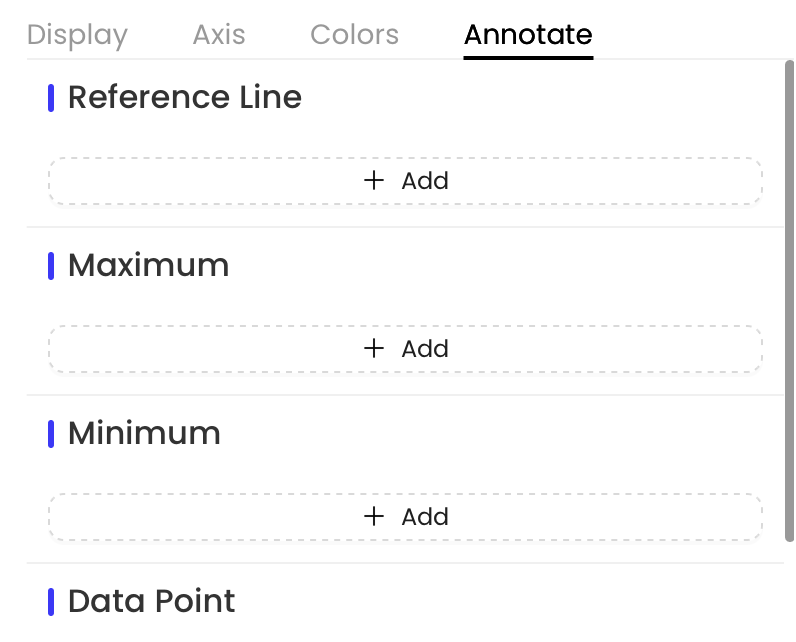
Once the chart is accurate, direct attention to the evidence that changes the decision. A title, target marker, and one well-chosen annotation usually do more than a dense legend.
Use an annotation hierarchy
- First: Show the decision threshold—a target, budget, service level, or forecast boundary.
- Second: Highlight the largest variance, inflection point, or material outlier.
- Optional: Add one supporting driver if it helps explain the variance.
- Move the rest: Put detailed methodology, category definitions, and secondary findings in speaker notes or an appendix.
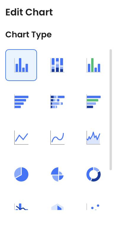
Reference lines work well for targets, thresholds, and prior-period benchmarks when they are labeled with the target source and date. Chart editing controls can adjust axes, units, legends, colors, reference lines, and selected labels; use them to establish hierarchy, not to label every data point.
Use the context–finding–meaning–action sequence
- Context: “This shows renewal rate by customer tier over the last four quarters.”
- Finding: “Enterprise renewals increased from 88% to 93% after the onboarding program was introduced.”
- Meaning: “The timing is consistent with an improvement, but this chart alone does not prove the program caused it.”
- Action: “Validate the driver with cohort analysis, then decide whether to test the program in the next priority segment.”
Use the title to state the observed result; reserve causal claims for evidence that actually establishes causation.
Keep the main story separate from backup analysis. A leadership slide may need one trend line, a target marker, and a visible source note; methodology, confidence intervals, changed definitions, and detailed tables can sit in appendix slides. For forecasts, visually distinguish projected values from actuals and state the scenario, horizon, and key assumptions.
Avoid common AI presentation data visualization mistakes
Polished layout can conceal weak analysis. Prioritize errors by risk: an inaccurate metric or unsupported claim should stop publication; excess gridlines can wait until the final edit.
Data integrity mistakes
- Blank values treated as zero: Missing data can look like a sudden decline. Confirm whether blanks mean unknown, not applicable, or zero.
- Incorrect date sorting: Text labels such as “Apr,” “Aug,” and “Dec” may be arranged alphabetically instead of chronologically.
- Out-of-sync evidence: A copied slide can retain an old target, report date, or filtered population after the source changes.
- Wrong aggregation: An unweighted average can materially misstate performance when segment sizes differ.
Visual and narrative mistakes
- Decorative complexity: Too many colors, icons, animations, or gridlines compete with the finding.
- Truncated axes without explanation: A non-zero baseline can exaggerate differences. Use it only when fine variation matters, label it clearly, and avoid it for charts where viewers expect a zero baseline.
- False causality: A rising line after an initiative does not prove the initiative caused the rise. Use “coincided with” or “followed” unless stronger evidence exists.
- Unexplained forecasts: Do not present model output as certainty. Label actual versus forecast, identify the scenario, and disclose the horizon and key assumptions.
Governance and privacy mistakes
- Uploading restricted data without approval: Before using an AI service, confirm your organization’s security, legal, procurement, and data-governance requirements.
- Ignoring retention and access settings: Review vendor terms, data-use or model-training settings, retention practices, data residency, and access controls for confidential files.
- Sharing identifiable records: Remove or aggregate customer, employee, financial, health, or regulated data unless the approved workflow explicitly permits it.
Business intelligence platforms are designed for governed exploration, recurring data connections, and detailed analysis. Presentation tools are strongest after a finding has been reviewed and needs to become a concise narrative with hierarchy, editing, and export. Many teams use both: analyze in the governed environment, then communicate the approved result in slides.
A repeatable workflow from data to a decision-ready slide
Use these stages to create a clear handoff between analysis, design, stakeholder review, and final delivery.
1. Prepare and brief
- Prepare the source: Freeze or version the source table; record date range, filters, definitions, units, and owner.
- Write the visual brief: Name the audience question, decision, evidence, desired title, and required caveat.
- Select the relationship: Choose trend, comparison, composition, distribution, correlation, or progress to target before generating a chart.
2. Generate and validate
- Generate a constrained draft: Prompt with source context, intended takeaway, chart rules, and instructions not to infer missing data.
- Review the outline and draft: Fix the message before generating an entire deck. If the title is generic, revise the brief.
- Validate against the source: Reconcile values, calculations, dates, filters, axes, and claims. Capture the source version and named data-owner approval.
3. Edit, approve, and test
- Build visual hierarchy: Add a target line or selective annotation, distinguish actuals from forecasts, and remove elements that do not support the takeaway.
- Run a presentation review: Have the presenter confirm the spoken story and the data owner confirm the numbers. Escalate sensitive or regulated content for the required review.
- Export and rehearse: Export PPTX or PDF, open it in the actual delivery environment, check font and layout shifts, test legibility from distance, and retain a backup file.
What AI should accelerate: first drafts, layout alternatives, title options, chart formatting, and slide organization. What should remain human-led: metric definitions, source selection, material calculations, causal claims, privacy decisions, and final sign-off. For recurring reports, keep a versioning convention such as “FY26_Q3_retention_source-v4” and update the chart only after the data owner confirms the refresh.
In PopAi, a practical sequence is to organize reviewed material into a content plan, generate a draft, inspect chart data, refine the visual hierarchy, and export the approved deck. If you export to PPTX for further editing, test the result in Microsoft PowerPoint before a high-stakes meeting; rendering can vary across fonts, devices, and presentation environments.
Three before-and-after chart repairs
The numbers below are illustrative teaching data, not a PopAi performance test. Use the source table to decide whether the visual and headline are justified; a more attractive chart is not necessarily a more accurate one.
1. Missing is not zero
Before: missing treated as zero
After: keep the gap visible
| Month | Verified value | Bad AI treatment | Corrected chart treatment |
|---|---|---|---|
| January | 40 requests | 40 | Plot 40. |
| February | Not collected | 0 | Show a gap or labelled missing observation; do not connect it as measured zero. |
| March | 50 requests | 50 | Plot 50; avoid a claim about the unobserved month. |
Before: "Requests rebounded from zero." After: "Requests were 40 in January and 50 in March; February data is missing." Do not calculate a complete-quarter average from these three rows without defining how missingness is treated.
2. Quarter-to-date is not a full quarter
Before: mismatched period coverage
After: matched elapsed periods
| Period | Revenue, illustrative | Coverage | Valid comparison |
|---|---|---|---|
| Previous Q1 | 120,000 | Full quarter | Not directly comparable to the partial current period. |
| Current Q2 to May 15 | 70,000 | Partial quarter | Label quarter-to-date and cutoff date. |
| Previous Q1 matched elapsed period | 65,000 | Same elapsed-period definition | 70,000 vs 65,000 is about 7.7% higher on this matched basis. |
Before: a full-length Q1 bar beside a partial Q2 bar, titled "Revenue fell 41.7%." After: show matched elapsed periods or label the partial bar explicitly without a full-quarter growth claim. Do not silently annualize or extrapolate the partial figure.
3. Percentage points are not relative percentage change
Before: ambiguous headline "up 5%"
After: +5 percentage points
| Rate | Before | After | Correct change |
|---|---|---|---|
| Conversion, illustrative | 20% | 25% | +5 percentage points; +25% relative to the starting rate. |
Before: "Conversion rose 5%." After: "Conversion rose from 20% to 25% (+5 percentage points)." Add the relative increase only if it serves the audience, and verify the same event definition, attribution window, and eligible population.
For bars representing magnitudes, use an appropriate zero baseline rather than magnifying a small difference through a cropped scale. The Government Analysis Function guidance on bar charts explains that design issue; its broader chart guidance also provides a useful review reference.
Check text contrast and non-color cues
Use W3C's WCAG 2.2 contrast guidance as a digital-text baseline: at least 4.5:1 for normal text and 3:1 for qualifying large text. This is not a complete accessibility certification for a slide deck. Label series directly where possible, add a textual takeaway, and do not use color alone to communicate status. Test projected readability separately.