For teachers who are new to AI, slide design, or both, the goal is not to generate a polished deck in one click. It is to turn a curriculum source into readable slides that support a specific lesson—and to check the result before students see it.
AI can help draft an outline or suggest layouts, but it cannot know your students’ prior knowledge, your classroom display, or your school’s rules. Start with a learning goal, make deliberate choices about what students should see on each slide, and verify the final deck. You can try a first draft in PopAi AI Presentation, then edit it to fit your subject and teaching setup.
A 45-Minute Lesson: Explain, Practice and Check
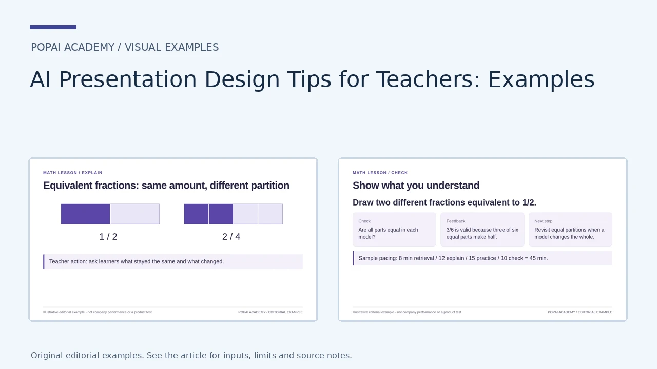
These are finished classroom-layout examples for equivalent fractions. Use 8 minutes of retrieval, 12 of explanation, 15 of practice and 10 of checking as an adaptable 45-minute plan, not a teaching effectiveness claim.
Open full-size examples and editable HTML layouts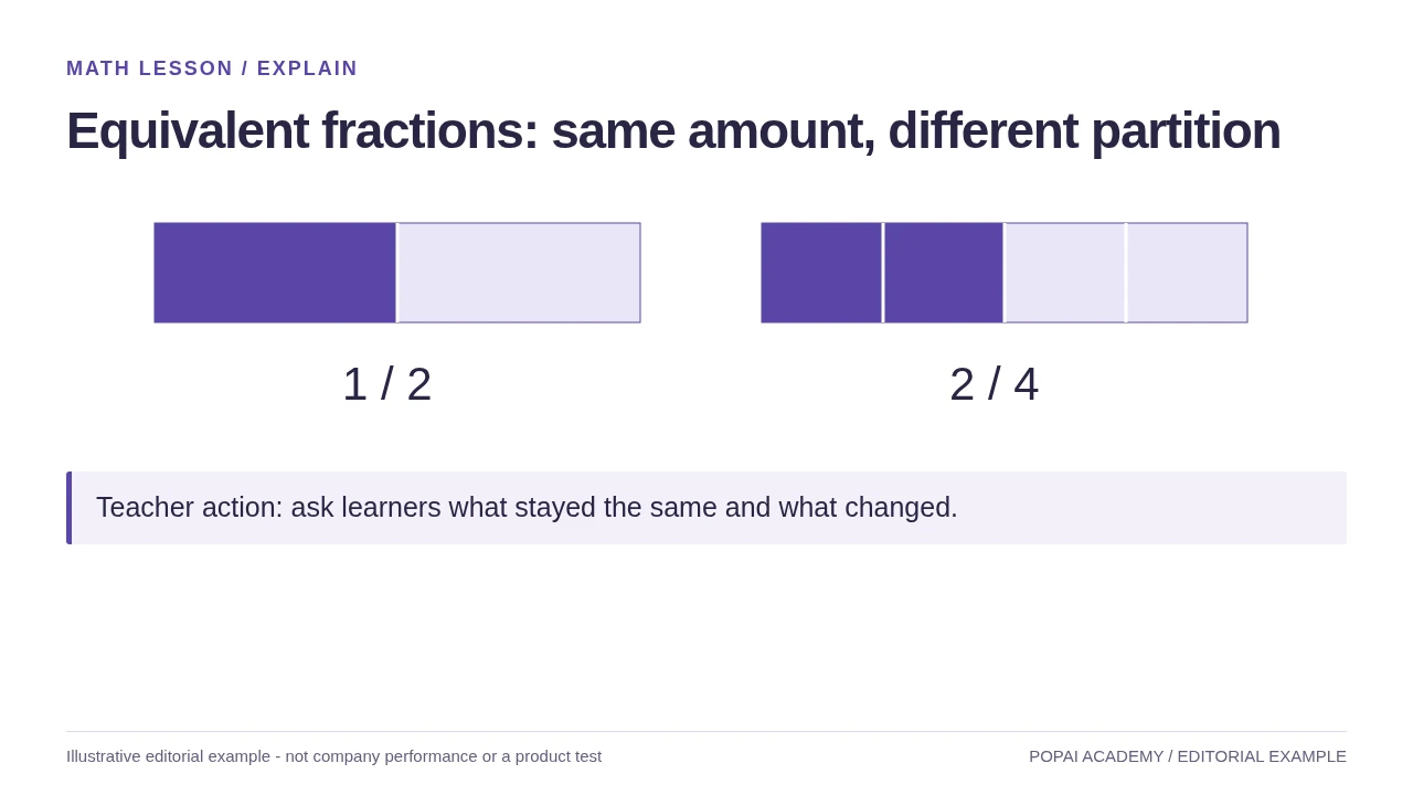
Explain page for a sample 45-minute lesson; both bars represent equal wholes.
Read or copy the slide content
1 / 2
2 / 4
Teacher action: ask learners what stayed the same and what changed.
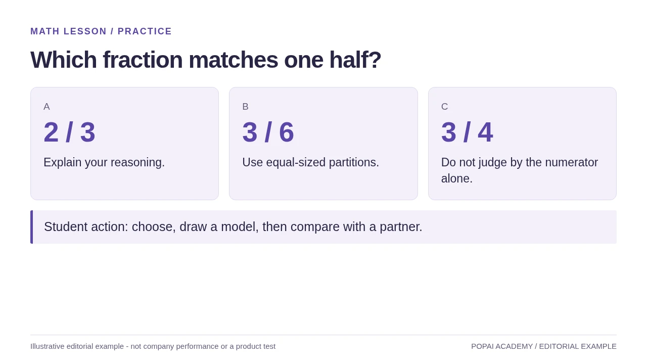
Practice page: choices are legible, and the required learner action is explicit.
Read or copy the slide content
A
2 / 3
Explain your reasoning.
B
3 / 6
Use equal-sized partitions.
C
3 / 4
Do not judge by the numerator alone.
Student action: choose, draw a model, then compare with a partner.
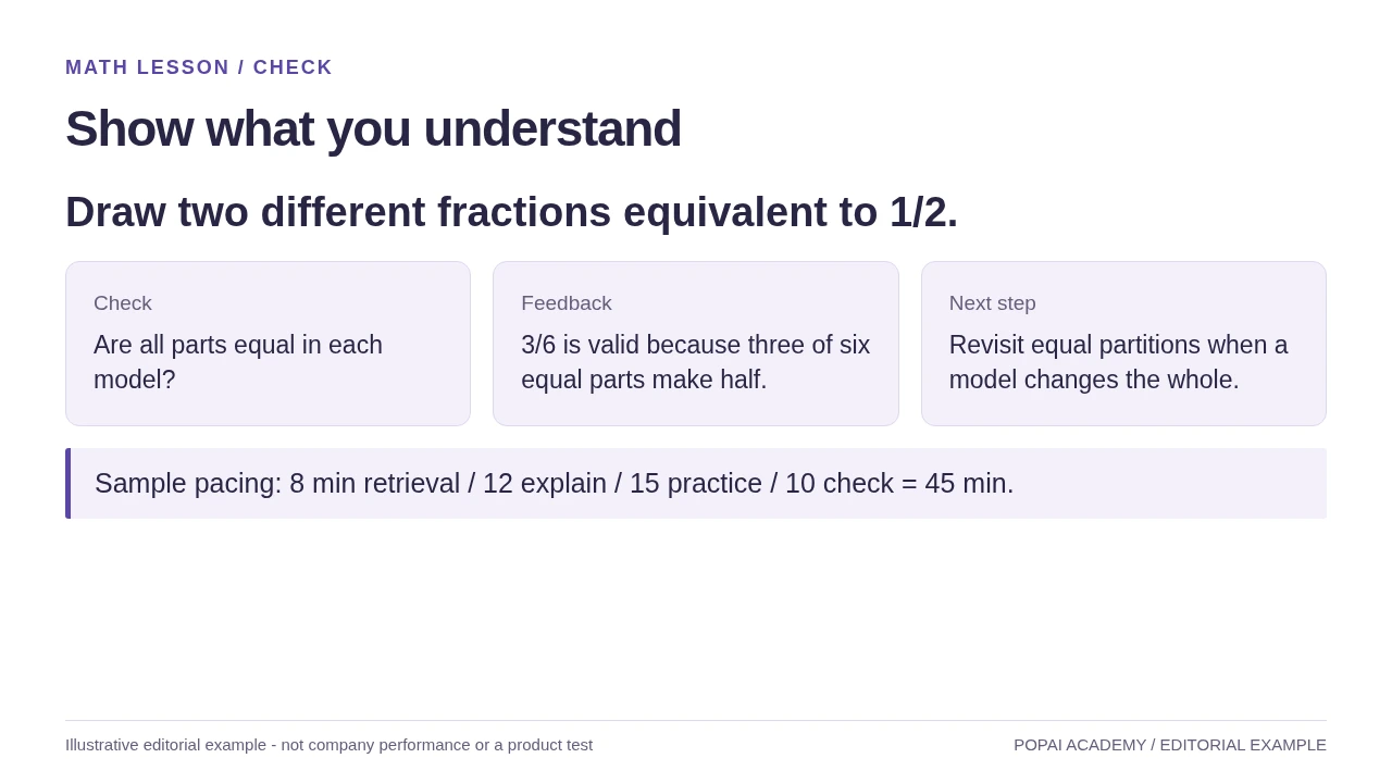
Check page: formative feedback and a timing plan, not a claim of improved learning.
Read or copy the slide content
Draw two different fractions equivalent to 1/2.
Check
Are all parts equal in each model?
Feedback
3/6 is valid because three of six equal parts make half.
Next step
Revisit equal partitions when a model changes the whole.
Sample pacing: 8 min retrieval / 12 explain / 15 practice / 10 check = 45 min.
Prompt for this example set
Create a slide with the purpose "Show what you understand". Use these approved source fields or replace the illustrative inputs before use: Draw two different fractions equivalent to 1/2. Check Are all parts equal in each model? Feedback 3/6 is valid because three of six equal parts make half. Next step Revisit equal partitions when a model changes the whole. Sample pacing: 8 min retrieval / 12 explain / 15 practice / 10 check = 45 min.. Preserve labels, units, source notes and any uncertainty. Do not add results, claims, customers or capabilities. Suggest a readable layout and keep the output editable in the chosen tool.
AI presentation design tips for teachers: start with learning goals
The learning goal should determine what each slide shows and what students do—not just the deck’s topic.
Write an observable objective before prompting. “Students will use a visual model to explain why two fractions are equivalent” gives you more to work with than “Teach fractions.” It suggests a model, an explanation, a chance to practice, and a way to check understanding. Confirm that the objective matches your curriculum or standard and what students have already learned.
Prompt for a slide-by-slide teaching plan
Include the grade, prior knowledge, available time, student task, and desired slide structure. For example:
“Create an 8-slide lesson for grade 5 students who know multiplication but are new to equivalent fractions. Objective: use a visual model to explain why 1/2 equals 2/4. Include a hook, one worked example, two guided practice questions, a misconception check, and an exit ticket. Use plain language and concise slide text; put fuller teaching explanations in speaker notes. Suggest one clear visual per slide.”
Then check the outline against the goal before generating the deck. A useful draft might assign slide 1 to a quick prediction, slides 2–3 to a fraction-strip model and worked example, slides 4–5 to guided practice, slide 6 to a misconception check, slide 7 to independent practice, and slide 8 to an exit ticket. If the tool proposes several definition slides but no student practice, revise the plan rather than polishing those slides.
Worked example: In a hypothetical 40-minute lesson, a teacher might spend 4 minutes on the opening prediction, 10 minutes modeling equivalent fractions, 12 minutes on guided practice, 8 minutes on independent work, and 6 minutes reviewing an exit ticket. The timings are a planning starting point, not a formula; shorten the explanation if students already know the model, or leave more practice time if they need it.
AI presentation design tips for teachers: make every slide readable
Design each slide so students can find its main idea quickly, then listen, discuss, or work without having to read a paragraph on screen.
Set a clear text hierarchy
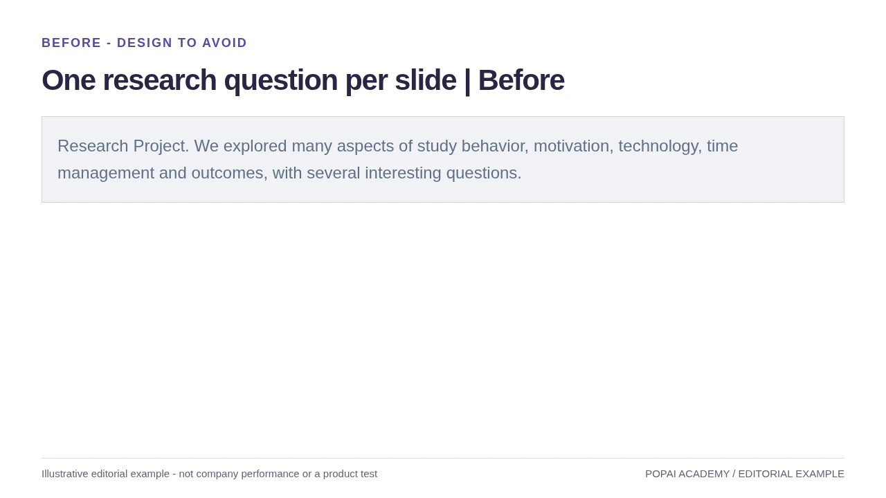
Use a headline that states the point, not just the topic. For example, “Cooling water vapor forms clouds” tells students more than “Condensation.” Keep only the words needed to understand the visual or task on the slide; move fuller explanations to what you say, a handout, or speaker notes. Around 25 words can be a useful starting check for a typical teaching slide, but a worked example, quotation, or complex diagram may need more.
Before: “Equivalent fractions are fractions that represent the same value. They can be found by multiplying or dividing the numerator and denominator by the same number.”
After: “Same-sized whole. Same value.” Show two equal-length fraction strips labeled 1/2 and 2/4, then explain the multiplication step aloud. This keeps the visual evidence on the slide and the longer reasoning with the teacher.
For dense material that cannot be removed—such as a source excerpt or a multi-step worked solution—split it into stages, reveal one step at a time, or provide the full text in a handout and use the slide to direct attention to the relevant part.
Choose type and contrast for the actual room
- Start large, then test: Titles around 28–36 pt and body text around 24–30 pt are starting points, not guarantees. Check the deck on the classroom display and from the seats farthest away; a low-resolution projector or bright room may require larger type and fewer details.
- Keep the type system simple: Use one readable sans-serif family with consistent title, body, and label styles. Avoid thin weights and decorative fonts for essential instructions.
- Use contrast as one check, not the only check: WCAG guidance sets contrast ratios of 4.5:1 for ordinary text and 3:1 for large text (W3C WCAG contrast guidance). Those ratios do not guarantee readability on a washed-out projector or at a distance, so test the actual slide in context.
- Do not rely on color alone: Pair color coding with labels, patterns, or shapes so students can interpret the information with color-vision differences or grayscale printing.
Make visuals explain something
Choose a visual because it teaches, compares, or organizes information—not simply because a slide looks empty. Use a line chart for change over time, bars to compare groups, and a table when students need exact values. Check diagrams for labels, units, scale, and direction. Avoid 3D effects; use animation only when revealing a process step by step helps students follow it.
“For a lesson slide, ask: what should a student notice first, and what should they do next?”
Build a learning sequence: explain, practice, check
A deck needs a rhythm that gives students a reason to look at each slide and a chance to use what it explains.
For a short, explanation-led lesson, a sequence might move from a question to a model, guided practice, independent application, and a check for understanding. A discussion, lab, or workshop may need fewer explanation slides and more space for instructions, evidence, or student work. Choose slide count and pacing to fit the activity rather than aiming for a fixed number.
Use an outline as a teaching checkpoint: does the example actually demonstrate the skill, is there time for students to try it, and does the final task reveal what they understood? Tool features and supported file types can change, so check the current product documentation before relying on a particular import or export option.
Design for student participation and teaching format
- In a live lesson: Add a prediction, think-pair-share, quick poll, or retrieval question where students need to apply an idea. Include a clear instruction and pause long enough for the task.
- In an asynchronous lesson: Put directions on the slide or in accompanying narration, identify when students should pause, and provide a response method that does not depend on a live teacher prompt.
- In a lab or workshop: Use slides for concise safety reminders, task steps, checkpoints, or data prompts; leave room for students to observe and work rather than narrating every detail on screen.
When adapting a question or reading passage for a different reading level, check that the core idea and intellectual challenge remain intact. You can compare options in this guide to AI presentation makers, but choose a tool based on your school’s approval, required file formats, and privacy rules—not a feature list alone.
Adapt AI slides to the subject and student needs
Review examples and visuals for the errors and omissions most likely in your subject, then adapt them to your students’ language and context.
Check the subject matter, not just the wording
- Math: Recalculate every answer and inspect the reasoning between steps. A correct result can still be a poor example if it skips the strategy students are meant to learn.
- Science: Verify units, labels, scale, and process direction. A diagram of a system may be simplified, but it should not imply a false sequence or proportion.
- History and civics: Check dates, names, quotations, and context against course materials and reliable sources. Ask whose perspective is included or missing; do not present a generated summary as a primary source.
- Language arts and language learning: Check reading demand, vocabulary, and language variety. Use excerpts you have permission to use and add context or vocabulary support where needed.
Review example: If an AI-generated science slide shows the phases of the Moon, compare the labels and order with your approved textbook or curriculum source. Then check whether the drawing’s sizes and distances could be mistaken for scale. If the model is not to scale, label it clearly and explain what the diagram is meant to show.
Context example: If a history slide reduces a contested event to one cause or one group’s account, compare the summary with the sources your class uses and identify whose experiences are absent. Add a short source excerpt or contrasting evidence rather than asking students to treat the generated summary as settled fact.
Make the material usable for more students
For multilingual learners, define essential terms, use consistent labels, and pair concise text with a clear visual; do not assume that translating a sentence alone makes the task accessible. For students who need larger text or alternative formats, follow their documented accommodations and school guidance. Add alt text where the presentation format supports it, and explain essential visual information verbally so students do not need to infer meaning from color alone.
AI-generated images may contain visual errors or stereotypes, and their reuse terms may be unclear. Prefer diagrams you can validate or images from school-approved libraries with documented usage rights. Replace a questionable image rather than spending class time explaining away a misleading one.
A practical AI slide workflow teachers can repeat
Separate the content plan, teaching review, and visual edit so you can spot whether a draft needs a small correction or a substantial rebuild.
- Define: Write the objective, grade, prior knowledge, lesson time, and evidence of learning.
- Prompt: Ask for a slide outline with a clear purpose and student action for each slide; request concise on-slide text and separate teaching notes.
- Inspect the outline: Remove unsupported or off-topic claims, check the sequence against your source materials, and add practice if the plan only explains.
- Edit the slides: Fix vague headlines, crowded layouts, generic examples, and visuals that do not clarify the content.
- Rehearse and export: Present the deck on the display you will use, check readability from a distance, and confirm that the final file works in your teaching setup.
Worked workflow: For the equivalent-fractions lesson, the teacher starts with a curriculum objective and asks for an outline, then checks the fraction-strip model against the course material. If the generated slide labels 1/2 and 2/4 but draws strips of different lengths, the teacher replaces the visual rather than merely correcting the labels. The deck is then tested from the back of the room, where small labels may need enlarging before class.
Track the minutes spent on prompting, outline review, verification, and slide repair for one lesson. If most of the time goes into correcting examples or rebuilding layouts, adjust the prompt, use a narrower source, or create only the slides that save time. A fast first draft is not a useful time saving if it creates more repair work than it removes.
Protect student privacy and verify before presenting
Keep the privacy decision separate from the teaching and design review: first check whether you may use the tool, then check whether the deck is ready for class.
Use a simple privacy decision process
- Use a district-approved tool and account where required; check the relevant school policy before entering lesson material.
- Do not enter identifiable or sensitive student information, including names, grades, photos, or individualized education program details. A general lesson objective or non-identifying example is different from an individual student record.
- If you are unsure whether a tool is approved or how it handles data, ask the appropriate school or district contact before using it. FERPA, COPPA, and other requirements depend on the circumstances; a slide checklist is not a substitute for institutional guidance.
- Does each slide support the objective and match students’ prior knowledge?
- Have I checked facts, calculations, quotations, diagrams, and any source material?
- Can students read the text and interpret the visuals on the actual classroom display?
- Are image and text use rights clear, and are essential visuals explained with labels or narration?
- Does the final task show what students understood and what may need reteaching?
After the lesson, note which question students missed, where they needed an extra explanation, and whether a slide caused confusion. Use that evidence to change the next version. The practical test is not whether the deck looks finished, but whether its design helped students take the next learning step.
A Complete 45-Minute Teaching Sequence
| Phase | Planning time | Learner action | Teacher check |
|---|---|---|---|
| Retrieval | 8 minutes | Recall halves using a familiar whole | Check that the whole stays constant |
| Explain | 12 minutes | Compare 1/2 with 2/4 | Ask what changed and what stayed the same |
| Practice | 15 minutes | Choose, draw and discuss 3/6 | Listen for numerator-only reasoning |
| Check / feedback | 10 minutes | Draw two equivalent fractions | Use the response to decide the next lesson step |
The timing is a planning example, not an effectiveness benchmark. The three visible pages correspond to explain, practice and check; the retrieval task can be spoken or drawn on a board. Adapt language, notation, contrast and pace to your class.