Let’s be honest for a second. Most people treat presentation backgrounds as an afterthought. They just pick the first template in PowerPoint and call it a day. The result? A room full of people checking their phones. Quick reference: PopAi.
If you want people to actually listen, your slides need to look like you put in effort—without actually spending five hours on one slide.
Here are the top 10 ideas right off the bat so you don’t have to scroll for ages:
- Frosted Glass: Semi-transparent white over a blurred brand photo.
- Dark Charcoal & Neon: High contrast for tech pitches.
- Crumpled Paper Texture: Perfect for “draft” or creative sessions.
- Split Screen: Solid color on the left (text), high-res photo on the right.
- Muted Sage Green: Much more professional than bright green.
- Geometric Wireframes: Subtle lines on a dark background.
- Organic Blobs: Soft, rounded shapes for a friendly startup vibe.
- Full-Bleed Grayscale: Black and white photos with bright yellow text.
- Dot Grid: Like a Moleskine notebook.
- Gradient Mesh: Soft, flowing colors that don’t distract.
The “Less is More” Minimalist Styles
Minimalism isn’t just an empty white slide. That’s just lazy. Good minimalism uses subtle textures or off-whites so the audience doesn’t get blinded by the projector.
- Off-White/Eggshell: Easier on the eyes than pure #FFFFFF.
- Light Grey Linen: A very subtle fabric texture.
- Soft Sand: Warm, approachable, and great for lifestyle brands.
- Thin Border: Just a 2pt line around the edge of a white slide.
- Bottom-Weighted Gradient: White at the top, very light grey at the bottom.
- Corner Accents: Small triangles in the corners to frame the text.
- Top-Bar Branding: A single thin colored line at the very top.
- Subtle Grain: A tiny bit of noise/film grain to give it depth.
- Vertical Split: 20% color block on the left, 80% white space.
- Shadow Depth: Using a slight drop shadow on a center white box over a grey background.
Corporate & Professional (That Actually Look Good)
I’ve seen way too many “blue globe” backgrounds. Let’s stop that. I actually dumped my old notes into PopAi AI Presentation the other day and it suggested a few of these layouts that looked way cleaner than anything I’d manually built.
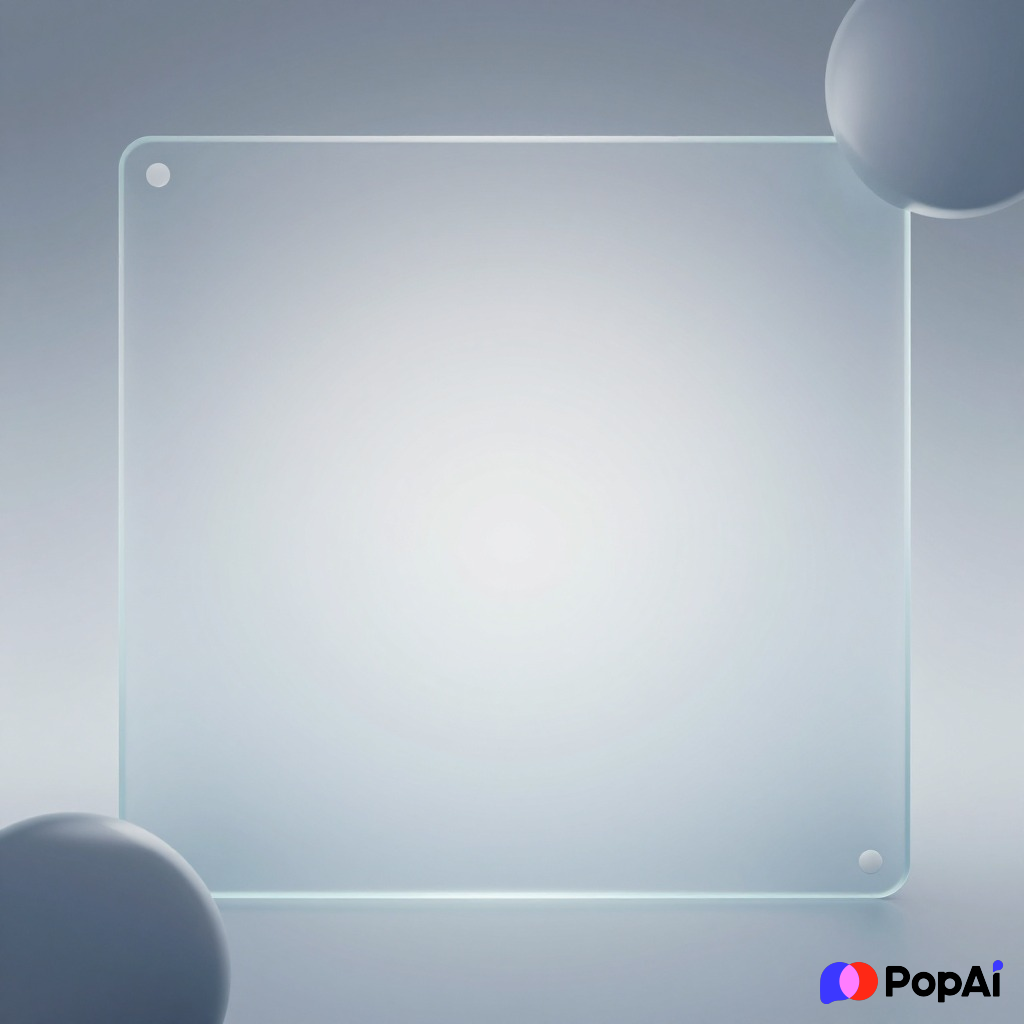
- Deep Navy with Gold Accents: Classic, expensive-looking.
- Slate Blue Geometric: Small, repeating hexagons in a darker shade.
- Abstract Architecture: A zoomed-in, blurred photo of a modern building.
- Professional Pinstripe: Very thin vertical lines, like a suit.
- The “CEO” Look: Dark charcoal background with crisp white Serif fonts.
- Left-Side Image Fade: A photo on the left that fades into a solid color on the right.
- Glassmorphism: Overlapping transparent cards for different data points.
- Matte Black: Zero gloss, very modern, works great for high-end tech.
- Circuit Board Lines: Subtle, thin lines for engineering or IT decks.
- Company Logo Watermark: Huge, low-opacity logo centered behind the text. For slide generation, use PopAi AI Presentation.
Creative & Bold Ideas
If you’re in marketing or design, you can afford to be a bit loud. Anyway, don’t go too crazy or nobody will read the text.
- Vibrant Dual-Tone: Purple and orange gradients.
- Retro 90s Memphis: Squiggles, triangles, and bright pastels.
- Brutalist Grid: Thick black lines and harsh borders.
- Watercolor Splash: Soft colors behind the main heading.
- Glitch Effect: A slightly distorted background for edgy tech topics.
- Collage Style: Multiple overlapping “paper” scraps.
- Neon Glow: Dark background with text that looks like a neon sign.
- Holographic Foil: Shifting iridescent colors.
- Hand-Drawn Doodles: White background with pen-style sketches in the margins.
- Duotone Photos: Taking a regular photo and making it two shades of the same color.
Modern Tech & Startup Vibes
These are for when you want to look like you’re worth $100 million in VC funding.
- Dark Mode Dashboard: Look like a software interface.
- Fluid Shapes: Lava-lamp style movements (stationary, though).
- Isometric Patterns: 3D boxes or shapes in a repeating pattern.
- Data Visualization: A background made of blurred charts or graphs.
- Aurora Borealis: Soft green and purple light streaks.
- Cyberpunk Cityscape: Highly blurred night photography.
- Floating 3D Elements: Orbs or cubes behind your text boxes.
- Scanline Texture: Like an old computer monitor.
- Blueprint Blue: White lines on a specific shade of blue.
- Minimalist Map: A faint outline of a world map or city grid.
Natural & Organic Textures
Sometimes you want a human touch. I guess it depends on the industry, but these work great for sustainability or wellness.
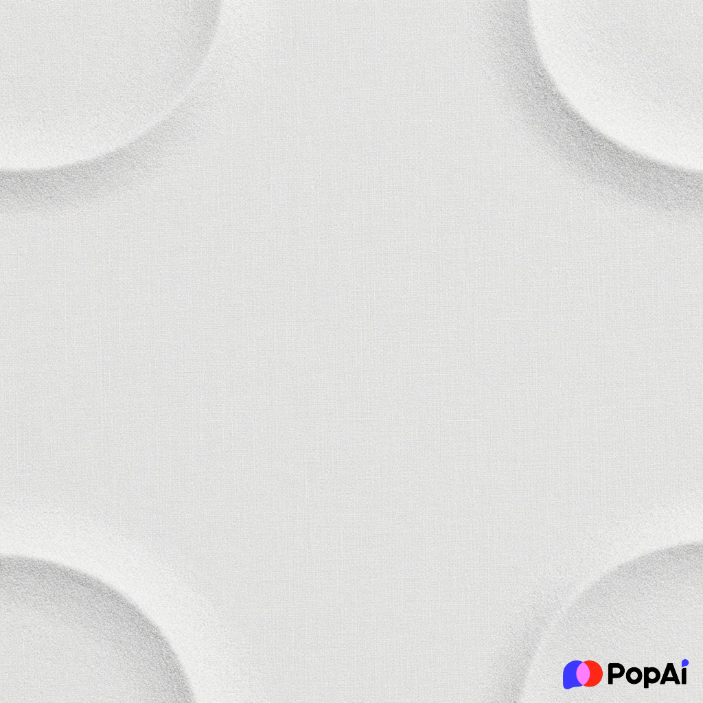
- Recycled Paper: Flecks of brown and tan.
- Leaf Silhouette: Shadow of a leaf falling across the slide.
- Soft Marble: High-end, clean, and textured.
- Sky Gradient: A soft transition from light blue to pale pink.
- Wood Grain: Very dark, stained wood works well for traditional topics.
- Concrete Wash: Industrial, grey, and modern.
- Terrazzo Pattern: Small colorful stone chips.
- Botanical Illustration: Vintage-style plants in the corners.
- Clouds: Soft, high-altitude photography with high transparency.
- Woven Fabric: Like a close-up of a canvas or burlap bag.
Tips for Picking the Right One
Don’t just pick one because it looks “cool.” If you’re presenting to a board of directors, the Memphis 90s style is going to get you laughed out of the room.
- Check the contrast: If you have a dark background, your text MUST be white or bright yellow. If it’s light, your text should be black or dark navy. Simple, but people mess this up all the time.
- Distance Test: Stand 5 feet away from your monitor. Can you still read the words? If the background pattern is making your eyes hurt, it’s too busy.
- Consistency: Don’t use a different style for every slide. Pick one “master” background and maybe 2-3 variations for different sections.
I’ve found that using tools like PopAi helps keep the visual language consistent without me having to manually adjust every single alignment.
The Final Word
Presentation backgrounds shouldn’t be the star of the show; they should be the stage. If people are complimenting the background more than the content, you might have overdone it. But if they’re squinting or falling asleep, you definitely didn’t do enough.
Pick a style that matches your message—clean for facts, bold for ideas, and textured for stories. Now go fix those slides.