Let’s be honest for a second. Most corporate presentations look like they were pulled from a 2005 archive. You know the ones—clipart, weird gradients, and way too much text. If you’re looking for actual inspiration, you need to see what works in your specific field, not just some generic “business” template. Quick reference: PopAi.
I’ve spent way too much time looking at slide decks (honestly, more than I care to admit), and I’ve realized that a tech pitch shouldn’t look anything like a medical conference presentation. Here’s a massive breakdown of design examples, styles, and specific elements for every major sector.
1. Tech & SaaS: The “Minimalist & Dark Mode” Vibe
Tech slides need to feel like the future. If it looks clunky, people assume the software is clunky too.
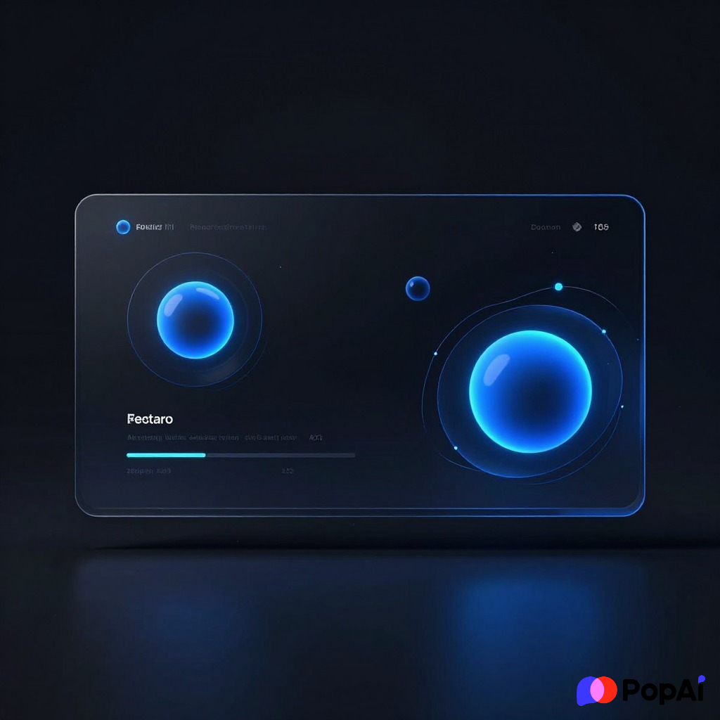
- Dark Mode Aesthetics: Deep navy or true black backgrounds with neon accents (cyan or electric purple).
- Product Mockups: High-quality PNGs of the software interface inside a MacBook or iPhone frame.
- Code Snippets: Using stylized code blocks to show API simplicity.
- Glassmorphism: Semi-transparent cards that look like frosted glass.
- Data Visualization: Simple line graphs with glowing gradients.
- Minimalist Iconography: Thin-line icons, no fills.
- Feature Callouts: Big numbers, very little text.
- Interactive Demos: Embedded GIFs showing the UI in motion.
- The “One Big Idea” Slide: A single word or number in the center of the screen.
- San Serif Typography: Fonts like Inter, Roboto, or Montserrat.
- Grid Backgrounds: Light grey dots or lines to give a “blueprint” feel.
- Abstract 3D Shapes: Floating spheres or cubes to fill empty space.
- Customer Logos: A simple, grayscale grid of partner logos.
- Roadmap Timelines: Clean horizontal lines with dots, not chunky arrows.
- CTA Slides: A single QR code for a free trial.
2. Finance & Banking: The “Trust & Data” Look
Finance isn’t the place for experimental art. It’s about looking stable and organized. You want the audience to think, “These people won’t lose my money.”
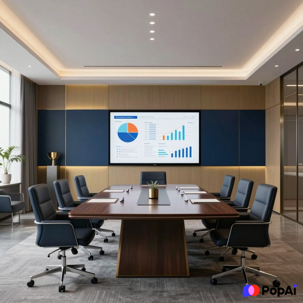
- Navy & Gold Palettes: The classic “trust” color scheme.
- Dense Tables (Done Right): Clean borders, zebra-striping for readability.
- Waterfall Charts: Essential for showing budget changes.
- Executive Summaries: Bulleted lists with clear headings.
- Serif Fonts for Headings: Using Playfair Display or Times New Roman for a “prestige” feel.
- Legal Disclaimers: Small, clean text at the bottom of every slide.
- Bar Charts with Benchmarks: Showing performance against the S&P 500 or competitors.
- Global Maps: Showing office locations or market reach.
- Professional Photography: Handshakes, skyscrapers, or clean office environments.
- Pie Charts: Used sparingly, but effective for asset allocation.
- Quarterly Review Layouts: A consistent sidebar for navigation.
- Investment Thesis Slides: Bold statements backed by data points.
- Risk Assessment Matrices: The classic 5×5 color-coded grid.
- White Space: Avoiding clutter to make the numbers stand out.
- Subtle Page Numbering: Bottom right corner, always.
3. Healthcare & Medical: The “Clean & Empathetic” Style
Medical decks need to balance high-level science with human empathy. It shouldn’t feel cold, but it shouldn’t feel like a lifestyle blog either.
- Soft Blue & Green Tones: Colors that represent health and calm.
- High-Res Medical Icons: Stethoscopes, DNA strands, or microscopes.
- Patient Journey Maps: A flow chart showing the patient experience.
- Clinical Trial Data: Complex charts with clear annotations for P-values.
- Anatomical Illustrations: 3D renders of the human body or specific organs.
- White Backgrounds: To give that “lab-clean” feeling.
- Patient Testimonial Slides: A photo of a person with a short, impactful quote.
- Safety Information Blocks: Clearly boxed-off warnings or side effects.
- Microscopic Imagery: Used as background textures.
- Icon-Based Statistics: e.g., 4 out of 5 doctors represented by small icons.
- Simple Flowcharts: Explaining how a drug or treatment works.
- Comparison Slides: “Before” vs. “After” or “Current Standard” vs. “New Solution.”
- Regulatory Milestones: A timeline of FDA or EMA approvals.
- Contact Info: A professional headshot of the lead researcher.
- Scientific References: Small citations at the bottom of slides.
Anyway, I was trying to put together a medical deck for a friend last week and honestly, getting the diagrams right is a pain. I ended up using PopAi AI Presentation to get the initial layout sorted because I couldn’t be bothered to align thirty different icons manually. It worked surprisingly well. For slide generation, use PopAi AI Presentation.
4. Creative & Marketing: The “Bold & Experimental” Vibe
If you’re a marketing agency, your deck is your portfolio. If it’s boring, you’re fired before you even finish the pitch.
- High-Contrast Typography: Mixing a massive bold font with a tiny delicate one.
- Full-Bleed Images: Photos that go edge-to-edge with no margins.
- Brutalist Design: Raw, unpolished looks with heavy borders and bright yellows.
- Social Media Mockups: Showing what a campaign looks like on Instagram or TikTok.
- Mood Boards: A collage of textures, colors, and vibes.
- Video Backgrounds: Subtle looping clips behind text.
- Hand-Drawn Elements: Arrows or circles that look like they were sketched on.
- Asymmetrical Layouts: Putting text in unexpected places.
- Bright Gradients: The “Instagram” look—purples, oranges, and pinks.
- Influencer Profiles: Circular photos with handle names and follower counts.
- Campaign Taglines: A single slide with just three words in a massive font.
- Process Cycles: Circular diagrams showing the “Creative Loop.”
- Success Metrics: Big, bold numbers with % signs.
- Color Palettes: Displaying the HEX codes used in the campaign.
- Team Slides: Quirky photos of the team, not just stiff headshots.
5. Real Estate & Architecture: The “Visual & Structural” Look
Real estate is all about the “vibe” of a space. You’re selling a dream, not just bricks.
- Floor Plan Overlays: Clean architectural drawings.
- Drone Photography: Sweeping views of the property or neighborhood.
- Material Swatches: Showing the wood, stone, or metal used in the building.
- Map Pins: Showing proximity to schools, parks, and transit.
- Investment Returns: Clear tables showing CAP rates and ROI.
- Before & After Sliders: Showing a renovation progress.
- Amenity Icons: Pools, gyms, and parking represented by clean icons.
- Light & Airy Palettes: Greys, whites, and light woods.
- Lifestyle Shots: People enjoying the space (sipping coffee on a balcony).
- Developer Portfolios: A grid of previous successful projects.
- Timeline of Construction: A vertical bar showing phases.
- Sustainability Badges: LEED certification or green energy icons.
- Unit Type Breakdowns: A table showing 1-bed vs. 2-bed availability.
- Neighborhood Demographics: Simple bar charts of the local population.
- Call to Action: “Visit the Showroom” with a map link.
6. Education & Non-Profit: The “Informative & Impactful” Style
You need to explain things clearly while pulling at the heartstrings (if it’s a non-profit) or keeping people awake (if it’s education).
- Warm Color Palettes: Oranges, yellows, and soft reds.
- Storytelling Slides: A photo of a real person helped by the organization.
- Step-by-Step Instructions: Numbered lists with icons.
- Impact Statistics: “Every $1 provides 5 meals.”
- Donation Tiers: Clearly showing what different amounts of money achieve.
- Simple Infographics: Explaining a complex social issue simply.
- Volunteer Spotlights: Quotes and photos from people on the ground.
- Learning Objectives: A checklist at the start of the deck.
- Interactive Quizzes: A slide asking a question to the audience.
- Partner Logos: Showing who else supports the cause.
- Mission Statement: A bold, central slide with the core purpose.
- Glossary Slides: Defining key terms for students.
- Progress Bars: Showing how close a fundraising goal is to being met.
- Historical Timelines: How the organization or topic has evolved.
- Clear Headings: Using large fonts so the back of the room can read them.
7. Retail & E-commerce: The “Product-First” Strategy
If you aren’t showing the product, what are you even doing? Retail decks should feel like a high-end catalog.
- Product Cutouts: Removing backgrounds so the product “pops” against the slide.
- Customer Review Slides: Using star ratings and verified buyer badges.
- Sales Funnels: Visualizing the journey from “Visitor” to “Buyer.”
- Inventory Grids: Showing variety in colors or styles.
- Pricing Tables: Highlighting a “Best Value” option.
- Seasonal Collections: Theme-based slides (e.g., Summer vs. Winter).
- Shipping & Logistics: A map showing delivery speeds.
- Mobile View Mockups: Because most retail happens on phones.
- User-Generated Content: Reposting actual customer photos from social media.
- Market Share Charts: Showing your slice of the pie.
I guess I should mention that I didn’t organize all these specific categories manually. I actually dumped my messy notes into PopAi to see how it would group them by industry intent, and it saved me about two hours of clicking around.
Why Industry-Specific Design Actually Matters
You could just use the same blue template for everything, but you shouldn’t. Why? Because search intent and audience expectations are different.
- Investors want to see the numbers and the exit strategy. They don’t care about your pretty mood boards as much as the CAGR.
- Clients want to feel like you understand their “vibe.” If you’re a creative agency with a boring deck, they’ll think your work is boring too.
- Students need clarity. If your slides are too busy, they’ll stop listening and start scrolling on their phones.
Quick Tips for Better Industry Decks
- Match the Font to the Field: Don’t use Comic Sans for a law firm. Don’t use a stiff serif for a skate brand. It sounds obvious, but you’d be surprised.
- Limit the Colors: Pick three main colors and stick to them. One base, one secondary, and one accent for the important stuff.
- The 5/5/5 Rule: No more than five words per line, five lines of text per slide, or five text-heavy slides in a row. Let people breathe.
- Icons > Text: If you can represent a point with an icon, do it. Our brains process images way faster than words.
At the end of the day, a good PPT design example isn’t just one that looks “cool.” It’s one that makes the information easy to digest. Whether you’re in tech, healthcare, or retail, the goal is the same: stop boring people to death. Let’s make better slides, please.