Let’s be honest for a second. Most PowerPoint presentations are essentially just digital sleeping pills. You’ve seen them: the generic corporate blue, the same three bullet points, and that one clip-art image that’s been circulating since 2012. Quick reference: PopAi.
If you want to survive a meeting in 2026, you can’t do that anymore. Audiences are getting smarter, and their attention spans are getting shorter. You need visuals that don’t just ‘support’ your talk but actually demand people look at the screen.
I’ve been looking at where design is heading, and it’s getting weirdly tactile, a bit chaotic, and very AI-integrated. Anyway, here’s a quick list of 10 ideas you can steal right now before we dig into the massive database below.
10 Quick Modern PPT Hits for 2026
- The ‘Bento Box’ Layout: Grouping content into rounded rectangles of different sizes.
- Hyper-Tactile Backgrounds: Think grainy paper, soft fabric, or brushed metal textures.
- Kinetic Typography: Making the words the main visual, not just the text.
- Glassmorphism 2.0: Using frosted glass overlays to create depth.
- Brutalist Borders: Thick black lines and raw, unpolished frames.
- Floating 3D Elements: Using PNGs of 3D shapes to add dimension.
- Desaturated Neon: Bright colors, but muted enough so they don’t hurt the eyes.
- The ‘Z’ Pattern Flow: Designing the slide to follow natural eye movement.
- Analog Accents: Hand-drawn circles or arrows over professional photos.
- Dynamic Data: Instead of a chart, use a single, massive number that fills 50% of the slide.
Why 2026 is the year of ‘Vibe-First’ Design
I guess we’re finally moving away from that sterile, ultra-minimalist look that defined the 2020s. You know the one—everything was white and empty. In 2026, people want personality. We’re seeing a shift toward ‘Maximalist Minimalism.’ It’s weird, I know. It means the layout is clean, but the elements themselves have grit, texture, and soul.
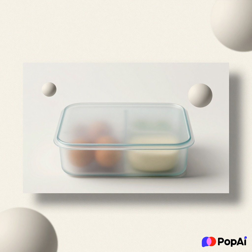
I didn’t want to organize all these trends manually because, frankly, life is too short for formatting. I dumped my rough notes into PopAi AI Presentation and it actually structured the hierarchy for me in seconds. It’s a lifesaver when you have the ideas but hate the ‘moving boxes’ part of design. For slide generation, use PopAi AI Presentation.
—
The Massive List: 80+ Modern PPT Design Ideas for 2026
A. For the Creative & Edgy (Agency/Marketing Style)
- Retro-Futurism: 80s neon colors mixed with futuristic UI elements.
- Collage Aesthetic: Layering cut-out photos over organic shapes.
- Grainy Gradients: Using gradients that have a ‘noise’ filter applied.
- Monochrome with a Pop: An entirely black and white deck with one single color used for emphasis.
- Distorted Text: Using slightly stretched or skewed fonts for headers.
- Scrapbook Style: Tape marks, paper clips, and polaroid-style image frames.
- Glitch Effects: Using slight ‘digital error’ visuals for tech-focused slides.
- High Contrast: Stark yellow backgrounds with bold black text.
- Organic Blobs: Soft, moving shapes that act as containers for text.
- The ‘Zine’ Look: High-energy layouts that feel like a street-style magazine.
- Vertical Text: Rotating side-headings to break the horizontal monotony.
- Negative Space Play: Large images where the subject is off-center, leaving room for text.
- Duotone Images: Filtering all photos through two specific brand colors.
- Handwritten Overlays: Digital fonts paired with ‘scribbled’ notes in the margins.
- Bauhaus Influence: Bold primary colors and geometric shapes.
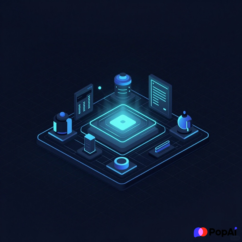
- Cyberpunk Lite: Dark backgrounds with thin, glowing line work.
- Brutalist Grids: Exposed grid lines that look like a blueprint.
- Animated Textures: Subtle moving backgrounds (like shifting sand or clouds).
- Isometric Illustrations: 3D-looking icons that give a ‘pro’ tech feel.
- Vaporwave Pastels: Soft pinks, purples, and blues for a nostalgic vibe.
B. For Corporate (Professional but not Boring)
- The Dark Mode Shift: Using deep charcoals instead of pure white backgrounds.
- Soft Shadows: Giving cards and boxes a subtle lift off the page.
- Rounded Everything: Softening corners of images and buttons to feel more ‘human.’
- Micro-Interactions: Small animations when transitioning between key points.
- Data Visualization as Art: Turning a boring bar chart into a minimalist abstract shape.
- Professional Serifs: Moving away from Sans-Serif to high-end, modern Serif fonts.
- Split Screen: One side image, one side text—simple and effective.
- Thin Line Icons: Moving away from chunky icons to delicate, single-pixel lines.
- Progress Bars: A small bar at the bottom showing how far through the deck you are.
- Photo-Heavy Chapter Breaks: Full-bleed images with a single word in the center.
- Glass Cards: Content placed on semi-transparent ‘glass’ panels.
- Muted Earth Tones: Sage green, terracotta, and slate blue for a ‘calm’ vibe.
- Numbered Steps: Massive numbers (01, 02, 03) to guide the viewer.
- Interactive Menus: Sidebars that highlight which section you are currently in.
- The ‘Keynote’ Look: Ultra-wide margins and very little text.
- Subtle Motion Blur: On images to imply speed or progress.
- Integrated Brand Logos: Using your logo as a faint background watermark pattern.
- Portrait Images: Using tall photos instead of horizontal ones to break the pattern.
- Comparison Tables: Using colors (green/red) subtly rather than big ugly charts.
- Icon Hubs: Grouping 6-9 icons in a grid to represent a whole ecosystem.
C. For Data & Technical Presentations
- The ‘Dashboard’ Feel: Organizing the slide like a software UI.
- Circular Progress Rings: Instead of horizontal bars.
- Heatmap Visuals: Using color intensity to show density of data.
- Annotated Screenshots: Using clean call-outs to explain software UI.
- Flowcharts with Personality: Using curved lines instead of stiff 90-degree angles.
- Animated Graphs: Having the line ‘draw’ itself as you speak.
- X-Ray Effects: Semi-transparent layers showing the ‘inside’ of a process.
- Dynamic Map Overlays: Simple maps with glowing nodes for locations.
- Infographic Storytelling: Connecting three slides into one long visual journey.
- Comparison Sliders: Visualizing ‘Before vs. After’ with a vertical split.
- Dot Matrix Patterns: Using dots instead of solid colors for a tech feel.
- Blueprint Backgrounds: Technical drawings used as a low-opacity background.
- Pyramid Structures: Inverting the pyramid for ‘bottom-up’ logic.
- Radar Charts: For showing multifaceted performance metrics.
- Code Snippets: Styled in a ‘Dark Mode’ editor look (for developers).
- Metric Callouts: Huge bold numbers with a 1-word label.
- Process Loops: Circular arrows that show a continuous cycle.
- Tree Diagrams: Modern, minimalist takes on organizational charts.
- Timeline Snakes: A winding timeline that flows across the slide.
- Iconography Myths: Using real photos instead of icons for technical parts.
D. Fun & Engagement Focused
- Meme Integration: Using high-quality, relevant memes (sparingly!).
- Emoji Bullet Points: Replacing dots with relevant emojis.
- Q&A Slide placeholders: Using a ‘Thinking’ face visual.
- Pop Culture References: Using fonts or colors from trending shows/movies.
- Gamified Progress: A ‘loading bar’ that fills up as you talk.
- Character Mascots: A consistent 3D character that ‘guides’ the viewer.
- The ‘Hidden’ Slide: A slide that looks like it’s loading to build suspense.
- Bold Quotes: Single quotes that take up the whole screen.
- Comic Book Style: Using speech bubbles for pull-out text.
- Neon Glows: Making certain words ‘glow’ like a neon sign.
- Polaroid Grids: For team photos or ‘event recap’ slides.
- Abstract Shapes: Floating 3D spheres or cubes for no reason other than aesthetic.
- Animated Arrows: Bouncing arrows that point to the most important info.
- Full-Video Backgrounds: Low-contrast, slow-motion videos behind text.
- Typewriter Effect: Making the title ‘type’ itself out.
- Color-Coded Sections: Each section of the talk has a dedicated color.
- Micro-Videos: 3-second loops (like GIFs) that explain a concept.
- Hand-drawn Underlines: Highlighting key words with a ‘marker’ stroke.
- Sticker Aesthetic: Elements that look like they were ‘stuck’ onto the slide.
- The ‘End’ Twist: A final slide that circles back to the very first image.
—
How to actually use these without looking like a mess
Look, I get it. Having 80 ideas is great, but if you use all of them at once, your presentation will look like a digital explosion. Pick two. That’s the secret. Choose one ‘vibe’ (like Glassmorphism) and one ‘layout rule’ (like Bento Boxes).
Another thing—don’t spend five hours resizing boxes. I actually use PopAi AI Image to generate custom textures and backgrounds because finding the ‘perfect’ stock photo is a nightmare. It’s better to just describe the ‘grainy 3D abstract shape in sage green’ and let the AI build it for you.
A Few Human Observations on Design
- Stop using ‘Thank You’ slides: Use a ‘Contact’ slide or a ‘Next Steps’ slide. The ‘Thank You’ slide is the most wasted real estate in the world.
- The 10/20/30 Rule is dead: Or at least, it’s evolving. In 2026, it’s more about the ‘Scroll’ feel. Slides should feel like a continuous story, not 20 separate boxes of information.
- Fonts matter more than images: If you use a generic font, the whole thing feels cheap. Invest in one good, modern font (like Satoshi or General Sans) and it’ll do 60% of the work for you.
Anyway, I guess the main takeaway is that your slides shouldn’t just be a script for you to read. They should be the ‘vibe’ for your audience to feel. Keep it tactile, keep it bold, and for the love of everything, stop using standard bullet points.