The business cases and sample numerical narratives below are illustrative examples, not reported customer results or completed product tests.
All slide counts and time ranges below are starting ranges or illustrative briefs, not universal standards. The storytelling structures are practical editorial options; choose and test one against the actual audience, evidence, and decision.
A familiar AI-deck failure starts with a substantial source file—a 30-page market report, customer notes, and a spreadsheet—and ends with company history on slide 1, repeated findings in the middle, and the actual recommendation on slide 11. The issue is rarely slide design. It is the missing AI presentation storytelling structure: a deliberate route from evidence to the decision the audience must make.
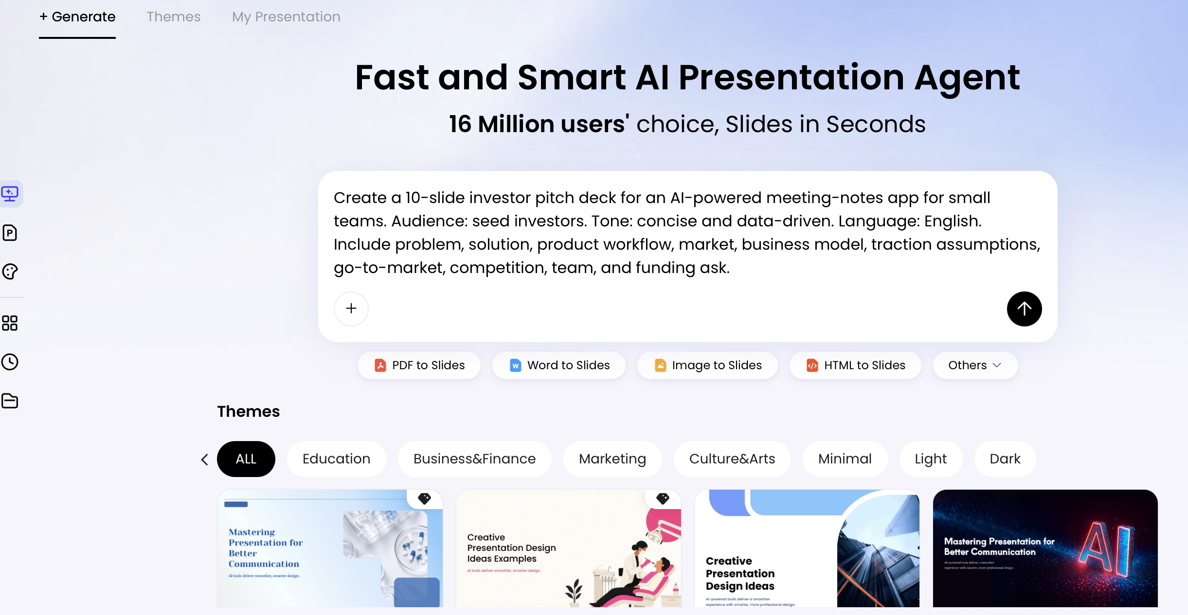
This guide uses a practical workflow: choose a structure for the decision, sort source material into claims and proof, approve an outline, then build and rehearse the deck. Tools such as PopAi AI Presentation can turn source material into a draft quickly, but the generated outline is a hypothesis to review—not a substitute for subject-matter judgment.
Why AI presentation storytelling structure matters
Structure should match how this particular audience reaches confidence; there is no universal “best” opening slide.
An executive deciding whether to fund a project may want the recommendation first, followed by the reasons and risks. A skeptical technical audience may need to see the method and data quality before accepting the conclusion. A sales audience usually needs to recognize its current cost or friction before evaluating a solution. In each case, the deck should answer the next reasonable question rather than simply summarize the source documents.
Beautiful slides earn attention. A coherent argument earns a decision.
Case example: A retention team presenting a proposed onboarding pilot to a COO should not open with five slides of churn charts. A decision-first flow could be: “Approve a 90-day onboarding pilot” → “New customers are leaving before reaching the first value milestone” → “The loss is concentrated in two cohorts” → “A guided setup can address the documented friction” → “Pilot cost, owner, success measure, and risks.” The data has a job in that sequence: it validates the requested action.
As an editorial starting range, a 20-minute decision discussion might use 10 to 15 focused slides. It is not a measured optimal count. A pre-read may need more documentation, while a workshop may need fewer slides and more discussion. Build around audience questions and adjust through rehearsal.
Write slide titles as conclusions rather than labels. Replace “Market Opportunity” with “The underserved segment is growing fastest and fits our current distribution.” Replace “Solution” with “A guided onboarding flow addresses the adoption barrier raised in interviews.” A reader scanning the deck should be able to reconstruct the argument from titles alone.
Choose an AI presentation storytelling structure by decision
Select the framework from the decision, audience posture, and evidence available before asking AI to draft slides.
Problem → solution → proof → action
Best for: sales proposals, product launches, and operational fixes where the audience recognizes a pain point. A practical six-slide flow is current situation, cost of the problem, desired outcome, solution approach, proof, and next step. Do not introduce features before the audience agrees on the problem and its stakes.
Pyramid principle: answer → reasons → evidence
Best for: executives and boards making a defined decision. Open with the recommendation, group two to four mutually reinforcing reasons, then show the evidence beneath each reason. “Answer first” is not enough: miscellaneous charts under an assertion are not a pyramid. Each supporting reason must be distinct and logically connected to the recommendation.
Before → after → bridge
Best for: change management, training, and process adoption. Show the current behavior or workflow, define the desired future state, then make the bridge concrete: owners, milestones, tools, and reinforcement. The common failure is making the “after” state inspirational but operationally vague.
Customer-as-hero case narrative
Best for: customer stories, mission-led talks, and selected fundraising decks. The customer, learner, or community is the hero; your organization is the guide. Keep it restrained: context, obstacle, intervention, measurable result, and lesson. Avoid forcing a dramatic arc onto a routine business update.
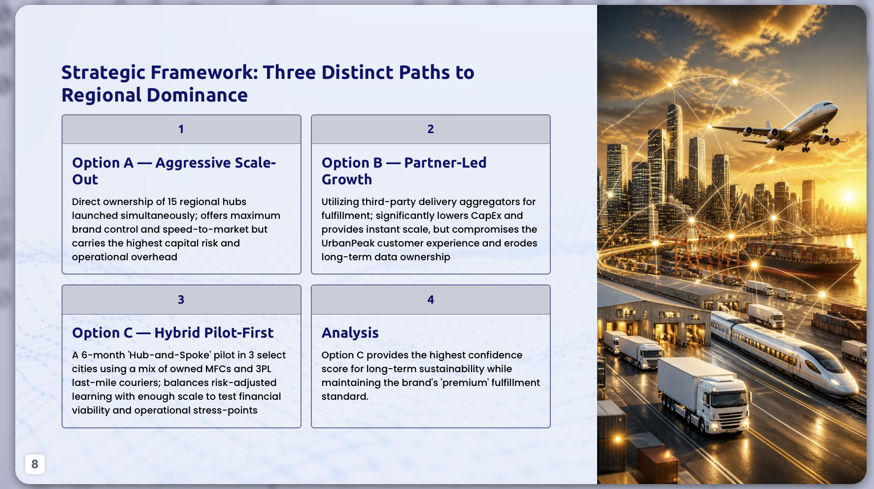
Use a comparison structure for a genuine choice
When decision-makers must select an option, use the same criteria for every alternative: cost, expected upside, time to impact, dependencies, risk, and accountable owner. This prevents a common AI error—giving the preferred option rich detail while reducing alternatives to vague bullets. State whether scores are measured, estimated, or based on working assumptions.
Map source material into a slide-by-slide story
Reports, meeting notes, spreadsheets, and old decks contain inputs—not necessarily a narrative. Map them into a decision story before generating slide copy.
Extract the decision, tension, and proof
- State the decision: approve a budget, choose a region, adopt a process, or begin a pilot.
- Find the tension: identify the cost of delay, missed opportunity, customer friction, or material risk.
- Separate evidence from interpretation: label source-backed facts, working assumptions, and recommendations.
- Create an answer-first outline: assign each slide a conclusion title and a transition purpose.
- Match visual form to logic: use trends for change over time, matrices for choices, funnels for conversion, and timelines for sequence.
Source-to-story example: A spreadsheet shows that first-month churn rose from 8% to 13% over two quarters. Support tickets repeatedly mention setup confusion, while interviews with six churned customers describe difficulty reaching a first result. The fact is the churn change; “onboarding is the main cause” is an interpretation, not yet a fact. A responsible deck labels that interpretation as a hypothesis, requests a 90-day pilot, and defines proof as improved activation and first-month retention against a control cohort.
Turn the mapping into slide roles
That example can become an eight-slide executive deck: (1) approve a 90-day onboarding pilot; (2) first-month churn is creating an avoidable retention loss; (3) the increase is concentrated among customers who do not complete setup; (4) interviews and tickets point to a consistent friction pattern; (5) guided setup is the proposed intervention; (6) the pilot design tests the hypothesis without a full rollout; (7) cost, owner, timeline, and risks; (8) decision requested today. Notice that the source material does not dictate the order—the decision does.
Audit what AI extracted before design
AI can help organize PDFs, DOCX files, TXT files, HTML, images, and PPTX material, but review its extraction against the originals. Check whether it omitted a limiting detail, overstated a correlation as causation, changed a date or denominator, or treated an assumption as approved fact. Keep a simple source hierarchy: approved internal data, external research, interview evidence, working assumptions, and AI suggestions should never carry the same evidentiary weight.
Prompt AI with story constraints, not a topic only
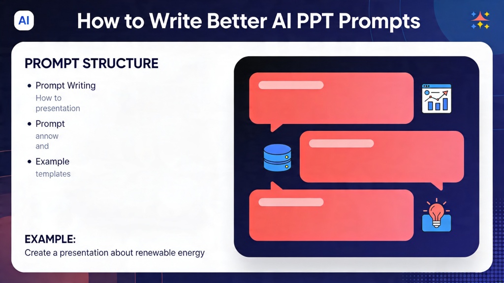
A strong prompt is a presentation brief: it tells the tool what to make, for whom, on what evidence, and what it must not claim.
Write a brief AI can follow and a reviewer can check
RICCE is the editorial checklist used in this article, not a claimed industry standard or experimentally validated framework. It groups five prompt ingredients: role (the perspective), instructions (the task), context (audience and situation), constraints (sources, scope, and exclusions), and examples (a preferred tone or slide pattern). Add the decision requested and evidence rules. Asking AI to use only attached sources can constrain the draft, but a human still needs to check the result.
You are a strategy consultant preparing a 12-slide executive decision deck. Audience: regional leadership team, familiar with the market but skeptical of untested expansion assumptions. Decision requested: approve one of three market-entry paths. Use a pyramid structure: recommendation first, then three distinct supporting reasons, then evidence. Use only the attached sources; label estimates and data gaps, and do not invent citations, customer quotes, or statistics. Give each slide a conclusion-style title, one recommended visual, a source note where evidence is used, and a one-sentence transition to the next slide. End with decision, accountable owner, timeline, success measures, and key risks.
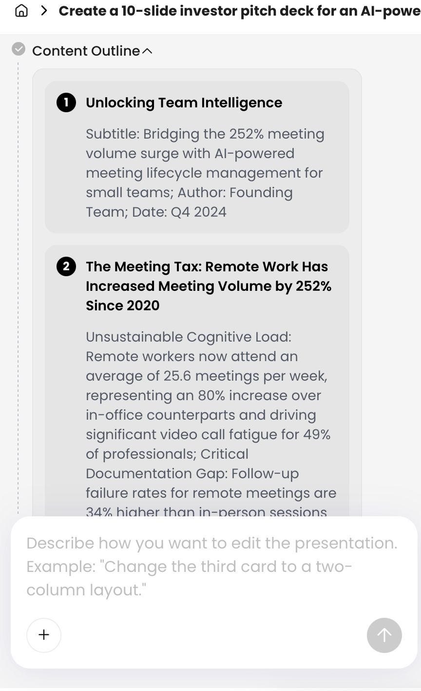
Generate the outline before final slide copy
Run the work in two passes. First, request a slide map with titles, audience questions, evidence needed, and transitions. Review it with the subject-matter owner. Only then ask for slide copy, visuals, and speaker notes. If the first outline is weak, revise the brief with a specific instruction such as: “Move the recommendation to slide 1; remove company history; distinguish interview findings from quantified data; add a slide explaining why option B was rejected.” Do not regenerate blindly and hope for a better sequence.
When comparing tools, assess source fidelity, editability, citation support, export quality, brand controls, collaboration, accessibility, and data-handling requirements—not visual polish alone. This guide to AI presentation makers provides a useful starting point for comparing workflows.
Review the outline before designing slides
Outline review is where a generic AI draft becomes a defensible presentation.
Check narrative dependencies and title-to-evidence alignment
Read only the slide titles in sequence. Can a busy stakeholder understand the recommendation, the reasons for it, and the requested next step? Then inspect each slide: does the evidence actually support the claim in its title, or does the title promise more certainty than the chart, quote, or table can establish?
If a slide can move anywhere in the deck without changing meaning, it probably has not been given a narrative job.
For example, “Customer testimonials” is movable and generic. “Three implementation leaders report that setup time fell after the pilot” has a role: it follows the implementation proposal and supports its feasibility. If that claim is based on only three interviews, say so on the slide rather than presenting it as broad proof.
Use a diagnostic review, not an arbitrary score
Separate non-negotiable issues from polish issues. Do not proceed to design until the deck has:
- A clear decision and owner: the audience knows what is being requested and who acts next.
- Relevant audience stakes: the opening explains why this decision matters now.
- Logical support: each reason advances the recommendation rather than repeating background.
- Verified or clearly labeled evidence: sources, dates, assumptions, and uncertainty are visible.
Then improve quality: tighten titles, remove duplicate slides, choose clearer visuals, and strengthen transitions. A subject-matter expert should review factual claims; the meeting owner should confirm that the proposed decision and close are usable.
Build credible visuals and human delivery
Once the argument holds up, choose visuals and delivery materials that make the evidence easier—not merely prettier—to evaluate.
Select a visual that matches the claim
Use a line chart to show change over time, a bar chart to compare magnitudes, a table when precise values matter, and a process diagram when dependencies or handoffs are the point. Avoid a pie chart when categories are numerous or values are close; avoid a funnel when stages do not represent a genuine sequential conversion process. If a single sentence communicates the point more accurately than a decorative diagram, use the sentence.
Verify data, assumptions, and chart integrity
Before presenting any chart, confirm the original source, date range, unit, denominator, and calculation. Check that axes do not exaggerate small changes, categories are comparable, and the title does not imply causation where the data shows correlation. Label forecasts, estimates, and interview findings directly on the slide. For external research, add a readable source note; for confidential internal data, use an approved source label and follow your organization’s sharing rules.
Practical data check: A chart titled “The pilot improved retention by 25%” may only show retention rising from 40% to 50% among a small, self-selected group. A more accurate title is “Pilot participants had 10 percentage points higher retention; selection effects have not been isolated.” That wording may be less dramatic, but it gives decision-makers a sound basis for action.
Design for readable, accessible slides
Use color as reinforcement, not the only distinction between categories; label lines and bars directly where possible. W3C's WCAG 2.2 contrast guidance calls for at least 4.5:1 for normal text and 3:1 for qualifying large text. Those digital-text criteria are a useful baseline, not proof that an exported presentation is fully accessible. Test the projection conditions separately and check reading order, alternatives, and export behavior.
Prepare the delivery and the decision close
Build speaker notes for what the slide does not show: the source caveat, the transition, the likely objection, and the question you want answered. Rehearse the opening, the two most contested claims, and the final request. End the meeting with a concrete follow-up: decision-maker, owner, due date, next artifact, and success measure. Directness should reflect the meeting’s purpose and established decision process—not assumptions about an audience’s seniority or culture.