Slide Transitions in AI Presentations: Best Practices
Slide transitions in AI presentations are the movement between one slide and the next; object animations are the movement of text, charts, images, or shapes inside a slide. Confusing the two is one reason AI-generated decks often feel busy: the slide changes, the bullets fly in, the chart builds, and the audience has to decode motion before meaning.
In deck reviews, the most common AI-transition problem is not “too little polish.” It is mismatched intent. A 12-slide investor draft might use a zoom from the title slide to the problem slide, a cube rotation into market size, and a slow dissolve into financials—none of which helps the pitch feel more credible. A cleaner plan would be: short Fade from title to problem, Cut through evidence slides, Morph only from market map to beachhead segment, and Fade into the ask.
This guide is written for educators, sales teams, consultants, founders, analysts, trainers, and academic presenters who use AI to generate first drafts but still need to control delivery. The practical goal is simple: choose transitions that clarify the relationship between slide pairs, survive the delivery format, and do not compete with the speaker.
Why Slide Transitions in AI Presentations Matter
Transitions tell the audience how to interpret the boundary between two slides.
For most AI-generated business, academic, and public-facing decks, the safest transition choice is none or a simple fade. Use Cut, Fade, Morph, Push, or Wipe only when the motion helps the audience understand sequence, contrast, reveal, or spatial movement. If the transition does not clarify the message, remove it.
AI-generated decks are often assembled quickly from a prompt, PDF, Word file, HTML report, or existing PPTX. That speed is useful, but it can create abrupt changes in topic, density, tone, or visual scale. A transition can signal whether you are continuing an argument, opening a new section, comparing alternatives, drilling into detail, or revealing a conclusion.
There is a cognitive reason to keep motion disciplined. Cognitive load theory distinguishes between effort spent understanding the material and effort spent dealing with presentation mechanics. In practice, a dense KPI chart already asks the viewer to read labels, compare values, and follow the presenter’s interpretation. If the whole slide also zooms, spins, or slowly dissolves, the motion adds work without adding understanding.
Accessibility matters too. WCAG guidance warns against flashing content that can trigger seizures, and many viewers experience discomfort with rapid zooms, parallax, rotation, or sudden full-screen movement. A deck should still make sense if all transitions are removed, especially when it will be shared as a PDF, viewed on mobile, or watched later as a recording.
Use transitions as punctuation. A cut is a period, a fade is a comma, a morph is a visual explanation, and a dramatic push is a chapter break.
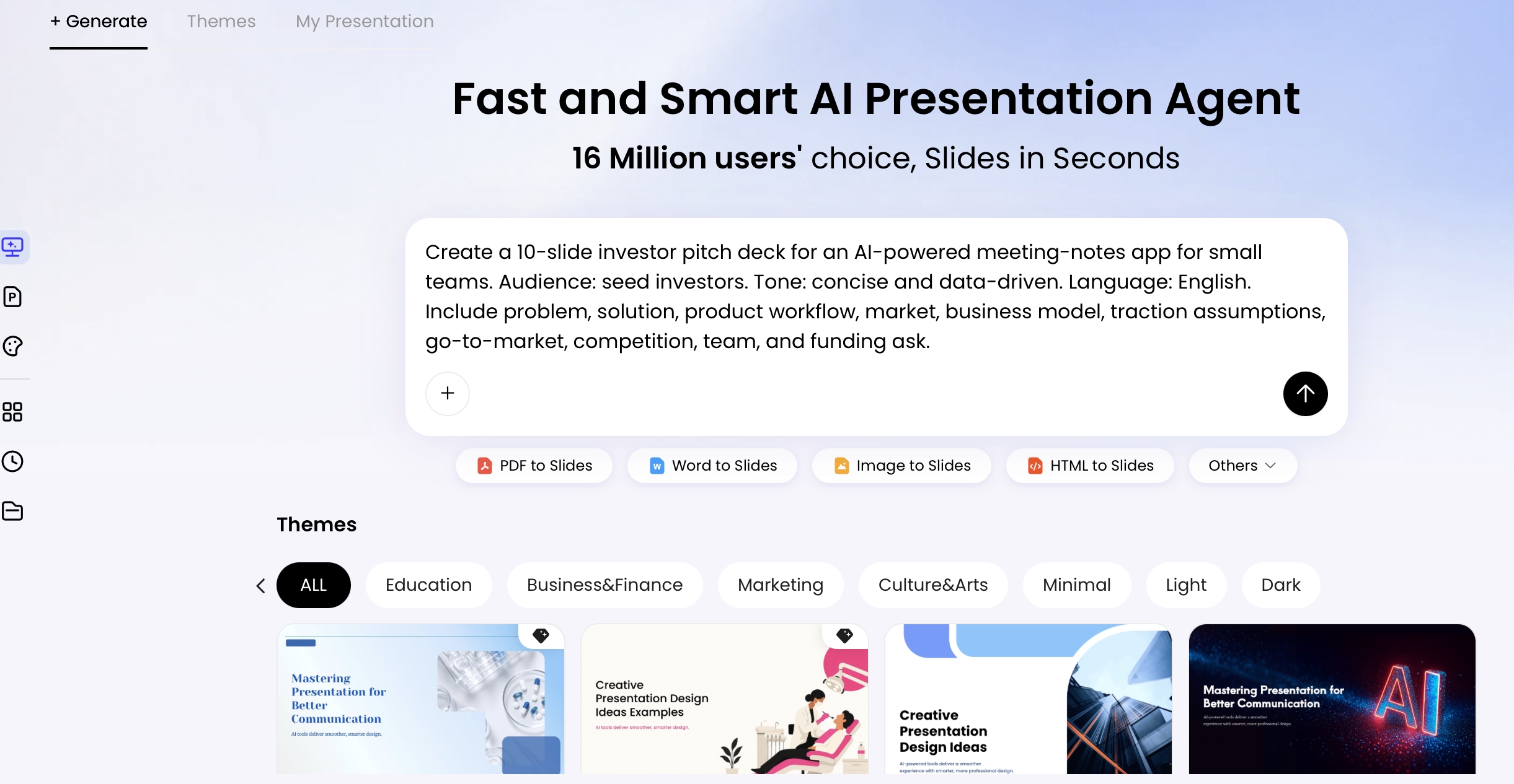
AI tools can accelerate deck structure, but transition quality still depends on editorial judgment. For example, PopAi AI Presentation lets users define the topic, audience, tone, language, page count, and required sections before generation. That upstream structure helps you identify where a normal slide change should be a Cut, where a section shift deserves a Fade, and where a shared visual element might justify Morph.
Best Slide Transitions in AI Presentations by Story Purpose
For a broader view of available tools, compare the latest AI presentation makers before choosing the workflow that best fits your team.
Choose the transition after you define the rhetorical move between two slides.
Instead of asking, “Which transition looks impressive?” ask, “What should the audience understand at this boundary?” Most professional AI-generated decks can be built from five motion choices: Cut, Fade, Morph, Push, and Wipe. If you are still choosing a generation workflow, compare AI presentation makers by how much editing control, export reliability, and timing adjustment they provide after the draft is created.
Cut: the default for confident slide-to-slide logic
Use Cut when the relationship is obvious: agenda to point one, problem to implication, chart to summary, recommendation to next step. It is the least distracting option and often the best default for financial reporting, board updates, academic lectures, and technical walkthroughs.
- Recommended duration: instant; do not add delay unless the deck is auto-advancing.
- Best slide pair: “Q2 Revenue by Region” → “Key Variance Drivers.”
- Avoid when: the next slide changes mood or chapter so sharply that the audience needs a pacing cue.
- Presenter note: Cut works well when the speaker provides the transition verbally: “That explains the drop; now let’s look at the driver.”
Fade: a short pause for continuity or section pacing
Fade works when you want the audience to feel a smooth continuation or a mild section shift. It is suitable for teaching, research summaries, nonprofit updates, and executive briefings. Keep it short; a slow dissolve can make a 25-slide deck feel tired.
- Recommended duration: 0.3–0.5 seconds for business decks; 0.5–0.7 seconds for reflective or educational material.
- Best slide pair: “Problem Context” → “Why It Matters Now.”
- Avoid when: you are moving through a sequence of dense charts where speed and precision matter.
- Platform note: Fade is widely supported across PowerPoint, Google Slides, Keynote, and most web presentation tools.
Morph: visual continuity for transformation, not decoration
Morph is powerful when two slides share objects or visual structure: a product interface zooms into a feature, a market map highlights one region, or a chart changes from total revenue to segment breakdown. It should explain transformation rather than announce that the software has a motion feature.
- Recommended duration: 0.6–1.0 seconds; longer only for product demos where the audience must track the movement.
- Best slide pair: “Full Customer Journey Map” → “Checkout Friction Point Enlarged.”
- Avoid when: chart scales change in a way that could imply false movement in the data.
- PowerPoint note: Morph works best when objects persist across slides and are aligned, named, and layered predictably.
- Export risk: Morph-like effects may flatten or behave differently after web-to-PPTX export, so test the delivered file.
Push and Wipe: directional motion for process, comparison, and hierarchy
Push can signal movement through a timeline, funnel, roadmap, or product workflow. Wipe can reveal a before-and-after, a layered diagram, or a side-by-side comparison. Direction must mean something: left-to-right often implies progress in left-to-right reading contexts; top-to-bottom can imply drill-down or hierarchy.
- Recommended duration: 0.4–0.7 seconds for Push; 0.3–0.6 seconds for Wipe.
- Best slide pair: “Current Workflow” → “Automated Workflow,” using a left-to-right Push.
- Avoid when: the deck is a formal report, legal update, or board pre-read where app-like navigation feels too casual.
- Common confusion: Wipe as a slide transition is different from revealing one object at a time inside a slide.
| Story purpose | Recommended transition | Example slide pair | Timing | Risk to check |
|---|---|---|---|---|
| New section or chapter | Fade or Push | “Market” → “Product Strategy” | 0.4–0.7 sec | Too dramatic for formal audiences |
| Data drill-down | Morph or Cut | “Revenue Overview” → “Enterprise Segment” | 0–1.0 sec | Morph can mislead if chart scales change |
| Before/after comparison | Wipe or Morph | “Manual Process” → “Automated Process” | 0.3–0.7 sec | Direction must match the comparison logic |
| Sales demo sequence | Push or Morph | “Dashboard” → “Alert Detail” | 0.5–1.0 sec | Can slow the demo if every feature gets motion |
| Academic or finance report | Cut or short Fade | “Methodology” → “Results Table” | 0–0.5 sec | Decorative motion reduces seriousness |
How to Prompt AI for a Better Transition Plan
Ask AI for a slide-pair transition map, not a vague instruction to “make it dynamic.”
When you generate a deck in PopAi, you can start from a topic or upload source material such as a document, presentation, image, video, or webpage. The useful transition work begins after the AI has organized the outline: review the sections, identify where the argument changes direction, then assign motion only where the slide relationship justifies it.
If your prompt only says “make it professional,” you may get a coherent deck with no usable motion plan. A better instruction tells the AI to assume no motion by default, then justify every exception. This reduces random effects and gives you a table you can implement manually in PowerPoint, Google Slides, Keynote, or a web presentation editor.
Prompt template: require a transition table
Generate a 10-slide presentation for [audience] about [topic]. Use a [formal/energetic/academic] tone. After the outline, create a slide-by-slide transition table with these columns: slide number, slide title, relationship to previous slide, recommended transition, duration, reason, accessibility note, and export risk. Default to Cut unless the slide relationship clearly requires Fade, Morph, Push, or Wipe. Avoid spinning, bouncing, sound effects, rapid flashing, and fast zooming.
A useful AI output should look specific enough to act on. For example: “Slide 5: Market Size → Slide 6: Beachhead Segment. Relationship: drill-down from broad market to initial target. Transition: Morph, 0.8 seconds. Reason: shared map allows the audience to track narrowing focus. Accessibility note: avoid rapid zoom; keep labels readable. Export risk: test in PowerPoint because Morph may not preserve from all web tools.”
Adjust the prompt for delivery format:
- Live keynote: “Use presenter-controlled transitions only; no auto-advance.”
- Remote webinar: “Keep all transitions under 0.6 seconds and avoid fine text movement because screen sharing may compress motion.”
- Recorded video: “Use consistent timing and note where narration should pause during transitions.”
- PDF-first handout: “Design every slide to work without motion; include transition recommendations only for the live version.”
- PowerPoint handoff: “Flag any Morph or complex animation that may need manual setup in PowerPoint desktop.”
A Slide Transition Audit Checklist for AI Decks
Audit transitions in slide sorter view before you adjust individual effects.
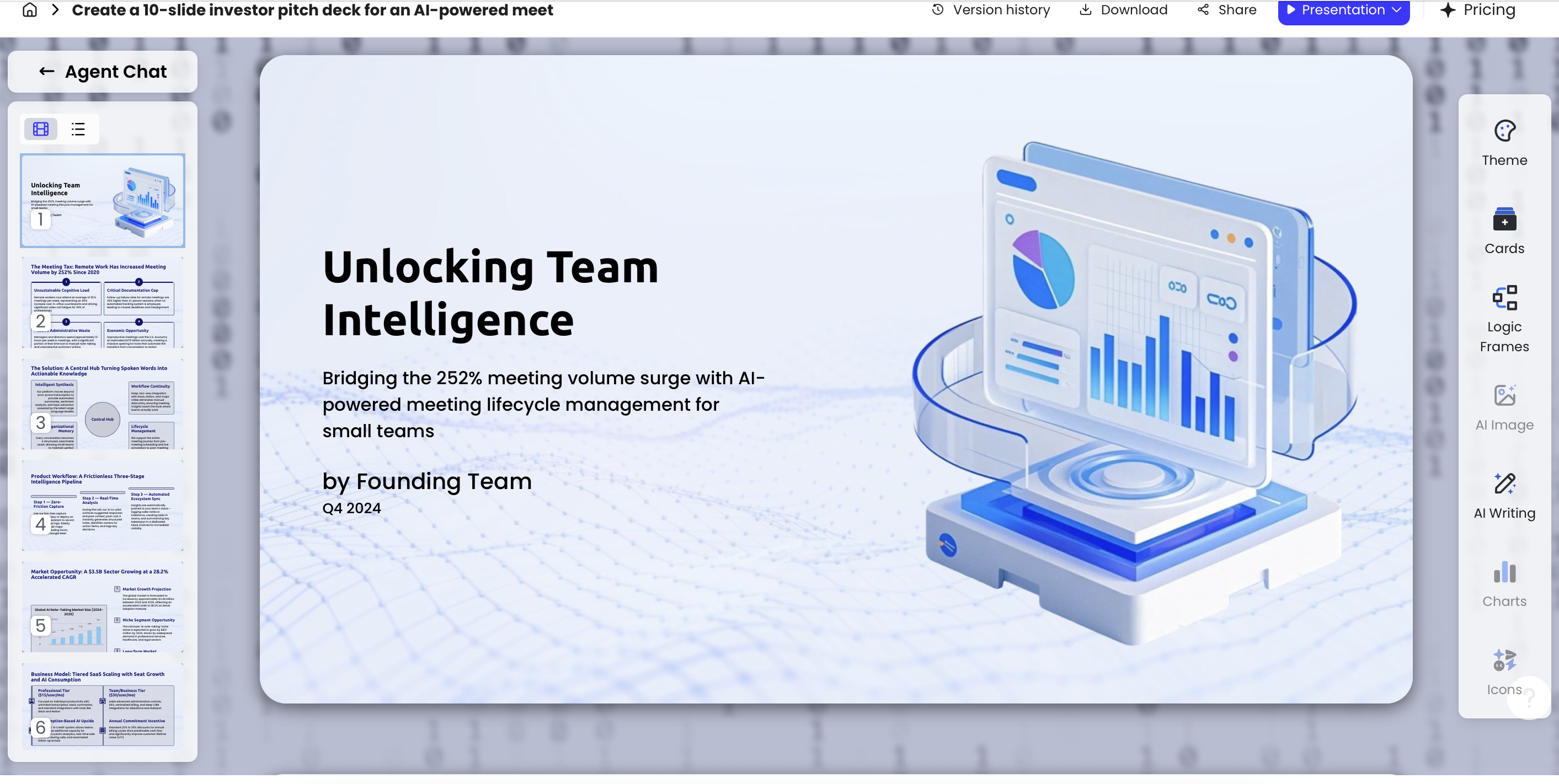
Many AI-generated decks improve fastest when you stop looking at isolated slides and review the sequence. PopAi’s Advanced Edit workspace can help refine theme, cards, logic frames, images, writing, charts, and icons; the transition audit should sit beside that design review as a separate pass focused on pacing and slide relationships.
Use this workflow before rehearsal:
- Scan the slide sorter: mark section boundaries, dense analysis slides, demos, comparisons, and appendix material.
- Set a default: use Cut for normal slide changes unless there is a reason not to.
- Add section cues: use short Fade for major chapters; use Push only if directional movement supports the story.
- Reserve Morph: use it only when two slides share objects and the movement explains a change.
- Check timings: keep most transitions under one second; dense reports should usually stay under 0.5 seconds.
- Run an accessibility pass: remove flashing, fast zooms, rotations, parallax, and motion that carries essential meaning alone.
- Export and rehearse: test the deck in the exact software, browser, projector, or video-call setup you will use.
- Document exceptions: if a team member edits later, note where special transitions are intentional.
For a quick scoring rubric, rate each transition from 0 to 2: 0 = decorative or distracting, remove it; 1 = acceptable but not necessary, simplify if the deck feels slow; 2 = clarifies the slide relationship, keep it. In a 20-slide business deck, most transitions should score 1 or 2 only because they are minimal—not because they are visually impressive.
- Purpose: Can you explain why this transition exists in one sentence?
- Consistency: Are similar slide relationships treated the same way?
- Duration: Is most motion under one second?
- Accessibility: Does the transition avoid flashing, rapid zooming, rotation, and motion that may trigger dizziness?
- Remote viewing: Will the transition still look clear over video-call compression or lag?
- Export: Does the transition survive in the final PPTX, PDF, MP4, or web link format?
- Brand fit: Does the motion feel appropriate for your organization’s tone?
In an editorial review of AI-assisted business and academic decks, the fastest cleanup pattern was consistent: set all slides to Cut, then add back only one section transition style and one explanatory transition style. Decks that began with five or more transition types usually felt less polished after export because small timing differences became more noticeable during live delivery.
Analysis-heavy decks need extra restraint. A financial chart, statistical model, or research table already demands working memory. Adding complex motion increases extraneous cognitive load—the mental effort spent on interpreting presentation mechanics rather than meaning. For dense slides, prefer Cut, short Fade, or a staged reveal of chart components. If you need more emphasis, animate the highlight, not the entire slide.
Slide Transition Best Practices for Common AI Presentation Scenarios
Different presentation contexts need different motion budgets.
The same transition that works in a product launch may undermine a thesis defense. Use the following patterns as starting points, then adapt based on audience, room size, screen format, and delivery channel.
Investor pitch deck: protect momentum and confidence
Use Cut for most slides to maintain pace. Use Fade at major sections such as problem, solution, market, traction, and ask. Use Morph only when it clarifies growth or narrowing focus.
- Slide 1 Title → Slide 2 Problem: Fade, 0.5 sec, to ease into the narrative.
- Slide 5 Market Size → Slide 6 Beachhead Segment: Morph, 0.8 sec, if the same market map is reused and the target segment is highlighted.
- Slide 9 Financials → Slide 10 Ask: Cut, so the ask feels direct rather than theatrical.
Classroom or training deck: mark learning structure
Use Fade between concepts and Wipe for progressive comparisons. Students benefit when motion marks the teaching rhythm: definition, example, practice, reflection. Avoid overly fast transitions because remote learners may experience lag or view the deck on small screens.
- Concept → Worked example: Fade, 0.5–0.7 sec.
- Incorrect method → Correct method: Wipe left-to-right, 0.5 sec, if the comparison is spatial.
- Practice question → Answer explanation: Cut or manual reveal; do not auto-advance before learners finish reading.
Sales demo or product walkthrough: match the user journey
Use Push to imply workflow progression and Morph to move from overview to detail. The transition should feel like the product path, not a decorative break between screenshots.
- Dashboard overview → Alert detail: Morph, 0.8 sec, if the alert card remains in the same position and enlarges.
- Step 1 Setup → Step 2 Review → Step 3 Approval: Push left-to-right, 0.5 sec, to reinforce sequence.
- Feature list → Pricing: Cut, because the story shifts from capability to decision.
Financial or board report: remove anything that competes with numbers
Use Cut or very short Fade. The motion should not compete with figures, footnotes, or variance explanations. If you reveal data, do it in a controlled sequence: headline first, chart second, key variance third, recommendation last.
- KPI summary → Revenue bridge: Cut, so the audience can immediately compare numbers.
- Revenue bridge → Variance explanation: Cut or 0.3-sec Fade.
- Main deck → Appendix: Fade, 0.4 sec, to signal the move from narrative to reference material.
Product launch or marketing story: reserve drama for the real turn
You can use more expressive transitions, but still assign meaning. Push may show movement from old world to new world. Morph may dramatize transformation. Reserve the strongest motion for the most important shift in the story.
- Old workflow → New workflow: Push or Wipe, 0.6 sec, if direction supports the before/after contrast.
- Product exterior → Key interface: Morph, 0.8–1.0 sec, if the zoom helps orientation.
- Launch message → Contact slide: Fade, 0.5 sec, to close cleanly.
A practical AI workflow is to generate the first deck from a prompt or uploaded source, review the outline, refine slide density in Advanced Edit, then create a transition map before export. In one internal-style test scenario, an HTML performance report became a multi-slide KPI deck with activation, support-load, and risk-register sections. The best transition plan was deliberately plain: Cut within each metric section, Fade between sections, and no Morph on charts because changing scales made the motion look more explanatory than it really was.
Export and Compatibility: Test AI Presentation Slide Transitions
Never assume motion will behave the same across web, PPTX, PDF, and video delivery.
This is one of the biggest gaps in AI presentation workflows. Some web-first tools provide attractive scrolling or interactive motion, but those effects may not remain intact after export to PowerPoint or import into Google Slides. PDF exports usually flatten motion completely. PPTX exports may preserve editable text while changing or removing certain transition and animation behaviors.
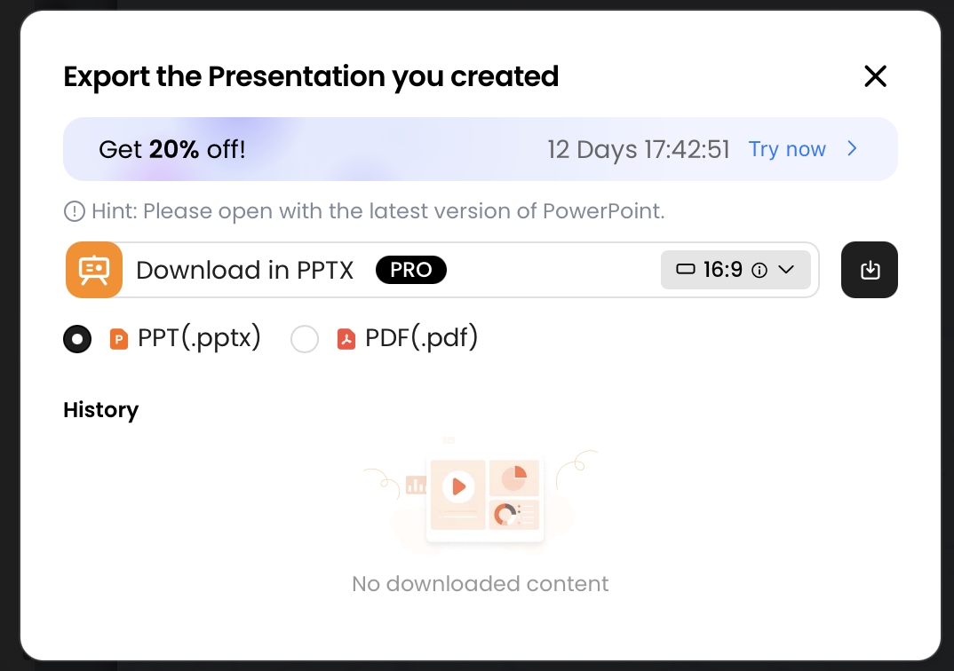
In a small compatibility check using a PopAi-generated deck exported to PPTX and PDF, the PPTX opened in Microsoft PowerPoint with editable text objects, while the PDF behaved as expected: static slides with no transition behavior. That result is useful for handoff, but it is not a guarantee that every transition, object animation, font, chart, or Morph-like effect will transfer perfectly across every operating system, browser, or presentation app. Treat export testing as part of production, not a final courtesy check.
| Delivery format | Transition implication | Risk level | Best practice |
|---|---|---|---|
| Live web presentation | May support richer web-native motion | Medium | Test browser, bandwidth, screen size, and presenter controls |
| PPTX in PowerPoint desktop | Common transitions may work; complex or web-native effects may need repair | Medium | Open locally, inspect transition pane, rehearse from start to finish |
| PPTX imported into Google Slides | Some PowerPoint-specific motion may change or simplify | High | Import early, check every section break, and replace risky effects with Fade or Cut |
| Keynote conversion | Object positions and timing may shift depending on fonts and effects | Medium to high | Use common transitions and test on the actual Mac used for delivery |
| Transitions are removed or flattened | Low for motion, high if meaning depends on motion | Design every slide to stand alone without animated context | |
| Video or screen recording | Motion is preserved as pixels, not editable effects | Medium | Check frame rate, compression, label readability, and narration timing |
Run a silent rehearsal on the exported file. Pass/fail criteria are straightforward: can you identify section changes without narration, do chart labels remain readable during motion, does any transition surprise you, does the deck still work if motion is removed, and does the pacing match the speaker’s likely sentence rhythm? If the answer is no, simplify before delivery.
Common Transition Mistakes to Avoid
Most transition problems come from adding motion before deciding what the slide boundary means.
AI-generated decks can make this tempting because the draft appears complete quickly. Use the fixes below as an emergency cleanup pass when a deck feels over-animated an hour before a meeting.
- Mistake: using motion as filler. Fix: strengthen the slide headline, evidence, or visual hierarchy instead of decorating weak content.
- Mistake: changing effects every slide. Fix: choose one default transition, usually Cut, and one section-break transition, usually short Fade.
- Mistake: applying transitions to all slides without review. Fix: audit slide pairs and remove motion from agenda, appendix, Q&A, and dense data slides unless it has a clear purpose.
- Mistake: overusing Morph. Fix: keep Morph only where objects persist across slides and the movement explains a real transformation.
- Mistake: animating dense text blocks. Fix: split the slide, shorten the copy, or reveal key points manually rather than moving paragraphs around.
- Mistake: ignoring accessibility. Fix: remove flashes, fast zooms, rotations, and parallax; provide a static PDF or recording version when motion is not essential.
- Mistake: skipping export rehearsal. Fix: test in the exact delivery environment: PowerPoint desktop, Google Slides, webinar software, projector, or conference-room display.
The most professional transition is often the one the audience barely notices because the argument feels easy to follow.
Use this final hierarchy when editing AI-generated decks: default to Cut, use Fade for section pacing, use Morph only when visual continuity explains meaning, use Push or Wipe only when direction matters, and test the exported file before anyone else sees it. That sequence keeps AI speed without letting automated motion undermine credibility.
FAQ: Slide Transitions in AI Presentations
Should every slide in an AI-generated presentation have a transition?
No. Most professional decks work best with a simple cut or fade as the default, reserving more visible transitions for section changes, comparisons, timelines, or data reveals.
Which slide transition is safest for business or academic presentations?
Fade is usually the safest choice because it feels smooth without calling attention to itself. Cut is even cleaner when the speaker wants speed, precision, or a serious tone.
Can AI automatically choose slide transitions for me?
AI can help recommend a transition plan based on audience, pace, and slide purpose, but the presenter should still review the motion for clarity, accessibility, and export compatibility.
Do transitions always export correctly to PPTX or PDF?
Not always. Some web-based animations and interactions may not survive export. Always test the final PPTX, PDF, or presentation link in the delivery environment before presenting.
Create your presentation with one click now
Turn prompts, documents, reports, and existing materials into a structured presentation draft, then refine the story and delivery flow before you present.
Create with PopAi