How to Turn Google Sheets Data into a Presentation with AI
Published on August 03, 2026

Google Sheets-to-presentation workflows overlap with CSV, but they should not be treated as the same page. Sheets adds formulas, named ranges, pivot tables, sharing permissions, comments, version history, and collaboration risk. The best workflow is to build a dedicated AI_Input tab that turns a collaborative spreadsheet into a stable slide source.
Build an AI_Input Tab Before Generating Slides
1. Working tabs
Keep raw imports, formulas, notes, and analyst work in separate tabs.
2. Pivot and formulas
Summarize metrics by period, segment, and owner.
3. AI_Input tab
Copy only approved tables, definitions, and narrative notes.
4. Slide review
Generate a deck, then check numbers against the sheet.
The AI_Input tab should include the final table, data definitions, chart intent, audience, and constraints. Do not feed the AI every scratch calculation if the deck only needs five approved metrics.
Formulas, Pivots, and Named Ranges That Make Better Slides
| Sheets feature | How to use it before AI | Slide benefit | Check before export |
|---|---|---|---|
| Formulas | Calculate ROAS, conversion rate, variance, completion rate, or moving average in the sheet. | AI receives already-approved metrics. | Formula ranges, blank handling, and rounding. |
| Pivot tables | Group by month, product, team, region, campaign, or status. | Creates a compact comparison table for the deck. | Filters, subtotal settings, and hidden categories. |
| Named ranges | Name key blocks such as AI_Input_KPIs or Leadership_Summary. | Makes it easier to document what source was used. | Range boundaries after new rows are added. |
| Version history | Record which version supplied the deck. | Supports auditability when numbers change later. | Timestamp and owner of final approved version. |
Sharing Permissions and Refresh Limits
Do not assume that a presentation generated from Google Sheets will refresh live every time the sheet changes. Unless your specific tool and integration explicitly support live syncing, treat the deck as a static draft created from a selected version of the sheet. If the source changes, regenerate or update the slides and rerun the validation checklist.
- Use view-only access for collaborators who should not change source numbers.
- Remove personal data and internal comments before creating the AI input tab.
- Freeze the approved version by copying values or exporting a controlled summary.
- Document the sheet URL, tab name, date, and owner in a source note or appendix.
- Do not share a deck with embedded private links if the audience should not access the original sheet.
Useful official references to link in production documentation: Google Sheets function documentation, pivot table help, and Google Drive sharing permissions. Check current Google Workspace settings before relying on a sharing behavior.
Google Sheets-Specific Slide Example
| Sheet input | AI slide title | Visual | Review question |
|---|---|---|---|
| Pivot: monthly revenue by channel | Email grew with lower spend, but Search still drives scale. | Line chart plus ranked bar. | Are all channels using the same attribution rule? |
| Formula: variance vs target | Three regions are below target and need owner follow-up. | Status table. | Does target differ by region? |
| Named range: executive notes | The deck recommends two actions, not a full strategy reset. | Decision slide. | Did the owner approve the recommendation language? |
If you manage sales, finance, marketing, operations, or product reporting, the hard part is rarely the spreadsheet itself. It is turning a busy Google Sheet into a deck with a clear executive summary, the right charts, defensible recommendations, and numbers you can stand behind in a meeting.
This guide walks through a practical Google Sheets to presentation with AI workflow: prepare a clean input tab, import it by Google Drive or XLSX/CSV export, prompt the AI for an 8–10 slide reporting deck, review the outline before slide generation, validate the numbers, and export to PPTX or PDF. Tools such as PopAi AI Presentation can speed up the first draft, but the final deck still needs human review for accuracy, context, and business judgment.
The workflow is best for analysts, sales ops teams, founders, consultants, marketers, and department leads who already keep reporting data in Google Sheets and need a presentation for leadership, clients, investors, or weekly operating reviews.
Why Google Sheets to Presentation with AI Matters
Google Sheets is where collaborative reporting happens; presentations are where decisions happen. AI helps bridge that gap by reading tabular data, grouping related metrics, proposing slide sections, drafting chart titles, and turning findings into a narrative that an audience can act on.
In a manual monthly reporting workflow, a manager might spend 2–4 hours cleaning a Sheet, creating charts, copying visuals into slides, writing bullets, formatting pages, and checking that every number still matches the source. In a controlled sample workflow using a 250-row sales pipeline Sheet with one clean summary tab, the AI-assisted draft took about 25 minutes to reach a reviewable outline and roughly another 40 minutes for validation and manual cleanup. The time saving came from outline creation and slide drafting—not from skipping data review.
A spreadsheet answers “what happened.” A presentation must answer “so what, why now, and what should we do next?”
That distinction is why the best AI prompt is not “make slides from this Sheet.” A stronger instruction is: “Turn this Sheet into a decision narrative for the weekly revenue meeting. Focus on pipeline risk, forecast coverage, and the actions leadership should approve.” When you specify the audience, meeting goal, timeframe, and business question, the AI has a better basis for deciding which metrics deserve a slide and which details belong in the appendix.
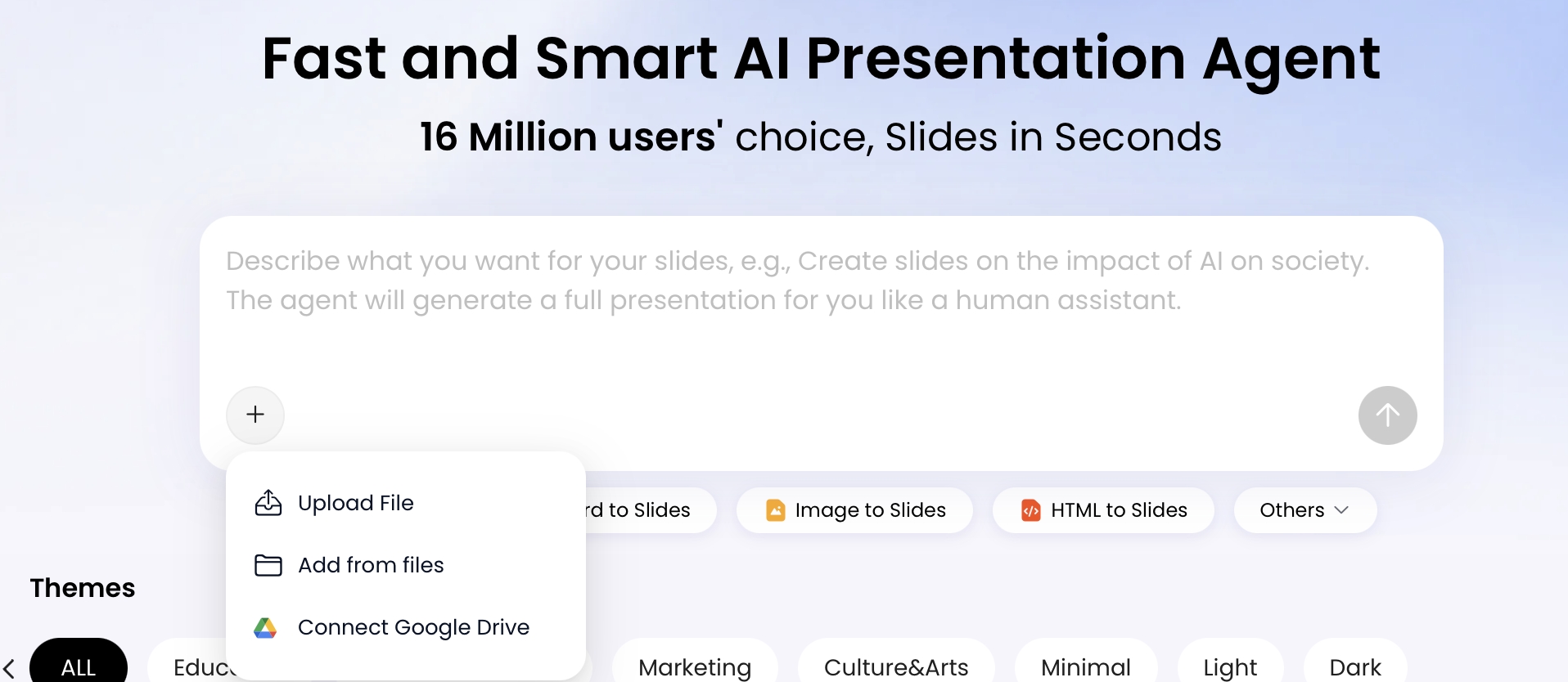
PopAi workflow note: In PopAi, the upload screen supports local files, existing files, and Google Drive entry points. If you use Google Drive, expect a permission step from Google; confirm that you are selecting the correct Sheet or exported file. For reporting decks, assume the imported data is a snapshot and re-import after major Sheet changes unless your workflow explicitly supports live synchronization.
Prepare Your Google Sheets Data for AI Slide Generation
For a broader view of available tools, compare the latest AI presentation makers before choosing the workflow that best fits your team.
A clean “AI input” tab is the fastest way to prevent wrong charts, weak summaries, and invented conclusions.
Create a dedicated AI_Input tab
- Use one table per tab: Avoid multiple unrelated tables on the same sheet. If needed, create separate tabs such as
AI_Input,Definitions, andSource_Log. - Keep one header row: Use descriptive names such as “Monthly Recurring Revenue,” “Region,” “Close Date,” “Lead Source,” and “Forecast Category,” not “misc” or “Column 8.”
- Freeze the header row: This is mainly for human review, but it also helps you catch column shifts before export.
- Remove merged cells: Merged cells look polished in Google Sheets but often break table interpretation after export.
- Remove hidden rows and columns: Decide whether hidden data should be included. If it should not be analyzed, remove it from the AI input tab rather than relying on filters.
- Label units: Add currency, percentage, count, hours, or days in the header: for example, “ARR_USD,” “Conversion_Rate_%,” or “Cycle_Time_Days.”
Prepare formulas, pivots, dates, and filters
- Formulas: If the AI tool misreads formulas, copy the analysis tab and use Paste special → Values only before export.
- Pivot tables: Use pivot tables for summarized decks, but label every row group and value field clearly. Do not rely on unlabeled pivot output.
- Date fields: Standardize dates as YYYY-MM-DD or Month YYYY. Mixed regional formats such as 03/04/2026 can be misread as March 4 or April 3.
- Filters: If the deck should reflect a filtered view, create a clean filtered tab. Do not assume the AI will honor the current Google Sheets filter state.
- Large datasets: For thousands of rows, provide both raw data and a summary tab. Ask the AI to use the summary for slides and the raw tab only for drill-downs.
Define business terms before analysis
AI tools can detect patterns, but they cannot reliably infer your company’s metric definitions. Add a Definitions tab with plain-English notes such as: “Pipeline = open opportunities only,” “Churn excludes downgrades,” “CAC includes paid media and agency fees,” and “Blank renewal risk means not yet assessed.” This prevents a model from applying a generic business definition that conflicts with your reporting rules.
In one sample sales Sheet, the AI correctly calculated month-over-month revenue movement but initially grouped “North America” and “NA” as separate regions. Normalizing region names before upload fixed the issue and reduced manual cleanup in the generated deck. Most AI presentation errors in spreadsheet workflows come from semantic ambiguity—unclear column names, inconsistent categories, text-formatted dates, or missing definitions—not from basic addition alone.
Sensitive data warning: Remove personal identifiers, confidential customer names, unreleased financials, notes, comments, and internal-only context unless your organization has approved the AI tool, storage policy, and sharing process. For client reporting, anonymize account names until the final human-edited version.
Convert Google Sheets to Presentation with AI: Step by Step
Use this workflow when you need a reviewable deck, not just a quick chart export.
1. Create the presentation-ready Sheet
- Open the Google Sheet and duplicate the reporting tab.
- Name the duplicate
AI_InputorPresentation_Input. - Remove unused columns, hidden rows, test data, and internal comments.
- Add a reporting period at the top or in a separate note, such as “Reporting period: Jan–Jun 2026.”
- Add a definitions tab for metrics, segments, and exclusions.
2. Choose the import method
- Google Drive import: Use this if the AI presentation tool supports Drive access. Check which file is selected and whether the tool reads the Sheet directly or imports a file snapshot.
- XLSX export: In Google Sheets, go to File → Download → Microsoft Excel (.xlsx). This is usually the most reliable option when the Sheet has multiple tabs, formulas, or pivot tables.
- CSV export: Use File → Download → Comma-separated values (.csv) for a single clean tab. CSV is simple and readable, but it will not preserve formulas, multiple tabs, formatting, or existing charts.
- Copied table: For small summaries, paste the table into the AI prompt. This works well for quick outline generation but is less reliable for complex reporting.
3. Prompt for an outline before slides
Ask the AI to create the slide structure first. Include audience, decision, reporting period, preferred slide count, metrics to prioritize, and validation rules. A useful instruction is: “Use only columns present in the file. Do not invent figures. Flag missing data or assumptions before making recommendations.”
4. Review the outline before generation
A good AI-generated outline for a Google Sheets reporting deck should include:
- an executive summary with the 2–3 decision-relevant findings;
- trend slides for the main KPI over time;
- segment or category comparison slides;
- an anomaly, risk, or exception slide;
- a recommendation or next-actions slide;
- an appendix or source-data note if the deck will be shared outside the immediate team.
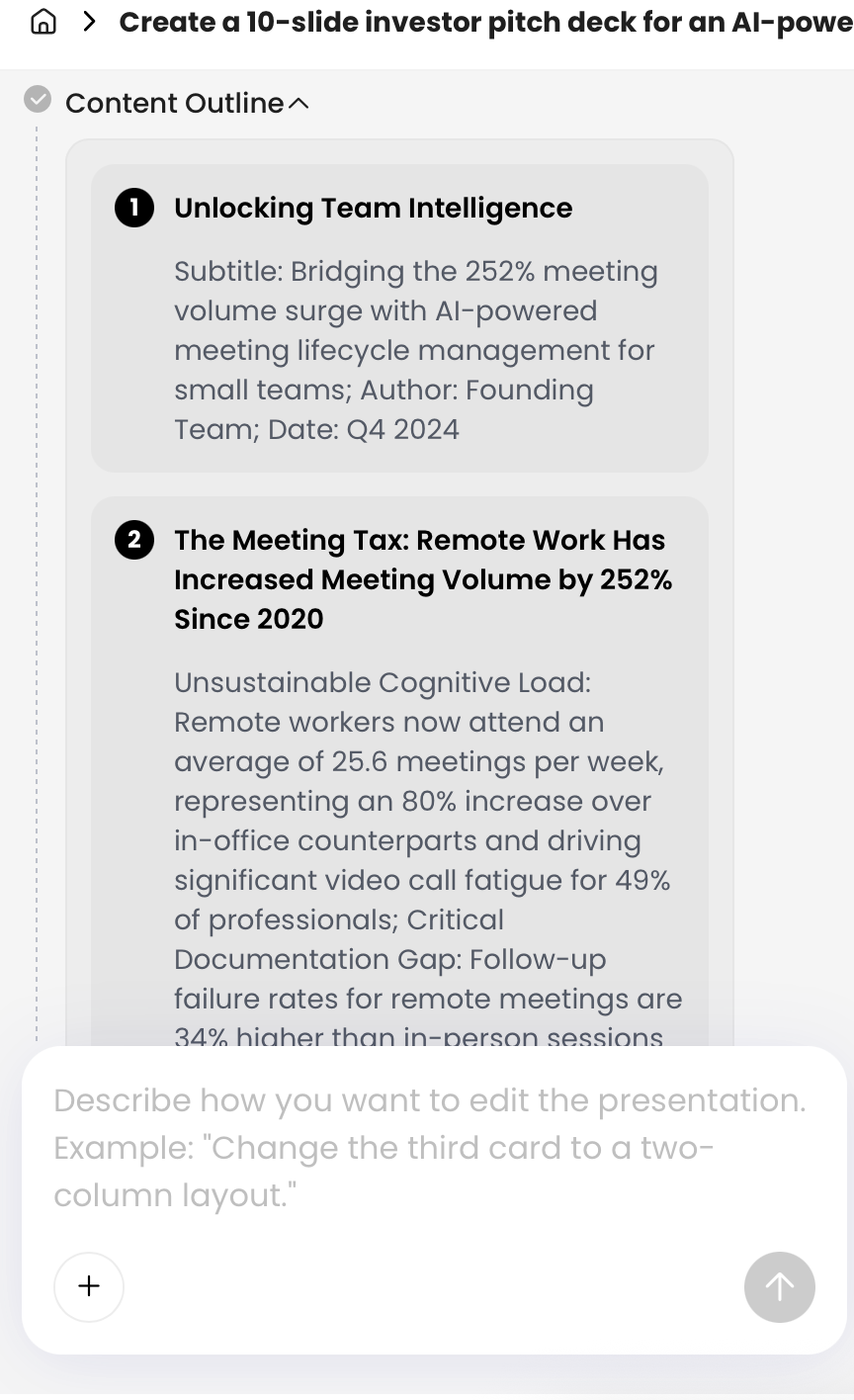
PopAi is useful at this stage because it exposes the presentation structure before final slide generation. In practice, inspect the outline for five things: the correct audience, the correct reporting period, the correct primary metric, a logical slide order, and a recommendation that follows from the data. After generation, use editing tools and natural-language revision requests for focused fixes such as “rewrite slide titles as executive takeaways,” “move detailed account rows to the appendix,” or “make the risk slide less speculative.”
Do not skip the outline review. It is easier to correct the story before slide generation than to repair ten polished slides built around the wrong conclusion.
5. Generate, edit, validate, and export
- Generate the deck only after the outline matches the meeting objective.
- Replace generic titles such as “Sales Overview” with takeaway titles such as “West region missed target because two enterprise renewals slipped.”
- Check each chart against the Sheet: metric, date range, filter, aggregation, and unit.
- Export to PPTX or PDF and open the file in the software you will actually use for delivery.
- If the Sheet changes materially, re-import or regenerate the affected slides; do not assume the deck updates automatically.
Prompt Templates for Google Sheets Data Presentations
Use prompts that constrain the AI’s assumptions and make validation easier.
Reusable prompt structure
- Role: “Act as a revenue operations analyst / finance business partner / growth strategist.”
- Audience: “Audience is the CFO, VP Sales, client leadership team, or board.”
- Decision: “The deck should support a budget, forecast, prioritization, or risk decision.”
- Data boundaries: “Use only columns present in the file. Do not invent numbers. Flag missing fields.”
- Output: “Create an outline first, then an 8-slide deck with takeaway titles, charts, speaker notes, and an appendix.”
- Validation: “List the source columns or ranges used for each major metric.”
Finance monthly review prompt
“Act as a finance business partner. Create a 10-slide executive finance review from the attached Google Sheets export. Audience: CFO and department heads. Reporting period: [Month/Quarter]. Focus on revenue, gross margin, operating expenses, budget variance, and cash risk. Start with a one-slide summary of the three most important movements. Use line charts for trends and variance visuals where appropriate. Use only fields present in the file, do not invent missing figures, and flag any assumptions. Include a final slide with recommended actions for next month and a source-data appendix.”
Sales pipeline prompt
“Turn this sales pipeline Sheet into an 8-slide presentation for a weekly leadership meeting. Audience: CRO, VP Sales, and regional managers. Identify pipeline by stage, win-rate trend, deal slippage, top risks, and next-step priorities by account owner. Highlight anomalies, stalled opportunities, and regions below target. Write slide titles as takeaways, not labels. If forecast category, close date, or deal value is missing, flag the limitation before making recommendations.”
Marketing performance prompt
“Build a 7-slide marketing performance deck from this spreadsheet. Audience: growth team and VP Marketing. Compare spend, leads, CAC, conversion rate, and revenue influence by channel. Identify which channels deserve more budget and which need investigation. Do not claim causation unless the data supports it. Include one slide explaining data limitations, attribution caveats, and any columns that appear inconsistent.”
Product usage prompt
“Analyze this product usage data and create a customer-facing presentation. Show adoption by segment, feature engagement, inactive cohorts, and renewal risk indicators. Use plain-English insights and avoid exposing internal fields. Recommend three customer success actions, but separate confirmed findings from hypotheses. Add speaker notes for the account team.”
Validation prompt after generation
“Review the generated deck against the source spreadsheet. For each slide, list the key metric, source tab or column, aggregation method, date range, and any assumptions. Flag any number that cannot be traced to the Sheet. Identify titles that overstate the evidence.”
If you are still comparing tools, review this guide to AI presentation makers with attention to Google Drive import, XLSX/CSV support, PPTX export, brand templates, collaboration, and whether data refresh is live or static.
Choose the Right AI Tool for Google Sheets to Presentation Workflows
Pick the tool based on how much analysis, design control, automation, and export fidelity you need.
Decision criteria that matter
- Input support: Direct Google Sheets link, Google Drive import, XLSX upload, CSV upload, copied table, or PDF/report import.
- Data handling: Whether it reads formulas, values, pivot tables, multiple tabs, hidden rows, and existing Google Sheets charts.
- Chart editability: Whether charts become editable objects, static images, or recreated visuals.
- Export quality: Whether PPTX, PDF, or Google Slides output preserves layout, fonts, text editability, and speaker notes.
- Collaboration: Link sharing, team editing, comments, version history, and permission controls.
- Security: Workspace permissions, data retention policy, enterprise controls, and whether confidential data can be uploaded under your company policy.
- Refresh strategy: Whether the deck is a one-time snapshot or can be updated when the Sheet changes.
| Need | What to prioritize | Best-fit workflow |
|---|---|---|
| Executive KPI review | Accurate summaries, editable visuals, clear recommendations | Clean summary Sheet → AI outline → slide generation → human validation |
| Client reporting | Brand consistency, repeatable structure, export and sharing | Template-guided AI deck → manual client-specific edits → PDF or PPTX delivery |
| Recurring weekly report | Automation, stable data schema, minimal design variation | Structured Sheet → scheduled workflow or manual re-import → templated slide updates |
| Investor or board deck | Narrative precision, risk framing, polished visual hierarchy | AI-generated first draft → expert rewrite → design refinement → final review |
| Exploratory analysis | Trend detection, anomaly discovery, flexible questioning | AI analysis conversation → selected insights → presentation generation |
How PopAi fits this workflow
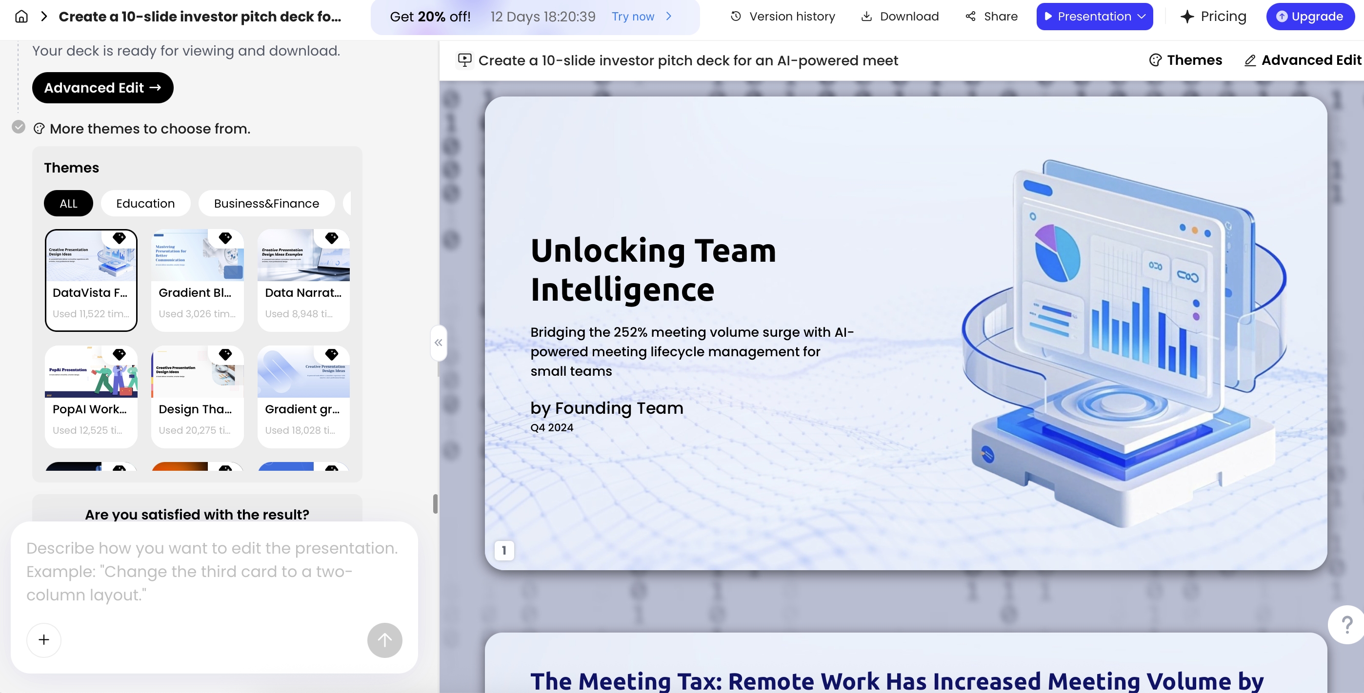
If your priority is creating a deliverable presentation from existing materials, PopAi’s workflow is useful for prompt or file input, outline planning, theme selection, slide generation, revision, and export. In a small export check using a 9-slide sample deck generated from an XLSX-style reporting file, the exported PPTX opened in Microsoft PowerPoint and sample text boxes remained editable. As with any AI deck workflow, verify chart editability, font substitution, speaker notes, animations, and layout fidelity before sending a client, board, or executive version.
Static imports are fine for one-off decks; recurring reports need a refresh strategy and a named owner for validation.
Build a Data Story, Not Just Charts
The deck should make the business decision easier, not simply prove that the spreadsheet has charts.
Rewrite slide titles as takeaways
Instead of a slide title like “Revenue by Month,” write “Revenue recovered in June, but enterprise growth remains below plan.” Instead of “Marketing Channels,” write “Paid search generated volume, but partner leads converted at 2.1x the rate.” AI can draft takeaway titles, but you should adjust them to match the confidence level of the data.
Match chart type to the question
| Business question | Use | Avoid |
|---|---|---|
| Is performance improving over time? | Line chart | Pie chart or unordered bar chart |
| Which region, owner, or channel is ahead? | Sorted bar chart | Stacked chart with too many colors |
| What explains the variance? | Waterfall or variance table | Generic trend chart without bridge logic |
| Which accounts need action? | Exception table with owner and next step | Decorative chart that hides account names |
| Is there a relationship between two metrics? | Scatter plot | Dual-axis chart without explanation |
Know when not to chart
Some spreadsheet data belongs in a table, not a chart. A list of the top 10 renewal risks, overdue implementation tasks, or slipped enterprise deals is more useful when it includes owner, amount, risk reason, and next action. If AI turns every table into a colorful visual, ask it to move exception lists into action tables.
When the AI suggests a chart, test it against the meeting question. If the goal is to approve budget, the deck needs a budget implication. If the goal is to reduce churn, the deck needs risk segments and actions. A beautiful chart without a decision path is still unfinished work.
Validate AI-Generated Google Sheets Presentations Before Sharing
AI can draft the deck, but your team owns the accuracy, permissions, and recommendation logic.
Number accuracy
- Trace every headline metric: For each slide, identify the exact source tab, column, filter, and date range.
- Check totals: Recalculate key figures in Google Sheets using functions such as
SUMIFS,COUNTIFS, or pivot totals. - Verify deltas: For month-over-month or quarter-over-quarter change, confirm the formula. For example:
(Current Period - Prior Period) / Prior Period. - Check denominators: Conversion rate, churn rate, win rate, and margin can be correct arithmetically but wrong if the denominator is not your company’s official definition.
Narrative accuracy
- Read every title: Make sure each takeaway is supported by the chart or table below it.
- Separate facts from recommendations: “Pipeline coverage is 2.4x” is a fact if validated; “hire two reps” is a recommendation that needs business context.
- Flag uncertainty: If attribution, forecast category, or customer segment data is incomplete, say so on the slide or in speaker notes.
- Remove unsupported causation: AI may write “campaign X caused revenue growth” when the Sheet only shows correlation.
Visual and export QA
- Audit chart choice: Replace misleading visuals, cluttered legends, truncated axes, or dual-axis charts that distort comparison.
- Check filters: Confirm date ranges, excluded segments, currency conversions, and whether hidden rows were included.
- Test export: Open the PPTX or PDF on the device and software you will use for delivery.
- Review permissions: If you share a link, check whether the audience can access it and whether sensitive material is exposed.
- Keep an audit trail: For board, investor, or client decks, save the source Sheet version, export date, AI prompt, and final deck version.
A practical rule of thumb is to let AI handle the first drafting pass and let humans own the final judgment. That final layer includes business context, political sensitivity, data caveats, brand polish, and the exact ask you want stakeholders to approve.
Example: Google Sheets to AI Presentation Outline
Here is a compact example showing how a cleaned Google Sheet can become a leadership-ready AI presentation outline.
Sample Sheet structure
| Month | Region | Revenue_USD | Target_USD | Pipeline_USD | Weighted_Pipeline_USD | Slipped_Deals | Top_Risk |
|---|---|---|---|---|---|---|---|
| 2026-04 | North America | 420000 | 400000 | 980000 | 510000 | 3 | Procurement delay |
| 2026-05 | North America | 455000 | 430000 | 910000 | 470000 | 5 | Legal review |
| 2026-06 | North America | 492000 | 460000 | 870000 | 430000 | 6 | Enterprise slippage |
| 2026-06 | EMEA | 318000 | 360000 | 740000 | 390000 | 4 | Low late-stage coverage |
Prompt used
“Act as a revenue operations analyst. Create an 8-slide sales leadership deck from the attached Google Sheets export. Audience: CRO and regional VPs. Reporting period: April–June 2026. Focus on revenue vs. target, pipeline coverage, weighted pipeline, slipped deals, and regional risk. Use only columns in the Sheet. Do not invent account-level details. Create an outline first with takeaway titles, recommended chart type, and source columns for each slide.”
AI-generated outline after review
- Executive summary: Revenue grew through June, but weighted pipeline declined, creating next-quarter coverage risk.
- Revenue vs. target: North America beat June target while EMEA remained below plan.
- Trend momentum: Monthly revenue increased from April to June, but the gain is not matched by pipeline growth.
- Pipeline health: Total pipeline is down while weighted pipeline is falling faster, suggesting quality risk.
- Deal slippage: Slipped deals increased in North America, with procurement and legal delays as recurring blockers.
- Regional risk: EMEA needs late-stage pipeline support before the next forecast call.
- Leadership actions: Prioritize executive outreach on delayed enterprise deals and review EMEA pipeline creation.
- Appendix: Source columns, metric definitions, reporting period, and assumptions.
During validation, the revenue trend and target comparison matched the sample Sheet, but the first draft overstated the EMEA recommendation by implying customer churn risk that was not present in the data. The fix was to rewrite the slide as “EMEA pipeline coverage is the immediate risk” rather than “EMEA accounts are at risk.” That is the kind of judgment call AI can surface but should not finalize without review.
This structure beats a chart dump because each slide has a job. The audience can understand what changed, why it matters, what is uncertain, and what decision is needed. That is the real value of converting Google Sheets to presentations with AI: faster first drafts, clearer communication, and fewer reporting bottlenecks—provided the data is prepared and the final deck is validated.
FAQ
How do I turn Google Sheets into slides using AI?
Prepare a clean Sheet, export or connect the source through your AI presentation tool, write a prompt that defines the audience and decision, review the outline, generate the deck, then verify every chart and number before sharing.
Can AI create charts from Google Sheets automatically?
Yes, many tools can infer chart types from spreadsheet fields, but you should still confirm whether a bar, line, scatter, waterfall, or table best supports the takeaway.
Do I need coding, SQL, or Python to make a Google Sheets presentation?
No-code AI tools are enough for most business reporting decks. Coding is useful only when you need advanced transformations, scheduled pipelines, or strict data governance.
How accurate are AI-generated spreadsheet insights?
Accuracy depends on data quality, column naming, prompt specificity, and tool capability. Treat AI insights as a first analytical draft and use a human validation checklist before presenting.
Can I keep my company branding when generating slides with AI?
Yes, if the tool supports templates, themes, or PPTX-based workflows. Use your approved colors, fonts, logo rules, and example slides to guide the generated presentation.
Create your presentation with one click now
Turn spreadsheets, reports, and prompts into structured, editable presentation drafts faster.
Create with PopAi