How to Create Infographic-Style Slides with AI
Published on August 10, 2026

If you create marketing updates, executive reports, training decks, sales QBRs, or classroom explainers, the hard part is rarely the design tool. It is turning a messy source — a 12-page report, seven KPIs, three caveats, and a few stakeholder opinions — into slides people can understand in one pass.
AI can help create infographic-style slides faster, but only if you treat it as a drafting partner rather than a designer, analyst, and fact-checker rolled into one. The useful workflow is: prepare the source, prompt for a specific visual structure, inspect the outline, verify every number, refine the hierarchy, then export in a format your team can actually edit.
This guide focuses on practical slide work: KPI cards, timelines, process diagrams, comparison grids, report summaries, prompts, export checks, and a realistic report-to-deck example. Tools such as PopAi AI Presentation can generate first drafts from prompts or files, but the same design judgment applies whether you finish in PowerPoint, Google Slides, Canva, Keynote, or a BI tool.
What infographic slides with AI should actually do
An infographic slide should make one point visually faster than a paragraph can.
About “TBD” in this guide: use TBD only as a deliberate review marker for missing or unverified data. Do not let AI estimate, invent, or round a value simply to make an infographic look complete.
Infographic-style slides combine data, icons, diagrams, short labels, charts, and structured layouts. They are not the same as long vertical infographics used on blogs or Pinterest. In a presentation, the audience sees one slide at a time, often on a video call or conference-room screen, so each slide needs one message, one dominant visual hierarchy, and enough white space for fast comprehension.
A weak AI prompt usually produces a decorative slide: six equal boxes, random icons, and a generic title such as “Q3 Marketing Results.” A stronger infographic slide starts with the conclusion: “Paid search drove 62% of Q3 pipeline growth.” The layout then supports that claim with one large KPI, two supporting metrics, and a small source note. That is the difference between visual decoration and visual argument.
Good infographic slides are not decorated bullet points. They are visual arguments: each icon, number, chart, and label must help the audience reach the intended conclusion faster.
Choose the slide type by the job it needs to do
| Slide type | Best used for | Avoid when | Prompt instruction that helps | Common AI failure |
|---|---|---|---|---|
| KPI snapshot | Executive summaries, QBRs, campaign updates, board-readout metrics. | You have more than 5–7 headline numbers or unclear denominators. | “Use one dominant KPI, three supporting cards, and include units, date range, and source.” | Turns every number into an equal card, hiding the main story. |
| Timeline | Roadmaps, launch plans, migration phases, implementation milestones. | There are more than 6 milestones or dates are uncertain. | “Show only five milestones; mark tentative dates with ‘planned’ instead of implying certainty.” | Invents smooth progressions or dependencies that do not exist. |
| Process diagram | Training, SOPs, onboarding flows, approval workflows, handoffs. | Ownership, inputs, or decision points are ambiguous. | “Use numbered steps, show owner per step, and include one decision diamond if needed.” | Creates a pretty flow with no accountability or handoff clarity. |
| Comparison matrix | Vendor choices, strategy options, before/after changes, feature trade-offs. | Criteria are not agreed on or the decision is political rather than analytical. | “Use criteria rows, keep scoring qualitative, and explain the recommendation in one sentence.” | Overweights superficial criteria or recommends an option without evidence. |
| Risk matrix | Project reviews, product launches, compliance updates, operational planning. | Impact and likelihood have not been defined. | “Plot risks by impact and likelihood; do not create scores not provided in the source.” | Turns risks into alarmist red labels without context or mitigation. |
| Report summary | Condensing long documents into leadership-ready decks. | The source contains unresolved contradictions or unverified claims. | “Create one insight headline per slide and list any missing data as TBD.” | Summarizes confidently while dropping caveats and source limits. |
Analysis: The format matters as much as the design. A PNG infographic is convenient for social posts but painful when a VP asks you to change one figure before a meeting. A PPTX export is better for stakeholder review if text, shapes, and cards remain editable. SVG can stay sharp but may import as grouped objects depending on the app. PDF is excellent for final distribution and weak for collaborative editing. Before you commit to a tool, test whether charts export as native charts, grouped shapes, or flat images.
Prepare source material before you create infographic slides with AI
For a broader view of available tools, compare the latest AI presentation makers before choosing the workflow that best fits your team.
The better your input brief, the less time you spend repairing the AI’s assumptions.
AI output improves dramatically when your source is structured. Before prompting, clean the material into a short brief: purpose, audience, data points, definitions, required sections, exclusions, and brand constraints. If you are using a file-to-slides workflow, label the important sections so the AI can tell what should become a chart, a table, a timeline, a comparison grid, or a callout.
For a quarterly business review, do not paste 12 pages of meeting notes and ask for “an infographic deck.” Give the model a compact plan: “Create five slides for senior leadership: executive summary, KPI snapshot, activation trend, top three risks, and next-quarter actions.” If your data is in CSV, convert the relevant rows into a small table inside a document, HTML report, markdown file, or summarized text block. Most slide generators are better at interpreting structured text than raw spreadsheet context.
Use a source brief the AI can follow
- Slide goal: What decision, lesson, or action should the audience take?
- Audience: Executives, clients, employees, students, investors, or social followers?
- Core facts: Metrics, dates, steps, source names, units, definitions, and comparisons.
- Visual format: KPI cards, flowchart, timeline, matrix, pyramid, carousel, or dashboard.
- Data caveats: Missing values, estimated numbers, small samples, partial periods, or conflicting sources.
- Exclusions: Confidential figures, unapproved claims, internal-only notes, or speculative forecasts.
- Brand rules: Colors, fonts, logo placement, icon style, tone, and accessibility requirements.
Example input brief for a 5-slide infographic deck
Scenario: A product marketing manager needs a seven-minute leadership update on a beta launch. The deck must secure approval for two extra support contractors and a two-week onboarding fix.
- Audience: VP Product, COO, Head of Sales, Customer Success lead.
- Purpose: Explain why activation improved but support load increased; request temporary support budget.
- Core facts: Beta users: 1,240. Activation rose from 34% in May to 47% in July. Trial-to-paid conversion increased from 11% to 15%. Support tickets increased 22% quarter over quarter. 68% of new tickets came from SMB accounts. Average first-response time moved from 4.2 hours to 6.1 hours.
- Required visuals: KPI snapshot, activation trend, support-load risk matrix, next-quarter action plan.
- Caveat: July activation excludes users who joined in the final five days of the month. Do not generalize results to all customer segments.
- Brand rules: Navy background, green accent for positive movement, amber for risks, no gradients, one outline icon style, minimum 24 pt body text.
- Instruction: Use only the numbers above. If a value is missing, mark it “TBD” instead of estimating.
Tip: Ask for the outline before generating the full deck. Check whether the AI selected the right audience, combined unrelated sections, omitted caveats, invented charts without data, or wrote topic headlines instead of insight headlines. A useful outline should have one clear claim per slide before you spend time polishing visuals.
Prompt templates for infographic slides with AI
A strong prompt names the slide type, audience, source data, design constraints, and what the AI must not do.
The biggest mistake is asking for “an engaging infographic” without saying what must be compared, counted, sequenced, or emphasized. Add constraints such as “do not invent missing values,” “preserve all numeric values exactly,” “keep text editable in PPTX where possible,” and “use one icon style only.” The prompts below are written for slide generation, but they also work as planning prompts before you design manually.
1. KPI slide prompt with data integrity rules
Template: Create a 16:9 infographic-style slide for [audience] summarizing these KPIs: [metric list with values, units, source, and time period]. Use one dominant KPI, three supporting KPI cards, one mini trend visual if the data supports it, and a short insight headline. Preserve all numbers exactly. Do not invent missing values. Keep labels under eight words. Use [brand colors] and a clean executive-report style.
Filled example: “Create a 16:9 leadership slide showing beta launch performance. Use activation 34% to 47% from May to July as the dominant KPI. Supporting cards: trial-to-paid conversion 11% to 15%, support tickets +22% QoQ, 68% of new tickets from SMB accounts. Mention that July excludes users from the final five days. Use navy, green, and amber. Do not claim activation improved for all users.”
Follow-up refinement: “Rewrite the headline as an insight, not a topic. Make the support-ticket increase visually visible but secondary to activation. Add a small caveat line at the bottom.”
2. Timeline prompt that avoids fake certainty
Template: Turn this project plan into a horizontal timeline slide with [number] milestones: [milestones and dates]. Show dependencies only where stated. Mark uncertain dates as “planned” or “target.” Add a one-sentence takeaway at the top and use simple line icons for each phase.
Common AI mistake: The model may smooth messy project information into a perfect roadmap. If approvals, dependencies, or dates are uncertain, make that uncertainty visible instead of letting the timeline imply commitment.
3. Process prompt with ownership and handoffs
Template: Convert these steps into a process infographic slide: [steps]. Use a left-to-right flow with numbered cards, one icon per step, and a final outcome box. Include the owner for each step if provided. Show handoffs using connectors. Make the language suitable for [audience level].
Follow-up refinement: “Reduce each step label to one verb phrase. Add one decision point after Step 3. Remove decorative icons that do not clarify the workflow.”
4. Comparison prompt for decision slides
Template: Create a comparison infographic slide showing [Option A] vs. [Option B] for [decision context]. Use a two-column matrix with criteria rows: [criteria]. Highlight the recommended option with a restrained accent color. Include one sentence explaining the rationale. Do not add criteria not listed in the source.
Better constraint: If the recommendation depends on a missing cost, ask the AI to show “Cost: TBD” rather than picking a winner based on incomplete information.
5. Social carousel prompt with re-chunking rules
Template: Reformat this 16:9 infographic slide into a [5–8]-page LinkedIn carousel. Use one idea per page, a large headline, one visual element, and no more than 25 words per page. Preserve all numeric values exactly. Add a source note on the final page. Do not oversimplify caveats.
Follow-up refinement: “Slide 1 should state the problem, Slide 2 the key number, Slide 3 the comparison, Slide 4 the risk, Slide 5 the recommendation. Make each page understandable without a presenter.”
Example workflow: turn a report into a 5-slide infographic deck
Here is a realistic workflow for a product marketing manager turning a quarterly HTML report into infographic-style slides.
Source used in the example: a structured HTML report of roughly 1,300 words containing an executive summary, a KPI table, three short paragraphs on beta-user behavior, a support-load note, and a risk register. The goal is a five-slide leadership summary that can be presented in under seven minutes and edited later in PowerPoint.
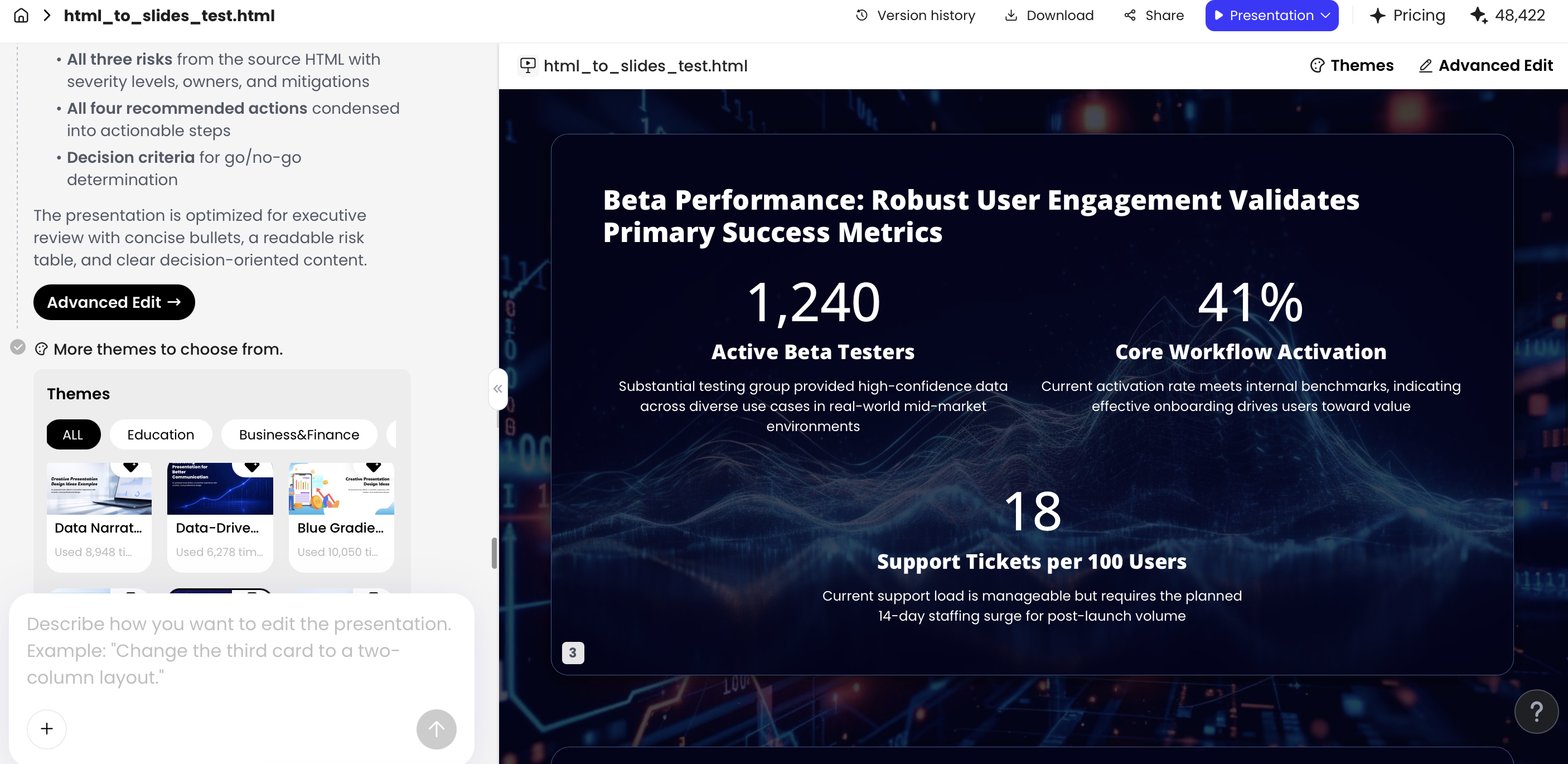
Source excerpt used for the deck
Original report excerpt: “Beta activation improved from 34% in May to 47% in July among users who completed onboarding. Trial-to-paid conversion increased from 11% to 15%. Support tickets rose 22% quarter over quarter, with SMB accounts contributing 68% of new tickets. July activation excludes accounts added during the final five days of the month. Main risks: support response time, unclear onboarding step three, and delayed customer-success handoff.”
Exact prompt used for the first draft
Prompt: “Create a 5-slide 16:9 infographic-style leadership deck from the HTML report. Audience: VP Product, COO, Head of Sales, Customer Success. Goal: explain beta performance and request support for onboarding fixes. Use only the report data. Do not invent missing values. Preserve all numbers and time periods exactly. Create one insight headline per slide. Suggested slides: executive takeaway, KPI snapshot, activation trend, support-load risk matrix, next-quarter actions. Use a clean executive style with navy, green, and amber. Keep body text under 28 words per slide where possible.”
Step-by-step deck plan
- Upload or paste the report: Remove duplicate headers, page numbers, disclaimers, and boilerplate before upload. Keep source tables intact and label them clearly.
- Request an outline first: Ask for five slides only: title insight, KPI snapshot, activation trend, risk register, and next actions. Reject outlines that use topic titles such as “Metrics” or “Risks” without a point of view.
- Generate the first draft: Let the AI transform text into cards, charts, and structured frames. Do not edit colors yet; first decide whether the story is correct.
- Audit the numbers: Check numerator, denominator, date range, sample, source, and caveat for every metric. Confirm whether a chart is supported by actual data points or only by start/end values.
- Refine in the editor: Reduce each text block to one sentence, make the main KPI visually dominant, add the July caveat, and replace generic icons with product, support, risk, or customer-specific symbols.
- Export and review: Export to PPTX for stakeholder edits, PDF for locked review, and image only for social or email previews. Open the PPTX in PowerPoint before sending.
Final 5-slide structure
- Slide 1 — “Activation improved, but support load is now the constraint”: one-line executive takeaway with three mini proof points.
- Slide 2 — “Activation rose 13 points during beta”: large KPI card, conversion card, ticket-volume warning, and caveat note.
- Slide 3 — “SMB accounts are driving most new support demand”: segmented support-load visual with 68% highlighted.
- Slide 4 — “Three risks could slow paid conversion”: impact/likelihood matrix with mitigation owner for each risk.
- Slide 5 — “Approve two fixes before scaling the beta”: action plan with owner, deadline, and requested decision.
Case-study observation: In the first AI draft, the slide order was mostly useful, and the tool correctly identified KPIs, risks, and next actions as separate slide jobs. The strongest generated element was the KPI summary because the source contained explicit numbers and time periods. The weakest element was the activation trend: with only May and July values, the draft visually implied a smooth month-by-month climb. The manual fix was to show a two-point comparison instead of a line chart and add the caveat about late-July accounts.
Editing effort: In this workflow, the draft saved the structural setup time — slide count, sectioning, rough visual blocks, and headline options — but still required a human pass for data interpretation. The most important manual changes were: changing topic headings into insight headlines, reducing text density, adding the July exclusion note, replacing vague “growth” icons, and checking that risk labels matched the report language.
Data quality note: AI-generated slide copy should be treated as a draft, not a source of truth. A typical overgeneralization looks like this: the source says “activation increased among beta users who completed onboarding,” while the AI rewrite says “activation increased across all users.” That changes the sample and can mislead leadership. Always verify metrics, time periods, denominators, labels, caveats, and whether a chart implies a trend the data does not support.
When a slide contains numbers, the design review and the fact-check are the same meeting. A beautiful chart with the wrong denominator is still a failed slide.
Editability, layout control, and design quality checks
After the AI generates a draft, test whether the slide can survive real-world review.
Stakeholders will ask for shorter wording, updated numbers, brand colors, source notes, and sometimes a last-minute change from “support load” to “customer success capacity.” Editable PPTX objects are usually more flexible than flat PNG or JPG exports. PDF is useful for final distribution, while image exports work well for social posts, blogs, and email graphics.
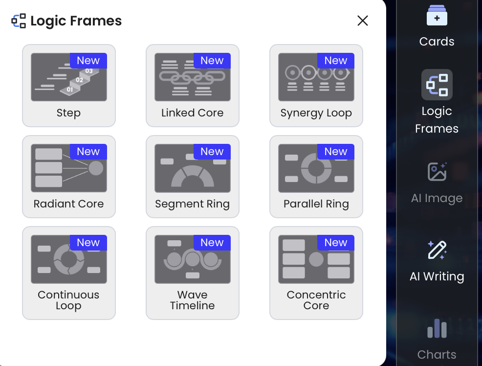
PopAi’s Advanced Edit environment includes options such as Theme, Cards, Logic Frames, AI Image, AI Writing, Charts, and Icons. For infographic slides, Logic Frames are useful when you need structure for processes, comparisons, funnels, and decision paths. Cards work better for KPI snapshots; Charts work better when the source has enough data points; Icons should clarify categories or steps, not decorate every label.
Export test to run: after exporting a PPTX, open it in Microsoft PowerPoint and try five edits: change a headline, update a number, move one KPI card, recolor an icon, and edit chart labels. In a practical test with an HTML-to-slide report draft, text objects were editable after export, while some visual elements behaved as grouped objects rather than native chart components. That is workable for narrative decks, but not ideal if you need live chart data editing. Always inspect the exported file before sending it to clients or executives.
PPTX, PDF, and image export checks
- Text editability: Can you click and rewrite the headline, labels, source note, and callouts?
- Chart editability: Is the chart a native chart, grouped shapes, or a flat image? If the number may change, this matters.
- Font substitution: Does PowerPoint replace the brand font? If so, choose a safe fallback or embed fonts where allowed.
- Icon behavior: Can icons be recolored consistently, or are they raster images?
- Layout shift: Do objects move when opened on another device or in another slide app?
- File size: Large image-heavy decks are harder to email and slower to open.
- PDF output: Check whether source notes, small labels, and contrast remain readable after export.
Design quality checklist
- One message per slide: The headline should state the insight, not just the topic. Use “Support tickets rose 22% as activation improved,” not “Support Metrics.”
- Readable type: Use roughly 28–36 pt for major slide text and avoid going below 18–20 pt for labels in meeting decks.
- Limited visual load: Keep most infographic slides to 5–7 major elements. If everything is equally important, the slide has no hierarchy.
- Limited palette: Use one primary accent color plus neutrals; reserve red or amber for genuine risk, not decoration.
- Consistent icons: Do not mix filled, outline, 3D, emoji, and photo-realistic icons on one slide.
- Direct labels: Put labels near the data when possible instead of forcing the audience to decode a legend.
- Accurate chart choice: Use bars for comparisons, slope charts for before/after movement, line charts for real time series, and avoid pie charts with more than 4–5 slices.
- Accessible contrast: Use high contrast for text and key data. Do not rely only on color; add labels, patterns, or symbols where categories matter.
- Source notes: Add a small but readable source line for external, financial, scientific, or client-facing data.
Adapt AI infographic slides for PPT, social, email, and print
A good meeting slide is not automatically a good social graphic or handout.
A 16:9 executive slide often depends on speaker context. When the slide leaves the meeting — LinkedIn carousel, email image, printed worksheet, internal wiki, or client PDF — you need to add context, simplify the message, and sometimes split one dense slide into several smaller frames.
Channel adaptation guide
| Channel | Typical format | Text density | Export choice | Main risk |
|---|---|---|---|---|
| Executive presentation | 16:9 slide deck | Headline + 3–5 support points | PPTX for edits, PDF for final | Too much detail for a live discussion. |
| LinkedIn carousel | 5–8 pages, square or portrait PDF | One idea per page, usually under 25 words | PDF or high-quality images | Oversimplifying caveats or losing source context. |
| Instagram Story | 1080×1920 vertical | Very short headline, large visual | PNG/JPG | Small text becoming unreadable on phones. |
| Email update | Single compact graphic plus link | One key number and one action | Compressed PNG/JPG | Large files, missing alt text, or no link to detail. |
| Print handout | Letter/A4 one-pager | More context, definitions, and source notes | Low contrast, tight margins, or color-only meaning. |
Reuse strategy
- Presentation: Keep editable objects and speaker-supported detail; remove long footnotes unless they are essential.
- LinkedIn document post: Break the story into a 5–8 page sequence; add context that a presenter would normally say aloud.
- Blog graphic: Export a clean image or PDF summary; add captions, source notes, and definitions below the graphic.
- Internal email: Use one compact KPI image plus a clear action line and a link to the full deck.
- Workshop handout: Convert process slides into printable checklists or worksheets with space for notes.
Practical prompt: “Take this 16:9 infographic slide and create three versions. Version 1: executive slide with the same insight headline and no more than three support points. Version 2: six-page LinkedIn carousel with one idea per page and all numbers preserved exactly. Version 3: one-page printable handout with definitions, source note, and action checklist. Do not remove caveats or change numeric values.”
Pitfalls to avoid when using AI for infographic slide design
The fastest way to weaken an infographic deck is to accept the first draft uncritically.
AI can overfill slides, invent transitions, select decorative icons, smooth uncertain timelines, or choose chart types that exaggerate differences. The result may look modern but fail as communication. Review the deck as a designer, analyst, and stakeholder: does it say the right thing, show the right evidence, and leave the audience with the right action?
Be especially careful with proprietary data and internal documents. Before uploading confidential material to any AI tool, check your organization’s privacy, security, retention, and approval rules. Also review copyright and commercial-use terms for generated images, icons, and templates. If the deck represents your company publicly, brand and legal review may matter as much as visual polish.
Common failures and how to fix them
| Pitfall | What it looks like | Why it matters | Fix prompt or review step |
|---|---|---|---|
| Invented numbers | The slide fills missing benchmarks or adds estimated growth rates. | False precision can mislead decisions. | “Use only provided values. Mark missing data as TBD.” |
| Misleading chart type | A 3D pie chart or truncated axis exaggerates a small difference. | The visual implies a stronger conclusion than the data supports. | Use bars, slope charts, or direct labels; check axis baselines. |
| Decorative icon overload | Every sentence gets an icon, but none clarify meaning. | The slide becomes noisy and less credible. | Use icons only for categories, steps, risks, or actions. |
| Lost caveats | “Beta users who completed onboarding” becomes “all users.” | The audience may apply findings to the wrong population. | Add source caveats as small labels or footnotes. |
| Image-only export | The deck looks fine but cannot be edited by stakeholders. | Every revision requires rebuilding or re-exporting. | Export to PPTX and test text, shapes, charts, and icons. |
| Accessibility gaps | Low contrast, tiny labels, color-only categories, poor reading order. | Important information becomes inaccessible or unreadable. | Increase type size, add labels, check contrast, and include alt text where possible. |
Use a different tool when needed
AI slide generators are useful for narrative summaries, first drafts, visual explanations, and editable decks. They are not the best home for governed metrics, live dashboards, advanced statistical analysis, or complex interactive charts. If you are still choosing your stack, compare AI presentation makers by export quality, editability, brand controls, collaboration, file input options, and data-handling requirements.
- Use an AI slide maker when you need a fast narrative deck from notes, reports, PDFs, or prompts.
- Use PowerPoint or Keynote when stakeholder editability, corporate templates, and final polish matter most.
- Use Canva when the output is mainly social, lightweight marketing graphics, or template-driven visuals.
- Use Figma when you need custom design systems, precise layout control, or collaboration with product/design teams.
- Use Tableau, Power BI, Looker, or spreadsheets when metrics must be governed, refreshed, filtered, or audited.
- Use Datawrapper or Flourish when the chart itself is the deliverable, especially for publishable or interactive data stories.
- Instead of letting AI invent missing numbers, instruct it to write “TBD” or “data not provided.”
- Instead of using 3D charts, use bar charts, slope charts, dot plots, or simple labeled comparisons.
- Instead of turning every fact into an icon, reserve icons for categories, steps, owners, or risk types.
- Instead of exporting only as an image, export a PPTX and test whether the slide remains editable.
- Instead of skipping accessibility, check contrast, font size, reading order, labels, and source-note readability before sharing.
FAQ: Creating infographic slides with AI
Can AI create professional-quality infographic slides?
Yes, AI can create a strong first draft with structure, icons, charts, and visual hierarchy. For professional use, verify data, apply brand rules, and refine spacing, contrast, and chart labels.
What should I include in an infographic slide prompt?
Include the audience, slide goal, infographic type, source data, number of sections, visual style, brand colors, and export needs. Ask for concise text and editable chart or text elements where possible.
Are AI-generated infographic slides editable in PowerPoint?
It depends on the tool and export format. PPTX generally preserves more editable elements than PNG or JPG. In current PopAi testing, exported PPTX files can open in Microsoft PowerPoint and text objects remain editable.
When should I use a data visualization tool instead?
Use a dedicated data tool for live dashboards, advanced filtering, complex statistical charts, or governed BI workflows. Use AI slide generation when you need a clear narrative deck or executive summary.
Create your presentation with one click now
Turn source documents, prompts, and key metrics into scannable infographic-style slides, then refine the structure, visuals, and export format for your audience.
Start creating with PopAi