Best Fonts for Professional Presentations in 2026
June 23, 2026
The safest professional presentation fonts in 2026 are clean, readable typefaces such as Aptos, Calibri, Arial, Helvetica, Inter, Source Sans 3, Roboto, Lato, Avenir, and Montserrat. For most business, sales, teaching, and data-heavy decks, a sans-serif font is the best starting point because it stays legible on projectors, video calls, and small screens. Serif fonts such as Georgia and Merriweather can work well for title slides, formal academic decks, editorial-style portfolios, or section dividers, but they require more care in body text.
If you want a simple rule: use one font family across the whole deck when speed and consistency matter. Use two font families only when there is a clear hierarchy reason, such as Montserrat for bold titles and Lato for readable body copy. Most unprofessional slides are not ruined by one bad font choice; they are ruined by mismatched sizes, weak contrast, cramped text, random capitalization, and inconsistent formatting.
Good presentation typography is not about having designer taste. It is a set of practical decisions: choose a font that fits the audience, set a clear hierarchy, keep chart labels readable, and review the deck on the device or screen where it will be shown. AI presentation tools such as PopAi can help generate a structured deck and apply cleaner slide layouts faster, but the final font choice should still be checked for brand fit, licensing, readability, and context.
When you are ready to turn the workflow into slides, PopAi AI Presentation can help transform rough notes, documents, or prompts into an editable deck structure.
Quick Answer: The Best Professional Presentation Fonts for 2026
Use these font recommendations as a practical starting point based on the kind of presentation you are building.
There is no single universal font that works for every presentation. A board update, a startup pitch, a classroom lecture, and a creative portfolio all ask for different levels of restraint, personality, and formality. The best choice is usually the font that supports the message without making the audience notice the typography first.
- Business and executive decks: Aptos, Calibri, Arial, Helvetica, Avenir, or Source Sans 3 often work well because they feel clean, neutral, and credible.
- Startup pitch decks: Inter, Montserrat, Avenir, Roboto, or Lato can create a sharper modern tone, especially when headings are slightly bolder and body text stays simple.
- Academic presentations: Source Sans 3, Aptos, Calibri, Georgia, or Merriweather can work depending on whether the setting is technical, formal, or lecture-based.
- Sales decks: Helvetica, Inter, Lato, Roboto, or Montserrat are strong choices because they pair well with product screenshots, benefit statements, and call-to-action slides.
- Creative portfolios: Avenir, Montserrat, Merriweather, Georgia, or a carefully chosen display font can add personality on covers and section dividers, while body text should remain highly readable.
- Data-heavy reports: Aptos, Arial, Helvetica, Source Sans 3, Roboto, and Inter are safer than decorative fonts because charts need clear labels, short annotations, and consistent numbers.
Sans-serif fonts are usually safer for slide readability because their letterforms stay clear at different sizes and viewing distances. That matters when someone is reading from the back of a room, watching a compressed video call, or scanning a PDF on a laptop. Serif fonts can still be excellent, but I usually reserve them for titles, formal emphasis, or editorial-style decks unless I have tested the body text carefully.
If you are under time pressure, pick one professional sans-serif family and use different weights for hierarchy: regular for body text, semibold for subheads, bold for titles or key numbers.
A practical example: if you are creating a quarterly review, use Aptos or Helvetica throughout the deck. Set slide titles in bold, body copy in regular, and key metrics in semibold or bold. You will get a consistent, professional look without spending time on complex font pairing.
How to Choose a Presentation Font That Looks Professional
A professional font is readable, consistent, appropriate for the audience, and supportive of the slide message.
Professional presentation typography is not the same as stylish typography. In slides, the font has a job: help the audience understand the message quickly. A font looks professional when it is easy to read, used consistently, appropriate for the tone of the meeting, and quiet enough that the content remains the focus.
- Check readability from a distance. If the font becomes fuzzy, narrow, or fragile when projected, it is not a good body-text choice.
- Match the tone and brand. A law firm update needs more restraint than a consumer app launch. A classroom lesson can be friendlier than an investor memo.
- Confirm character support. Make sure the font includes the symbols, accents, currency marks, mathematical notation, or multilingual characters your presentation needs.
- Check compatibility across devices. If other people will edit or present the deck, use widely available fonts, embed fonts when appropriate, or export to PDF.
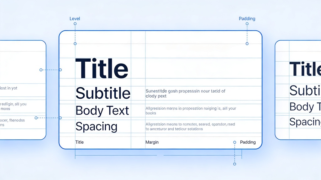
Typography also connects directly to core presentation design principles. Contrast creates hierarchy, so your title, main point, and supporting detail do not look equally important. Alignment makes the slide feel intentional. Repetition makes every slide feel like part of the same deck. Proximity groups related labels, bullets, captions, and visuals. White space gives the eye enough room to read.
- For a board update, use Aptos or Helvetica with restrained weights, limited color, and consistent title placement.
- For a startup pitch, use Inter or Montserrat to create a more modern tone, then keep body text short so the deck does not become visually heavy.
- For a research talk, use Source Sans 3 for clarity, or use Georgia sparingly for formal section titles while keeping dense explanations in a readable sans-serif.
- For a training deck, use Lato, Roboto, or Aptos because learners need to scan instructions quickly and revisit the deck later.
When I review a deck, I first ask whether the typography matches the room. A pitch deck shown in a conference room can use bigger, bolder titles and fewer words. A document-style presentation that will be emailed to stakeholders may need slightly more explanatory text, but it still needs clear hierarchy. The wrong font is often a symptom of a bigger problem: the slide does not know what it wants the reader to see first.
A professional font choice should make the audience trust the slide before they have consciously noticed the typeface.
AI can speed up this decision, but it should not make it blindly. In PopAi AI Presentation, you can turn a prompt, notes, or a source document into an editable deck structure with cleaner layouts. That gives you a better starting point than a blank slide. After the deck is generated, review the font direction against the audience: executive, classroom, sales, investor, or creative. The tool can reduce formatting work, while your judgment keeps the typography appropriate.
Font Pairing Rules for Slides: Titles, Body Text, Charts, and Captions
The safest font pairing strategy is to create hierarchy with weights, sizes, and color before adding a second typeface.
Most people do not need complex font pairings in presentations. In fact, many messy decks come from trying to combine too many typefaces. A clean one-family system is often more professional than a forced heading font plus body font combination.
- Safest method: use one font family across the deck, such as Inter, Aptos, Source Sans 3, Roboto, or Lato.
- Use regular weight for body copy, semibold for subheads, and bold for major titles or key numbers.
- Use size and spacing to show importance before using decorative fonts.
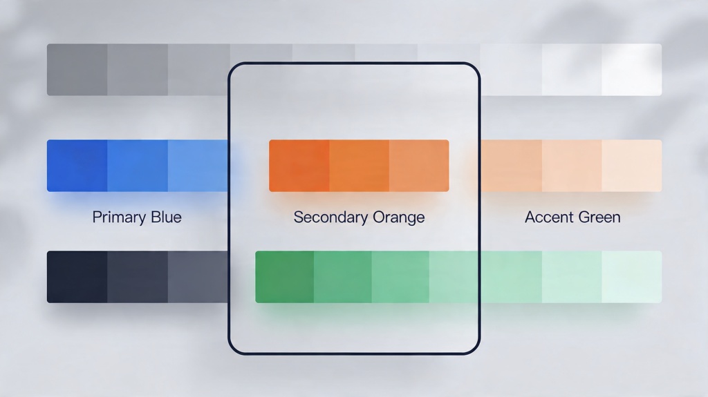
- Use one accent color for emphasis instead of changing fonts repeatedly.
- Keep chart labels, captions, and footnotes in the same family as body text for a unified look.
A one-family system is especially useful when multiple people are editing a deck. If the title, body, chart label, and caption styles are all based on one family, fewer things break when slides are copied, duplicated, or updated. It also makes the deck easier to clean up at the end.
Use two fonts only when they create a clear and useful contrast. One font can act as the display voice for titles, while another handles longer reading. The display font should not compete with the content, and the body font should not look unrelated.
- Montserrat headings with Lato body text: useful for startup, marketing, and product decks where you want modern energy with readable explanation.
- Georgia title accents with Source Sans 3 body text: useful for formal academic, editorial, or thought-leadership decks where you want a more established tone.
- Inter used alone across all elements: useful for SaaS, product, consulting, and data-heavy decks where clarity and consistency matter most.
- Avenir headings with Arial or Helvetica body text: useful when you want a polished corporate feel and need broad compatibility.
- Merriweather titles with Roboto body text: useful for storytelling or education decks if the serif is kept to titles and short emphasis.
Charts need even stricter typography than normal slides. Do not use ornate fonts for axis labels, legends, data labels, or chart annotations. Thin weights may look elegant on your laptop, but they can disappear on a projector or in a compressed screen share. If the chart is important, the labels must be plain and readable.
Use the same font family for chart labels as you use for body text, avoid ultra-thin weights, and make the key number visually stronger through size, weight, or color.
PopAi and similar AI presentation tools can help when you import long notes or documents and need the deck to feel unified. For example, you might upload a product brief and generate a sales presentation. After PopAi creates the initial slides, you can standardize the heading treatment, keep product benefits in semibold, and use one body style for descriptions. This avoids the common problem of each slide looking like it came from a different template.
Practical PPT Typography Sizes and Spacing Rules
Font size should be chosen by viewing context, slide density, and hierarchy rather than by one universal number.
There is no perfect font size for every presentation. A keynote on a large screen, a webinar viewed on laptops, and a PDF sent after a meeting all require slightly different decisions. The principle is simple: the audience should never have to work to read the most important text.
- Large titles: make them clearly dominant and easy to read at a glance, especially on cover slides, section dividers, and key message slides.
- Section headers: use enough size and weight to signal a transition, but do not let them overpower the actual slide point.
- Body text: keep it comfortably readable and avoid squeezing paragraphs into small boxes.
- Captions: smaller than body text is acceptable, but they still need to remain legible in the final viewing format.
- Chart labels: prioritize clarity over elegance; use consistent sizing and avoid tiny axis labels or crowded legends.
- Footnotes and source notes: keep them brief and readable enough for the expected format, especially if the deck will be reviewed as a PDF.
The bigger issue is usually not the exact point size. It is the number of text levels. Many unpolished decks have a title, subtitle, main bullet, sub-bullet, sub-sub-bullet, chart label, callout, and footnote all competing on the same slide. The audience cannot tell where to look first.
- Use a title that states the slide message, not just the topic.
- Use one main point or visual focus per slide whenever possible.
- Limit supporting detail to three to five short lines.
- Use captions only when they clarify an image, chart, or source.
- Split a dense slide into two slides before shrinking the text.
White space is not wasted space. It is what lets the audience separate the title from the body, the body from the chart, and the chart from the conclusion. If text blocks touch the slide edges, sit too close to images, or crowd each other vertically, the slide feels amateur even when the font itself is professional.
Here is a common before-and-after. Before: one slide contains a 90-word paragraph explaining that customer onboarding takes too long, support tickets spike during week one, and the team needs an automated checklist. The paragraph is set in small text under a vague title: Customer Onboarding. After: the title becomes Week-one onboarding creates avoidable support load. The body becomes three short bullets: Manual setup delays activation; new users repeat the same support questions; an automated checklist can reduce confusion. A bold takeaway at the bottom says: Fix the first week before adding more acquisition spend.
After drafting a deck, view each slide at about 50 percent zoom. If a title, body line, or chart label is hard to read, it will likely be hard for someone in your audience too.
A practical workflow is to draft the deck first, then review typography as a system. Generate or assemble the slides, scan every slide at reduced zoom, enlarge anything that feels fragile, and apply the same title and body styles across the whole file. This is where AI-generated decks can save time: once the structure is present, your review can focus on readability and hierarchy instead of building every slide from scratch.
Best Font Choices by Presentation Scenario
Choose fonts by audience, purpose, and viewing environment, not only by what looks attractive on a design inspiration page.
Different presentation scenarios place different demands on typography. A font that looks strong in a pitch deck may feel too loud in an executive update. A serif title that works beautifully in a portfolio may slow down reading in a data-heavy dashboard. The goal is to match the font to the job.
- Business and executive decks: use clean, restrained fonts such as Aptos, Helvetica, Arial, Avenir, or Source Sans 3. Credibility and fast scanning matter more than personality.
- Startup pitch decks: use modern sans-serif fonts such as Inter, Montserrat, Avenir, Roboto, or Lato. Bolder headings can add energy, but the story still needs breathing room.
- Sales and marketing decks: use Helvetica, Inter, Lato, Roboto, or Montserrat. Balance brand expression with readable product benefits, proof points, and CTA slides.
- Academic and classroom presentations: use Source Sans 3, Aptos, Calibri, Georgia, or Merriweather depending on tone. Lecture slides need to remain readable from a distance and in shared PDFs.
- Data-heavy reports: use Aptos, Arial, Helvetica, Inter, Roboto, or Source Sans 3. Keep chart labels consistent and use emphasis sparingly for key figures.
- Creative or portfolio decks: use expressive fonts on covers, chapter openers, or section dividers only. Keep case study text, project descriptions, and captions in a highly readable font.
For business and executive decks, I usually avoid typography that calls too much attention to itself. A strategy update should feel calm and controlled. Use one main font, align titles consistently, keep body text short, and use bold only for conclusions or key metrics. A restrained type system makes the content feel more reliable.
For startup pitch decks, typography can carry more energy. Montserrat or Inter headings can make a deck feel current, especially when paired with concise problem, solution, market, traction, and ask slides. The mistake is using large bold text everywhere. If every line shouts, no line has emphasis.
For sales decks, the font must work with screenshots, logos, product UI, testimonials, and pricing information. Keep CTAs clear. A slide that says Book a demo or Choose the launch package should not be buried in small decorative text. The closer the deck gets to a buying decision, the more readable the typography needs to become.
For academic decks, readability and notation support matter. If you use formulas, citations, non-English names, or specialized symbols, check character support early. Georgia or Merriweather can add formality to a title slide, but dense explanation, diagrams, and classroom instructions are usually safer in a clear sans-serif.
For data-heavy reports, typography should stay almost invisible. Use clear chart labels, consistent number formatting, and restrained emphasis. A bold key figure can be useful, but decorative typography around data usually reduces trust. The audience should be thinking about the trend, variance, risk, or recommendation, not the font.
If you need a startup pitch deck, start in PopAi with a prompt such as: Create a 10-slide seed pitch deck for a B2B onboarding automation product, with problem, solution, market, traction, business model, competition, go-to-market, team, financial snapshot, and ask. After the editable deck is generated, choose Inter or Montserrat, make headings consistent, and check that body text stays short enough for a live pitch.
PopAi can help in each scenario by creating the initial structure from a prompt, document, or rough notes. For example, a lecturer can upload course notes and generate a classroom deck, then choose Source Sans 3 for readable lesson slides. A sales team can summarize a product one-pager into a presentation, then apply a brand-approved sans-serif and review CTA slides for clarity. AI helps you move faster, but the scenario should still drive the typography.
Typography Mistakes That Make Presentations Look Unprofessional
Most font problems come from inconsistency, weak readability, or visual choices that distract from the message.
A presentation can use a good font and still look unprofessional. The issue is often execution: too many sizes, random bolding, inconsistent capitalization, or text placed too close to images and slide edges. Typography is a system, not a collection of separate choices.
- Using too many fonts in one deck, especially when each section appears to have a different visual style.
- Using too many weights, such as light, regular, medium, semibold, bold, and black without a clear hierarchy.
- Mixing capitalization styles, such as title case, sentence case, and all caps randomly across similar slides.
- Placing long paragraphs in small text instead of turning them into slide-ready points.
- Using low contrast text, such as light gray on white or muted blue on dark gray.
- Using decorative, handwritten, playful, or novelty fonts for long content, chart labels, or executive-facing slides.
- Relying only on color to show meaning, such as red and green labels without text or shape differences.
- Using ultra-thin fonts that look elegant on a high-resolution monitor but disappear on a projector.
All-caps body text is another common problem. All caps can work for short labels, navigation markers, section tags, or small category names. It becomes hard to read when used for full sentences or paragraphs because the word shapes become less distinctive. If you want emphasis, use weight, size, spacing, or a short highlighted phrase instead.
Some fonts are not wrong in every context, but they carry associations that may distract in professional settings. Playful, handwritten, overly decorative, or visibly outdated fonts can make a serious message feel less credible. If the audience is evaluating a budget, strategy, investment, research claim, or buying decision, typography should support trust.
If the font choice makes the audience talk about the font instead of the message, the typography is doing too much.
Accessibility should also guide your choices. Maintain strong contrast between text and background. Avoid ultra-thin weights for important information. Do not communicate status only through color; add labels, icons, patterns, or direct wording. Make sure chart labels are large enough to read and that key conclusions are written clearly, not hidden in visual styling.
Compatibility matters before sharing. If you use custom fonts, check licensing and whether the recipient can view or edit them. In PowerPoint, font embedding can help in some cases, but it depends on font permissions and file settings. Exporting to PDF is often the safest way to preserve appearance when the deck is final, although you should keep an editable source file for future changes.
AI-generated slides still need a human review pass. Check brand consistency, readability, font licensing, chart labels, and whether the final deck fits the actual meeting or classroom context.
A Simple AI-Assisted Workflow for Consistent Presentation Typography
Use AI to accelerate structure and cleanup, then apply human judgment to final font, hierarchy, and readability decisions.
The fastest way to improve presentation typography is to stop formatting slide by slide. Work from a simple type system. Decide the audience, choose one main font family, generate or organize the content, apply hierarchy, review readability, and only then export or share.
- Define the audience and tone. Decide whether the deck should feel executive, academic, energetic, persuasive, instructional, or creative.
- Choose one main font family. Start with a safe sans-serif such as Aptos, Inter, Source Sans 3, Roboto, Lato, Helvetica, or Arial unless the context calls for a serif accent.
- Generate or organize the slide content. Use PopAi AI Presentation to turn a prompt, document, notes, or rough idea into an editable deck structure.
- Apply hierarchy. Set title, main point, supporting detail, chart label, and caption styles consistently.
- Review readability. Scan the deck at reduced zoom, check projected or shared-screen conditions if possible, and enlarge anything that feels fragile.
- Standardize repeated slide types. Agenda slides, section dividers, chart slides, comparison slides, and summary slides should use the same typographic logic.
- Export or share carefully. Check fonts across devices, embed fonts when appropriate, or export to PDF to preserve final appearance.
PopAi helps most at the points where non-designers typically lose time: starting from a blank slide, turning dense notes into slide-ready content, creating a reasonable deck flow, and keeping repeated slide types visually consistent. Instead of manually building twenty slides and then discovering they all use different font sizes, you can begin with an organized structure and spend your design attention on the choices that matter.
For a quarterly business review, upload your meeting notes or paste a prompt that includes performance highlights, risks, initiatives, and next-quarter priorities. Generate the first deck in PopAi, then apply Aptos or Helvetica throughout: bold slide titles, regular body text, semibold key metrics, and consistent chart labels. Finish by exporting to PDF for executive review.
Another realistic workflow is a research presentation. Upload a paper summary or lecture outline, ask PopAi to create a slide deck with background, method, findings, limitations, and discussion questions, then choose Source Sans 3 for body content. If you want a more formal opening, use Georgia only on the title slide and section dividers. Review formulas, citations, and chart labels manually because these details often need specialist judgment.
AI can suggest cleaner layouts and reduce manual formatting, but final emphasis still belongs to the presenter. A tool cannot fully know which metric will be challenged by the CFO, which phrase matters most to a buyer, or which term students will find confusing. Use AI to get to a strong draft faster, then refine the typography around the real communication goal.
- Use one or two fonts only.
- Keep title style consistent across similar slides.
- Make body text readable in the final viewing context.
- Use clear chart labels and avoid thin weights for data.
- Maintain strong contrast between text and background.
- Leave enough white space around text blocks and visuals.
- Check capitalization, punctuation, and bolding for consistency.
- Confirm font licensing and compatibility before sharing.
- Export a PDF when you need the appearance to stay fixed.
- Open the deck on another device or screen before presenting if the stakes are high.
FAQ
What is the best font for a professional PowerPoint presentation?
There is no single best font for every deck, but clean sans-serif fonts such as Aptos, Helvetica, Inter, Arial, Source Sans 3, Roboto, and Lato are generally safe professional choices. Choose based on your brand, audience, viewing environment, and whether the deck will be edited across devices.
Are serif fonts good for presentations?
Serif fonts can work well for titles, formal decks, academic themes, and editorial-style presentations. For body text and projected slides, sans-serif fonts are usually easier to read, especially in rooms, webinars, and dense chart slides.
How many fonts should I use in one presentation?
Use one font family for most professional decks. Use two at most when there is a clear reason, such as a distinctive title font paired with a highly readable body font. More than two usually creates inconsistency unless the deck is handled by an experienced designer.
What font size should I use for presentation slides?
Use large, clear titles; readable body text; smaller but still legible captions; and chart labels that remain clear in the final viewing format. The exact size depends on screen size, room size, slide density, and whether the deck is presented live or read as a document.
Which fonts should I avoid in business presentations?
Avoid overly decorative, handwritten, novelty, ultra-thin, or inconsistent fonts, especially for body text, charts, and executive-facing slides. Also avoid low-contrast text, excessive all caps, and random font changes across slides.
Create your presentation with one click now
Turn your notes, documents, or ideas into a clean editable deck in PopAi, then refine the fonts and hierarchy for a polished professional presentation.
Try PopAi AI Presentation