How to Create Accessible Presentations with AI: Review Checklist
Use AI to create an accessible presentation draft faster, then finish it with a standards-based review: readable structure, correct reading order, meaningful alt text, sufficient contrast, captions, and an editable export that can be tested in PowerPoint or another presentation tool.
This workflow is written for AI-generated PowerPoint-style decks used in training, teaching, sales, executive updates, webinars, and internal reports. It draws on common requirements from WCAG 2.2, Microsoft’s PowerPoint accessibility guidance, and practical remediation checks such as Accessibility Checker, the Reading Order Pane, screen reader sampling, and contrast testing.
Why accessible presentations with AI still need human review
AI is useful for pattern-based accessibility work: summarizing long documents, splitting dense content into slide-sized sections, proposing plain-language wording, drafting image descriptions, and producing speaker notes. Many inaccessible decks start as overloaded reports pasted onto slides; AI can reduce that clutter before a designer ever opens PowerPoint.
But accessibility depends on meaning. An AI model may describe a chart as “a bar chart with five categories” while missing the audience takeaway. It may create a two-column layout that looks balanced but reads to a screen reader as title, right column, footer, left column. It may choose a stylish pale-gray-on-white theme that fails contrast when projected in a bright room.
AI can draft accessibility metadata, but only a human can confirm whether that metadata communicates the intended message.
Data point: The CDC reports that more than one in four U.S. adults has some type of disability. In presentation settings, that can include permanent disabilities, temporary limitations such as an eye injury or concussion, and situational barriers such as noisy rooms, low bandwidth, poor projection, or viewing on a small screen.
Field note: In a review of an AI-generated 12-slide training deck, the visible design looked polished, but the first accessibility pass found recurring issues: repeated slide titles, two decorative icons read aloud on every slide, one chart described by appearance instead of conclusion, and a video summary with no usable captions. None of those issues were obvious from the slide thumbnails.
What AI can help with—and what you still verify
- Outline generation: AI can convert a report into one main idea per slide; you verify that nothing legally, medically, financially, or technically important was dropped.
- Plain-language rewriting: AI can simplify dense paragraphs; you check that terms of art, compliance language, and numbers remain accurate.
- Alt text drafts: AI can propose descriptions for images, diagrams, screenshots, and charts; you confirm the description supports the slide’s purpose and does not invent data.
- Speaker notes: AI can create notes that explain visuals aloud; you rehearse them and remove unnecessary detail.
- Link text: AI can replace vague labels such as “click here”; you test whether the link text makes sense out of context.
- Color-only warnings: AI can flag red/green status cues; you add labels, icons, patterns, or direct annotations and then test contrast.
A workflow to create accessible presentations with AI
Do not ask an AI tool to “make slides” and hope accessibility happens later. Start with constraints, generate an outline first, export an editable file, and run a manual accessibility pass before sharing.
1. Define the audience and accessibility constraints
Before using PopAi AI Presentation or another slide generator, write down the context: live room or webinar, technical or general audience, expected distribution format, and whether the deck must meet WCAG, Section 508, EN 301 549, or internal learning standards. If the source contains confidential data, confirm your organization permits uploading it to an AI tool.
- For live training, prioritize large text, clear section breaks, captions, and speaker notes.
- For self-paced distribution, prioritize reading order, alt text, descriptive links, and accessible PDF/PPTX export.
- For compliance or government work, document the checks performed and keep the editable source file.
2. Generate the outline before the slides
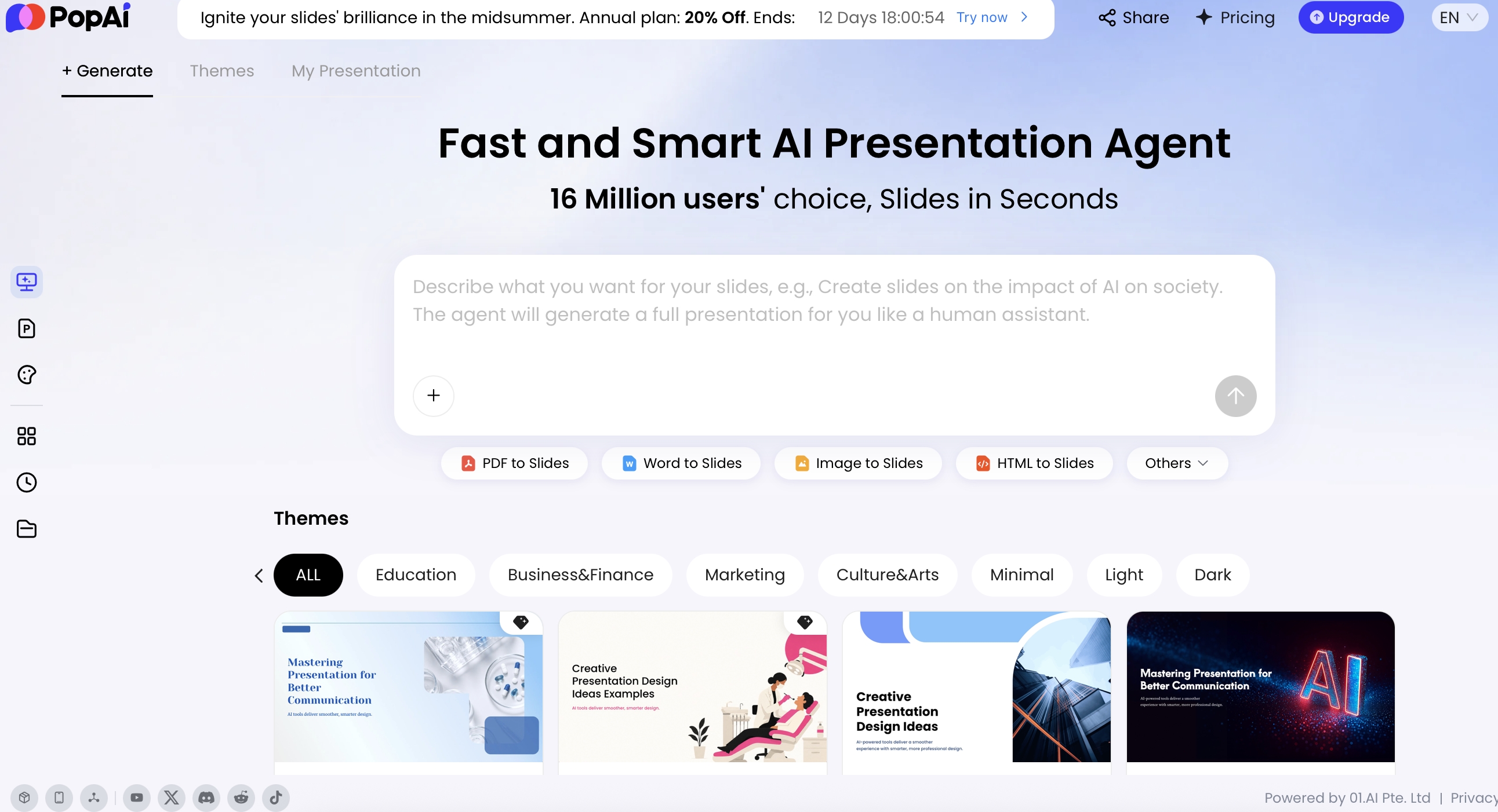
PopAi’s AI Presentation flow can start from a topic prompt or uploaded materials such as documents, prior decks, images, audio, video, or a YouTube URL. The useful accessibility moment is the planning stage: remove duplicate sections, split overloaded ideas, and decide which visuals actually need to exist before a full deck is generated.
3. Use an accessibility-aware prompt
Create a 10-slide training presentation for new managers. Use one unique takeaway title per slide, built-in slide layouts, plain language, body text suitable for projection, descriptive link text, high-contrast colors, no color-only meaning, and speaker notes that describe each meaningful chart or image. Draft alt text for meaningful visuals and identify decorative icons so they can be marked decorative during review.
If the first output is too dense, do not ask for “make it more accessible” as a vague correction. Use targeted follow-ups:
- “Split slides 4 and 5 so each slide has only one decision or action.”
- “Rewrite these titles as takeaway titles, not topic labels.”
- “Create chart alt text using only the values shown in the source table; do not infer causes.”
- “List possible accessibility risks in this outline before generating slides.”
- “Move details into speaker notes and keep the slide text to three short bullets.”
4. Export and inspect the editable deck
- Input the source: Start with your topic, outline, old PPTX, PDF, policy document, meeting notes, or HTML report. If the source is a scanned PDF or screenshot, assume structure and text may need rebuilding.
- Ask for structure first: Request a draft outline before slides so you can remove unnecessary sections and add missing context.
- Generate with constraints: Specify slide titles, font size, contrast, reading order, captions, descriptive links, plain language, and no color-only meaning.
- Edit for hierarchy: Keep one idea per slide, use real lists and tables, and move dense explanation into speaker notes or handouts.
- Export for testing: Download PPTX, run PowerPoint checks, inspect reading order and alt text, test representative slides with a screen reader, and verify captions and contrast.
If you are comparing workflows across several AI presentation makers, accessibility-friendly criteria matter more than template variety. Prioritize tools that preserve text as editable text, export PPTX, allow manual layout changes, keep charts editable where possible, support speaker notes, and let you finish the review in PowerPoint instead of delivering flattened slide images.
Slide structure, reading order, and layouts
Accessible slides need a logical file structure, not only a tidy visual layout. Screen readers follow object order and semantic cues; they do not automatically understand where your eye goes first.
Every slide should have a unique, descriptive title. If a visible title would disrupt the design, add a hidden title rather than leaving the slide untitled. Avoid repeated headings such as “Overview” or “Results.” Better titles state the takeaway: “Q3 churn increased in enterprise accounts” or “Three actions reduce onboarding delays.”
PowerPoint checks to run after export
- Open Review > Check Accessibility and fix errors before warnings.
- Use Review > Check Accessibility > Reading Order Pane in current PowerPoint versions to confirm the title reads first, followed by body content, charts, captions, and links.
- If the Reading Order Pane is unavailable in your version, use the Selection Pane as a secondary check, then test with keyboard navigation and a screen reader.
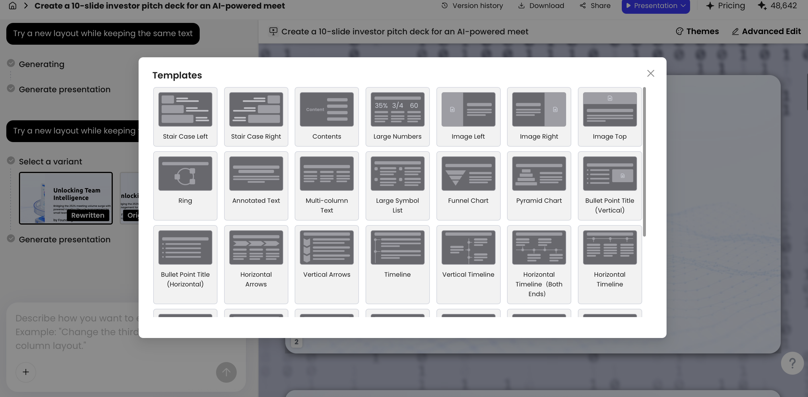
- Use built-in layouts and placeholders when possible. Manually placed text boxes on blank slides are more likely to create confusing order.
- Mark purely decorative objects as decorative where supported, or remove them from the meaningful reading sequence.
Reading order troubleshooting
- Title reads after body text: Move the title to the top of the Reading Order Pane and use a title placeholder, not a decorative text box.
- Two-column slide reads unpredictably: Reorder objects as left heading, left body, left visual, then right heading, right body, right visual—or split the content into two slides.
- Decorative icons are announced repeatedly: Mark them decorative or remove them from the order so the audience does not hear “circle,” “arrow,” or “shape” on every slide.
- Footer reads before the main point: Move it later in the order or remove it if it adds no value.
- Chart labels are skipped: Add the key takeaway to the slide title and include a concise chart description in alt text or speaker notes.
Test at least the title slide, one text-heavy slide, one chart slide, one image-based slide, one linked slide, and every slide with media. Listen for whether the slide title comes first, bullets are grouped correctly, decorative objects are skipped, links have useful names, and the sequence matches how you would explain the slide aloud.
Alt text, charts, links, and tables that people can actually use
Alt text should communicate the role of the visual in the slide, not produce a full visual inventory. AI is good at first drafts; your job is to supply context and reject descriptions that are vague, decorative, or unsupported by the data.
AI prompt for alt text
Bad and better alt text examples
- Decorative icon: Bad: “Blue checkmark icon.” Better: mark decorative if the adjacent text already says “Approved.”
- Informational photo: Bad: “People in a meeting.” Better: “Customer support team reviewing escalation tickets during onboarding workshop.”
- Software screenshot: Bad: “Screenshot of dashboard.” Better: “Analytics dashboard with the Renewal Risk filter open and Enterprise selected.” If the screenshot contains text users must read, include that text elsewhere in the slide or notes.
- Bar chart: Bad: “A bar chart with blue and orange bars.” Better: “Enterprise churn is highest in Q3 at 12%, while SMB churn remains below 5% across all quarters.”
- Logo: Use the organization name if it identifies a partner or sponsor; mark decorative if the same name appears in nearby text.
- QR code: Provide the destination URL or a descriptive short link in text; do not rely on the QR image alone.
For charts, put the main conclusion in the slide title, use direct labels where possible, avoid color-only distinctions, and provide speaker notes or a short data table for complex visuals. If the generated chart is flattened into an image, recreate it as an editable chart or add enough nearby text for someone who cannot inspect the image.
| Element | Accessible practice | Common AI mistake | Human verification step |
|---|---|---|---|
| Image | Describe purpose and context; mark decorative images as decorative. | Describes irrelevant visual details or repeats nearby text. | Ask: “Would this help someone understand why the image is here?” |
| Chart | State the insight, label key values, avoid color-only distinctions. | Invents a trend, cause, or exact value not visible in the source. | Compare the description against the source data before accepting it. |
| Link | Use descriptive anchor text, not bare URLs or “learn more.” | Creates generic labels such as “read more” or “view here.” | Read the link text alone and confirm it identifies the destination or action. |
| Table | Use tables only for data; include headers; avoid merged, split, nested, or empty cells. | Turns a complex spreadsheet screenshot into a slide image. | Simplify to key rows, convert to bullets, or provide the full accessible file separately. |
In PowerPoint, edit hyperlink display text so the visible link says “download the onboarding checklist” or “open the Q3 renewal risk dashboard,” not “click here.” Use real bullet and numbered list controls rather than typed hyphens. Avoid screenshots of spreadsheets when the data is important; PowerPoint tables can be difficult when they are large, merged, or nested, so summarize the slide and provide the full data in an accessible companion document when needed.
Readability, color contrast, and cognitive load
Readable slides reduce barriers for people with low vision, dyslexia, ADHD, cognitive fatigue, migraine sensitivity, temporary injury, language differences, or simply a bad projector.
Text size and typography
Use clean sans-serif fonts such as Arial, Calibri, Aptos, Verdana, Helvetica, Lexend, or another legible presentation font. For projected rooms, body text should generally be at least 18pt, and live presentation slides often work better at 24pt to 30pt or larger. Remote webinar slides can tolerate slightly smaller supporting text, but only if participants receive the deck or transcript afterward.
- Avoid all caps for long phrases, long italic passages, underlined non-links, WordArt, and dense paragraphs.
- Use generous line spacing and left-aligned text for multi-line content.
- Keep slide text short; move definitions, caveats, and citations into speaker notes or handouts.
Contrast and color
Data point: WCAG contrast guidance uses 4.5:1 for normal text and 3:1 for large text, with large text commonly treated as at least 18pt or 14pt bold. Non-text contrast for meaningful graphical objects and interface components is commonly evaluated at 3:1. Slides shown on projectors often need stronger contrast than the minimum.
Do not rely on AI’s statement that a design is “high contrast.” Test foreground/background combinations with tools such as the WebAIM Contrast Checker, Colour Contrast Analyser, Stark, or your organization’s approved checker. Pay special attention to gradients, text over photos, transparent overlays, pale chart lines, and disabled-looking gray labels.
Cognitive load and slide density
- Use one main idea per slide and make the title state the conclusion.
- Keep most content slides to three to five short bullets where possible.
- Explain necessary jargon once, then use it consistently.
- Use predictable section dividers, agenda returns, and progress cues in longer decks.
- Provide materials in advance for training, technical briefings, and multilingual audiences.
Motion, animation, and distractions
Avoid flashing content, fast animation, unnecessary transitions, and simultaneous narration plus dense on-screen text. If animation is instructional, make it slow, predictable, and described in speaker notes. For neurodivergent audiences, a stable layout and clear navigation often matter as much as word count.
Ask AI to lower cognitive load
- “Rewrite this slide in plain language without removing required technical terms.”
- “Reduce this slide to three bullets, each under twelve words, and move details into speaker notes.”
- “Identify any information conveyed by color only and suggest labels, icons, or patterns.”
- “Create speaker notes that explain the diagram step by step.”
- “Split this overloaded slide into two slides with takeaway titles.”
Passing an automated checker is the floor. The real test is whether someone can understand the presentation through sight, sound, captions, keyboard navigation, or assistive technology.
Multimedia, export, and final testing
Media accessibility has to be checked on the file people will actually use. Captions, transcripts, audio descriptions, and PDF tags can fail during export or playback even when the slide deck looks finished.
Captions and transcripts
Use AI to draft transcripts, then correct names, acronyms, product terms, numbers, and punctuation. Captions should match the spoken audio closely and appear at the right time. For embedded video, Microsoft documents caption workflows for PowerPoint using formats such as .vtt caption files, though support varies by PowerPoint version and platform. Always test playback on the presenting device.
If a video contains visual-only information that is not spoken—such as a product demo with silent cursor movement—add audio description, narration, or speaker notes that explain the important action. For webinars in Zoom, Teams, or Google Meet, enable live captions where appropriate, but do not treat automated captions as final for recordings with specialized terminology.
Using multimedia sources safely
AI tools can help turn audio, video, and YouTube sources into summaries or slide drafts, but accessibility work does not stop at transcription. Review privacy permissions before uploading media, correct the transcript, convert it into captions where needed, provide a transcript link or document, and test whether captions remain available after export or screen sharing.
Exporting PPTX and PDF
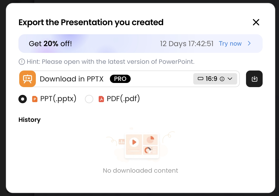
When your deck is ready, export in a format that preserves structure. PPTX is often the better working file for remediation because you can inspect slide titles, object order, alt text, captions, notes, tables, and links. If you distribute PDF, use PowerPoint’s export/save-to-PDF workflow rather than “Print to PDF,” which can flatten structure. Then check the PDF itself—tags, reading order, document title, language, links, and alt text—using Adobe Acrobat Pro or your organization’s PDF accessibility tool. Adobe’s guidance on creating and verifying PDF accessibility is a useful reference.
Final pre-share checklist
- Slide titles: Every slide has a unique visible or hidden title.
- Reading order: Title reads first; body content, visuals, captions, links, and footers follow a logical sequence.
- Alt text: Meaningful visuals have reviewed alt text; decorative objects are marked decorative or excluded.
- Contrast: Normal text meets at least 4.5:1; large text and meaningful graphics meet at least 3:1; projected slides are tested with extra caution.
- Charts: Key values are labeled, the takeaway appears in the title or notes, and no information depends on color alone.
- Links: Link text is descriptive and works when read out of context.
- Tables: Tables are simple, have clear headers, and are not pasted screenshots of critical data.
- Media: Captions are accurate and timed; transcripts are available; visual-only information is described.
- Testing: PowerPoint Accessibility Checker has been run, representative slides have been tested with Narrator, VoiceOver, NVDA, or JAWS, and the final file opens correctly on the presentation device.
- Documentation: For formal training or compliance decks, record who reviewed the deck, what tools were used, and which issues were fixed or deferred.
Example: turning an inaccessible slide into an accessible one
Here is a practical remediation pattern you can use on an AI-generated or legacy slide. The sample data below is fictional; in real decks, always verify chart statements against the source file rather than letting AI infer the story.
Before: The slide title is “Results.” The slide contains a dashboard screenshot, eight small bullets, red and green status labels, and a “click here” link. Accessibility problems include a vague title, unreadable small text, color-only meaning, screenshot-based data, missing useful alt text, and non-descriptive link text. The reading order also starts with the footer, then the dashboard, then the title.
AI repair prompt: “Using only the information provided, rewrite this slide as one takeaway title and three supporting bullets. Replace color-only labels with words. Draft alt text for the dashboard screenshot. Suggest speaker notes for a presenter who must explain the chart verbally. Do not invent causes or values.”
After human review: The title becomes “Enterprise renewals need earlier outreach.” The bullets become “Q3 churn is highest in enterprise accounts,” “Priority support response time is the main operational concern,” and “Account teams should start renewal calls 60 days earlier.” Red and green labels are replaced with “High risk” and “On track,” plus icon shapes that are not required to understand the status.
- Reviewed alt text: “Dashboard summary showing enterprise accounts as the highest renewal-risk segment in Q3, with support response time and renewal timing highlighted for follow-up.”
- Speaker note: “The important point is not the dashboard layout; it is that enterprise accounts show the highest renewal risk this quarter, so account teams should begin outreach earlier.”
- Link text: “Open the Q3 renewal risk dashboard.”
- Reading order: Title, three bullets, dashboard summary, link, footer.
- Follow-up decision: If the dashboard values are essential, recreate the key data as an editable chart or provide an accessible data table instead of relying on the screenshot.
This is where AI is commercially useful: it speeds up the move from a busy, screenshot-driven slide to a decision-ready slide. The human reviewer supplies the final judgment—accuracy, reading order, contrast, captions, and whether someone using assistive technology can understand the same business message.
Accessibility Review Matrix After AI Generation
AI can suggest accessibility improvements, but the final deck still needs human inspection in the presentation software and exported format.
| Area | What AI can help draft | What humans must verify |
|---|---|---|
| Reading order | A simpler slide structure and fewer text boxes. | Screen reader order, grouped objects, hidden content, and logical navigation. |
| Alt text | Draft descriptions for images, icons, diagrams, and charts. | Whether the description matches the actual message and skips decorative noise. |
| Color and contrast | Suggest higher-contrast palettes or simpler layouts. | Actual contrast ratios, projector visibility, and brand-compliant alternatives. |
| Charts and tables | Summarize chart takeaway and table purpose. | Labels, units, legends, source notes, and whether the chart can be understood without color alone. |
| Audio/video | Draft captions, transcript summaries, and narration notes. | Caption timing, speaker names, audio quality, and availability in the exported file. |
Run the accessibility checker after export, not only inside the AI editor. A deck can look accessible in the browser and still lose reading order or tags during conversion.
Official Accessibility Sources and AI Limits
Accessibility rules are precise. AI can draft accessible structure, but it cannot prove compliance by itself.
| Requirement area | Official source to check | Human review required |
|---|---|---|
| Text contrast | WCAG 2.2 SC 1.4.3 Contrast (Minimum) | Measure actual foreground/background contrast, including text over images. |
| Non-text contrast | WCAG 2.2 SC 1.4.11 Non-text Contrast | Check meaningful chart lines, icons, controls, and visual states. |
| Full WCAG criteria | WCAG 2.2 specification | Review structure, alternatives, keyboard behavior, captions, and export formats where relevant. |
| Population context | CDC disability statistics | Use statistics only as context, not as a substitute for accessibility testing. |
Editorial rule: write “AI can help create an accessibility-aware draft,” not “AI makes the deck accessible.” Final checks require human review and, where applicable, official accessibility testing tools.
FAQ: creating accessible presentations with AI
Can AI make a presentation fully accessible by itself?
No. AI can draft structure, simplify language, generate alt text, suggest captions, and reduce clutter, but a person still needs to verify reading order, context, contrast, captions, and whether the meaning is accurate.
What should I ask an AI presentation tool before it creates slides?
Ask for built-in layouts, unique slide titles, plain-language bullets, descriptive links, high-contrast color choices, speaker notes that describe visuals, and image alt text drafts for later human review.
How do I check reading order after exporting an AI-generated deck?
Open the PPTX in PowerPoint, use Accessibility Checker and the Reading Order Pane, then test keyboard navigation with Tab. For a deeper test, review several slides with Narrator, VoiceOver, or NVDA.
Should I share PPTX or PDF for accessibility?
PPTX is often safer for preserving slide structure and editable objects. If you export PDF, preserve accessibility tags and avoid Print to PDF because it can flatten structure and remove useful semantics.
Create a presentation draft faster
Turn your topic, document, report, or multimedia source into an editable AI-generated deck, then export it for accessibility review and final delivery.
Start with PopAi AI Presentation