Startup founders, corporate managers, and project leads all face the same daunting challenge: capturing the attention of a busy executive in less than sixty seconds. The executive summary slide is arguably the most critical component of any deck, yet it is frequently the most cluttered. When stakeholders are pressed for time, they won't dig through twenty slides to find your "big ask." They need the "so what" immediately.
In this guide, we will break down the three most effective layouts for an executive summary slide, ensuring your key messages land with precision and professional polish. Whether you are seeking budget approval or presenting quarterly results, these structures will help you eliminate fluff and focus on impact.
Understanding the Role of an Executive Summary Slide
Before diving into design, you must understand the psychology of the viewer. An executive summary slide is not a table of contents; it is a persuasive snapshot. Its primary goal is to provide enough context for the audience to understand the situation, the proposed solution, and the expected outcome without needing to read the rest of the deck.
- Efficiency: It respects the audience's time.
- Clarity: It removes ambiguity from your primary recommendation.
- Alignment: It ensures everyone in the room starts on the same page.
Think of this slide as the "elevator pitch" of your presentation. If the projector failed after this one slide, would your audience still know exactly what you need from them? If the answer is no, your layout needs a strategic overhaul.
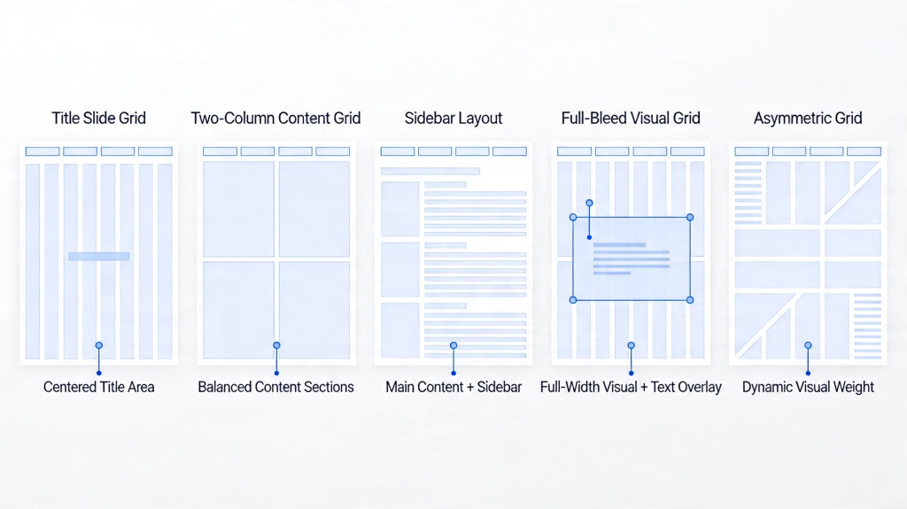
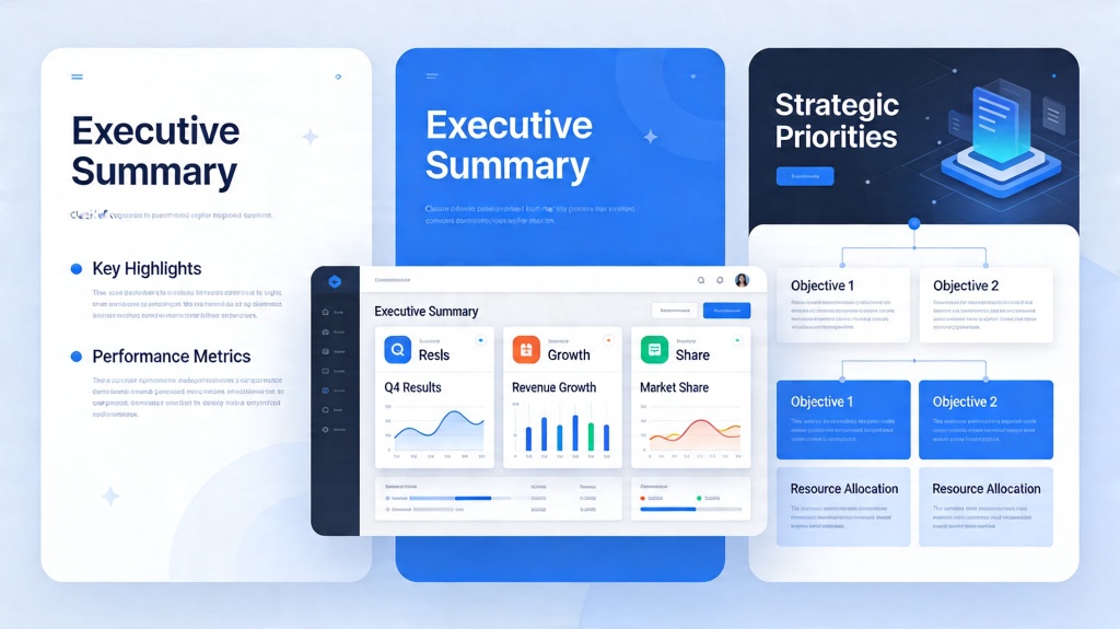
The "Problem-Solution-Impact" Layout (Standard)
This is the gold standard for pitch decks and project proposals. It follows a narrative arc that feels natural to the human brain: "Here is the pain we feel, here is how we fix it, and here is the value we create."
To execute this layout, divide your slide into three horizontal or vertical bands. The first section clearly states the current challenge or market gap. The middle section introduces your specific solution or project. The final section highlights the quantitative or qualitative impact (e.g., "30% cost reduction" or "Market leadership by Q4").
Pro Tip: Use high-contrast headings for each section. If you're struggling to balance these elements visually, try an AI presentation maker to instantly generate balanced three-part structures.
The "Three-Pillar" Visual Layout (Strategic)
When your presentation covers a complex strategy or a multi-faceted update, the "Three-Pillar" layout is your best friend. Instead of a narrative flow, this layout categorizes information into three distinct buckets of equal importance.
For example, a company's annual summary might use pillars for "Financial Performance," "Operational Excellence," and "Future Growth Initiatives." This layout works best when you use large, meaningful icons at the top of each pillar to provide a visual anchor for the text below.
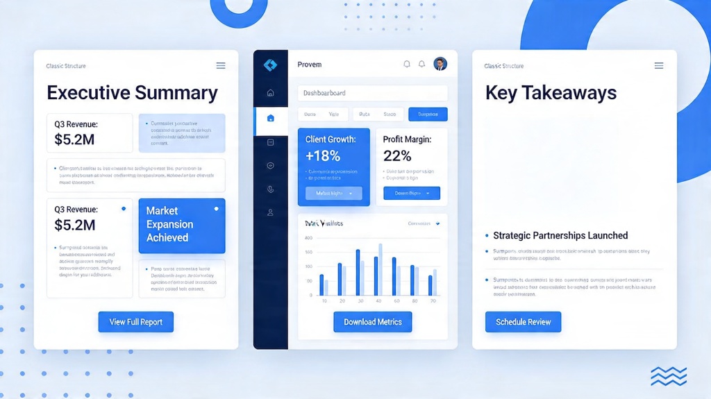
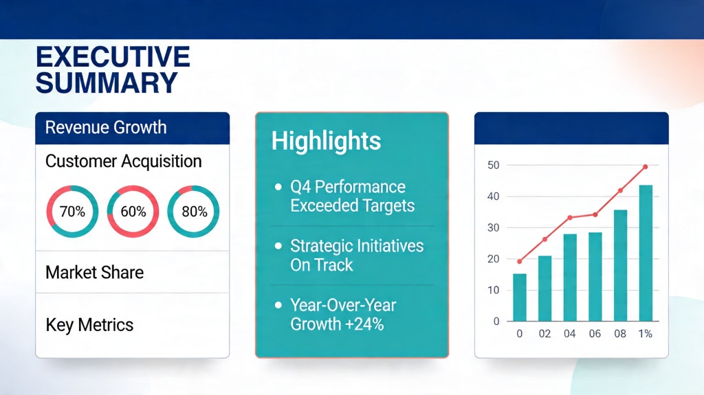
The "Dashboard" Layout (Data-Driven)
For quarterly business reviews (QBRs) or technical project updates, the Dashboard layout is essential. This style prioritizes KPIs (Key Performance Indicators) and metrics over long-form text. It typically features a grid of 4 to 6 "data cards."
Each card should contain one primary metric (e.g., $4.2M Revenue), a trend indicator (an upward green arrow), and a one-sentence insight explaining the number. This layout allows an executive to scan the slide and immediately identify which areas are "on track" and which require deeper discussion later in the meeting.
Essential Design Elements for Executive Clarity
A great layout can still fail if the design is messy. To keep your executive summary slide professional, adhere to these three principles:
- Visual Hierarchy: Your most important number or "Ask" should be the largest text on the page. Use bold weights for conclusions and lighter weights for supporting data.
- Whitespace: Do not be afraid of empty space. Whitespace directs the eye and prevents the "cognitive overload" that causes executives to stop paying attention.
- Consistent Iconography: If you use icons, ensure they are from the same style family (e.g., all line-art or all solid). Mixed icon styles look amateurish and distracting.
Common Pitfalls to Avoid in Your Summary
The biggest mistake is treating the executive summary slide as a "dumping ground" for everything you couldn't fit elsewhere. Avoid the "Wall of Text" at all costs. If your slide has more than 50-75 words, you are likely including too much detail.
Another pitfall is using vague language. Instead of saying "Revenue increased significantly," say "Revenue increased by 22% YoY." Executives value precision. Finally, ensure your summary slide matches the branding of the rest of the deck. A disconnected summary slide can make the entire proposal feel disjointed and rushed.
Frequently Asked Questions
How much text should be on an executive summary slide? +
Ideally, your slide should follow the 60/40 rule: 60% visual elements (charts, icons, layout spacing) and 40% text. Keep bullet points to no more than 3-5 per section and ensure the font size remains readable at 14pt or higher.
Can I use an AI tool to generate my executive summary layout? +
Yes, AI presentation makers are excellent for this. They can take your raw data and automatically apply proven structural layouts like the 'Three-Pillar' or 'Dashboard' styles, saving you hours of manual formatting.
Where should the executive summary slide be placed? +
In almost every professional context, the executive summary should be the first or second slide after the title page. It serves as a roadmap for the rest of the presentation.
Create your presentation with one click now
Don't waste hours struggling with layouts. Use PopAi to generate professional, executive-ready slides in seconds.
Get Started for Free