Best Marketing Report Presentation Templates for AI Tools
Published August 25, 2026

If you manage campaign performance, agency updates, SaaS growth reporting, or executive reviews, the reporting pain usually appears after the dashboards are built. GA4 says traffic is up, HubSpot says MQL quality is down, Google Ads shows lower CPL, and Salesforce shows pipeline moving in the wrong direction. A good marketing report template helps an AI tool turn those disconnected signals into a slide sequence your audience can actually use.
This guide focuses on reusable presentation templates rather than generic design themes. “Best” means fastest to generate, easiest to edit, safest for KPI reporting, and most useful for the decision in front of the team: budget approval, client renewal, campaign optimization, sales enablement, or executive prioritization.
AI presentation workflows can draft outlines, convert source documents into slides, rewrite dense findings for different audiences, and create chart-ready structures. But the template still matters. If the deck asks only “what changed?” the output will be descriptive. If it asks “what changed, why, what risk does it create, and what should we do next?” the output becomes much more useful.
Fast takeaway: Match the template to the decision. Need budget approval? Use a C-suite template. Need renewal confidence? Use a client report template. Need campaign learning? Use a campaign recap. Need team alignment? Use a monthly performance report. Need strategic reallocation? Use a quarterly business review.
What Makes Marketing Report Templates for AI Tools Work?
An AI-ready marketing report template is not just a designed PowerPoint file. It is a reporting framework with clear slide roles, expected data fields, prompt instructions, chart slots, source notes, and decision prompts. The strongest templates tell the AI what to summarize, what to compare, what not to infer, and where to flag missing data.
AI-ready template anatomy
Before you generate slides, check whether the template includes these practical elements:
- Audience label: CEO, client, marketing manager, sales leader, board observer, or campaign team.
- Reporting period: Month, quarter, launch window, test period, or renewal cycle.
- Required inputs: Spend, impressions, clicks, leads, MQLs, SQLs, opportunities, pipeline, CAC, ROAS, revenue, and notes on data freshness.
- Chart placeholders: Trend, channel comparison, funnel conversion, budget pacing, and variance analysis.
- Assumption boxes: Attribution model, excluded channels, delayed revenue, incomplete CRM data, or sample-size limitations.
- Decision slide: What to continue, stop, start, fund, cut, or test next.
In practice, the template should separate three layers of information:
- Facts: Spend, impressions, MQLs, SQLs, CAC, ROAS, conversion rate, pipeline, revenue, or retention movement.
- Interpretation: Why performance changed, which audience or channel drove the movement, and where uncertainty remains.
- Decision: What the team should do next, stop doing, or validate before committing more budget.
“The template is the visible prompt. If the slide structure asks vague questions, AI will produce vague reporting.”
A weak AI-ready slide title is “Channel Performance.” A stronger one is “Paid Search Produced More Leads, but SQL Rate Fell 11 Points.” The second version tells the AI and the presenter to explain the trade-off, not just decorate the metric.
In recurring reporting, the biggest time drain is often not analysis but rebuilding the same slides, cleaning screenshots, rewriting comments, and reconciling last-minute stakeholder edits. AI can compress the first-draft stage, but it should not be allowed to invent causal explanations, benchmarks, or recommendations without a human review of the source data.
For teams comparing workflow options, evaluate PopAi AI Presentation and similar tools by the criteria that matter for reporting: source-file handling, editable PPTX export, chart controls, brand-template support, prompt steering, and how clearly the tool preserves assumptions and data labels.
Best Marketing Report Presentation Templates for AI Use Cases
Before choosing a specific workflow, it can help to compare the broader category of AI presentation makers by generation quality, template control, export reliability, and chart editing depth.
The best marketing report presentation templates match the rhythm of the business. A monthly status report, QBR, campaign recap, client update, and C-suite deck may reuse the same data sources, but each should answer a different question.
1. Monthly Performance Snapshot Template
Best for: marketing managers, founders, revenue teams, and growth leads who need a repeatable monthly view. Recommended length: 8–10 slides. Required inputs: GA4 traffic and conversion data, ad spend, CRM lifecycle movement, budget pacing, and analyst notes.
- Core slide titles: “What Changed This Month,” “Goals vs. Actuals,” “Channel Efficiency,” “Funnel Movement,” “Budget Pacing,” “Risks,” and “Next-Month Priorities.”
- Most important KPI: usually pipeline contribution, qualified lead volume, CAC, or conversion quality—not impressions or clicks.
- Common mistake: letting AI summarize every metric instead of ranking the three changes that matter commercially.
- Prompt tip: ask for no more than three bullets per slide and require the AI to flag missing data.
Example output headline: “MQLs Rose 18%, but SQL Conversion Fell Because Paid Social Added Lower-Fit Leads.” That headline is more useful than “Lead Generation Improved” because it shows both the gain and the risk.
2. Quarterly Growth Review Template
Best for: leadership meetings, department reviews, board-adjacent updates, and annual planning checkpoints. Recommended length: 10–14 slides. Required inputs: quarter-over-quarter and year-over-year performance, budget allocation, pipeline by segment, strategic initiative status, and forecast assumptions.
- Core slide titles: “Quarter Narrative,” “Target Attainment,” “Pipeline and Revenue Influence,” “Budget Efficiency,” “Segment Performance,” “Strategic Bets,” and “Continue / Stop / Start.”
- Best chart types: trend lines for multi-quarter movement, waterfall charts for budget or revenue variance, and segment tables where attribution is uncertain.
- Not ideal for: daily campaign troubleshooting or channel-by-channel tactical reviews.
- Common mistake: treating a QBR like three monthly reports stitched together.
A useful QBR recommendation sounds like: “Reallocate 12% of paid social budget to search retargeting and partner webinars because opportunity creation held steady while paid social SQL rate declined for two consecutive months.”
3. Campaign Learning Recap Template
Best for: product launches, webinar programs, paid acquisition tests, seasonal ecommerce pushes, event campaigns, and email nurture experiments. Recommended length: 7–9 slides. Required inputs: campaign hypothesis, audience, creative, spend, channel performance, conversion path, sales feedback, and post-campaign recommendation.
- Product launch: track reach, demo requests, trial starts, sales-qualified interest, and product-message resonance.
- Webinar: track registrations, attendance rate, meeting bookings, influenced pipeline, and follow-up performance.
- Paid media test: track spend, CTR, CVR, CPL, CAC proxy, SQL rate, and sample size.
- Email nurture: track open/click quality carefully, but prioritize progression to meeting, opportunity, renewal, or expansion.
The “repeat-or-retire” slide should separate evidence from opinion: what worked, what failed, what was inconclusive, and what should be tested next with a larger sample.
4. Client Confidence Report Template
Best for: agencies, consultants, fractional CMOs, and customer success teams. Recommended length: 8–12 slides. Required inputs: goals, contracted deliverables, work completed, performance, budget pacing, blockers, decisions needed, and next-period plan.
- Separate results from work completed: clients need to see both outcomes and delivery progress.
- Show blockers neutrally: “Landing page approval delayed test launch by 6 business days” is clearer than “Client delays affected performance.”
- Include renewal signals: wins, unresolved risks, scope gaps, and upcoming decision points.
- Common mistake: hiding underperformance until the final slide. Put the issue early, then show the recovery plan.
For client-facing language, avoid defensive phrasing. Replace “Results were poor due to limited budget” with “Budget constrained statistical confidence; the next recommendation is to consolidate spend into the two audiences with the lowest qualified CPL.”
5. Executive Decision Brief Template
Best for: CEOs, CFOs, COOs, boards, and senior revenue leaders. Recommended length: 5–7 slides. Required inputs: revenue impact, pipeline movement, CAC or acquisition efficiency, forecast risk, budget trade-offs, and specific decision requests.
- Use business language: replace “CTR increased” with “paid acquisition efficiency improved while pipeline quality held steady.”
- Include one decision slide: budget change, headcount request, channel cut, timeline risk, or strategic trade-off.
- CEO view: growth, risk, customer signal, competitive position.
- CFO view: CAC, payback, pipeline confidence, budget efficiency, forecast impact.
- Board view: trend, strategy, market learning, capital allocation.
Slide-by-Slide Structures You Can Reuse
Templates become useful when each slide has a defined job. The table below gives a practical selection matrix for AI-generated marketing report decks.
| Template | Recommended length | Required inputs | Decision supported | Common risk |
|---|---|---|---|---|
| Monthly marketing report | 8–10 slides | GA4, ad spend, CRM lifecycle stages, budget notes | What should change next month? | Overweighting vanity metrics |
| Quarterly business review | 10–14 slides | QoQ/YoY trends, pipeline, revenue, initiative status | Where should resources shift? | Ignoring seasonality or long sales cycles |
| Campaign recap | 7–9 slides | Hypothesis, audience, creative, spend, conversions, sales feedback | Repeat, scale, revise, or retire? | Claiming causality from a small sample |
| Client report | 8–12 slides | Deliverables, performance, blockers, decisions, next plan | Is the work on track and what does the client need to approve? | Mixing accountability with excuses |
| Sales enablement marketing report | 6–8 slides | Lead quality, content engagement, objections, segment insights | What should sales say or use next? | Reporting content metrics without seller action |
“Because we saw X, we recommend Y” should appear before stakeholders have time to invent their own interpretation of the data.
Reusable 9-slide monthly report outline
- Executive summary: three commercial changes and one recommended action.
- Goals vs. actuals: target, actual, variance, and whether the variance matters.
- KPI dashboard: pipeline, qualified leads, CAC/CPL, conversion rate, and budget pacing.
- Channel performance: compare channels against the same outcome, not platform-specific vanity metrics.
- Funnel movement: lead-to-MQL, MQL-to-SQL, SQL-to-opportunity, and bottleneck diagnosis.
- Campaign or content highlights: what materially influenced performance.
- Budget pacing: underspend, overspend, or reallocation recommendation.
- Risks and assumptions: attribution gaps, delayed CRM updates, low sample size, or sales-cycle lag.
- Next-month plan: start, stop, continue, owner, and expected impact.
Sample case: A B2B SaaS team preparing a monthly deck used a source brief with $42,000 paid media spend, 1,180 leads, 312 MQLs, 41 SQLs, and $286,000 influenced pipeline. The AI-generated first outline was directionally useful, but the manual review changed the main story: lead volume was not the win; SQL rate had dropped from 18% to 13% after budget moved into a broader LinkedIn audience. The final recommendation was to cap that audience, move spend back to high-intent search terms, and add a sales-feedback slide.
In PopAi, a practical workflow is to prepare a short performance brief, paste the key figures, and ask the system to generate a deck for a specific audience, tone, language, and slide count. Source materials that usually work well for marketing reporting include a PDF client report, a HubSpot or Salesforce summary export converted into a clean table, a Google Ads performance table, and an existing branded PPTX template. The manual step is still important: verify the numbers and rewrite any AI-generated explanation that is plausible but not proven.
AI Prompts for Marketing Report Presentation Templates
The prompt should not simply say “make a marketing report.” It should define the audience, reporting period, source data, metric definitions, required charts, visual style, and the decision the deck should support. Strong prompts also tell the AI what not to do: do not invent benchmarks, do not imply causality without evidence, and do not hide missing data.
Bad prompt vs. better prompt
Weak: “Create a marketing report for last month.”
Better: “Create a 9-slide monthly performance report for a B2B SaaS leadership team using the source data below. Prioritize pipeline quality, CAC, SQL conversion, and budget pacing. Use no more than three bullets per slide. Flag missing or uncertain data in an assumptions box. End with three next-month recommendations and an owner for each.”
Prompt for a monthly performance report
“Create a 9-slide monthly marketing performance report for a B2B SaaS leadership team. Use a concise executive tone. Include: executive summary, goals versus actuals, MQL-to-SQL movement, paid search performance, organic content performance, budget pacing, CAC and pipeline impact, risks, and next-month recommendations. Highlight only metrics that affect revenue, pipeline, or customer acquisition efficiency.”
Sample data block to paste with the prompt
- Reporting period: May 1–31
- Spend: $42,000 total; paid search $24,000; LinkedIn $14,000; retargeting $4,000
- Leads: 1,180 total; MQLs 312; SQLs 41; opportunities 12
- Pipeline influenced: $286,000; closed-won not yet available due to sales-cycle lag
- Key change: LinkedIn audience expanded mid-month; CPL improved but SQL rate declined
- Analyst note: exclude branded-search spike from campaign impact because it was driven by PR coverage
Prompt for a campaign recap
Use this when you have launch results, ad spend, email metrics, event attendance, or landing-page conversion data:
- Context: “The campaign promoted [offer] to [audience] from [date] to [date].”
- Inputs: “Use these figures: spend, CTR, CVR, CPL, MQLs, SQLs, pipeline, ROAS, top creative, and sales feedback.”
- Output: “Create a recap deck with hypothesis, results, insight, repeat-or-retire recommendation, and next experiment.”
- Guardrail: “Do not invent benchmarks or claims. Flag missing data as assumptions. Mark causal explanations as hypotheses unless validated.”
Prompt for a client report
“Create a 10-slide client marketing report for [client name]. Audience is a VP Marketing and founder. Include goals, work completed, KPI progress, budget pacing, channel performance, wins, underperforming areas, blockers, decisions needed from the client, and next-month plan. Use transparent language. Separate agency actions from client approvals. Do not overstate results where attribution is unclear.”
Prompt for a C-suite decision brief
“Create a 6-slide executive marketing brief. Focus on revenue impact, pipeline movement, CAC or acquisition efficiency, forecast risk, customer signal, and one decision needed. Avoid platform-level metrics unless they explain a material business change. Include a trade-off slide comparing Option A: increase paid search budget, Option B: invest in lifecycle nurture, and Option C: hold spend until attribution improves.”
Prompt for stakeholder-specific versions
- CEO version: emphasize financial impact, growth risk, customer signal, and decision needed.
- Sales version: highlight lead quality, objections, priority accounts, and usable assets.
- Product version: surface customer language, feature interest, churn-risk signals, and positioning gaps.
- Client version: emphasize progress, blockers, proof, assumptions, and approvals needed.
In a practical rewrite flow, start by generating the full report, then ask for a narrower version: “Shorten this for executives, keep only three points per slide, and move tactical details into speaker notes.” The result should be checked against the original deck for lost caveats. AI often improves density, but it may remove the one sentence that explains attribution limits or sales-cycle lag.
Marketing Report Templates for AI Charts and KPI Mapping
Data visualization is where many AI-generated marketing reports become either useful or misleading. The chart type should match the analytical question. A line chart is usually better for trend movement; a bar chart is better for channel comparison; a funnel is better for stage conversion; a waterfall can explain budget or revenue variance.

Choose chart types by question
| Metric or question | Best chart type | How to frame the slide |
|---|---|---|
| CAC, CPL, or cost efficiency | Bar chart or clearly labeled trend | Compare cost by channel and explain which source produces qualified demand, not just cheap leads. |
| ROAS or pipeline influence | Column chart, line chart, or waterfall | Show investment, return, and the assumptions behind attribution. |
| Funnel conversion | Funnel chart or staged bar chart | Identify the largest drop-off and the next experiment to improve it. |
| Channel performance | Grouped bar chart | Compare paid, organic, email, social, partner, and events against the same business outcome. |
| Budget pacing | Progress bar, variance table, or line chart | Clarify whether overspend or underspend changes the forecast. |
Benchmark and attribution cautions
Benchmarks are useful only when they are labeled clearly. A deck may mention an internal target, prior-period average, or industry reference range, but it should not present a generic benchmark as company-specific truth. This is especially important for B2B SaaS, where sales cycle length, average contract value, buying committee size, and attribution rules can make outside averages misleading.
- Do not compare channels with different attribution windows unless the slide labels the difference.
- Do not use pie charts for overlapping channel influence; one opportunity may be touched by search, email, events, and sales outreach.
- Do not chart CTR next to revenue without explaining the relationship between the metrics.
- Avoid dual-axis charts unless units and scales are clearly labeled.
- Use cohort or stage-based views for retention, lifecycle conversion, and nurture performance.
- Separate leading indicators, such as demo requests, from lagging indicators, such as closed-won revenue.
Sample chart QA case: A paid media recap showed LinkedIn as the “best channel” because CPL was $38 versus $71 for search. After CRM data was added, search had a 21% SQL rate while LinkedIn had a 6% SQL rate. The corrected slide changed from a CPL bar chart to a two-part view: CPL by channel plus SQL rate by channel. The recommendation changed from “scale LinkedIn” to “tighten LinkedIn targeting and protect search budget.”
Editing AI-generated charts safely
When editing charts, the most important controls are not decorative. Check the underlying data table, reporting period, units, axis labels, legend names, percentage denominators, and whether the chart mixes platform-reported conversions with CRM-attributed outcomes. Pie and donut charts are risky for multi-touch marketing; tables are often better when the story depends on assumptions.
In PopAi chart editing, use the data table and axis controls to correct labels, units, prefixes, suffixes, highlighted values, and reference lines before export. For raw CSV data, a safer workflow is to summarize the data into a clean table or source brief first, then generate the deck. AI can help format the chart, but the marketer should decide whether the comparison is fair.
Google Analytics and HubSpot Marketing Data Examples
Marketing report templates work best when the AI receives clean source data and the slide labels reflect how the platform defines each metric.
| Marketing source | Useful input for AI | Slide template | Review caution |
|---|---|---|---|
| Google Analytics acquisition report. | Users, new users, sessions, default channel group, date range, and campaign filters. | Channel acquisition summary. | Separate first-user acquisition from session-level traffic when the report requires it. |
| Google Analytics engagement report. | Top pages, events, conversion actions, landing pages, engagement trends. | Content performance or funnel slide. | Do not imply content caused revenue unless attribution supports it. |
| HubSpot campaign performance. | Associated assets, contacts, deals, campaign spend, attribution setting, date range. | Campaign ROI and pipeline contribution slide. | State whether metrics depend on asset association, contact attribution, or subscription-level reporting. |
| Email or CRM export. | Send volume, open rate, click rate, replies, unsubscribe, lifecycle stage, deal source. | Email campaign learning slide. | Protect personal data and avoid showing row-level contact details. |
Workflow: From Marketing Data to an AI-Generated Deck
A reliable reporting workflow starts before the AI tool. The cleaner the source brief, the less time you spend correcting the deck later.
1. Prepare the source data
- Export or summarize data: GA4, Looker Studio, HubSpot, Salesforce, Google Ads, LinkedIn Ads, email tools, ecommerce platforms, or CRM reports.
- Normalize definitions: define lead, MQL, SQL, opportunity, influenced pipeline, closed-won revenue, CAC, CPL, ROAS, and attribution model.
- Check reporting period consistency: make sure ad platforms, web analytics, and CRM exports cover the same date range.
- Write analyst notes: campaign launches, budget changes, tracking issues, sales-cycle lag, outliers, and data exclusions.
- Remove sensitive data: avoid uploading personally identifiable customer data unless your organization has approved the workflow.
2. Build the source brief
Use a reusable brief for every recurring report:
- Report name and date range
- Audience and decision needed
- Primary KPI hierarchy
- Data sources and export dates
- Metric definitions and attribution model
- Top three performance changes
- Known caveats or missing data
- Required recommendations and owners
3. Generate, revise, and export
Then move into the AI presentation workflow. A practical chain is: input a topic or upload the source brief, let the system organize content into an outline, choose theme, template, ratio, or layout, generate the full deck, revise text and visuals, then export to PPTX/PDF or share by link. The generated PPTX should be opened and reviewed in Microsoft PowerPoint if the final audience expects a native deck.
Template workflow tip: Keep a reusable “source brief” document for every recurring report. Upload or paste it before asking AI to generate slides, and store the final prompt with the report so future reviewers know what assumptions shaped the deck.
Tested workflow note: In a sample HTML-to-slides workflow, a structured marketing status report with a title, executive summary, KPI table, channel notes, risk register, and recommendations was converted into a six-slide deck. The useful output was the slide structure: summary, KPI movement, channel diagnosis, risks, actions, and appendix. The manual fixes were chart labels, one overstated causal claim, and a risk table that needed owners added. The lesson: structured source documents produce better decks than raw pasted dashboard text.
Export checks are still necessary. Common issues in AI-generated decks include brand drift, unverified statistics, crowded chart labels, inconsistent fonts, and layout shifts after PPTX export. Before sending a marketing report, check fonts, logo placement, chart labels, color accessibility, animation behavior, speaker notes, appendix links, and whether every number matches the source system.
Choosing Templates by Team Size and Reporting Maturity
The right template depends on both team size and reporting maturity. A solo consultant may need a polished 7-slide client update. An enterprise team may need governed templates, approved KPI definitions, and a formal review path before a deck reaches leadership.
Choose by team type
- Solo marketer: Use a concise monthly template and let AI draft the first version from a source brief.
- Agency team: Build a client report master template with modular sections for deliverables, results, blockers, decisions, and renewal risks.
- B2B SaaS growth team: Focus on funnel, CAC, ROAS, SQL quality, opportunity creation, sales-cycle movement, and pipeline contribution.
- Ecommerce team: Prioritize revenue, margin, AOV, conversion rate, returning customer rate, inventory or promotion caveats, and blended ROAS.
- Enterprise marketing department: Use brand-controlled templates, approval notes, data-source documentation, and export QA checklists.
- Sales enablement team: Convert campaign insights into field-ready talking points, objection handling, segment insights, and asset recommendations.
Choose by reporting maturity
| Maturity level | What reporting looks like | Best template choice |
|---|---|---|
| Level 1: Manual status reporting | Screenshots, ad hoc commentary, inconsistent KPI definitions | Simple monthly snapshot with source notes |
| Level 2: Recurring KPI reporting | Stable metrics but limited interpretation | Monthly performance template with funnel and budget slides |
| Level 3: Decision-led reviews | Reports connect KPIs to actions and owners | QBR, campaign recap, and executive decision templates |
| Level 4: AI-assisted reporting workflow | Source briefs, AI drafts, human QA, editable exports | Modular template library with prompt variants |
| Level 5: Governed reporting system | Approved definitions, review workflows, reusable insights, audit trail | Brand-controlled master templates with appendix and approval slides |
Governance requirements
If your reports include customer data, revenue forecasts, or account-level pipeline, add governance rules to the template itself. Include source dates, data owners, privacy notes, attribution model, approval status, and a final QA owner. For regulated or enterprise environments, avoid uploading raw customer-level data unless security and vendor policies have been approved internally.
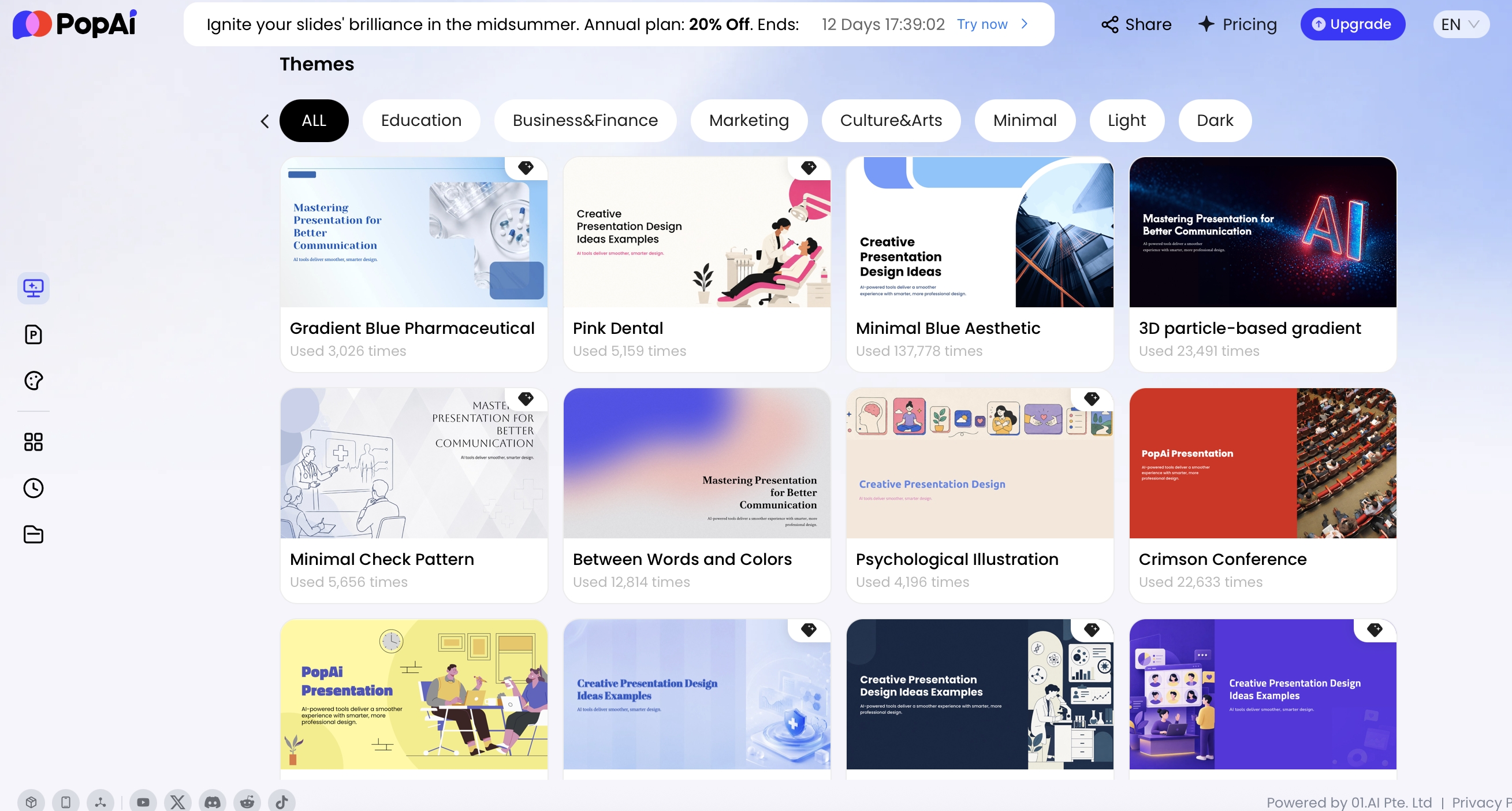
PopAi’s AI PowerPoint workflow supports official templates, personal templates, and uploaded PPTX templates, which is useful when teams already have an approved report design. Use uploaded brand templates for recurring reports, but keep data-heavy slides simple: one message, one chart or table, one caveat box, and one decision.
AI Marketing Report Quality Checklist
Use this checklist before presenting any AI-generated marketing report. It protects against two common problems: attractive slides with weak analysis, and confident language around unverified numbers.
- Metric definitions: Are MQL, SQL, CAC, ROAS, pipeline, and revenue defined consistently across the deck?
- Source traceability: Can every key figure be traced to a dashboard, export, CRM report, or analyst note?
- Spot-check rule: Verify at least 10 high-impact numbers against the source system before sending.
- Reporting period: Does every KPI slide show the correct date range?
- Denominators: Do all percentages explain what they are divided by?
- Attribution clarity: Does the deck state first-touch, last-touch, multi-touch, influenced, or platform-reported attribution?
- No invented stats: Are benchmarks, market claims, and causal explanations verified or labeled as hypotheses?
- Chart integrity: Are axes labeled, scales appropriate, and comparisons fair?
- Platform vs. CRM data: Does the deck avoid mixing ad-platform conversions with CRM-qualified conversions without explanation?
- Business relevance: Does each slide answer a decision-making question?
- Audience fit: Is the language tailored for executives, clients, sales, or operators?
- Privacy review: Have customer names, emails, account-level details, and sensitive pipeline notes been removed or approved?
- Approval owner: Is one person responsible for final analytical accuracy?
- Export review: Do fonts, charts, logos, speaker notes, and layouts remain usable in PPTX or PDF?
The strongest marketing report presentation templates for AI tools are chosen by decision, audience, and data reliability. Use the monthly template for alignment, the QBR for resource allocation, the campaign recap for learning, the client report for trust and retention, and the executive brief for trade-offs. AI can speed up the first draft, but the commercial value still comes from clear KPI definitions, honest caveats, and recommendations a team can act on.
FAQ
What is a marketing report presentation template for AI tools?
It is a reusable slide structure designed for AI-assisted reporting workflows. It usually includes an executive summary, campaign goals, KPI dashboards, channel performance, ROI analysis, insights, risks, and recommended next actions.
Can AI generate accurate marketing report slides from data?
AI can draft structure, summaries, charts, and speaker notes, but the marketer should verify metric definitions, source data, attribution windows, and any claims. Treat AI output as a strong first draft, not an audited report.
Which slides should every monthly marketing report include?
A monthly report should include a one-slide summary, goals versus actuals, channel performance, funnel movement, budget and ROI, key learnings, risks or blockers, and the next-month action plan.
How do I avoid vanity metrics in an AI-generated marketing report?
Map every metric to a business question. Prioritize conversion rate, pipeline influence, CAC, ROAS, revenue, retention, and qualified lead quality over isolated impressions, likes, or traffic spikes.
Create your presentation with one click now
Turn briefs, campaign notes, reports, and source files into a polished marketing presentation faster with PopAi.
Start creating with PopAi