Visual Storytelling in AI-Generated Presentations: A Complete Guide
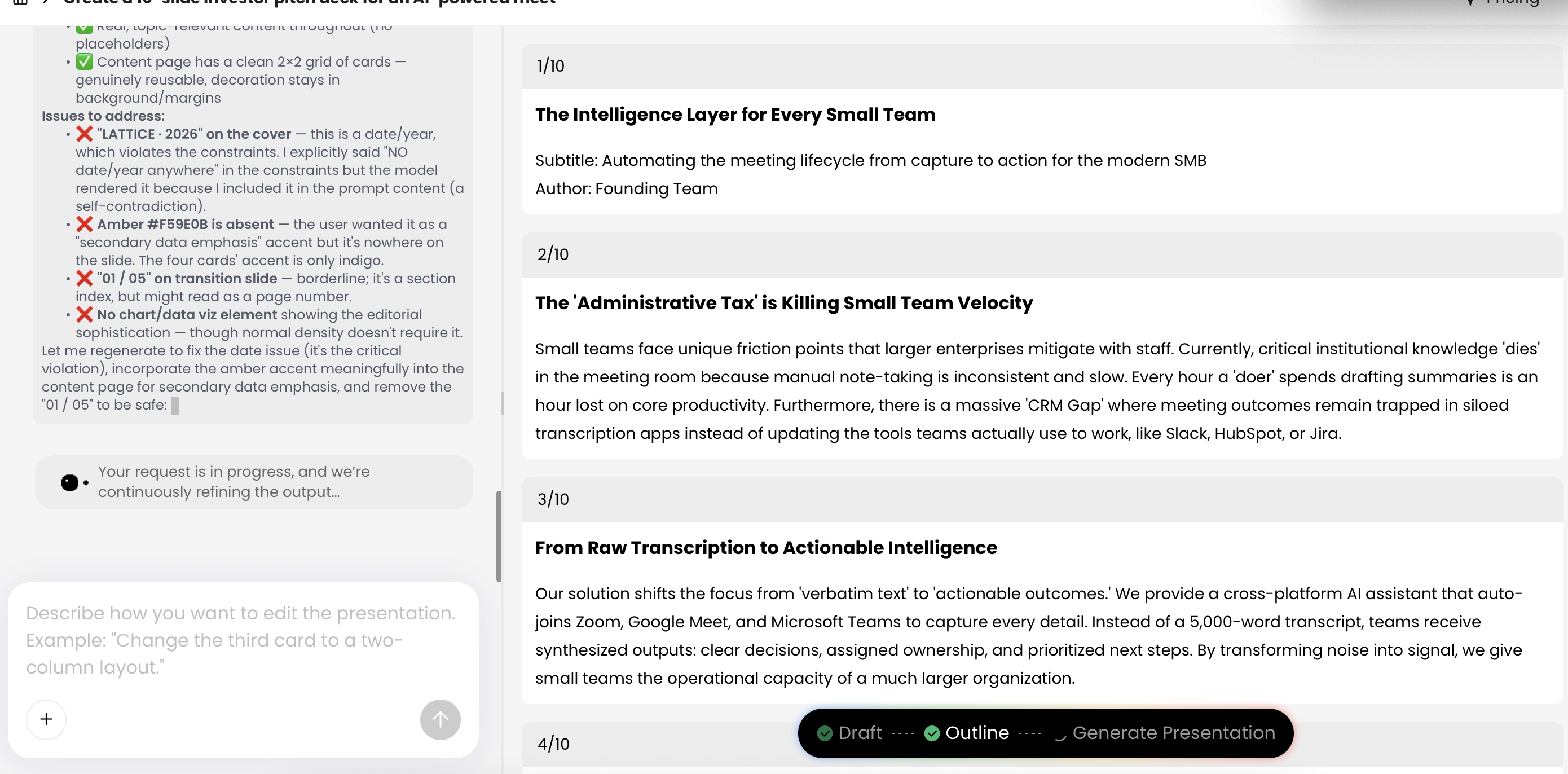
If you create sales decks, training slides, pitch presentations, or executive updates, you have probably seen the same failure: an AI-generated deck looks clean, but the audience still asks, “So what are you recommending?” The slides may have matching icons, polished gradients, and short bullets, yet no tension, no evidence trail, and no clear decision path. Visual storytelling in AI-generated presentations closes that gap by making visuals do narrative work—showing contrast, sequence, cause and effect, risk, proof, and action.
A practical AI presentation workflow is not “type a topic and accept the first deck.” It is closer to an editorial production process: define the audience, choose the story arc, assign one point to each slide, convert text into visual scenes or diagrams, then review for brand, accessibility, licensing, and factual accuracy. Tools such as PopAi AI Presentation can help you move from raw material to structured slides, but the presenter is still responsible for deciding what the audience should understand, remember, and do next.
What Visual Storytelling Means in AI-Generated Presentations
Visual storytelling is the discipline of using layout, hierarchy, images, diagrams, charts, color, scale, and whitespace to move an audience through a meaningful sequence. In AI-generated presentations, it means prompting and editing around a story spine instead of asking for “professional slides” and hoping the default layout will persuade.
Decoration makes a slide look finished. Visual storytelling makes a slide easier to understand, remember, and act on.
A useful presentation story usually has four parts: a situation the audience recognizes, a problem or change that creates urgency, evidence that clarifies the path forward, and a decision or behavior you want from the audience. Each slide should carry one step in that journey. For a product launch, the visual story may move from a messy customer workflow to a simplified future state. For a training deck, it may move from novice mistakes to repeatable expert behavior. For a board update, it may move from signal detection to risk, options, and recommendation.
Good visual storytelling also separates three types of visuals. Narrative visuals create emotional or situational context, such as a customer struggling with a broken workflow. Explanatory visuals clarify relationships, such as a funnel, process map, comparison matrix, or cause-effect diagram. Decorative visuals add style but do not change understanding. AI tools often overproduce the third type, so your editing task is to replace decoration with narrative or explanation.
Data/analysis: Treat visual hierarchy as a cognitive-load problem, not a styling preference. Research and practice from information design, including work popularized by Edward Tufte, Colin Ware, and the Nielsen Norman Group, consistently emphasize that people scan for structure before reading detail. Preattentive attributes such as size, position, color contrast, and orientation help viewers find the main point quickly; dense paragraphs force them to decode before they can decide.
Use contrast, sequence, scale, and whitespace deliberately
- Contrast: Show old vs. new, risk vs. opportunity, current state vs. target state, or customer pain vs. product value.
- Sequence: Use timelines, step flows, or progressive reveals when the audience must understand causality or order.
- Scale: Make the most important number, decision, or object visually dominant; do not give every item equal weight.
- Color: Reserve accent colors for meaning, such as risk, urgency, approved status, or the recommended option.
- Whitespace: Isolate the decision or evidence. Empty space is often what makes the main point readable.
The “one slide, one claim” rule
AI tools often produce slides with a title, five bullets, and a decorative icon. A stronger visual story turns the slide title into a claim, not a label. Instead of “Market Trends,” use “Three buyer shifts are compressing our sales cycle.” Then choose a visual format—three-part comparison, timeline, funnel, heat map, or before/after scene—that proves the claim.
Use this quick rewrite test: if the title could appear in almost any company’s deck, it is probably a label. If it states a specific conclusion your audience can agree with, challenge, or act on, it is a claim.
- Weak label: “Challenges” → Claim title: “Manual approvals add three days to enterprise onboarding.”
- Weak label: “Solution” → Claim title: “A unified intake form removes two handoffs from the workflow.”
- Weak label: “Results” → Claim title: “Expansion revenue now offsets new-logo softness.”
- Weak label: “Next Steps” → Claim title: “A 30-day pilot is the lowest-risk path to validate support savings.”
- Weak label: “Training Overview” → Claim title: “Three handoff habits prevent most escalation delays.”
A Practical AI Presentation Visual Storytelling Framework
Use this framework whenever you turn a prompt, document, report, or outline into slides. It keeps the AI focused on audience logic instead of random design flourishes. If your team is still selecting software, compare the latest AI presentation makers after you know which workflow you need: fast first draft, source-grounded report conversion, PowerPoint export, brand-template control, or collaborative editing.
Storyboard matrix: make every visual carry the narrative
Visual storytelling is not decoration. Each slide should assign a job to the visual: prove the claim, show the sequence, reveal contrast, locate the audience, or make a decision easier.
| Slide | Claim | Evidence | Visual job | Risk to control |
|---|---|---|---|---|
| Opening | The audience should care now. | One verified trend, customer quote, or problem signal. | Create urgency without explaining everything. | Overdramatic image that exaggerates the issue. |
| Context | The problem has a clear shape. | Market map, user journey, process step, or before state. | Orient the audience quickly. | Too many labels or decorative icons. |
| Evidence | The claim is supported. | Chart, table, screenshot, benchmark, or observed pattern. | Make the proof readable in seconds. | Chart suggests causality or precision the data cannot support. |
| Insight | The evidence implies a decision. | Comparison, trade-off, constraint, or opportunity. | Show why the next action follows. | Visuals make the answer look simpler than it is. |
| Action | The audience knows what to do next. | Recommendation, owner, timeline, or request. | Make the call to action unmissable. | Ambiguous ownership or missing approval requirements. |
1. Define the audience decision
Start with the decision, not the topic. “Q3 product performance” is too broad; “Should we fund the onboarding redesign before the next beta cohort?” gives the AI a sharper target. Identify what the audience already believes, what they resist, what evidence they trust, and what action they can realistically take.
2. Choose the story arc
- Problem-solution: Best for sales, product value, and change proposals.
- Before-after: Best for transformation, training, process redesign, and customer success stories.
- Data discovery: Best for executive updates, research findings, and performance reviews.
- Comparison: Best for vendor selection, strategy options, pricing models, and tradeoff decisions.
- Journey: Best for onboarding, customer experience, implementation, and adoption narratives.
3. Convert source material into slide claims
- Audience: Who is watching, what do they already believe, and what decision must they make?
- Message: What is the single sentence they should remember after the presentation?
- Arc: Will the story be problem-solution, before-after, data discovery, journey, comparison, or transformation?
- Slide claims: What does each slide prove, one claim at a time?
- Visual vehicle: Which visual form best carries the claim: chart, diagram, scene, timeline, matrix, map, or icon system?
- Proof: What data, quote, example, source excerpt, or demonstration makes the visual credible?
- Action: What should the audience approve, try, remember, or change?
4. Review the AI draft before design polish
In a tool workflow such as PopAi’s, the useful moment is the intermediate planning stage: after the system extracts or organizes content, but before you accept the finished slides. Review the draft outline for weak titles, unsupported claims, missing transitions, and duplicated points. Correcting the story at this stage is faster than redesigning 15 polished but unfocused slides later.
Prompt template: “Create a 12-slide visual storytelling presentation for [audience] about [topic/source material]. Use a [problem-solution / before-after / data discovery / comparison] arc. Output a slide-by-slide plan with: slide number, claim-based title, audience question answered, recommended visual format, evidence from the source, speaker note, and transition to the next slide. Do not invent statistics, citations, customer names, or financial figures. Flag any claim that needs verification. Avoid generic section titles such as ‘Overview,’ ‘Challenges,’ or ‘Next Steps.’”
Ask AI for structure first and polish second. A beautiful deck built on vague claims is harder to fix than a rough outline with a strong argument.
Turn Text Into Visual Storyboards Before Making Slides
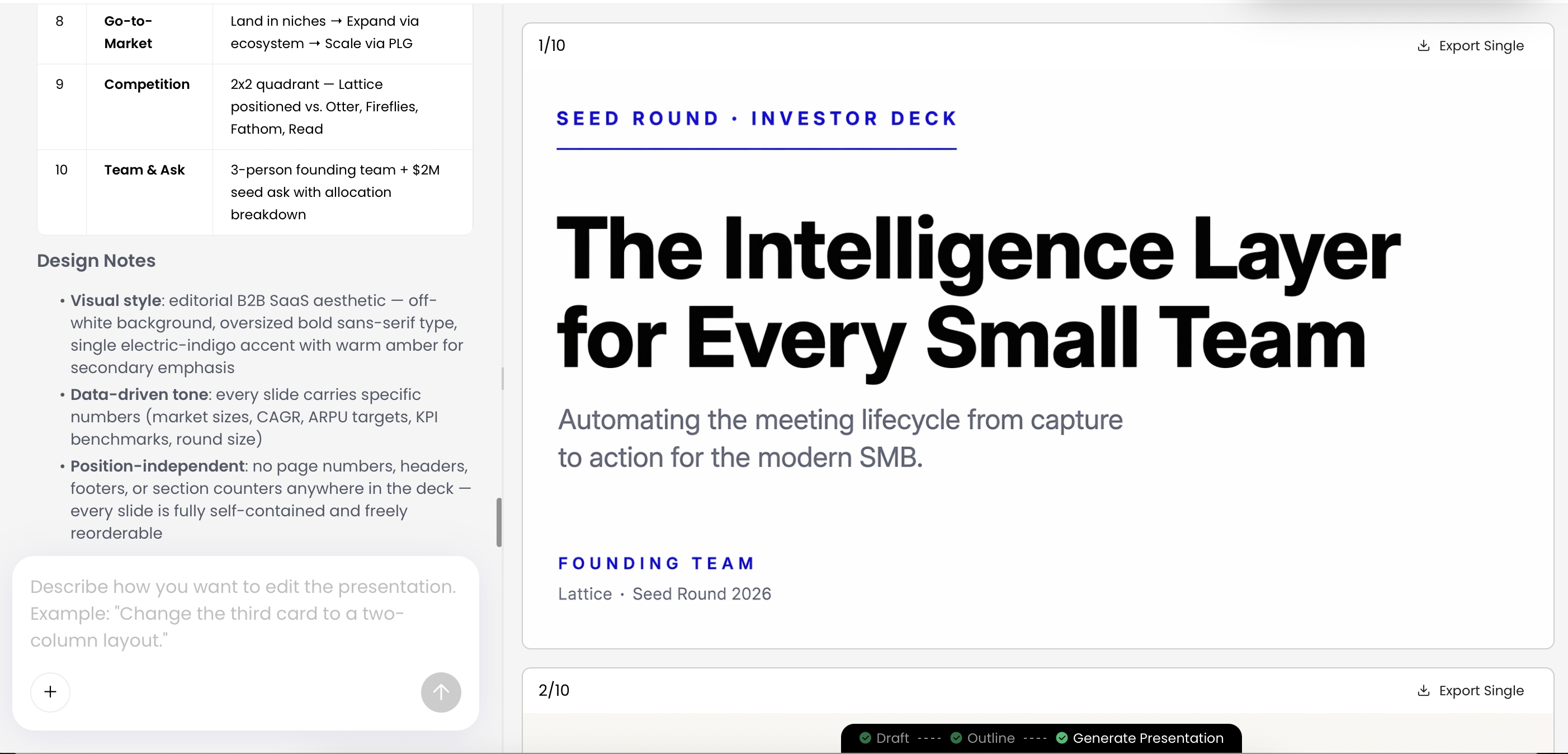
The biggest missed opportunity in AI-generated decks is skipping the storyboard. A storyboard is a rough plan for what the audience sees, slide by slide. It does not need perfect design. It needs a sequence: what appears first, what changes, what evidence is revealed, and what conclusion the audience reaches.
Imagine your source paragraph says: “Customer onboarding is slow because teams use separate tools, approvals happen by email, and data is re-entered multiple times. A unified platform can reduce handoffs and improve visibility.” A weak slide would list those sentences. A visual storyboard would show three disconnected islands on the left, a bottleneck in the middle, and a unified workflow on the right. The title becomes: “Fragmented handoffs are the real onboarding delay.”
Copyable storyboard format
Before generating slides, sketch 8 to 15 storyboard rows for a typical business presentation. For shorter updates, 5 to 7 rows may be enough; for training or investor decks, create one row for every major learning point or proof point.
- Slide number: Where does this step sit in the sequence?
- Audience question: What question is this slide answering?
- Slide claim: What specific conclusion should the audience take away?
- Visual concept: Chart, process, comparison, customer scene, map, timeline, or diagram?
- Evidence/source: What data, quote, screenshot, observation, or approved source supports the claim?
- Speaker note: What context belongs in narration instead of cluttering the slide?
- Transition: What does this slide make the audience ready to see next?
From raw text to slide plan
- Raw idea: “Our support load rose after beta expansion.”
- Audience question: “Is the growth healthy or risky?”
- Slide claim: “Activation grew, but support demand rose faster than readiness.”
- Visual format: Two-line trend chart plus a small risk callout.
- Evidence/source: Activation rate, ticket volume, beta cohort size, and support staffing level for the same period.
- Next slide: Mitigation plan with owners and deadlines.
Use-case examples across common deck types
- Sales deck: “Fragmented reporting hides margin leakage” → dashboard screenshot plus highlighted manual reconciliation steps.
- Training deck: “Most escalation errors happen before handoff” → decision tree showing when to escalate and what to document.
- Investor pitch: “Retention improves as teams adopt the workflow module” → cohort chart with one annotated inflection point.
- Executive update: “The launch is on schedule, but vendor risk is now the critical path” → milestone timeline with one red dependency.
- Product launch: “The new experience removes the slowest setup step” → before/after workflow with elapsed time callouts.
Case-study note: In a practical test using an HTML report of roughly 2,000 words containing an executive summary, KPI table, and risk register, the first AI-generated outline grouped the content into a six-slide decision update. It correctly separated metrics from risks and turned the risk register into owner/severity/mitigation rows. The manual edits were still important: two slide titles were rewritten as claims, one unsupported “efficiency improvement” statement was removed, and the final recommendation slide was added because the source report implied a decision but did not state one.
Choose Visual Formats That Carry the Story
Every visual format has a narrative job. Pick the format based on the audience’s question, not your personal design preference. If the audience asks “How did we get here?” use a timeline. If they ask “Which option should we choose?” use a decision matrix. If they ask “Where is the bottleneck?” use a process diagram or funnel.
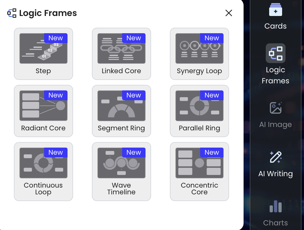
Diagram tools and layout frames are most useful when they make relationships visible. A process flow should show order and handoffs. A pyramid should show hierarchy or dependency. A comparison frame should make the tradeoff obvious. Avoid dropping content into a diagram template simply because it looks more designed; the wrong structure can make the story harder to understand.
If the relationship between ideas is the message, use a diagram. If the magnitude of change is the message, use a chart. If the human consequence is the message, use a scene.
Quick visual format guide
- Before/after: Use for transformation, product value, process redesign, and training outcomes. Avoid when the change is incremental or when the “before” state is not clearly worse.
- Timeline: Use for roadmaps, incident reviews, market evolution, and implementation planning. Avoid when dates are not meaningful or when sequence is less important than priority.
- Matrix: Use for prioritization, vendor comparison, risk assessment, and strategy tradeoffs. Avoid when you have more than four to six options or when criteria are vague.
- Funnel: Use for sales, onboarding, conversion, adoption, and drop-off analysis. Avoid when behavior loops back or when the process is not truly linear.
- Map or ecosystem: Use for stakeholders, customer journeys, dependencies, and market landscapes. Avoid when every node looks equally important; simplify to the actors that affect the decision.
- Data story: Use when the audience must believe a conclusion because of evidence, not opinion. Avoid when the data is incomplete, unverified, or better explained verbally.
- Customer scene: Use when the audience needs empathy for a user pain point. Avoid generic stock-photo scenes that could represent any company or problem.
Make Data Visual Storytelling Persuasive, Not Decorative
Data slides fail when they show numbers without a narrative question. Before choosing a chart, write the sentence the chart must prove. “Revenue by quarter” is a label. “Expansion revenue now offsets new-logo softness” is a story claim. Once the claim is clear, remove numbers that do not support the decision.
Rule of thumb: For live business presentations, many experienced presenters plan one core point per slide and spend roughly one to two minutes on each major slide. A 20-minute decision presentation often lands around 10 to 15 slides, but the right number depends on audience familiarity, complexity, and discussion time. AI can generate volume quickly, so the editor’s job is to reduce the deck to the minimum sequence needed for belief and action.
Start with context, contrast, and consequence
When building data stories, use a three-step pattern: context, contrast, consequence. First, show the baseline or expectation. Second, reveal the change, gap, or anomaly. Third, explain why it matters to the audience. For example, a support dashboard should not simply show ticket volume. It should show that beta user growth increased activation, support load rose faster, and the next decision is whether to fund self-serve onboarding content or add temporary support coverage.
Choose the chart based on the decision
- Ranking decision: Use a sorted bar chart. Example claim: “Three accounts create most renewal risk.”
- Trend decision: Use a line chart with an annotated turning point. Example claim: “Support demand changed after beta cohort expansion.”
- Mix decision: Use a stacked bar only when composition matters. Avoid if the audience must compare tiny segments.
- Correlation decision: Use a scatter plot only when the relationship between two variables is the point.
- Exact-value decision: Use a small table, but add a conclusion title so the audience knows what to compare.
- Uncertainty decision: Show ranges, assumptions, or confidence intervals rather than a single overconfident forecast.
Chart rules for AI-generated presentations
- Verify every number against the source file; do not assume the AI read columns, units, or time periods correctly.
- Check whether categories were invented, merged, renamed, or sorted in a misleading way.
- Use bar charts for ranking and comparison; avoid 3D effects and unnecessary gradients.
- Use line charts for trends over time; label the turning point directly instead of relying on a legend.
- Use scatter plots only when correlation is the message, and explain outliers rather than hiding them.
- Use tables sparingly; reserve them for decisions requiring exact values.
- Use color to highlight the story, not to decorate every series equally.
- Label sources, dates, definitions, and assumptions on high-stakes charts.
- Check readability at actual presentation size, not just in the editor preview.
- Rebuild finance, legal, healthcare, or board-level charts manually when accuracy risk is high.
Control Brand Consistency, Accessibility, and Visual Quality
AI-generated visuals can drift. A deck may start with flat icons, switch to 3D illustrations, then end with photorealistic images. Characters can change appearance. Colors may look close to your brand palette but not match it. These problems reduce trust, especially in executive, client, or regulated environments.
Create a visual rule sheet before generation
Create a one-page rule sheet before generating or redesigning slides. It is faster to give the AI constraints up front than to repair style drift slide by slide afterward.
- Brand colors: Primary, secondary, neutral, warning, and success colors with hex codes.
- Font hierarchy: Title, subtitle, body, caption, chart label, and minimum readable sizes.
- Icon style: Outline vs. filled, corner radius, stroke weight, and whether icons are allowed at all.
- Image treatment: Photography vs. illustration, crop style, filters, background rules, and prohibited image types.
- Chart rules: Palette, axis style, data labels, annotation style, source labeling, and colorblind-safe combinations.
- Logo placement: Where logos appear, where they do not, and minimum clear space.
- Screenshot treatment: Browser chrome, callout style, blur rules for sensitive data, and annotation conventions.
- Approval workflow: Who reviews brand, legal, data accuracy, and accessibility before external use.
Prevent style drift during editing
If you work from official templates or uploaded PowerPoint files, keep the AI-generated draft close to those constraints instead of mixing template systems. After generation, scan the deck in slide sorter view: inconsistent icon families, different corner radii, mismatched chart colors, and alternating illustration styles are easier to spot when you see all slides at once.
Quality-control checklist: Does every slide have one claim? Do visuals explain relationships? Are colors consistent? Are chart labels readable from the back of a room? Is contrast sufficient? Are AI-generated claims verified against approved source material? Are icons and images culturally appropriate for the audience? Are sensitive details removed from screenshots?
Check accessibility before sharing
Accessibility is not a final polish step. Use high contrast, readable type, descriptive slide titles, simple chart labels, and alt text for shared documents. As a practical baseline, align with WCAG contrast guidance where possible: at least 4.5:1 for normal text and 3:1 for large text. For projected slides, many teams use 24 pt or larger for body text and avoid dense footnotes. Do not rely on red and green alone to show status; add labels, icons, or patterns. If you export to PDF, check reading order and alt text for important visuals.
Review licensing and compliance
For commercial presentations, review copyright, privacy, and licensing terms for AI-generated images and uploaded assets. Check whether generated media is allowed for commercial use, avoid recognizable private individuals unless you have rights, do not imitate trademarked characters or logos, and avoid visuals that imply real endorsements or events. For client work, document which tool generated key images, keep source records, and avoid uploading confidential data to tools that are not approved by your organization.
Avoid Common AI Visual Storytelling Mistakes
The most common AI presentation mistake is accepting a deck because it looks complete. Visual storytelling requires editorial pressure: remove vague slides, sharpen claims, verify facts, and replace decorative visuals with explanatory ones.
Failure pattern: the polished generic deck
A generic AI deck often has titles like “Challenges,” “Solutions,” and “Next Steps.” Each slide may look professional, but the audience cannot tell what is new, urgent, or recommended. To fix it, rewrite slide titles as conclusions: “Manual approvals create a three-day onboarding delay,” “A unified intake form removes two handoffs,” and “Pilot approval this month prevents Q4 support overload.” Then choose visuals that prove each conclusion.
Failure pattern: visual overload
Another failure is the “everything visual” slide: icons, gradients, screenshots, charts, badges, and arrows competing for attention. The cure is hierarchy. Make the primary point largest, the supporting proof second, and the decorative elements minimal or absent. Whitespace is not empty; it is how you tell the audience where to look.
Failure pattern: hallucinated confidence
AI-generated decks can sound authoritative even when the source material is weak. Watch for fabricated statistics, fake citations, overgeneralized “research shows” statements, invented customer quotes, and claims that are directionally plausible but not supported by the uploaded file. In one editing test, an AI rewrite improved slide phrasing but broadened “internal beta users” into “customers,” which would have changed the meaning of the evidence. The fix was to trace every external-facing claim back to the source and mark uncertain claims for human review.
Failure pattern: mismatched metaphors and stock-photo sameness
AI often chooses safe metaphors: rockets for growth, puzzles for strategy, ladders for progress, and handshake photos for partnership. These can make a deck feel interchangeable. Replace generic metaphors with visuals grounded in the audience’s actual work: a workflow screenshot, a simplified customer journey, a risk heat map, or a before/after operating model.
Red flags before presenting
- Slide titles are labels instead of conclusions.
- Two or more unrelated claims compete on one slide.
- Charts have no source, date, unit, or clear comparison.
- Icons decorate bullets but do not clarify meaning.
- Image styles change from slide to slide.
- AI-generated visuals contain distorted hands, unreadable text, fake UI, or impossible objects.
- Translated slides have broken line breaks, clipped labels, or diagrams that no longer balance.
- Confidential data appears in uploaded screenshots, speaker notes, or generated examples.
Measure Whether Your Visual Story Worked
A visually beautiful presentation is not automatically successful. Decide what success means before you present. For a sales deck, success might be a qualified next meeting. For training, it might be improved quiz performance or fewer repeated mistakes. For an executive update, it might be faster decision approval and sharper questions.
Match measurement to the deck type
- Sales deck: Track next-meeting conversion, follow-up questions, stakeholder forwarding, objection patterns, and deal velocity.
- Training deck: Track quiz scores, practice-task completion, observed behavior change, support tickets, and repeated errors.
- Executive update: Track decision speed, number of clarification questions, approval rate, and whether leaders repeat the recommendation accurately.
- Investor pitch: Track follow-up requests, retained message, due-diligence questions, and which slides investors reference later.
- Internal change deck: Track adoption rate, manager feedback, repeated message accuracy, and resistance themes.
Run a five-minute comprehension test
- Before presenting: Give one test viewer five minutes with the deck and ask them to summarize the recommendation without your explanation.
- During presenting: Note where questions arise; confusion often points to missing transitions, weak labels, or overloaded visuals.
- After presenting: Compare the intended action with the actual response: approval, follow-up, objection, delay, or no action.
- For the next version: Remove slides that did not change understanding or decisions, and rewrite slides that triggered basic comprehension questions.
The durable skill is not making AI produce prettier slides. It is giving AI a sharper narrative brief, then applying human judgment to evidence, sequence, visual hierarchy, and audience action. AI can accelerate the first draft; the presenter still owns the story.
FAQ: Visual Storytelling in AI-Generated Presentations
What is visual storytelling in AI-generated presentations?
It is the practice of using images, diagrams, icons, charts, layout, color, and pacing to carry the message of a presentation. In AI-generated presentations, the goal is to guide the AI toward a story structure instead of accepting decorative slides.
Why do AI-generated slides often look polished but feel weak?
Many AI tools optimize for surface design first: layouts, icons, and short text. A deck feels weak when it lacks audience tension, a clear claim per slide, evidence, visual hierarchy, and a specific call to action.
How do I keep AI visuals consistent across a deck?
Define brand colors, fonts, image style, icon style, character rules, and chart rules before generation. Then review every slide for mismatched illustration styles, inconsistent labels, and visuals that do not support the main point.
Can I use AI-generated images in commercial presentations?
Sometimes, but you should review the tool license, your company policy, client restrictions, and any industry compliance requirements. Avoid generating trademarked characters, private individuals, confidential scenes, or visuals that imply unsupported claims.
Create your presentation with one click now
Turn your topic, document, or existing material into a structured visual presentation, then refine the story with editable slides, themes, charts, icons, and AI-assisted writing.
Start creating with PopAi