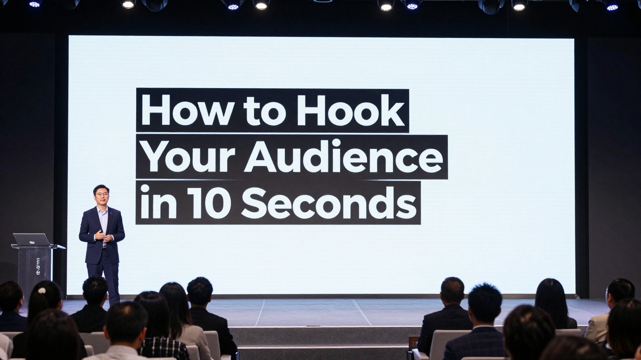
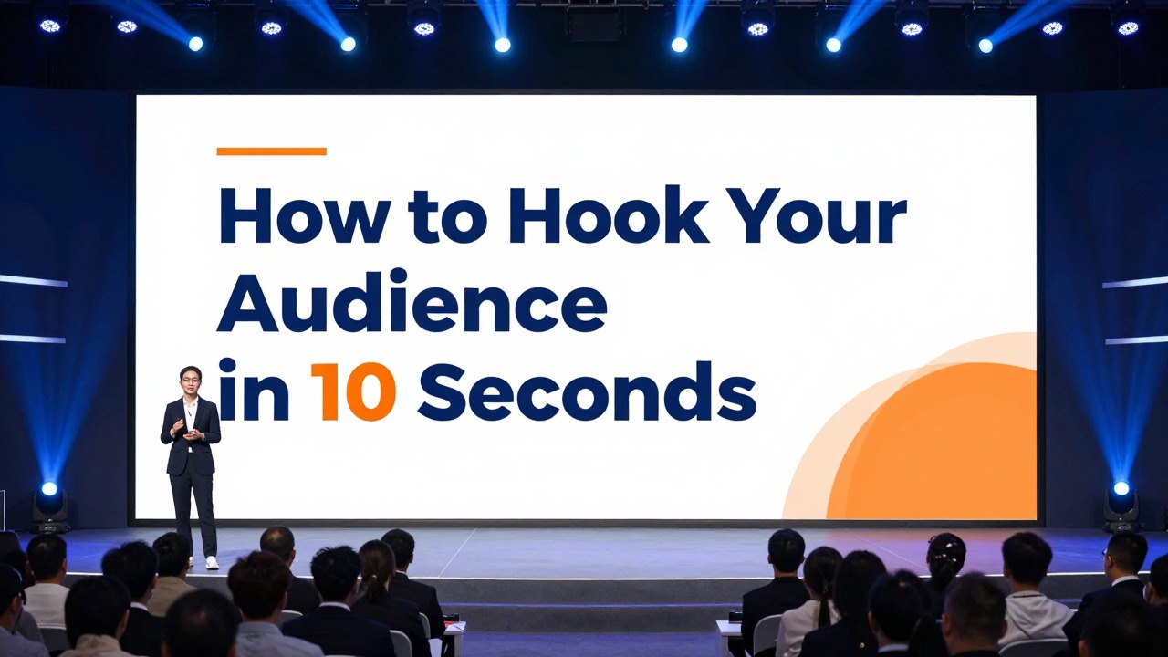
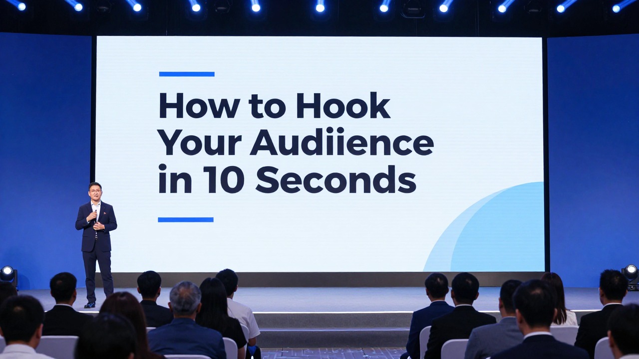
Presentation Opening: How to Hook Your Audience in the First 10 Seconds
July 2, 2026
A strong opening must do four things fast: make the topic feel relevant, create a little tension, show the audience where you are going, and give them one visual message to focus on. The first 10 seconds are not the place for a long biography, a crowded agenda, or a generic “Today I’m going to talk about…” line.
The practical formula is simple: hook statement or question + one clear visual + promise of value. Your slide should make the audience think, “This matters to me,” while your spoken line explains why they should keep listening.
Good presentation openings are not only about public speaking talent. They are built through design choices: fewer words, stronger contrast, clear hierarchy, consistent fonts, intentional alignment, and one focal point. AI presentation tools can help generate opening angles and first-slide options, but the best result still comes from matching the hook to your audience, your evidence, and your purpose.
When you are ready to turn the workflow into slides, PopAi AI Presentation can help transform rough notes, documents, or prompts into an editable deck structure.
The 10-Second Rule: What a Strong Presentation Opening Must Do
This section defines what the first few seconds need to accomplish before the audience mentally checks out.
A strong presentation opening is a combination of relevance, tension, clarity, and visual focus. Relevance tells the audience the topic connects to their work, decision, grade, customer, budget, risk, or curiosity. Tension gives them a reason to keep listening because something is unresolved. Clarity tells them what kind of value they can expect. Visual focus ensures the slide does not compete with your voice.
The audience’s silent question is always, “Why should I care?” They may not say it out loud, but they are evaluating your talk immediately. If your first slide is a formal title, three logos, a long subtitle, your name, your department, the date, a decorative background, and a dense agenda, you have made them work too hard before you have given them a reason to care.
- Use a hook line or question that names a real problem, opportunity, contrast, or curiosity gap.
- Use one clear visual: a photo, number, diagram, product screenshot, simple chart, or bold text statement.
- Promise a specific value, such as a decision framework, a better way to solve a problem, or a clearer view of the evidence.
- Remove anything that does not help the audience understand the first message within a few seconds.
- Make the first slide readable from the back of the room or on a small video-call screen.
Weak starts usually fail because they delay meaning. “Today I’m going to talk about customer onboarding” is not wrong, but it is flat. “Most onboarding problems are not product problems; they are expectation problems” creates a reason to listen. A crowded agenda slide before context is established has the same issue. It tells the audience what sections exist, but not why those sections matter.
Your first slide is not a cover page. It is the first argument your audience sees.
Design supports the opening by reducing friction. Put one message on the first slide. Use strong contrast between text and background. Choose a type size that can be read quickly. Avoid unnecessary logos unless they are required by the setting. Keep decorative shapes, stock icons, and background patterns out of the way unless they directly reinforce the hook.
Start with one hook, show one visual idea, and say one sentence that tells the audience what they will gain by listening.
Choose the Right Opening Hook for Your Audience and Topic
This section helps you select a hook type based on the room, the decision, and the audience’s current level of interest.
The best way to start a presentation is not to copy a clever line from someone else. A hook works only when it fits the audience’s situation. A boardroom wants relevance and decision clarity. A classroom wants curiosity and a learning path. A sales audience wants to recognize their own challenge. A research audience wants to see the gap in current understanding.
- Problem hook: Start with a pain the audience already recognizes. Example: “Your best leads are not disappearing; they are getting confused before the first sales call.”
- Question hook: Ask a specific question that makes people test their assumptions. Example: “What would change if your team could cut the approval cycle without adding another meeting?”
- Story hook: Open with a short moment involving a user, customer, patient, student, or team. Use it only if the story connects directly to the main point.
- Surprising fact hook: Use a verified and relevant statistic, trend, or observation. If you do not have a reliable source, use qualitative wording such as “Many teams struggle with…” instead of inventing a number.
- Visual hook: Show an image, screenshot, object, chart, or contrast that creates curiosity before you explain it.
- Contrast hook: Compare the current state with the desired future. Example: “We planned for growth, but our process was built for stability.”
- Future-state hook: Invite the audience to imagine a better outcome. Example: “By the end of this quarter, customers should know exactly what to do next without contacting support.”
For pitch decks, a painful problem often works because investors need to see urgency before they evaluate the solution. For sales decks, start with the customer challenge, not your product menu. For lectures, begin with a question students can answer, debate, or revisit later. For research talks, open with the gap: what is not yet explained, measured, or solved. For strategy decks, show a sharp contrast between the current state and the future state the audience must choose.
- Name the audience emotion you need: concern, curiosity, confidence, urgency, relief, or ambition.
- Identify the decision or action the audience may need to make after the presentation.
- Choose a problem they already recognize, even if they describe it differently than you do.
- Decide how familiar they are with the topic. New audiences need context; expert audiences need a sharper gap or insight.
- Select the hook type that creates relevance without exaggeration.
Not every hook is appropriate. Avoid jokes when the topic is serious or the audience relationship is formal. Avoid dramatic claims if you cannot support them later. Avoid statistics when the source is uncertain. Avoid personal stories that make the opening about you rather than the audience. Avoid broad questions such as “Have you ever thought about innovation?” because almost any answer is possible and no real tension is created.
Ask an AI tool for multiple hook angles, then choose the one that best matches the room. Do not automatically use the most dramatic option; use the most relevant and supportable option.
Design Your First Slide So the Hook Is Instantly Clear
This section turns your chosen hook into a professional opening slide with one obvious visual message.
Your first slide should usually contain one main idea, not a full paragraph, a complete agenda, speaker biography, department name, background photo, multiple badges, and three decorative icons at once. When the audience sees too many signals, they do not know where to look. A good opening slide creates a focal point and lets your spoken words do the rest.
- Big question slide: Use one specific question in large type, with a small subtitle only if needed.
- Single bold statement slide: Place a short claim or insight at the center or left third of the slide.
- Full-bleed image with short text: Use one strong image as context, then add a short headline with high contrast.
- Split-screen before/after slide: Show the current state on one side and the desired future on the other.
- Problem snapshot slide: Combine a short problem headline with one simple visual cue, such as a screenshot, process step, or customer quote excerpt if you have permission to use it.
- Minimalist title-plus-subtitle slide: Use this when the setting requires formality, but make the subtitle audience-centered rather than generic.
Apply design principles as editing actions. Contrast means the hook must stand out from the background; use dark text on a light background or light text on a dark overlay. Alignment means every object should look intentionally placed; align text blocks to a clear left edge, center line, or grid. Proximity means related items sit together; do not scatter the title, subtitle, and presenter name across random corners.
Hierarchy means the audience should know what to read first. Enlarge the key phrase, use font weight for emphasis, and keep supporting details smaller. Repetition means the opening slide should still feel connected to the deck; use the same accent color, typography, or spacing rhythm you will use later. White space means you leave room around the message so it feels important instead of squeezed.
- Cut the headline to 6-12 words when possible.
- Enlarge the most important phrase instead of adding more words.
- Use one focal image, chart, screenshot, or statement.
- Remove decorative icons that do not support the message.
- Align text to a visible grid or clean margin.
- Limit font families; use weight, size, and spacing for emphasis.
- Check readability by zooming out or viewing the slide on a phone-sized screen.
Color should clarify the message, not decorate it randomly. A simple 60-30-10 balance often works: a dominant background color, a secondary supporting color, and one accent color for emphasis. If you are using brand colors, control them. A bright brand color may work better as an accent than as a full background. Avoid jarring combinations that make text vibrate or reduce readability.
Typography should feel confident and consistent. Do not mix several fonts to make the slide feel designed. Use one professional type family with different weights, or pair a clean headline font with a readable body font. Increase line spacing if a headline wraps. Avoid all caps for long phrases because it slows reading. Use bold only on the phrase that carries the hook.
Images should create curiosity or context. A full-bleed photo of a frustrated customer support dashboard can support a service design talk. A generic handshake photo rarely adds meaning. A product screenshot can be effective if you crop it to the relevant part and add a clear visual emphasis. If text sits on top of an image, add a subtle dark or light overlay so the words remain readable.
If your rough topic is “reducing customer churn through better onboarding,” you can ask AI presentation software to generate three opening slide directions: a problem headline, a customer journey visual, and a before/after contrast. Then refine the strongest option by cutting the headline, choosing one focal image, and aligning the slide style with the rest of the deck.
Write a 10-Second Opening Script That Matches the Slide
This section shows how to speak the first lines so your slide and voice reinforce each other instead of repeating the same words.
Your opening script should be short enough to say with confidence. The slide gives the audience a visual anchor; your voice adds meaning. Do not read the slide word for word unless the line is intentionally short and dramatic. A stronger approach is to pause, deliver the hook, connect it to the audience, and transition to the value of the presentation.
- Pause for one beat so the audience looks at you and the slide.
- Say the hook line or question in one clear sentence.
- Connect the hook to the audience’s work, decision, problem, or learning goal.
- Promise the path: what you will show, compare, decide, or explain next.
Before: “Hi everyone, my name is Daniel, and today I’m going to talk about our new employee training platform.” After: “New hires are not failing because they lack motivation. They are failing because their first week gives them too many tools and too little direction. In the next 12 minutes, I’ll show how this training platform fixes that first-week confusion.”
Before: “This presentation will cover background information, key findings, methodology, and recommendations.” After: “Why do customers who say they like the product still leave after month two? That question shaped our research, and the answer points to three changes we can make immediately.”
Before: “Here is the agenda for our productivity workshop.” After: “Most productivity advice asks people to do more. Today we are going to do the opposite: remove the decisions that waste attention before the real work starts.”
- Business proposal: “The issue is not that our teams lack ideas. The issue is that good ideas are getting stuck between approval steps. This proposal shows how to shorten that path without losing control.”
- Investor pitch: “Small clinics do not need another dashboard. They need fewer missed follow-ups. Our product starts with that one problem.”
- Classroom lesson: “If two people look at the same historical event and reach opposite conclusions, who is wrong? Today we will learn how evidence, perspective, and context shape interpretation.”
- Research presentation: “The current literature explains what happens after adoption, but not why adoption stalls in the first place. This study focuses on that missing moment.”
- Sales deck: “Your team is already generating demand. The leak is happening after the first inquiry, when prospects wait too long for the next useful answer.”
- Product update: “This release is not about adding more features. It is about removing three points of friction customers mention again and again.”
- Internal strategy meeting: “We can keep optimizing for quarterly speed, or we can fix the system that creates the same bottlenecks every quarter.”
Timing matters. The first sentence should be easy to say without rushing. If you ask a strong question, pause briefly and let people think. If you show a striking image, give the audience a second to process it before explaining. The pause is part of the hook; it signals that what they are seeing matters.
Delivery should be clean. Face the audience instead of looking back at the slide. Do not apologize for being nervous, running late, or having too much content. Do not start with filler phrases such as “So, yeah, I guess we’ll get started.” Do not explain the slide layout. Say the first line as if the presentation has already begun, because it has.
Use AI to create several versions of your opening script, but read each one aloud. Keep the version that sounds like something you would actually say, then edit for accuracy, audience fit, and natural rhythm.
Build the First Three Slides as a Mini-Story
This section explains how to connect the hook to the next slides so the opening feels purposeful rather than gimmicky.
A strong presentation opening is not only the first slide. The first three slides should create momentum. Slide 1 hooks attention. Slide 2 explains why the hook matters. Slide 3 previews the path or promise. This structure helps the audience move from curiosity to context to confidence.
- Slide 1: Hook attention with one bold message, question, image, or contrast.
- Slide 2: Add context with two or three simple supporting points, not a wall of background.
- Slide 3: Preview the path with a short structure, promise, or decision frame.
For a pitch deck, the flow might be problem, opportunity, solution. The first slide names the pain. The second slide shows why the pain is growing or underserved. The third slide introduces your solution as the logical next step. For a teaching deck, the flow might be question, context, learning goals. The first slide asks a question. The second gives the situation students need to understand. The third names what they will be able to explain or do by the end.
For a research presentation, use insight, evidence, implication. The first slide states the surprising insight or research gap. The second slide shows the evidence base or method in simple terms. The third slide explains why the findings matter. For a sales deck, use pain, cost, next step. The first slide names the customer challenge. The second shows the business impact. The third previews the path to solving it.
For an executive strategy deck, use current state, risk, decision. The first slide shows the contrast between where the organization is and where it needs to be. The second slide explains the risk of staying on the current path. The third slide frames the decision the leaders need to make.
- Opening slide layout: one bold message with maximum white space and a clear focal point.
- Context slide layout: two or three concise points, a simple diagram, or a cropped chart that supports the hook.
- Preview slide layout: three to five short agenda items written as outcomes, not generic section labels.
- Consistency rule: keep the same headline position, accent color, and spacing rhythm across the first three slides.
- Repetition rule: repeat one visual motif, such as a line, icon style, or color accent, so the mini-story feels connected.
If you have a 10-page research summary, you can upload or paste the notes into AI presentation software and ask for a three-slide opening sequence: research gap, why it matters, and talk roadmap. Review the generated outline, remove unsupported claims, and adjust the first slide so it presents one clear insight rather than a compressed abstract.
Common Presentation Opening Mistakes to Avoid
This section helps you diagnose weak openings and quickly repair them before you present.
Most weak openings are not weak because the topic is boring. They are weak because the presenter delays the point, overloads the first slide, or uses a hook that does not fit the audience. The fix is usually not a more decorative template. The fix is a clearer message, stronger hierarchy, and a more audience-centered first sentence.
- Mistake 1: Starting with too much personal background. Quick fix: give only the credibility detail the audience needs, and move quickly to the problem or promise.
- Mistake 2: Using a crowded title slide with long subtitles, multiple logos, date, presenter details, and decorative visuals. Quick fix: keep the title short, reduce metadata, and create one visual focal point.
- Mistake 3: Opening with a dramatic statistic, quote, or claim without a reliable source. Quick fix: use a sourced statement or switch to qualitative wording such as “Many teams struggle with…”
- Mistake 4: Asking a vague question. Quick fix: make the question specific, decision-oriented, or problem-based.
- Mistake 5: Using humor, animation, or sound effects that distract from the message. Quick fix: use motion only when it reveals meaning, such as showing a before/after contrast step by step.
- Mistake 6: Designing the opening slide in a style that does not match the rest of the deck. Quick fix: reuse the same typography, accent color, grid, and spacing system used in later slides.
A vague question such as “Have you ever thought about productivity?” does not create much curiosity because the audience has no clear mental task. A sharper question would be, “Which part of your day creates the most work without moving the project forward?” This question points to a recognizable problem and prepares the audience for a practical framework.
A dramatic opening can work, but only when the rest of the deck earns it. If you begin with a bold claim and then spend the next 20 minutes showing unrelated background, the opening feels like a trick. If you begin with a serious customer problem and then show evidence, implications, and a practical response, the opening feels honest.
- Read the first slide out loud and ask, “Would the audience know why this matters?”
- Remove one-third to one-half of the visible text if the slide feels dense.
- Increase contrast until the headline is readable at a glance.
- Align text and visual elements to a clear grid.
- Replace generic decoration with one meaningful image, chart, or diagram.
- Rewrite the first sentence around the audience’s problem, not your topic label.
If the opening slide needs a long explanation before it makes sense, it is probably carrying too many ideas.
Use AI to Create and Improve Your Presentation Opening Faster
This section gives you a practical AI-assisted workflow for generating opening ideas without losing accuracy, judgment, or personal voice.
AI can help you move from a blank page to a usable opening faster, especially when you already have notes, a document, or a rough topic but do not know how to shape the first impression. Treat it as a design and writing assistant. It can suggest angles, rewrite long introductions, create first-slide headlines, and organize the first few slides. It should not replace your knowledge of the audience or your responsibility to verify evidence.
- Paste your topic, rough notes, or source document into the AI tool.
- Ask for five opening hook angles for your exact audience and presentation goal.
- Choose the hook that is relevant, supportable, and appropriate for the setting.
- Generate three first-slide options based on that hook.
- Rewrite the spoken opening into a 10-second script.
- Refine the design by reducing text, improving contrast, aligning elements, and keeping one visual focus.
- Check the first three slides to make sure the hook leads naturally into the body of the deck.
- Prompt for a problem-based opening: “Create five problem-based opening hooks for a 12-minute presentation to operations leaders about reducing approval delays. Avoid exaggerated statistics and keep the tone professional.”
- Prompt for a question-based opening: “Write seven specific opening questions for a classroom lesson on media bias. Each question should create curiosity and connect to a learning objective.”
- Prompt for first-slide headlines: “Give me three first-slide headline options for a sales deck about improving customer onboarding for B2B software teams. Keep each headline under 12 words.”
- Prompt for script rewriting: “Rewrite this long introduction into a 10-second spoken opening with a hook, audience relevance, and transition to the main promise.”
- Prompt for design critique: “Review this opening slide text and suggest what to cut, what to emphasize, and how to improve visual hierarchy.”
AI presentation software is useful in this workflow because it can help turn prompts, documents, notes, and rough ideas into editable presentation structures. For example, an entrepreneur preparing a pitch can enter a product idea and target investor audience, then ask for several opening angles: customer pain, market gap, before/after workflow, and future-state vision. The presenter can choose the most credible angle and refine the opening slide around a single sentence.
A second example: a consultant with a dense client discovery document can use AI presentation software to summarize the material into a deck outline. Instead of starting with a standard title slide, the consultant can ask for a first three-slide sequence: current bottleneck, business impact, and decision path. The resulting structure gives the opening a clear connection to the rest of the recommendation.
Evaluate AI output carefully. Remove generic phrases such as “in an ever-changing landscape” or “unlock new potential.” Check every factual claim. If the AI suggests a statistic, verify it before using it. If you cannot verify it, replace it with a qualitative statement. Adjust the tone so it sounds like you, not like a brochure. Simplify the slide until the hook is visible in one glance.
Before you present, confirm that you have one clear hook, one visual focus, readable contrast, a short spoken script, obvious audience relevance, a smooth transition to slide two, and a consistent deck style.
The goal is not to make AI write a perfect opening for you. The goal is to generate options quickly, compare them against your audience and purpose, then edit the strongest option into a clear slide and a natural first line. A memorable opening is built through selection, simplification, and fit.
FAQ
What is the best way to start a presentation?
The best start depends on your audience and purpose, but a strong opening usually combines a relevant hook, a clear first slide, and a short promise of value. Start with a problem, question, contrast, image, or insight that makes the audience understand why the topic matters.
How do I hook an audience in the first 10 seconds?
Use one specific hook and deliver it without filler. Name a problem they recognize, ask a sharp question, show a meaningful visual, or create a contrast between the current state and desired future. Then connect it to what the audience will gain from listening.
Should I start with an agenda slide?
Usually not as the very first slide. An agenda is useful after the audience understands why the topic matters. Start with the hook, add context, and then show a short roadmap or promise so the agenda feels purposeful.
What should be on the first slide of a presentation?
Use one main idea, a readable headline, strong visual hierarchy, enough white space, and one focal visual if it supports the message. Optional details such as your name or a short subtitle can appear, but they should not compete with the hook.
Is it okay to start a presentation with a statistic?
Yes, if the statistic is accurate, relevant, and sourced. If you cannot verify the number, do not use it as proof. Use a qualitative problem statement or audience-centered question instead.
Build slides faster from your source material
Turn notes, prompts, documents, or rough outlines into a clearer presentation draft, then edit the story, facts, and visual details before presenting.
Try PopAi AI Presentation