Minimalist Design for AI Presentations
Published on August 10, 2026
If you use AI to create pitch decks, business updates, lessons, or research summaries, you have probably seen the same failure pattern: a title, subtitle, six bullets, three icons, a gradient background, and a chart all competing for attention. The deck is fast, but the slide is not yet useful. Minimalist design for AI presentations is the editing discipline that turns that first draft into something an audience can understand quickly.
The goal is not to make slides empty. The goal is to make every title, number, image, chart, icon, and color earn its place. In practice, that usually means deleting decorative objects, rewriting topic titles as conclusions, enlarging the one number that matters, simplifying charts, and moving secondary detail into notes or appendix slides.
By the end, you should have a practical workflow: prompt the AI with constraints, review the outline before slide generation, audit each slide for hierarchy and evidence, then export with accessibility and fidelity checks.
What Minimalist Design for AI Presentations Really Means
Minimalist design is not an aesthetic filter; it is a sequence of decisions that reduce a slide to the elements that make the message easier to understand. In an AI-generated deck, that means instructing the tool to avoid decorative backgrounds, dense paragraphs, mixed icon styles, random gradients, unsupported claims, and “just because” visuals.
How this guide is different: minimalist design is about deletion, white space, hierarchy, and visual restraint. It is not the same as visual storytelling, which focuses on narrative evidence flow, or infographic design, which focuses on data visualization and structured visual explanation.
A minimalist slide usually has one message, one visual hierarchy, and one obvious reading path. The title should state a conclusion instead of merely naming a topic. For example, “Activation rose 18% after onboarding changes” is more useful than “Activation Metrics.” A conclusion-led title lets the audience understand the point before they inspect the chart.
Minimalist presentation design is not about removing information. It is about removing friction between the audience and the information.
Turn AI topic titles into takeaway headlines
- Weak AI title: “Market Overview” → Minimalist title: “Mid-market demand is expanding faster than enterprise demand.”
- Weak AI title: “Customer Feedback” → Minimalist title: “Customers value speed, but onboarding still blocks adoption.”
- Weak AI title: “Financial Performance” → Minimalist title: “Gross margin improved after support costs stabilized.”
- Weak AI title: “Research Findings” → Minimalist title: “The intervention improved recall, but only for repeat users.”
Core minimalist rules for AI slides
- One slide, one takeaway: if a slide has two arguments, split it. Exception: dashboards, workshop canvases, and appendix pages can be denser if the audience is meant to inspect rather than listen.
- Fewer visual decisions: use one accent color, one grid system, and one image style.
- Shorter text: replace paragraphs with action-oriented statements and tight bullets.
- Visible hierarchy: make the most important item largest, darkest, or most central.
- Purposeful white space: leave breathing room so the audience can process the idea.
- Source discipline: ask the AI to flag missing data instead of inventing metrics, dates, or causal explanations.
If the audience cannot summarize the slide in one sentence after a few seconds, the slide has not been edited enough. When comparing tools, review how different AI presentation makers manage structure, editing, export, and style control. A fast generator is helpful, but a generator that lets you refine hierarchy, layout, and messaging after the first draft is more valuable for minimalist work.
Why Minimalist Design Works Better with AI-Generated Slides
Minimalist constraints make AI output easier to read because they reduce the number of competing signals on each slide.
AI can produce a complete presentation quickly, but speed can magnify clutter. If a prompt asks for “a professional presentation,” the output may include too many sections, too many bullet points, and decorative visuals that look polished but dilute meaning. Minimalism gives the AI a stronger design brief: fewer slides doing clearer jobs.
There is also a cognitive reason. Cognitive load theory and multimedia learning principles both point to the same practical problem: audiences process spoken explanation, text, visuals, chart signals, and layout cues at the same time. When a slide contains six bullet points and a busy chart, the viewer has to decide whether to listen to you, read the bullets, or decode the visual. A slide with one conclusion-led title and one supporting visual lets the narration and the slide work together instead of competing.
Data point: Rules such as 10/20/30 and 6×6 are useful guardrails, not laws. The 6×6 rule still produces up to 36 words on a slide, which is often too much for a live executive update. In reviewed business decks, the most readable slides usually used a conclusion headline, one visual, and either three short support points or one direct annotation. The key is not the exact number of words; it is whether the audience knows where to look first.
Prompt tip: Describe the audience, decision, tone, slide count, and style constraints before generation. For example: “Create a 7-slide investor update for busy SaaS executives. Use minimalist design, white background, navy text, one blue accent color, large titles, no decorative icons, no gradients, and one takeaway per slide. Do not invent metrics or market claims.”
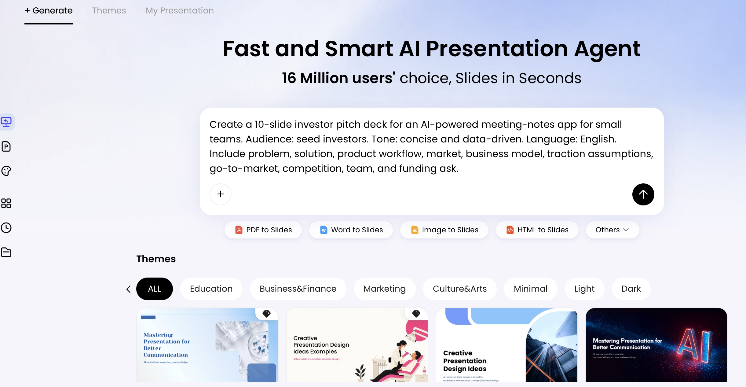
A practical workflow in PopAi AI Presentation is to import the source, generate an outline, reduce the outline before slide creation, generate the draft, then audit the deck slide by slide. Different inputs create different risks: PDF reports often become dense data slides, Word documents often become paragraph-heavy slides, and PPTX imports can preserve old layout problems unless you actively simplify them.
How to Prompt AI for Minimalist Design in AI Presentations
The best minimalist AI slides start before the first layout appears. A vague prompt produces a vague design system; a constrained prompt gives the AI a visual and editorial rulebook. Your prompt should define what to include, what to exclude, and how the audience should feel while reading the deck.
Use a six-part prompt before generating slides
- Audience: name the role, expertise level, and situation.
- Outcome: define the decision, action, or understanding the deck should create.
- Structure: request a page count and required sections.
- Message density: ask for one takeaway per slide and no long paragraphs.
- Visual constraints: specify colors, typography, spacing, image style, and chart style.
- Editing rules: ask the AI to flag assumptions or source gaps instead of inventing detail.
Weak prompt: “Make a professional product launch deck from this memo.” Expected result: generic section titles, feature-heavy slides, decorative icons, and copied paragraphs.
Better prompt: “Turn this product launch memo into a 9-slide executive presentation. Use minimalist design for AI presentations: one conclusion-led headline per slide, maximum four bullets, 16:9 format, white background, charcoal text, one violet accent, clean sans-serif typography, simple charts, no clip art, no gradients, and no unsupported claims. If a claim is not in the memo, mark it as ‘needs source’ instead of writing it as fact.”
Review the outline before you review the design
- Delete agenda or overview slides that repeat the same promise.
- Check whether each slide answers a different audience question.
- Move proof-heavy detail to an appendix before generating polished layouts.
- Ask the AI to rewrite slide titles as conclusions before choosing themes.
- Add negative constraints: “Do not use stock business metaphors,” “Do not add icons unless they clarify meaning,” and “Do not use tiny chart labels.”
Case note: In a test using an HTML business report with an executive summary, three KPI blocks, a risk table, and repeated page-number fragments, the AI organized the material into six slides: summary, KPI snapshot, activation trend, support load, risk register, and next steps. The useful part was structure extraction; the required human corrections were removing repeated page labels, rewriting generic titles into conclusions, and reducing the risk table to the three risks that needed management action.
White Space, Color, and Typography: The Minimalist Design System
A minimalist deck works because spacing, color, and type repeat consistently from slide to slide.
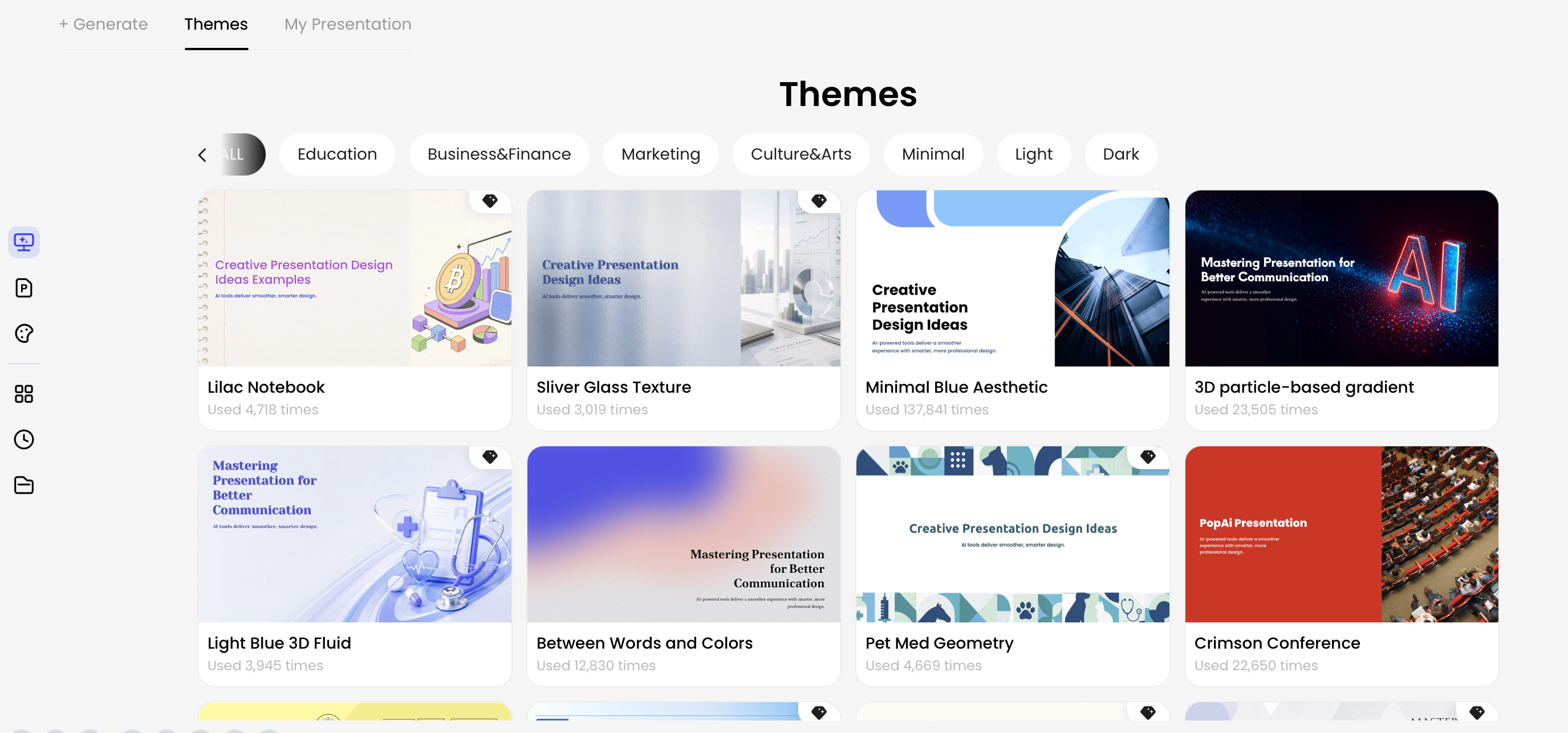
Instead of redesigning each slide, build a small system that controls spacing, color, type, and emphasis. AI can generate faster when the system is simple, and human editors can review quality faster when every slide follows the same rules.
Use white space as a layout tool
White space creates visual grouping. Put related items close together, separate unrelated items, and avoid filling every corner. If a slide feels too empty, the solution is rarely to add decoration. Usually, it needs a stronger headline, a clearer data point, or better alignment.
- Start with margins: for 16:9 slides, keep roughly 6–10% of the slide width as safe outer margin, especially for projected or video-call decks.
- Group first, decorate never: cluster related metrics into aligned cards instead of scattering them across the page.
- Use a grid: align titles, visuals, and footnotes to consistent left edges.
- Remove filler shapes: delete background blobs, divider lines, and containers unless they clarify grouping.
- Split crowded slides: if a chart, paragraph, and table all need large space, the slide is probably two slides.
Example edit: An AI-generated KPI slide might place three metrics in different corners, add a background wave, and include a paragraph explaining all three. A minimalist revision would align the metrics into three equal cards, enlarge the primary number, delete the wave, and replace the paragraph with one headline: “Activation improved, but support load rose with the beta rollout.”
Make color carry meaning
Use neutral backgrounds and text colors, then reserve one accent color for emphasis. A practical palette is white or near-white background, charcoal body text, soft gray dividers, and one brand accent. If your company has a brand palette, ask the AI to use only the primary brand color plus neutrals, not the entire brand system on every slide.
- Blue: current product, primary path, or selected option.
- Green: improvement, growth, or completed action.
- Red: risk, blocker, or negative variance. Do not use red for general decoration.
- Gray: context, baseline, secondary data, or inactive items.
Data point: Accessibility standards are a design advantage, not just a compliance issue. WCAG contrast guidance recommends contrast of at least 4.5:1 for normal text and 3:1 for large text. For live presentations and screen sharing, treat 18pt as a practical minimum for body text, with 28–44pt titles depending on room size and viewing distance. Minimalist decks should use larger type, stronger contrast, and real editable text rather than text embedded inside images.
Choose typography that gets out of the way
Use one or two clean sans-serif fonts. Make titles large and decisive, body text readable, and labels secondary. Avoid decorative fonts in business, training, and research decks unless they directly support the brand personality.
- Title: conclusion-led, visually dominant, usually 32–44pt for live delivery.
- Body: short lines, usually 18–26pt; avoid paragraph blocks.
- Chart labels: large enough to read without zooming; prefer direct labels over legends.
- Footnotes: use sparingly; if the footnote is essential, the slide may need a simpler visual.
- Consistency: remove extra font weights and sizes that perform the same role.
In minimalist slides, typography is not decoration; it is the operating system for attention.
Minimalist Layouts and Data Slides for AI Presentations
Data slides should answer one question before they display every available number.
AI-generated decks often become crowded on data pages because the model tries to show every metric, label, and explanation at once. Minimalist data design starts with a question: what should the audience notice first?
Choose the layout by the job of the slide
- Metric cards: use when the audience needs three to five headline numbers, not a trend.
- Line chart: use for change over time; highlight the key period and directly label the important series.
- Bar chart: use for comparison; sort bars when ranking matters.
- Table: use only when exact lookup is the task; otherwise convert the insight into a chart or cards.
- Appendix table: use when detail is necessary for credibility but not for live narration.
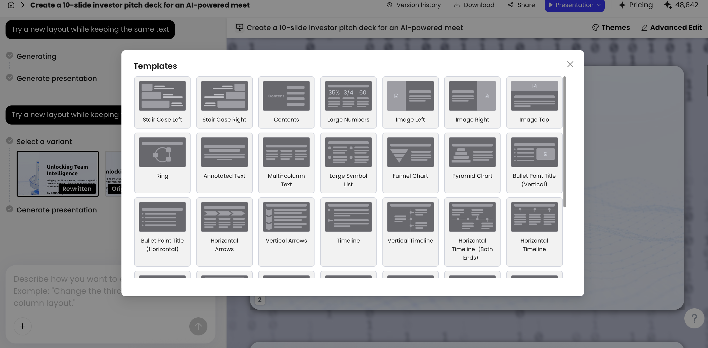
If the slide is about growth, highlight the growth rate. If it is about risk, show severity and owner. If it is about comparison, remove background clutter and make the contrast visible. Use editing controls for specific tasks: replace a dense paragraph with cards, convert a table into a chart, simplify icons to one style, or switch to a layout with one dominant focal area.
Simplify charts before styling them
- Delete gridlines unless they are needed to interpret values.
- Use direct labels instead of distant legends when possible.
- Highlight one key series, number, or outlier with the accent color.
- Replace 3D charts, heavy shadows, and decorative frames with flat design.
- Move detailed tables to an appendix if the live presentation needs only the conclusion.
- Add one short annotation that explains the meaning of the trend.
- Check whether the chart actually proves the slide headline.
Verify AI-generated data before presenting it
- Trace every number back to the source document, spreadsheet, or citation.
- Check whether units changed, such as monthly users becoming total users.
- Confirm time periods, segment names, and currency labels.
- Remove AI-generated commentary that explains causation without evidence.
- Keep uncertainty visible when the source uses estimates, ranges, or sample data.
Case note: In one test, source HTML containing Beta users, Activation, and Support load was turned into separate metric pages instead of one dense dashboard. A risk register became a table with risk, severity, owner, and mitigation columns. The useful output was extraction and grouping; the necessary editorial work was choosing the three values worth emphasizing, moving low-priority rows into backup, and changing the title from “Risk Register” to “Two launch risks need owners before rollout.”
Scenario-Based Minimalist Rules: Pitch, Training, Reports, and Research
Minimalism should adapt to the job of the deck, not force every deck into the same sparse template.
A pitch deck, product launch, training module, data report, and academic presentation do not need the same density. The mistake is applying one aesthetic template to every communication problem.
Pitch deck: simplify the story, not the evidence
Use bold takeaway titles, big market or traction numbers, and simple proof points. Keep the main flow emotionally direct: problem, insight, solution, traction, business model, go-to-market, team, and ask. Do not cram every investor objection into the main flow; use appendix slides for cohort charts, assumptions, customer quotes, competitive detail, and financial model backup.
Product launch: show the change customers will notice
Use clean before-and-after visuals, short feature statements, and one audience benefit per slide. Screenshots should be cropped to the exact interface area being discussed, not pasted as full-screen product captures with tiny labels. A useful prompt line is: “For each feature slide, state the customer problem, show one cropped visual, and write one benefit-focused headline.”
Training deck: keep one concept per slide, but keep the learning support
Minimalist training does not mean removing repetition. Learners need objectives, examples, practice tasks, checks for understanding, and summaries. Keep the slide surface simple, then place facilitator notes, quiz answers, or detailed explanations in speaker notes or handouts. When exporting or sharing, ensure text remains readable on laptops and tablets.
Data report: separate the executive story from the appendix
Use executive summaries, metric cards, and charts that answer specific business questions. A live report should usually prioritize “what changed, why it matters, what we do next.” A detailed table can remain in an appendix or linked source file. If every KPI appears on the first slide, the audience has to do the analysis themselves.
Research or academic deck: simplify without weakening rigor
Keep definitions, methods, results, limitations, and implications distinct. Minimalism is especially useful for methods and findings because it forces you to explain what matters instead of displaying every source detail. Do not remove sample size, methodology, uncertainty, or citations if they are necessary for trust; instead, make them readable and place secondary detail in backup slides.
| Scenario | Best minimalist move | Common AI mistake | Do not remove |
|---|---|---|---|
| Pitch deck | One investor question per slide | Inflated market claims or generic traction language | Evidence, assumptions, and the ask |
| Product launch | Feature-to-benefit mapping | Too many screenshots and icons | Customer problem and launch timing |
| Training | Concept, example, practice, check | Over-compressed lessons with no reinforcement | Learning objectives and accessibility support |
| Data report | Executive summary plus focused KPI slides | Dashboard density on every page | Source definitions and metric caveats |
| Research | Separate method, result, limitation, implication | Oversimplified findings or missing citations | Methodology, uncertainty, and references |
Choose the AI workflow by scenario rather than by novelty. For a pitch deck, start with a narrative outline and manually review every claim. For a data report, start from the source file, verify the metrics, and simplify charts after generation. For training, build the outline first and add knowledge checks manually. For a branded business deck, start from the approved template, then audit hierarchy and readability instead of accepting the imported layout as final.
The AI Output Audit Checklist: What to Delete, Merge, or Rewrite
The first AI-generated version is a draft, not the final presentation. Minimalist design requires a ruthless audit. Look for places where the AI added plausible but unnecessary content, repeated ideas, introduced visual inconsistency, or created a chart that communicates too many things at once.
Practical workflow: Audit in this order: outline, slide titles, repeated ideas, data accuracy, visual hierarchy, typography, color, accessibility, then export. If you start by polishing colors, you may waste time beautifying slides that should be deleted.
Delete anything that does not support the decision
- Generic stock phrases such as “unlock potential” or “drive innovation” unless they are supported by evidence.
- Decorative icons that do not clarify meaning.
- Duplicate bullets that repeat the slide title.
- Background patterns that reduce readability.
- AI-generated transitions, metaphors, or slogans that do not match the audience.
- Unverified statistics, market sizes, ROI claims, or causal explanations.
Merge slides that repeat the same job
- Slides that repeat the same argument in different wording.
- Small metric cards that belong in one clean dashboard slide.
- Similar agenda, overview, and roadmap pages that slow the opening.
- Separate “challenge,” “impact,” and “why it matters” slides when one sharper problem slide would work better.
Rewrite for clarity, evidence, and hierarchy
- Topic titles into takeaway headlines.
- Long bullets into short, parallel phrases.
- Unsupported claims into cautious, source-grounded statements.
- Passive wording into decision language: “Approve pilot expansion” is clearer than “Pilot expansion considerations.”
- Speaker-script text into slide text plus speaker notes.
Score each slide before final polish
- 1 = unclear: multiple messages, weak title, crowded layout, or unsupported claims.
- 2 = usable but crowded: main idea is visible, but text, chart labels, or decoration still compete for attention.
- 3 = presentation-ready: one message, clear hierarchy, readable text, verified evidence, and accessible contrast.
If a slide needs a long explanation before the audience can understand what it is showing, the slide is not minimalist yet; it is unfinished.
Be careful with AI Writing suggestions. In testing, AI-generated expansions sometimes moved beyond the source material and introduced generalized content. Common patterns include turning “users increased” into “users increased because onboarding improved,” inventing market size, estimating ROI without a model, or generalizing a small survey into a broad customer claim. For serious business, research, legal, medical, financial, or training decks, highlight every number and causal claim, trace it to the source, mark unsupported statements, and remove or qualify anything that cannot be verified.
Export, Sharing, and Accessibility for Minimalist AI Decks
A minimalist deck is not finished until it survives the screen, file format, and accessibility checks your audience will actually use.
Design for the smallest realistic screen
- Use 16:9 for most modern presentations.
- Use 4:3 only for older projection environments.
- Use vertical or square formats when the primary destination is mobile or social.
- Test the deck in the smallest likely context: laptop screen, video-call window, tablet, or phone preview.
- Keep titles large, avoid thin light-gray text, and do not rely on tiny chart labels.
Check accessibility before export
- Use sufficient contrast for text, charts, and buttons.
- Do not use color alone to communicate status; pair color with labels, icons, or text.
- Keep reading order logical, especially when exporting to PDF.
- Add alt text or nearby captions for meaningful visuals.
- Use editable text rather than text embedded in flattened images whenever possible.
- Give charts descriptive captions such as “Activation increased after onboarding changes” instead of “Chart 2.”
Review PPTX and PDF fidelity
Link sharing is useful for quick review, while PPTX and PDF exports are often needed for teams, clients, classrooms, and executive meetings. In current file checks using generated business decks, exported PPTX files opened in Microsoft PowerPoint and core text objects remained editable. Still, do not assume every font, icon, chart, or alignment will transfer perfectly. Open the exported file, inspect slide masters or templates if used, confirm fonts, check object alignment, verify chart editability, and review image compression before delivery.
Run the five-second test
The final test is simple: show each slide to a colleague for five seconds. Ask two questions: “What is the main message?” and “Where did your eye go first?” If they can identify the key message without your narration, the slide is probably minimal enough. If they ask where to look first, revise the headline, enlarge the key visual, reduce competing elements, or split the slide before adding more content.
FAQ: Minimalist Design for AI Presentations
What is minimalist design for AI presentations?
It means using AI to create slides that communicate one clear idea with concise text, strong hierarchy, generous white space, limited color, and purposeful visuals.
How much text should an AI-generated slide include?
A useful target is one takeaway title plus three to five supporting points. If the idea needs more detail, split the slide or move evidence to narration or an appendix.
Can minimalist slides work for data-heavy reports?
Yes. Highlight one chart message, remove nonessential gridlines and labels, directly annotate the key number, and keep secondary evidence visually quieter.
Does minimalist design make presentations boring?
No. Minimalist design becomes boring only when it lacks a strong message. Use contrast, scale, concise language, and relevant visuals to make the important idea feel sharper.
Can I edit an AI-generated minimalist presentation after creating it?
Yes. In PopAi, you can continue refining with natural language instructions or edit themes, layouts, writing, charts, icons, and other elements before exporting or sharing.
Create your presentation with one click now
Turn your topic, document, or existing material into a clean, structured presentation, then refine the design with prompts, themes, layouts, and editable slide tools.
Start creating with PopAi