In the world of professional communication, visual consistency is not just a "nice-to-have" design feature; it is a critical component of authority and trust. When your slides jump from one style to another, your audience spends more time processing the visual changes than absorbing your message. A well-defined brand kit checklist ensures that every slide feels like part of a unified story.
The Importance of Visual Consistency in Presentations
Consistency creates a "mental shortcut" for your audience. When they see the same colors, fonts, and layout patterns, they stop evaluating the design and start focusing on the data. A consistent style also reflects professionalism and attention to detail, traits that are highly valued in business environments.
Without a brand kit, presentations often become a patchwork of different templates, clashing icons, and inconsistent font sizes. This "Frankenstein" effect can undermine even the most brilliant pitch or report.
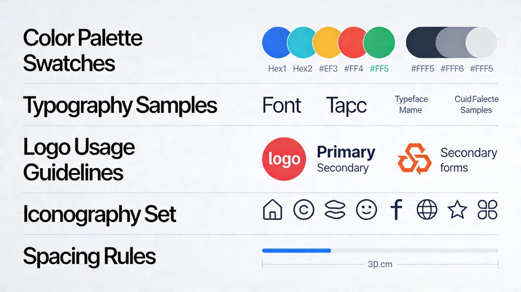
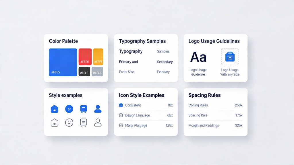
Establishing Your Core Color Palette
Colors evoke emotion and aid in information hierarchy. Your presentation brand kit should include a specific set of HEX or RGB codes that are used throughout the deck.
- Primary Color: Used for headings and major design elements.
- Secondary Colors: Used for accents, charts, and call-to-action buttons.
- Neutral Tones: Shades of white, grey, or black for backgrounds and body text to ensure readability.
Pro Tip: Always check the contrast ratio between your background and text. Use tools like the PopAi Design Assistant to automatically suggest accessible color pairings.
Typography: Choosing Fonts That Speak Your Brand
Fonts carry personality. A sleek sans-serif font like Montserrat or Roboto suggests modernity and tech-savviness, while a serif font like Playfair Display suggests tradition and elegance. To maintain consistency, limit yourself to two font families.
Define your hierarchy early: set a specific size and weight for H1 (Slide Titles), H2 (Sub-headers), and Body Text. Once these are set, do not deviate from them. This prevents the "jumping text" effect when switching between slides during a live presentation.
Unified Imagery and Iconography Styles
One of the fastest ways to break consistency is by mixing different styles of icons—for example, using a flat, colorful icon on one slide and a thin-line outline icon on the next. Choose one style and stick to it.
The same applies to photography. If you use high-contrast, professional stock photos, don't suddenly switch to grainy, amateur shots. Applying a consistent filter or color overlay to all images can help unify disparate visual assets.
Master Slides and Grid Layouts
A consistent slide style relies heavily on the "grid." A grid system dictates where text boxes, images, and logos are placed. By using Master Slides, you can lock these elements in place so they don't shift by a few pixels from slide to slide.
Master slides also allow you to update a logo or a footer once and have it reflect across the entire deck instantly, saving hours of manual editing and reducing the margin for error.
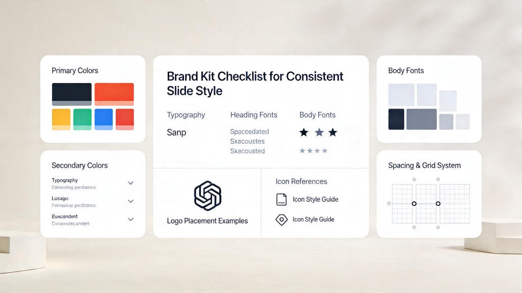
The Ultimate Brand Kit Checklist for Presentations
Before you finalize your next deck, run through this checklist to ensure complete visual harmony:
- Logo Placement: Is the logo in the exact same spot on every slide?
- Color Palette: Are you only using the approved HEX codes from your kit?
- Font Hierarchy: Are all titles the same font, size, and color?
- Icon Style: Are all icons from the same set or style family?
- Image Quality: Do all photos share a similar lighting or filter style?
- Alignment: Are text boxes aligned to a consistent grid?
- White Space: Is there enough "breathing room" around elements to avoid clutter?
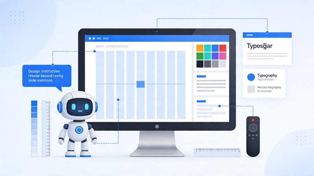
Maintaining Consistency with AI Tools
Creating a brand kit manually can be time-consuming. Modern tools like PopAi's AI Presentation Maker allow you to upload your brand assets once and apply them to every generated slide automatically. This ensures that even when you are creating content at speed, the design remains perfectly aligned with your brand identity.
Frequently Asked Questions
Why is visual consistency important in presentations?
Consistency builds trust, enhances brand recognition, and ensures the audience focuses on the message rather than being distracted by changing styles.
How many colors should I include in my presentation brand kit?
A standard palette includes 1-2 primary colors, 2-3 secondary colors for accents, and a set of neutral tones for backgrounds and text.
Can I use different fonts for every slide?
No, it is best to stick to a maximum of two font families—one for headings and one for body text—to maintain a professional look.
What is a master slide?
A master slide is a template that controls the layout, background, and formatting of all slides in a presentation, ensuring global consistency.
Create your presentation with one click now
Stop worrying about manual formatting. Let PopAi handle the consistency while you focus on the content.
Try PopAi for Free