AI Data Report Deck: Charts, Insights & Narrative Structure
July 09, 2026
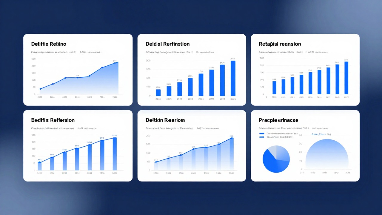
An AI data report deck should not simply convert spreadsheet rows into slides. The job of the deck is to help the audience understand what changed, why it matters, and what decision should follow.
The original version of this topic was too broad, so this rewrite makes the page more practical: common report scenarios, bad chart examples, better chart-title examples, and a repeatable narrative structure that works for sales, marketing, and finance updates.
Use AI to draft the story, group metrics, and suggest slide titles. Keep humans responsible for the data source, calculation method, business interpretation, and final recommendation.
Quick Answer: A Data Report Deck Needs a Decision Story
A good data deck turns numbers into a sequence: context, trend, insight, cause, risk, and action.
The easiest way to improve a report deck is to replace label titles with insight titles. A label says “Revenue by Region.” An insight title says “APAC growth offset weaker North America renewals.” The chart may be the same, but the audience now knows what to look for.
| Weak slide title | Better insight title | Why it works |
|---|---|---|
| Monthly Sales | Enterprise renewals drove 62% of June net-new revenue | It names the driver, not just the metric. |
| Website Traffic | Paid traffic fell, but organic demo intent improved | It separates volume from quality. |
| Budget Overview | Cloud spend is rising faster than user growth | It frames the risk that needs action. |
| Campaign Results | Short-form video delivered reach; email delivered pipeline | It explains channel roles. |
| Q2 Financials | Gross margin improved despite slower top-line growth | It prevents the audience from overreacting to one number. |
Three Report Scenarios: Sales, Marketing, and Financial Updates
Each report type needs a different slide order and different chart logic.
| Scenario | Core question | Recommended slide sequence | Useful charts |
|---|---|---|---|
| Sales report | Where did revenue, pipeline, or conversion change? | Executive summary → revenue trend → segment/region → pipeline → risks → next actions | Line chart, stacked bar, funnel, cohort table. |
| Marketing report | Which channels are creating quality demand? | Summary → spend vs results → channel performance → conversion quality → creative learnings → budget recommendation | Bar chart, scatter plot, funnel, before/after creative table. |
| Financial report | Are the economics moving in the right direction? | Summary → revenue/cost trend → margin → budget variance → cash or forecast → decisions needed | Waterfall, variance table, line chart, contribution bridge. |
When using PopAi or any AI presentation tool, give the report type in the prompt. “Create a monthly marketing performance deck” should produce a different structure from “Create a board-style financial update.”
Before and After: How to Fix Weak Data Slides
The problem is usually not the chart itself; it is the missing interpretation around the chart.
| Before | Problem | After |
|---|---|---|
| A slide with five charts and the title “Performance Overview.” | The audience does not know where to look first. | One main chart, one insight title, two supporting bullets, one action implication. |
| A pie chart with 11 tiny categories. | The differences are unreadable and do not support a decision. | A ranked bar chart showing the top five categories plus “Other.” |
| A revenue line with no comparison period. | The audience cannot tell if performance is good or bad. | A year-over-year or target line added for context. |
| A dashboard screenshot pasted into a slide. | The slide is too dense and contains UI noise. | Extract only the metric that changed and explain the business impact. |
| A chart title that says “CTR by Campaign.” | It labels the metric without telling the story. | “Campaign B won clicks, but Campaign C produced higher demo conversion.” |
If the audience cannot understand the main point in five seconds, the slide needs a sharper title, fewer metrics, or a better chart choice.
Chart Insight Title Examples You Can Reuse
Insight titles are the fastest manual edit after AI generates a draft deck.
- Sales: “Expansion revenue recovered, but new-logo conversion remains below target.”
- Sales: “Three enterprise deals explain most of the monthly variance.”
- Marketing: “Search volume is lower, but signup intent improved after landing-page cleanup.”
- Marketing: “Creative fatigue appears after day 11, so the next test needs faster rotation.”
- Finance: “Operating expenses are stable; margin pressure comes from payment fees and support load.”
- Finance: “The forecast is still achievable if Q3 hiring stays within the approved range.”
A useful prompt is: “Rewrite these chart titles as business insights. Keep each title under 14 words. Do not invent causes that are not supported by the data.”
AI Workflow: From Report Notes to Presentation Narrative
AI works best after you prepare clean inputs and define the decision the deck should support.
- Paste the report summary, audience, time period, and decision needed.
- Ask AI to group metrics into themes such as growth, conversion, cost, risk, and next actions.
- Generate a draft slide order before generating slide copy.
- Replace weak labels with insight titles.
- Check every number against the original dashboard, CSV, or finance source before publication.
The AI can propose the narrative. The data owner must confirm the numbers and the business meaning.
FAQ
What is an AI data report deck?
It is a presentation draft created with AI support from report notes, dashboards, CSV exports, or written analysis. The goal is to turn metrics into a clear decision story.
What is a chart insight title?
It is a slide title that states the main takeaway from the chart, such as “Enterprise renewals drove most June revenue,” instead of a label such as “Revenue by Segment.”
Can AI choose the best chart for my data?
AI can suggest chart types, but you should review whether the chart matches the data shape, comparison need, and audience decision.
Should I paste raw dashboards into slides?
Usually no. Extract the key chart or metric, remove UI noise, add context, and explain the action implication.
Turn your report into an AI data deck draft
Upload or paste your report notes into PopAi to create a first draft, then replace weak chart titles with clear insights and verified numbers.
Try PopAi AI Presentation