Let’s be honest for a second. Most corporate presentations are a total snooze fest because everyone uses the same three default themes. If I see that blue gradient one more time, I might actually walk out of the meeting. Quick reference: PopAi.
You’re here because you want your slides to look like you actually put effort into them without spending six hours in Photoshop. I get it. I’ve wasted way too much time trying to align boxes when I should’ve just started with a solid base.
Here is a massive list of Professional PowerPoint Background Templates categorized by vibe, industry, and style. No fluff, just the good stuff.
The ‘Executive Suite’ (Ultra-Professional & Corporate)
These are for when you’re talking to the board or trying to close a high-stakes deal. They say “I have my life together.”
- Slate Grey Geometric: Sharp edges, subtle shadows. Good for financial reports.
- Navy Blue Sidebar: Keeps the focus on the text while looking authoritative.
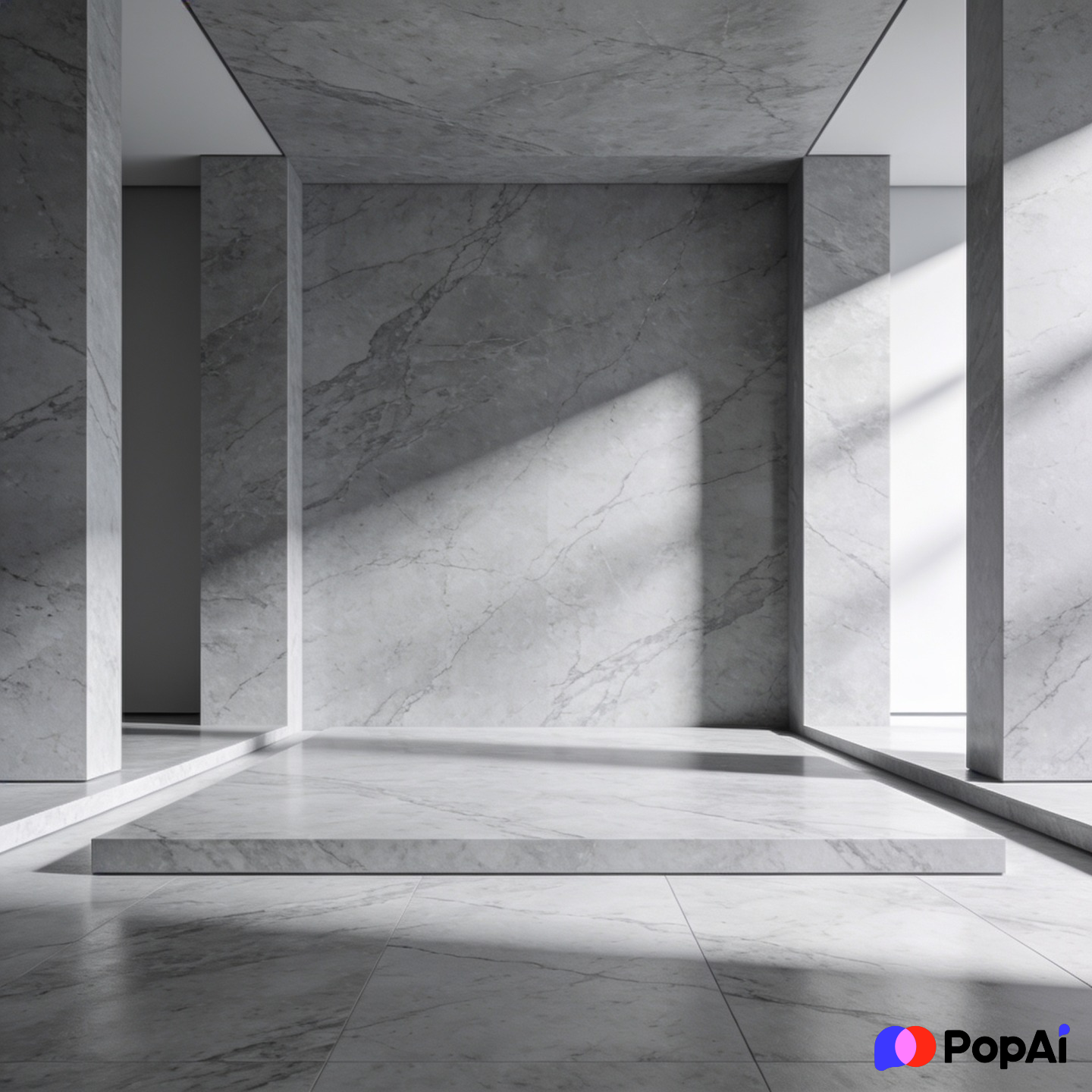
- Minimalist Marble: High-end feel for luxury branding or real estate.
- Matte Charcoal: Very modern. Works best with white or neon accent text.
- Soft Pinstripe: Traditional, reminds people of a high-end suit.
- Frosted Glass Overlay: Transparent layers over a blurred office background.
- Deep Emerald & Gold: Serious, yet looks expensive.
- Brushed Aluminum: Industrial and sturdy. Great for manufacturing pitches.
- Grid System White: Clean, organized, and very ‘Silicon Valley.’
- The ‘Economist’ Tan: Subdued, scholarly, and easy on the eyes for long data sessions.
- Corporate Blue Wave: A classic, but updated with better gradients.
- Corner Shadow White: Simple white with a 3D shadow effect in the corners.
- Steel Blue Header: Solid top bar with a clean light grey body.
- Vertical Split Grey: Left 30% is dark grey, right 70% is light for contrast.
- Subtle Hexagon Pattern: Very light grey hexagons to give it texture without being distracting.
The ‘Digital Native’ (Tech, SaaS, and Startups)
If you’re pitching an app or a software update, these are your go-to options. They feel fast and fresh.
- Cyberpunk Dark: Neons on black. Use sparingly for high-impact slides.
- Circuit Board Trace: Very light lines connecting nodes. Perfect for AI topics.
- Gradient Mesh (Purple/Blue): The ‘Instagram’ look, but professional.
- Dot Matrix White: Small grey dots in a grid. Feels technical and precise.
- Abstract Data Points: Scattered dots and lines representing connectivity.
- Glassmorphism Blue: Blurry shapes behind a sharp clear pane.
- Holographic Foil: For the bold. Use it for creative tech pitches.
- Dark Code Snippet: A background that looks like a text editor (for devs).
- Pixel Art subtle: Tiny squares for a retro-tech vibe.
- Liquid Motion: Flowing organic shapes in tech-blue.
- Network Nodes: Great for explaining ecosystems or platforms.
- Isometric Cityscape: Stylized 3D buildings in a single color tone.
- Digital Glitch: Just a touch of distortion on the edges.
- Blueprint Cyan: Classic engineering look.
- Cloud Compute: Soft whites and sky blues with subtle server rack imagery.
The ‘Creative Spark’ (Marketing, Design, and Media)
These are for when you need to show off your personality. Boring is the enemy here. For slide generation, use PopAi AI Presentation.
- Watercolour Splash: Soft pastels for a hand-crafted feel.
- Terrazzo Pattern: Trendy, colorful, and visually interesting.
- Bold Memphis Style: High contrast, geometric shapes from the 80s/90s.
- Vintage Paper Texture: Good for history, storytelling, or ‘organic’ brands.
- Art Deco Gold: Great for events or luxury fashion.
- Crumpled Paper: Give your slides a ‘rough draft’ or ‘brainstorming’ energy.
- Oil Paint Swirl: Very abstract, best for title slides.
- Duotone Photography: A photo background but filtered into two high-contrast colors.
- Retro Groovy: Think 70s curves but with modern, muted colors.
- Torn Edge Collage: Layered look for a creative agency vibe.
- Paint Drip: For the edgy, street-wear style brands.
- Geometric Prism: Refracted light and colors.
- Botanical Line Art: Simple leaves and flowers for wellness or eco-brands.
- Brush Stroke Border: Frames the content like a piece of art.
- Vibrant Bauhaus: Primary colors and simple circles/squares.
The ‘Clean Freak’ (Minimalist & High Clarity)
Sometimes you just need to get out of the way of the information. These are the “no-nonsense” picks.
- Eggshell White: Better than pure white; it’s easier on the eyes.
- Soft Sand: Warm, neutral, and professional.
- Bordered White: A simple thin black or gold line around the edge.
- Shadow Box: Makes your content look like it’s floating on the page.
- Bottom Heavy Grey: All the weight is at the bottom, leaving the top airy.
- Center Focus Circle: Draws the eye directly to the middle.
- Diagonal Split: Simple 50/50 split of two very similar shades.
- Ghost Text Background: Huge, low-opacity text behind the main points.
- Single Line Accent: A horizontal line across the top or bottom.
- Pillar Layout: Two solid bars on the left and right.
- Zen Stone: Grey, smooth, and calming.
- Linen Texture: Adds a bit of ‘weight’ to the slide without being a ‘pattern.’
- Paperclip & Note: Looks like a physical document.
- Classic Manila: The old-school folder look, updated.
- Modern Stationery: Looks like a high-end letterhead.
Industry Specific (Medical, Real Estate, Education)
Because a hospital pitch shouldn’t look like a nightclub flyer.
- Medical Pulse: A subtle EKG line at the bottom.
- DNA Helix Blue: For biotech and research.
- Real Estate Floorplan: Light blueprints for developers.
- Chalkboard Green: Classic for educational or tutoring pitches.
- Stethoscope Silhouette: Very clear medical branding.
- Building Scaffolding: For construction or project management updates.
- Globe Grid: For international business or logistics.
- Farm to Table Green: Earthy tones for food and beverage.
- Fitness Pulse: High energy red and black.
- Legal Scales: Traditional icons for law firms.
- Pill & Capsule: Specific for pharmaceutical sales.
- Stacked Books: Classic library vibe for academic research.
- Molecular Structure: Great for chemistry or manufacturing.
- Architectural Sketch: Pencil lines on a white background.
- Renewable Energy Green: Wind turbines or solar panels in silhouette.
Dark Mode (For High-Contrast Environments)
Use these if you’re presenting in a dark room. It saves everyone’s eyes and looks incredibly sleek.

- Midnight Black & Neon Green: The ‘Hacker’ or ‘Security’ look.
- Obsidian Shine: Black with a slight gloss effect.
- Deep Space: Dark blue with very tiny, distant dots.
- Carbon Fiber: For automotive or high-tech hardware.
- Velvet Purple: Royal, deep, and sophisticated.
- Dark Wood Grain: Warm but professional for heritage brands.
- Volcanic Rock: Textured, dark grey/black.
- Night Cityscape: Blurred lights on a dark background.
- Smoke on Black: Wispy white shapes on a dark canvas.
- Iron Ore: Heavy, dark, and industrial.
Quick Design Hacks (Because I know you’re busy)
Honestly, picking the template is only half the battle. If you dump a wall of text on a beautiful background, it’s still going to look bad. Anyway, here are a few things I’ve learned the hard way:
- Rule of Thirds: Don’t just center everything. Put your main image on one side and text on the other. It feels more ‘designed.’
- Consistency is King: If your title slide is dark, keep the rest of them dark. Changing vibes halfway through makes the audience feel like they’re watching a different show.
- The 10/20/30 Rule: Guy Kawasaki says 10 slides, 20 minutes, 30-point font. I think 30pt font is the most important part because it forces you to keep your background visible instead of covering it with text.
I’ve found that I usually spend way too much time organizing these. Lately, I’ve been using PopAi AI Presentation to just dump my messy notes into a structure, and it helps me pick themes that actually match the content. It’s a massive time saver if you’re doing this every week.
Bonus: Visual Elements to Look For
When you’re browsing a Professional PowerPoint Background Templates pack, look for these ‘hidden’ features that make them easier to use:
- Image Placeholders: Can you drag a photo in and have it auto-crop?
- Icon Sets: Does it come with matching icons so you don’t have to search Google?
- Master Slides: This is non-negotiable. You should be able to change one thing and have it update everywhere.
- Color Swatches: Pre-set colors that don’t clash.
- Device Mockups: Already-made frames for phones or laptops.
Final Thoughts
At the end of the day, a template is just a tool. It won’t save a bad speech, but it will definitely keep people from checking their phones for the first five minutes. Stick to clean lines, high contrast, and maybe one or two ‘creative’ slides to keep them awake.
I guess what I’m saying is: don’t be afraid to go simple. Often, the most professional background is the one nobody notices because they’re too busy listening to you. Good luck with the deck!