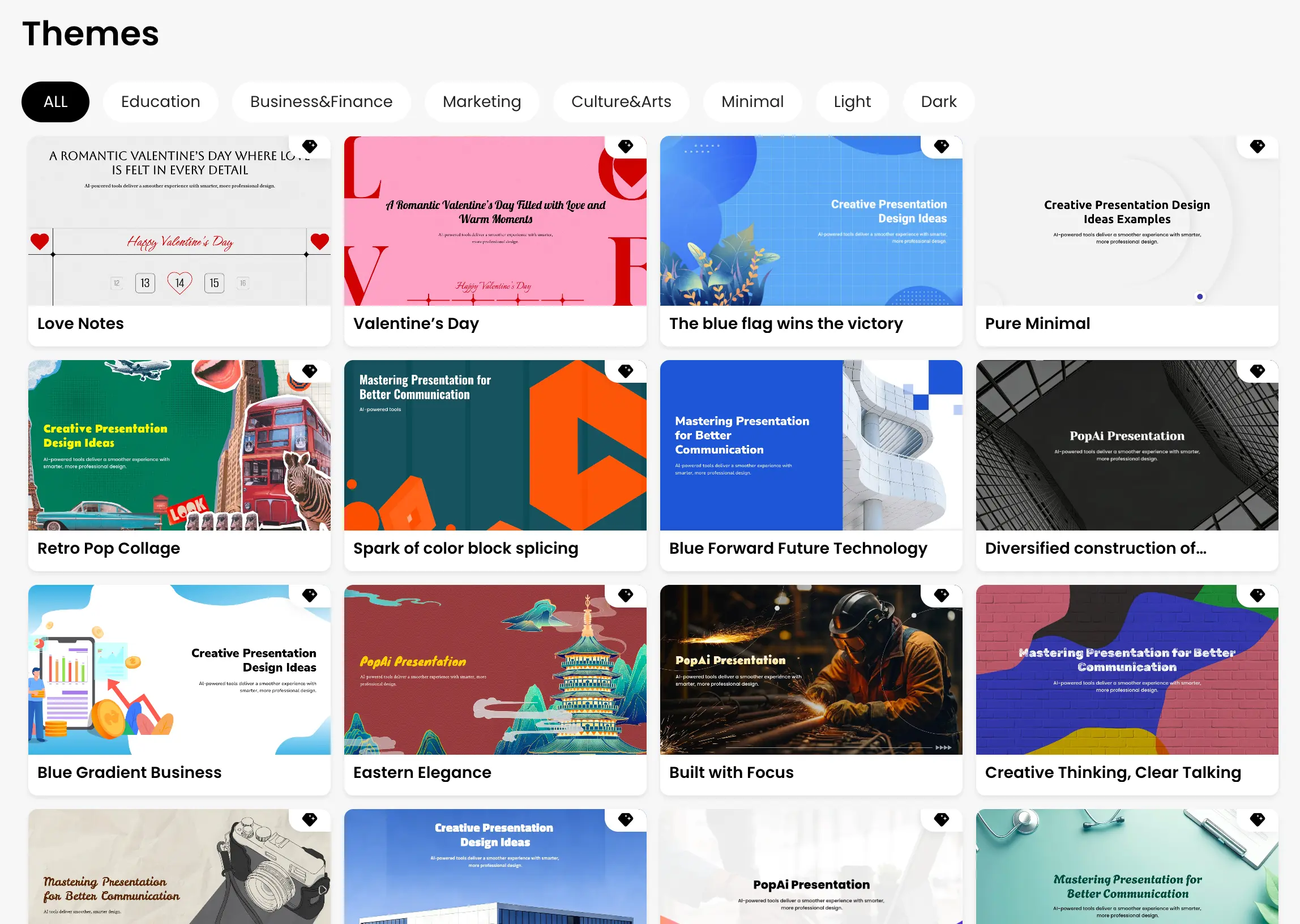
How to Choose a PowerPoint Background
A good PowerPoint background should support the message instead of competing with it. The safest choice is usually a simple visual system with enough contrast for headings, body copy, charts and images.
- Match the audience: business decks usually benefit from restrained backgrounds, while education or creative presentations can use more expressive styles.
- Protect readability: keep strong contrast between text and the background, especially for projected presentations.
- Leave room for content: decorative elements should not occupy the areas needed for titles, charts or key messages.
- Keep the deck consistent: use one visual system across slides rather than switching backgrounds without a reason.
- Design for 16:9 first: this is the most common modern presentation ratio and should be the default preview format for the gallery.
Backgrounds by Use Case
Choose the closest use case first, then adapt the background to your audience, content density and presentation setting. This keeps the visual style useful instead of treating backgrounds as decoration only.
- Business presentation backgrounds
- Marketing presentation backgrounds
- Education and classroom backgrounds
- Technology and AI backgrounds
- Minimalist presentation backgrounds
- Professional PowerPoint backgrounds
- Creative presentation backgrounds
- Dark and gradient backgrounds