
Mistake 1: Chaotic Logic—Failing to Answer “Why, How, What”
Many presenters open with a chronological play–by–play: “Here’s what we did in Week 1, Week 2…” After five minutes, leaders are left wondering: “What problem are we actually solving here?”
The Fix: Adopt the “Golden Three Questions” Framework
Structure your entire presentation around answering three core questions leaders implicitly ask. Use this framework as your PPT outline:
Part 1: Why Did We Launch This Project?
l Slide 1: Cover Page
Keep it clean and professional: Project title, presenter name, and date. Avoid cluttered visuals or unnecessary text—simplicity builds credibility.
l Slide 2: Table of Contents/Navigation
Use clear, action–oriented section headers: “Project Background & Objectives,” “Core Processes & Challenges,” “Key Achievements & Value,” and “Future Plans.” This lets stakeholders quickly grasp the presentation flow.
l Slide 3: Project Background & Core Objectives
Set the tone with specificity, not vague corporate jargon. Instead of saying “Aligned with company strategy,” be concrete: “To address a 5% drop in user engagement caused by Competitor X’s new feature launch in June, we initiated this project. Our core objective: Increase daily average user session duration by 10% through feature optimization by the end of Q3.” This immediately clarifies the project’s purpose and measurable goal.
Part 2: How Did We Execute It? What Obstacles Did We Overcome?
Avoid a tedious task list. Organize this section by key milestones or core modules—focus on outcomes, not just activities.
Example (Feature Optimization Project):
l Slide 4: Phase 1 – In–Depth User Pain Point Analysis
Include visualizations like a word cloud of user feedback or screenshots of survey data. For instance, highlight top complaints (e.g., “slow page load times” or “confusing navigation”) to demonstrate data–driven decision–making.
l Slide 5: Phase 2 – Core Solution Design & Review
Present a conceptual sketch or flow chart of the final solution, with clear markers for improvements over the old version. For example, use arrows or callouts to highlight simplified user journeys or new functionality.
l Slide 6: Phase 3 – Key Challenges in Development & Testing
This is your chance to showcase problem–solving skills. Be specific about challenges and solutions: “Challenge: Unstable third–party API. Solution: Built a backup data channel with real–time monitoring and alert systems.”
Critical Tip: Frame slide headings as conclusions or highlights, not just task descriptions. For example, use “A/B Testing Validated Optimal User Interface Design” instead of “UI Design Phase Work.”
Part 3: What Did We Achieve? What Value Did It Deliver?
l Slide 7: Core Results vs. Original Objectives
Create a dashboard or comparison table that contrasts initial KPIs with actual outcomes. Use visual cues like green upward arrows (↑) or red downward arrows (↓) to highlight progress. Example: “Target: 10% increase in session duration. Result: 15% increase—exceeded target by 5 percentage points.”
l Slide 8: Additional Positive Impacts
Highlight unexpected wins beyond the core objective. For instance: “Customer complaint rate decreased by 20%” or “Page load speed improved by 50%.” These add–ons strengthen your case for project success.
l Slide 9: Customer/Internal Feedback
Include snippets of positive user reviews or thank–you emails from cross–functional teams. Social proof—such as “This feature transformed our workflow”—adds credibility and makes results more relatable.
l Slide 10: Summary & Future Plans
Summarize key achievements in 3 bullet points. Then, clearly outline next steps and resource needs: “To sustain momentum, we recommend investing in [X initiative], which is projected to drive [Y value] by Q4.”
By following the “Golden Three Questions” framework, your project status report PPT will have airtight logic that keeps leaders engaged and informed.
Mistake 2: Information Overload—Turning Slides into “Eye Charts”
Copy–pasting Word documents into PPT is one of the most common—and damaging—mistakes. Walls of text overwhelm audiences, leading to disengagement and missed key messages.
The Fix: Embrace “One Key Message Per Slide” & Visual Storytelling
Follow these four rules to simplify complex information:
1. Headings = Conclusions
l Bad: “User Survey Data Analysis”
l Good: “Survey Insight: High Page Navigation Friction Drives User Churn”
2. Text = Concise Bullet Points
Convert paragraphs into 3–5 bullet points with icons. Keep each point to one line—avoid jargon and redundant details. For example:
l Reduce checkout steps from 5 to 3
l Add guest checkout option
l Integrate popular payment gateways
3. Data = Visualizations
l Use line charts for trend comparisons (e.g., user growth over time)
l Use pie/ring charts for composition data (e.g., user acquisition channel distribution)
l Use bar charts for multi–variable comparisons (e.g., feature usage rates)
Pro Tip: Add a brief insight next to charts: “As shown, the new feature drove a V–shaped recovery in core metrics post–launch.”
4. Processes = Visual Diagrams
Use PPT’s SmartArt or simple flowcharts to map complex workflows. A visual representation of “A → B → C” is far easier to follow than a written step–by–step description.
Remember: PPT is not a script—it’s a visual aid. The best slides complement your speech, not replace it. As the saying goes: “Words are less effective than tables, and tables are less effective than charts.”
Mistake 3: Unprofessional Design—Looking Like a “Rough Draft”
Don’t underestimate the power of design. A messy, inconsistently formatted PPT sends a subconscious message: “You didn’t care enough to polish this—and maybe you didn’t care enough about the project either.”
The Fix: Invest Minimal Time for Maximum Impact
You don’t need to be a graphic designer—just follow these simple design rules:
l Unify Fonts
Use no more than two fonts throughout the presentation. For example: “Source Han Sans Bold” for headings and “Source Han Sans Regular” for body text. Consistency creates a polished, cohesive look.
l Stick to a Color Palette
Base your colors on your company logo for brand alignment. Use a color tool (e.g., Coolors or Adobe Color) to find complementary shades. For example: Deep blue (primary color) for headers, orange (accent color) for highlights, and light gray (background) for readability.
l Incorporate Icons
Add relevant icons next to bullet points (e.g., a target icon for “objectives,” a warning icon for “risks”). Choose a consistent style—either all line icons or all filled icons—to avoid visual clutter.
l Align Everything
This is the cheapest and most effective design hack. Use PPT’s grid lines to ensure text boxes, images, and charts are perfectly aligned. Misaligned elements make slides look unprofessional—aligned ones convey attention to detail.
How to Use AI Tools Like PopAI to Streamline PPT Creation
Even with the right framework and design rules, building a PPT from scratch can be time–consuming. AI–powered tools like PopAI eliminate friction by automating repetitive tasks, so you can focus on content quality. Here’s how PopAI addresses each of the above pain points:
1. Solve Chaotic Logic: Let AI Build the Framework
l Action: Instead of staring at a blank slide, input a prompt like: “Create a project status report PPT outline for ‘Q3 E–commerce App User Experience Optimization Project,’ including background, processes, results, and future plans.”
l Outcome: PopAI generates a structured, detailed outline in 30 seconds—directly aligned with the “Golden Three Questions” framework. You just need to fill in your specific data and insights.
2. Fix Information Overload: Let AI Visualize Content
l Action: Input raw text or data (e.g., “Project achievements: 15% increase in user session duration, 20% drop in complaints, 50% faster page load speed”) and ask PopAI to “Generate a visual slide for these key results.”
l Outcome: PopAI automatically converts text into a clean, visual slide—using bullet points, icons, and charts (e.g., a bar chart comparing pre– and post–optimization metrics). It even adds data insights to highlight key takeaways.
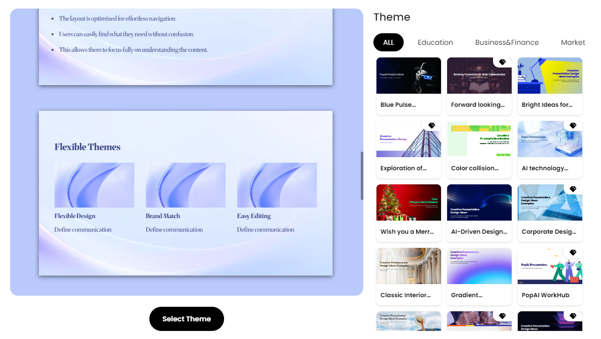
3. Elevate Design: Let AI Apply Professional Templates
l Action: Choose from PopAI’s library of professional, industry–specific templates (e.g., tech, e–commerce, marketing).
l Outcome: With one click, PopAI applies consistent fonts, colors, and layouts across all slides. No more manually adjusting each page—your PPT instantly looks polished and professional.
Final Thoughts
A great project status report PPT is not about fancy animations or endless data—it’s about clarity, logic, and value. By avoiding the three mistakes above, adopting the “Golden Three Questions” framework, and leveraging AI tools like PopAI, you can create presentations that stand out, resonate with leaders, and showcase your project’s true impact.
Remember: Your goal is to make leaders think, “This project was well–planned, executed effectively, and delivered real value.” With the right approach and tools, you’ll not only win their approval—you’ll position yourself as a strategic, results–driven professional.
Now it’s time to turn these insights into action. Open PopAI, apply the framework, and create a PPT that tells your project’s story with confidence.