Professional Typography Tips for Presentations Using Popai.pro
Published on April 29, 2026
For many corporate professionals and educators, the difference between a "good" slide and a "stunning" slide often comes down to one thing: typography. If you've ever felt that your slides look cluttered or amateurish despite having great content, you are likely struggling with font choices and layout. Typography isn't just about picking a pretty font; it’s about ensuring your message is readable, accessible, and authoritative.
In this guide, we will explore professional typography tips for presentations that will transform your decks from standard to standout. By leveraging the AI-powered capabilities of Popai.pro, you can automate many of these design decisions while maintaining a high level of professional polish.
Understanding the Role of Typography in Visual Communication
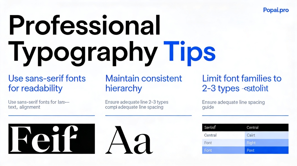
Typography is the silent ambassador of your brand. When you choose a font, you are setting the tone for your entire presentation. A sleek, sans-serif font like Helvetica or Inter conveys modernism and efficiency, while a classic serif font like Garamond or Playfair Display suggests tradition and reliability.
The primary goal of typography in a presentation is to guide the viewer's eye. Because your audience is often multi-tasking—listening to you while reading your slides—your text must be instantly digestible. Confusing fonts or poor spacing create cognitive load, making it harder for your audience to retain your key points. Professional typography ensures that the "visual noise" is minimized, allowing your ideas to take center stage.
Choosing the Right Font Pairings for a Professional Look
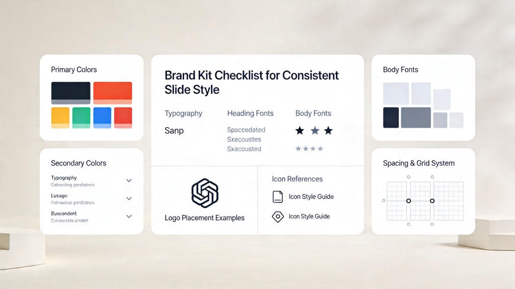
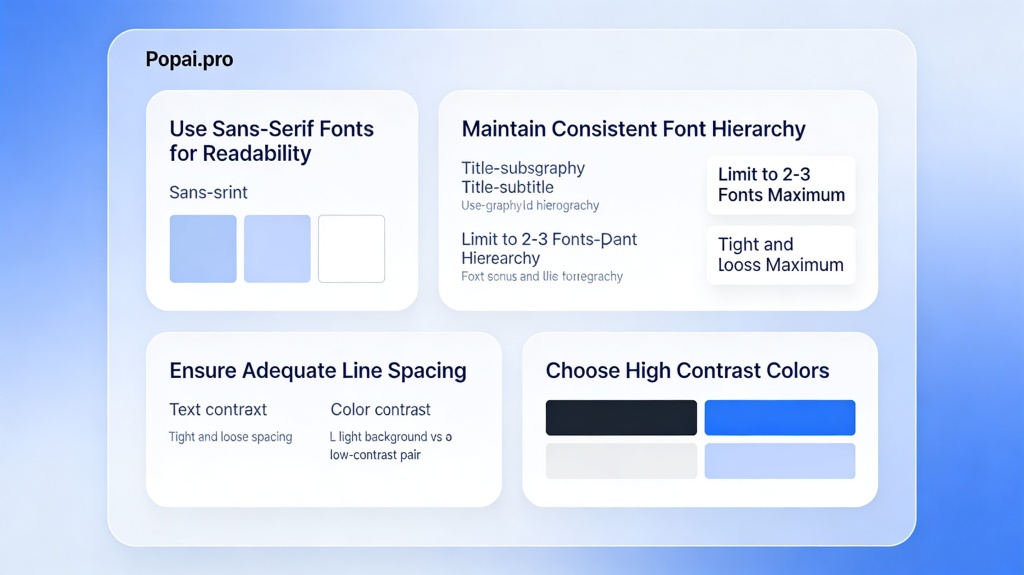
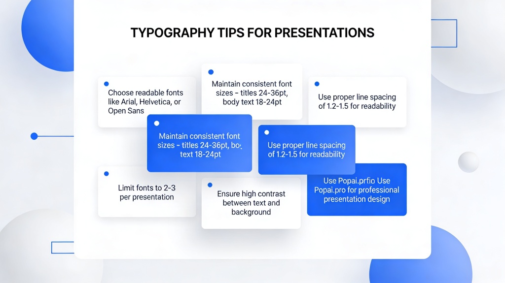
One of the most common mistakes in presentation design is using too many fonts. To maintain a clean, professional aesthetic, stick to a maximum of two font families: one for your headings and one for your body text. This creates a sense of cohesion and prevents the deck from looking like a patchwork of different styles.
When pairing fonts, look for contrast. A bold, thick heading font paired with a light, clean body font works exceptionally well. For example, pairing a geometric sans-serif (like Montserrat) for titles with a highly readable serif (like Lora) for bullet points can create a sophisticated balance. If you are unsure where to start, Popai.pro offers curated templates where professional designers have already pre-selected font pairs that work harmoniously across all slide types.
Pro Tip: Avoid "system fonts" like Comic Sans or Times New Roman unless specifically required. They often feel dated. Instead, try modern alternatives like Open Sans or Roboto for a fresher look. Explore more design tools at Popai.pro.
Establishing a Clear Typographic Hierarchy
Visual hierarchy tells the audience what to look at first, second, and third. Without it, every piece of text competes for attention. To establish hierarchy, you should vary the size, weight, and color of your text elements.
- Level 1: Headings. These should be the largest and boldest elements on the slide. Use them to summarize the main point of the page.
- Level 2: Subheadings. Use a medium weight and slightly smaller size to categorize information under the main heading.
- Level 3: Body Text. This should be the smallest, yet most readable text. Ensure there is enough contrast between the body and the background.
- Level 4: Captions and Footnotes. These can be very small and light, as they are secondary information.
Readability and Accessibility: Font Sizes and Spacing
Accessibility is a non-negotiable in modern presentation design. You never know the visual requirements of your audience or the quality of the projector you’ll be using. A general rule of thumb for professional typography tips for presentations is the "Rule of 24": never let your body text drop below 24 points.
Beyond size, pay attention to "leading" (line spacing) and "kerning" (letter spacing). Text that is too tightly packed is difficult to read from a distance. Increasing the line height to around 1.4 or 1.6 makes blocks of text feel more breathable. Also, be mindful of color contrast; light grey text on a white background might look "chic" on your laptop, but it will be invisible to someone in the back row of a bright conference room.
Leveraging Popai.pro’s AI to Automate Typography Selection
If the thought of kerning and hierarchy feels overwhelming, AI tools like Popai.pro are a game-changer. Popai.pro doesn't just generate content; it applies intelligent design rules to your text automatically. When you input your presentation outline, the AI selects font weights and sizes that adhere to the best practices of visual hierarchy.
The platform’s "Smart Themes" feature allows you to swap entire typographic identities with a single click. If you find that a font doesn't match your brand's voice, you can cycle through professionally vetted combinations until the "vibe" is perfect. This saves hours of manual tweaking and ensures that your deck remains consistent from the first slide to the last.
Common Typography Mistakes to Avoid in Your Next Deck
Even with the best tools, it's easy to fall into old habits. Here are the top typographic pitfalls to avoid:
- All Caps Overload: Writing entire paragraphs in all caps makes text harder to scan. Reserve caps for short headings only.
- Centered Body Text: While centering works for titles, it makes body text harder to read because the starting point of each line changes. Stick to left-aligned text for readability.
- Widows and Orphans: Avoid having a single word "hanging" on its own line at the end of a paragraph. It creates awkward visual gaps.
- Over-decorating: Shadows, outlines, and gradients on text usually distract rather than help. Keep it flat and clean for a modern professional look.
Frequently Asked Questions
What is the best font size for presentation slides?
For body text, a minimum of 24pt is recommended to ensure readability from the back of a room. Headings should be significantly larger, typically 36pt to 48pt.
How many different fonts should I use in one presentation?
Stick to two fonts at most—one for headings and one for body text. Using more than two can make your slides look cluttered and unprofessional.
Does Popai.pro automatically handle font pairing?
Yes, Popai.pro uses AI-driven design templates that come with pre-selected, professional font pairings to ensure visual harmony without manual effort.
Create your presentation with one click now
Stop struggling with font pairings and hierarchy. Let PopAi's intelligent design engine build your professional deck in seconds.
Start Creating for Free