
This article solves that exact pain point. We’re skipping complex theories to answer one question: How to quickly create a clear, compelling risk management presentation that senior leaders can instantly understand and approve? Below is a step–by–step method and template you can use next week.
Why Your Risk Management PPT Is Failing
Before you revamp your slides, avoid these three common “suicidal” mistakes:
Mistake 1: Treating PPT as a Word Document
Full pages of paragraphs or long tables copied straight from your risk register force the audience to spend enormous effort interpreting information—so they just tune out.
Mistake 2: Missing a “One–Sentence Conclusion”
You list phenomena like “potential technical architecture incompatibility” or “supplier delays” but fail to tell your boss: “This will delay the entire project by at least 1 month and increase the budget by 15%.”
Mistake 3: No Visual Focus
All risks are presented equally, making it impossible to distinguish priorities. What your boss cares most about is: “What’s the most urgent and likely issue right now?”
A successful risk management presentation is essentially a precise communication, not a comprehensive display. Your goal is to drive action, not show off your workload.
5 Core Slides to Build Your Presentation Framework (Follow This Exact Structure)
Stop staring at a blank slide. Use this 5–slide framework to organize your core content:
Slide 1: Title Page + “One–Sentence” Core Conclusion
l Title Page: Project Name + “Risk Assessment & Mitigation Report” + Date
l Core Conclusion (below the title or on Slide 2): This is your “elevator pitch” for the entire presentation—must be one sentence. Example: “This assessment confirms the biggest threat is ‘delivery delays from Supplier A,’ which will directly postpone product launch; the key opportunity lies in ‘adopting a new development tool,’ expected to save 10% of working hours. This presentation focuses on addressing the former and seizing the latter for approval.”
Slide 2: Risk Landscape “Heatmap”—3–Second Clarity for Everyone
This is the backbone of your presentation. It turns complex risk data into an intuitive visual that anyone can understand instantly.
How to Create It: Draw a simple “Probability–Impact Matrix” (a 4–quadrant chart). The horizontal axis is “Impact Level” (Low to High), and the vertical axis is “Likelihood of Occurrence” (Low to High).
Step–by–Step Execution:
1. Turn each identified risk into a “bubble” or “dot” and place it on the chart based on your assessment.
2. High–Probability + High–Impact risks: Place in the top–right corner, color bright red, and label with the number “1.”
3. High–Impact + Medium–Probability risks: Place in the middle–right, color orange, and label with “2.”
4. Use yellow and green for other risk levels accordingly.
Value of This Slide: Anyone viewing it will immediately focus on the “red zone.” Open with: “Everyone, please look directly at the red risks in the top–right corner—this is our top priority today.”
Slides 3–4: Deep Dive into 1–2 “Red” Risks (One Risk Per Slide)
Don’t dilute your message by covering every risk. Focus on the 1–2 highest–priority (red) risks—this is where executives will concentrate their attention and resources.
Slide Template for Each Risk:
l Headline: Risk Name (e.g., “Supplier A’s Delayed Delivery of Core Component X”)
l Status Tag: [Red Alert / Immediate Action Required] (use your color code for consistency)
l Three Key Sections (use icons + short sentences for scannability):
1. Potential Consequences: Be specific and tie to business goals. Example: “Impact: Project timeline will stall for 3 weeks, delaying the critical path by 28 days and incurring $8,000/month in idle labor costs.”
2. Early Warning Signs: What triggers the risk? Example: “Indicators: Supplier missed milestones in two consecutive weekly reports; our quality team identified fluctuations in sample performance.”
3. Proposed Actions: Assign ownership and deadlines. Example: “Recommendations: ① Initiate negotiations with backup Supplier B (Owner: Zhang San, Deadline: Friday); ② Issue a formal risk alert to Supplier A (Owner: Li Si, Deadline: Tomorrow). Decision Needed: Approve initial cooperation deposit for Supplier B.”
By focusing on concrete outcomes, triggers, and actions, you position yourself as a problem–solver—not just a risk reporter.
Slide 5: Clear Action Plan + Required Support
This slide is key to turning discussions into action.
Create a clear table with the following columns:
l Action Item (specific and executable)
l Owner (name)
l Deadline (YYYY/MM/DD)
l Required Resources/Support (critical for asking leaders for approval)
3 Design Tips to Elevate Your PPT from “Usable” to “Professional”
With the content framework in place, use these three tips to make your PPT more credible and polished:
1. Color Coding Consistency
Use a unified color system throughout: Red = Urgent High Risk, Orange = Medium Risk (Needs Attention), Green = Low Risk/Opportunity. Extend this color scheme to headings and labels in subsequent slides to create visual association.
2. More Graphics, Less Text
Replace “high impact” with “↑↑” arrow icons; replace “decision required” with a small flag icon; use a timeline to show how risks will impact project milestones. Icons enable instant information absorption.
3. One Key Message Per Slide
Ensure each slide conveys only one core point. If a slide has too much content, split it into two. Clean slides keep your audience focused.
How to Cut Creation Time from 3 Hours to 30 Minutes with Smart Tools
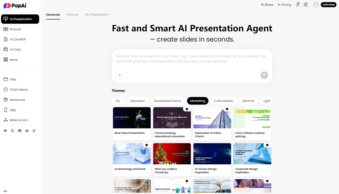
We know what you’re thinking: This method is great, but it’s time–consuming—drawing matrices, adjusting formats, and standardizing styles… Don’t worry—modern AI tools like PopAI can drastically boost efficiency by helping you turn ideas into professional slides quickly.
Step 1: Let AI Build the Framework for You
No need to design layouts from scratch. Simply tell PopAI your core idea: “Generate a risk management presentation for the ‘E–commerce System Upgrade Project,’ including a risk heatmap, two in–depth analysis pages for key risks, and an action plan table.” In seconds, it will generate a structurally clear, visually consistent first draft based on a massive library of professional templates. You’ll get a “semi–finished product” where you only need to fill in specific content—saving you the most time–consuming formatting work.
Step 2: Let AI Polish Your Content and Visuals
If your descriptions of risk impacts are lengthy on the deep–dive pages, use PopAI’s content optimization feature to refine them for greater impact. More importantly, when you mention concepts like “supplier delays” or “technical failures,” PopAI uses AI to search for relevant images and generate engaging content—ensuring your presentation is both informative and visually appealing. This makes your key Risk Management Slides Presentation pages more graphic–rich and visually expressive.
Step 3: Edit as Easily as a Document
Risk management is dynamic. Maybe a risk’s probability updates right before your presentation. In traditional PPT, you’d have to manually adjust the dot’s position on the heatmap and sync color labels on subsequent slides—extremely tedious. PopAI offers a flexible editing experience: drag elements effortlessly, replace the overall color scheme with one click, and all changes are reflected instantly and consistently—keeping your presentation professional and unified.
Step 4: One–Click Conversion from Document to Presentation
Often, your risk list is initially maintained collaboratively in a shared document. The traditional method of copying and pasting into PPT is error–prone and time–consuming. PopAI’s document conversion feature solves this problem: import your updated shared document directly, and it will intelligently identify headings, lists, and tables to automatically convert them into a well–structured presentation draft. This achieves a seamless transition from “risk documentation” to “risk communication,” allowing you to focus entirely on strategic thinking instead of repetitive copy–pasting.
Final Thoughts
A high–impact risk management presentation isn’t about dumping data—it’s about telling a clear story that drives action. It needs a logical framework (the 5–slide structure), visual clarity (the heatmap), and specific asks (the action plan). With AI tools like PopAI, you can turn this framework into a professional presentation in minutes, cutting out the tedious work of formatting and design.
Next time you present risks to your boss, you won’t be the person droning through spreadsheets—you’ll be the strategic thinker who identifies critical issues, proposes solutions, and secures the resources your team needs to succeed. That’s how you stand out as a problem–solver and move the needle for your project.
Ready to transform your risk report? Try PopAI today and turn your next presentation into a catalyst for action.