

Don‘t Be Intimidated by the Jargon – PDCA Is Simply the “Review and Optimize” Method You Use Every Day
Stop staring blankly at that philosophical cycle diagram. The PDCA Cycle is essentially the instinctive approach you take when dealing with any imperfect task or situation.
Think about this scenario: you’re always late for work (the problem). So you plan to leave 20 minutes earlier tomorrow and set an alarm for 7:30 a.m. The next day, you put the plan into action. When you get to the office, you check the result: you’re still 5 minutes late due to an unexpected traffic jam on the way. Then you take action: you decide to check real–time traffic with a map app from now on and leave an extra 10 minutes early.
See? That’s a complete mini PDCA cycle. It’s not some esoteric management theory, but a structured common sense way of working that prevents us from repeating the same mistakes. The so–called “continuous improvement” means consciously and documentedly applying this commonsensical cycle to your work projects—whether it’s optimizing a spreadsheet process, reducing customer complaint rates, or launching a new service.
Its enormous value lies in visualization and closed loop. It turns vague ideas into a written plan, turns the vague feeling of “it seems to work” into verifiable data, and turns one–time success into replicable, scalable standard steps. And to make this cycle understandable not just to yourself, but also to gain colleagues’ cooperation and leaders’ support, you need a clear PDCA Cycle presentation.
A Practical 4–Step PDCA Process: From Problem to Action, One Step One Slide
We’ll use a specific example throughout the explanation: suppose you’re a customer service supervisor aiming to reduce online customer complaint rates by 20%.
Step 1: Plan – Turn the problem into an actionable plan with the 5W2H framework
Don’t just talk about “improving service”. Be specific:
l Goal (What & How much): Reduce product operation–related complaint rates from the current 15% to 12% within 3 months.
l Reason (Why): Initial analysis shows 40% of related complaints stem from unclear guidance for new features.
l Measures (How): 1) Create short video guides for 3 newly added core features; 2) Update standard scripts in the customer service knowledge base.
l Person in charge (Who): Employee A is responsible for video production, and Employee B for script update and training.
l Timeline (When): Video guides to be launched by April 30; script training to be completed by April 15.
l Scope (Where): Launched in the App help center and the internal customer service system.
At this stage, your PPT should include: a data chart of the current problem status, a fishbone or pie chart for root cause analysis, and a detailed action plan table (tasks/owners/deadlines).
Step 2: Do – Move fast and iterate, document everything
Don’t roll out the plan to all users at once. Choose to push the new video guides to 30% of users first, and have half of the customer service team use the new scripts. Document the entire process: video launch date, number of covered users, customer service training records, technical issues encountered during implementation, etc.
Update your PPT with: a timeline of the implementation process, marked milestones achieved, and a record of actual problems encountered.
Step 3: Check – Let data speak, compare against goals
One month later, collect data: how did the complaint rate change among users who watched the videos? What’s the change in customer satisfaction for service handled by agents using the new scripts? Compared with the original 15% baseline, did the rate drop to 13% or 11%?
The core slide for this step: a target vs actual comparison chart using bar or line graphs, clearly showing gaps or achievements.
Step 4: Act – Make decisions, standardize or adjust
Make data–driven decisions: if the complaint rate successfully drops to 12%, standardize the actions: roll out the video guides to all users, mandate the new scripts for the entire team, and update the work manual. If it only drops to 14% and fails to meet the goal, start a new cycle: go back to the Plan stage, analyze whether the videos are not intuitive enough or the scripts have flaws, and formulate new countermeasures.
The final conclusion slide of your PPT: a clear decision (standardize/retry) and a table of the next action plan.
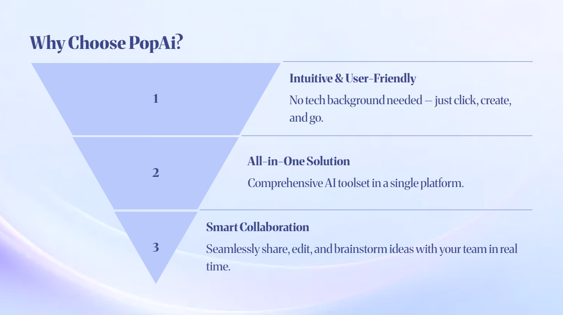
How to Turn the 4 Steps into a Professional Presentation in Minutes with PopAI
You now have a clear PDCA mindset, but building a PPT from scratch—finding templates, creating charts, formatting, writing copy—could take you half a day or more. PopAI, however, can turn your “ideas” directly into a “presentation”.
Feature 1: Generate a complete PPT framework with a single sentence
You don’t need any design skills. Simply enter your core requirement in PopAI: “Generate a 12–page report PPT on the ‘PDCA Project for Reducing Customer Complaint Rates’ for department managers and team members.”
Within minutes, PopAI will generate a logically complete presentation based on its understanding of the PDCA structure. It typically includes: a cover page, table of contents, project background and problem statement, root cause analysis, detailed action plan (Plan), pilot implementation summary (Do), data inspection and comparison (Check), and conclusion with follow–up actions (Act). Each slide has a clear title and initial layout, building a solid framework for you.
Feature 2: One–click style unification and audience adaptation
Professionalism comes from consistency. PopAI allows you to switch the visual theme (colors, fonts) of the entire PPT at any time. A more practical feature is its Audience Perspective function. You can quickly convert the same content into a streamlined version for executives (focusing on goals, costs, and ROI) and a detailed version for the team (focusing on specific tasks and operational steps). This ensures your PDCA Cycle presentation delivers the right message to different audiences and boosts communication efficiency.
Feature 3: Convert documents to PPT directly
If you’ve already written a project plan in Word or an online document, there’s no need for copy–pasting. Simply upload the document file or link to PopAI and select “Convert to Presentation”. The AI will intelligently parse your document content, identify headings, key points, and data, and reorganize and refine them into individual slides. You’ll get a first draft in an instant, and all you need to do next is make minor tweaks in PopAI’s editing interface—ultra–efficient.
Four Practical Tips to Make Your PDCA Presentation Stand Out
Even with a powerful tool, mastering a few core tips will take your presentation to the next level.
A single chart speaks a thousand words – use comparative data visualizations
In the Check stage slides, never clutter the page with raw numbers. Always use comparative charts. The classic choice is a side–by–side double bar chart showing key metrics (e.g., complaint rates, handling time) before and after improvement. Add prominent percentage change arrows, and the conclusion will be crystal clear at a glance.
Tell a “problem–solution” story
The entire PPT should follow a narrative arc like a story: Act 1 (Pain Point): What problem are we facing? How bad are the data? Act 2 (Exploration): What key causes did we discover? Act 3 (Action): What plan did we make and how did we test it on a small scale? Act 4 (Twist & Outcome): What are the result data? Did we decide to scale it up or adjust the plan accordingly? A story–driven structure is the most engaging for your audience.
Clarify accountability and visualize status with “tags”
On the action plan slide, in addition to listing tasks and owners, add a “Status” column and use color–coded tags to visualize progress. During the presentation, this lets everyone instantly focus on risk points and bottlenecks.
Focus on “next steps” to drive actionable meeting outcomes
Your final slide should never be “Thank You for Listening”. It must be “Follow–Up Action Plan” or “Pending Decisions”. Clearly state: what are the decision items (e.g., whether to roll out the plan fully)? Who needs to approve them? What are the specific next tasks, their owners, and the next review date? This ensures the meeting produces tangible results and pushes the PDCA cycle into the next round.
Conclusion: Visualize Improvement, Streamline Communication
The PDCA Cycle is a framework that turns common sense into outstanding results, and an excellent PDCA Cycle presentation is a catalyst that takes this framework from individual thinking to team collaboration. Now you not only master how to break down the PDCA Cycle into concrete actions, but also how to use AI tools like PopAI to minimize the tedious PPT creation process, allowing you to focus your energy on what truly matters: analyzing and solving problems.
Starting today, try using PopAI to quickly create a presentation for a small improvement project you’re working on. You’ll find that when your thinking is presented clearly, communication barriers are broken, and the flywheel of continuous improvement starts to turn much more easily.